by Calculated Risk on 3/31/2009 01:30:00 PM
Tuesday, March 31, 2009
March Economic Summary in Graphs
Here is a collection of 20 real estate and economic graphs for data released in March ...
 New Home Sales in February
The first graph shows monthly new home sales (NSA - Not Seasonally Adjusted).
Note the Red column for 2009. This is the lowest sales for February since the Census Bureau started tracking sales in 1963. (NSA, 27 thousand new homes were sold in February 2009; the previous low was 29 thousand in February 1982).
From: New Home Sales: Just above Record Low
 Housing Starts in February
Total housing starts were at 583 thousand (SAAR) in February, well off the record low of 477 thousand in January (the lowest level since the Census Bureau began tracking housing starts in 1959).
Single-family starts were at 357 thousand in February; just above the record low in January (353 thousand).
Permits for single-family units increased in February to 373 thousand, suggesting single-family starts could increase in March.
From: Housing Starts Rebound
 Construction Spending in January
This graph shows private residential and nonresidential construction spending since 1993. Note: nominal dollars, not inflation adjusted.
Residential construction spending is still declining, and now nonresidential spending has peaked and will probably decline sharply over the next 18 months to two years.
From: Construction Spending: Non-Residential Cliff Diving
 February Employment Report
This graph shows the unemployment rate and the year over year change in employment vs. recessions.
Nonfarm payrolls decreased by 651,000 in February. The economy has lost almost 2.6 million jobs over the last 4 months!
The unemployment rate rose to 8.1 percent; the highest level since June 1983.
From: Employment Report: 651K Jobs Lost, 8.1% Unemployment Rate
 February Retail Sales
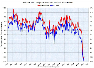
This graph shows the year-over-year change in nominal and real retail sales since 1993.
On a monthly basis, retail sales decreased slightly from January to February (seasonally adjusted), but sales are off 9.5% from February 2008 (retail and food services decreased 8.6%). Automobile and parts sales decline sharply 4.3% in February (compared to January), but excluding autos, all other sales climbed 0.7%.
From: Retail Sales: Some Possible Stabilization
 LA Port Traffic in February
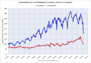
This graph shows the loaded inbound and outbound traffic at the port of Los Angeles in TEUs (TEUs: 20-foot equivalent units or 20-foot-long cargo container). Although containers tell us nothing about value, container traffic does give us an idea of the volume of goods being exported and imported.
Inbound traffic was 35% below last February and 35% below last month.
From: LA Port Import Traffic Collapses in February
 U.S. Imports and Exports Through January
This graph shows the monthly U.S. exports and imports in dollars through January 2009. The recent rapid decline in foreign trade continued in January. Note that a large portion of the decline in imports is related to the fall in oil prices - but not all.
The graph includes both goods and services. The import and export of services has held up pretty well; most of the collapse in trade has been in goods. Imports of goods has declined by one third from the peak of last July!
From: U.S. Trade: Exports and Imports Decline Sharply in January
 February Capacity Utilization
The Federal Reserve reported that industrial production fell 1.4% in February, and output in February was 11.2% below February 2008. The capacity utilization rate for total industry fell to 70.9%, matching the historical low set in December 1982.
This is a very sharp decline in industrial output.
From: Industrial Production and Capacity Utilization: Cliff Diving
 NAHB Builder Confidence Index in March
This graph shows the builder confidence index from the National Association of Home Builders (NAHB).
The housing market index (HMI) was flat at 9 in March (same as February). The record low was 8 set in January.
This is the fifth month in a row at either 8 or 9.
From: NAHB Housing Market Index Still Near Record Low
 Architecture Billings Index for February
"Following another historic low score in January, the Architecture Billings Index (ABI) was up two points in February. As a leading economic indicator of construction activity, the ABI reflects the approximate nine to twelve month lag time between architecture billings and construction spending. The American Institute of Architects (AIA) reported the February ABI rating was 35.3, up from the 33.3 mark in January, but still pointing to a general lack of demand for design services (any score above 50 indicates an increase in billings)."
From: Architecture Billings Index Near Record Low
 Vehicle Miles driven in January
By this measure, vehicle miles driven are off 3.6% Year-over-year (YoY); the decline in miles driven is worse than during the early '70s and 1979-1980 oil crisis.
As the DOT noted, miles driven in January 2009 were 3.1% less than January 2008.
From: DOT: U.S. Vehicle Miles Off 3.1% in January
 Existing Home Sales in February
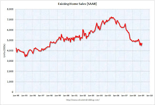
 This graph shows existing home sales, on a Seasonally Adjusted Annual Rate (SAAR) basis since 1993.
Sales in February 2009 (4.72 million SAAR) were 5.1% higher than last month, and were 4.6% lower than January 2008 (4.95 million SAAR).
It's important to note that about 45% of these sales were foreclosure resales or short sales. Although these are real transactions, this means activity (ex-distressed sales) is under 3 million units SAAR.
From: Existing Home Sales Increase Slightly in February
 Existing Home Inventory February
This graph shows nationwide inventory for existing homes. According to the NAR, inventory increased to 3.8 million in February. The all time record was 4.57 million homes for sale in July 2008. This is not seasonally adjusted.
Usually most REOs (bank owned properties) are included in the inventory because they are listed - but not all. Recently there have been stories about a substantial number of unlisted REOs - this is possible, but not confirmed.
From: Existing Home Sales Increase Slightly in February
 Case Shiller House Prices for January
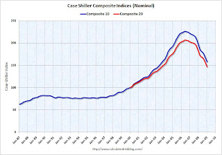
This graph shows the nominal Composite 10 and Composite 20 indices (the Composite 20 was started in January 2000).
The Composite 10 index is off 30.2% from the peak, and off 2.5% in January.
The Composite 20 index is off 29.1% from the peak, and off 2.8% in January.
From: Case-Shiller: Prices Fall Sharply in January
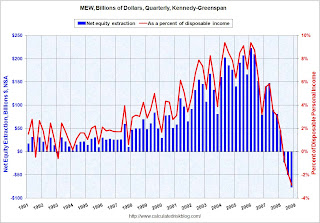 Mortgage Equity Extraction for Q4
Here are the Kennedy-Greenspan estimates (NSA - not seasonally adjusted) of home equity extraction for Q4 2008, provided by Jim Kennedy based on the mortgage system presented in "Estimates of Home Mortgage Originations, Repayments, and Debt On One-to-Four-Family Residences," Alan Greenspan and James Kennedy, Federal Reserve Board FEDS working paper no. 2005-41.
For Q4 2008, Dr. Kennedy has calculated Net Equity Extraction as minus $77 billion, or negative 2.9% of Disposable Personal Income (DPI).
This graph shows the net equity extraction, or mortgage equity withdrawal (MEW), results, both in billions of dollars quarterly (not annual rate), and as a percent of personal disposable income.
From: Q4 Mortgage Equity Extraction Strongly Negative
 Unemployment Claims
The first graph shows weekly claims and continued claims since 1971.
The four week moving average is at 649,000.
Continued claims are now at 5.56 million - the all time record.
From: Unemployment Insurance: Continued Claims Over 5.5 Million
 Restaurant Performance Index for February
"Restaurant industry performance remained soft in February, as the National Restaurant Association’s comprehensive index of restaurant activity stood below 100 for the 16th consecutive month. The Association’s Restaurant Performance Index (RPI) ... stood at 97.5 in February, up 0.1 percent from its January level."
From: Restaurant Peformance Index: 16th Consecutive Month of Contraction
 New Home Sales: February
This graph shows New Home Sales vs. recessions for the last 45 years. New Home sales have fallen off a cliff.
Sales of new one-family houses in February 2009 were at a seasonally adjusted annual rate of 337,000, according to estimates released jointly today by the U.S. Census Bureau and the Department of Housing and Urban Development.From: New Home Sales: Just above Record Low
This is 4.7 percent (±18.3%) above the revised January rate of 322,000, but is 41.1 percent (±7.9%) below the February 2008 estimate of 572,000.
 Philly Fed State Indexes February
Here is a map of the three month change in the Philly Fed state coincident indicators. All 50 states are showing declining activity.
This is the new definition of "Red states".
This is what a widespread recession looks like based on the Philly Fed states indexes.
From: Philly Fed State Indexes: We're all Red States now!
 New Home Months of Supply: February
There were 12.2 months of supply in February - just below the all time record of 12.9 months of supply set in January.
The seasonally adjusted estimate of new houses for sale at the end of February was 330,000. This represents a supply of 12.2 months at the current sales rate.From: New Home Sales: Just above Record Low
Restaurant Peformance Index: 16th Consecutive Month of Contraction
by Calculated Risk on 3/31/2009 11:55:00 AM
From the National Restaurant Association (NRA): Restaurant Industry Outlook Remains Uncertain as Restaurant Performance Index Stood Below 100 for 16th Consecutive Month
Restaurant industry performance remained soft in February, as the National Restaurant Association’s comprehensive index of restaurant activity stood below 100 for the 16th consecutive month. The Association’s Restaurant Performance Index (RPI) ... stood at 97.5 in February, up 0.1 percent from its January level.
“Although the index registered its second consecutive monthly gain, each of the RPI’s eight indicators stood below 100 in February, which signifies continued contraction,” said Hudson Riehle, senior vice president of Research and Information Services for the Association. “A majority of restaurant operators reported negative same-store sales and customer traffic levels in February, and their outlook for sales growth in the months ahead remains uncertain.”
emphasis added
 Click on graph for larger image in new window.
Unfortunately the data for this index only goes back to 2002.
The index values above 100 indicate a period of expansion; index values below 100 indicate a period of contraction.
Based on this indicator, the restaurant industry has been contracting since November 2007.
Philly Fed State Indexes: We're all Red States now!
by Calculated Risk on 3/31/2009 11:00:00 AM
 Click on map for larger image.
Here is a map of the three month change in the Philly Fed state coincident indicators. All 50 states are showing declining activity.
This is the new definition of "Red states".
This is what a widespread recession looks like based on the Philly Fed states indexes.
On a one month basis, activity decreased in all 50 states in February. Here is the Philadelphia Fed state coincident index release for February.
The Federal Reserve Bank of Philadelphia has released the coincident indexes for the 50 states for February 2009. The indexes decreased in all 50 states both for the month and for the past three months (one-month and three-month diffusion indexes of -100).
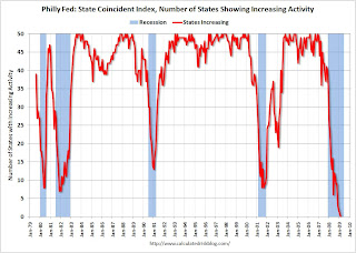 The second graph is of the monthly Philly Fed data of the number of states with one month increasing activity. Most of the U.S. was has been in recession since December 2007 based on this indicator.
All states showed declining activity. A widespread recession ...
House Prices: Tracking More Adverse Stress Test Scenario
by Calculated Risk on 3/31/2009 09:21:00 AM
For more on house prices, please see: Case-Shilller: Prices Fall Sharply in January Click on graph for larger image in new window.
The first graph compares the Case-Shiller Composite 10 index with the Stress Test scenarios from the Treasury (stress test data is estimated from quarterly forecasts).
The Stress Test scenarios use the Composite 10 index and start in December. This is the first month and it is difficult to see the track on the graph. Here are the numbers:
Case-Shiller Composite 10 Index, January: 158.04
Stress Test Baseline Scenario, January: 159.69
Stress Test More Adverse Scenario, January: 158.07
It is only one month, but prices tracked the More Adverse scenario in January.
And some more data on selected cities ... This graph shows the Case-Shiller house price indices for five cities. These are nominal graphs (not adjusted for inflation).
This shows the incredible bubbles in Los Angeles and Miami (other cities like Las Vegas, Phoenix, San Diego had similar price bubbles). Now the prices in these cities are falling quickly.
I included Denver and Cleveland as examples of cities with smaller price bubbles - and prices are falling in those cities too. New York was a special case. Prices held up longer, but are now starting to fall rapidly.  The third graph shows the price-to-rent ratio for Miami, Los Angeles and New York. This is similar to the national price-to-rent ratio, but uses local prices and local Owners' equivalent rent.
This ratio is getting close to normal for LA and Miami (although rents are now falling!), but still has further to go in NY.
Case-Shiller: Prices Fall Sharply in January
by Calculated Risk on 3/31/2009 09:00:00 AM
S&P/Case-Shiller released their monthly Home Price Indices for January this morning. This includes prices for 20 individual cities, and two composite indices (10 cities and 20 cities). Note: This is not the quarterly national house price index. Click on graph for larger image in new window.
The first graph shows the nominal Composite 10 and Composite 20 indices (the Composite 20 was started in January 2000).
The Composite 10 index is off 30.2% from the peak, and off 2.5% in January.
The Composite 20 index is off 29.1% from the peak, and off 2.8% in January.
Prices are still falling and will probably decline for some time. The second graph shows the Year over year change in both indices.
The Composite 10 is off 19.4% over the last year.
The Composite 20 is off 19.0% over the last year.
These are the worst year-over-year price declines for the Composite indices since the housing bubble burst started.
The following graph shows the price declines from the peak for each city included in S&P/Case-Shiller indices. In Phoenix, house prices have declined more almost 50% from the peak. At the other end of the spectrum, prices in Charlotte and Dallas are off about 11% from the peak. Prices have declined by double digits everywhere.
Prices fell at least 1% in all Case-Shiller cities in January, with Phoenix off 5.5% for the month alone. Chicago and Minneapolis were off close to 5% for the month.
I'll have more on house prices including a comparison to the stress test scenarios.
Monday, March 30, 2009
The End of the GM Hummer on Tuesday?
by Calculated Risk on 3/30/2009 10:28:00 PM
From the NY Times: A Dealer’s Big Bet Is on the Line as the Hummer Falls From Favor
Sales of Hummers over all have fallen so far — 51 percent last year, the worst drop in the industry — that General Motors is trying to find a buyer for the brand. Without one, the company might close Hummer. An announcement about Hummer’s fate may be made Tuesday.And from: Humbling a Giant
“It’s a brand that represents a lot of what people want to get away from,” said Rebecca Lindland, an analyst with the research firm I.H.S. Global Insight.
...
If Hummer is closed, it would be phased out “rather quickly,” G.M.’s president, Frederick A. Henderson, said last month.
For too long, [GM] sold too many models, under too many brands, in too many markets — with too few customers.There is much more in the 2nd article about the downsizing of GM. The Hummer will probably be history tomorrow.
...
The task force ... said Monday that G.M. had to drastically pare the broadest lineup of products offered by any car company.
“G.M. has retained too many unprofitable nameplates that tarnish its brands, distract the focus of its management team, demand increasingly scarce marketing dollars, and are a lingering drag on consumer perception, market share and margin,” the task force said in its report.
...
Instead of cutting eight brands down to four in the United States, G.M. may be left with Chevrolet and Cadillac.
How Iceland Went Mad
by Calculated Risk on 3/30/2009 08:06:00 PM
Most of the news today was about GM and Chrysler. See WSJ: Obama Favors Bankruptcy for GM, Chrysler and NY Times: Obama Issues Ultimatum to Struggling Automakers
Bankruptcy is likely.
For some interesting reading, there was an excellent article in the NY Magazine today about a software programmer who wrote some of the software for securitizing mortgages: see: My Manhattan Project
And here is a story from Michael Lewis writing in Vanity Fair on Iceland: Wall Street on the Tundra Short excerpt:
Iceland’s de facto bankruptcy—its currency (the krona) is kaput, its debt is 850 percent of G.D.P., its people are hoarding food and cash and blowing up their new Range Rovers for the insurance—resulted from a stunning collective madness. What led a tiny fishing nation, population 300,000, to decide, around 2003, to re-invent itself as a global financial power? In Reykjavík, where men are men, and the women seem to have completely given up on them, the author follows the peculiarly Icelandic logic behind the meltdown.
...
An entire nation without immediate experience or even distant memory of high finance had gazed upon the example of Wall Street and said, “We can do that.” For a brief moment it appeared that they could. In 2003, Iceland’s three biggest banks had assets of only a few billion dollars, about 100 percent of its gross domestic product. Over the next three and a half years they grew to over $140 billion and were so much greater than Iceland’s G.D.P. that it made no sense to calculate the percentage of it they accounted for. It was, as one economist put it to me, “the most rapid expansion of a banking system in the history of mankind.”
Autos: Cerberus Loses Equity, New GM CEO Says Bankruptcy "may be best option"
by Calculated Risk on 3/30/2009 05:59:00 PM
From the WSJ: Cerberus’s Equity in Chrysler’s Auto Company to Be Eliminated
Cerberus Capital Management will lose its equity stake in Chrysler ... as a condition of the Treasury Department’s bailout deal with the U.S. auto maker ...I wonder if any banks still hold Chrysler debt?
The New York private-equity firm purchased an 80% stake in Chrysler in 2007 ... In term sheets released by the Treasury Department on Monday, the government said Chrysler’s restructuring “at a minimum will require extinguishing the vast majority of Chrysler’s outstanding secured debt and all of its unsecured debt and equity.”
And from CNBC: New GM CEO: Bankruptcy May Be Best Option for Automaker
General Motors's new chief executive told CNBC that filing for Bankruptcy may be the best option for the struggling automaker. ... Henderson told reporters that the company would still prefer to restructure outside of court, but the level of support Washington is offering would help the company quickly restructure through bankruptcy.A bankruptcy sounds very likely.
Added: I think a reasonable role for government is to guarantee the warranties (so people keep buying cars) and provide DIP (debtor-in-possession) financing. There are many other issues too - like making sure the vendors don't all go bankrupt, and the U.S. Pension Benefit Guarantee Corp. (PBGC) will probably be taking significant losses on GM and Chrysler pensions.
Good thing the PBGC invested so wisely recently, see: Pension insurer shifted to stocks
Just months before the start of last year's stock market collapse, the federal agency that insures the retirement funds of 44 million Americans departed from its conservative investment strategy and decided to put much of its $64 billion insurance fund into stocks.Heckuva job.
Switching from a heavy reliance on bonds, the Pension Benefit Guaranty Corporation decided to pour billions of dollars into speculative investments such as stocks in emerging foreign markets, real estate, and private equity funds.
"My Manhattan Project"
by Calculated Risk on 3/30/2009 05:02:00 PM
For your reading enjoyment ... here is an article about a software programmer who wrote some of the software for securitizing mortgages.
From Michael Osinski in New York Magazine: My Manhattan Project How I helped build the bomb that blew up Wall Street
I have been called the devil by strangers and “the Facilitator” by friends. It’s not uncommon for people, when I tell them what I used to do, to ask if I feel guilty. I do, somewhat, and it nags at me. When I put it out of mind, it inevitably resurfaces, like a shipwreck at low tide. It’s been eight years since I compiled a program, but the last one lived on, becoming the industry standard that seeded itself into every investment bank in the world.
I wrote the software that turned mortgages into bonds
Because of the news, you probably know more about this than you ever wanted to. The packaging of heterogeneous home mortgages into uniform securities that can be accurately priced and exchanged has been singled out by many critics as one of the root causes of the mess we’re in. I don’t completely disagree. But in my view, and of course I’m inescapably biased, there’s nothing inherently flawed about securitization. Done correctly and conservatively, it increases the efficiency with which banks can loan money and tailor risks to the needs of investors. Once upon a time, this seemed like a very good idea, and it might well again, provided banks don’t resume writing mortgages to people who can’t afford them. Here’s one thing that’s definitely true: The software proved to be more sophisticated than the people who used it, and that has caused the whole world a lot of problems.
Market Cliff Diving and More
by Calculated Risk on 3/30/2009 04:00:00 PM
These swings are wild ...
DOW down 3.3% (254 points)
S&P 500 down 3.5% (28 points)
NASDAQ down 2.8% (43 points) Click on graph for larger image in new window.
The first graph is from Doug Short of dshort.com (financial planner): "Four Bad Bears".
This is the 2nd worst S&P 500 / DOW bear market in the U.S. in 100 years.
Note that the Great Depression crash is based on the DOW; the three others are for the S&P 500. The second graph compares four significant bear markets: the Dow during the Great Depression, the NASDAQ, the Nikkei, and the current S&P 500.
See Doug's: "The Mega-Bear Quartet and L-Shaped Recoveries".
And since I haven't posted this for awhile, here are a few credit crisis indicators ...
The British Bankers' Association reported that the three-month dollar Libor rates were fixed at 1.2075%, down from Friday's 1.22%. The dollar LIBOR was at 1.31% just 10 days ago - so this is some improvement.
The LIBOR peaked at 4.81875% on Oct. 10th, and hit a cycle low of 1.0825% on Jan. 14th. There has been improvement in the A2P2 spread. This has declined to 0.92. This is far below the record (for this cycle) of 5.86 after Thanksgiving, but still above the normal spread.
This is the spread between high and low quality 30 day nonfinancial commercial paper.
 | Meanwhile the TED spread is holding steady at 108.7. This is the difference between the interbank rate for three month loans and the three month Treasury. The peak was 463 on Oct 10th and a normal spread is around 50 bps. The TED spread has been relatively flat for months (and is being impacted by the Fed and other Central Banks). |


