by Calculated Risk on 11/29/2011 12:46:00 PM
Tuesday, November 29, 2011
Real House Prices and House Price-to-Rent
An update: Case-Shiller, CoreLogic and others report nominal house prices. However it is also useful to look at house prices in real terms (adjusted for inflation), as a price-to-rent ratio, and also price-to-income (not shown here).
Below are three graphs showing nominal prices (as reported), real prices and a price-to-rent ratio. Real prices are back to 1999/2000 levels, and the price-to-rent ratio is also back to 2000 levels.
Nominal House Prices
 Click on graph for larger image.
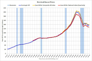
The first graph shows the quarterly Case-Shiller National Index SA (through Q3 2011), and the monthly Case-Shiller Composite 20 SA and CoreLogic House Price Indexes (through September) in nominal terms (as reported).
In nominal terms, the Case-Shiller National index (SA) is back to Q4 2002 levels, the Case-Shiller Composite 20 Index (SA) is back to April 2003 levels, and the CoreLogic index is back to June 2003.
Real House Prices
 The second graph shows the same three indexes in real terms (adjusted for inflation using CPI less Shelter). Note: some people use other inflation measures to adjust for real prices.
In real terms, the National index is back to Q1 1999 levels, the Composite 20 index is back to May 2000, and the CoreLogic index back to April 2000.
In real terms, all appreciation in the '00s is gone.
Price-to-Rent
In October 2004, Fed economist John Krainer and researcher Chishen Wei wrote a Fed letter on price to rent ratios: House Prices and Fundamental Value. Kainer and Wei presented a price-to-rent ratio using the OFHEO house price index and the Owners' Equivalent Rent (OER) from the BLS.
 Here is a similar graph using the Case-Shiller Composite 20 and CoreLogic House Price Index.
This graph shows the price to rent ratio (January 1998 = 1.0).
On a price-to-rent basis, the Composite 20 index is back to June 2000 levels, and the CoreLogic index is back to May 2000.
In real terms - and as a price-to-rent ratio - prices are mostly back to 2000 levels and will probably be back to 1999 levels in the next few months.
Earlier:
• CoreLogic: 10.7 Million U.S. Properties with Negative Equity in Q3
• Case Shiller: Home Prices decline in September
CoreLogic: 10.7 Million U.S. Properties with Negative Equity in Q3
by Calculated Risk on 11/29/2011 10:55:00 AM
CoreLogic released the Q3 2011 negative equity report today.
CoreLogic ... today released negative equity data showing that 10.7 million, or 22.1 percent, of all residential properties with a mortgage were in negative equity at the end of the third quarter of 2011. This is down slightly from 10.9 million properties, or 22.5 percent, in the second quarter. An additional 2.4 million borrowers had less than 5 percent equity, referred to as near-negative equity, in the third quarter.Here are a couple of graphs from the report:
 Click on graph for larger image.
This graph shows the break down of negative equity by state. Note: Data not available for some states. From CoreLogic:
"Nevada has the highest negative equity percentage with 58 percent of all of its mortgaged properties underwater, followed by Arizona (47 percent), Florida (44 percent), Michigan (35 percent) and Georgia (30 percent). This is the first quarter that Georgia entered the top five, surpassing California which had been in the top five since tracking began in 2009.
The top five states combined have an average negative equity ratio of 41.4 percent, while the remaining states have a combined average negative equity ratio of 17.6 percent."
 The second graph shows the distribution of equity by state- black is Loan-to-value (LTV) of less than 80%, blue is 80% to 100%, red is a LTV of greater than 100% (or negative equity). Note: This only includes homeowners with a mortgage - about 31% of homeowners nationwide do not have a mortgage.
Some states - like New York - have a large percentage of borrowers with more than 20% equity, and Nevada, Arizona and Florida have the fewest borrowers with more than 20% equity.
Some interesting data on borrowers with and without home equity loans from CoreLogic: "Of the 10.7 million borrowers in negative equity, there are 6.3 million first liens without home equity loans that have an average mortgage balance of $222,000. They are underwater by an average of $52,000 which equates to an average LTV ratio of 131 percent. The negative equity share for the first lien-only borrowers was 18 percent, and 40 percent had an LTV of 80 percent or higher.
The remaining 4.4 million negative equity borrowers hold first liens and home equity loans with an average mortgage balance of $309,000. These borrowers are underwater by an average of $84,000 and have an average LTV of 137 percent."
Case Shiller: Home Prices decline in September
by Calculated Risk on 11/29/2011 09:00:00 AM
S&P/Case-Shiller released the monthly Home Price Indices for September (a 3 month average of July, August and September). This release includes prices for 20 individual cities and and two composite indices (for 10 cities and 20 cities) and the national quarterly index for Q3.
Note: Case-Shiller reports NSA, I use the SA data. Here is a table of the year-over-year and monthly changes for both SA and NSA.
| Case Shiller September 2011 | Seasonally Adjusted | Not Seasonally Adjusted | ||
|---|---|---|---|---|
| YoY Change | One Month Change | YoY Change | One Month Change | |
| Composite 10 | -3.3% | -0.4% | -3.3% | -0.4% |
| Composite 20 | -3.6% | -0.6% | -3.6% | -0.6% |
From S&P: Home Prices Weaken as the Third Quarter of 2011 Ends
The S&P/Case-Shiller U.S. National Home Price Index, which covers all nine U.S. census divisions, recorded a 3.9% decline in the third quarter of 2011 over the third quarter of 2010. In September, the 10- and 20-City Composites posted annual rates of decline of 3.3% and 3.6%, respectively. Eighteen of the 20 MSAs and both monthly Composites had negative annual rates in September 2011, the only exceptions being Detroit and Washington DC.
“Home prices drifted lower in September and the third quarter,” says David M. Blitzer, Chairman of the Index Committee at S&P Indices. “The National Index was down 3.9% versus the third quarter of 2010 and up only 0.1% from the previous quarter. Three cities posted new index lows in September 2011 - Atlanta, Las Vegas and Phoenix. Seventeen of the 20 cities and both Composites were down for the
month.
 Click on graph for larger image.
 The first graph shows the nominal seasonally adjusted Composite 10 and Composite 20 indices (the Composite 20 was started in January 2000).
The Composite 10 index is off 32.5% from the peak, and down 0.4% in September (SA). The Composite 10 is 0.5% above the June 2009 post-bubble bottom (Seasonally adjusted).
The Composite 20 index is off 32.5% from the peak, and down 0.6% in September (SA). The Composite 20 is at a new post-bubble low.
 The second graph shows the Year over year change in both indices.
The Composite 10 SA is down 3.3% compared to September 2010.
The Composite 20 SA is down 3.6% compared to September 2010. This is slightly smaller year-over-year decline than in August.
The third graph shows the price declines from the peak for each city included in S&P/Case-Shiller indices.
 Prices increased (SA) in 5 of the 20 Case-Shiller cities in September seasonally adjusted. Prices in Las Vegas are off 60.6% from the peak, and prices in Dallas only off 8.6% from the peak.
Prices are now falling again, and the Case-Shiller Composite 20 (SA) hit a new post-bubble low.
Monday, November 28, 2011
NY Times: "Crisis in Europe Tightens Credit Across the Globe"
by Calculated Risk on 11/28/2011 11:04:00 PM
From the NY Times: Crisis in Europe Tightens Credit Across the Globe
Europe’s worsening sovereign debt crisis has spread beyond its banks and the spillover now threatens businesses on the Continent and around the world.I've been watching some of the credit indicators we tracked several years ago - like the TED spread and the two year U.S. dollar swap spread - both are rising, but are well below the levels during the financial crisis. Probably the most significant channel of contagion from the European financial crisis would be tightening of U.S. credit conditions - and so far the tightening in the U.S. appears to be minimal. However, as the NY Times story points out, tighter credit could be impacting U.S. trading partners "from Berlin to Beijing".
From global airlines and shipping giants to small manufacturers, all kinds of companies are feeling the strain as European banks pull back on lending in an effort to hoard capital and shore up their balance sheets.
The result is a credit squeeze for companies from Berlin to Beijing ...
Earlier on New Homes:
• New Home Sales in October: 307,000 SAAR
• New Home Prices: Average Lowest since 2003
• All current New Home Graphs
Visible Existing Home Inventory declines 17% year-over-year in November
by Calculated Risk on 11/28/2011 07:50:00 PM
Another update: I've been using inventory numbers from HousingTracker / DeptofNumbers to track changes in inventory. Tom Lawler mentioned this back in June (Tom also discussed how the NAR estimates existing home inventory - they don't aggregate data from local boards!)
In a few months, the NAR is expect to release revisions for their existing home sales and inventory numbers for the last few years. The sales and inventory revisions will be down (the NAR has pre-announced this).
Using the deptofnumbers.com for monthly inventory (54 metro areas), it appears inventory will be back to 2005 levels this month. Unfortunately the deptofnumbers only started tracking inventory in April 2006.
 Click on graph for larger image.
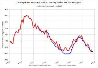
This graph shows the NAR estimate of existing home inventory through October (left axis) and the HousingTracker data for the 54 metro areas through November. The HousingTracker data shows a steeper decline in inventory over the last few years (as mentioned above, the NAR will probably revise down their inventory estimates in a few months).
 The second graph shows the year-over-year change in inventory for both the NAR and HousingTracker.
HousingTracker reported that the November listings - for the 54 metro areas - declined 16.9% from the same month last year.
This is just "visible inventory" (inventory listed for sales). There is a large percentage of distressed inventory, and various categories of "shadow inventory" too, but visible inventory has clearly declined in many areas.
Earlier on New Homes:
• New Home Sales in October: 307,000 SAAR
• New Home Prices: Average Lowest since 2003
• All current New Home Graphs
Dallas Fed Manufacturing Survey shows contraction in November
by Calculated Risk on 11/28/2011 04:09:00 PM
This is the last of the regional Fed surveys for November. The regional surveys provide a hint about the ISM manufacturing index - and the regional surveys were mixed and still fairly weak in November.
From the Dallas Fed: Texas Manufacturing Activity Declines
Texas factory activity decreased in November, according to business executives responding to the Texas Manufacturing Outlook Survey. The production index, a key measure of state manufacturing conditions, dipped from 4.1 to –5.1, registering its first negative reading in two years.Here is a graph comparing the regional Fed surveys and the ISM manufacturing index:
Other measures of current manufacturing conditions also indicated contraction in November. The new orders index suggested deterioration of demand, falling to –5.1 after a year in positive territory. ... The capacity utilization index tumbled to –10.2 after several months of weak readings centered around zero.
Perceptions of broader economic conditions improved slightly in November. The general business activity index posted its second positive reading in a row, and it edged up from 2.3 to 3.2. The company outlook index remained positive but moved down from 7.2 to 4.7. More than 90 percent of manufacturers said their outlooks were unchanged or improved from last month.
Labor market indicators reflected continued labor demand growth, albeit at a slower pace. The employment index came in at 9, down from 15.1 in October.
 Click on graph for larger image.
The New York and Philly Fed surveys are averaged together (dashed green, through November), and five Fed surveys are averaged (blue, through November) including New York, Philly, Richmond, Dallas and Kansas City. The Institute for Supply Management (ISM) PMI (red) is through October (right axis).
The ISM index for November will be released Thursday, Dec 1st and the regional surveys suggest another fairly weak reading in November. The consensus is for a slight increase to 51.7 from 50.8 in Octobeber.
New Home Prices: Average Lowest since 2003
by Calculated Risk on 11/28/2011 01:37:00 PM
As part of the new home sales report, the Census Bureau reported that the average price for new homes fell to the lowest level since September 2003.
From the Census Bureau: "The median sales price of new houses sold in October 2011 was $212,300; the average sales price was $242,300."
The following graph shows the median and average new home prices. The average new home price is at the lowest level since August 2003.
 Click on graph for larger image.
This makes sense - to compete with all the distressed sales, the builders have had to build smaller and less expensive homes.
The second graph shows the percent of new home sales by price. At the peak of the housing bubble, almost 40% of new homes were sold for more than $300K - and over 20% were sold for over $400K. In October, only 20% were sold for more than $300K - and only 8% for over $400K.
 Almost half of all home sales in October were under $200K - and about 80% of home sales were under $300K. This is the lowest percentage under $300K since November 2002.
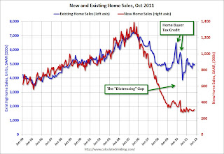
The third graph shows existing home sales (left axis) and new home sales (right axis) through October.
This graph starts in 1994, but the relationship has been fairly steady back to the '60s. Then along came the housing bubble and bust, and the "distressing gap" appeared due mostly to distressed sales.
 The flood of distressed sales has kept existing home sales elevated, and depressed new home sales since builders can't compete with the low prices of all the foreclosed properties.
I expect this gap to close over the next few years once the number of distressed sales starts to decline.
Note: The National Association of Realtors (NAR) is working on a benchmark revision for existing home sales numbers and I expect significant downward revisions to sales estimates for the last few years - perhaps as much as 10% to 15% for 2011. Even with these revisions, most of the "distressing gap" will remain.
Earlier:
• New Home Sales in October: 307,000 SAAR
• All current New Home Graphs
NY Fed Q3 Report on Household Debt and Credit
by Calculated Risk on 11/28/2011 11:56:00 AM
From the NY Fed: Consumer Debt Falls in Third Quarter
Aggregate consumer debt fell approximately $60 billion to $11.66 trillion in the third quarter of 2011 according to the Federal Reserve Bank of New York’s latest Quarterly Report on Household Debt and Credit.Here is the Q3 report: Quarterly Report on Household Debt and Credit. Here are two graphs:
...
"The decline in outstanding consumer debt reveals that households continue to try and deleverage in the wake of a challenging economic environment and large declines in home values," said Andrew Haughwout, vice president in the Research and Statistics Group at the New York Fed. "However, our findings also provide evidence that consumer credit demand continues to increase, a positive sign for consumer sentiment."
 Click on graph for larger image.
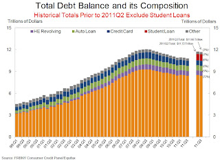
The first graph shows aggregate consumer debt decreased slightly in Q3. From the NY Fed:
Aggregate consumer debt fell slightly in the third quarter. As of September 30, 2011, total consumer indebtedness was $11.66 trillion, a reduction of $60 billion (0.6%) below its (revised) June 30, 2011 level. The 2011Q2 and 2011Q3 totals reflect improvements in our measurement of student loan balances, which we had previously undercounted ... As a result, student loan and total debt balances for 2011Q2 and 2011Q3 are not directly comparable to earlier data ...
Mortgage balances shown on consumer credit reports fell noticeably ($114 billion or 1.3%) during the quarter; home equity lines of credit (HELOC) balances rose by $14 billion (2.3%). Household mortgage and HELOC indebtedness are now 9.6% and 10.5%, respectively, below their peaks. Consumer indebtedness excluding mortgage and HELOC balances rose slightly ($32 billion or about 1.3%) in the quarter. Consumers’ non-real estate indebtedness now stands at $2.62 trillion.
 The second graph shows the percent of debt in delinquency. In general, the percent of delinquent debt is declining (there was a small increase in Q3), but what really stands out is the percent of debt 90+ days delinquent (Yellow, orange and red).
 From the NY Fed:
Total household delinquency rates rose in 2011Q3. As of September 30, 10.0% of outstanding debt was in some stage of delinquency, compared to 9.8% on June 30. About $1.2 trillion of consumer debt is currently delinquent, with $834 billion seriously delinquent (at least 90 days late or “severely derogatory”).There are a number of credit graphs at the NY Fed site.
About 264,000 individuals had a foreclosure notation added to their credit reports between June 30 and September 30, a 7% decrease from the 2011Q2 level of new foreclosures. New bankruptcies in 2011Q3 were 18.8% below their levels of 2010Q3, at 423,000.
Earlier:
• New Home Sales in October: 307,000 SAAR
New Home Sales in October: 307,000 SAAR
by Calculated Risk on 11/28/2011 10:00:00 AM
The Census Bureau reports New Home Sales in October were at a seasonally adjusted annual rate (SAAR) of 307 thousand. This was up from a revised 303 thousand in September (revised down from 313 thousand).
The first graph shows New Home Sales vs. recessions since 1963. The dashed line is the current sales rate.
Sales of new single-family houses in October 2011 were at a seasonally adjusted annual rate of 307,000 ... This is 1.3 percent (±19.7%)* above the revised September rate of 303,000 and is 8.9 percent (±17.2%)* above the October 2010 estimate of 282,000.
 Click on graph for larger image in graph gallery.
The second graph shows New Home Months of Supply.
Months of supply decreased to 6.3 in October.
The all time record was 12.1 months of supply in January 2009.
 This is still slightly higher than normal (less than 6 months supply is normal).
The seasonally adjusted estimate of new houses for sale at the end of October was 162,000. This represents a supply of 6.3 months at the current sales rate.On inventory, according to the Census Bureau:
"A house is considered for sale when a permit to build has been issued in permit-issuing places or work has begun on the footings or foundation in nonpermit areas and a sales contract has not been signed nor a deposit accepted."Starting in 1973 the Census Bureau broke this down into three categories: Not Started, Under Construction, and Completed.
 This graph shows the three categories of inventory starting in 1973.
The inventory of completed homes for sale was at 60,000 units in October. The combined total of completed and under construction is at the lowest level since this series started.
The last graph shows sales NSA (monthly sales, not seasonally adjusted annual rate).
In October 2011 (red column), 25 thousand new homes were sold (NSA). This was just above the record low for October of 23 thousand set in 2010. The high for October was 105 thousand in 2005.
 This was slightly below the consensus forecast of 310 thousand, and just above the record low for the month of October set last year (NSA).
 New home sales have averaged only 299 thousand SAAR over the 18 months since the expiration of the tax credit ... mostly moving sideways at a very low level.
OECD: Euro zone in recession
by Calculated Risk on 11/28/2011 08:47:00 AM
The OECD's track record hasn't been great lately, but it does seem likely that the euro zone is already in a recession ...
From Reuters: Euro Zone in Mild Recession, US May Follow: OECD
The global economic recovery is running out of steam, leaving the euro zone stuck in a mild recession ... In the absence of decisive action from euro zone leaders, the European Central Bank (ECB) alone has the power to contain the bloc's crisis, the Paris-based [Organization for Economic Cooperation and Development] said.And here is the report from the OECD: OECD calls for urgent action to boost ailing global economy
...
Its twice-yearly Economic Outlook forecast world growth would slow to 3.4 percent in 2012 from 3.8 percent this year.
Yesterday:
• Summary for Week Ending Nov 25th
• Schedule for Week of Nov 27th


