by Calculated Risk on 4/30/2012 04:47:00 PM
Monday, April 30, 2012
Fannie Mae and Freddie Mac Serious Delinquency rates declined in March
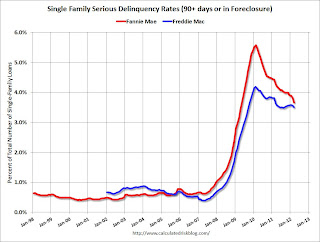
Fannie Mae reported that the Single-Family Serious Delinquency rate declined in March to 3.67%, down from 3.82% in February. The serious delinquency rate is down from 4.44% in March 2011, and is at the lowest level since April 2009. Some of the decline over the last two months is seasonal.
The Fannie Mae serious delinquency rate peaked in February 2010 at 5.59%.
Freddie Mac reported that the Single-Family serious delinquency rate declined to 3.51% in March, down from 3.57% in February. Freddie's rate is down from 3.63% in Feburary 2010. Freddie's serious delinquency rate peaked in February 2010 at 4.20%.
These are loans that are "three monthly payments or more past due or in foreclosure".
 Click on graph for larger image
With the mortgage servicer settlement, I'd expect the delinquency rate to start to decline faster over the next year or so.
The "normal" serious delinquency rate is under 1%, so there is a long way to go.
Note: LPS reported the serious delinquency rate (including in foreclosore) was about 7.5% in March. That includes the Fannie and Freddie loans with serious delinquency rates at less than half the industry average. This is also a reminder of how bad the non-Fannie/Freddie loans are performing.
Fed: On net, Domestic Banks eased their lending standards and experienced stronger demand over the last 3 months
by Calculated Risk on 4/30/2012 02:27:00 PM
From the Federal Reserve: The April 2012 Senior Loan Officer Opinion Survey on Bank Lending Practices
Overall, in the April survey, modest net fractions of domestic banks generally reported having eased their lending standards and having experienced stronger demand over the past three months. ... However, moderate to large net fractions of domestic banks eased many terms on C&I loans to firms of all sizes, with most indicating that they had done so in response to more aggressive competition from other banks or nonbank lenders. Domestic banks also reported an increase in demand from firms of all sizes.
...
Regarding loans to households, standards on prime residential mortgage loans and home equity lines of credit (HELOCs) were about unchanged. However, the April survey indicated a moderate strengthening in demand for prime residential mortgage loans. With respect to consumer loans, moderate net fractions of banks reported that they had eased standards on most types of these loans over the past three months. In addition, demand for all types of consumer loans increased somewhat, on net, with demand for auto loans showing the largest increase.
 Click on graph for larger image.
Here are some charts from the Fed.
This graph shows the change in lending standards from the previous quarterly for commercial real estate (CRE). Lenders are now easing standards a little for CRE. A little easing doesn't mean standards are "loose", just not as tight as over the last several years.
 The second graph shows the change in demand for CRE loans.
 Increasing demand and some easing in standards - this is another indicator suggesting the drag from non-residential investment will probably end mid-year.
Q1 2012 GDP Details: Office and Mall Investment falls to record low, Single Family investment increases
by Calculated Risk on 4/30/2012 12:25:00 PM
The BEA released the underlying details today for the Q1 Advance GDP report. As expected, key non-residential categories - offices, malls and lodging - saw further declines in investment in Q1.
Note: Last year, there was a small overall increase in non-residential structure investment due to investment for power and communication, and mining and exploration of petroleum. This masked some of the decline in other categories.
The first graph shows investment in offices, malls and lodging as a percent of GDP. Office investment as a percent of GDP peaked at 0.46% in Q1 2008 and then declined sharply.
Investment as a percent of GDP fell to a new low in Q1 and is now down 64% from the peak. This decline will probably slow mid-year based on the architectural billings index, but with the high office vacancy rate, investment will probably not increase (as a percent of GDP) for several years.
 Click on graph for larger image.
Investment in multimerchandise shopping structures (malls) peaked in 2007 and is down about 68% from the peak and at a new low in Q1 (note that investment includes remodels, so this will not fall to zero).
Lodging investment peaked at 0.32% of GDP in Q2 2008 and has fallen by about 82%.
Notice that investment for all three categories typically falls for a year or two after the end of a recession, and then usually recovers very slowly (flat as a percent of GDP for 2 or 3 years). This is happening again, and there will not be a recovery in these categories until the vacancy rates fall significantly.
 The second graph is for Residential investment (RI) components as a percent of GDP. According to the Bureau of Economic Analysis, RI includes new single family structures, multifamily structures, home improvement, broker's commissions, and a few minor categories (dormitories, manufactured homes).
Usually the most important components are investment in single family structures followed by home improvement.
Investment in single family structures is finally increasing after mostly moving sideways for almost three years (the increase in 2009-2010 was related to the housing tax credit).
Investment in home improvement was at a $164 billion Seasonally Adjusted Annual Rate (SAAR) in Q1 (over 1.0% of GDP), significantly above the level of investment in single family structures of $114 billion (SAAR) (or 0.74% of GDP). Eventually single family structure investment will overtake home improvement as the largest category of residential investment.
Brokers' commissions increased slightly in Q1, and has been moving sideways as a percent of GDP.
And investment in multifamily structures increased slightly as a percent of GDP. This is a small category, and even though investment is increasing, the positive impact on GDP will be relatively small.
These graphs show there is currently very little investment in offices, malls and lodging. And residential investment is starting to pickup, but from a very low level.
HVS: Q1 Homeownership and Vacancy Rates
by Calculated Risk on 4/30/2012 10:15:00 AM
The Census Bureau released the Housing Vacancies and Homeownership report for Q1 2012 this morning.
This report is frequently mentioned by analysts and the media to track the homeownership rate, and the homeowner and rental vacancy rates. However, based on the initial evaluation, it appears the vacancy rates are too high.
It might show the trend, but I wouldn't rely on the absolute numbers.
 Click on graph for larger image.
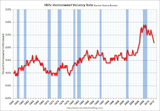
The Red dots are the decennial Census homeownership rates for April 1st 1990, 2000 and 2010. The HVS homeownership rate declined to 65.4%, down from to 66.0% in Q4 2011 and at the lowest level for this survey since the mid-90s.
I'd put more weight on the decennial Census numbers and that suggests the actual homeownership rate is probably in the 64% to 65% range.
 The Census researchers are investigating differences in Census 2010, ACS 2010, and HVS 2010 vacant housing unit estimates, but there is no scheduled date for any report.
The HVS homeowner vacancy rate declined to 2.2% from 2.3% in Q4. This is the lowest level since Q2 2006 for this report.
The homeowner vacancy rate has peaked and is now declining. However - once again - this probably shows that the trend is down, but I wouldn't rely on the absolute numbers.
 The rental vacancy rate declined to 8.8% from 9.4% in Q4.
I think the Reis quarterly survey (large apartment owners only in selected cities) is a much better measure of the overall trend in the rental vacancy rate - and Reis reported that the rental vacancy rate has fallen to the lowest level since 2001.
The quarterly HVS is the most timely survey on households, but there are many questions about the accuracy of this survey. Unfortunately many analysts still use this survey to estimate the excess vacant supply. However this does suggest that the housing vacancy rates are falling.
Chicago PMI declines to 56.2
by Calculated Risk on 4/30/2012 09:52:00 AM
Chicago PMI: The overall index declined to 56.2 in April, down from 62.2 in March. This was below consensus expectations of 60.8 and indicates slower growth in April. Note: any number above 50 shows expansion. From the Chicago ISM:
April 2012: The Chicago Purchasing Managers reported the April Chicago Business Barometer decreased for a second consecutive month. After five months above 60, the Chicago Business Barometer fell to 56.2, a 29 month low. The index has remained in expansion since October 2009.New orders declined to 57.4 from 63.3, and employment increased to 58.7 from 56.3.
...
• PRODUCTION lowest level since September 2009;
• PRICES PAID down from March's 7 month high;
Personal Income increased 0.4% in March, Spending 0.3%
by Calculated Risk on 4/30/2012 08:42:00 AM
The BEA released the Personal Income and Outlays report for March:
Personal income increased $50.3 billion, or 0.4 percent ... in March, according to the Bureau of Economic Analysis. Personal consumption expenditures (PCE) increased $29.6 billion, or 0.3 percent.The following graph shows real Personal Consumption Expenditures (PCE) through March (2005 dollars). Note that the y-axis doesn't start at zero to better show the change.
...
Real PCE -- PCE adjusted to remove price changes -- increased 0.1 percent in March, compared with an increase of 0.5 percent in February. ... PCE price index -- The price index for PCE increased 0.2 percent in March, compared with an increase of 0.3 percent in February. The PCE price index, excluding food and energy, increased 0.2 percent, compared with an increase of 0.1 percent.
 Click on graph for larger image.
PCE increased 0.3% in March, and real PCE increased 0.1%.
Note: The PCE price index, excluding food and energy, increased 0.2 percent.
The personal saving rate was at 3.8% in March.
As reported on Friday, PCE increased sharply in Q1 (PCE for January and February were revised up). Income in March was slightly better than expected.
Sunday, April 29, 2012
Housing: The "Long Bottom"
by Calculated Risk on 4/29/2012 09:49:00 PM
From Nick Timiraos at the WSJ: Housing Ends Slide but Faces a Long Bottom
Nearly six years after home prices started falling, more U.S. housing markets appear to be nearing a new phase: a prolonged bottom.It appears housing starts, new home sales and residential investment have already bottomed and will increase in 2012. All three had a "long bottom" of several years.
Hitting a bottom, of course, isn't the same as a full-fledged recovery ... The good news is that housing construction and home sales appear to have hit a floor. Home builders cut back heavily in the past four years and began construction on just 434,000 single-family homes last year, the lowest level on record. Research firm Zelman & Associates estimates builders will start construction on 540,000 homes this year, a 24% increase.
...
Housing economists are debating whether that shadow inventory will spoil any housing recovery. "That'll be like a ball and chain," said Mark Fleming, chief economist at CoreLogic. "It won't prevent a recovery, but it could drag it out over several years."
...
Ms. Zelman ... said the shadow inventory is "not going to result in the double dip that people always talk about." She points to a burgeoning appetite for housing from investors, who are scooping up homes that can be converted to rentals, and six years of pent-up demand from traditional buyers who feel better about their financial prospects. "The fear is gone," she said.
...
While the foreclosure overhang is serious, some economists say there is a less-noticed tailwind that could balance things out: the sharp decline in new construction over the past four years. "A lot of the people who talk about 'shadow inventory' don't talk about how slow the overall housing stock has been growing," said Thomas Lawler, an independent housing economist
I think house prices have "bottomed" too, but this is just the beginning of the bottoming process. I agree with Ms. Zelman that the "shadow inventory" will probably not push prices down further nationally (it probably will in some judicial foreclosure areas), but I think the "shadow inventory" will limit any price increases for some time.
Yesterday:
• Summary for Week ending April 27th
• Schedule for Week of April 29th
• The upward slope of Real House Prices
Unofficial Problem Bank list declines to 930 Institutions
by Calculated Risk on 4/29/2012 02:01:00 PM
This is an unofficial list of Problem Banks compiled only from public sources.
Here is the unofficial problem bank list for April 27, 2012. (table is sortable by assets, state, etc.)
Changes and comments from surferdude808:
Very busy week for the Unofficial Problem Bank List because of failures and the FDIC releasing its enforcement actions through March. In all, there were 17 removals and eight additions that leave the list with 930 institutions with assets of $361.7 billion. A year ago, the list held 984 institutions with assets of $422.1 billion. At 930 institutions, it is the lowest weekly count since December 24, 2010 when 919 institutions were on the list. During April 2012, there were 16 additions and 34 removals including 25 action terminations, six failures, and three unassisted mergers. For the month, the institution count fell by 18 to 930 and assets dropped by $15.8 billion to $361.7 billion.Yesterday:
Five banks were closed this Friday, which is the most in one night since five were closed nearly a year ago on April 29, 2011. This week is the 17th of the year and, for the past five years, it has been the third most active for closings at 4.2 institutions after the 44th week (mid-November) at 4.75 closings and 30th week (late July) at 4.5 closings. Removals from failure this week include Plantation Federal Bank, Pawleys Island, SC ($486 million); Inter Savings Bank, fsb D/B/A Interbank, fsb, Maple Grove, MN ($482 million); Bank of the Eastern Shore, Cambridge, MD ($167 million); HarVest Bank of Maryland, Gaithersburg, MD ($164 million); Palm Desert National Bank, Palm Desert, CA ($126 million).
There was one unassisted merger -- Brazos Valley Bank, National Association, College Station, TX ($112 million), which merged with American Momentum Bank, Tampa, FL. Action terminations include Opus Bank, Irvine, CA ($2.4 billion); Heritage Oaks Bank, Paso Robles, CA ($983 million); North Valley Bank, Redding, CA ($901 million); Citizens Bank of Mukwonago, Mukwonago, WI ($651 million); Northeast Bank, Minneapolis, MN ($352 million); Union State Bank, Pell City, AL ($275 million); The Peoples State Bank, Ellettsville, IN ($177 million); Quoin Financial Bank, Miller, SD ($131 million), Clarke County State Bank, Osceola, IA ($110 million); Americas United Bank, Glendale, CA ($100 million); and First State Bank of Kiester, Kiester, MN.
This week there were eight additions including Hudson Valley Bank, National Association, Stamford, CT ($2.8 billion Ticker: HVB); Macon Bank, Inc., Franklin, NC ($874 million); State Bank of Countryside, Countryside, IL ($728 million); Omaha State Bank, Omaha, NE ($292 million); Friends Bank, New Smyrna Beach, FL ($123 million Ticker: FRIE); Peoples State Bank, Lake City, FL ($74 million); Waterman State Bank, Waterman, IL ($48 million); and Colorado Valley Bank, SSB, La Grange, TX ($30 million).
Other changes include Prompt Corrective Action Orders being issued against Truman Bank, St. Louis, MO ($315 million) and Syringa Bank, Boise, ID ($197 million).
• Summary for Week ending April 27th
• Schedule for Week of April 29th
• The upward slope of Real House Prices
Recovery Measures
by Calculated Risk on 4/29/2012 08:01:00 AM
By request, here is an update to four key indicators used by the NBER for business cycle dating: GDP, Employment, Industrial production and real personal income less transfer payments.
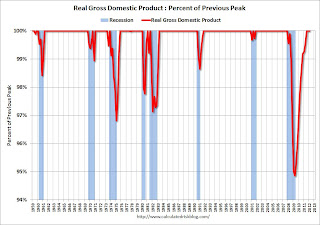
Note: The following graphs are all constructed as a percent of the peak in each indicator. This shows when the indicator has bottomed - and when the indicator has returned to the level of the previous peak. If the indicator is at a new peak, the value is 100%.
These graphs show that several major indicators are still significantly below the pre-recession peaks.
 Click on graph for larger image.
This graph is for real GDP through Q1 2012. Real GDP returned to the pre-recession peak in Q3 2011, and has been at new post recession highs for three consecutive quarters.
At the worst point, real GDP was off 5.1% from the 2007 peak.
 Real GDP has performed better than other indicators ...
This graph shows real personal income less transfer payments as a percent of the previous peak through February (March data will be released Monday).
This measure was off 10.7% at the trough.
Real personal income less transfer payments is still 4.2% below the previous peak.
 The third graph is for industrial production through March.
Industrial production was off over 17% at the trough, and has been one of the stronger performing sectors during the recovery.
However industrial production is still 4.1% below the pre-recession peak.
 The final graph is for employment. This is similar to the graph I post every month comparing percent payroll jobs lost in several recessions.
Payroll employment is still 3.8% below the pre-recession peak.
All of these indicators collapsed in 2008 and early 2009, and only real GDP is back to the pre-recession peak. It is possible that industrial production will be back to the pre-recession peak in early 2013, but employment and personal income less transfer payments have a long way to go.
Yesterday:
• Summary for Week ending April 27th
• Schedule for Week of April 29th
• The upward slope of Real House Prices
Saturday, April 28, 2012
The upward slope of Real House Prices
by Calculated Risk on 4/28/2012 04:14:00 PM
A year ago, Dave Altig asked Just how out of line are house prices?. Dr. Altig's post featured both a price-to-rent graph and a real house price graph originally from the NY Times based on Professor Robert Shiller's work.
The price-to-rent ratio graph Dr Altig presented seemed to show that house prices were getting back to normal, but the graph based on Professor Shiller's work seemed to suggest that house prices could fall much further. Below is an updated graph from Shiller through Q4 2011.
The Shiller graph has suggested to many observers that house prices track inflation (i.e. that house prices adjusted for inflation are stable - except for bubbles). Last year I pointed out the slope depends on the data series used, and that if Professor Shiller had used either Corelogic or the Freddie Mac house prices series, before Case-Shiller was available, there would a greater upward slope to his graph.
An upward slope to real prices makes sense to me as I've argued before: "In many areas - if the population is increasing - house prices increase slightly faster than inflation over time, so there is an upward slope for real prices."
 Click on graph for larger image in new window.
This is the updated graph from Professor Shiller.
For the underlying data for the NY Times graphic, please see Professor Shiller's Irrational Exuberance website.
It is important to realize that Professor Shiller used the quarterly Case-Shiller National index starting in 1987. From 1975 through 1986 he used what is now called the FHFA index. He used other price indexes in earlier periods.
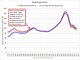 The second graph shows the National Case-Shiller real prices and the CoreLogic HPI real prices (adjusted for CPI just like Shiller). For Q1, I used the February Corelogic index value.
The FHFA index used by Shiller was based on a small percentage of transactions back in the '70s. If we look at the CoreLogic index instead, there is a clear upward slope to real house prices.
If Professor Shiller had used the Freddie Mac quarterly index back to 1970 (instead of the PHCPI), there would be more of an upward slope to his graph too. So it is important to understand that for earlier periods the data is probably less accurate.
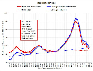 The third graph shows the upward slope for both real price indexes. Even the Shiller "Irrational Exuberance" real price index has an upward slope (about 0.5% per year) - and the CoreLogic upward slope is steeper (about 1.5% per year).
Right now the real CoreLogic HPI is only slightly above the trend line (it could overshoot), and the Case-Shiller national index will probably be just above the trend line when the Q1 data is released.
This would suggest nominal prices are at the bottom (and real prices are close too). This is one reason I think the Case-Shiller and Corelogic house prices indexes probably stopped falling, NSA, in March 2012 (the March data will be released next month).
Earlier:
• Summary for Week ending April 27th
• Schedule for Week of April 29th


