by Calculated Risk on 6/26/2012 02:36:00 PM
Tuesday, June 26, 2012
House Prices to increase 10%?
Leave it to the NAR to get overly enthusiastic.
From Jeff Collins at the O.C. Register: Realtor guru: 10% home-price jump possible
"This time next year, there could be a 10% price appreciation. I would not be surprised to see that,” [National Association of Realtors Chief Economist Lawrence] Yun said.It is one thing for prices to stop falling - and maybe increase a little over the next year. But, in addition to the large number of homes in the foreclosure pipeline, there are also many people waiting for a "better market" to sell - and I suspect the slightest appreciation will bring more inventory to market. A 10% increase over the next year? Well, three words: Not. Gonna. Happen.
Earlier on house prices:
• Case Shiller: House Prices increased in April
• Real House Prices and Price-to-Rent Ratio
• All Current House Price Graphs
Real House Prices and Price-to-Rent Ratio
by Calculated Risk on 6/26/2012 12:03:00 PM
Nick Timiraos at the WSJ has a nice summary: Why Home Prices Are Rising Again (According to Case-Shiller)
It wasn’t hard to see this coming: Home prices rose in April after a spring that bought more buyers chasing fewer homes.Yes, this was pretty easy to see coming. A key question is: Did nominal house prices bottom in March or will there be further price declines?
I think it is likely that prices have bottomed, although I expect prices to be choppy going forward - and I expect any nominal price increase over the next year or two to be small.
I've seen some forecasts of additional 20% price declines on the repeat sales indexes. Three words: Not. Gonna. Happen.
Others, like Barry Ritholtz at the Big Picture, have argued that we could see an additional 10% price decline in the Case-Shiller indexes. I think that is unlikely, but not impossible. The argument for further price declines is that there are still a large number of distressed properties in the foreclosure pipeline - and that there are over 10 million property owners with negative equity, and that could lead to even more distressed sales. So even though prices are pretty much back to "normal" based on real prices and price-to-rent ratio (see below), the argument is that all of these distressed sales could push prices down further. Also, Barry argues that prices following a bubble usually "overshoot".
Those are solid arguments, but I think that some of the policy initiatives (refinance programs, emphasis on modifications, REO-to-rental and more) will lessen the downward pressure from distressed sales - and I also think any "overshoot" will be in real terms (inflation adjusted) as opposed to nominal terms. It is probably correct that any increase in house prices will lead to more inventory (sellers waiting for a "better market"), but that is an argument for why prices will not increase - as opposed to an argument for further price declines.
My view is prices will be up slightly year-over-year next March (when prices usually bottom seasonally for the repeat sales indexes). Some analysts see a small decrease (like 1% to 2%) over the next 12 months, but that isn't much different than a small increase (when compared to forecasts of 10% or 20% declines).
And here is another update a few graphs: Case-Shiller, CoreLogic and others report nominal house prices, and it is also useful to look at house prices in real terms (adjusted for inflation) and as a price-to-rent ratio. Below are three graphs showing nominal prices (as reported), real prices and a price-to-rent ratio. Real prices, and the price-to-rent ratio, are back to late 1998 and early 2000 levels depending on the index.
Nominal House Prices
 Click on graph for larger image.
The first graph shows the quarterly Case-Shiller National Index SA (through Q1 2012), and the monthly Case-Shiller Composite 20 SA and CoreLogic House Price Indexes (through April) in nominal terms as reported.
In nominal terms, the Case-Shiller National index (SA) is back to Q4 2002 levels, and even with the recent small increase, the Case-Shiller Composite 20 Index (SA) is back to March 2003 levels, and the CoreLogic index (NSA) is back to May 2003.
Real House Prices
 The second graph shows the same three indexes in real terms (adjusted for inflation using CPI less Shelter). Note: some people use other inflation measures to adjust for real prices.
In real terms, the National index is back to Q4 1998 levels, the Composite 20 index is back to March 2000, and the CoreLogic index back to February 2000.
As we've discussed before, in real terms, all of the appreciation in the '00s is gone.
Price-to-Rent
In October 2004, Fed economist John Krainer and researcher Chishen Wei wrote a Fed letter on price to rent ratios: House Prices and Fundamental Value. Kainer and Wei presented a price-to-rent ratio using the OFHEO house price index and the Owners' Equivalent Rent (OER) from the BLS.
 Here is a similar graph using the Case-Shiller National, Composite 20 and CoreLogic House Price Indexes.
This graph shows the price to rent ratio (January 1998 = 1.0).
On a price-to-rent basis, the Case-Shiller National index is back to Q4 1998 levels, the Composite 20 index is back to March 2000 levels, and the CoreLogic index is back to April 2000.
In real terms - and as a price-to-rent ratio - prices are mostly back to late 1990s or early 2000 levels.
Case Shiller: House Prices increased in April
by Calculated Risk on 6/26/2012 09:00:00 AM
S&P/Case-Shiller released the monthly Home Price Indices for April (a 3 month average of February, March and April).
This release includes prices for 20 individual cities and two composite indices (for 10 cities and 20 cities).
Note: Case-Shiller reports NSA, I use the SA data.
From S&P: Home Prices Rise in April 2012 According to the S&P/Case-Shiller Home Price Indices
Data through April 2012, released today by S&P Indices for its S&P/CaseShiller Home Price Indices ... showed that on average home prices increased 1.3% in the month of April for both the 10- and 20-City Composites. This comes after seven consecutive months of falling home prices as measured by both indices.
April’s data indicate that on an annual basis home prices fell by 2.2% for the 10-City Composite and by 1.9% for the 20-City Composites, versus April 2011. While still negative, this is an improvement over the annual rates of -2.9% and -2.6% recorded for the month of March 2012. Both Composites and 18 of the 20 MSAs saw increases in annual returns in April compared to those published for March; only Detroit and New York fared worse in April ...
...
“With April 2012 data, we finally saw some rising home prices,” says David M. Blitzer, Chairman of the Index Committee at S&P Indices. “On a monthly basis, 19 of the 20 MSAs and both Composites rose in April over March. Detroit was the only city that saw prices fall, down 3.6%. In addition, 18 of the 20 MSAs and both Composites saw better annual rates of return. It has been a long time since we enjoyed such broadbased gains. While one month does not make a trend, particularly during seasonally strong buying months, the combination of rising positive monthly index levels and improving annual returns is a good sign.
 Click on graph for larger image.
 The first graph shows the nominal seasonally adjusted Composite 10 and Composite 20 indices (the Composite 20 was started in January 2000).
The Composite 10 index is off 33.3% from the peak, and up 0.7% in April (SA). The Composite 10 is up from the post bubble low set in March, Not Seasonally Adjusted (NSA).
The Composite 20 index is off 33.0% from the peak, and up 0.7% (SA) in April. The Composite 20 is also up from the post-bubble low set in March (NSA).
 The second graph shows the Year over year change in both indices.
The Composite 10 SA is down 2.2% compared to April 2011.
The Composite 20 SA is down 1.9% compared to April 2011. This was a smaller year-over-year decline for both indexes than in March.
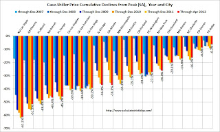
The third graph shows the price declines from the peak for each city included in S&P/Case-Shiller indices.
 Prices increased (SA) in 17 of the 20 Case-Shiller cities in April seasonally adjusted (18 cities increased NSA). Prices in Las Vegas are off 61.1% from the peak, and prices in Dallas only off 6.2% from the peak. Note that the red column (cumulative decline through April 2012) is the lowest for only a couple of cities.
This was better than the consensus forecast, and the NSA indexes are above the post-bubble lows set last month (NSA). I'll have more on prices later.
Monday, June 25, 2012
Look Ahead: Case-Shiller House Prices
by Calculated Risk on 6/25/2012 09:31:00 PM
The key report tomorrow will be the Case-Shiller house price index for April. Of course most of the focus will be on Europe and the summit meeting later this week.
On Europe, the Financial Times reports: EU could rewrite eurozone budgets
The European Union would gain far-reaching powers to rewrite national budgets for eurozone countries that breach debt and deficit rules under proposals likely to be discussed at a summit this week, according to a draft report seen by the Financial Times.• At 9:00 AM ET, S&P/Case-Shiller House Price Index for April will be released. The consensus is for a 2.3% decrease year-over-year in Composite 20 prices (NSA) in April. I think the year-over-year decline will be smaller than the consensus.
The proposals are part of an ambitious plan to turn the eurozone into a closer fiscal union ...
Excerpt with permission
• At 10:00 AM, The Conference Board's consumer confidence index for June will be released. The consensus is for a decrease to 63.5 from 64.9 last month.
• Also at 10:00 AM, the Richmond Fed Survey of Manufacturing Activity for June will be released. The consensus is for an increase to 5 for this survey from 4 in May (above zero is expansion). So far the NY Fed (Empire State) and Philly Fed surveys were lower than expected, but the Dallas Fed survey was above expectations.
When will the Case-Shiller house price index turn positive Year-over-year?
by Calculated Risk on 6/25/2012 06:43:00 PM
On Friday I posted Zillow's forecasts for the April Case-Shiller indexes to be released tomorrow. The year-over-year (YoY) decline in Case-Shiller prices has been getting smaller all year, and the Zillow forecast suggests the YoY decline will be smaller still in April - and be the smallest YoY decline since the expiration of the housing tax credit.
This raises the question: When will the Case-Shiller indexes turn positive year-over-year?
I looked at the recent improvement in prices (comparing the month-to-month changes for the NSA index to last year). At the current pace of improvement, it looks like the YoY change will turn positive in either the August or September reports.
It is important to remember that most of the sales that will be included in the August report have already been signed. The August Case-Shiller report will be a 3 month average of closing prices for June, July and August - and the contracts are usually signed 45 to 60 days before closing. So just about all of the contracts that will close in July have been signed, and probably many of the contracts that will close in August have already been signed.
So any increase in inventory will probably not impact the August Case-Shiller house price report. Note: we haven't seen any increase yet through June, and I don't expect a huge surge in inventory - but others do.
 Click on graph for larger image.
Here is a graph of the YoY change in the Case-Shiller Composite 10 and 20 indexes. In March, the indexes were down 2.8% and 2.6%, respectively.
Zillow is forecasting the Composite 10 index will be down 2.4% YoY in April, and the Composite 20 index will be down 1.9%.
Earlier this year, when I argued prices were near the bottom for the Not Seasonally Adjusted (NSA) repeat sales indexes, I thought the year-over-year change would turn positive late this year or early in 2013. Right now it looks like August or September of this year.
Dallas Fed: Regional Manufacturing Activity "Surges" in June
by Calculated Risk on 6/25/2012 02:52:00 PM
Here is a bit of an outlier this month ... earlier from the Dallas Fed: Texas Manufacturing Activity Surges but Outlook Largely Unchanged
Texas factory activity surged in June, according to business executives responding to the Texas Manufacturing Outlook Survey. The production index, a key measure of state manufacturing conditions, rose from 5.5 to 15.5, posting its strongest reading in 15 months.This was above expectations of a zero reading for the general business activity index.
Other measures of current manufacturing conditions also indicated strengthening activity in June. The new orders index rose to 7.9, following three readings around zero, suggesting demand finally grew after staying flat since February. ... The general business activity index had been negative in April and May but increased to 5.8 this month.
...
Labor market indicators reflected stronger labor demand growth and steady workweeks. Employment grew at a faster pace in June, with the index rising from 8.5 to 13.7. Twenty-one percent of firms reported hiring new workers, while 8 percent reported layoffs. The hours worked index was 1, suggesting little change in workweek length.
There are two more regional surveys to be released this week, and the ISM index for June will be released Monday, July 2nd.
Earlier on New Home Sales:
• New Home Sales increase in May to 369,000 Annual Rate
• Home Sales Reports: What Matters
• New Home Sales graphs
Home Sales Reports: What Matters
by Calculated Risk on 6/25/2012 12:18:00 PM
After the existing home sales report for May was released last week, I saw several cautionary comments focused on the decline in sales in May (from 4.62 million in April to 4.55 million in May). The key number in the existing home sales report is not sales, but inventory. It is visible inventory that impacts prices (although the "shadow" inventory will keep prices from rising).
When we look at sales for existing homes, the focus should be on the composition between conventional and distressed. Total sales are probably close to the normal level of turnover, but the composition of sales is far from normal - sales are still heavily distressed sales. Over time, existing home sales will probably settle around 5 million per year, but the percentage of distressed sales will eventually decline. Those looking at the number of existing home sales for a recovery in housing are looking at the wrong number. Look at inventory and the percent of conventional sales.
However, for the new home sales report, the key number is sales! An increase in sales adds to both GDP and employment (completed inventory is at record lows, so any increase in sales will translate to more single family starts).
It might be hard to believe, but earlier this year there was a debate on whether housing had bottomed. That debate is over - clearly new home sales have bottomed – and the debate is now about the strength of the recovery. Although sales are still historically very weak, sales are up 35% from the low, and up about 24% from the May 2010 through September 2011 average.
Some people think housing will recover rapidly to the 1.2+ million rate we saw in 2004 and 2005. I think that is incorrect for two reasons. First, I think the recovery will be sluggish - 2012 will probably be the third worst year ever. Second, the 1.2 million in annual sales was due to an increasing homeownership rate and speculative buying. With a stable homeownerhip rate, and little speculative buying, sales will probably only rise to around 800 thousand at full recovery.
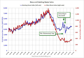
With existing home sales around 5 million per year, and new home sales around 800 thousand per year, the “distressing gap” in the graph below will be closed.
 Click on graph for larger image in graph gallery.
This "distressing gap" graph that shows existing home sales (left axis) and new home sales (right axis) through May. This graph starts in 1994, but the relationship has been fairly steady back to the '60s.
Following the housing bubble and bust, the "distressing gap" appeared mostly because of distressed sales. The flood of distressed sales has kept existing home sales elevated, and depressed new home sales since builders haven't been able to compete with the low prices of all the foreclosed properties.
This gap will eventually close, but it will probably take a number of years.
Note: Existing home sales are counted when transactions are closed, and new home sales are counted when contracts are signed. So the timing of sales is different.
Earlier:
• New Home Sales increase in May to 369,000 Annual Rate
• New Home Sales graphs
New Home Sales increase in May to 369,000 Annual Rate
by Calculated Risk on 6/25/2012 10:00:00 AM
The Census Bureau reports New Home Sales in May were at a seasonally adjusted annual rate (SAAR) of 369 thousand. This was up from 343 thousand SAAR in April. Sales in February and March were revised up.
The first graph shows New Home Sales vs. recessions since 1963. The dashed line is the current sales rate.
Sales of new single-family houses in May 2012 were at a seasonally adjusted annual rate of 369,000 ... 7.6 percent above the revised April rate of 343,000 and is 19.8 percent above the May 2011 estimate of 308,000.
 Click on graph for larger image in graph gallery.
The second graph shows New Home Months of Supply.
Months of supply decreased to 4.7 in May from 5.0 in April.
The all time record was 12.1 months of supply in January 2009.
 This is now in the normal range (less than 6 months supply is normal).
The seasonally adjusted estimate of new houses for sale at the end of May was 145,000. This represents a supply of 4.7 months at the current sales rate.On inventory, according to the Census Bureau:
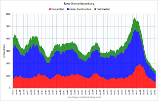
"A house is considered for sale when a permit to build has been issued in permit-issuing places or work has begun on the footings or foundation in nonpermit areas and a sales contract has not been signed nor a deposit accepted."Starting in 1973 the Census Bureau broke this down into three categories: Not Started, Under Construction, and Completed.
 This graph shows the three categories of inventory starting in 1973.
The inventory of completed homes for sale was at a record low 43,000 units in May. The combined total of completed and under construction is at the lowest level since this series started.
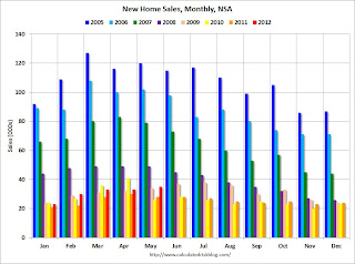
The last graph shows sales NSA (monthly sales, not seasonally adjusted annual rate).
In May 2012 (red column), 35 thousand new homes were sold (NSA). Last year only 28 thousand homes were sold in May. This was the fourth weakest May since this data has been tracked. The high for May was 120 thousand in 2005.
 Even though sales are still very low, new home sales have clearly bottomed. New home sales have averaged 353 thousand SAAR over the first 5 months of 2012, after averaging under 300 thousand for the previous 18 months. All of the recent revisions have been up too.
This was a very solid report and above the consensus forecast.
Chicago Fed: Economic growth slower in May
by Calculated Risk on 6/25/2012 08:40:00 AM
The Chicago Fed released the national activity index (a composite index of other indicators): Index shows slower economic growth in May
Led by declines in production-related indicators, the Chicago Fed National Activity Index (CFNAI) decreased to –0.45 in May from +0.08 in April. ...This graph shows the Chicago Fed National Activity Index (three month moving average) since 1967.
The index’s three-month moving average, CFNAI-MA3, decreased from –0.13 in April to –0.34 in May—its third consecutive reading below zero and its lowest value since June 2011. May’s CFNAI-MA3 suggests that growth in national economic activity was below its historical trend. The economic growth reflected in this level of the CFNAI-MA3 suggests subdued inflationary pressure from economic activity over the coming year.
 Click on graph for larger image.
This suggests growth was below trend in May.
According to the Chicago Fed:
A zero value for the index indicates that the national economy is expanding at its historical trend rate of growth; negative values indicate below-average growth; and positive values indicate above-average growth.
Sunday, June 24, 2012
Look Ahead: New Home Sales
by Calculated Risk on 6/24/2012 10:25:00 PM
The key report tomorrow will be new home sales.
• At 8:30 AM ET on Monday, 8:30 AM: The Chicago Fed National Activity Index for May will be released. This is a composite index of other data.
• At 10:00 AM, The Census Bureau will release New Home Sales for May. The consensus is for an increase in sales to 350 thousand Seasonally Adjusted Annual Rate (SAAR) in May from 343 thousand in April.
• At the 10:30 AM, the Dallas Fed Manufacturing Survey for June will be released. The consensus is for 0.0 for the general business activity index, up from -5.1 in May. The regional surveys have been disappointing in June.
The Asian markets are mostly red tonight. The Nikkei is down slightly, and the Shanghai Composite is down 0.5%.
From CNBC: Pre-Market Data and Bloomberg futures: the S&P 500 futures are down about 8, and Dow futures are down 50.
Oil: WTI futures are up to $80.09 (this is down from $109.77 in February) and Brent is up to $91.90 per barrel.
Yesterday:
• Summary for Week ending June 22nd
• Schedule for Week of June 24th
For the monthly economic question contest (four more questions for June):


