by Calculated Risk on 7/07/2012 10:04:00 PM
Saturday, July 07, 2012
Percent Job Losses: Great Recession and Great Depression
The causes of the Great Recession were similar to the Great Depression - as opposed to most post war recessions that were caused by Fed tightening to slow inflation - and I'm frequently asked if we could compare the percent job losses during the two periods. Unfortunately there is very little data for the Great Depression.
Back in February I posted a graph based on some rough annual data.
In April, Treasury released a slide deck titled Financial Crisis Response In Charts. One of the charts shows the percentage jobs lost in the current recession compared to the Great Depression.
Here is that graph (I've added a couple of dots to update the current recession).

This graph compares the job losses from the start of the employment recession, in percentage terms for the Great Depression, the 2007 recession, and the average for several recent recession following financial crisis.
Although the 2007 recession is much worse than any other post-war recession, the employment impact was much less than during the Depression. Note the second dip during the Depression - that was in 1937 and the result of austerity measures.
 For reference, the second graph shows the job losses from the start of the employment recession, in percentage terms, compared to other post WWII recessions.
Earlier:
• Summary for Week Ending July 6th
• Schedule for Week of July 8th
Unofficial Problem Bank list declines to 913 Institutions
by Calculated Risk on 7/07/2012 06:32:00 PM
Note: The FDIC's official problem bank list is comprised of banks with a CAMELS rating of 4 or 5, and the list is not made public. (CAMELS is the FDIC rating system, and stands for Capital adequacy, Asset quality, Management, Earnings, Liquidity and Sensitivity to market risk. The scale is from 1 to 5, with 1 being the strongest.)
As a substitute for the CAMELS ratings, surferdude808 is using publicly announced formal enforcement actions, and also media reports and company announcements that suggest to us an enforcement action is likely, to compile a list of possible problem banks in the public interest.
So this is an unofficial list of Problem Banks compiled only from public sources. (And only US banks).
Here is the unofficial problem bank list for July 6, 2012. (table is sortable by assets, state, etc.)
Changes and comments from surferdude808:
Changes to the Unofficial Problem Bank List this week were limited to four removals. Afterward, the list holds 913 institutions with assets of $353.4 billion. A year ago, the list hit its high at 1,004 institutions with assets of $418.8 billion.Earlier:
There were three action terminations -- First Community Bank, National Association, Lexington, SC ($602 million Ticker: FCCO); Profinium Financial, Inc., Truman, MN ($307 million); and Solera National Bank, Lakewood, CO ($146 million Ticker: SLRK).
The other removal was the failed Montgomery Bank & Trust, Ailey, GA ($174 million), which is the 80th bank to fail in Georgia since August 2008. This failure was costly as FDIC estimated the loss at 75.2 million or 43.3 percent of MB&T's assets. There is some intrigue with the failure as a director apparently has gone missing with $17 million of the bank's monies according to the Wall Street JournalOn Tuesday, the U.S. attorney's office in New York announced that missing director Aubrey Lee Price has been charged with wire fraud involving the embezzlement of $17 million from the bank. After telling upper management that he was investing in U.S. Treasury securities, Mr. Price wired bank funds to accounts he controlled and prepared falsified statements to cover his tracks, the federal complaint said. The banker has been missing since at least June 16. He vanished after writing friends to tell them he had lost large amounts of client funds on trades and wanted to kill himself, authorities said. Investigators say Mr. Price, 46 years old, was last seen boarding a ferry in Key West, Fla., bound for Fort Myers, Fla. He had "previously stated that he owns real estate in Venezuela" and "may own a boat that would be large enough to travel to Venezuela from Florida," the complaint says.There are 67 banks in Georgia still on the Unofficial Problem Bank List, so there is a good chance the state could experience 100 failures during this banking crisis. Next week, we anticipate the OCC will release its enforcement actions through mid-June 2012.
• Summary for Week Ending July 6th
• Schedule for Week of July 8th
Schedule for Week of July 8th
by Calculated Risk on 7/07/2012 01:04:00 PM
Earlier:
• Summary for Week Ending July 6th
The key report this week is the May Trade Balance report.
The FOMC minutes, to be released on Wednesday, will receive extra attention for clues about QE3. Also several regional Fed presidents will speak this week.
8:45 AM ET: LPS Mortgage Monitor for May.
3:00 PM: Consumer Credit for June. The consensus is for credit to increase $8.5 billion.
 7:30 AM: NFIB Small Business Optimism Index for June.
 Click on graph for larger image in graph gallery.
The index decreased slightly to 94.4 in May from 94.5 in April.
The consensus is for a decrease to 92.0 in June.
 10:00 AM: Job Openings and Labor Turnover Survey for May from the BLS.
 This graph shows job openings (yellow line), hires (purple), Layoff, Discharges and other (red column), and Quits (light blue column) from the JOLTS.
Jobs openings declined in April to 3.416 million, down from 3.741 million in March. However the number of job openings (yellow) has generally been trending up, and openings are up about 13% year-over-year compared to April 2011.
7:00 AM: The Mortgage Bankers Association (MBA) will release the mortgage purchase applications index.
 8:30 AM: Trade Balance report for May from the Census Bureau.
 Exports decreased in April. Imports decreased even more. Exports are 11% above the pre-recession peak and up 4% compared to April 2011; imports are 2% above the pre-recession peak, and up about 6% compared to April 2011.
The consensus is for the U.S. trade deficit to decrease to $48.7 billion in May, down from from $50.1 billion in April. Export activity to Europe will be closely watched due to economic weakness. Also oil prices started to decline in April, and that will probably reduce the value of oil imports in May.
10:00 AM: Monthly Wholesale Trade: Sales and Inventories for May. The consensus is for a 0.3% increase in inventories.
2:00 PM: FOMC Minutes, Meeting of June 19-20, 2012.
8:30 AM: The initial weekly unemployment claims report will be released. The consensus is for claims to increase slightly to 375 thousand.
8:30 AM: Import and Export Prices for May. The consensus is a for a 1.9% decrease in import prices.
8:30 AM: Producer Price Index for June. The consensus is for a 0.4% decrease in producer prices (0.2% increase in core).
9:55 AM: Reuter's/University of Michigan's Consumer sentiment index (preliminary for July). The consensus is for sentiment to increase slightly to 73.5 from 73.2 in June.
Summary for Week ending July 6th
by Calculated Risk on 7/07/2012 08:01:00 AM
The week started off with the ISM manufacturing index showing contraction for the first time since 2009, and ended with a disappointing employment report. Those were the key reports for the week - and they were dismal.
However, sandwiched in the middle of the week - around the July 4th Holiday - there was a little better news. Auto sales were stronger than expected, initial weekly unemployment claims declined, construction spending increased, and vacancy rates declined for two categories of commercial real estate in Q2 (but not for offices).
I'll have more on the employment report later today.
Here is a summary of last week in graphs:
• June Employment Report: 80,000 Jobs, 8.2% Unemployment Rate
 Click on graph for larger image.
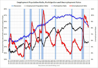
This graph shows the employment population ratio, the participation rate, and the unemployment rate. The unemployment rate was unchanged at 8.2% (red line).
The Labor Force Participation Rate was unchanged at 63.8% in June (blue line). This is the percentage of the working age population in the labor force.
The participation rate is well below the 66% to 67% rate that was normal over the last 20 years, although most of the recent decline is due to demographics.
The Employment-Population ratio was unchanged at 58.6% in June (black line).
 The second graph shows the job losses from the start of the employment recession, in percentage terms. The dotted line is ex-Census hiring.
This shows the depth of the recent employment recession - worse than any other post-war recession - and the relatively slow recovery due to the lingering effects of the housing bust and financial crisis.
The economy has added 902,000 jobs over the first half of the year (952,000 private sector jobs). At this pace, the economy would add around 1.9 million private sector jobs in 2012; less than the 2.1 million added in 2011.
However job growth has really slowed over the last three months with only 225,000 payroll jobs added (a 900,000 annual pace), and only 274,000 private sector jobs (a 1.1 million annual pace). This is very sluggish employment growth.
• ISM Manufacturing index declines in June to 49.7
 This is the first contraction in the ISM index since the recession ended in 2009. PMI was at 49.7% in June, down from 53.5% in May. The employment index was at 56.6%, down from 56.9%, and new orders index was at 47.8%, down from 60.1%.
Here is a long term graph of the ISM manufacturing index.
This was below expectations of 52.0%. This suggests manufacturing contracted in June for the first time since July 2009.
This was a weak report, and the decline in new orders was especially significant.
• U.S. Light Vehicle Sales at 14.1 million annual rate in June
 Based on an estimate from Autodata Corp, light vehicle sales were at a 14.08 million SAAR in June. That is up 22% from June 2011, and up 2.6% from the sales rate last month (13.73 million SAAR in May 2012).
This was above the consensus forecast of 13.9 million SAAR (seasonally adjusted annual rate).
This graph shows the historical light vehicle sales from the BEA (blue) and an estimate for June (red, light vehicle sales of 14.08 million SAAR from Autodata Corp).
Sales have averaged a 14.28 million annual sales rate through the first half of 2012, up sharply from the same period of 2011.
• ISM Non-Manufacturing Index declines, indicates slower expansion in June
 The June ISM Non-manufacturing index was at 52.1%, down from 53.7% in May. The employment index increased in June to 52.3%, up from 50.8% in May. Note: Above 50 indicates expansion, below 50 contraction.
 This graph shows the ISM non-manufacturing index (started in January 2008) and the ISM non-manufacturing employment diffusion index.
This was below the consensus forecast of 53.0% and indicates slower expansion in June than in May.
• Construction Spending in May: Private spending increases, Public Spending declines
 This week the Census Bureau reported that overall construction spending increased in May:
 The U.S. Census Bureau of the Department of Commerce announced today that construction spending during May 2012 was estimated at a seasonally adjusted annual rate of $830.0 billion, 0.9 percent above the revised April estimate of $822.5 billion. The May figure is 7.0 percent above the May 2011 estimate of $775.8 billion.This graph shows private residential and nonresidential construction spending, and public spending, since 1993. Note: nominal dollars, not inflation adjusted.
Private residential spending is 61% below the peak in early 2006, and up 17% from the recent low. Non-residential spending is 28% below the peak in January 2008, and up about 30% from the recent low.
Public construction spending is now 17% below the peak in March 2009 and at a new post-bubble low.
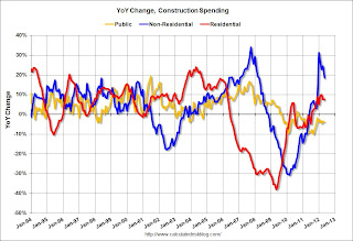 The second graph shows the year-over-year change in construction spending.
On a year-over-year basis, both private residential and non-residential construction spending are positive, but public spending is down on a year-over-year basis. The year-over-year improvements in private non-residential is mostly related to energy spending (power and electric).
The year-over-year improvement in private residential investment is an important change (the positive in 2010 was related to the tax credit). Construction is now the "bright spot" for the economy, however the improvement in residential construction is being somewhat offset by declines in public construction spending.
• Reis: Office, Mall and Apartment Vacancy Rates for Q2
 This graph shows the office vacancy rate starting in 1980 (prior to 1999 the data is annual).
Reis is reporting the vacancy rate was unchanged at 17.2% in Q2, and down from 17.5% in Q2 2011. The vacancy rate peaked in this cycle at 17.6% in Q3 and Q4 2010.
As Reis noted, there are very few new office buildings being built in the US, and new construction will probably stay low for several years.
 Reis reported that the apartment vacancy rate (82 markets) fell to 4.7% in Q2 from 4.9% in Q1 2012. The vacancy rate was at 5.9% in Q2 2011 and peaked at 8.0% at the end of 2009.
This graph shows the apartment vacancy rate starting in 2005.
Reis is just for large cities, but this decline in vacancy rates - and increase in rents - is happening just about everywhere.
Reis also reported a strong increase in apartment rents.
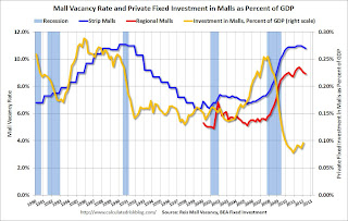 Reis reported that the vacancy rate for regional malls declined slightly to 8.9% in Q2 from 9.0% in Q1. This is down from a cycle peak of 9.4% in Q3 of last year.
For Neighborhood and Community malls (strip malls), the vacancy rate declined to 10.8% in Q2, from 10.9% in Q1. For strip malls, the vacancy rate peaked at 11.0% in Q2 of last year.
This graph shows the strip mall vacancy rate starting in 1980 (prior to 2000 the data is annual). The yellow line shows mall investment as a percent of GDP. This isn't zero because this includes renovations and improvements. New mall investment has essentially stopped following the financial crisis.
• Weekly Initial Unemployment Claims decline to 374,000
 The DOL reports:
In the week ending June 30, the advance figure for seasonally adjusted initial claims was 374,000, a decrease of 14,000 from the previous week's revised figure of 388,000. The 4-week moving average was 385,750, a decrease of 1,500 from the previous week's revised average of 387,250.This graph shows the 4-week moving average of weekly claims since January 2000.
The dashed line on the graph is the current 4-week average. The four-week average of weekly unemployment claims declined slightly to 385,750.
This is just off the high for the year.
• Other Economic Stories ...
• ADP: Private Employment increased 176,000 in June
• AAR: Rail Traffic "mixed" in June, Intermodal at Record Level
• CoreLogic: House Price Index increases in May, Up 2.0% Year-over-year
Friday, July 06, 2012
Bank Failure #32 in 2012: Montgomery Bank & Trust, Ailey, Georgia
by Calculated Risk on 7/06/2012 08:49:00 PM
From the FDIC: Ameris Bank, Moultrie, Georgia, Assumes All of the Deposits of Montgomery Bank & Trust, Ailey, Georgia
As of March 31, 2012, Montgomery Bank & Trust had approximately $173.6 million in total assets and $164.4 million in total deposits. ... The FDIC estimates that the cost to the Deposit Insurance Fund (DIF) will be $75.2 million. Compared to other alternatives, Ameris Bank's acquisition was the least costly resolution for the FDIC's DIF. Montgomery Bank & Trust is the 32nd FDIC-insured institution to fail in the nation this year, and the sixth in Georgia.That is a pretty high loss rate!
Update: From Bill Dawers at the Peach Pundit:
Some folks might have seen this closure coming. From the AJC a couple days ago:Earlier on employment:The Securities and Exchange Commission said Monday it has received a federal court order to freeze the assets of Aubrey Lee Price, and several associated businesses.
In a 22-page letter to investors, Price allegedly admitted he made false statements to conceal losses of $20 million to $23 million.
Regulators said Price told clients he was investing their money in traditional stocks, but he also put money into “illiquid” bets including South American real estate and shares of Montgomery Bank & Trust.
...
William P. Hicks, associate director of the SEC in Atlanta, said Price “made woeful financial transactions” that he hid from his investors.
“Now both the money and Price are missing,” Hicks said.
• June Employment Report: 80,000 Jobs, 8.2% Unemployment Rate
• Employment: Another Weak Report (more graphs)
• All Employment Graphs
AAR: Rail Traffic "mixed" in June, Intermodal at Record Level
by Calculated Risk on 7/06/2012 04:34:00 PM
Once again rail traffic was "mixed". This was mostly due to the year-over-year decline in coal traffic. Building related commodities were up such as lumber and crushed stone, gravel, sand. Lumber was up 11.4% from June 2011.
From the Association of American Railroads (AAR): AAR Reports Mixed Rail Traffic for June
The Association of American Railroads (AAR) today reported U.S. rail carloads originated in June 2012 totaled 1,140,271, down 1.3 percent compared with June 2011. Intermodal volume in June 2012 totaled 996,022 containers and trailers, up 49,168 units or 5.2 percent compared with June 2011. The June 2012 average weekly intermodal volume of 249,006 units is the highest average for any June on record and the third highest for any month, behind August and October 2006.
...
“U.S. intermodal originations in 2012 through June are slightly ahead of 2006’s record pace, setting up the very real possibility that 2012 will be the highest-volume intermodal year ever for U.S. railroads,” said AAR Senior Vice President John T. Gray. “The recovery in intermodal traffic since the recession has been remarkable and is due in large part to railroads’ huge investments in their intermodal business that have improved rail intermodal’s reliability and efficiency.”
 Click on graph for larger image.
This graph shows U.S. average weekly rail carloads (NSA).
U.S. rail carload traffic in June 2012 wasn’t as encouraging as intermodal traffic, but it was better than it’s been lately. U.S. freight railroads originated 1,140,271 carloads in June, an average of 285,068 carloads per month and down 1.3% from June 2011.Grains are down due to fewer exports.
That’s the lowest percentage decline in five months, mainly because coal carloads weren’t as lousy as they have been. Coal carloads in June 2012 averaged 114,485 per week, the highest weekly average in four months and down just 6.2% from June 2011. Normally, a 6.2% year-over year decline is terrible, but compared to the 11% to 17% declines in the previous four months, it’s not so bad.
The second graph is for intermodal traffic (using intermodal or shipping containers):
 Graphs reprinted with permission.
Intermodal traffic is now at peak levels.
U.S. railroads originated 996,022 intermodal containers and trailers in June 2012, up 5.2% (49,168 units) over June 2011 and an average of 249,006 units per week. That’s the highest average for any June in history and the third highest average for any month in historyThe top months for intermodal are usually in the fall, and it looks like intermodal traffic will be at record levels this year.
Earlier on employment:
• June Employment Report: 80,000 Jobs, 8.2% Unemployment Rate
• Employment: Another Weak Report (more graphs)
• All Employment Graphs
Where are the construction jobs?
by Calculated Risk on 7/06/2012 02:21:00 PM
Back in 2006, I predicted we'd see construction job losses in the seven figures. All through 2006 and into 2007, I was constantly asked: "Where are the construction job losses you predicted?"
And then it started ... and the BLS reported construction employment fell 2.27 million from peak to trough. No one asks that question any more.
There were several reasons why construction jobs didn't decline at the same time as housing starts. First, construction includes residential, commercial and other construction (like roads). Even after housing starts began to collapse, commercial real estate was still booming and workers shifted from residential to commercial (many commercial projects have long time frames - and many developers remained in denial). Also some construction workers are paid in cash (illegal immigrants), and these workers weren't counted on the BLS payrolls.
Now people are asking "Where are the construction jobs?"
Oh, Grasshopper ... the construction jobs are coming.
The graph below shows the number of total construction payroll jobs in the U.S. including both residential and non-residential since 1969 compared to housing starts. Unfortunately the BLS only started breaking out residential construction employment fairly recently (residential specialty trade contractors in 2001).
Right away we can see that construction employment isn't just tied to housing starts. There are other categories that have been generally increasing over the decades.
 Click on graph for larger image.
Notice that housing starts collapsed in 2006, but construction employment didn't start falling until 2007 - and didn't collapse until 2008. Some people will look at the sub-categories for construction, but there are two problems: 1) construction workers shift between categories, and 2) the BLS hasn't been tracking these categories for very long.
Even though construction is down since the beginning of the year, and only increased by 2,000 jobs in June, construction employment appears to have bottomed, and should add to both GDP and employment growth in 2012.
Other construction indicators - housing starts, new home sales, construction spending, builder comments - are all improving (although public construction spending is decreasing), and construction employment will follow.
A little Kung Fu:
Young Caine: "Old man, how is it that you hear these things?"
Master Po: "Young man, how is it that you do not?"
The housing recovery is here. The construction jobs are coming.
Earlier on employment:
• June Employment Report: 80,000 Jobs, 8.2% Unemployment Rate
• Employment: Another Weak Report (more graphs)
• All Employment Graphs
Reis: Mall Vacancy Rate declines slightly in Q2
by Calculated Risk on 7/06/2012 12:42:00 PM
Reis reported that the vacancy rate for regional malls declined slightly to 8.9% in Q2 from 9.0% in Q1. This is down from a cycle peak of 9.4% in Q3 of last year.
For Neighborhood and Community malls (strip malls), the vacancy rate declined to 10.8% in Q2, from 10.9% in Q1. For strip malls, the vacancy rate peaked at 11.0% in Q2 of last year.
Comments from Reis Senior Economist Ryan Severino:
[Strip mall] The national vacancy rate fell by 10 bps during the second quarter to 10.8%. This is the second consecutive quarterly decline in the vacancy rate after vacancies had generally been rising between the second quarter of 2005 and the fourth quarter of 2011. Although demand for space remains weak, new construction remains moored at such low levels that even weak demand is sufficient to push vacancy rates downward. Only 572,000 SF of neighborhood and community center space were delivered during the quarter. That is the second-lowest quarterly figure on record since Reis began publishing quarterly data in 1999 and a fairly substantial decline from the already scant 1.554 million SF that were delivered during the first quarter.
Despite the second consecutive quarterly vacancy decline, Reis is not yet convinced that a recovery for shopping centers has commenced. Just as much of the recent improvement in the market is owed to limited increases in supply as the somewhat resurgent demand. New completions remain just above historically low levels. With supply growth once again falling back to such trivial levels, the modest demand we observed pushed vacancy down slightly. Two consecutive quarters of vacancy decline is a notable result, but nonetheless only represents the nascent stages of stabilization. With construction projected to remain at low levels, Reis expects vacancies to continue moving slowly downward in 2012 as demand for space outpaces new construction.
...
Regional malls posted another quarter of modest improvement, with national vacancies declining by 10 bps to 8.9%. This is the third consecutive quarter with a vacancy decline. Asking rents grew by 0.3%, marking the fifth consecutive quarter of rent increases. Although regional malls continue to perform better then neighborhood and community centers at this juncture, demand for space remains weak.
 Click on graph for larger image.
This graph shows the strip mall vacancy rate starting in 1980 (prior to 2000 the data is annual). The regional mall data starts in 2000. Back in the '80s, there was overbuilding in the mall sector even as the vacancy rate was rising. This was due to the very loose commercial lending that led to the S&L crisis.
In the mid-'00s, mall investment picked up as mall builders followed the "roof tops" of the residential boom (more loose lending). This led to the vacancy rate moving higher even before the recession started. Then there was a sharp increase in the vacancy rate during the recession and financial crisis.
The yellow line shows mall investment as a percent of GDP. This isn't zero because this includes renovations and improvements. New mall investment has essentially stopped following the financial crisis.
The good news is, as Severino noted, "new [mall] completions remain just above historically low levels", and, with very little new supply, the vacancy rate will probably continue to decline slowly.
Mall vacancy data courtesy of Reis.
Earlier on employment:
• June Employment Report: 80,000 Jobs, 8.2% Unemployment Rate
• Employment: Another Weak Report (more graphs)
• All Employment Graphs
Employment: Another Weak Report (more graphs)
by Calculated Risk on 7/06/2012 10:54:00 AM
Another month, another disappointing employment report.
The economy has added 902,000 jobs over the first half of the year (952,000 private sector jobs). At this pace, the economy would add around 1.9 million private sector jobs in 2012; less than the 2.1 million added in 2011.
However job growth has really slowed over the last three months with only 225,000 payroll jobs added (a 900,000 annual pace), and only 274,000 private sector jobs (a 1.1 million annual pace). This is very sluggish employment growth.
The unemployment rate was unchanged at 8.2% in June The household survey showed a another increase in employment (128,000 jobs added), and since the participation rate was unchanged at 63.8%, that was just enough to keep with the increase in the labor force.
U-6, an alternate measure of labor underutilization that includes part time workers and marginally attached workers, increased slightly to 14.9%.
The bottom line is this was another disappointing employment report. Here are a few more graph ...
Employment-Population Ratio, 25 to 54 years old
 Click on graph for larger image.
Since the participation rate has declined recently due to cyclical (recession) and demographic (aging population) reasons, an important graph is the employment-population ratio for the key working age group: 25 to 54 years old.
In the earlier period the employment-population ratio for this group was trending up as women joined the labor force. The ratio has been mostly moving sideways since the early '90s, with ups and downs related to the business cycle.
This ratio should probably move back to or above 80% as the economy recovers. So far the ratio has only increased slightly from a low of 74.7% to 75.6% in June (this was down slightly in June.)
Percent Job Losses During Recessions

This graph shows the job losses from the start of the employment recession, in percentage terms - this time aligned at maximum job losses.
In the earlier post, the graph showed the job losses aligned at the start of the employment recession.
Part Time for Economic Reasons
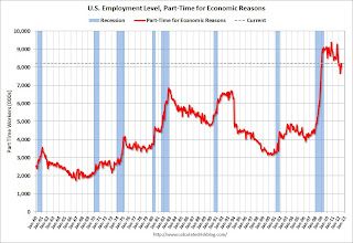 From the BLS report:
The number of persons employed part time for economic reasons (sometimes referred to as involuntary part-time workers) was essentially unchanged at 8.2 million. These individuals were working part time because their hours had been cut back or because they were unable to find a full-time job.The number of part time workers increased in June to 8.21 millon.
These workers are included in the alternate measure of labor underutilization (U-6) that increased in June to 14.9%, up from 14.8% in May.
Unemployed over 26 Weeks
 This graph shows the number of workers unemployed for 27 weeks or more.
 According to the BLS, there are 5.37 million workers who have been unemployed for more than 26 weeks and still want a job. This was down from 5.41 million in May. This is generally trending down, but very slowly. Long term unemployment remains one of the key labor problems in the US.
State and Local Government
So far in 2012 - through June - state and local government have lost 20,000 jobs (3,000 jobs were added in June). In the first six months of 2011, state and local governments lost 133,000 payroll jobs - and 230,000 for the year. So the layoffs have slowed.
 This graph shows total state and government payroll employment since January 2007. State and local governments lost 129,000 jobs in 2009, 262,000 in 2010, and 230,000 in 2011.
Note: Some of the stimulus spending from the American Recovery and Reinvestment Act probably kept state and local employment from declining faster in 2009.
Of course the Federal government is still losing workers (52,000 over the last 12 months and another 7,000 in June alone), but it looks like state and local government employment losses might be ending (or at least slowing sharply).
Overall this was another weak report.
June Employment Report: 80,000 Jobs, 8.2% Unemployment Rate
by Calculated Risk on 7/06/2012 08:30:00 AM
From the BLS:
Nonfarm payroll employment continued to edge up in June (+80,000), and the unemployment rate was unchanged at 8.2 percent, the U.S. Bureau of Labor Statistics reported today.
...
Both the civilian labor force participation rate and the employment-population ratio were unchanged in June at 63.8 and 58.6 percent, respectively.
...
The change in total nonfarm payroll employment for April was revised from +77,000 to +68,000, and the change for May was revised from +69,000 to +77,000.
 Click on graph for larger image.
This was another weak month, and the revisions for the previous two months were offsetting.
This was below expectations of 90,000 payroll jobs added.
The second graph shows the employment population ratio, the participation rate, and the unemployment rate. The unemployment rate was unchanged at 8.2% (red line).
 The Labor Force Participation Rate was unchanged at 63.8% in June (blue line). This is the percentage of the working age population in the labor force.
The participation rate is well below the 66% to 67% rate that was normal over the last 20 years, although most of the recent decline is due to demographics.
The Employment-Population ratio was unchanged at 58.6% in June (black line).
 The third graph shows the job losses from the start of the employment recession, in percentage terms. The dotted line is ex-Census hiring.
This shows the depth of the recent employment recession - worse than any other post-war recession - and the relatively slow recovery due to the lingering effects of the housing bust and financial crisis.
This was weaker payroll growth than expected (expected was 90,000). More later ...


