by Calculated Risk on 6/08/2014 12:00:00 PM
Sunday, June 08, 2014
41-Year-Olds and the Labor Force Participation Rate
On Friday, Dean Baker wrote: The Question on People Leaving the Labor Force is 41-Year-Olds, Not 61-Year-Olds
In his discussion of today's employment report Neil Irwin notes that the unemployment rate is considerably lower than would otherwise be the case because so many people have simply given up looking for work and are therefore not counted as being unemployed. Irwin then adds that the big question is that if the economy eventually recovers is:This brings up a few key points:
"How many of the 61-year-olds who gave up looking for a job in the last few years are going to return to the labor force when they smell opportunity, and how many have retired for good?"
Actually, the story of people leaving the labor force is not primarily one of older workers who are near retirement age, it is primarily a story of prime age workers. ...
It is difficult to envision any obvious reason why people in their prime working years would suddenly decide that they did not want to work other than the weakness of the labor market. Most of these workers will presumably come back into the labor market if they see opportunities for employment.
1) Analyzing and forecasting the labor force participation requires looking at a number of factors. Everyone is aware that there is a large cohort has moved into the 50 to 70 age group, and that that has pushing down the overall participation rate. Another large cohort has been moving into the 16 to 24 year old age group - and many in this cohort are staying in school (a long term trend that has accelerated recently) - and that is another key factor in the decline in the overall participation rate.
2) But there are other long term trends. One of these trends is for a decline in the participation rate for prime working age men (25 to 54 years old).
3) Although Dr. Baker argues that the decline in prime working age workers is due to "weakness of the labor market", this decline was happening long before the Great Recession. For some reasons, see: Possible Reasons for the Decline in Prime-Working Age Men Labor Force Participation and on demographics from researchers at the Atlanta Fed: "Reasons for the Decline in Prime-Age Labor Force Participation"
Lets take a look at Dean Bakers "41-Year-Olds". I used the BLS data on 40 to 44 year old men (only available Not Seasonally Adjusted since 1976). I choose men only to simplify.
 Click on graph for larger image.
This graph shows the 40 to 44 year old men participation rate since 1976 (note the scale doesn't start at zero to better show the change).
There is a clear downward trend, and a researcher looking at this trend in the year 2000 might have predicted the 40 to 44 year old men participation rate would about the level as today (see trend line).
Clearly there are other factors than "economic weakness" causing this downward trend. I listed some reasons a few months ago, and new research from Pew Research suggests stay-at-home dads is one of the reasons: Growing Number of Dads Home with the Kids
Just looking at this graph, I don't think there are many "missing 41-Year-Old" men that will be returning to the labor force.
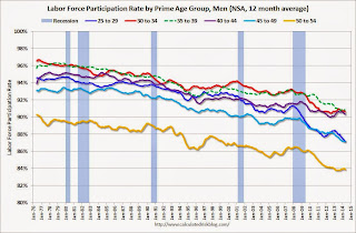 The second graph shows the trends for each prime working age men 5-year age group.
Note: This is a rolling 12 month average to remove noise (data is NSA), and the scale doesn't start at zero to show the change.
Clearly there is a downward trend for all 5 year age groups. When arguing about how many workers are "missing", we need to take these long term trends into account.
 The third graph shows the same data but with the full scale (0% to 100%). The trend is still apparent, but the decline has been gradual.
The bottom line is that the participation rate was declining for prime working age workers before the recession, there are several reasons for this decline (not just recent "economic weakness") and many estimates of "missing workers" are probably way too high.
Saturday, June 07, 2014
Schedule for Week of June 8th
by Calculated Risk on 6/07/2014 01:11:00 PM
This will be a light week for economic data.
The key report this week is May retail sales on Thursday.
No economic releases scheduled.
7:30 AM ET: NFIB Small Business Optimism Index for May.
 10:00 AM: Job Openings and Labor Turnover Survey for April from the BLS.
 This graph shows job openings (yellow line), hires (purple), Layoff, Discharges and other (red column), and Quits (light blue column) from the JOLTS.
In March, the number of job openings (yellow) were up 3.5% year-over-year compared to March 2013, and Quits were up sharply year-over-year.
10:00 AM: Monthly Wholesale Trade: Sales and Inventories for April. The consensus is for a 0.5% increase in inventories.
7:00 AM: The Mortgage Bankers Association (MBA) will release the results for the mortgage purchase applications index.
2:00 PM ET: The Monthly Treasury Budget Statement for May. Note: The CBO's estimate is the deficit through May in fiscal 2014 was $439 billion, compared to $626 billion for the same period in fiscal 2013.
8:30 AM: The initial weekly unemployment claims report will be released. The consensus is for claims to decrease to 309 thousand from 312 thousand.
 8:30 AM ET: Retail sales for May will be released.
This graph shows retail sales since 1992 through March 2014. This is monthly retail sales and food service, seasonally adjusted (total and ex-gasoline). On a monthly basis, retail sales increased 0.1% from March to April (seasonally adjusted), and sales were up 3.8% from April 2013.
The consensus is for retail sales to increase 0.6% in May, and to increase 0.4% ex-autos.
10:00 AM: Manufacturing and Trade: Inventories and Sales (business inventories) report for April. The consensus is for a 0.4% increase in inventories.
8:30 AM: The Producer Price Index for May from the BLS. The consensus is for a 0.1% increase in prices.
9:55 AM: Reuter's/University of Michigan's Consumer sentiment index (preliminary for June). The consensus is for a reading of 83.0, up from 81.9 in May.
Unofficial Problem Bank list declines to 495 Institutions
by Calculated Risk on 6/07/2014 08:15:00 AM
This is an unofficial list of Problem Banks compiled only from public sources.
Here is the unofficial problem bank list for June 6, 2014.
Changes and comments from surferdude808:
It was a very quiet week for the Unofficial Problem Bank List with only one removal. The list holds 495 institutions with assets of $153.9 billion. A year ago, the list had 923 institutions with assets of $355.7 billion. The OCC terminated the action against Independence National Bank, Greenville, SC ($97 million Ticker: IEBS). Next week, we anticipate for the OCC to provide an update on its enforcement action activity through mid-May 2014.CR Note: The first unofficial problem bank list was published in August 2009 with 389 institutions. The list peaked at 1,002 institutions on June 10, 2011, and is now down to 495.
Friday, June 06, 2014
Larry Summers on "House of Debt"
by Calculated Risk on 6/06/2014 07:14:00 PM
An interesting piece from Larry Summers in the Financial Times: Lawrence Summers on ‘House of Debt’ A short excerpt:
Atif Mian and Amir Sufi’s House of Debt, despite some tough competition, looks likely to be the most important economics book of 2014; it could be the most important book to come out of the 2008 financial crisis and subsequent Great Recession. Its arguments deserve careful attention, and its publication provides an opportunity to reconsider policy choices made in 2009 and 2010 regarding mortgage debt.I have my copy of the book and will probably post a few comments soon too (thanks for nice mention of Calculated Risk on page 147).
...
Mian and Sufi ... argue that, rather than failing banks, the key culprits in the financial crisis were overly indebted households. ... Mian and Sufi highlight how harsh leverage and debt can be – for example, when the price of a house purchased with a 10 per cent downpayment goes down by 10 per cent, all of the owner’s equity is lost. They demonstrate powerfully that spending fell much more in parts of the country where house prices fell fastest and where the most mortgage debt was attached to homes. So their story of the crisis blames excessive mortgage lending, which first inflated bubbles in the housing market and then left households with unmanageable debt burdens. These burdens in turn led to spending reductions and created an adverse economic and financial spiral that ultimately led financial institutions to the brink.
emphasis added
Public and Private Sector Payroll Jobs: Carter, Reagan, Bush, Clinton, Bush, Obama
by Calculated Risk on 6/06/2014 04:34:00 PM
By request, here is an update on an earlier post through the May employment report.
Important: There are many differences between these periods. Overall employment was smaller in the '80s, so a different comparison might be to look at the percentage change. Of course the participation rate was increasing in the '80s (younger population and women joining the labor force), and the participation rate is declining now. But these graphs give an overview of employment changes.
The first graph shows the change in private sector payroll jobs from when each president took office until the end of their term(s). President George H.W. Bush only served one term, and President Obama is just starting the second year of his second term.
Mr. G.W. Bush (red) took office following the bursting of the stock market bubble, and left during the bursting of the housing bubble. Mr. Obama (blue) took office during the financial crisis and great recession. There was also a significant recession in the early '80s right after Mr. Reagan (yellow) took office.
There was a recession towards the end of President G.H.W. Bush (purple) term, and Mr Clinton (light blue) served for eight years without a recession.
 Click on graph for larger image.
The first graph is for private employment only.
The employment recovery during Mr. G.W. Bush's (red) first term was very sluggish, and private employment was down 841,000 jobs at the end of his first term. At the end of Mr. Bush's second term, private employment was collapsing, and there were net 462,000 private sector jobs lost during Mr. Bush's two terms.
Private sector employment increased slightly under President G.H.W. Bush (purple), with 1,510,000 private sector jobs added.
Private sector employment increased by 20,955,000 under President Clinton (light blue), by 14,717,000 under President Reagan (yellow), and 9,041,000 under President Carter (dashed green).
There were only 1,998,000 more private sector jobs at the end of Mr. Obama's first term. Sixteen months into Mr. Obama's second term, there are now 5,197,000 more private sector jobs than when he initially took office.
 A big difference between the presidencies has been public sector employment. Note the bumps in public sector employment due to the decennial Census in 1980, 1990, 2000, and 2010.
The public sector grew during Mr. Carter's term (up 1,304,000), during Mr. Reagan's terms (up 1,414,000), during Mr. G.H.W. Bush's term (up 1,127,000), during Mr. Clinton's terms (up 1,934,000), and during Mr. G.W. Bush's terms (up 1,744,000 jobs).
However the public sector has declined significantly since Mr. Obama took office (down 710,000 jobs). These job losses have mostly been at the state and local level, but more recently at the Federal level. This has been a significant drag on overall employment.
Looking forward, I expect the economy to continue to expand for the next few years, so I don't expect a sharp decline in private employment as happened at the end of Mr. Bush's 2nd term (In 2005 and 2006 I was warning of a coming recession due to the bursting of the housing bubble).
A big question is when the public sector layoffs will end. It appears the cutbacks are over at the state and local levels in the aggregate, but there are ongoing cutbacks at the Federal level. Right now I'm expecting some increase in public employment in 2014.
Employment Recovery: Great Recession, Great Depression, and other Financial Crises
by Calculated Risk on 6/06/2014 01:58:00 PM
As a follow-up to my earlier posts comparing employment recoveries from recent recessions, here is a graph comparing the recent recovery to other financial crises.
Even though it took 6+ years to exceed the previous employment peak, this is actually better than most recoveries from a financial crisis. (Note: this recovery was during a period of declining participation - partially due to demographics - and that makes this milestone even better).
From Josh Lehner today: U.S. Jobs Are Back … To Pre-Recession Levels
With the May jobs report, the U.S. economy is now back to pre-recession peak levels of employment. While this is the longest post WWII recovery the U.S. has experienced — by a good margin — it is important to keep in mind that financial crises are different. When comparing the Great Recession against other advanced economies’ financial crises in recent decades, the current U.S. cycle has outperformed in terms of employment, even as most other measures of financial crises were just as bad — home prices, stock prices, GDP per capita, government debt and the like.
 This graph from Lehner shows employment recoveries for several different financial crises.
 The U.S. Great Recession is in red.
The Great Depression is in dark blue.
Comment: U.S. Employment at All Time High
by Calculated Risk on 6/06/2014 10:10:00 AM
First, I promised the headline for this post last week!
Second, this means I'll be retiring the graph many called the "scariest jobs chart ever" (first graph in previous post).
Earlier: May Employment Report: 217,000 Jobs, 6.3% Unemployment Rate
Now some numbers: Through the first five months of 2014, the economy has added 1,068,000 payroll jobs - slightly better than during the same period in 2013 even with the severe weather early this year. (For comparison, there were 1,020,000 payroll jobs added during the first five months of 2013). My expectation at the beginning of the year was the economy would add between 2.4 and 2.7 million payroll jobs this year, and that still looks about right.
Here is a table of the annual change in total nonfarm and private sector payrolls jobs since 1999. The last three years have been near the best since 1999 (2005 was the best year for total nonfarm, and 2011 the best for private jobs).
It is possible that 2014 will be the best year since 1999 for both total nonfarm and private sector employment.
| Change in Payroll Jobs per Year (000s) | ||
|---|---|---|
| Total, Nonfarm | Private | |
| 1999 | 3,177 | 2,716 |
| 2000 | 1,946 | 1,682 |
| 2001 | -1,735 | -2,286 |
| 2002 | -508 | -741 |
| 2003 | 105 | 147 |
| 2004 | 2,033 | 1,886 |
| 2005 | 2,506 | 2,320 |
| 2006 | 2,085 | 1,876 |
| 2007 | 1,140 | 852 |
| 2008 | -3,576 | -3,756 |
| 2009 | -5,087 | -5,013 |
| 2010 | 1,058 | 1,277 |
| 2011 | 2,083 | 2,400 |
| 2012 | 2,236 | 2,294 |
| 2013 | 2,331 | 2,365 |
| 20141 | 2,563 | 2,527 |
| 1 2014 is current pace annualized (through May). | ||
Also employment has reached another milestone: total employment is now 98,000 above the previous peak, and and at a new all time high in May. Of course the labor force has continued to increase over the last 6+ years, and there are still millions of workers unemployed - so the economy still has a long way to go.
Note: Private payroll employment increased 216,000 in May and private employment is now 617,000 above the previous peak (the unprecedented large number of government layoffs has held back total employment).
Overall this was another solid employment report.
Employment-Population Ratio, 25 to 54 years old
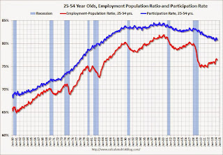 Since the overall participation rate declined recently due to cyclical (recession) and demographic (aging population, younger people staying in school) reasons, an important graph is the employment-population ratio for the key working age group: 25 to 54 years old.
In the earlier period the participation rate for this group was trending up as women joined the labor force. Since the early '90s, the participation rate has mostly moved sideways (with a downward drift started around '00) - and with ups and downs related to the business cycle.
The 25 to 54 participation rate was unchanged in May at 80.8%, and the 25 to 54 employment population ratio decreased to 76.4% from 76.5%. As the recovery continues, I expect the participation rate for this group to increase.
Percent Job Losses During Recessions

This graph shows the job losses from the start of the employment recession, in percentage terms - this time aligned at maximum job losses. Employment is now back above pre-recession levels and this graph will be retired until the next recession (Of course this doesn't include population growth).
In the earlier post, the graph showed the job losses aligned at the start of the employment recession.
Part Time for Economic Reasons
 From the BLS report:
The number of persons employed part time for economic reasons (sometimes referred to as involuntary part-time workers), at 7.3 million, changed little in May. These individuals were working part time because their hours had been cut back or because they were unable to find a full-time job.The number of persons working part time for economic reasons declined in May to 7.269 million from 7.465 million in April. This suggests significantly slack still in the labor market. These workers are included in the alternate measure of labor underutilization (U-6) that decreased to 12.2% in May from 12.3% in April. This is the lowest level for U-6 since October 2008.
Unemployed over 26 Weeks
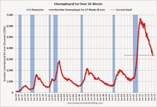 This graph shows the number of workers unemployed for 27 weeks or more.
 According to the BLS, there are 3.374 million workers who have been unemployed for more than 26 weeks and still want a job. This was down from 3.452 in April. This is trending down, but is still very high. This is the lowest level for long term unemployed since March 2009.
Long term unemployment remains one of the key labor problems in the US.
State and Local Government
 This graph shows total state and government payroll employment since January 2007. State and local governments lost jobs for four straight years. (Note: Scale doesn't start at zero to better show the change.)
 In May 2014, state and local governments added 6,000 jobs. State and local government employment is now up 107,000 from the bottom, but still 637,000 below the peak.
It appears state and local employment employment is now increasing. Of course Federal government layoffs are ongoing (another 5,000 jobs lost in May).
May Employment Report: 217,000 Jobs, 6.3% Unemployment Rate
by Calculated Risk on 6/06/2014 08:30:00 AM
From the BLS:
Total nonfarm payroll employment rose by 217,000 in May, and the unemployment rate was unchanged at 6.3 percent, the U.S. Bureau of Labor Statistics reported today.
...
After revision, the change in total nonfarm employment for March remained +203,000, and the change for April was revised from +288,000 to +282,000. With these revisions, employment gains in March and April were 6,000 lower than previously reported.
 Click on graph for larger image.
The headline number was at expectations of 213,000 payroll jobs added.
The first graph shows the job losses from the start of the employment recession, in percentage terms, compared to previous post WWII recessions. The dotted line is ex-Census hiring.
This shows the depth of the recent employment recession - worse than any other post-war recession - and the relatively slow recovery due to the lingering effects of the housing bust and financial crisis.

Total employment is now 98 thousand above the pre-recession peak and at an all time high. It is probably time to retire this graph - until the next recession.
NOTE: The second graph is the change in payroll jobs ex-Census - meaning the impact of the decennial Census temporary hires and layoffs is removed to show the underlying payroll changes.
The third graph shows the employment population ratio and the participation rate.
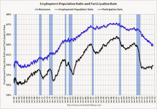 The Labor Force Participation Rate was unchanged in May at 62.8%. This is the percentage of the working age population in the labor force. A large portion of the recent decline in the participation rate is due to demographics.
The Employment-Population ratio was unchanged in May at 58.9% (black line).
I'll post the 25 to 54 age group employment-population ratio graph later.
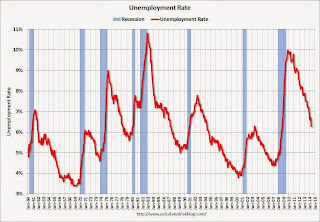 The fourth graph shows the unemployment rate.
 The unemployment rate was unchanged in May at 6.3%.
This was a solid employment report, and total non-farm employment is now at a new all time high.
I'll have much more later ...
Thursday, June 05, 2014
Friday: Jobs, Jobs, Jobs
by Calculated Risk on 6/05/2014 09:47:00 PM
Some great graphs from Nick Timiraos at the WSJ: Mortgage Rates Are Falling, So Where Are the Home Buyers?
True, mortgage rates are low—as low as they’ve been in almost 12 months. But in the same way that shoppers may not be lured by “low prices” at a department store that is always advertising a sale, mortgage rates at 4.1% may not be seen as a steal by buyers who lived with rates that were even lower for all of 2012 and the first half of 2013—especially considering that prices have moved higher.Check out the graphs!
Friday:
• At 8:30 AM ET, the Employment Report for May. The consensus is for an increase of 213,000 non-farm payroll jobs in May, down from the 288,000 non-farm payroll jobs added in April. The consensus is for the unemployment rate to increase to 6.4% in May. There are 406 thousand more private sector jobs now than when the recession started in 2007, but total employment is still 113 thousand below the pre-recession peak.
• At 3:00 PM, Consumer Credit for April from the Federal Reserve. The consensus is for credit to increase $15.5 billion.
Mortgage Equity Withdrawal Still Negative in Q1 2014
by Calculated Risk on 6/05/2014 06:55:00 PM
Note: This is not Mortgage Equity Withdrawal (MEW) data from the Fed. The last MEW data from Fed economist Dr. Kennedy was for Q4 2008.
The following data is calculated from the Fed's Flow of Funds data (released this morning) and the BEA supplement data on single family structure investment. This is an aggregate number, and is a combination of homeowners extracting equity - hence the name "MEW", but there is little MEW right now - and normal principal payments and debt cancellation.
For Q1 2014, the Net Equity Extraction was minus $74 billion, or a negative 2.3% of Disposable Personal Income (DPI).
 Click on graph for larger image.
This graph shows the net equity extraction, or mortgage equity withdrawal (MEW), results, using the Flow of Funds (and BEA data) compared to the Kennedy-Greenspan method.
There are smaller seasonal swings right now, perhaps because there is a little actual MEW (this is heavily impacted by debt cancellation right now).
The Fed's Flow of Funds report showed that the amount of mortgage debt outstanding decreased by $37 billion in Q1. Compared to recent years, this was a small decrease in mortgage debt.
The Flow of Funds report also showed that Mortgage debt has declined by almost $1.3 trillion since the peak. This decline is mostly because of debt cancellation per foreclosures and short sales, and some from modifications. There has also been some reduction in mortgage debt as homeowners paid down their mortgages so they could refinance. With residential investment increasing, and a slower rate of debt cancellation, it is possible that MEW will turn positive again soon.
For reference:
Dr. James Kennedy also has a simple method for calculating equity extraction: "A Simple Method for Estimating Gross Equity Extracted from Housing Wealth". Here is a companion spread sheet (the above uses my simple method).
For those interested in the last Kennedy data included in the graph, the spreadsheet from the Fed is available here.


