by Calculated Risk on 6/24/2014 04:20:00 PM
Tuesday, June 24, 2014
House Prices: Real Prices and Price-to-Rent Ratio decline slightly in April
I've been expecting a slowdown in year-over-year prices as "For Sale" inventory increases, and it appears the slowdown has started. The Case-Shiller Composite 20 index was up 10.8% year-over-year in April; the smallest year-over-year increase since early 2013. Still, this is a very strong year-over-year change.
On a seasonally adjusted monthly basis, the Case-Shiller Composite 20 index was up 0.2% in April - and the Composite 10 was close to unchanged - the smallest monthly increase since prices bottomed in early 2012.
On a real basis (inflation adjusted), prices actually declined slightly for the first time since 2012. The price-rent ratio also declined slightly in April for the Case-Shiller Composite 20 index.
It is important to look at prices in real terms (inflation adjusted). Case-Shiller, CoreLogic and others report nominal house prices. As an example, if a house price was $200,000 in January 2000, the price would be close to $278,000 today adjusted for inflation (39%). That is why the second graph below is important - this shows "real" prices (adjusted for inflation).
Nominal House Prices
 The first graph shows the quarterly Case-Shiller National Index SA (through Q1 2014), and the monthly Case-Shiller Composite 20 SA and CoreLogic House Price Indexes (through April) in nominal terms as reported.
In nominal terms, the Case-Shiller National index (SA) is back to mid-2004 levels (and also back up to Q2 2008), and the Case-Shiller Composite 20 Index (SA) is back to November 2004 levels, and the CoreLogic index (NSA) is back to December 2004.
Real House Prices
 The second graph shows the same three indexes in real terms (adjusted for inflation using CPI less Shelter). Note: some people use other inflation measures to adjust for real prices.
In real terms, the National index is back to Q4 2001 levels, the Composite 20 index is back to August 2002, and the CoreLogic index back to December 2002.
In real terms, house prices are back to early '00s levels.
Price-to-Rent
In October 2004, Fed economist John Krainer and researcher Chishen Wei wrote a Fed letter on price to rent ratios: House Prices and Fundamental Value. Kainer and Wei presented a price-to-rent ratio using the OFHEO house price index and the Owners' Equivalent Rent (OER) from the BLS.
 Here is a similar graph using the Case-Shiller National, Composite 20 and CoreLogic House Price Indexes.
This graph shows the price to rent ratio (January 1998 = 1.0).
On a price-to-rent basis, the Case-Shiller National index is back to Q1 2002 levels, the Composite 20 index is back to December 2002 levels, and the CoreLogic index is back to April 2003.
In real terms, and as a price-to-rent ratio, prices are mostly back to early 2000 levels.
Comments on Housing and the New Home Sales report
by Calculated Risk on 6/24/2014 01:39:00 PM
In early May I wrote: What's Right with Housing? I concluded with "Housing is a slow moving market - and the recovery will not be smooth or fast with all the residual problems. But overall housing is clearly improving and the outlook remains positive for the next few years."
Here are a few positive updates:
1) Existing home sales were down 5.0% year-over-year in May. This is good news because the decline is due to fewer foreclosures and short sales.
2) Mortgage delinquencies are down sharply. See: Black Knight: Mortgage Loans in Foreclosure Process Lowest since July 2008 and Fannie Mae and Freddie Mac: Mortgage Serious Delinquency rate declined in April
3) The impact from rising mortgage rates is mostly behind us. In fact, mortgage rates are now down year-over-year. On June 23, 2013, 30 year mortgage rates were at 4.49%. On June 23, 2014, 30 year fixed rates were at 4.18%.
4) Existing home inventory is increasing, and house price increases are slowing. Sometimes rising inventory is a sign of trouble (I was pointing to this in 2005), but now inventory is so low that it is a positive that inventory is increasing. This will also slow house price increases (I think that will be a positive for housing too - a more normal market).
Overall the housing recovery is ongoing and should continue.
Also this morning the Census Bureau reported that new home sales were at a seasonally adjusted annual rate (SAAR) of 504 thousand in May. That is the highest level since May 2008. As usual, I don't read too much into any one report. In fact, through May this year, sales were 196,000, Not seasonally adjusted (NSA) - only up 2% compared to the same period in 2013 - not much of an increase.
This was a disappointing start to the year, probably mostly due to higher mortgage rates and higher prices. Also there were probably supply constraints in some areas and credit remains difficult for many potential borrowers.
Also early 2013 was a difficult comparison period. Annual sales in 2013 were up 16.3% from 2012, but sales in the first five months of 2013 were up 23% from the same period in 2012!
 Click on graph for larger image.
This graph shows new home sales for 2013 and 2014 by month (Seasonally Adjusted Annual Rate).
The comparisons to last year will be a little easier starting in July, and I still expect to see solid year-over-year growth later this year.
And here is another update to the "distressing gap" graph that I first started posting several years ago to show the emerging gap caused by distressed sales. Now I'm looking for the gap to close over the next few years.
 The "distressing gap" graph shows existing home sales (left axis) and new home sales (right axis) through May 2014. This graph starts in 1994, but the relationship has been fairly steady back to the '60s.
Following the housing bubble and bust, the "distressing gap" appeared mostly because of distressed sales.
I expect existing home sales to mostly move sideways (distressed sales will slowly decline and be offset by more conventional / equity sales). And I expect this gap to slowly close, mostly from an increase in new home sales.
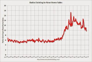 Another way to look at this is a ratio of existing to new home sales.
This ratio was fairly stable from 1994 through 2006, and then the flood of distressed sales kept the number of existing home sales elevated and depressed new home sales. (Note: This ratio was fairly stable back to the early '70s, but I only have annual data for the earlier years).
In general the ratio has been trending down - and is currently at the lowest level since November 2008. I expect this ratio to continue to trend down over the next several years as the number of distressed sales declines and new home sales increase.
Note: Existing home sales are counted when transactions are closed, and new home sales are counted when contracts are signed. So the timing of sales is different.
New Home Sales increase sharply to 504,000 Annual Rate in May
by Calculated Risk on 6/24/2014 10:00:00 AM
The Census Bureau reports New Home Sales in May were at a seasonally adjusted annual rate (SAAR) of 504 thousand.
April sales were revised down from 433 thousand to 425 thousand, and March sales were revised up from 407 thousand to 410 thousand.
Sales of new single-family houses in May 2014 were at a seasonally adjusted annual rate of 504,000, according to estimates released jointly today by the U.S. Census Bureau and the Department of Housing and Urban Development. This is 18.6 percent above the revised April rate of 425,000 and is 16.9 percent above the May 2013 estimate of 431,000.
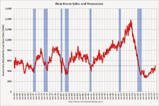 Click on graph for larger image.
The first graph shows New Home Sales vs. recessions since 1963. The dashed line is the current sales rate.
This is the highest sales rate since May 2008. Even with the increase in sales over the previous two years, new home sales are still just above the bottom for previous recessions.
The second graph shows New Home Months of Supply.
 The months of supply decreased in May to 4.5 months from 5.3 months in April.
 The all time record was 12.1 months of supply in January 2009.
This is now in the normal range (less than 6 months supply is normal).
"The seasonally adjusted estimate of new houses for sale at the end of May was 189,000. This represents a supply of 4.5 months at the current sales rate."
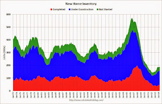 On inventory, according to the Census Bureau:
 "A house is considered for sale when a permit to build has been issued in permit-issuing places or work has begun on the footings or foundation in nonpermit areas and a sales contract has not been signed nor a deposit accepted."Starting in 1973 the Census Bureau broke this down into three categories: Not Started, Under Construction, and Completed.
The third graph shows the three categories of inventory starting in 1973.
The inventory of completed homes for sale is still low, and the combined total of completed and under construction is also low.
 The last graph shows sales NSA (monthly sales, not seasonally adjusted annual rate).
In May 2014 (red column), 49 thousand new homes were sold (NSA). Last year 40 thousand homes were also sold in May. The high for May was 120 thousand in 2005, and the low for May was 26 thousand in 2010.
This was well above expectations of 441,000 sales in May, and sales were up 16.9% year-over-year.
I'll have more later today .
Case-Shiller: Comp 20 House Prices increased 10.8% year-over-year in April
by Calculated Risk on 6/24/2014 09:00:00 AM
S&P/Case-Shiller released the monthly Home Price Indices for April ("April" is a 3 month average of February, March and April prices).
This release includes prices for 20 individual cities, and two composite indices (for 10 cities and 20 cities).
Note: Case-Shiller reports Not Seasonally Adjusted (NSA), I use the SA data for the graphs.
From S&P: Rate of Home Price Gains Drop Sharply, According to the S&P/Case-Shiller Home Price Indices
Data through April 2014, released today by S&P Dow Jones Indices for its S&P/Case-Shiller1 Home Price Indices ... show that the 10-City and 20-City Composites posted annual gains of 10.8%. This is a significantly lower rate when compared to last month. Nineteen of the 20 cities saw lower annual gains in April than in March.
The 10-City and 20-City Composites increased 1.0% and 1.1% in April. Seven cities – Cleveland, Las Vegas, Los Angeles, Miami, Phoenix, San Diego and San Francisco – reported lower returns than in March. ...
“Although home prices rose in April, the annual gains weakened,” says David M. Blitzer, Chairman of the Index Committee at S&P Dow Jones Indices. “Overall, prices are rising month-to-month but at a slower rate. Last year some Sunbelt cities were seeing year-over-year numbers close to 30%, now all are below 20%: Las Vegas (18.8%), Los Angeles (14.0%), Phoenix (9.8%), San Diego (15.3%) and San Francisco (18.2%). Other cities around the nation are also experiencing slower price increases."
...
In April, all cities saw prices increase with twelve cities reporting higher returns than last month. Boston gained the most with an increase of 2.9%, its highest month-over-month gain. San Francisco and Seattle trailed at +2.3%. At the bottom of the list, New York gained only 0.1%. Dallas and Denver continue to set new peaks while Detroit remains the only city below its January 2000 value.
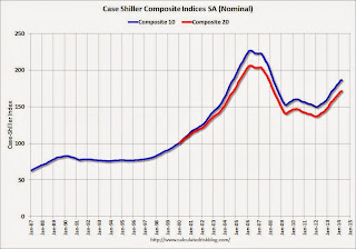 Click on graph for larger image.
 The first graph shows the nominal seasonally adjusted Composite 10 and Composite 20 indices (the Composite 20 was started in January 2000).
The Composite 10 index is off 17.8% from the peak, and unchanged in April (SA). The Composite 10 is up 24.4% from the post bubble low set in Jan 2012 (SA).
The Composite 20 index is off 16.9% from the peak, and up 0.2% (SA) in April. The Composite 20 is up 25.2% from the post-bubble low set in Jan 2012 (SA).
 The second graph shows the Year over year change in both indices.
The Composite 10 SA is up 10.8% compared to April 2013.
The Composite 20 SA is up 10.8% compared to April 2013.
Prices increased (SA) in 15 of the 20 Case-Shiller cities in April seasonally adjusted. (Prices increased in 20 of the 20 cities NSA) Prices in Las Vegas are off 43.6% from the peak, and prices in Denver and Dallas are at new highs (SA).
This was lower than the consensus forecast for a 11.4% YoY increase and suggests a slowdown in price increases. I'll have more on house prices later.
Black Knight: Mortgage Loans in Foreclosure Process Lowest since July 2008
by Calculated Risk on 6/24/2014 07:01:00 AM
According to Black Knight's First Look report for May, the percent of loans delinquent was unchanged in May compared to April, and declined by 7.6% year-over-year.
Also the percent of loans in the foreclosure process declined further in May and were down 37% over the last year. Foreclosure inventory was at the lowest level since July 2008.
Black Knight reported the U.S. mortgage delinquency rate (loans 30 or more days past due, but not in foreclosure) was unchanged at 5.62% in May. The normal rate for delinquencies is around 4.5% to 5%. The increase in delinquencies was in the 'less than 90 days' bucket.
The percent of loans in the foreclosure process declined to 1.91% in May from 2.02% in April.
The number of delinquent properties, but not in foreclosure, is down 204,000 properties year-over-year, and the number of properties in the foreclosure process is down 559,000 properties year-over-year.
Black Knight will release the complete mortgage monitor for May in early June.
| Black Knight: Percent Loans Delinquent and in Foreclosure Process | |||
|---|---|---|---|
| May 2014 | April 2014 | May 2013 | |
| Delinquent | 5.62% | 5.62% | 6.08% |
| In Foreclosure | 1.91% | 2.02% | 3.05% |
| Number of properties: | |||
| Number of properties that are 30 or more, and less than 90 days past due, but not in foreclosure: | 1,670,000 | 1,634,000 | 1,708,000 |
| Number of properties that are 90 or more days delinquent, but not in foreclosure: | 1,169,000 | 1,187,000 | 1,335,000 |
| Number of properties in foreclosure pre-sale inventory: | 966,000 | 1,016,000 | 1,525,000 |
| Total Properties | 3,805,000 | 3,837,000 | 4,569,000 |
Monday, June 23, 2014
Tuesday: New Home Sales, Case-Shiller House Prices
by Calculated Risk on 6/23/2014 09:01:00 PM
Tuesday:
• At 9:00 AM ET, the S&P/Case-Shiller House Price Index for April. Although this is the April report, it is really a 3 month average of February, March and April. The consensus is for a 11.4% year-over-year increase in the Composite 20 index (NSA) for April.
• Also at 9:00 AM, the FHFA House Price Index for April. This was original a GSE only repeat sales, however there is also an expanded index. The consensus is for a 0.5% increase.
• At 10:00 AM, New Home Sales for May from the Census Bureau. The consensus is for an in increase in sales to 441 thousand Seasonally Adjusted Annual Rate (SAAR) in May from 433 thousand in April.
• Also at 10:00 AM, the Conference Board's consumer confidence index for June. The consensus is for the index to increase to 83.7 from 83.0.
• Also at 10:00 AM, the Richmond Fed Survey of Manufacturing Activity for June. The consensus is for a reading of 7, unchanged from 7 in May.
Fed's Mike Bryan: "Torturing CPI Data until They Confess"
by Calculated Risk on 6/23/2014 06:27:00 PM
Every month I post a few key measures of inflation including the Atlanta Fed's median CPI and trimmed-mean CPI, along with core CPI and core PCE. Atlanta Fed senior economist Mike Bryan and his colleagues developed these two measures.
Here is a very informative post on inflation today from Mike Bryan: Torturing CPI Data until They Confess: Observations on Alternative Measures of Inflation
Why do price change distributions have peaked centers and very elongated tails? ... absent a clear economic rationale for this unusual distribution, it presents a measurement problem and an immediate remedy. The problem is that these long tails tend to cause the CPI (and other weighted averages of prices) to fluctuate pretty widely from month to month, but they are, in a statistical sense, tethered to that large proportion of price changes that lie in the center of the distribution.
... The median CPI is immune to the obvious analyst bias that I had been guilty of, while greatly reducing the volatility in the monthly CPI report in a way that I thought gave the Federal Reserve Bank of Cleveland a clearer reading of the central tendency of price changes.
Cecchetti and I pushed the idea to a range of trimmed-mean estimators, for which the median is simply an extreme case. Trimmed-mean estimators trim some proportion of the tails from this price-change distribution and reaggregate the interior remainder. Others extended this idea to asymmetric trims for skewed price-change distributions, as Scott Roger did for New Zealand, and to other price statistics, like the Federal Reserve Bank of Dallas's trimmed-mean PCE inflation rate.
How much one should trim from the tails isn't entirely obvious. We settled on the 16 percent trimmed mean for the CPI (that is, trimming the highest and lowest 8 percent from the tails of the CPI's price-change distribution) because this is the proportion that produced the smallest monthly volatility in the statistic while preserving the same trend as the all-items CPI.
Weekly Update: Housing Tracker Existing Home Inventory up 13.6% year-over-year on June 23rd
by Calculated Risk on 6/23/2014 03:58:00 PM
Here is another weekly update on housing inventory ...
There is a clear seasonal pattern for inventory, with the low point for inventory in late December or early January, and then usually peaking in mid-to-late summer.
The Realtor (NAR) data is monthly and released with a lag (the most recent data released this morning was for May). However Ben at Housing Tracker (Department of Numbers) has provided me some weekly inventory data for the last several years.
 Click on graph for larger image.
This graph shows the Housing Tracker reported weekly inventory for the 54 metro areas for 2010, 2011, 2012, 2013 and 2014.
In 2011 and 2012, inventory only increased slightly early in the year and then declined significantly through the end of each year.
In 2013 (Blue), inventory increased for most of the year before declining seasonally during the holidays. Inventory in 2013 finished up 2.7% YoY compared to 2012.
Inventory in 2014 (Red) is now 13.6% above the same week in 2013. (Note: There are differences in how the data is collected between Housing Tracker and the NAR).
I expect inventory to be above the same week in 2012 at the end of the month (prices bottomed in early 2012). This increase in inventory should slow price increases, and might lead to price declines in some areas.
Note: One of the key questions for 2014 will be: How much will inventory increase? My guess was inventory would be up 10% to 15% year-over-year at the end of 2014. Right now it looks like inventory might increase more than I expected.
Black Knight (formerly LPS): House Price Index up 0.9% in April, Up 6.4% year-over-year
by Calculated Risk on 6/23/2014 02:16:00 PM
Notes: I follow several house price indexes (Case-Shiller, CoreLogic, Black Knight (formerly LPS), Zillow, FHFA, FNC and more). The timing of different house prices indexes can be a little confusing. Black Knight uses the current month closings only (not a three month average like Case-Shiller or a weighted average like CoreLogic), excludes short sales and REOs, and is not seasonally adjusted.
From LPS: U.S. Home Prices Up 0.9 Percent for the Month; Up 6.4 Percent Year-Over-Year
Today, the Data and Analytics division of Black Knight Financial Services (formerly the LPS Data & Analytics division) released its latest Home Price Index (HPI) report, based on February 2014 residential real estate transactions. ... The Black Knight HPI represents the price of non-distressed sales by taking into account price discounts for REO and short sales.The year-over-year increases have been getting steadily smaller for the last 7 months - as shown in the table below:
| Month | YoY House Price Increase |
|---|---|
| Jan-13 | 6.7% |
| Feb-13 | 7.3% |
| Mar-13 | 7.6% |
| Apr-13 | 8.1% |
| May-13 | 7.9% |
| Jun-13 | 8.4% |
| Jul-13 | 8.7% |
| Aug-13 | 9.0% |
| Sep-13 | 9.0% |
| Oct-13 | 8.8% |
| Nov-13 | 8.5% |
| Dec-13 | 8.4% |
| Jan-14 | 8.0% |
| Feb-14 | 7.6% |
| Mar-14 | 7.0% |
| Apr-14 | 6.4% |
The LPS HPI is off 12.0% from the peak in June 2006.
Note: The press release has data for the 20 largest states, and 40 MSAs.
LPS shows prices off 43.3% from the peak in Las Vegas, off 36.2% in Orlando, and 32.5% off from the peak in Riverside-San Bernardino, CA (Inland Empire). Prices are at new highs in Colorado and Texas (Denver, Austin, Dallas, Houston and San Antonio metros). Prices are also at new highs in San Jose, CA and in Nashville, TN.
Note: Case-Shiller for April will be released tomorrow.
Comments on Existing Home Sales
by Calculated Risk on 6/23/2014 12:05:00 PM
The two key numbers in the existing home sales report right now are: 1) inventory, and 2) the percent of distressed sales.
The most important number in the report each month is inventory. This morning the NAR reported that inventory was up 6.0% year-over-year in May. This is a smaller increase than other sources suggest, and it is important to note that the NAR inventory data is "noisy" (and difficult to forecast based on other data). A few other points:
• The headline NAR inventory number is NOT seasonally adjusted (and there is a clear seasonal pattern).
• Inventory is still very low, and with the low level of inventory, there is still upward pressure on prices.
• I expect inventory to increase in 2014, and I expect the year-over-year increase to be in the 10% to 15% range by the end of 2014 (maybe even higher).
 Click on graph for larger image.
The NAR does not seasonally adjust inventory, even though there is a clear seasonal pattern. Trulia chief economist Jed Kolko sent me the seasonally adjusted inventory.
This shows that inventory bottomed in January 2013 (on a seasonally adjusted basis), and inventory is now up about 9.4% from the bottom. On a seasonally adjusted basis, inventory was up slightly in May compared to April.
Important: The NAR reports active listings, and although there is some variability across the country in what is considered active, many "contingent short sales" are not included. "Contingent short sales" are strange listings since the listings were frequently NEVER on the market (they were listed as contingent), and they hang around for a long time - they are probably more closely related to shadow inventory than active inventory. However when we compare inventory to 2005, we need to remember there were no "short sale contingent" listings in 2005. In the areas I track, the number of "short sale contingent" listings is also down sharply year-over-year.
Another key point: The NAR reported total sales were down 5.0% from May 2013, but normal equity sales were probably up from May 2013, and distressed sales down sharply. The NAR reported that 11% of sales were distressed in May (from a survey that is far from perfect):
Distressed homes – foreclosures and short sales – accounted for 11 percent of May sales, down from 18 percent in May 2013. Eight percent of May sales were foreclosures and three percent were short sales.Last year the NAR reported that 18% of sales were distressed sales.
A rough estimate: Sales in May 2013 were reported at 5.15 million SAAR with 18% distressed. That gives 927 thousand distressed (annual rate), and 4.22 million equity / non-distressed. In May 2014, sales were 4.89 million SAAR, with 11% distressed. That gives 538 thousand distressed - a decline of 42% from May 2013 - and 4.35 million equity. Although this survey isn't perfect, this suggests distressed sales were down sharply - and normal sales up slightly (even with less investor buying).
The following graph shows existing home sales Not Seasonally Adjusted (NSA).
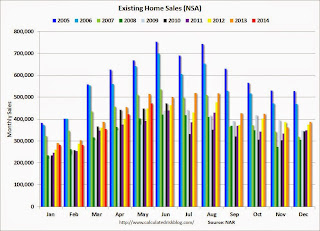 Click on graph for larger image.
Sales NSA in May (red column) were below the level of sales in May 2013, and above sales for 2008 through 2012.
Overall this report was a solid report.
Earlier:
• Existing Home Sales in May: 4.89 million SAAR, Inventory up 6.0% Year-over-year


