by Calculated Risk on 8/12/2014 02:18:00 PM
Tuesday, August 12, 2014
Treasury: Budget Deficit declined in July 2014 compared to July 2013
The Treasury released the July Monthly Treasury Statement today. The Treasury reported a $94 billion deficit in July 2014, down from $97 billion in July 2013. For fiscal year 2014 through July, the deficit was $460 billion compared to $607 billion for the same period in fiscal 2013 (the fiscal year end in September).
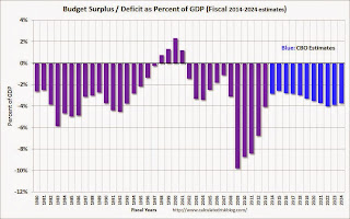
In April, the Congressional Budget Office (CBO) released their new Updated Budget Projections: 2014 to 2024. The projected budget deficits were reduced for each of the next ten years, and the projected deficit for 2014 was revised down from 3.0% to 2.8%. Based on the Treasury release today, I expect the deficit for fiscal 2014 to be close to the current CBO projection. The CBO will publish new budget projections this month.
 Click on graph for larger image.
This graph shows the actual (purple) budget deficit each year as a percent of GDP, and an estimate for the next ten years based on estimates from the CBO.
The deficit should decline further next year and is projected to stay below 3% for the next 5 years.
The decline in the deficit, as a percent of GDP, from almost 10% to under 3% in 2014 is the fastest decline in the deficit since the demobilization following WWII (not shown on graph).
As an aside, the states are doing better too. In California: Controller Releases July Cash Update
State Controller John Chiang today released his monthly report covering California's cash balance, receipts and disbursements in July 2014. Total revenues for the first month of Fiscal Year 2014-15 totaled $5.4 billion, beating estimates in the Budget Act by $231.9 million, or 4.5 percent.
"Even though July is usually a weak revenue collection month, the new fiscal year is off to a strong start," Chiang said. "While the State plans to borrow operating funds through revenue anticipation notes, the $2.8 billion needed solely for smoothing out the timing of revenues is at the lowest level since the 2006-07 fiscal year. If we can continue to reduce short- and long-term debts, we can continue to improve our fiscal condition."
emphasis added
BLS: Jobs Openings increased to 4.7 million in June, Highest since 2001
by Calculated Risk on 8/12/2014 10:00:00 AM
From the BLS: Job Openings and Labor Turnover Summary
There were 4.7 million job openings on the last business day of June, little changed from 4.6 million in May, the U.S. Bureau of Labor Statistics reported today. ...The following graph shows job openings (yellow line), hires (dark blue), Layoff, Discharges and other (red column), and Quits (light blue column) from the JOLTS.
...
Quits are generally voluntary separations initiated by the employee. Therefore, the quits rate can serve as a measure of workers’ willingness or ability to leave jobs. ... The number of quits (not seasonally adjusted) increased over the 12 months ending in June for total nonfarm and total private. The number of quits was little changed for government.
This series started in December 2000.
Note: The difference between JOLTS hires and separations is similar to the CES (payroll survey) net jobs headline numbers. This report is for June, the most recent employment report was for July.
 Click on graph for larger image.
Note that hires (dark blue) and total separations (red and light blue columns stacked) are pretty close each month. This is a measure of labor market turnover. When the blue line is above the two stacked columns, the economy is adding net jobs - when it is below the columns, the economy is losing jobs.
Jobs openings increased in June to 4.671 million from 4.577 million in May. This is the highest level since February 2001.
The number of job openings (yellow) are up 18% year-over-year compared to June 2013.
Quits are up 15% year-over-year. These are voluntary separations. (see light blue columns at bottom of graph for trend for "quits").
It is a good sign that job openings are over 4 million for the fifth consecutive month, and that quits are increasing.
NFIB: Small Business Optimism Index increases in July
by Calculated Risk on 8/12/2014 08:51:00 AM
From the National Federation of Independent Business (NFIB): Small Business Optimism Ticks Up Slightly
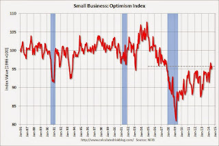
July’s Optimism Index technically rose 0.7 points to a reading of 95.7. ...Hiring plans increased to 13, the highest since 2007.
Labor Markets. NFIB owners increased employment by an average of 0.01 workers per firm in July (seasonally adjusted), the tenth positive month in a row and the best string of gains since 2006.
emphasis added
And in another good sign, the percent of firms reporting "poor sales" as the single most important problem has fallen to 13, down from 16 last year - and "taxes" and "regulations" are the top problems at 22 (taxes are usually reported as the top problem during good times).
 Click on graph for larger image.
This graph shows the small business optimism index since 1986.
The index increased to 95.7 in July from 95.0 in June.
Note: There is high percentage of real estate related businesses in the "small business" survey - and this has held down over all optimism.
Monday, August 11, 2014
Tuesday: Job Openings
by Calculated Risk on 8/11/2014 08:01:00 PM
The Job Openings and Labor Turnover Survey (JOLTS) is a key monthly report used by the Federal Reserve. The June survey results will be released tomorrow.
The Atlanta Fed has a great graphic on the labor market that uses three parameters from JOLTS (See: Labor Market Spider Chart©).
Dave Altig includes the spider chart in a post at the Atlanta Fed's Macroblog: Getting There?
Regarding labor markets, here is our favorite type of snapshot, courtesy of the Atlanta Fed’s Labor Market Spider Chart:See this link Labor Market Spider Chart© for a larger interactive version of the spider chart. Note that Job Vacancies, Hires and Quits are all from JOLTS - and we will get an update Tuesday.
There is a lot to like in that picture. Leading indicators, payroll employment, vacancies posted by employers, and small business confidence are fully recovered relative to their levels at the end of the Great Recession.
On the less positive side, the numbers of people who are marginally attached or who are working part-time while desiring full-time hours remain elevated, and the overall job-finding rate is still well below prerecession levels. Even so, these indicators are noticeably better than they were at this time last year.
That year-over-year improvement is an important observation: the period from mid-2012 to mid-2013 showed little progress in the broader measures of labor-market performance that we place in the resource “utilization” category. During the past year, these broad measures have improved at the same relative pace as the standard unemployment statistic.
And a post from John Robertson at Macroblog: Are We There Yet?
Tuesday:
• At 7:30 AM ET, the NFIB Small Business Optimism Index for July.
• At 10:00 AM, the Job Openings and Labor Turnover Survey for June from the BLS. In May, the number of job openings (yellow) were up 19% year-over-year compared to May 2013, and Quits were up 15% year-over-year.
• At 2:00 PM, the Monthly Treasury Budget Statement for July. Note: The CBO's estimate is the deficit through July in fiscal 2014 was $462 billion, compared to $607 billion for the same period in fiscal 2013.
Weekly Update: Housing Tracker Existing Home Inventory up 13.3% YoY on Aug 11th
by Calculated Risk on 8/11/2014 04:34:00 PM
Here is another weekly update on housing inventory ...
There is a clear seasonal pattern for inventory, with the low point for inventory in late December or early January, and then usually peaking in mid-to-late summer.
The Realtor (NAR) data is monthly and released with a lag (the most recent data released was for June and indicated inventory was up 6.5% year-over-year).
Fortunately Ben at Housing Tracker (Department of Numbers) has provided me some weekly inventory data, for 54 metro areas, for the last several years.
 Click on graph for larger image.
This graph shows the Housing Tracker reported weekly inventory for the 54 metro areas for 2010, 2011, 2012, 2013 and 2014.
In 2011 and 2012, inventory only increased slightly early in the year and then declined significantly through the end of each year.
In 2013 (Blue), inventory increased for most of the year before declining seasonally during the holidays.
Inventory in 2014 (Red) is now 13.3% above the same week in 2013.
Inventory is also about 3.2% above the same week in 2012. According to several of the house price indexes, house prices bottomed in early 2012, and low inventories were a key reason for the subsequent price increases. Now that inventory is back above 2012 levels, I expect house price increases to slow (and possibly decline in some areas).
 The second graph is monthly using the NAR data for several selected years. The steady increase in inventory in 2005 (yellow) helped me call the top of the housing bubble.
Inventory was high from 2006 through 2010, with the peak year in 2007 (orange on this graph).
Inventory started declining significantly in 2011 (light blue), and the helped me call the bottom for house prices in February 2012 (see The Housing Bottom is Here).
Now inventory is increasing, although using the NAR monthly data, inventory was still below the level in 2012 for June (6.5% above June 2013).
Note: One of the key questions for 2014 will be: How much will inventory increase? My guess was inventory would be up 10% to 15% year-over-year at the end of 2014 based on the NAR report. Right now it looks like inventory might increase more than I expected.
Kolko: "Let’s Improve, Not Ignore, Seasonal Adjustment of Housing Data"
by Calculated Risk on 8/11/2014 01:15:00 PM
CR Note: This is from Trulia chief economist Jed Kolko: Let’s Improve, Not Ignore, Seasonal Adjustment of Housing Data
The housing crisis substantially changed the seasonal pattern of housing activity: relative to conventional home sales, which peak in summer, distressed home sales are more evenly spread throughout the year and sell at a discount. As a result, in years when distressed sales constitute a larger share of overall sales, the seasonal swings in home prices get bigger while the seasonal swings in sales volumes get smaller.
Sharply changing seasonal patterns create problems for seasonal adjustment methods, which typically estimate seasonal adjustment factors by averaging several years’ worth of observed seasonal patterns. A sharp but ultimately temporary change in the seasonal pattern for housing activity affects seasonal adjustment factors more gradually and for more years than it should. Despite the recent normalizing of the housing market, seasonal adjustment factors are still based, in part, on patterns observed at the height of the foreclosure crisis, causing home price indices to be over-adjusted in some months and under-adjusted in others.
Unfortunately, many have concluded that the solution to the problem of changing seasonal patterns is to downplay or ignore seasonally adjusted housing data until the foreclosure crisis is far enough in the past that it is no longer averaged into seasonal adjustment factors. Standard and Poor’s, publishers of the Case-Shiller home-price index, themselves warned in 2010 that “the unadjusted series is a more reliable indicator and, thus, reports should focus on the year-over-year changes where seasonal shifts are not a factor. Additionally, if monthly changes are considered, the unadjusted series should be used.” Even today, Case-Shiller home-price index press releases continue to emphasize non-seasonally-adjusted (NSA) changes over seasonally adjusted (SA) changes.
But ignoring seasonality during and after the foreclosure crisis is the opposite of what we should be doing. Changing seasonal patterns make seasonal adjustment more important. Because the foreclosure crisis caused seasonal swings in home prices to increase, NSA data were even less reflective of the true underlying trend than in normal times. Furthermore, when the true seasonal pattern is shifting, seasonality affects year-over-year changes (y/y), not just month-over-month (m/m) and other intra-year changes. Y/y changes are immune from seasonality concerns only if the true seasonal effect is the same for a given month in successive years.
The solution is to develop better seasonal adjustment factors (SAFs). If distressed sales account for the change in seasonal patterns, then the shift in SAFs over these years should reflect the timing and magnitude of the distressed sales share. CoreLogic data show that the distressed share (REO plus short sales) of home sales rose sharply around 2008 and since then have fallen more than halfway back to normal:
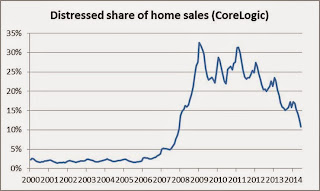
The SAFs for the Case-Shiller index became more extreme between the pre-crisis years of the early 2000s and the height of the foreclosure crisis. However, the Case-Shiller SAFs increased in amplitude much more gradually than the spike in the distressed sales share, and in 2014 the SAFs remain near their most extreme levels despite the drop in distressed share.

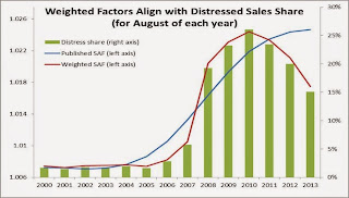
So, consider this simple adjustment: for each calendar month, treat the average Case-Shiller SAFs prior to the increase in amplitude (roughly 2004 and earlier) as the norm for that month, and treat the most extreme SAF for that month over the whole time period as an accurate reflection of the seasonal pattern when the distressed sales share peaked. Then, using this set of normal and extreme SAFs, calculate the “weighted seasonal adjustment factor” (WSAF) as the average of the normal and extreme SAF for each month, weighed by how the actual share of distressed sales compared with the extreme and normal share of distressed sales for that month. The resulting WSAFs look like this:

The WSAF series closely reflects timing of the rise and fall in distressed sales share, while the Case-Shiller SAF series changes much more slowly, as is clear from looking at the distressed share, the SAFs, and WSAFs for every August since 2000:
Applying these WSAFs to the unadjusted Case-Shiller 20-city index yields a weighted seasonally adjusted (WSA) index. We can compare the published NSA and SA price changes with the WSA price changes that reflect this alternative seasonal adjustment method. While the m/m SA change for May was -0.3%, the m/m WSA change was +0.3%. Here are NSA, SA, and WSA m/m changes since January 2013:
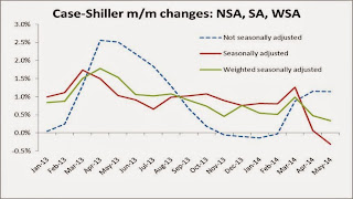
The WSA changes show that there has been a gradual slowdown in home price gains, but prices are still increasing. WSA price changes offer no evidence that the housing recovery has gone into reverse, even though the SA index showed prices essentially flat in April and falling in May.
Finally: what do these WSAFs tell us about the value of seasonal adjustment? Two things. First: even though the published SA series is based on factors that don’t reflect the time-pattern of the foreclosure crisis perfectly, the published SA changes and the WSA changes look more similar to each other than either does to the NSA changes. If the WSA is a correct approach, then even the flawed published SA home price changes come a lot closer to the true m/m seasonally adjusted trend than the NSA price changes do. In other words, we should not ignore seasonal adjustment and rely on NSA m/m changes.
Second: when seasonal patterns are changing sharply, seasonality can affect y/y changes, too, not just intra-year changes. In March 2014, for instance, the NSA and SA y/y price increases for the Case-Shiller 20-city index were both 12.4%, but the WSA y/y price increase was 12.0%. The WSA y/y change is lower because it properly uses a more modest upward seasonal adjustment for March 2014 than for March 2013, but the published SAFs changed little between March 2013 and March 2014, and of course the NSA y/y change assumes that the seasonal factors in successive Marches are identical and cancel each other out. In other months, though, such as May 2014, the WSA y/y change is quite similar to the NSA and SA y/y changes.
The solution to changing seasonal patterns, therefore, is to develop better seasonal adjustment factors, not to ignore seasonality. Using flawed seasonal adjustment factors – or, worse, relying on non-seasonally-adjusted data – clouds our view of the housing recovery, both today and for several years to come.
FNC: Residential Property Values increased 8.0% year-over-year in June
by Calculated Risk on 8/11/2014 10:27:00 AM
In addition to Case-Shiller, CoreLogic, I'm also watching the FNC, Zillow and several other house price indexes.
FNC released their June index data today. FNC reported that their Residential Price Index™ (RPI) indicates that U.S. residential property values increased 0.8% from May to June (Composite 100 index, not seasonally adjusted). The other RPIs (10-MSA, 20-MSA, 30-MSA) increased between 0.8% and 0.9% in June. These indexes are not seasonally adjusted (NSA), and are for non-distressed home sales (excluding foreclosure auction sales, REO sales, and short sales).
The year-over-year (YoY) change slowed in May, with the 100-MSA composite up 8.0% compared to June 2013. For FNC, the YoY increase has been slowing since peaking in February at 9.4%.
The index is still down 20.0% from the peak in 2006.
 Click on graph for larger image.
This graph shows the year-over-year change based on the FNC index (four composites) through June 2014. The FNC indexes are hedonic price indexes using a blend of sold homes and real-time appraisals.
All of the price indexes are now showing a slowdown in price increases.
The June Case-Shiller index will be released on Tuesday, August 26th, and I expect Case-Shiller to show a further slowdown in YoY price increases.
Fed's Fischer: "The Great Recession--Moving Ahead"
by Calculated Risk on 8/11/2014 08:31:00 AM
From Fed Vice Chairman Stanley Fischer: The Great Recession--Moving Ahead. Here is a brief excerpt:
In the United States, three major aggregate demand headwinds appear to have kept a more vigorous recovery from taking hold. The unusual weakness of the housing sector during the recovery period, the significant drag--now waning--from fiscal policy, and the negative impact from the growth slowdown abroad--particularly in Europe--are all prominent factors that have constrained the pace of economic activity.Fischer is referring to the research of Atif Mian and Amir Sufi (see: House of Debt). I expected a slow recovery in housing due to the overhang of distressed properties, but I do think more could have been done to deal with housing (although some attempts at helping housing - like the housing tax credit - were clear policy blunders).
The housing sector was at the epicenter of the U.S. financial crisis and recession and it continues to weigh on the recovery. After previous recessions, vigorous rebounds in housing activity have typically helped spur recoveries. In this episode, however, residential construction was held back by a large inventory of foreclosed and distressed properties and by tight credit conditions for construction loans and mortgages. Moreover, the wealth effect from the decline in housing prices, as well as the inability of many underwater households to take advantage of low interest rates to refinance their mortgages, may have reduced household demand for non-housing goods and services. Indeed, some researchers have argued that the failure to deal decisively with the housing problem seriously prolonged and deepened the crisis. ...
From Fischer:
The stance of U.S. fiscal policy in recent years constituted a significant drag on growth as the large budget deficit was reduced. Historically, fiscal policy has been a support during both recessions and recoveries. In part, this reflects the operation of automatic stabilizers, such as declines in tax revenues and increases in unemployment benefits, that tend to accompany a downturn in activity. In addition, discretionary fiscal policy actions typically boost growth in the years just after a recession. In the U.S., as well as in other countries--especially in Europe--fiscal policy was typically expansionary during the recent recession and early in the recovery, but discretionary fiscal policy shifted relatively fast from expansionary to contractionary as the recovery progressed. ...Both the second headwind (U.S. fiscal policy) and third headwind (slow global growth) are related to the pivot to austerity in both the U.S. and Europe.
A third headwind slowing the U.S. recovery has been unexpectedly slow global growth, which reduced export demand. Over the past several years, a number of our key trading partners have suffered negative shocks.
Sunday, August 10, 2014
Sunday Night Futures
by Calculated Risk on 8/10/2014 07:58:00 PM
Joe Weisenthal at Business Insider does a great job of tying together some of my recent posts on demographics (Thanks Joe!): The Analyst Who Nailed The Housing Crash Is Quietly Revealing The Next Big Thing.
Weisenthal concludes with some very interesting analysis from Matt Busigin:
And while we're talking about housing, we should also take just a minute to talk about inflation. Matt Busigin wrote a great piece last year, talking about the non-monetary causes of inflation, and how demographics is a much bigger driver of inflation than people realize. Many of the same factors discussed above could contribute to higher inflation, as a younger workforce moves into its first homes and first cars, and has real buying power for the first time.Monday:
• At 3:15 AM ET, Speech by Fed Vice Chairman Stanley Fischer, The Great Recession: Moving Ahead, At the Swedish Ministry of Finance Conference: The Great Recession – Moving Ahead, Stockholm, Sweden
Weekend:
• Schedule for Week of Aug 10th
From CNBC: Pre-Market Data and Bloomberg futures: the S&P futures are flat and DOW futures are up 12 (fair value).
Oil prices were down slightly over the last week with WTI futures at $97.67 per barrel and Brent at $104.91 per barrel. A year ago, WTI was at $104, and Brent was at $109 - so prices are down a little year-over-year.
Below is a graph from Gasbuddy.com for nationwide gasoline prices. Nationally prices are around $3.47 per gallon (down about a dime from a year ago). If you click on "show crude oil prices", the graph displays oil prices for WTI, not Brent; gasoline prices in most of the U.S. are impacted more by Brent prices.
| Orange County Historical Gas Price Charts Provided by GasBuddy.com |
Update: Framing Lumber Prices
by Calculated Risk on 8/10/2014 02:33:00 PM
Here is another graph on framing lumber prices. Early in 2013 lumber prices came close to the housing bubble highs. Then prices declined over 25% from the highs by mid-year 2013.
The price increases in early 2013 were due to a surge in demand (more housing starts) and supply constraints (framing lumber suppliers were working to bring more capacity online).
Prices didn't increase as much early in 2014 (more supply, smaller "surge" in demand), however prices haven't fallen as sharply either.
 Click on graph for larger image in graph gallery.
This graph shows two measures of lumber prices: 1) Framing Lumber from Random Lengths through last week (via NAHB), and 2) CME framing futures.
Right now Random Lengths prices are up about 8% from a year ago, and CME futures are up about 7% year-over-year.


