by Calculated Risk on 8/26/2014 02:11:00 PM
Tuesday, August 26, 2014
Zillow: Negative Equity declines further in Q2 2014
From Zillow: High Negative Equity Causing Generational Housing Gridlock
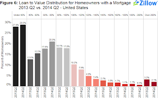
According to the second quarter Zillow Negative Equity Report, the national negative equity rate continued to decline in 2014 Q2, falling to 17 percent, down 14.4 percentage points from its peak (31.4 percent) in the first quarter of 2012. Negative equity has fallen for nine consecutive quarters as home values have risen. However, more than 8.7 million homeowners with a mortgage still remain underwaterThe following graph from Zillow shows negative equity by Loan-to-Value (LTV) in Q2 2014 compared to Q2 2013.
emphasis added
 Click on graph for larger image.
From Zillow:
Figure 6 shows the loan-to-value (LTV) distribution for homeowners with a mortgage in 2014 Q2 versus 2013 Q2. The bulk of underwater homeowners, roughly 7.9 percent, are underwater by up to 20 percent of their loan value and will soon cross over into positive equity territory.Almost half of the borrowers with negative equity have a LTV of 100% to 120% (7.9% in Q2 2014). Most of these borrowers are current on their mortgages - and they have probably either refinanced with HARP or the loans are well seasoned (most of these properties were purchased in the 2004 through 2006 period, so borrowers have been current for eight years or so). In a few years, these borrowers will have positive equity.
The key concern is all those borrowers with LTVs above 140% (about 5.7% of properties with a mortgage according to Zillow). It will take many years to return to positive equity ... and a large percentage of these properties will eventually be distressed sales (short sales or foreclosures).
Note: CoreLogic will release their Q2 negative equity report in the next couple of weeks. For Q1, CoreLogic reported there were 6.3 million properties with negative equity, and that will be down further in Q2 2014.
House Prices: Better Seasonal Adjustment; Real Prices and Price-to-Rent Ratio Decline in June
by Calculated Risk on 8/26/2014 11:22:00 AM
This morning, S&P reported that the Composite 20 index declined 0.2% in June seasonally adjusted. However, it appears the seasonal adjustment has been distorted by the high level of distressed sales in recent years. Trulia's Jed Kolko wrote last month: "Let’s Improve, Not Ignore, Seasonal Adjustment of Housing Data"
The housing crisis substantially changed the seasonal pattern of housing activity: relative to conventional home sales, which peak in summer, distressed home sales are more evenly spread throughout the year and sell at a discount. As a result, in years when distressed sales constitute a larger share of overall sales, the seasonal swings in home prices get bigger while the seasonal swings in sales volumes get smaller.
Sharply changing seasonal patterns create problems for seasonal adjustment methods, which typically estimate seasonal adjustment factors by averaging several years’ worth of observed seasonal patterns. A sharp but ultimately temporary change in the seasonal pattern for housing activity affects seasonal adjustment factors more gradually and for more years than it should. Despite the recent normalizing of the housing market, seasonal adjustment factors are still based, in part, on patterns observed at the height of the foreclosure crisis, causing home price indices to be over-adjusted in some months and under-adjusted in others.
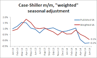 Kolko proposed a better seasonal adjustment:
This graph from Kolko shows the weighted seasonal adjustment (see Kolko's article for a description of his method). Kolko calculates that prices increased 0.1% on a weighted seasonal adjustment basis in June.
I've been expecting a slowdown in year-over-year prices as "For Sale" inventory increases, and the slowdown is here! The Case-Shiller Composite 20 index was up 8.1% year-over-year in June; the smallest year-over-year increase since December 2012.
This is still a very strong year-over-year change, but on a seasonally adjusted monthly basis, the Case-Shiller Composite 20 index was down 0.2% in June (the second monthly decline in a row), and on a weighted seasonal adjusted basis (Kolko's method), the Composite 20 index was only up 0.1% in June. This suggests price increases have slowed sharply in recent months.
On a real basis (inflation adjusted), prices actually declined for the third consecutive month. The price-rent ratio also declined in June for the Case-Shiller Composite 20 index.
It is important to look at prices in real terms (inflation adjusted). Case-Shiller, CoreLogic and others report nominal house prices. As an example, if a house price was $200,000 in January 2000, the price would be close to $280,000 today adjusted for inflation (40%). That is why the second graph below is important - this shows "real" prices (adjusted for inflation).
Nominal House Prices
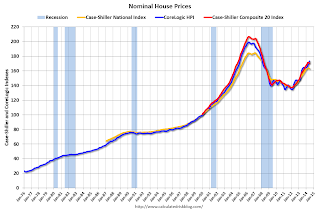 The first graph shows the monthly Case-Shiller National Index SA, and the Case-Shiller Composite 20 SA and CoreLogic House Price Indexes (through June) in nominal terms as reported.
In nominal terms, the Case-Shiller National index (SA) is back to early 2005 levels (and also back up to July 2008), and the Case-Shiller Composite 20 Index (SA) is back to September 2004 levels, and the CoreLogic index (NSA) is back to January 2005.
Real House Prices
 The second graph shows the same three indexes in real terms (adjusted for inflation using CPI less Shelter). Note: some people use other inflation measures to adjust for real prices.
In real terms, the National index is back to June 2002 levels, the Composite 20 index is back to July 2002, and the CoreLogic index back to February 2003.
In real terms, house prices are back to early '00s levels.
Price-to-Rent
In October 2004, Fed economist John Krainer and researcher Chishen Wei wrote a Fed letter on price to rent ratios: House Prices and Fundamental Value. Kainer and Wei presented a price-to-rent ratio using the OFHEO house price index and the Owners' Equivalent Rent (OER) from the BLS.
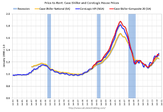 Here is a similar graph using the Case-Shiller National, Composite 20 and CoreLogic House Price Indexes.
This graph shows the price to rent ratio (January 1998 = 1.0).
On a price-to-rent basis, the Case-Shiller National index is back to January 2003 levels, the Composite 20 index is back to October 2002 levels, and the CoreLogic index is back to June 2003.
In real terms, and as a price-to-rent ratio, prices are mostly back to early 2000 levels. And real prices (and the price-to-rent ratio) have declined for three consecutive months using Case-Shiller National and Comp 20 indexes.
Case-Shiller: Comp 20 House Prices increased 8.1% year-over-year in June
by Calculated Risk on 8/26/2014 09:17:00 AM
S&P/Case-Shiller released the monthly Home Price Indices for June ("June" is a 3 month average of April, May and June prices).
This release includes prices for 20 individual cities, and two composite indices (for 10 cities and 20 cities) and the National index.
Note: Case-Shiller reports Not Seasonally Adjusted (NSA), I use the SA data for the graphs.
From S&P: Wide Spread Slowdown in Home Price Gains According to the S&P/Case-Shiller Home Price Indices
Data through June 2014, released today by S&P Dow Jones Indices for its S&P/Case-Shiller1 Home Price Indices ... show a sustained slowdown in price increases. The National Index gained 6.2% in the 12 months ending June 2014 while the 10-City and 20-City Composites gained 8.1%; all three indices saw their rates slow considerably from last month. Every city saw its year-over-year return worsen.
The National Index, now being published monthly, gained 0.9% in June. The 10- and 20-City Composites increased 1.0%. New York led the cities with a return of 1.6% and recorded its largest increase since June 2013. Chicago, Detroit and Las Vegas followed at +1.4%. Las Vegas posted its largest monthly gain since last summer. ...
“Home price gains continue to ease as they have since last fall,” says David M. Blitzer, Chairman of the Index Committee at S&P Dow Jones Indices. “For the first time since February 2008, all cities showed lower annual rates than the previous month."
 Click on graph for larger image.
 The first graph shows the nominal seasonally adjusted Composite 10 and Composite 20 indices (the Composite 20 was started in January 2000).
The Composite 10 index is off 18.2% from the peak, and down 0.1% in June (SA). The Composite 10 is up 23.8% from the post bubble low set in Jan 2012 (SA).
The Composite 20 index is off 17.4% from the peak, and down 0.2% (SA) in June. The Composite 20 is up 24.5% from the post-bubble low set in Jan 2012 (SA).
 The second graph shows the Year over year change in both indices.
The Composite 10 SA is up 8.1% compared to June 2013.
The Composite 20 SA is up 8.1% compared to June 2013.
Prices increased (SA) in 7 of the 20 Case-Shiller cities in June seasonally adjusted. (Prices increased in 20 of the 20 cities NSA) Prices in Las Vegas are off 42.7% from the peak, and prices in Denver and Dallas are at new highs (SA).
This was lower than the consensus forecast for a 8.4% YoY increase and suggests a further slowdown in price increases. I'll have more on house prices later.
Black Knight: Mortgage Loans in Foreclosure Process Lowest since March 2008
by Calculated Risk on 8/26/2014 08:01:00 AM
According to Black Knight's First Look report for July, the percent of loans delinquent decreased in July compared to June, and declined by 12% year-over-year.
Also the percent of loans in the foreclosure process declined further in July and were down 34% over the last year. Foreclosure inventory was at the lowest level since March 2008.
Black Knight reported the U.S. mortgage delinquency rate (loans 30 or more days past due, but not in foreclosure) was 5.64% in July, down from 5.70% in June. The normal rate for delinquencies is around 4.5% to 5%.
The percent of loans in the foreclosure process declined to 1.85% in July from 1.88% in June.
The number of delinquent properties, but not in foreclosure, is down 344,000 properties year-over-year, and the number of properties in the foreclosure process is down 471,000 properties year-over-year.
Black Knight will release the complete mortgage monitor for July in early September.
| Black Knight: Percent Loans Delinquent and in Foreclosure Process | ||||
|---|---|---|---|---|
| July 2014 | June 2014 | July 2013 | July 2012 | |
| Delinquent | 5.64% | 5.70% | 6.41% | 7.03% |
| In Foreclosure | 1.85% | 1.88% | 2.82% | 4.08% |
| Number of properties: | ||||
| Number of properties that are 30 or more, and less than 90 days past due, but not in foreclosure: | 1,713,000 | 1,728,000 | 1,846,000 | 1,960,000 |
| Number of properties that are 90 or more days delinquent, but not in foreclosure: | 1,136,000 | 1,155,000 | 1,347,000 | 1,650,000 |
| Number of properties in foreclosure pre-sale inventory: | 935,000 | 951,000 | 1,406,000 | 2,042,000 |
| Total Properties | 3,785,000 | 3,834,000 | 4,599,000 | 5,562,000 |
Monday, August 25, 2014
Tuesday: Durable Goods, Case-Shiller & FHFA House Prices, Richmond Fed Mfg Survey
by Calculated Risk on 8/25/2014 09:22:00 PM
From Gavyn Davies at the Financial Times: Draghi steals the show at Jackson Hole
The markets may read this as an empty threat, but they should note the importance of what [ECB President Mario Draghi] said about inflation expectations, which was added to the written text by the President himself on the day of the speech:Tuesday:
"Over the month of August, financial markets have indicated that inflation expectations exhibited significant declines at all horizons. The 5 year/5 year swap rate declined by 15 basis points to just below 2% … But if we go to shorter and medium-term horizons the revisions have been even more significant. The real [interest] rates on the short and medium term have gone up … The Governing Council will acknowledge these developments and within its mandate will use all the available instruments needed to ensure price stability over the medium term."This is much more explicit language about declining inflation expectations than anything the ECB has used in the past.
• At 8:30 AM ET, Durable Goods Orders for July from the Census Bureau. The consensus is for a 5.1% increase in durable goods orders. NOTE: The headline number could be huge because of a large number of aircraft orders in July.
• At 9:00 AM, S&P/Case-Shiller House Price Index for June. Although this is the June report, it is really a 3 month average of April, May and June. The consensus is for a 8.4% year-over-year increase in the Composite 20 index (NSA) for June. The Zillow forecast is for the Composite 20 to increase 8.1% year-over-year, and for prices to be unchanged month-to-month seasonally adjusted.
• Also at 9:00 AM, the FHFA House Price Index for June. This was original a GSE only repeat sales, however there is also an expanded index. The consensus is for a 0.3% increase.
• At 10:00 AM, the Conference Board's consumer confidence index for August. The consensus is for the index to decrease to 89.7 from 90.9.
• At 10:00 AM, the Richmond Fed Survey of Manufacturing Activity for August.
New Home Prices: 43% of Home over $300K, 8% under $150K
by Calculated Risk on 8/25/2014 04:54:00 PM
Here are two graphs I haven't posted for some time ...
As part of the new home sales report, the Census Bureau reported the number of homes sold by price and the average and median prices.
From the Census Bureau: "The median sales price of new houses sold in July 2014 was $269,800; the average sales price was $339,100. "
The following graph shows the median and average new home prices.

During the bust, the builders had to build smaller and less expensive homes to compete with all the distressed sales. With fewer distressed sales now, it appears the builders have moved to higher price points.
The average price in July 2014 was $339,100, and the median price was $269,800. Both are above the bubble high (this is due to both a change in mix and rising prices). The average is at an all time high.
The second graph shows the percent of new homes sold by price. At the peak of the housing bubble, almost 40% of new homes were sold for more than $300K - and over 20% were sold for over $400K.

And only 8% of homes sold were under $150K in July 2014. This is down from 30% in 2002 - and down from 20% as recently as August 2011. Quite a change.
Earlier on New Home Sales:
• New Home Sales at 412,000 Annual Rate in July
• Comments on New Home Sales
Comments on New Home Sales
by Calculated Risk on 8/25/2014 12:31:00 PM
The new home sales report for July was weak with sales at a 412,000 seasonally adjusted annual rate (SAAR), however combined with the upward revisions for the previous three months, total sales were somewhat above expectations. Sales for April, May and June were revised up a combined 33,000 sales SAAR.
The Census Bureau reported that new home sales this year, through July, were 266,000, Not seasonally adjusted (NSA). That is down 0.8% from 268,000 during the same period of 2013 (NSA). Basically flat compared to 2013.
Sales were up 12.3% year-over-year in July - but remember sales declined sharply in July 2013 as mortgage rates increased - so this was an easy comparison (I expect sales for July will be revised up too).

This graph shows new home sales for 2013 and 2014 by month (Seasonally Adjusted Annual Rate).
The comparisons to last year will be easy for the next couple of months, and I still expect to see year-over-year growth later this year.
And here is another update to the "distressing gap" graph that I first started posting several years ago to show the emerging gap caused by distressed sales. Now I'm looking for the gap to close over the next few years.

Following the housing bubble and bust, the "distressing gap" appeared mostly because of distressed sales.
I expect existing home sales to decline or move sideways (distressed sales will continue to decline and be partially offset by more conventional / equity sales). And I expect this gap to slowly close, mostly from an increase in new home sales.
Note: Existing home sales are counted when transactions are closed, and new home sales are counted when contracts are signed. So the timing of sales is different.
New Home Sales at 412,000 Annual Rate in July
by Calculated Risk on 8/25/2014 10:00:00 AM
The Census Bureau reports New Home Sales in July were at a seasonally adjusted annual rate (SAAR) of 412 thousand.
June sales were revised up from 406 thousand to 422 thousand, and May sales were revised up from 442 thousand to 454 thousand.
"Sales of new single-family houses in July 2014 were at a seasonally adjusted annual rate of 412,000, according to estimates released jointly today by the U.S. Census Bureau and the Department of Housing and Urban Development. This is 2.4 percent below the revised June rate of 422,000, but is 12.3 percent above the July 2013 estimate of 367,000."
 Click on graph for larger image.
The first graph shows New Home Sales vs. recessions since 1963. The dashed line is the current sales rate.
Even with the increase in sales over the previous two years, new home sales are still close to the bottom for previous recessions.
The second graph shows New Home Months of Supply.
 The months of supply increased in July to 6.0 months from 5.6 months in June.
 The all time record was 12.1 months of supply in January 2009.
This is now at the top of the normal range (less than 6 months supply is normal).
"The seasonally adjusted estimate of new houses for sale at the end of July was 205,000. This represents a supply of 6.0 months at the current sales rate."
 On inventory, according to the Census Bureau:
 "A house is considered for sale when a permit to build has been issued in permit-issuing places or work has begun on the footings or foundation in nonpermit areas and a sales contract has not been signed nor a deposit accepted."Starting in 1973 the Census Bureau broke this down into three categories: Not Started, Under Construction, and Completed.
The third graph shows the three categories of inventory starting in 1973.
The inventory of completed homes for sale is still low, and the combined total of completed and under construction is also low.
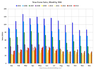 The last graph shows sales NSA (monthly sales, not seasonally adjusted annual rate).
In July 2014 (red column), 37 thousand new homes were sold (NSA). Last year 33 thousand homes were also sold in July. The high for July was 117 thousand in 2005, and the low for July was 26 thousand in 2010.
This was below expectations of 425,000 sales in July, and sales were up 12.3% year-over-year.
I'll have more later today .
Black Knight (formerly LPS): House Price Index up 0.8% in June, Up 5.5% year-over-year
by Calculated Risk on 8/25/2014 08:54:00 AM
Notes: I follow several house price indexes (Case-Shiller, CoreLogic, Black Knight, Zillow, FHFA, FNC and more). The timing of different house prices indexes can be a little confusing. Black Knight uses the current month closings only (not a three month average like Case-Shiller or a weighted average like CoreLogic), excludes short sales and REOs, and is not seasonally adjusted.
From Black Knight: U.S. Home Prices Up 0.8 Percent for the Month; Up 5.5 Percent Year-Over-Year
Today, the Data and Analytics division of Black Knight Financial Services released its latest Home Price Index (HPI) report, based on June 2014 residential real estate transactions. The Black Knight HPI combines the company’s extensive property and loan-level databases to produce a repeat sales analysis of home prices as of their transaction dates every month for each of more than 18,500 U.S. ZIP codes. The Black Knight HPI represents the price of non-distressed sales by taking into account price discounts for REO and short sales.The year-over-year increases have been getting steadily smaller for the last 9 months - as shown in the table below:
...
- Yearly increases in home appreciation continue to slow
- All 20 largest states and 40 largest metros again show month-over-month growth
- Nevada shows largest monthly gain among states, while Colorado and Texas continue to hit new highs
- Reno, Nev. home prices rise nearly 2 percent-- the most of any metropolitan area; Las Vegas still 42 percent off peak
| Month | YoY House Price Increase |
|---|---|
| Jan-13 | 6.7% |
| Feb-13 | 7.3% |
| Mar-13 | 7.6% |
| Apr-13 | 8.1% |
| May-13 | 7.9% |
| Jun-13 | 8.4% |
| Jul-13 | 8.7% |
| Aug-13 | 9.0% |
| Sep-13 | 9.0% |
| Oct-13 | 8.8% |
| Nov-13 | 8.5% |
| Dec-13 | 8.4% |
| Jan-14 | 8.0% |
| Feb-14 | 7.6% |
| Mar-14 | 7.0% |
| Apr-14 | 6.4% |
| May-14 | 5.9% |
| June-14 | 5.5% |
The Black Knight HPI is off 10.4% from the peak in June 2006 (not adjusted for inflation).
Note: The press release has data for the 20 largest states, and 40 MSAs.
Black Knight shows prices off 41.8% from the peak in Las Vegas, off 34.9% in Orlando, and 31.4% off from the peak in Riverside-San Bernardino, CA (Inland Empire). Prices are at new highs in Colorado and Texas (Denver, Austin, Dallas, Houston and San Antonio metros). Prices are also at new highs in San Jose, CA and in Nashville, TN.
Note: Case-Shiller for June will be released tomorrow.
Chicago Fed: "Index shows economic growth picked up in July"
by Calculated Risk on 8/25/2014 08:38:00 AM
The Chicago Fed released the national activity index (a composite index of other indicators): Index shows economic growth picked up in July
Led by improvements in production-related indicators, the Chicago Fed National Activity Index (CFNAI) rose to +0.39 in July from +0.21 in June. Three of the four broad categories of indicators that make up the index made positive contributions to the index in July, and two of the four categories increased from June.This graph shows the Chicago Fed National Activity Index (three month moving average) since 1967.
The index’s three-month moving average, CFNAI-MA3, increased to +0.25 in July from +0.16 in June, marking its fifth consecutive reading above zero. July’s CFNAI-MA3 suggests that growth in national economic activity was somewhat above its historical trend. The economic growth reflected in this level of the CFNAI-MA3 suggests limited inflationary pressure from economic activity over the coming year.
emphasis added
 Click on graph for larger image.
This suggests economic activity was above the historical trend in July (using the three-month average).
According to the Chicago Fed:
What is the National Activity Index? The index is a weighted average of 85 indicators of national economic activity drawn from four broad categories of data: 1) production and income; 2) employment, unemployment, and hours; 3) personal consumption and housing; and 4) sales, orders, and inventories.
A zero value for the index indicates that the national economy is expanding at its historical trend rate of growth; negative values indicate below-average growth; and positive values indicate above-average growth.


