by Calculated Risk on 8/28/2014 08:33:00 AM
Thursday, August 28, 2014
Weekly Initial Unemployment Claims decrease to 298,000
The DOL reports:
In the week ending August 23, the advance figure for seasonally adjusted initial claims was 298,000, a decrease of 1,000 from the previous week's revised level. The previous week's level was revised up by 1,000 from 298,000 to 299,000. The 4-week moving average was 299,750, a decrease of 1,250 from the previous week's revised average. The previous week's average was revised up by 250 from 300,750 to 301,000.The previous week was revised up to 299,000.
There were no special factors impacting this week's initial claims.
The following graph shows the 4-week moving average of weekly claims since January 1971.
 Click on graph for larger image.
The dashed line on the graph is the current 4-week average. The four-week average of weekly unemployment claims decreased to 299,750.
This was close to the consensus forecast of 300,000.
Wednesday, August 27, 2014
A comment from Tom Lawler on Household Estimates; Thursday: Unemployment Claims, Q2 GDP (2nd estimate), Pending Home Sales
by Calculated Risk on 8/27/2014 07:44:00 PM
CR Note: Many analysts and reporters use Census data to estimate ongoing household formation. They are ignoring severe problems with the Census estimates ... from housing economist Tom Lawler:
For well over a decade I have been trying to get Census to explain the widely different estimates of households from different surveys. In a 2004 "summit" that I hosted at Fannie Mae, I asked Census officials "what household number from a time series perspective should analysts use as the best estimate from Census?" The answer I got a decade a go was, "that's a good question." Read the attached.Thursday:
Household Estimates Conundrum: Effort to Develop More Consistent Household Estimates Across Surveys
And here is the conclusion section from the above.
We have an obligation to our data users to provide clear, unambiguous explanations and guidance about the estimates we provide on households (occupied housing units). In our role as the "leading source of quality data about the Nation’s people and economy," we ultimately should be able to:It's been a long slog ...
1. Develop a common methodology that produces reasonably consistent estimates of households (and, therefore, vacant housing units) across our current surveys,
2. Develop a common methodology that may still produce noticeable differences but still be able to explain differences and recommend a preferred estimate, or
3. Be able to explain why we cannot develop a common methodology and be able to explain the differences and provide guidance about the agency’s preferred estimate of households (occupied housing units) for the United States.
• At 8:30 AM ET, the initial weekly unemployment claims report will be released. The consensus is for claims to increase to 300 thousand from 298 thousand.
• Also at 8:30 AM, Gross Domestic Product, 2nd quarter 2014 (second estimate). The consensus is that real GDP increased 4.0% annualized in Q2, unchanged from 4.0% in the advance estimate.
• At 10:00 AM, the Pending Home Sales Index for July. The consensus is for a 0.5% increase in the index.
• At 11:00 AM, the Kansas City Fed manufacturing survey for August. This is the last of the Fed regional surveys for August.
Average 30 Year Fixed Mortgage Rates decline to 4.11%, No "Refi Boom" in Sight
by Calculated Risk on 8/27/2014 04:27:00 PM
I use the weekly Freddie Mac Primary Mortgage Market Survey® (PMMS®) to track mortgage rates. The PMMS series started in 1971, so there is a fairly long historical series.
For daily rates, the Mortgage News Daily has a series that tracks the PMMS very well, and is usually updated daily around 4 PM ET. The MND data is based on actual lender rate sheets, and is mostly "the average no-point, no-origination rate for top-tier borrowers with flawless scenarios". (this tracks the Freddie Mac series).
MND reports that average 30 Year fixed mortgage rates declined today to 4.11% from 4.13% yesterday.
One year ago rates were at 4.61%, so rates are down 50 bps year-over-year.
I've mentioned before that mortgage refinancing tends to pickup when mortgage rates drop by about 50 bps from the recent levels. However rates were only at or above 4.60% for a short period - and many homeowners refi'd when rates were below 4% in 2012 and 2013. So I don't expect a "refi boom" right now.
Here is a table from Mortgage News Daily:
Freddie Mac: Mortgage Serious Delinquency rate declined in July, Lowest since January 2009
by Calculated Risk on 8/27/2014 12:36:00 PM
Freddie Mac reported that the Single-Family serious delinquency rate declined in July to 2.02% from 2.07% in June. Freddie's rate is down from 2.70% in July 2013, and this is the lowest level since January 2009. Freddie's serious delinquency rate peaked in February 2010 at 4.20%.
These are mortgage loans that are "three monthly payments or more past due or in foreclosure".
Note: Fannie Mae will report their Single-Family Serious Delinquency rate for July in a few days.

Although this indicates progress, the "normal" serious delinquency rate is under 1%.
The serious delinquency rate has fallen 0.68 percentage points over the last year - and at that rate of improvement, the serious delinquency rate will not be below 1% until early 2016.
Note: Very few seriously delinquent loans cure with the owner making up back payments - most of the reduction in the serious delinquency rate is from foreclosures, short sales, and modifications.
So even though distressed sales are declining, I expect an above normal level of Fannie and Freddie distressed sales for perhaps 2 more years (mostly in judicial foreclosure states).
CBO Projection: Budget Deficits in Future Years to be Smaller than Previous Forecast
by Calculated Risk on 8/27/2014 10:25:00 AM
The Congressional Budget Office (CBO) released new budget projections today An Update to the Budget and Economic Outlook: 2014 to 2024. The projected budget deficits have been reduced for most of the next ten years, although the projected deficit for 2014 has been revised up slightly (by $14 billion).
NOTE: In the previous update, the CBO revised down their projection of the deficit for fiscal 2014 from 3.7% to just under 2.9% of GDP.
From the CBO:
The federal budget deficit for fiscal year 2014 will amount to $506 billion, CBO estimates, roughly $170 billion lower than the shortfall recorded in 2013. At 2.9 percent of gross domestic product (GDP), this year's deficit will be much smaller than those of recent years (which reached almost 10 percent of GDP in 2009) and slightly below the average of federal deficits over the past 40 years.The CBO projects the deficit will decline further in 2015, and will be at or below 3% of GDP through fiscal 2019. Then the deficit will slowly increase.
...
CBO's current economic projections differ in some respects from the ones issued in February 2014. The agency has significantly lowered its projection of growth in real GDP for 2014, reflecting surprising economic weakness in the first half of the year. However, the level of real GDP over most of the coming decade is projected to be only modestly lower than estimated in February. In addition, CBO now anticipates lower interest rates throughout the projection period and a lower unemployment rate for the next six years.
emphasis added
 Click on graph for larger image.
This graph shows the actual (purple) budget deficit each year as a percent of GDP, and an estimate for the next ten years based on estimates from the CBO.
The CBO revised down their deficit projections for fiscal years 2017 through 2024.
MBA: Mortgage Applications Increase in Latest MBA Weekly Survey
by Calculated Risk on 8/27/2014 07:01:00 AM
From the MBA: Mortgage Applications Increase in Latest MBA Weekly Survey
Mortgage applications increased 2.8 percent from one week earlier, according to data from the Mortgage Bankers Association’s (MBA) Weekly Mortgage Applications Survey for the week ending August 22, 2014. ...
The Refinance Index increased 3 percent from the previous week. The seasonally adjusted Purchase Index increased 3 percent from one week earlier. ...
...
The average contract interest rate for 30-year fixed-rate mortgages with conforming loan balances ($417,000 or less) decreased to 4.28 percent from 4.29 percent, with points decreasing to 0.25 from 0.26 (including the origination fee) for 80 percent loan-to-value ratio (LTV) loans.
emphasis added
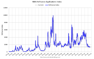 Click on graph for larger image.
The first graph shows the refinance index.
The refinance index is down 73% from the levels in May 2013.
As expected, refinance activity is very low this year.
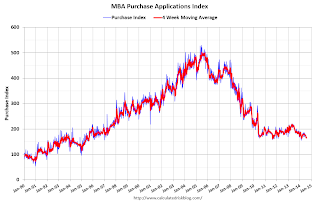 The second graph shows the MBA mortgage purchase index.
 According to the MBA, the unadjusted purchase index is down about 11% from a year ago.
Tuesday, August 26, 2014
Zillow: Case-Shiller House Price Index expected to slow further year-over-year in July
by Calculated Risk on 8/26/2014 08:31:00 PM
The Case-Shiller house price indexes for June were released this morning. Zillow has started forecasting Case-Shiller a month early - and I like to check the Zillow forecasts since they have been pretty close.
From Zillow: Case-Shiller Slowdown Forecasted to Continue
The Case-Shiller data for June 2014 came out this morning, and based on this information and the July 2014 Zillow Home Value Index (ZHVI, released August 21), we predict that next month’s Case-Shiller data (July 2014) will show that the non-seasonally adjusted (NSA) 20-City Composite Home Price Index increased by 7.0 percent and the NSA 10-City Composite Home Price Index increased by 6.9 percent on a year-over-year basis. The seasonally adjusted (SA) month-over-month change from June to July will be 0.1 percent for the 20-City Composite Index and flat for the 10-City Composite Home Price Index (SA). All forecasts are shown in the table below. Officially, the Case-Shiller Composite Home Price Indices for July will not be released until Tuesday, September 30.So the Case-Shiller index will probably show a lower year-over-year gain in July than in June (8.1% year-over-year).
| Zillow July 2014 Forecast for Case-Shiller Index | |||||
|---|---|---|---|---|---|
| Case Shiller Composite 10 | Case Shiller Composite 20 | ||||
| NSA | SA | NSA | SA | ||
| Case Shiller (year ago) | July 2013 | 176.39 | 172.88 | 162.38 | 158.96 |
| Case-Shiller (last month) | June 2014 | 187.19 | 185.57 | 172.33 | 170.69 |
| Zillow Forecast | YoY | 6.9% | 6.9% | 7.0% | 7.0% |
| MoM | 0.7% | 0.0% | 0.8% | 0.1% | |
| Zillow Forecasts1 | 188.5 | 185.2 | 173.7 | 170.5 | |
| Current Post Bubble Low | 146.45 | 149.91 | 134.07 | 137.13 | |
| Date of Post Bubble Low | Mar-12 | Jan-12 | Mar-12 | Jan-12 | |
| Above Post Bubble Low | 28.7% | 23.5% | 29.6% | 24.3% | |
| 1Estimate based on Year-over-year and Month-over-month Zillow forecasts | |||||
A few comments on the Seasonal Pattern for House Prices
by Calculated Risk on 8/26/2014 04:45:00 PM
• Starting this month, S&P is releasing the Case-Shiller National Index on a monthly basis. This probably means most reporting of a "headline number" will be switched from the Case-Shiller Composite 20 to the National Index.
• On a method to improve the seasonal factors, see Trulia chief economist Jed Kolko's article "Let’s Improve, Not Ignore, Seasonal Adjustment of Housing Data"
There has always been a clear seasonal pattern for house prices, but the seasonal differences have been more pronounced since the housing bust.
Even in normal times house prices tend to be stronger in the spring and early summer than in the fall and winter. Recently there has been a larger than normal seasonal pattern mostly because conventional sales are following the normal pattern (more sales in the spring and summer), but distressed sales (foreclosures and short sales) happen all year. So distressed sales have had a larger negative impact on prices in the fall and winter.
Note: I was one of several people to question the change in the seasonal factor (here is a post in 2009) - and this led to S&P Case-Shiller questioning the seasonal factor too (from April 2010).

This graph shows the month-to-month change in the CoreLogic and NSA Case-Shiller National index since 1987 (both through Jnue). The seasonal pattern was smaller back in the '90s and early '00s, and increased since the bubble burst.
It appears we've already seen the strongest month this year (NSA) for both Case-Shiller NSA and CoreLogic. This suggests both indexes will turn negative seasonally (NSA) earlier this year than the previous two years - perhaps in the August reports.
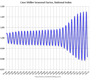
It appears the seasonal factor has started to decrease, and I expect that over the next several years - as the percent of distressed sales declines further and recent history is included in the factors - the seasonal factors will move back towards more normal levels (Kolko's article has more on this).
Zillow: Negative Equity declines further in Q2 2014
by Calculated Risk on 8/26/2014 02:11:00 PM
From Zillow: High Negative Equity Causing Generational Housing Gridlock
According to the second quarter Zillow Negative Equity Report, the national negative equity rate continued to decline in 2014 Q2, falling to 17 percent, down 14.4 percentage points from its peak (31.4 percent) in the first quarter of 2012. Negative equity has fallen for nine consecutive quarters as home values have risen. However, more than 8.7 million homeowners with a mortgage still remain underwaterThe following graph from Zillow shows negative equity by Loan-to-Value (LTV) in Q2 2014 compared to Q2 2013.
emphasis added
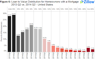 Click on graph for larger image.
From Zillow:
Figure 6 shows the loan-to-value (LTV) distribution for homeowners with a mortgage in 2014 Q2 versus 2013 Q2. The bulk of underwater homeowners, roughly 7.9 percent, are underwater by up to 20 percent of their loan value and will soon cross over into positive equity territory.Almost half of the borrowers with negative equity have a LTV of 100% to 120% (7.9% in Q2 2014). Most of these borrowers are current on their mortgages - and they have probably either refinanced with HARP or the loans are well seasoned (most of these properties were purchased in the 2004 through 2006 period, so borrowers have been current for eight years or so). In a few years, these borrowers will have positive equity.
The key concern is all those borrowers with LTVs above 140% (about 5.7% of properties with a mortgage according to Zillow). It will take many years to return to positive equity ... and a large percentage of these properties will eventually be distressed sales (short sales or foreclosures).
Note: CoreLogic will release their Q2 negative equity report in the next couple of weeks. For Q1, CoreLogic reported there were 6.3 million properties with negative equity, and that will be down further in Q2 2014.
House Prices: Better Seasonal Adjustment; Real Prices and Price-to-Rent Ratio Decline in June
by Calculated Risk on 8/26/2014 11:22:00 AM
This morning, S&P reported that the Composite 20 index declined 0.2% in June seasonally adjusted. However, it appears the seasonal adjustment has been distorted by the high level of distressed sales in recent years. Trulia's Jed Kolko wrote last month: "Let’s Improve, Not Ignore, Seasonal Adjustment of Housing Data"
The housing crisis substantially changed the seasonal pattern of housing activity: relative to conventional home sales, which peak in summer, distressed home sales are more evenly spread throughout the year and sell at a discount. As a result, in years when distressed sales constitute a larger share of overall sales, the seasonal swings in home prices get bigger while the seasonal swings in sales volumes get smaller.
Sharply changing seasonal patterns create problems for seasonal adjustment methods, which typically estimate seasonal adjustment factors by averaging several years’ worth of observed seasonal patterns. A sharp but ultimately temporary change in the seasonal pattern for housing activity affects seasonal adjustment factors more gradually and for more years than it should. Despite the recent normalizing of the housing market, seasonal adjustment factors are still based, in part, on patterns observed at the height of the foreclosure crisis, causing home price indices to be over-adjusted in some months and under-adjusted in others.
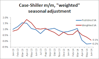 Kolko proposed a better seasonal adjustment:
This graph from Kolko shows the weighted seasonal adjustment (see Kolko's article for a description of his method). Kolko calculates that prices increased 0.1% on a weighted seasonal adjustment basis in June.
I've been expecting a slowdown in year-over-year prices as "For Sale" inventory increases, and the slowdown is here! The Case-Shiller Composite 20 index was up 8.1% year-over-year in June; the smallest year-over-year increase since December 2012.
This is still a very strong year-over-year change, but on a seasonally adjusted monthly basis, the Case-Shiller Composite 20 index was down 0.2% in June (the second monthly decline in a row), and on a weighted seasonal adjusted basis (Kolko's method), the Composite 20 index was only up 0.1% in June. This suggests price increases have slowed sharply in recent months.
On a real basis (inflation adjusted), prices actually declined for the third consecutive month. The price-rent ratio also declined in June for the Case-Shiller Composite 20 index.
It is important to look at prices in real terms (inflation adjusted). Case-Shiller, CoreLogic and others report nominal house prices. As an example, if a house price was $200,000 in January 2000, the price would be close to $280,000 today adjusted for inflation (40%). That is why the second graph below is important - this shows "real" prices (adjusted for inflation).
Nominal House Prices
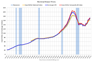 The first graph shows the monthly Case-Shiller National Index SA, and the Case-Shiller Composite 20 SA and CoreLogic House Price Indexes (through June) in nominal terms as reported.
In nominal terms, the Case-Shiller National index (SA) is back to early 2005 levels (and also back up to July 2008), and the Case-Shiller Composite 20 Index (SA) is back to September 2004 levels, and the CoreLogic index (NSA) is back to January 2005.
Real House Prices
 The second graph shows the same three indexes in real terms (adjusted for inflation using CPI less Shelter). Note: some people use other inflation measures to adjust for real prices.
In real terms, the National index is back to June 2002 levels, the Composite 20 index is back to July 2002, and the CoreLogic index back to February 2003.
In real terms, house prices are back to early '00s levels.
Price-to-Rent
In October 2004, Fed economist John Krainer and researcher Chishen Wei wrote a Fed letter on price to rent ratios: House Prices and Fundamental Value. Kainer and Wei presented a price-to-rent ratio using the OFHEO house price index and the Owners' Equivalent Rent (OER) from the BLS.
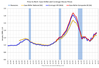 Here is a similar graph using the Case-Shiller National, Composite 20 and CoreLogic House Price Indexes.
This graph shows the price to rent ratio (January 1998 = 1.0).
On a price-to-rent basis, the Case-Shiller National index is back to January 2003 levels, the Composite 20 index is back to October 2002 levels, and the CoreLogic index is back to June 2003.
In real terms, and as a price-to-rent ratio, prices are mostly back to early 2000 levels. And real prices (and the price-to-rent ratio) have declined for three consecutive months using Case-Shiller National and Comp 20 indexes.


