by Calculated Risk on 10/21/2014 05:42:00 PM
Tuesday, October 21, 2014
DataQuick: California Foreclosure Starts Lowest Since 2005
From DataQuick: Golden State Foreclosure Starts Continue to Decline
Lending institutions initiated formal foreclosure proceedings last quarter on the lowest number of California homes in more than eight years, the result of a recovering real estate market and the dwindling pool of toxic home loans made in 2006 and 2007, Irvine-based CoreLogic DataQuick reported.
A total of 16,833 Notices of Default (NoDs) were recorded at county recorders offices during the July-through-September period. That was down 3.9 percent from 17,524 for the prior quarter, and down 17.1 percent from 20,314 in third-quarter 2013, according to CoreLogic DataQuick data.
Last quarter's NoD tally was the lowest since fourth-quarter 2005, when 15,337 NoDs were recorded. NoDs peaked in first-quarter 2009 at 135,431, while the low was 12,417 NoDs in third-quarter 2004. The NoD statistics go back to 1992.
...
"This home repo pipeline isn't exactly drying up, but it sure is diminishing. Its negative effect on the overall market is only a fraction of what it was several years ago, and is really only still noticeable in some pockets of the hardest-hit markets of the Inland Empire and Central Valley," said John Karevoll, a CoreLogic DataQuick analyst.
To some extent the level of NoD filings in recent quarters probably reflects the rate at which servicers are able to process paperwork. The 20,314 NoDs filed in third-quarter 2013 were followed by 18,120 the following quarter and then 19,215 in 2014Q1; 17,524 in 2014Q2; and 16,833 last quarter.
Most of the loans going into default are still from the 2005-2007 period. Last quarter the median origination quarter for defaulted loans was third-quarter 2006. That has been the case for more than five years, indicating that weak underwriting standards peaked then.
emphasis added
 Click on graph for larger image.
This graph shows the number of Notices of Default (NoD) filed in California each year. 2014 is in red (estimate based on Q1, Q2 and Q3).
Last year was the lowest year for foreclosure starts since 2005, and 2013 was also below the levels in 1997 through 2000 when prices were rising following the much smaller late '80s housing bubble / early '90s bust in California.
Overall foreclosure starts are close to a normal level in California (foreclosure starts were over 50,000 in 2004 and 2005 when prices were rising quickly).
Note: Foreclosures are still higher than normal in states with a judicial foreclosure process.
LA area Port Traffic in September: Imports Highest since 2006, Exports Soft
by Calculated Risk on 10/21/2014 03:48:00 PM
Container traffic gives us an idea about the volume of goods being exported and imported - and possibly some hints about the trade report for September since LA area ports handle about 40% of the nation's container port traffic.
The following graphs are for inbound and outbound traffic at the ports of Los Angeles and Long Beach in TEUs (TEUs: 20-foot equivalent units or 20-foot-long cargo container).
To remove the strong seasonal component for inbound traffic, the first graph shows the rolling 12 month average.
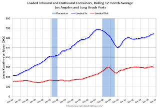
On a rolling 12 month basis, inbound traffic was up 0.9% compared to the rolling 12 months ending in August. Outbound traffic was down 0.4% compared to 12 months ending in August.
Inbound traffic has been increasing, and outbound traffic has been mostly moving sideways.
The 2nd graph is the monthly data (with a strong seasonal pattern for imports).
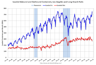
Imports were up 10.6% year-over-year in September, exports were down 5.6% year-over-year.
This might suggest retailers are expecting a happy holiday season.
BLS: Thirty-one States had Unemployment Rate Decreases in September
by Calculated Risk on 10/21/2014 01:31:00 PM
From the BLS: Regional and State Employment and Unemployment Summary
Regional and state unemployment rates were generally little changed in September. Thirty-one states had unemployment rate decreases from August, 8 states had increases, and 11 states and the District of Columbia had no change, the U.S. Bureau of Labor Statistics reported today.
...
Georgia had the highest unemployment rate among the states in September, 7.9 percent. North Dakota again had the lowest jobless rate, 2.8 percent.
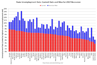 Click on graph for larger image.
This graph shows the current unemployment rate for each state (red), and the max during the recession (blue). All states are well below the maximum unemployment rate for the recession.
The size of the blue bar indicates the amount of improvement.
The states are ranked by the highest current unemployment rate. Georgia had the highest unemployment rate in September at 7.9%.
 The second graph shows the number of states with unemployment rates at or above certain levels since January 2006. At the worst of the employment recession, there were 10 states with an unemployment rate at or above 11% (red).
Currently no state has an unemployment rate at or above 8% (light blue); Nine states are still at or above 7% (dark blue).
A Few Comments on September Existing Home Sales
by Calculated Risk on 10/21/2014 11:02:00 AM
A few comments ...
• Once again housing economist Tom Lawler's forecast of 5.14 million SAAR was closer than the consensus (5.05 million) to the NAR reported sales (5.17 million). It is getting harder for Lawler to beat the "consensus" because it appears several analysts are waiting for Lawler's estimate before submitting their own!
• "The sky is falling! The sky is falling!" Maybe not ... Remember those analysts who incorrectly claimed that declining year-over-year existing home sales were a sign that the "housing recovery" was over? That was wrong, and I correctly pointed out: 1) the "housing recovery" is mostly new home sales and housing starts - not existing home sales, 2) declining overall existing home sales were a positive if the decline was related to fewer distressed sales.
• The most important number in the NAR report each month is inventory. This morning the NAR reported that inventory was up 6.0% year-over-year in September. It is important to note that the NAR inventory data is "noisy" and difficult to forecast based on other data.
The headline NAR inventory number is not seasonally adjusted, even though there is a clear seasonal pattern. Trulia chief economist Jed Kolko has sent me the seasonally adjusted inventory. NOTE: The NAR does provide a seasonally adjusted months-of-supply, although that is in the supplemental data.
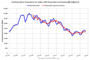
This shows that inventory bottomed in January 2013 (on a seasonally adjusted basis), and inventory is now up about 12.5% from the bottom. On a seasonally adjusted basis, inventory was up 1.4% in September compared to August.
Important: The NAR reports active listings, and although there is some variability across the country in what is considered active, many "contingent short sales" are not included. "Contingent short sales" are strange listings since the listings were frequently NEVER on the market (they were listed as contingent), and they hang around for a long time - they are probably more closely related to shadow inventory than active inventory. However when we compare inventory to 2005, we need to remember there were no "short sale contingent" listings in 2005. In the areas I track, the number of "short sale contingent" listings is also down sharply year-over-year.
And it appears investor buying is declining year-over-year. From the NAR:
All-cash sales were 24 percent of transactions in September, up slightly from August (23 percent) but down from 33 percent in September of last year. Individual investors, who account for many cash sales, purchased 14 percent of homes in September, up from 12 percent last month but below September 2013 (19 percent). Sixty-three percent of investors paid cash in September.And another key point: The NAR reported total sales were down 1.7% from September 2013, but normal equity sales were probably up year-over-year, and distressed sales down sharply. From the NAR (from a survey that is far from perfect):
Distressed homes – foreclosures and short sales – increased slightly in September to 10 percent from 8 percent in August, but are down from 14 percent a year ago. Seven percent of September sales were foreclosures and 3 percent were short sales.Last year in September the NAR reported that 14% of sales were distressed sales.
A rough estimate: Sales in September 2013 were reported at 5.26 million SAAR with 14% distressed. That gives 740 thousand distressed (annual rate), and 4.52 million equity / non-distressed. In September 2014, sales were 5.17 million SAAR, with 10% distressed. That gives 520 thousand distressed - a decline of about 30% from September 2013 - and 4.65 million equity. Although this survey isn't perfect, this suggests distressed sales were down sharply - and normal sales up slightly.
The following graph shows existing home sales Not Seasonally Adjusted (NSA).
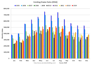 Click on graph for larger image.
Sales NSA in September (red column) were at the highest level for September since 2006.
Overall this was a solid report.
Earlier:
• Existing Home Sales in September: 5.17 million SAAR, Inventory up 6.0% Year-over-year
Existing Home Sales in September: 5.17 million SAAR, Inventory up 6.0% Year-over-year
by Calculated Risk on 10/21/2014 10:00:00 AM
The NAR reports: Existing-Home Sales Rebound in September
Total existing-home sales, which are completed transactions that include single-family homes, townhomes, condominiums and co-ops, increased 2.4 percent to a seasonally adjusted annual rate of 5.17 million in September from 5.05 million in August. Sales are now at their highest pace of 2014, but still remain 1.7 percent below the 5.26 million-unit level from last September. ...
Total housing inventory at the end of September fell 1.3 percent to 2.30 million existing homes available for sale, which represents a 5.3-month supply at the current sales pace. Despite fewer homes for sale in September, unsold inventory is still 6.0 percent higher than a year ago, when there were 2.17 million existing homes available for sale.
 Click on graph for larger image.
This graph shows existing home sales, on a Seasonally Adjusted Annual Rate (SAAR) basis since 1993.
Sales in September (5.17 million SAAR) were 2.4% higher than last month, and were 1.7% below the September 2013 rate.
The second graph shows nationwide inventory for existing homes.
 According to the NAR, inventory decreased to 2.30 million in September from 2.33 million in August. Headline inventory is not seasonally adjusted, and inventory usually increases from the seasonal lows in December and January, and peaks in mid-to-late summer.
The third graph shows the year-over-year (YoY) change in reported existing home inventory and months-of-supply. Since inventory is not seasonally adjusted, it really helps to look at the YoY change. Note: Months-of-supply is based on the seasonally adjusted sales and not seasonally adjusted inventory.
 Inventory increased 6.0% year-over-year in September compared to September 2013.
 Months of supply was at 5.3 months in September.
This was above expectations of sales of 5.09 million. For existing home sales, the key number is inventory - and inventory is still low, but up year-over-year. I'll have more later ...
Monday, October 20, 2014
Tuesday: Existing Home Sales
by Calculated Risk on 10/20/2014 08:09:00 PM
From Dina ElBoghdady at the WaPo: How a top housing regulator plans to make it easier to get a mortgage. Excerpts:
It’s unclear if Watt's downpayment plan will do much to ease access to credit. The average downpayment remains lower today than it was in more normal, pre-housing bubble times, said Sam Khater, chief deputy economist at CoreLogic. That’s because the Federal Housing Administration – which backs loans with as little as 5 percent down -- has a larger share of the mortgage market than usual, Khater said. Having Fannie and Freddie also accept downpayments as low as 5 percent would only help on the fringes, Khater said.From David Stevens, MBA President: MBA’s Stevens Applauds FHFA Steps to Ease Credit for Homebuyers
...
Today, the average credit score on a loan backed by Fannie and Freddie is close to 745, versus about 710 in the early 2000s, according to Moody’s Analytics.
“Offering lenders better clarity around representation and warranty requirements will ensure lenders are accountable for any material mistakes they may make in the loan process, yet acknowledges the fact that minor, immaterial loan defects should not automatically trigger a repurchase request. As a result, lenders will be more confident in offering mortgages to qualified borrowers within the full boundaries of the GSEs’ credit requirements.Tuesday:
• At 10:00 AM, Existing Home Sales for September from the National Association of Realtors (NAR). The consensus is for sales of 5.09 million on seasonally adjusted annual rate (SAAR) basis. Sales in August were at a 5.05 million SAAR. Economist Tom Lawler estimates the NAR will report sales of 5.14 million SAAR. A key will be the reported year-over-year increase in inventory of homes for sale.
• Also at 10:00 AM, Regional and State Employment and Unemployment (Monthly) for September 2014
Lawler: Updated Table of Distressed and All-Cash Share for September
by Calculated Risk on 10/20/2014 04:22:00 PM
CR Note: Existing Home Sales for September will be released tomorrow by the National Association of Realtors (NAR). The consensus is for sales of 5.09 million on seasonally adjusted annual rate (SAAR) basis. Sales in August were at a 5.05 million SAAR. Economist Tom Lawler estimates the NAR will report sales of 5.14 million SAAR.
Housing economist Tom Lawler sent me the updated table below of short sales, foreclosures and cash buyers for several selected cities in September. Lawler notes: "Note the jump in the foreclosure sales share in Orlando."
On distressed: Total "distressed" share is down in these markets due to a decline in short sales.
Short sales are down in all these areas.
Foreclosures are up slightly in several of these areas - and up significantly in Orlando.
The All Cash Share (last two columns) is mostly declining year-over-year. As investors pull back, the share of all cash buyers will probably continue to decline.
| Short Sales Share | Foreclosure Sales Share | Total "Distressed" Share | All Cash Share | |||||
|---|---|---|---|---|---|---|---|---|
| Sep-14 | Sep-13 | Sep-14 | Sep-13 | Sep-14 | Sep-13 | Sep-14 | Sep-13 | |
| Las Vegas | 10.4% | 23.0% | 8.8% | 7.0% | 19.2% | 30.0% | 34.3% | 47.2% |
| Reno** | 7.0% | 20.0% | 7.0% | 5.0% | 14.0% | 25.0% | ||
| Phoenix | 3.8% | 8.8% | 5.8% | 8.0% | 9.6% | 16.8% | 25.7% | 33.4% |
| Sacramento | 5.3% | 12.1% | 6.5% | 3.9% | 11.8% | 16.0% | 19.4% | 23.6% |
| Minneapolis | 3.4% | 6.0% | 9.4% | 16.0% | 12.8% | 22.0% | ||
| Mid-Atlantic | 5.5% | 7.7% | 9.7% | 8.2% | 15.2% | 15.9% | 19.1% | 18.4% |
| Orlando | 7.1% | 18.0% | 24.8% | 18.0% | 31.8% | 36.0% | 41.9% | 43.5% |
| California * | 5.9% | 10.8% | 5.3% | 7.1% | 11.2% | 17.9% | ||
| Bay Area CA* | 3.6% | 7.5% | 2.8% | 3.6% | 6.4% | 11.1% | 20.9% | 23.3% |
| So. California* | 6.0% | 10.9% | 4.7% | 6.4% | 10.7% | 17.3% | 24.3% | 28.7% |
| Hampton Roads | 19.6% | 26.1% | ||||||
| Tucson | 26.7% | 29.8% | ||||||
| Toledo | 31.4% | 38.1% | ||||||
| Wichita | 27.8% | 28.6% | ||||||
| Des Moines | 16.8% | 19.2% | ||||||
| Peoria | 24.7% | 20.7% | ||||||
| Georgia*** | 27.4% | N/A | ||||||
| Omaha | 19.9% | 19.1% | ||||||
| Pensacola | 29.2% | 27.3% | ||||||
| Memphis* | 11.7% | 16.5% | ||||||
| Springfield IL** | 9.5% | 14.1% | 22.6% | N/A | ||||
| *share of existing home sales, based on property records **Single Family Only ***GAMLS | ||||||||
FHFA Director Watt: Reps and Warrants to be Clarified in Coming Weeks, "sensible and responsible guidelines" for Lower Downpayments
by Calculated Risk on 10/20/2014 02:56:00 PM
From FHFA Director Melvin Watt: Prepared Remarks of Melvin L. Watt, Director, FHFA, At the Mortgage Bankers Association Annual Convention
On lower downpayments:
To increase access for creditworthy but lower-wealth borrowers, FHFA is also working with the Enterprises to develop sensible and responsible guidelines for mortgages with loan-to-value ratios between 95 and 97 percent. Through these revised guidelines, we believe that the Enterprises will be able to responsibly serve a targeted segment of creditworthy borrowers with lower-down payment mortgages by taking into account “compensating factors.” While this is a much more narrow effort than our work on the Representation and Warranty Framework, it is yet another much needed piece to the broader access to credit puzzle. Further details about these new guidelines will be available in the coming weeks as we continue to advance FHFA’s mission of ensuring safety, soundness and liquidity in the housing finance markets.On Reps and Warrants:
We know that the Representation and Warranty Framework did not provide enough clarity to enable lenders to understand when Fannie Mae or Freddie Mac would exercise their remedy to require repurchase of a loan. And, we know that this issue has contributed to lenders imposing credit overlays that drive up the cost of lending and also restrict lending to borrowers with less than perfect credit scores or with less conventional financial situations.
To address this problem, FHFA and the Enterprises have worked to revise the Framework to ensure that it provides clear rules of the road that allow lenders to manage their risk and lend throughout the Enterprises’ credit box. These revisions are consistent with our broader efforts to place more emphasis on upfront quality control reviews and other risk management practices that provide feedback on the quality of loans delivered to the Enterprises earlier in the process.
...
As I committed FHFA to do when I announced these refinements in May, we have continued to engage in an ongoing process to address the issue of life-of-loan exclusions. Life-of-loan exclusions are designed to protect Fannie Mae and Freddie Mac from instances of fraud or other significant noncompliance, and, as a result, they allow the Enterprises to require lenders to repurchase loans at any point during the term of the loan. The current life-of-loan exclusions are open-ended and make it difficult for a lender to predict when, or if, Fannie Mae or Freddie Mac will apply one of them.
So, we have continued to address this issue, and I can report that we have reached an agreement in principle on how to clarify and define the life-of-loan exclusions. These changes are a significant step forward that will result in a better Representation and Warranty Framework and facilitate market liquidity without compromising the safety and soundness of the Enterprises.
First, we are more clearly defining the life-of-loan exclusions, so lenders will know what they are and when they apply to loans that have otherwise obtained repurchase relief. These exclusions fall into six categories: 1) misrepresentations, misstatements and omissions; 2) data inaccuracies; 3) charter compliance issues; 4) first-lien priority and title matters; 5) legal compliance violations; and 6) unacceptable mortgage products.
Second, for loans that have already earned repurchase relief, we are clarifying that only life-of-loan exclusions can trigger a repurchase under the Framework. This is a straightforward clarification, but one that we believe will reduce confusion and risks to lenders.
The Enterprises will provide details about the updated definitions for each life-of-loan exclusion in the coming weeks ...
emphasis added
Is Mortgage Credit too Tight?
by Calculated Risk on 10/20/2014 11:04:00 AM
I frequently hear stories from prime borrowers about their horrible experiences getting mortgages right now. Yes, the process is difficult because of all the extra checks because the lenders are afraid the loans will be put back to them in a few years.
At the same time, loan officers are telling me it is easy for prime borrowers to get a loan.
This isn't a contradiction - an onerous process isn't "tight credit", it is just risk management. But that is for prime borrowers.
First, here is a piece today from Mark Fleming, chief economist at CoreLogic, writes: Is Credit Too Tight, Too Loose or Just Right?
One of the most pressing issues in housing finance today is the availability of credit. The lack of access to credit has been cited as a reason for the slower-than-hoped-for growth in home sales. The often cited Federal Reserve Loan Officer Survey tells us whether lenders are tightening or loosening credit, but tells us much less about the overall level of availability of credit. Furthermore, terms like tight credit or loose credit imply a normative goal of the right amount of credit. In fact, when discussing this topic, one can’t help but think of Goldilocks and the Three Bears: one bed is too hard, another too soft, and the last one is just right.
In order to determine whether credit is too tight, too loose, or just right CoreLogic has developed the Housing Credit Index (HCI) that measures the range and variation of residential mortgage credit over time and multiple housing credit underwriting attributes. The index includes attributes that are relevant to the assessment of credit risk for a borrower applying for credit. ...
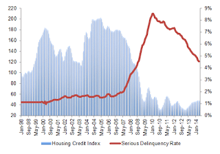
So is credit currently too loose, too tight or just right? In Figure 1, the HCI is shown from 1998 to early 2014 measured on the left axis along with the overall serious delinquency rate measured on the right axis. In the refinance boom of the early aughts, credit availability expanded significantly and then declined, but to a level moderately elevated compared to before the refinance boom. The result of increased credit availability was a modest rise from about 1 percent to 1.25 percent in the overall serious delinquency rate. The mid-aughts saw the significant expansion of credit to double the normal level and the very quick and dramatic contraction with which we are all far too familiar. Credit availability reached its tightest point in late 2010 at only one-third the normal level of the late 1990s. It is safe to say that credit was too tight. Of course, this was a natural response to the quickly rising serious delinquency rate that turned upward dramatically starting in 2006. Since 2010 credit availability has eased in fits and starts with the utilization of modification and refinance programs aimed at struggling homeowners. Most recently, the index is indicating a slight easing, but remains tight by historic standards.According to the CoreLogic index, credit is easing a little, but remains tight.
emphasis added
Below are some other measures. Note: Some less qualified borrowers are using FHA, but that involves high fees (high G-Fees), and the share of FHA loans is at the lowest level in 5 years according to Campbell/Inside Mortgage Finance HousingPulse. But most less qualified borrowers just can't qualify now. Two indicators of this are:
 This graph from Black Knight's mortgage monitor shows the share of purchase and refinance originations with credit scores at or above 720.
As Black Knight notes: "The share of purchase originations with high borrower credit scores is at an all time high". This suggests credit is tight for less qualified borrowers.
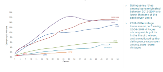 The second graph, also from Black Knight's mortgage monitor, shows that the recent loans are performing very well.
This graph only includes loans originated in 2005 through 2014, but older data shows the recent loans are the best performing ever. The loan performance suggests lending is currently tight (I believe this is better loan performance than even during the 2001 through 2005 period when house prices were rising quickly).
DOT: Vehicle Miles Driven increased 0.4% year-over-year in August
by Calculated Risk on 10/20/2014 08:58:00 AM
The Department of Transportation (DOT) reported:
Travel on all roads and streets changed by 0.4% (1.0 billion vehicle miles) for August 2014 as compared with August 2013.The following graph shows the rolling 12 month total vehicle miles driven.
Travel for the month is estimated to be 267.8 billion vehicle miles.
Cumulative Travel for 2014 changed by 0.6% (11.1 billion vehicle miles).
The rolling 12 month total is still mostly moving sideways ...
 Click on graph for larger image.
In the early '80s, miles driven (rolling 12 months) stayed below the previous peak for 39 months.
Currently miles driven has been below the previous peak for 81 months - almost 7 years - and still counting. Currently miles driven (rolling 12 months) are about 2.0% below the previous peak.
The second graph shows the year-over-year change from the same month in the previous year.
 In August 2014, gasoline averaged of $3.57 per gallon according to the EIA. That was down from August 2013 when prices averaged $3.65 per gallon.
 Prices will really be down year-over-year for September and October.
Of course gasoline prices are just part of the story. The lack of growth in miles driven over the last 7 years is probably also due to the lingering effects of the great recession (high unemployment rate and lack of wage growth), the aging of the overall population (over 55 drivers drive fewer miles) and changing driving habits of young drivers.
With all these factors, it might take a few more years before we see a new peak in miles driven - but it does seem like miles driven is now increasing.


