by Calculated Risk on 8/26/2015 07:00:00 AM
Wednesday, August 26, 2015
MBA: Mortgage Applications Increase Slightly in Latest Weekly Survey, Purchase Index up 18% YoY
From the MBA: Increase in Government Purchase Loans Drive Overall Increase in Latest MBA Weekly Survey
Mortgage applications increased 0.2 percent from one week earlier, according to data from the Mortgage Bankers Association’s (MBA) Weekly Mortgage Applications Survey for the week ending August 21, 2015. ...
The Refinance Index decreased 1 percent from the previous week. The seasonally adjusted Purchase Index increased 2 percent from one week earlier. The unadjusted Purchase Index decreased 0.3 percent compared with the previous week and was 18 percent higher than the same week one year ago.
The average contract interest rate for 30-year fixed-rate mortgages with conforming loan balances ($417,000 or less) decreased to 4.08 percent from 4.11 percent, with points decreasing to 0.36 from 0.37 (including the origination fee) for 80 percent loan-to-value ratio (LTV) loans.
emphasis added
 Click on graph for larger image.
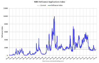
The first graph shows the refinance index.
Refinance activity remains very low.
2014 was the lowest year for refinance activity since year 2000, and refinance activity will probably stay low for the rest of 2015 (after the increase earlier this year).
 The second graph shows the MBA mortgage purchase index.
 According to the MBA, the unadjusted purchase index is 18% higher than a year ago.
Tuesday, August 25, 2015
Wednesday: Durable Goods
by Calculated Risk on 8/25/2015 08:46:00 PM
Wednesday:
• At 7:00 AM ET, the Mortgage Bankers Association (MBA) will release the results for the mortgage purchase applications index.
• At 8:30 AM, Durable Goods Orders for July from the Census Bureau. The consensus is for a 0.4% decrease in durable goods orders.
This is a leading indicator for industry production, from the ACC: Chemical Activity Barometer Follows Global Markets Downward
The Chemical Activity Barometer (CAB), a leading economic indicator created by the American Chemistry Council (ACC), dropped 0.3 percent in August, a marked deceleration of activity from second quarter performance. The declined follows a 0.1 percent gain in July and 0.5 percent gain in both May and June. Data is measured on a three-month moving average (3MMA). Accounting for adjustments, the CAB remains up 1.8 percent over this time last year, also a deceleration of annual growth as compared to this time last year when the barometer logged a 4.2 percent annual gain over 2013.
...
“Chemical, other equity, and product prices all suffered greatly in our latest reading of the Chemical Activity Barometer,” said ACC Chief Economist Kevin Swift. “There continued to be upward momentum in plastic resins for both consumer applications and light vehicles, but we also continue to see declines in oilfield chemicals and U.S. exports overall, largely as a result of softer oil prices and a strong U.S. dollar,” Swift said. Despite these modest headwinds, the Chemical Activity Barometer is still signaling slow gains in business activity into the early part of 2016.
Real Prices and Price-to-Rent Ratio in June
by Calculated Risk on 8/25/2015 03:04:00 PM
The year-over-year increase in prices is mostly moving sideways now at between 4% and 5%.. In October 2013, the National index was up 10.9% year-over-year (YoY). In June 2015, the index was up 4.5% YoY.
Here is the YoY change since January 2014 for the National Index:
| Month | YoY Change |
|---|---|
| Jan-14 | 10.5% |
| Feb-14 | 10.2% |
| Mar-14 | 8.9% |
| Apr-14 | 7.9% |
| May-14 | 7.0% |
| Jun-14 | 6.3% |
| Jul-14 | 5.6% |
| Aug-14 | 5.1% |
| Sep-14 | 4.8% |
| Oct-14 | 4.6% |
| Nov-14 | 4.6% |
| Dec-14 | 4.6% |
| Jan-15 | 4.4% |
| Feb-15 | 4.3% |
| Mar-15 | 4.2% |
| Apr-15 | 4.3% |
| May-15 | 4.4% |
| Jun-15 | 4.5% |
Most of the slowdown on a YoY basis is now behind us. This slowdown in price increases was expected by several key analysts, and I think it is good news for housing and the economy.
In the earlier post, I graphed nominal house prices, but it is also important to look at prices in real terms (inflation adjusted). Case-Shiller, CoreLogic and others report nominal house prices. As an example, if a house price was $200,000 in January 2000, the price would be close to $276,000 today adjusted for inflation (38%). That is why the second graph below is important - this shows "real" prices (adjusted for inflation).
It has been almost ten years since the bubble peak. In the Case-Shiller release this morning, the National Index was reported as being 7.5% below the bubble peak. However, in real terms, the National index is still about 21% below the bubble peak.
Nominal House Prices
 The first graph shows the monthly Case-Shiller National Index SA, the monthly Case-Shiller Composite 20 SA, and the CoreLogic House Price Indexes (through June) in nominal terms as reported.
In nominal terms, the Case-Shiller National index (SA) is back to June 2005 levels, and the Case-Shiller Composite 20 Index (SA) is back to February 2005 levels, and the CoreLogic index (NSA) is back to June 2005.
Real House Prices
 The second graph shows the same three indexes in real terms (adjusted for inflation using CPI less Shelter). Note: some people use other inflation measures to adjust for real prices.
In real terms, the National index is back to May 2003 levels, the Composite 20 index is back to April 2003, and the CoreLogic index back to October 2003.
In real terms, house prices are back to 2003 levels.
Note: CPI less Shelter is down 1.1% year-over-year, so this is pushing up real prices.
Price-to-Rent
In October 2004, Fed economist John Krainer and researcher Chishen Wei wrote a Fed letter on price to rent ratios: House Prices and Fundamental Value. Kainer and Wei presented a price-to-rent ratio using the OFHEO house price index and the Owners' Equivalent Rent (OER) from the BLS.
 Here is a similar graph using the Case-Shiller National, Composite 20 and CoreLogic House Price Indexes.
This graph shows the price to rent ratio (January 1998 = 1.0).
On a price-to-rent basis, the Case-Shiller National index is back to April 2003 levels, the Composite 20 index is back to January 2003 levels, and the CoreLogic index is back to October 2003.
In real terms, and as a price-to-rent ratio, prices are back to 2003 levels - and the price-to-rent ratio maybe moving a little sideways now.
Comments on July New Home Sales
by Calculated Risk on 8/25/2015 12:27:00 PM
The new home sales report for July was slightly below expectations and there were also minor downward revisions to prior months. However sales are still up solidly for 2015 compared to 2014.
Earlier: New Home Sales increased to 507,000 Annual Rate in July.
The Census Bureau reported that new home sales this year, through July, were 316,000, not seasonally adjusted (NSA). That is up 21.2% from 260,000 sales during the same period of 2014 (NSA). That is a strong year-over-year gain for the first seven months of 2015!
Sales were up 25.8% year-over-year in July.
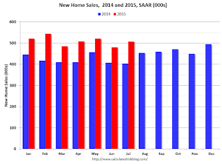
This graph shows new home sales for 2014 and 2015 by month (Seasonally Adjusted Annual Rate).
The year-over-year gain was strong through July (the first seven months were especially weak in 2014), however I expect the year-over-year increases to slow over the remaining months - but the overall year-over-year gain should be solid in 2015.
And here is another update to the "distressing gap" graph that I first started posting a number of years ago to show the emerging gap caused by distressed sales. Now I'm looking for the gap to close over the next several years.

Following the housing bubble and bust, the "distressing gap" appeared mostly because of distressed sales.
I expect existing home sales to mostly move sideways over the next few years (distressed sales will continue to decline and be offset by more conventional / equity sales). And I expect this gap to slowly close, mostly from an increase in new home sales.
Note: Existing home sales are counted when transactions are closed, and new home sales are counted when contracts are signed. So the timing of sales is different.
New Home Sales increased to 507,000 Annual Rate in July
by Calculated Risk on 8/25/2015 10:11:00 AM
The Census Bureau reports New Home Sales in July were at a seasonally adjusted annual rate (SAAR) of 507 thousand.
The previous three months were revised down by a total of 12 thousand (SA).
"Sales of new single-family houses in July 2015 were at a seasonally adjusted annual rate of 507,000, according to estimates released jointly today by the U.S. Census Bureau and the Department of Housing and Urban Development. This is 5.4 percent above the revised June rate of 481,000 and is 25.8 percent above the July 2014 estimate of 403,000."
 Click on graph for larger image.
The first graph shows New Home Sales vs. recessions since 1963. The dashed line is the current sales rate.
Even with the increase in sales since the bottom, new home sales are still close to the bottoms for previous recessions.
The second graph shows New Home Months of Supply.
 The months of supply decreased in July to 5.3 months.
 The all time record was 12.1 months of supply in January 2009.
This is now in the normal range (less than 6 months supply is normal).
"The seasonally adjusted estimate of new houses for sale at the end of July was 218,000. This represents a supply of 5.2 months at the current sales rate."
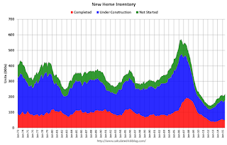 On inventory, according to the Census Bureau:
 "A house is considered for sale when a permit to build has been issued in permit-issuing places or work has begun on the footings or foundation in nonpermit areas and a sales contract has not been signed nor a deposit accepted."Starting in 1973 the Census Bureau broke this down into three categories: Not Started, Under Construction, and Completed.
The third graph shows the three categories of inventory starting in 1973.
The inventory of completed homes for sale is still low, and the combined total of completed and under construction is also low.
 The last graph shows sales NSA (monthly sales, not seasonally adjusted annual rate).
In July 2015 (red column), 43 thousand new homes were sold (NSA). Last year 35 thousand homes were sold in July. This is the highest for July since 2008.
The all time high for July was 117 thousand in 2005, and the all time low for July was 26 thousand in 2010.
This was below expectations of 516,000 sales in July, however new home sales are still on pace for solid growth in 2015. I'll have more later today.
Case-Shiller: National House Price Index increased 4.5% year-over-year in June
by Calculated Risk on 8/25/2015 09:15:00 AM
S&P/Case-Shiller released the monthly Home Price Indices for June ("June" is a 3 month average of April, May and June prices).
This release includes prices for 20 individual cities, two composite indices (for 10 cities and 20 cities) and the monthly National index.
Note: Case-Shiller reports Not Seasonally Adjusted (NSA), I use the SA data for the graphs.
From S&P: Home Prices Continue Upward Trend According to the S&P/Case-Shiller Home Price Indices
The S&P/Case-Shiller U.S. National Home Price Index, covering all nine U.S. census divisions, recorded a slightly higher year-over-year gain with a 4.5% annual increase in June 2015 versus a 4.4% increase in May 2015. The 10-City Composite had marginally lower year-over-year gains, with an increase of 4.6% year-over-year. The 20-City Composite year-over-year pace was virtually unchanged from last month, rising 5.0% year-over-year.
...
Before seasonal adjustment, the National index and 20-City Composite both reported gains of 1.0% month-over-month in June. The 10-City Composite posted a gain of 0.9% month-over-month. After seasonal adjustment, the National index posted a gain of 0.1% while the 10-City and 20-City Composites were both down 0.1% month-over-month. All 20 cities reported increases in June before seasonal adjustment; after seasonal adjustment, nine were down, nine were up, and two were unchanged.
...
“Nationally, home prices continue to rise at a 4-5% annual rate, two to three times the rate of inflation,” says David M. Blitzer, Managing Director and Chairman of the Index Committee at S&P Dow Jones Indices.
emphasis added
 Click on graph for larger image.
 The first graph shows the nominal seasonally adjusted Composite 10, Composite 20 and National indices (the Composite 20 was started in January 2000).
The Composite 10 index is off 14.6% from the peak, and down 0.2% in June (SA).
The Composite 20 index is off 13.3% from the peak, and down 0.1% (SA) in June.
The National index is off 7.5% from the peak, and up 0.1% (SA) in June. The National index is up 25.0% from the post-bubble low set in December 2011 (SA).
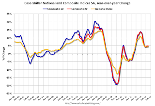 The second graph shows the Year over year change in all three indices.
The Composite 10 SA is up 4.6% compared to June 2014.
The Composite 20 SA is up 5.0% year-over-year..
The National index SA is up 4.5% year-over-year.
Prices increased (SA) in 10 of the 20 Case-Shiller cities in June seasonally adjusted. (Prices increased in 20 of the 20 cities NSA) Prices in Las Vegas are off 39.5% from the peak, and prices in Denver and Dallas are at new highs (SA).
 The last graph shows the bubble peak, the post bubble minimum, and current nominal prices relative to January 2000 prices for all the Case-Shiller cities in nominal terms.
As an example, at the peak, prices in Phoenix were 127% above the January 2000 level. Then prices in Phoenix fell slightly below the January 2000 level, and are now up 51% above January 2000 (51% nominal gain in 15 years).
These are nominal prices, and real prices (adjusted for inflation) are up about 40% since January 2000 - so the increase in Phoenix from January 2000 until now is about 11% above the change in overall prices due to inflation.
Two cities - Denver (up 67% since Jan 2000) and Dallas (up 48% since Jan 2000) - are above the bubble highs (a few other Case-Shiller Comp 20 city are close - Boston, Charlotte, San Francisco, Portland). Detroit prices are barely above the January 2000 level.
This was close to the consensus forecast. I'll have more on house prices later.
Monday, August 24, 2015
Tuesday: New Home Sales, Case-Shiller House Prices, Richmond Fed Mfg
by Calculated Risk on 8/24/2015 09:08:00 PM
Tuesday:
• At 8:30 AM: S&P/Case-Shiller House Price Index for June. Although this is the June report, it is really a 3 month average of April, May and June prices. The consensus is for a 5.2% year-over-year increase in the Comp 20 index for June. The Zillow forecast is for the National Index to increase 4.3% year-over-year in June.
• At 9:00 AM, FHFA House Price Index for June 2015. This was originally a GSE only repeat sales, however there is also an expanded index. The consensus is for a 0.4% month-to-month increase for this index.
• At 10:00 AM, New Home Sales for July from the Census Bureau. The consensus is for an increase in sales to 516 thousand Seasonally Adjusted Annual Rate (SAAR) in July from 482 thousand in June.
• At 10:00 AM, Richmond Fed Survey of Manufacturing Activity for August.

To put the recent sell-off in perspective, here is a graph (click on graph for larger image) from Doug Short and shows the S&P 500 since the 2007 high ...
Catching Up: Existing Home Sales in July: 5.59 million SAAR, Highest Pace in Eight Years
by Calculated Risk on 8/24/2015 04:24:00 PM
While I was on vacation, there were several key economic releases. I'm catching up ...
The NAR reported last week: Existing-Home Sales Maintain Solid Growth in July
Total existing-home sales, which are completed transactions that include single-family homes, townhomes, condominiums and co-ops, increased 2.0 percent to a seasonally adjusted annual rate of 5.59 million in July from a downwardly revised 5.48 million in June. Sales in July remained at the highest pace since February 2007 (5.79 million), have now increased year-over-year for ten consecutive months and are 10.3 percent above a year ago (5.07 million). ...
Total housing inventory at the end of July declined 0.4 percent to 2.24 million existing homes available for sale, and is now 4.7 percent lower than a year ago (2.35 million). Unsold inventory is at a 4.8-month supply at the current sales pace, down from 4.9 months in June.
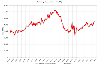 Click on graph for larger image.
This graph shows existing home sales, on a Seasonally Adjusted Annual Rate (SAAR) basis since 1993.
Sales in July (5.59 million SAAR) were 2.0% higher than last month, and were 10.3% above the July 2014 rate.
The second graph shows nationwide inventory for existing homes.
 According to the NAR, inventory decreased to 2.24 million in July from 2.25 million in June. Headline inventory is not seasonally adjusted, and inventory usually decreases to the seasonal lows in December and January, and peaks in mid-to-late summer.
The third graph shows the year-over-year (YoY) change in reported existing home inventory and months-of-supply. Since inventory is not seasonally adjusted, it really helps to look at the YoY change. Note: Months-of-supply is based on the seasonally adjusted sales and not seasonally adjusted inventory.
 Inventory decreased 4.7% year-over-year in July compared to July 2014.
 Months of supply was at 4.8 months in June.
This was above expectations of sales of 5.40 million.
As always, new home sales are more important for jobs and the economy than existing home sales. Since existing sales are existing stock, the only direct contribution to GDP is the broker's commission. There is usually some additional spending with an existing home purchase - new furniture, etc - but overall the economic impact is small compared to a new home sale. Also I wouldn't be surprised if the seasonally adjusted pace for existing home sales slows over the next several months due to limited inventory.
Inventory is still very low (down 4.7% year-over-year in July). More inventory would probably mean smaller price increases and slightly higher sales, and less inventory means lower sales and somewhat larger price increases. This will be important to watch.
Also, the NAR reported total sales were up 10.3% from July 2014, however normal equity sales were up even more, and distressed sales down sharply. From the NAR (from a survey that is far from perfect):
Representing the lowest share since NAR began tracking in October 2008, distressed sales — foreclosures and short sales — declined to 7 percent in July from 8 percent in June; they were 9 percent a year ago. Five percent of July sales were foreclosures and 2 percent were short sales.Last year in July the NAR reported that 9% of sales were distressed sales.
A rough estimate: Sales in July 2014 were reported at 5.07 million SAAR with 9% distressed. That gives 456 thousand distressed (annual rate), and 4.64 million equity / non-distressed. In July 2015, sales were 5.59 million SAAR, with 7% distressed. That gives 391 thousand distressed - a decline of about 14% from July 2014 - and 5.20 million equity. Although this survey isn't perfect, this suggests distressed sales were down sharply - and normal sales up around 13%.
The following graph shows existing home sales Not Seasonally Adjusted (NSA).
 Sales NSA in July (red column) were the highest for July since 2006 (NSA).
Catching Up: Housing Starts increased to 1.206 Million Annual Rate in July
by Calculated Risk on 8/24/2015 01:47:00 PM
While I was on vacation, there were several major economic releases. I'm catching up ...
From the Census Bureau: Permits, Starts and Completions
Housing Starts:
Privately-owned housing starts in July were at a seasonally adjusted annual rate of 1,206,000. This is 0.2 percent above the revised June estimate of 1,204,000 and is 10.1 percent above the July 2014 rate of 1,095,000.
Single-family housing starts in July were at a rate of 782,000; this is 12.8 percent above the revised June figure of 693,000. The July rate for units in buildings with five units or more was 413,000.
Building Permits:
Privately-owned housing units authorized by building permits in July were at a seasonally adjusted annual rate of 1,119,000. This is 16.3 percent below the revised June rate of 1,337,000, but is 7.5 percent above the July 2014 estimate of 1,041,000.
Single-family authorizations in July were at a rate of 679,000; this is 1.9 percent below the revised June figure of 692,000. Authorizations of units in buildings with five units or more were at a rate of 412,000 in July.
emphasis added
 Click on graph for larger image.
The first graph shows single and multi-family housing starts for the last several years.
Multi-family starts (red, 2+ units) decreased in July. Multi-family starts were down slightly year-over-year.
Single-family starts (blue) increased in July and are up about 19% year-over-year.
The second graph shows total and single unit starts since 1968.
 The second graph shows the huge collapse following the housing bubble, and then - after moving sideways for a couple of years - housing is now recovering (but still historically low),
Total housing starts in July were above expectations, and, including the upward revisions to May and June, starts were solid - especially single family starts.
This third graph shows the month to month comparison between 2014 (blue) and 2015 (red).
 Even with weak housing starts in February and March, total starts are still running 11.3% ahead of 2014 through July.
Single family starts are running 11.2% ahead of 2014 through July.
Starts for 5+ units are up 12.2% for the first six months compared to last year.
Below is an update to the graph comparing multi-family starts and completions. Since it usually takes over a year on average to complete a multi-family project, there is a lag between multi-family starts and completions. Completions are important because that is new supply added to the market, and starts are important because that is future new supply (units under construction is also important for employment).
These graphs use a 12 month rolling total for NSA starts and completions.
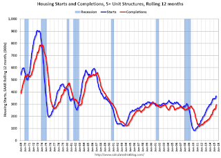 The blue line is for multifamily starts and the red line is for multifamily completions.
 The rolling 12 month total for starts (blue line) increased steadily over the last few years, and completions (red line) have lagged behind - but completions have been catching up (more deliveries), and will continue to follow starts up (completions lag starts by about 12 months).
Multi-family completions are increasing sharply.
I think most of the growth in multi-family starts is probably behind us - in fact multi-family starts might have peaked - although I expect solid multi-family starts for a few more years (based on demographics).
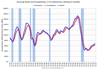 The second graph shows single family starts and completions. It usually only takes about 6 months between starting a single family home and completion - so the lines are much closer. The blue line is for single family starts and the red line is for single family completions.
Note the exceptionally low level of single family starts and completions. The "wide bottom" was what I was forecasting several years ago, and now I expect several years of increasing single family starts and completions.
A strong report, especially for single family starts.
Black Knight: House Price Index up 0.9% in June, 5.1% year-over-year
by Calculated Risk on 8/24/2015 11:14:00 AM
Note: I follow several house price indexes (Case-Shiller, CoreLogic, Black Knight, Zillow, FHFA, FNC and more). Note: Black Knight uses the current month closings only (not a three month average like Case-Shiller or a weighted average like CoreLogic), excludes short sales and REOs, and is not seasonally adjusted.
From Black Knight: U.S. Home Prices Up 0.9 Percent for the Month; Up 5.1 Percent Year-Over-Year
Today, the Data and Analytics division of Black Knight Financial Services, Inc. (NYSE: BKFS) released its latest Home Price Index (HPI) report, based on June 2015 residential real estate transactions. The Black Knight HPI combines the company's extensive property and loan-level databases to produce a repeat sales analysis of home prices as of their transaction dates every month for each of more than 18,500 U.S. ZIP codes. The Black Knight HPI represents the price of non-distressed sales by taking into account price discounts for REO and short sales.The Black Knight HPI increased 0.9% percent in June, and is off 5.8% from the peak in June 2006 (not adjusted for inflation).
For a more in-depth review of this month’s home price trends, including detailed looks at the 20 largest states and 40 largest metros, please download the full Black Knight HPI Report.
The year-over-year increase in the index has been about the same for the last nine months.
The report has data for the 20 largest states, and 40 MSAs.
Black Knight shows prices off 38.5% from the peak in Las Vegas, off 31.5% in Orlando, and 27.9% off from the peak in Riverside-San Bernardino, CA (Inland Empire).
Note: Case-Shiller for June will be released tomorrow.


