by Calculated Risk on 2/23/2016 03:56:00 PM
Tuesday, February 23, 2016
A Few Comments on January Existing Home Sales
The January existing home sales report was stronger than expected, and even slightly stronger than the December report (that included a rebound from the decline in November related to the new TILA-RESPA Integrated Disclosure (TRID)). Note: TILA: Truth in Lending Act, and RESPA: the Real Estate Settlement Procedures Act of 1974.
Going forward, there are some economic reasons for some softness in existing home sales in certain areas. Low inventory is probably holding down sales in many areas, and there will be weakness in some oil producing areas (see: Houston has a problem).
Earlier: Existing Home Sales increased in January to 5.47 million SAAR
I expected some increase in inventory last year, but that didn't happened. Inventory is still very low and falling year-over-year (down 2.2% year-over-year in January). More inventory would probably mean smaller price increases and slightly higher sales, and less inventory means lower sales and somewhat larger price increases.
The following graph shows existing home sales Not Seasonally Adjusted (NSA).

Sales NSA in January (red column) were the highest since January 2007 (NSA).
This is a solid start to 2016.
Chemical Activity Barometer "Slips" in February
by Calculated Risk on 2/23/2016 12:42:00 PM
Here is an indicator that I'm following that appears to be a leading indicator for industrial production.
From the American Chemistry Council: Chemical Activity Barometer Slips in February
The Chemical Activity Barometer (CAB), a leading economic indicator created by the American Chemistry Council (ACC), slipped 0.1 percent in February following flat performance in January and two months of revised gains in November and December 2015. All data is measured on a three-month moving average (3MMA). Accounting for adjustments, the CAB remains up 1.5 percent over this time last year, a decline of fifty-percent from activity of one year ago when the barometer logged a 3.0 percent year-over-year gain from February 2014. On an unadjusted basis the CAB rose 0.1 percent following two consecutive monthly declines.
...
Applying the CAB back to 1919, it has been shown to provide a lead of two to 14 months, with an average lead of eight months at cycle peaks as determined by the National Bureau of Economic Research. The median lead was also eight months. At business cycle troughs, the CAB leads by one to seven months, with an average lead of four months. The median lead was three months. The CAB is rebased to the average lead (in months) of an average 100 in the base year (the year 2012 was used) of a reference time series. The latter is the Federal Reserve’s Industrial Production Index.
emphasis added
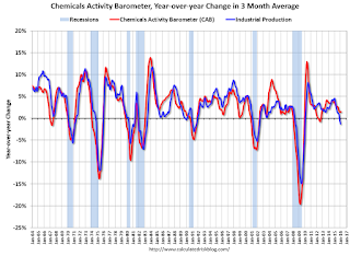 Click on graph for larger image.
This graph shows the year-over-year change in the 3-month moving average for the Chemical Activity Barometer compared to Industrial Production. It does appear that CAB (red) generally leads Industrial Production (blue).
Currently CAB is up slightly year-over-year, and this suggests a slight increase in Industrial Production over the next year is possible.
Existing Home Sales increased in January to 5.47 million SAAR
by Calculated Risk on 2/23/2016 10:10:00 AM
From the NAR: Existing-Home Sales Inch Forward in January, Price Growth Accelerates
Total existing-home sales, which are completed transactions that include single-family homes, townhomes, condominiums and co-ops, inched 0.4 percent to a seasonally adjusted annual rate of 5.47 million in January from a downwardly revised 5.45 million in December. Sales are now 11.0 percent higher than a year ago – the largest year-over-year gain since July 2013 (16.3 percent)....
Total housing inventory at the end of January increased 3.4 percent to 1.82 million existing homes available for sale, but is still 2.2 percent lower than a year ago (1.86 million). Unsold inventory is at a 4.0-month supply at the current sales pace, up slightly from 3.9 months in December 2015.
 Click on graph for larger image.
This graph shows existing home sales, on a Seasonally Adjusted Annual Rate (SAAR) basis since 1993.
Sales in January (5.47 million SAAR) were 0.4% hgiher than last month, and were 11.0% above the January 2015 rate.
The second graph shows nationwide inventory for existing homes.
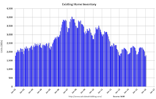 According to the NAR, inventory increased to 1.82 million in January from 1.76 million in December. Headline inventory is not seasonally adjusted, and inventory usually decreases to the seasonal lows in December and January, and peaks in mid-to-late summer.
The third graph shows the year-over-year (YoY) change in reported existing home inventory and months-of-supply. Since inventory is not seasonally adjusted, it really helps to look at the YoY change. Note: Months-of-supply is based on the seasonally adjusted sales and not seasonally adjusted inventory.
 Inventory decreased 2.2% year-over-year in January compared to January 2015.
 Months of supply was at 4.0 months in January.
This was above consensus expectations of sales of 5.32 million. For existing home sales, a key number is inventory - and inventory is still low. I'll have more later ...
Case-Shiller: National House Price Index increased 5.4% year-over-year in December
by Calculated Risk on 2/23/2016 09:21:00 AM
S&P/Case-Shiller released the monthly Home Price Indices for December ("December" is a 3 month average of October, November and December prices).
This release includes prices for 20 individual cities, two composite indices (for 10 cities and 20 cities) and the monthly National index.
Note: Case-Shiller reports Not Seasonally Adjusted (NSA), I use the SA data for the graphs.
From S&P: Home Prices Marginally Increased in December According to the S&P/Case-Shiller Home Price Indices
The S&P/Case-Shiller U.S. National Home Price Index, covering all nine U.S. census divisions, recorded a slightly higher year-over-year gain with a 5.4% annual increase in December 2015 versus a 5.2% increase in November 2015. The 10-City Composite increased 5.1% in the year to December compared to 5.2% previously. The 20-City Composite’s year-over-year gain was 5.7%, the same as November.
...
Before seasonal adjustment, the National Index posted a gain of 0.1% month-over-month in December. The 10- City Composite decreased by 0.1% and the 20-City Composite remained unchanged in December. After seasonal adjustment, the National and 20-City Composites Index both recorded a monthly increase of 0.8%. The 10-City Composite increased 0.7% month-over-month in December. Ten of 20 cities reported increases in December before seasonal adjustment; after seasonal adjustment, all 19 cities increased for the month.
emphasis added
 Click on graph for larger image.
 The first graph shows the nominal seasonally adjusted Composite 10, Composite 20 and National indices (the Composite 20 was started in January 2000).
The Composite 10 index is off 12.4% from the peak, and up 0.7% in December (SA).
The Composite 20 index is off 10.8% from the peak, and up 0.8% (SA) in December.
The National index is off 3.7% from the peak, and up 0.8% (SA) in December. The National index is up 30.1% from the post-bubble low set in December 2011 (SA).
 The second graph shows the Year over year change in all three indices.
The Composite 10 SA is up 5.1% compared to December 2014.
The Composite 20 SA is up 5.7% year-over-year..
The National index SA is up 5.4% year-over-year.
Prices increased (SA) in 19 of the 20 Case-Shiller cities in December seasonally adjusted. (Prices increased in 10 of the 20 cities NSA) Prices in Las Vegas are off 38.2% from the peak.
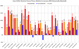 The last graph shows the bubble peak, the post bubble minimum, and current nominal prices relative to January 2000 prices for all the Case-Shiller cities in nominal terms.
As an example, at the peak, prices in Phoenix were 127% above the January 2000 level. Then prices in Phoenix fell slightly below the January 2000 level, and are now up 57% above January 2000 (57% nominal gain in almost 16 years).
These are nominal prices, and real prices (adjusted for inflation) are up about 40% since January 2000 - so the increase in Phoenix from January 2000 until now is about 17% above the change in overall prices due to inflation.
Six cities - Charlotte, Boston, Dallas, Denver, Portland and San Francisco - are above the bubble highs (Seattle is close). Detroit prices are barely above the January 2000 level.
I'll have more on house prices later.
Monday, February 22, 2016
Tuesday: Existing Home Sales, Case-Shiller House Prices, Richmond Fed Mfg Survey
by Calculated Risk on 2/22/2016 07:15:00 PM
From Matthew Graham at Mortgage News Daily: Mortgage Rates Sideways Again; Anxiety Builds
For now, the most prevalently-quoted conventional 30yr fixed rate remains 3.625% on top tier scenarios. Some of the less aggressive lenders are back up to 3.75%, but that was the case as of late last week as well.Tuesday:
• At 9:00 AM ET, S&P/Case-Shiller House Price Index for December. Although this is the December report, it is really a 3 month average of October, November and December prices. The consensus is for a 5.9% year-over-year increase in the Comp 20 index for November. The Zillow forecast is for the National Index to increase 5.3% year-over-year in November.
• At 10:00 AM, Existing Home Sales for January from the National Association of Realtors (NAR). The consensus is for 5.32 million SAAR, down from 5.46 million in December. Economist Tom Lawler expects the NAR to report sales of 5.36 million SAAR for January.
• At 10:00 AM, Richmond Fed Survey of Manufacturing Activity for February.
A comment on the January Black Knight Mortgage Delinquency Data
by Calculated Risk on 2/22/2016 04:43:00 PM
This morning I posted some mortgage delinquency data from Black Knight (formerly LPS). The data showed an increase in delinquencies in January to 5.09%. Several people asked me if this is a leading indicator of a potential problem. The answer is no.
Here is what I wrote in 2012 when the delinquency rate was at 8%:
At the current rate of decline, the number of delinquent lonas will be back to "normal" in about three years (around 4.5% to 5% of loans are delinquent even in good times). However the number of loans in the foreclosure process hasn't change year-over-year - although that will probably change soon with the mortgage servicer settlement (around 0.5% of loans in foreclosure is "normal").The percent of loans in delinquency is now close to the normal range, although there are still an excessive number of seriously delinquent loans. As the delinquency rate approaches normal, it will not be unusual for the rate to increase in some months - no worries.
Note that the number of loans in the foreclosure process is still way above normal at 1.30% in January 2016; the lenders are still working through the backlog.
DOT: Vehicle Miles Driven increased 4.2% year-over-year in December
by Calculated Risk on 2/22/2016 12:51:00 PM
With lower gasoline prices, driving has really picked up!
The Department of Transportation (DOT) reported today:
Travel on all roads and streets changed by 4.2% (10.6 billion vehicle miles) for December 2015 as compared with December 2014.The following graph shows the rolling 12 month total vehicle miles driven to remove the seasonal factors.
Travel for the month is estimated to be 264.2 billion vehicle miles.
The seasonally adjusted vehicle miles traveled for December 2015 is 268.5 billion miles, a 4.0% (10.4 billion vehicle miles) increase over December 2014. It also represents a 1.4% change (3.7 billion vehicle miles) compared with November 2015.
The rolling 12 month total is moving up - mostly due to lower gasoline prices - after moving sideways for several years.
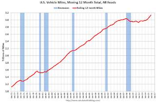 Click on graph for larger image.
In the early '80s, miles driven (rolling 12 months) stayed below the previous peak for 39 months.
Miles driven (rolling 12) had been below the previous peak for 85 months - an all time record - before reaching a new high for miles driven in January.
The second graph shows the year-over-year change from the same month in the previous year.
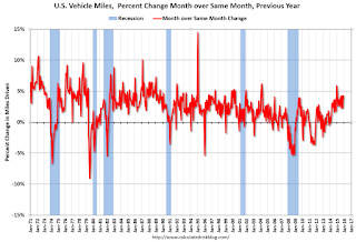 In December 2015, gasoline averaged $2.14 per gallon according to the EIA. That was down significantly from December 2014 when prices averaged $2.63 per gallon. Gasoline prices have continued to decline, and vehicle miles will probably up sharply year-over-year in January.
Gasoline prices aren't the only factor - demographics are also important. However, with lower gasoline prices, miles driven on a rolling 12 month basis, is setting new highs each month.
Black Knight's First Look at January Mortgage Data
by Calculated Risk on 2/22/2016 09:01:00 AM
From Black Knight: Black Knight Financial Services’ First Look at January Mortgage Data: Delinquencies Up Sharply; Prepayment Rate Drops
- Delinquency rate up 6.6 percent in January; back above 5 percent nationally for the first time in 11 monthsAccording to Black Knight's First Look report for January, the percent of loans delinquent increased 6.6% in January compared to December, and declined 7.1% year-over-year.
- Prepayment rate (historically a good indicator of refinance activity) dropped 29 percent to its lowest level since February 2014
- Foreclosure sales (completions) up nearly 16 percent following holiday moratoriums
- Active foreclosure inventory continues to decline; down 26 percent from last year
The percent of loans in the foreclosure process declined 4.5% in December and were down 25.7% over the last year.
Black Knight reported the U.S. mortgage delinquency rate (loans 30 or more days past due, but not in foreclosure) was 5.09% in January, down from 4.79% in December.
The percent of loans in the foreclosure process declined in January to 1.30%.
The number of delinquent properties, but not in foreclosure, is down 229,000 properties year-over-year, and the number of properties in the foreclosure process is down 226,000 properties year-over-year.
Black Knight will release the complete mortgage monitor for January in early March.
| Black Knight: Percent Loans Delinquent and in Foreclosure Process | ||||
|---|---|---|---|---|
| Jan 2016 | Dec 2015 | Jan 2015 | Jan 2014 | |
| Delinquent | 5.09% | 4.78% | 5.48% | 6.25% |
| In Foreclosure | 1.30% | 1.37% | 1.76% | 2.41% |
| Number of properties: | ||||
| Number of properties that are delinquent, but not in foreclosure: | 2,575,000 | 2,408,000 | 2,764,000 | 3,150,000 |
| Number of properties in foreclosure pre-sale inventory: | 659,000 | 689,000 | 885,000 | 1,213,000 |
| Total Properties | 3,234,000 | 3,097,000 | 3,649,000 | 4,363,000 |
Chicago Fed: "Index shows economic growth picked up in January"
by Calculated Risk on 2/22/2016 08:35:00 AM
The Chicago Fed released the national activity index (a composite index of other indicators): Index shows economic growth picked up in January
Led by improvements in production-related indicators, the Chicago Fed National Activity Index (CFNAI) rose to +0.28 in January from –0.34 in December. Two of the four broad categories of indicators that make up the index increased from December, and two of the four categories made positive contributions to the index in January.This graph shows the Chicago Fed National Activity Index (three month moving average) since 1967.
The index’s three-month moving average, CFNAI-MA3, increased to –0.15 in January from –0.30 in December. January’s CFNAI-MA3 suggests that growth in national economic activity was somewhat below its historical trend. The economic growth reflected in this level of the CFNAI-MA3 suggests subdued inflationary pressure from economic activity over the coming year.
emphasis added
 Click on graph for larger image.
This suggests economic activity was somewhat below the historical trend in January (using the three-month average).
According to the Chicago Fed:
What is the National Activity Index? The index is a weighted average of 85 indicators of national economic activity drawn from four broad categories of data: 1) production and income; 2) employment, unemployment, and hours; 3) personal consumption and housing; and 4) sales, orders, and inventories.
A zero value for the index indicates that the national economy is expanding at its historical trend rate of growth; negative values indicate below-average growth; and positive values indicate above-average growth.
Sunday, February 21, 2016
Sunday Night Futures
by Calculated Risk on 2/21/2016 07:36:00 PM
From Marcoblog: Are Paychecks Picking Up the Pace?
Based on the Atlanta Fed's Wage Growth Tracker (WGT), the median annual growth in hourly wage and salary earnings of continuously employed workers in 2015 was 3.1 percent—up from 2.5 percent in 2014 and 2.2 percent in 2013. That is, the typical wage growth of workers employed for at least 12 months appears to be trending higher.Weekend:
However, wage growth by job type varies considerably. For example, the WGT for part-time workers has been unusually low since 2010. ...
The take-away? Wage growth for continuously employed workers appears to have picked up some steam in 2015, and the recent trend in wage growth is positive across a variety of job characteristics. Wage growth for people in lower-skill jobs has increased during the last couple of years, consistent with evidence of increasing tightness in the market for those types of jobs. The largest discrepancy in wage growth appears to be among part-time workers, whose median gain in hourly wages in 2015 still fell well short of those in full-time jobs.
• Schedule for Week of February 21, 2016
• Fannie and Freddie: REO inventory declined in Q4, Down 34% Year-over-year
Monday:
• At 8:30 AM ET, the Chicago Fed National Activity Index for January. This is a composite index of other data.
From CNBC: Pre-Market Data and Bloomberg futures: currently S&P futures are down 4 and DOW futures are down 32 (fair value).
Oil prices were down over the last week with WTI futures at $29.64 per barrel and Brent at $33.01 per barrel. A year ago, WTI was at $50, and Brent was at $60 - so prices are down about 40% year-over-year.
Here is a graph from Gasbuddy.com for nationwide gasoline prices. Nationally prices are at $1.71 per gallon (down about $0.45 per gallon from a year ago).


