by Calculated Risk on 3/14/2016 10:10:00 AM
Monday, March 14, 2016
BLS: Unemployment Rate decreased in 28 States in January
From the BLS: Regional and State Employment and Unemployment Summary
Regional and state unemployment rates were little changed in January. Twenty-eight states and the District of Columbia had unemployment rate decreases from December, 8 states had increases, and 14 states had no change, the U.S. Bureau of Labor Statistics reported today.
...
North Dakota and South Dakota had the lowest jobless rates in January, 2.8 percent each, closely followed by New Hampshire, 2.9 percent. Mississippi had the highest rate, 6.7 percent, followed by Alaska, 6.6 percent.
 Click on graph for larger image.
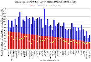
This graph shows the current unemployment rate for each state (red), and the max during the recession (blue). All states are well below the maximum unemployment rate for the recession.
The size of the blue bar indicates the amount of improvement. The yellow squares are the lowest unemployment rate per state since 1976.
The states are ranked by the highest current unemployment rate. Mississippi, at 6.7%, had the highest state unemployment rate.
 The second graph shows the number of states (and D.C.) with unemployment rates at or above certain levels since January 2006. At the worst of the employment recession, there were 11 states with an unemployment rate at or above 11% (red).
Currently no state has an unemployment rate at or above 7% (light blue); Only eight states are at or above 6% (dark blue).
Sunday, March 13, 2016
Sunday Night Futures
by Calculated Risk on 3/13/2016 08:16:00 PM
Gasoline prices have been increasing in most areas. As an example, from the LA Daily News: Southern California gas prices rise sharply again
The average price of a gallon of self-serve regular gasoline in Los Angeles County rose 3.5 cents Saturday to $2.693, one day after increasing 5 cents.Weekend:
The average price has risen 16 consecutive days, increasing 33.2 cents, according to figures from the AAA and Oil Price Information Service. It is 11.6 cents higher than one week ago and 12.2 cents greater than one month ago.
• Schedule for Week of March 13, 2016
• Goldman: FOMC Preview
Monday:
• At 10:00 AM ET, Regional and State Employment and Unemployment (Monthly) for January 2016 from BLS.
From CNBC: Pre-Market Data and Bloomberg futures: currently S&P futures are down 4 and DOW futures are down 29 (fair value).
Oil prices were up over the last week with WTI futures at $38.44 per barrel and Brent at $40.39 per barrel. A year ago, WTI was at $45, and Brent was at $55 - so prices are down about 15% to 25% year-over-year, respectively.
Here is a graph from Gasbuddy.com for nationwide gasoline prices. Nationally prices are at $1.94 per gallon (down about $0.50 per gallon from a year ago).
Goldman: FOMC Preview
by Calculated Risk on 3/13/2016 12:47:00 PM
A few excerpts from a research piece by Goldman Sachs economists Zach Pandl and Jan Hatzius: March FOMC Preview
At its meeting in late January, the FOMC suspended its normal balance of risks assessment over concerns about tighter financial conditions and downside risks to growth. Although policymakers continue to express some caution about the outlook, financial conditions have eased considerably over the last month, and incoming data have held up reasonably well.
We do not think the committee is ready to raise rates next week, but expect the statement to say that risks are “nearly balanced”. Guidance from the meeting in general should indicate that another rate hike is likely before too long—we expect an increase at the June 14-15 FOMC meeting, but action at the April 26-27 meeting is not inconceivable.
...
Beyond next week’s meeting, we think markets may be underestimating Fed officials’ tolerance for tighter financial conditions over time. In fact, we expect that financial conditions will need to tighten moderately over the next year to bring employment growth to a trend pace, which probably requires a steeper funds rate path than currently priced in the bond market.
emphasis added
Saturday, March 12, 2016
Schedule for Week of March 13, 2016
by Calculated Risk on 3/12/2016 08:11:00 AM
The key economic reports this week are February retail sales on Tuesday, and February housing starts on Wednesday.
For prices, PPI and CPI will be released this week.
From manufacturing, February Industrial Production and the March NY and Philly Fed manufacturing surveys will be released this week.
The FOMC meets this week, and the FOMC statement (and press conference) will be on Wednesday.
10:00 AM ET: Regional and State Employment and Unemployment (Monthly) for January 2016 from BLS.
 8:30 AM ET: Retail sales for February will be released. The consensus is for retail sales to decrease 0.1% in February.
This graph shows retail sales since 1992 through January 2016. This is monthly retail sales and food service, seasonally adjusted (total and ex-gasoline). On a monthly basis, retail sales were up 0.2% from December to January (seasonally adjusted), and sales were up 3.4% from January 2015.
8:30 AM: The Producer Price Index for February from the BLS. The consensus is for a 0.2% decrease in prices, and a 0.1% increase in core PPI.
8:30 AM: NY Fed Empire State Manufacturing Survey for March. The consensus is for a reading of -11.0, up from -16.7.
10:00 AM: The March NAHB homebuilder survey. The consensus is for a reading of 59, up from 58 in February. Any number above 50 indicates that more builders view sales conditions as good than poor.
10:00 AM: Manufacturing and Trade: Inventories and Sales (business inventories) report for January. The consensus is for no change in inventories.
7:00 AM ET: The Mortgage Bankers Association (MBA) will release the results for the mortgage purchase applications index.
 8:30 AM: Housing Starts for February.
 Total housing starts decreased to 1.099 million (SAAR) in January. Single family starts decreased to 731 thousand SAAR in January.
The consensus for 1.146 million, up from the January rate.
8:30 AM: The Consumer Price Index for February from the BLS. The consensus is for a 0.3% decrease in CPI, and a 0.2% increase in core CPI.
 9:15 AM: The Fed will release Industrial Production and Capacity Utilization for February.
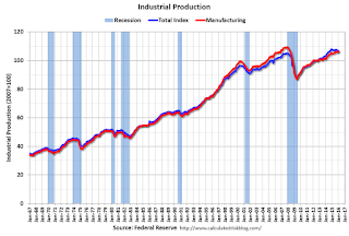
This graph shows industrial production since 1967.
The consensus is for a 0.2% decrease in Industrial Production, and for Capacity Utilization to decrease to 76.9%.
2:00 PM: FOMC Meeting Announcement. No change to the Fed Funds rate is expected at this meeting.
2:00 PM: FOMC Forecasts This will include the Federal Open Market Committee (FOMC) participants' projections of the appropriate target federal funds rate along with the quarterly economic projections.
2:30 PM: Fed Chair Janet Yellen holds a press briefing following the FOMC announcement.
8:30 AM: The initial weekly unemployment claims report will be released. The consensus is for 270 thousand initial claims, up from 259 thousand the previous week.
8:30 AM: the Philly Fed manufacturing survey for March. The consensus is for a reading of -1.4, up from -2.8.
 10:00 AM: Job Openings and Labor Turnover Survey for January from the BLS.
 This graph shows job openings (yellow line), hires (purple), Layoff, Discharges and other (red column), and Quits (light blue column) from the JOLTS.
Jobs openings increased in December to 5.607 million from 5.346 million in November.
The number of job openings (yellow) were up 15% year-over-year, and Quits were up 13% year-over-year.
10:00 AM: University of Michigan's Consumer sentiment index (preliminary for March). The consensus is for a reading of 92.2, up from 91.7 in February.
Friday, March 11, 2016
Sacramento Housing in February: Sales down 1.5%, Inventory down 24% YoY
by Calculated Risk on 3/11/2016 07:18:00 PM
During the recession, I started following the Sacramento market to look for changes in the mix of houses sold (equity, REOs, and short sales). For a few years, not much changed. But in 2012 and 2013, we saw some significant changes with a dramatic shift from distressed sales to more normal equity sales.
This data suggests healing in the Sacramento market and other distressed markets are showing similar improvement. Note: The Sacramento Association of REALTORS® started breaking out REOs in May 2008, and short sales in June 2009.
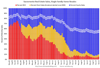
In February, total sales were down 1.5% from February 2015, and conventional equity sales were up 2.1% compared to the same month last year.
In February, 9.7% of all resales were distressed sales. This was up from 9.2% last month, and down from 14.8% in February 2015.
The percentage of REOs was at 5.4% in February, and the percentage of short sales was 4.3%.
Here are the statistics.

This graph shows the percent of REO sales, short sales and conventional sales.
There has been a sharp increase in conventional (equity) sales that started in 2012 (blue) as the percentage of distressed sales declined sharply.
Active Listing Inventory for single family homes decreased 23.5% year-over-year (YoY) in January. This was the tenth consecutive monthly YoY decrease in inventory in Sacramento.
Cash buyers accounted for 20.1% of all sales (frequently investors).
Summary: This data suggests a more normal market with fewer distressed sales, more equity sales, and less investor buying.
LA area Port Traffic Increased Sharply YoY in February due to Labor Slowdown last Year
by Calculated Risk on 3/11/2016 04:53:00 PM
Note: There were some large swings in LA area port traffic early last year due to labor issues that were settled in late February. Port traffic slowed in January and February last year, and then surged in March 2015 as the waiting ships were unloaded (the trade deficit increased in March too). This will impact the YoY changes for the first few months of 2016.
Container traffic gives us an idea about the volume of goods being exported and imported - and usually some hints about the trade report since LA area ports handle about 40% of the nation's container port traffic.
The following graphs are for inbound and outbound traffic at the ports of Los Angeles and Long Beach in TEUs (TEUs: 20-foot equivalent units or 20-foot-long cargo container).
To remove the strong seasonal component for inbound traffic, the first graph shows the rolling 12 month average.

On a rolling 12 month basis, inbound traffic was up 2.6% compared to the rolling 12 months ending in January. Outbound traffic was up 0.8% compared to 12 months ending in January.
The recent downturn in exports is probably due to the slowdown in China and the stronger dollar.
The 2nd graph is the monthly data (with a strong seasonal pattern for imports).

Imports and exports were up sharply year-over-year in February - but some of this increase was due to the labor issues last year.
Merle Hazard: "How Long (Will Interest Rates Stay Low)?"
by Calculated Risk on 3/11/2016 03:00:00 PM
A new song from Merle Hazard called "How Long (Will Interest Rates Stay Low)?"
Enjoy!
Mortgage Equity Withdrawal Slightly Negative in Q4
by Calculated Risk on 3/11/2016 11:41:00 AM
Note: This is not Mortgage Equity Withdrawal (MEW) data from the Fed. The last MEW data from Fed economist Dr. Kennedy was for Q4 2008.
The following data is calculated from the Fed's Flow of Funds data (released last week) and the BEA supplement data on single family structure investment. This is an aggregate number, and is a combination of homeowners extracting equity - hence the name "MEW", but there is still little (but increasing) MEW right now - and normal principal payments and debt cancellation (modifications, short sales, and foreclosures).
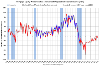
For Q4 2015, the Net Equity Extraction was a negative $24 billion, or a negative 0.7% of Disposable Personal Income (DPI) . MEW for Q2 and Q3 was slightly positive - the first positive MEW since Q1 2008 -and the decline in Q4 was probably seasonal.

This graph shows the net equity extraction, or mortgage equity withdrawal (MEW), results, using the Flow of Funds (and BEA data) compared to the Kennedy-Greenspan method.
Note: This data is still heavily impacted by debt cancellation and foreclosures.
The Fed's Flow of Funds report showed that the amount of mortgage debt outstanding increased by $22 billion in Q4.
The Flow of Funds report also showed that Mortgage debt has declined by almost $1.3 trillion since the peak. This decline is mostly because of debt cancellation per foreclosures and short sales, and some from modifications. There has also been some reduction in mortgage debt as homeowners paid down their mortgages so they could refinance.
With residential investment increasing, and a slower rate of debt cancellation, MEW will likely turn positive.
For reference:
Dr. James Kennedy also has a simple method for calculating equity extraction: "A Simple Method for Estimating Gross Equity Extracted from Housing Wealth". Here is a companion spread sheet (the above uses my simple method).
For those interested in the last Kennedy data included in the graph, the spreadsheet from the Fed is available here.
Goldman: "Quits and Gross Hiring Are Mostly Back to Normal"
by Calculated Risk on 3/11/2016 08:57:00 AM
A few excerpts from a research piece by Goldman Sachs economist Daan Struyven: Quits and Gross Hiring Are Mostly Back to Normal
Two years ago, Fed Chair Janet Yellen introduced a “dashboard” of labor market indicators that included two measures of worker flows, the hiring rate and the quit rate. At the time, these two measures reinforced the case that there was more labor market slack than the headline unemployment rate suggested.Struyven is referring to the JOLTS. Here is a graph from the recent report:
Today, the hiring and quit rates have recovered substantially to levels nearly in line with historical averages and consistent with the current U6 underemployment rate. This recovery of gross job flows has arguably had two positive effects. First, industry-level data suggest that higher turnover may have contributed to faster wage growth. Second, the increase in the hiring rate may have made it easier for unemployed workers to re-enter employment.
But the recovery in dynamism still looks somewhat incomplete. In particular, re-employment rates for the long-term unemployed have yet to fully normalize. We see this as an indication that despite considerable progress, the labor market has not yet fully healed.
 Click on graph for larger image.
This graph shows levels for job openings (yellow line), hires (dark blue), Layoff, Discharges and other (red column), and Quits (light blue column) from the JOLTS.
Note that hires (dark blue) and total separations (red and light blue columns stacked) are pretty close each month. This is a measure of labor market turnover. When the blue line is above the two stacked columns, the economy is adding net jobs - when it is below the columns, the economy is losing jobs.
Jobs openings increased in December to 5.607 million from 5.346 million in November.
The number of job openings (yellow) are up 15% year-over-year compared to December 2014.
Quits are up 13% year-over-year. These are voluntary separations. (see light blue columns at bottom of graph for trend for "quits").
As Struyven notes, the hiring and quit rates have recovered to "historical averages".
Thursday, March 10, 2016
Fannie Mae: "Millennials ... Are the Driving Force Behind the Recent Surge in Apartment Demand"
by Calculated Risk on 3/10/2016 06:23:00 PM
From Patrick Simmons at Fannie Mae: Housing Myths, Debunked: Millennials, Not Baby Boomers, Are the Driving Force Behind the Recent Surge in Apartment Demand
By far, the most important generational driver of apartment demand growth between 2009 and 2014 was the Millennials. Millennials have been reaching adulthood and entering the housing market in large numbers in recent years. For many of these new housing market entrants, the first step in their housing careers after leaving the parental nest has been occupancy of an apartment. As can be seen from the chart at bottom-left when the 2014 button is selected, Millennials’ demand for apartments increased by millions between 2009 and 2014, far outpacing the demand growth from Boomers. In fact, the increase in Millennials’ consumption of apartments during this period was more than 10 times that of Boomers, as can be seen when the “All cohorts” button is selected.Check out the interactive graphic.
This is related to my post earlier this week, see: Demographics: Renting vs. Owning. The huge surge in the prime rental age group is nearing the end, and over the next decade, there will be a pickup in the key 30 to 39 demographic (homebuyers).


