by Calculated Risk on 8/11/2016 10:40:00 AM
Thursday, August 11, 2016
MBA: "Delinquencies and Foreclosures Continue to Drop" in Q2
From the MBA: Second Quarter Delinquency Rate Lowest in Ten Years
The delinquency rate for mortgage loans on one-to-four-unit residential properties decreased 11 basis points to a seasonally adjusted rate of 4.66 percent of all loans outstanding at the end of the second quarter of 2016. This was the lowest level since the second quarter of 2006. The delinquency rate was 64 basis points lower than one year ago, according to the Mortgage Bankers Association's (MBA) National Delinquency Survey.
The percentage of loans on which foreclosure actions were started during the second quarter was 0.32 percent, a decrease of three basis points from the previous quarter, and down eight basis points from one year ago. This foreclosure starts rate was at its lowest level since the second quarter of 2000.
The delinquency rate includes loans that are at least one payment past due but does not include loans in the process of foreclosure. The percentage of loans in the foreclosure process at the end of the second quarter was 1.64 percent, down 10 basis points from the previous quarter and 45 basis points lower than one year ago. The foreclosure inventory rate was at its lowest level since the second quarter of 2007.
The serious delinquency rate, the percentage of loans that are 90 days or more past due or in the process of foreclosure, was 3.11 percent, a decrease of 18 basis points from previous quarter, and a decrease of 84 basis points from last year. The serious delinquency rate was at its lowest level since the third quarter of 2007.
Marina Walsh, MBA's Vice President of Industry Analysis, offered the following commentary on the survey:
"Mortgage performance improved again in the second quarter primarily because of the combination of lower unemployment, strong job growth, and a continued nationwide housing market recovery. The mortgage delinquency rate tracks closely with the nation's improving unemployment rate. In the second quarter of 2016, the mortgage delinquency rate was 4.66 percent, while the unemployment rate was 4.87 percent. By comparison, at its peak in the first quarter of 2010, the delinquency rate was 10.06 percent and the unemployment rate stood at 9.83 percent.
"In addition, the delinquency rate of 4.66 percent for the second quarter of 2016 was lower than the historical average of 5.36 percent for the time period 1979 to the present. Among the various loan types, the delinquency rate improved for conventional loans as well as FHA loans. The FHA delinquency rate dropped to 8.46 percent, its lowest level since 2000.
"The percentage of new foreclosures initiated in the second quarter was 0.32, the lowest rate since 2000, and 13 basis points below the historical average of 0.45 percent. FHA loans saw a 15 basis point drop in the percentage of new foreclosures, which pushed the rate down to 0.48 percent, its lowest level since 1993.
"Continuing a downward trend that began in the second quarter of 2012, the foreclosure inventory rate fell again to 1.64 percent in the second quarter of 2016. The FHA foreclosure inventory rate dropped 26 basis points from the previous quarter to 2.15 percent, its lowest level since 2001. "
emphasis added
 Click on graph for larger image.
This graph shows the percent of loans delinquent by days past due.
Note that the total percent delinquencies and foreclosures is below the 2002 level.
The percent of loans 30 and 60 days delinquent ticked down in Q2, and is below the normal historical level.
The 90 day bucket declined further in Q2, but remains a little elevated.
The percent of loans in the foreclosure process continues to decline, and is still above the historical average.
The 90 day bucket and foreclosure inventory are still elevated, but should be close to normal in 2017. Most other mortgage measures are already back to normal, but the lenders are still working through the backlog of bubble legacy loans.
Weekly Initial Unemployment Claims decreased to 266,000
by Calculated Risk on 8/11/2016 08:33:00 AM
The DOL reported:
In the week ending August 6, the advance figure for seasonally adjusted initial claims was 266,000, a decrease of 1,000 from the previous week's revised level. The previous week's level was revised down by 2,000 from 269,000 to 267,000. The 4-week moving average was 262,750, an increase of 3,000 from the previous week's revised average. The previous week's average was revised down by 500 from 260,250 to 259,750.The previous week was revised down 2,000.
There were no special factors impacting this week's initial claims. This marks 75 consecutive weeks of initial claims below 300,000, the longest streak since 1970.
The following graph shows the 4-week moving average of weekly claims since 1971.
 Click on graph for larger image.
The dashed line on the graph is the current 4-week average. The four-week average of weekly unemployment claims increased to 262,750.
This was close to the consensus forecast of 265,000. The low level of claims suggests relatively few layoffs.
Wednesday, August 10, 2016
Memory Lane: From 2005 just as Housing Inventory started to Increase
by Calculated Risk on 8/10/2016 05:26:00 PM
A quick trip down memory lane. Here are couple of posts from August 2005 when we were looking for the housing top. Inventory was the key - and inventory was just starting to increase.
Sign, Sign, Everywhere a Sign

The first photo - from August 2005 - shows four houses in a row for sale in my neighborhood (the signs were everywhere).
And back when I wrote at Angry Bear: Signs of the Times

The second photo - from the 2005 Angry Bear post - was from the O.C. Register showing three in a row.

Update: Framing Lumber Prices Up Year-over-year
by Calculated Risk on 8/10/2016 01:57:00 PM
Here is another update on framing lumber prices. Early in 2013 lumber prices came close to the housing bubble highs.
The price increases in early 2013 were due to a surge in demand (more housing starts) and supply constraints (framing lumber suppliers were working to bring more capacity online).
Prices didn't increase as much early in 2014 (more supply, smaller "surge" in demand).
In 2015, even with the pickup in U.S. housing starts, prices were down year-over-year. Note: Multifamily starts do not use as much lumber as single family starts, and there was a surge in multi-family starts. This decline in 2015 was also probably related to weakness in China.
Prices are now up year-over-year.

This graph shows two measures of lumber prices: 1) Framing Lumber from Random Lengths through early July 2016 (via NAHB), and 2) CME framing futures.
Right now Random Lengths prices are up 9% from a year ago, and CME futures are up about 17% year-over-year.
BLS: Job Openings "little changed" in June
by Calculated Risk on 8/10/2016 10:11:00 AM
From the BLS: Job Openings and Labor Turnover Summary
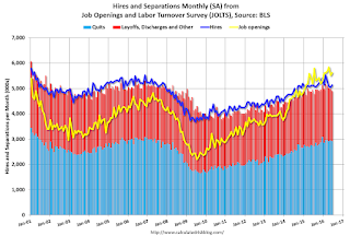
The number of job openings was little changed at 5.6 million on the last business day of June, the U.S. Bureau of Labor Statistics reported today.> ...The following graph shows job openings (yellow line), hires (dark blue), Layoff, Discharges and other (red column), and Quits (light blue column) from the JOLTS.
...
The number of quits held steady in June at 2.9 million. The quits rate was 2.0 percent. Over the month, the number of quits was little changed for total private and increased for government (+18,000). The number of quits increased in state and local government education (+20,000) and was little changed in all other industries.
emphasis added
This series started in December 2000.
Note: The difference between JOLTS hires and separations is similar to the CES (payroll survey) net jobs headline numbers. This report is for June, the most recent employment report was for July.
 Click on graph for larger image.
Note that hires (dark blue) and total separations (red and light blue columns stacked) are pretty close each month. This is a measure of labor market turnover. When the blue line is above the two stacked columns, the economy is adding net jobs - when it is below the columns, the economy is losing jobs.
Jobs openings increased in June to 5.624 million from 5.514 million in May.
The number of job openings (yellow) are up 9% year-over-year.
Quits are up 6% year-over-year. These are voluntary separations. (see light blue columns at bottom of graph for trend for "quits").
This is solid report with job openings just a little below the record high set in April 2016.
MBA: "Mortgage Applications Increase in Latest Weekly Survey"
by Calculated Risk on 8/10/2016 07:00:00 AM
From the MBA: Mortgage Applications Increase in Latest MBA Weekly Survey
Mortgage applications increased 7.1 percent from one week earlier, according to data from the Mortgage Bankers Association’s (MBA) Weekly Mortgage Applications Survey for the week ending August 5, 2016.
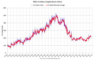
... The Refinance Index increased 10 percent from the previous week. ... The seasonally adjusted Purchase Index increased 3 percent from one week earlier. The unadjusted Purchase Index increased 2 percent compared with the previous week and was 13 percent higher than the same week one year ago.
...
The average contract interest rate for 30-year fixed-rate mortgages with conforming loan balances ($417,000 or less) decreased to 3.65 percent from 3.67 percent, with points increasing to 0.34 from 0.30 (including the origination fee) for 80 percent loan-to-value ratio (LTV) loans.
emphasis added
 Click on graph for larger image.
The first graph shows the refinance index since 1990.
Refinance activity has increased this year since rates have declined.
However it would take another significant move down in mortgage rates to see a large increase in refinance activity.
 The second graph shows the MBA mortgage purchase index.
 The purchase index is "13 percent higher than the same week one year ago".
Tuesday, August 09, 2016
Update: "Scariest jobs chart ever"
by Calculated Risk on 8/09/2016 08:01:00 PM
Wednesday:
• At 7:00 AM ET, The Mortgage Bankers Association (MBA) will release the results for the mortgage purchase applications index.
• At 10:00 AM, Job Openings and Labor Turnover Survey for June from the BLS. Jobs openings decreased in May to 5.500 million from 5.845 million in April. The number of job openings were up 2% year-over-year, and Quits were up 5% year-over-year.
During and following the 2007 recession, every month I posted a graph showing the percent jobs lost during the recession compared to previous post-WWII recessions.
Some people started calling this the "scariest jobs chart ever". In 2009 it was pretty scary!
I retired the graph in May 2014 when employment finally exceeded the pre-recession peak.
I keep getting asked if I could post an update to the graph, and here it is through the July 2016 report.
This graph shows the job losses from the start of the employment recession, in percentage terms, compared to previous post WWII recessions. Since exceeding the pre-recession peak in May 2014, employment is now 4.3% above the previous peak.
Note: I ended the lines for most previous recessions when employment reached a new peak, although I continued the 2001 recession too on this graph. The downturn at the end of the 2001 recession is the beginning of the 2007 recession. I don't expect a downturn for employment any time soon (unlike in 2007 when I was forecasting a recession).
EIA: "Gasoline prices at 16-week low, expected to average less than $2 a gallon by December"
by Calculated Risk on 8/09/2016 05:13:00 PM
The EIA released the Short-Term Energy Outlook today. From the STEO:
• EIA expects the retail price of regular gasoline to average $2.19/gal during the 2016 summer driving season (April through September), 6 cents/gal lower than projected in last month's STEO and 44 cents/gal lower than the price in summer 2015. EIA expects that the U.S. average retail price of regular gasoline reached a peak of $2.37/gal in June and will fall to an average of $2.05/gal in September and to an average of $1.92/gal in December.
• The monthly average spot price of Brent crude oil decreased by $3/b in July to $45/b, which was the first monthly decrease since January 2016. Significant outages of global oil supply contributed to rising oil prices during the second quarter of 2016. However, concerns about future economic growth related to the United Kingdom's June 23 vote to exit the European Union and the easing of supply disruptions in Canada contributed to falling oil prices in late June. Prices continued to fall in July because of concerns about high levels of U.S. and global petroleum product inventories, despite relatively strong demand, and because of growing U.S. oil rig counts. The Baker Hughes U.S. active oil rig count increased for six consecutive weeks in July and early August, the longest stretch of weekly increases in almost a year.
• EIA expects consistent global oil inventory draws to begin in mid-2017. The expectation of inventory draws contributes to accelerating price increases in the second quarter of 2017, with price increases continuing later in 2017. Brent prices are forecast to average $52/b in 2017, unchanged from last month's STEO. Forecast Brent prices average $58/b in the fourth quarter of 2017, reflecting the potential for more significant inventory draws beyond the forecast period.
Las Vegas Real Estate in July: Sales down 10% YoY, Inventory down 1%
by Calculated Risk on 8/09/2016 01:41:00 PM
This is a key distressed market to follow since Las Vegas has seen the largest price decline of any of the Case-Shiller composite 20 cities.
The Greater Las Vegas Association of Realtors reported Southern Nevada Home Prices Keep Climbing Amid Tight Supply, GLVAR Housing Statistics for July 2016
“The local housing market is having a pretty solid summer so far,” said 2016 GLVAR President Scott Beaudry, a longtime local REALTOR®. “Home prices have been going up gradually. And although we sold fewer homes and condos in July than we did during the previous month and year, sales have been running ahead of last year’s pace. Our tight inventory might finally be slowing down our sales pace. Sales slipped the most during July for lower-priced homes. This suggests it’s getting harder for entry-level buyers to find the homes they want.”1) Overall sales were down 9.6% year-over-year.
According to GLVAR, the total number of existing local homes, condominiums and townhomes sold in July was 3,447, down from 3,815 total sales in July of 2015. Compared to the same month one year ago, 7.2 percent fewer homes, and 4.2 percent fewer condos and townhomes sold in July.
...
By the end of July, GLVAR reported 7,338 single-family homes listed without any sort of offer. That’s down 1.3 percent from one year ago. For condos and townhomes, the 1,212 properties listed without offers in July represented a 48.0 percent decrease from one year ago.
...
As in past months, GLVAR continued to track declines in distressed sales and a corresponding increase in traditional home sales, where lenders are not controlling the transaction. In July, 5.7 percent of all local sales were short sales – when lenders allow borrowers to sell a home for less than what they owe on the mortgage. That’s down from 7.1 percent of all sales one year ago. Another 5.9 percent of all July sales were bank-owned, down from 7.7 percent one year ago.
emphasis added
2) Active inventory is down 1.3% from a year ago.
NY Fed: Household Debt Increased Slightly in Q2 2016, Delinquency Rates Declined
by Calculated Risk on 8/09/2016 11:00:00 AM
The Q2 report was released today: Household Debt and Credit Report.
From the NY Fed: Household Debt Balances Increase Slightly, Boosted By Growth In Auto Loan And Credit Card Balances
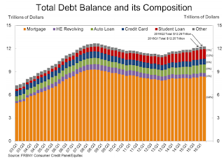
The Federal Reserve Bank of New York’s Center for Microeconomic Data today issued its Quarterly Report on Household Debt and Credit, which reported that household debt increased by $35 billion (a 0.3 percent increase) to $12.29 trillion during the second quarter of 2016. This moderate growth was driven by increases in auto loan and credit card debt, which increased by $32 billion and $17 billion respectively. Mortgage debt declined by $7 billion in the second quarter, after a $120 billion increase in the first quarter, and student loan balances were roughly flat. Meanwhile, this quarter saw improvements in overall delinquency rates and another historical low (over the 18 years of the data sample) in new foreclosures. ...
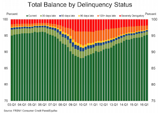
Overall delinquency rates improved, continuing the trend in place since 2010. In the second quarter, 4.8 percent of outstanding debt was in some stage of delinquency down from 5 percent previous quarter, and 5.6 percent in the second quarter of 2015. There were 82,000 consumers with new foreclosure notations on their credit reports – another low in the 18-year history of this data set.
...
"Today's report highlights a positive ongoing trend in household debt," said Donghoon Lee, Research Officer at the New York Fed. "Delinquency rates continue to improve, even as credit has become more widely available."
emphasis added
 Click on graph for larger image.
Here are two graphs from the report:
The first graph shows aggregate consumer debt increased in Q2. Household debt peaked in 2008, and bottomed in Q2 2013.
Mortgage debt decreased in Q2, from the NY Fed:
Mortgage balances, the largest component of household debt, were essentially flat in the second quarter of 2016. Mortgage balances shown on consumer credit reports on June 30 stood at $8.36 trillion, a $7 billion drop from the first quarter of 2016. Balances on home equity lines of credit (HELOC) also dropped by $7 billion, to $478 billion. Non-housing debt balances rose in the second quarter; with increases of $32 billion and $17 billion in auto loans and credit cards, respectively, and a slight decline in student loan balances (-$2 billion).
 The second graph shows the percent of debt in delinquency. The percent of delinquent debt is declining, although there is still a larger than normal percent of debt 90+ days delinquent (Yellow, orange and red).
 The overall delinquency rate decreased in Q2 to 4.8%. From the NY Fed:
Overall delinquency rates improved again in 2016Q2. As of June 30, 4.8% of outstanding debt was in some stage of delinquency. Of the $589 billion of debt that is delinquent, $407 billion is seriously delinquent (at least 90 days late or “severely derogatory”).There are a number of credit graphs at the NY Fed site.


