by Calculated Risk on 8/12/2016 06:25:00 PM
Friday, August 12, 2016
"Mortgage Rates Drop Back to 1-Month Lows"
From Matthew Graham at Mortgage News Daily: Mortgage Rates Drop Back to 1-Month Lows
Just a day after bouncing firmly higher from the lowest levels in a month, mortgage rates are right back down to the bottom of the recent range. For some lenders, there have been one or two days with lower rates over the past, but for most, today is the best in exactly one month. Incidentally, that also puts rates fairly close to the lowest levels in 3 years seen in the immediate wake of the UK vote to leave the European Union (Brexit).Here is a table from Mortgage News Daily:
For flawless scenarios, 3.375% is now a more prevalent quote than 3.5% on conventional 30yr fixed loans. At current levels, the most aggressive fringe of the marketplace is beginning to offer 3.25% again--a rate that enjoyed a brief spat of popularity in early July. It should also be noted that government rates (FHA/VA/USDA) have been shining of late, with several lenders offering 30yr rates near or under 3.0%, and the vast majority able to do at least 3.25%. But again, don't expect to see these rates without a perfect scenario (in terms of credit score, property type, loan purpose, Loan-to-value, etc).
emphasis added
The Housing Bottom and Comparing Recoveries
by Calculated Risk on 8/12/2016 12:44:00 PM
In early 2012 I wrote The Housing Bottom is Here and Housing: The Two Bottoms, I pointed out there are usually two bottoms for housing: the first for new home sales, housing starts and residential investment, and the second bottom is for house prices.
For the bottom in activity, I presented a graph of Single family housing starts, New Home Sales, and Residential Investment (RI) as a percent of GDP.
When I posted that graph, the bottom wasn't obvious to everyone. Here is an update to that graph.

The arrows point to some of the earlier peaks and troughs for these three measures.
The purpose of this graph is to show that these three indicators generally reach peaks and troughs together. Note that Residential Investment is quarterly and single-family starts and new home sales are monthly.
For the most recent housing bust, the bottom was spread over a few years from 2009 into 2011. This was a long flat bottom - something a number of us predicted given the overhang of existing vacant housing units.
In 2012, I argued that the current housing recovery would continue to be sluggish relative to previous housing recoveries. I suggested there were several reasons for this. From my 2012 post:
First, the causes of this downturn were different than in most cycles. Usually housing down cycles are related to the Fed fighting inflation, and then housing comes back strongly when the Fed starts to ease again. But in this cycle, the housing downturn was the result of the bursting of the housing bubble and the financial crisis.That was correct, and the recovery continued to be sluggish.
As everyone now knows (or should know by now), recoveries following a financial crisis are sluggish. This is especially true for housing as all the excesses have to be worked down before the recovery will become robust. In some areas of the country, housing is starting to recover, and in other areas there are still a large number of excess vacant houses (although the number is being reduced just about everywhere).
There are also a large number of houses in the foreclosure process, especially in certain states with a judicial foreclosure process (like New Jersey). This means there will be competition for homebuilders from foreclosures for an extended period in these areas.
Contrast this to a typical recovery were most areas recover at the same time.
There are other factors too. Employment gains are sluggish following a financial crisis, there is still quite a bit of consumer deleveraging ongoing, and lending standards are still tight (in a typical recovery, lending standards are loosened pretty quickly).
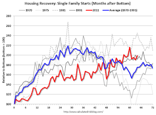
 This graph compares the current housing recovery (single family starts) to previous recoveries. The bottom is set to 100 for each housing cycle.
For the first several years, the current recovery (red) under performed previous recoveries.
Note: This doesn't even consider the depth of the current cycle (the deepest decline in housing starts since the Census Bureau started collecting data).
In 2012 I wrote:
With excess inventory, more foreclosures (especially in certain states), more consumer deleveraging, and tight lending standards, I expect this recovery to remains sluggish. The good news is - barring a significant policy mistake - this housing recovery will probably continue for several years (last for more years than usual).The current recovery (red) started slowly, but is still ongoing!
Preliminary August Consumer Sentiment at 90.4
by Calculated Risk on 8/12/2016 10:03:00 AM
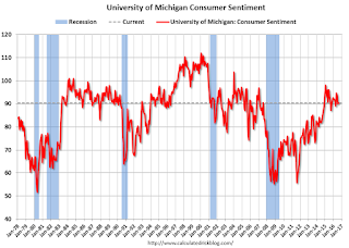
The preliminary University of Michigan consumer sentiment index for August was at 90.4, up from 90.0 in July.
Confidence inched upward in early August due to more favorable prospects for the overall economy offsetting a small pullback in personal finances. Most of the weakness in personal finances was among younger households who cited higher expenses than anticipated as well as somewhat smaller expected income gains. Concerns about Brexit have faded amid rising references to the outcome of the presidential election as a source of uncertainty about future economic prospects. Home buying has become particularly dependent on low interest rates, with net references to low interest rates spontaneously mentioned by 48%-this figure has been exceeded in only two months in the past ten years. In contrast, low housing prices were cited by just 25%, the lowest figure in ten years. Overall, the data remains consistent with real personal consumption expenditures improving at an annual rate of 2.6% through mid 2017, with new and existing home sales also benefitting from low mortgage rates.
emphasis added

Click on graph for larger image.
Retail Sales unchanged in July
by Calculated Risk on 8/12/2016 08:41:00 AM
On a monthly basis, retail sales were unchanged from June to July (seasonally adjusted), and sales were up 2.3% from July 2015.
From the Census Bureau report:
The U.S. Census Bureau announced today that advance estimates of U.S. retail and food services sales for July, adjusted for seasonal variation and holiday and trading-day differences, but not for price changes, were $457.7 billion, virtually unchanged from the previous month, and 2.3 percent above July 2015. ... The May 2016 to June 2016 percent change was revised from up 0.6 percent to up 0.8 percent.
 Click on graph for larger image.
This graph shows retail sales since 1992. This is monthly retail sales and food service, seasonally adjusted (total and ex-gasoline).
Retail sales ex-gasoline were up 0.2% in July.
The second graph shows the year-over-year change in retail sales and food service (ex-gasoline) since 1993.
 Retail and Food service sales ex-gasoline increased by 3.4% on a YoY basis.
The increase in July was below expectations for the month, however retail sales for June were revised up.
Thursday, August 11, 2016
Friday: Retail Sales, PPI, Consumer Sentiment
by Calculated Risk on 8/11/2016 06:18:00 PM
From the WSJ: Home Equity Loans Come Back to Haunt Borrowers, Banks
More homeowners are missing payments on their home-equity lines of credit, or Helocs ... These loans typically require interest-only payments for the first 10 years, but then principal payments kick in for the next 15 or 20 years.This isn't a large concern for the economy. But the ripples from the housing bubble are still being felt.
The increased cost of the loan can become a strain for some borrowers. This is becoming an issue now because many borrowers signed up for Helocs in the run-up to the housing bust as home values kept rising. Roughly 840,000 Helocs taken out in 2006 are resetting this year, with principal payments on an additional nearly one million loans expected to hit in 2017.
Friday:
• At 8:30 AM ET, Retail sales for July will be released. The consensus is for retail sales to increase 0.4% in July.
• Also at 8:30 AM, The Producer Price Index for July from the BLS. The consensus is for a 0.1% increase in prices, and a 0.2% increase in core PPI.
• At 10:00 AM, Manufacturing and Trade: Inventories and Sales (business inventories) report for June. The consensus is for a 0.1% increase in inventories.
• Also at 10:00 AM, University of Michigan's Consumer sentiment index (preliminary for August). The consensus is for a reading of 91.0, up from 90.0 in July.
Mortgage Delinquencies and the Unemployment Rate
by Calculated Risk on 8/11/2016 01:43:00 PM
In the press release for the MBA quarterly National Delinquency Survey for Q2, Marina Walsh, MBA's Vice President of Industry Analysis, wrote:
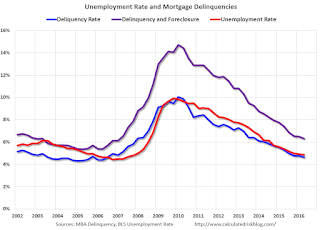
"The mortgage delinquency rate tracks closely with the nation's improving unemployment rate. In the second quarter of 2016, the mortgage delinquency rate was 4.66 percent, while the unemployment rate was 4.87 percent. By comparison, at its peak in the first quarter of 2010, the delinquency rate was 10.06 percent and the unemployment rate stood at 9.83 percent."Here is a graph comparing the mortgage delinquency rate and the unemployment rate. The unemployment rate is in Red, the mortgage delinquency rate (excluding in foreclosure) is in Blue, and the combined delinquency and in foreclosure is in Purple.
 Click on graph for larger image.
As Ms. Walsh noted, the delinquency rate has pretty much tracked the unemployment rate since the great recession.
In 2002, the mortgage delinquency rate was below the unemployment rate, probably because house prices were rising even as the unemployment rate was still recovering from the 2001 recession.
A huge difference between the great recession and prior periods was the large number of homes in the foreclosure process (Purple is a combination of the mortgage delinquency rate and the percent of homes in foreclosure).
The combined rate of delinquencies and in foreclosure is now below the combined rate in 2002. The mix is different (more in the foreclosure process now). These rates are getting close to normal (foreclosures are still elevated).
MBA: "Delinquencies and Foreclosures Continue to Drop" in Q2
by Calculated Risk on 8/11/2016 10:40:00 AM
From the MBA: Second Quarter Delinquency Rate Lowest in Ten Years
The delinquency rate for mortgage loans on one-to-four-unit residential properties decreased 11 basis points to a seasonally adjusted rate of 4.66 percent of all loans outstanding at the end of the second quarter of 2016. This was the lowest level since the second quarter of 2006. The delinquency rate was 64 basis points lower than one year ago, according to the Mortgage Bankers Association's (MBA) National Delinquency Survey.
The percentage of loans on which foreclosure actions were started during the second quarter was 0.32 percent, a decrease of three basis points from the previous quarter, and down eight basis points from one year ago. This foreclosure starts rate was at its lowest level since the second quarter of 2000.
The delinquency rate includes loans that are at least one payment past due but does not include loans in the process of foreclosure. The percentage of loans in the foreclosure process at the end of the second quarter was 1.64 percent, down 10 basis points from the previous quarter and 45 basis points lower than one year ago. The foreclosure inventory rate was at its lowest level since the second quarter of 2007.
The serious delinquency rate, the percentage of loans that are 90 days or more past due or in the process of foreclosure, was 3.11 percent, a decrease of 18 basis points from previous quarter, and a decrease of 84 basis points from last year. The serious delinquency rate was at its lowest level since the third quarter of 2007.
Marina Walsh, MBA's Vice President of Industry Analysis, offered the following commentary on the survey:
"Mortgage performance improved again in the second quarter primarily because of the combination of lower unemployment, strong job growth, and a continued nationwide housing market recovery. The mortgage delinquency rate tracks closely with the nation's improving unemployment rate. In the second quarter of 2016, the mortgage delinquency rate was 4.66 percent, while the unemployment rate was 4.87 percent. By comparison, at its peak in the first quarter of 2010, the delinquency rate was 10.06 percent and the unemployment rate stood at 9.83 percent.
"In addition, the delinquency rate of 4.66 percent for the second quarter of 2016 was lower than the historical average of 5.36 percent for the time period 1979 to the present. Among the various loan types, the delinquency rate improved for conventional loans as well as FHA loans. The FHA delinquency rate dropped to 8.46 percent, its lowest level since 2000.
"The percentage of new foreclosures initiated in the second quarter was 0.32, the lowest rate since 2000, and 13 basis points below the historical average of 0.45 percent. FHA loans saw a 15 basis point drop in the percentage of new foreclosures, which pushed the rate down to 0.48 percent, its lowest level since 1993.
"Continuing a downward trend that began in the second quarter of 2012, the foreclosure inventory rate fell again to 1.64 percent in the second quarter of 2016. The FHA foreclosure inventory rate dropped 26 basis points from the previous quarter to 2.15 percent, its lowest level since 2001. "
emphasis added
 Click on graph for larger image.
This graph shows the percent of loans delinquent by days past due.
Note that the total percent delinquencies and foreclosures is below the 2002 level.
The percent of loans 30 and 60 days delinquent ticked down in Q2, and is below the normal historical level.
The 90 day bucket declined further in Q2, but remains a little elevated.
The percent of loans in the foreclosure process continues to decline, and is still above the historical average.
The 90 day bucket and foreclosure inventory are still elevated, but should be close to normal in 2017. Most other mortgage measures are already back to normal, but the lenders are still working through the backlog of bubble legacy loans.
Weekly Initial Unemployment Claims decreased to 266,000
by Calculated Risk on 8/11/2016 08:33:00 AM
The DOL reported:
In the week ending August 6, the advance figure for seasonally adjusted initial claims was 266,000, a decrease of 1,000 from the previous week's revised level. The previous week's level was revised down by 2,000 from 269,000 to 267,000. The 4-week moving average was 262,750, an increase of 3,000 from the previous week's revised average. The previous week's average was revised down by 500 from 260,250 to 259,750.The previous week was revised down 2,000.
There were no special factors impacting this week's initial claims. This marks 75 consecutive weeks of initial claims below 300,000, the longest streak since 1970.
The following graph shows the 4-week moving average of weekly claims since 1971.
 Click on graph for larger image.
The dashed line on the graph is the current 4-week average. The four-week average of weekly unemployment claims increased to 262,750.
This was close to the consensus forecast of 265,000. The low level of claims suggests relatively few layoffs.
Wednesday, August 10, 2016
Memory Lane: From 2005 just as Housing Inventory started to Increase
by Calculated Risk on 8/10/2016 05:26:00 PM
A quick trip down memory lane. Here are couple of posts from August 2005 when we were looking for the housing top. Inventory was the key - and inventory was just starting to increase.
Sign, Sign, Everywhere a Sign

The first photo - from August 2005 - shows four houses in a row for sale in my neighborhood (the signs were everywhere).
And back when I wrote at Angry Bear: Signs of the Times

The second photo - from the 2005 Angry Bear post - was from the O.C. Register showing three in a row.

Update: Framing Lumber Prices Up Year-over-year
by Calculated Risk on 8/10/2016 01:57:00 PM
Here is another update on framing lumber prices. Early in 2013 lumber prices came close to the housing bubble highs.
The price increases in early 2013 were due to a surge in demand (more housing starts) and supply constraints (framing lumber suppliers were working to bring more capacity online).
Prices didn't increase as much early in 2014 (more supply, smaller "surge" in demand).
In 2015, even with the pickup in U.S. housing starts, prices were down year-over-year. Note: Multifamily starts do not use as much lumber as single family starts, and there was a surge in multi-family starts. This decline in 2015 was also probably related to weakness in China.
Prices are now up year-over-year.

This graph shows two measures of lumber prices: 1) Framing Lumber from Random Lengths through early July 2016 (via NAHB), and 2) CME framing futures.
Right now Random Lengths prices are up 9% from a year ago, and CME futures are up about 17% year-over-year.


