by Calculated Risk on 1/03/2017 02:34:00 PM
Tuesday, January 03, 2017
Construction Spending increased in November
Earlier today, the Census Bureau reported that overall construction spending increased in November:
The U.S. Census Bureau of the Department of Commerce announced today that construction spending during November 2016 was estimated at a seasonally adjusted annual rate of $1,182.1 billion, 0.9 percent above the revised October estimate of $1,171.4 billion. The November figure is 4.1 percent above the November 2015 estimate of $1,135.5 billionBoth private and public spending increased in November:
During the first 11 months of this year, construction spending amounted to $1,070.9 billion, 4.4 percent above the $1,025.5 billion for the same period in 2015.
Spending on private construction was at a seasonally adjusted annual rate of $892.8 billion, 1.0 percent above the revised October estimate of $884.3 billion ...
In November, the estimated seasonally adjusted annual rate of public construction spending was $289.3 billion, 0.8 percent above the revised October estimate of $287.1 billion.
emphasis added
 Click on graph for larger image.
This graph shows private residential and nonresidential construction spending, and public spending, since 1993. Note: nominal dollars, not inflation adjusted.
Private residential spending has been generally increasing, but is 32% below the bubble peak.
Non-residential spending is now 4% above the previous peak in January 2008 (nominal dollars).
Public construction spending is now 11% below the peak in March 2009, and 10% above the austerity low in February 2014.
 The second graph shows the year-over-year change in construction spending.
On a year-over-year basis, private residential construction spending is up 3%. Non-residential spending is up 6% year-over-year. Public spending is up 3% year-over-year.
Looking forward, all categories of construction spending should increase in the coming year.
This was above the consensus forecast of a 0.6% increase for November. A solid report.
CoreLogic: House Prices up 7.1% Year-over-year in November
by Calculated Risk on 1/03/2017 11:31:00 AM
Notes: This CoreLogic House Price Index report is for November. The recent Case-Shiller index release was for October. The CoreLogic HPI is a three month weighted average and is not seasonally adjusted (NSA).
From CoreLogic: CoreLogic US Home Price Report Shows Prices Up 7.1 Percent in November 2016
Home prices nationwide, including distressed sales, increased year over year by 7.1 percent in November 2016 compared with November 2015 and increased month over month by 1.1 percent in November 2016 compared with October 2016, according to the CoreLogic HPI.
...
“Last summer’s very low mortgage rates sparked demand, and with for-sale inventories low, the result has been a pickup in home-price growth,” said Dr. Frank Nothaft, chief economist for CoreLogic. “With mortgage rates higher today and expected to rise even further in 2017, our national Home Price Index is expected to slow to 4.7 percent year over year by November 2017.”
“Home prices continue to march higher, with home prices in 27 states above their pre-crisis peak levels,” said Anand Nallathambi, president and CEO of CoreLogic. “Nationally, the CoreLogic Home Price Index remains 4 percent below its April 2006 peak, but should surpass that peak by the end of 2017.”
emphasis added
 Click on graph for larger image.
 This graph shows the national CoreLogic HPI data since 1976. January 2000 = 100.
The index was up 1.1% in November (NSA), and is up 7.1% over the last year.
This index is not seasonally adjusted, and this was another solid month-to-month increase.
The index is still 4.1% below the bubble peak in nominal terms (not inflation adjusted).
 The second graph shows the YoY change in nominal terms (not adjusted for inflation).
The YoY increase had been moving sideways over the last two years, but might have picked up recently (the recent pickup could be revised away).
The year-over-year comparison has been positive for almost five consecutive months since turning positive year-over-year in February 2012.
ISM Manufacturing index increased to 54.7 in December
by Calculated Risk on 1/03/2017 10:06:00 AM
The ISM manufacturing index indicated expansion in December. The PMI was at 54.7% in December, up from 53.2% in November. The employment index was at 53.1%, up from 52.3% last month, and the new orders index was at 60.2%, up from 53.0%.
From the Institute for Supply Management: December 2016 Manufacturing ISM® Report On Business®
Economic activity in the manufacturing sector expanded in December, and the overall economy grew for the 91st consecutive month, say the nation’s supply executives in the latest Manufacturing ISM® Report On Business®.
The report was issued today by Bradley J. Holcomb, CPSM, CPSD, chair of the Institute for Supply Management® (ISM®) Manufacturing Business Survey Committee. “The December PMI® registered 54.7 percent, an increase of 1.5 percentage points from the November reading of 53.2 percent. The New Orders Index registered 60.2 percent, an increase of 7.2 percentage points from the November reading of 53 percent. The Production Index registered 60.3 percent, 4.3 percentage points higher than the November reading of 56 percent. The Employment Index registered 53.1 percent, an increase of 0.8 percentage point from the November reading of 52.3 percent. Inventories of raw materials registered 47 percent, a decrease of 2 percentage points from the November reading of 49 percent. The Prices Index registered 65.5 percent in December, an increase of 11 percentage points from the November reading of 54.5 percent, indicating higher raw materials prices for the 10th consecutive month. The PMI®, New Orders, Production and Employment Indexes all registered new highs for the year 2016, and the forward-looking comments from the panel are largely positive.”
emphasis added
 Click on graph for larger image.
Here is a long term graph of the ISM manufacturing index.
This was above expectations of 53.8%, and suggests manufacturing expanded at as faster pace in December than in November.
Another solid report.
Monday, January 02, 2017
Tuesday: ISM Manufacturing, Construction Spending
by Calculated Risk on 1/02/2017 08:12:00 PM
Weekend:
• Schedule for Week of Jan 1, 2017
Tuesday:
• 10:00 AM ET, ISM Manufacturing Index for December. The consensus is for the ISM to be at 53.8, up from 53.2 in November. The ISM manufacturing index indicated expansion at 53.2% in November. The employment index was at 52.3%, and the new orders index was at 53.0%.
• Also at 10:00 AM, Construction Spending for November. The consensus is for a 0.6% increase in construction spending.
From CNBC: Pre-Market Data and Bloomberg futures: S&P futures are up 7, and DOW futures are up 75 (fair value).
Oil prices were up over the last week with WTI futures at $54.01 per barrel and Brent at $56.82 per barrel. A year ago, WTI was at $36, and Brent was at $37 - so oil prices are up about 50% year-over-year.
Here is a graph from Gasbuddy.com for nationwide gasoline prices. Nationally prices are at $2.35 per gallon - a year ago prices were at $2.00 per gallon - so gasoline prices are up about 35 cents per gallon year-over-year.
Question #7 for 2017: How much will wages increase in 2017?
by Calculated Risk on 1/02/2017 12:26:00 PM
Last week I posted some questions for 2017: Ten Economic Questions for 2017. I'll try to add some thoughts, and maybe some predictions for each question.
7) Real Wage Growth: Wage growth picked up in 2016. How much will wages increase in 2017?
The most followed wage indicator is the “Average Hourly Earnings” from the Current Employment Statistics (CES) (aka "Establishment") monthly employment report.

The blue line shows the nominal year-over-year change in "Average Hourly Earnings" for all private employees. Nominal wage growth had been running close to 2% since 2010, and picked up a little in 2015, and more in 2016.
As the labor market tightens, nominal wages growth will probably increase further in 2017.
The red line is real wage growth (adjusted using headline CPI). Real wages increased during the crisis because CPI declined sharply. CPI was very low in 2015 - due to the decline in oil prices - so real wage growth picked up in 2015.
There are two quarterly sources for earnings data: 1) “Hourly Compensation,” from the BLS’s Productivity and Costs; and 2) the Employment Cost Index which includes wage/salary and benefit compensation. All three data series are different, and most of the focus recently has been the CES series (used in the graph above).
![]()
The second graph is from the Atlanta Fed Wage Tracker. This measure is the year-over-year change in nominal wages for individuals.
By following wage changes for individuals, this removes the demographic composition effects (older workers who are retiring tend to be higher paid, and younger workers just entering the workforce tend to be lower paid). The composition effect lower the overall year-over-year change as seen in graph 1.
The Atlanta Fed Wage tracker shows nominal wages are increasing close to 4%. A solid year-over-year gain.
As the labor market continues to tighten, we should see more wage pressure as companies have to compete for employees. I expect to see some further increases in both the Average hourly earning from the CES, and in the Altanta Fed Wage Tracker. Perhaps nominal wages will increase more than 3% in 2017 according to the CES.
Here are the Ten Economic Questions for 2017 and a few predictions:
• Question #1 for 2017: What about fiscal and regulatory policy in 2017?
• Question #2 for 2017: How much will the economy grow in 2017?
• Question #3 for 2017: Will job creation slow further in 2017?
• Question #4 for 2017: What will the unemployment rate be in December 2017?
• Question #5 for 2017: Will the core inflation rate rise in 2017? Will too much inflation be a concern in 2017?
• Question #6 for 2017: Will the Fed raise rates in 2017, and if so, by how much?
• Question #7 for 2017: How much will wages increase in 2017?
• Question #8 for 2017: How much will Residential Investment increase?
• Question #9 for 2017: What will happen with house prices in 2017?
• Question #10 for 2017: Will housing inventory increase or decrease in 2017?
Sunday, January 01, 2017
December 2016: Unofficial Problem Bank list declines to 169 Institutions, Q4 2016 Transition Matrix
by Calculated Risk on 1/01/2017 11:18:00 AM
Note: Surferdude808 compiles an unofficial list of Problem Banks compiled only from public sources. Here are the monthly changes and a few comments from surferdude808:
Update on the Unofficial Problem Bank List for December 2016. During the month, the list fell from 173 institutions to 169 after five removals and one addition. Assets dropped by $15 billion to an aggregate $45 billion. A year ago, the list held 250 institutions with assets of $75 billion.
This month, actions have been terminated against Flagstar Bank, FSB, Troy, MI ($14.2 billion Ticker: FBC); First Central Savings Bank, Glen Cove, NY ($537 million); International Bank, Raton, NM ($302 million); North Alabama Bank, Hazel Green, AL ($95 million); and Home Federal Bank of Hollywood, Hallandale Beach, FL ($41 million).
The addition this month was Heartland Bank, Little Rock, AR ($219 million).
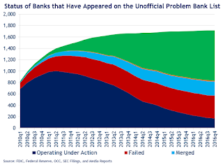
With it being the end of the fourth quarter, we bring an updated transition matrix to detail how banks are moving off the Unofficial Problem Bank List. Since the Unofficial Problem Bank List was first published on August 7, 2009 with 389 institutions, a total of 1,716 institutions have appeared on a weekly or monthly list at some point. Only 9.8 percent of the banks that have appeared on the list remain today. In all, there have been 1,547 institutions that have transitioned through the list. Departure methods include 883 action terminations, 400 failures, 248 mergers, and 16 voluntary liquidations. Of the 389 institutions on the first published list, 18 or 4.6 percent still remain more than seven years later. The 400 failures represent 23.3 percent of the 1,713 institutions that have made an appearance on the list. This failure rate is well above the 10-12 percent rate frequently cited in media reports on the failure rate of banks on the FDIC's official list.
During this fourth quarter, only eight banks were removed because of an improved financial condition. These eight removals represented only 4.5 percent of the 177 banks at the start of the quarter. This is the smallest number and rate of removal due to rehabilitation since the list was first published. Of note this quarter, is the removal of Flagstar Bank, FSB and its $14.2 billion in assets. This significantly narrows the asset differential to around $10 billion between the unofficial and the FDIC’s official figures. In its last release, the FDIC said there were 132 banks with assets of $35 billion on the official list. Subsequent to the release of the official figures, the FDIC placed First NBC Bank with assets of $4.9 billion under an enforcement action. Hence, we expect for the official figures to show an asset increase when they are released at the end of February 2017.
| Unofficial Problem Bank List | |||
|---|---|---|---|
| Change Summary | |||
| Number of Institutions | Assets ($Thousands) | ||
| Start (8/7/2009) | 389 | 276,313,429 | |
| Subtractions | |||
| Action Terminated | 170 | (63,869,745) | |
| Unassisted Merger | 40 | (9,818,439) | |
| Voluntary Liquidation | 4 | (10,584,114) | |
| Failures | 157 | (184,803,449) | |
| Asset Change | (1,348,079) | ||
| Still on List at 12/31/2016 | 18 | 5,889,603 | |
| Additions after 8/7/2009 | 151 | 39,069,010 | |
| End (12/31//2016) | 169 | 44,958,613 | |
| Intraperiod Deletions1 | |||
| Action Terminated | 713 | 300,183,934 | |
| Unassisted Merger | 208 | 80,570,288 | |
| Voluntary Liquidation | 12 | 2,474,477 | |
| Failures | 243 | 119,858,467 | |
| Total | 1,176 | 503,087,166 | |
| 1Institution not on 8/7/2009 or 12/31/2016 list but appeared on a weekly list. | |||
Saturday, December 31, 2016
Schedule for Week of Jan 1, 2017
by Calculated Risk on 12/31/2016 08:11:00 AM
Happy New Year!
The key report this week is the December employment report on Friday.
Other key indicators include the December ISM manufacturing and non-manufacturing indexes, the November trade deficit, and December auto sales.
Also the Q4 quarterly Reis surveys for office, apartment and malls will be released this week.
All US markets will be closed in observance of the New Year's Day Holiday.
 10:00 AM: ISM Manufacturing Index for December. The consensus is for the ISM to be at 53.8, up from 53.2 in November.
Here is a long term graph of the ISM manufacturing index.
The ISM manufacturing index indicated expansion at 53.2% in November. The employment index was at 52.3%, and the new orders index was at 53.0%.
10:00 AM: Construction Spending for November. The consensus is for a 0.6% increase in construction spending.
7:00 AM ET: The Mortgage Bankers Association (MBA) will release the results for the mortgage purchase applications index.
Early: Reis Q4 2016 Office Survey of rents and vacancy rates.
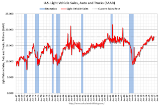 All day: Light vehicle sales for December. The consensus is for light vehicle sales to decrease to 17.7 million SAAR in December, from 17.9 million in November (Seasonally Adjusted Annual Rate).
This graph shows light vehicle sales since the BEA started keeping data in 1967. The dashed line is the November sales rate.
2:00 PM: The Fed will release the FOMC minutes for the December meeting.
8:15 AM: The ADP Employment Report for December. This report is for private payrolls only (no government). The consensus is for 172,000 payroll jobs added in December, down from 216,000 added in November.
8:30 AM ET: The initial weekly unemployment claims report will be released. The consensus is for 260 thousand initial claims, down from 265 thousand the previous week.
Early: Reis Q4 2016 Apartment Survey of rents and vacancy rates.
10:00 AM: the ISM non-Manufacturing Index for December. The consensus is for index to decrease to 56.8 from 57.2 in November.
8:30 AM: Employment Report for December. The consensus is for an increase of 175,000 non-farm payroll jobs added in December, down from the 178,000 non-farm payroll jobs added in November.
The consensus is for the unemployment rate to increase to 4.7%.
 This graph shows the year-over-year change in total non-farm employment since 1968.
In November, the year-over-year change was 2.25 million jobs.
A key will be the change in wages.
 8:30 AM: Trade Balance report for November from the Census Bureau.
 This graph shows the U.S. trade deficit, with and without petroleum, through October. The blue line is the total deficit, and the black line is the petroleum deficit, and the red line is the trade deficit ex-petroleum products.
The consensus is for the U.S. trade deficit to be at $44.5 billion in November from $42.6 billion in October.
Early: Reis Q4 2016 Mall Survey of rents and vacancy rates.
10:00 AM: Manufacturers' Shipments, Inventories and Orders (Factory Orders) for November. The consensus is a 2.5% decrease in orders.
Friday, December 30, 2016
"Mortgage Rates Slightly Lower to End 2016"
by Calculated Risk on 12/30/2016 04:18:00 PM
From Matthew Graham at Mortgage News Daily: Mortgage Rates Slightly Lower to End 2016
Mortgage rates moved lower for a 3rd consecutive day to end 2016, bringing them to the lowest levels in more than 3 weeks for many lenders. December 8th was the last time rates were lower. As of yesterday, 4.25% regained the status of the "most prevalent" conventional 30yr fixed quote on top tier scenarios. Quite a few lenders remain at 4.375% and a scant few are down to 4.125%.Here is a table from Mortgage News Daily:
While this is all good news in the context of the past few weeks, 2016 nonetheless ends with one of the worst 2-month losing streaks in the history of mortgage rates. Specifically, the 5 weeks following the election were the worst 5 weeks on record, going back to the Spring of 1987.
emphasis added
A few Graphs for 2016
by Calculated Risk on 12/30/2016 11:41:00 AM
Here are a few graphs for 2016.
The first graph shows the monthly change in payroll jobs, ex-Census (meaning the impact of the decennial Census temporary hires and layoffs is removed - mostly in 2010 - to show the underlying payroll changes).
Total payrolls increased by 178 thousand in November (private payrolls increased 156 thousand).
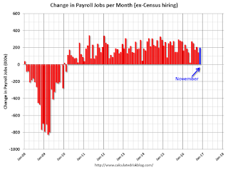
Job growth has averaged 180,000 per month this year.
The peak year for job growth in this cycle was 2014 with just over 3 million jobs added. Job growth was at 2.74 million in 2015, and job growth was probably around 2.2 million in 2016.
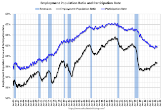
The second graph shows the employment population ratio and the participation rate.
A key story in 2016 was that the labor force participation rate (blue) increased slightly - from 62.6% in December 2015 to 62.7%.
Correction: Earlier I posted the participation rates for the 25 to 54 year old age group, not 16+.
Based on demographics, the participation rate will start declining again as more baby boomers retire - and continue declining for the next decade.
The increase in the participation rate this year suggests the labor market was strong enough to attract enough workers to overcome the demographic trend.

The unemployment rate decreased in November to 4.6%.
The unemployment rate was down from 5.0% in December 2015. The unemployment rate would have fallen further if not for the increase in the labor force participation rate.
Note the low for the unemployment rate in the previous cycles was 4.4% in 2006, and 3.8% in 2000. It wouldn't take much to be below the 2006 low.
And now to housing ...

Both existing home and home sales have been increasing, and the gap is closing.
I expect existing home sales to move more sideways, and I expect this gap to slowly close, mostly from an increase in new home sales.
This graph shows the year-over-year change in inventory and the months-of-supply. Inventory is not seasonally adjusted, so it really helps to look at the YoY change.
Inventory decreased 9.3% year-over-year in November compared to November 2015.
Months of supply was at 4.0 months in November.
The low level of existing home inventory continues to be a key story.
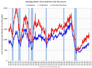
This graph shows the huge collapse in housing starts following the housing bubble, and that housing starts then mostly moved sideways for two years.
Housing is now recovering (but starts are still historically low) - so there is room to run.
Another piece of good news is mortgage delinquencies are almost back to normal.
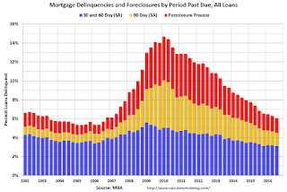
Note that the total percent delinquencies and foreclosures is below the 2002 level.
The percent of loans 30 and 60 days delinquent ticked down in Q3, and is below the normal historical level.
The 90 day bucket declined further in Q3, but remains a little elevated.
The percent of loans in the foreclosure process continues to decline, and is still above the historical average.
The 90 day bucket and foreclosure inventory are still elevated, but should be close to normal in 2017. Most other mortgage measures are already back to normal, but the lenders are still working through the backlog of bubble legacy loans.
Some more good news for housing is that REO (Real Estate Owned) inventories at Fannie and Freddie are almost back to normal.

REO inventory decreased in Q3 for both Fannie and Freddie, and combined inventory is down 31% year-over-year.
Delinquencies are falling, but there are still a number of properties in the foreclosure process with long time lines in judicial foreclosure states - but this is getting close to normal levels of REOs.
Remember this is just a portion of the total REO inventory. Private label securities (the worst of the worst lending) and banks and thrifts also hold a number of REOs.

Industrial production is 18.9% above the recession low, and is close to the pre-recession peak.

The recovery in consumer spending has been ongoing, and seem to have picked up in recent years.
Using the two-month method to estimate Q4 PCE growth, PCE was increasing at a 2.7% annual rate in Q4 2016. (using the mid-month method, PCE was increasing 3.2%). This suggests decent PCE growth in Q4.
So PCE had a solid year in 2016.

According to the AIA, there is an "approximate nine to twelve month lag time between architecture billings and construction spending" on non-residential construction. This index was positive in 9 of the last 12 months, suggesting a further increase in CRE investment through mid-2017.
Best to all
Chicago PMI decreases in December
by Calculated Risk on 12/30/2016 09:58:00 AM
Chicago PMI: December Chicago Business Barometer Down 3.0 Points to 54.6
The MNI Chicago Business Barometer fell 3.0 points to 54.6 in December from 57.6 in November, led by declines in both New Orders and Order Backlogs.This was below the consensus forecast of 57.0.
After a disappointing start to the fourth quarter, the latest results suggest economic conditions have improved somewhat, with the Barometer averaging 54.3 in Q4, the highest in two years.
The December decline was led by a slowdown in New Orders, which fell 6.7 points to 56.5, giving up most of the November gain that had left it running at the fastest pace since June.
...
“The Chicago Business Barometer ended 2016 in a much healthier position than a year ago when it slipped into contraction. This is largely owed to stronger outturns in the second half of the year and is testament to the resilience of the US economy.
“Most respondents to our survey remain upbeat about the fate of their business as we head into 2017, buoyed by fresh hope of better things to come under the new administration. Hopefully, 2017 can build on the momentum generated in the latter stages of 2016.” said Jamie Satchithanantham, economist at MNI Indicators.
emphasis added

