by Calculated Risk on 2/21/2018 10:47:00 AM
Wednesday, February 21, 2018
AIA: "Architecture billings continue growth into 2018"
Note: This index is a leading indicator primarily for new Commercial Real Estate (CRE) investment.
From the AIA: Architecture billings continue growth into 2018
2018 started on a strong note for architecture firms, as the Architecture Billings Index (ABI) saw its highest January score since 2007. The American Institute of Architects (AIA) reported the January ABI score was 54.7, up from a score of 52.8 in the previous month. This score reflects an increase in design services provided by U.S. architecture firms (any score above 50 indicates an increase in billings). The new projects inquiry index was 61.1, down from a reading of 62.0 the previous month, while the new design contracts index increased slightly from 53.4 to 53.9.
“Healthy conditions continue across all sectors and regions except the Northeast, where firm billings softened for the second consecutive month,” said AIA Chief Economist, Kermit Baker, Hon. AIA, PhD. “With strong billings and healthy growth in new projects to start the year, firms remain generally optimistic about business conditions for the next several months.”
...
• Regional averages: West (56.2), South (55.3), Midwest (54.8), Northeast (47.3)
• Sector index breakdown: multi-family residential (56.0), commercial / industrial (53.3), institutional (52.5), mixed practice (50.1)
emphasis added
 Click on graph for larger image.
This graph shows the Architecture Billings Index since 1996. The index was at 54.7 in January, up from 52.8 in December. Anything above 50 indicates expansion in demand for architects' services.
Note: This includes commercial and industrial facilities like hotels and office buildings, multi-family residential, as well as schools, hospitals and other institutions.
According to the AIA, there is an "approximate nine to twelve month lag time between architecture billings and construction spending" on non-residential construction. This index was positive in 11 of the last 12 months, suggesting a further increase in CRE investment in 2018.
NAR: "Existing-Home Sales Slip 3.2 Percent in January"
by Calculated Risk on 2/21/2018 10:16:00 AM
From the NAR: Existing-Home Sales Slip 3.2 Percent in January
Existing-home sales slumped for the second consecutive month in January and experienced their largest decline on an annual basis in over three years, according to the National Association of Realtors®. All major regions saw monthly and annual sales declines last month.
Total existing-home sales, which are completed transactions that include single-family homes, townhomes, condominiums and co-ops, sank 3.2 percent in January to a seasonally adjusted annual rate of 5.38 million from a downwardly revised 5.56 million in December 2017. After last month’s decline, sales are 4.8 percent below a year ago (largest annual decline since August 2014 at 5.5 percent) and at their slowest pace since last September (5.37 million).
...
Total housing inventory at the end of January rose 4.1 percent to 1.52 million existing homes available for sale, but is still 9.5 percent lower than a year ago (1.68 million) and has fallen year-over-year for 32 consecutive months. Unsold inventory is at a 3.4-month supply at the current sales pace (3.6 months a year ago).
emphasis added
 Click on graph for larger image.
This graph shows existing home sales, on a Seasonally Adjusted Annual Rate (SAAR) basis since 1993.
Sales in January (5.38 million SAAR) were 3.2% lower than last month, and were 4.8% below the January 2017 rate.
The second graph shows nationwide inventory for existing homes.
 According to the NAR, inventory increased to 1.52 million in January from 1.46 million in December. Headline inventory is not seasonally adjusted, and inventory usually decreases to the seasonal lows in December and January, and peaks in mid-to-late summer.
The last graph shows the year-over-year (YoY) change in reported existing home inventory and months-of-supply. Since inventory is not seasonally adjusted, it really helps to look at the YoY change. Note: Months-of-supply is based on the seasonally adjusted sales and not seasonally adjusted inventory.
 Inventory decreased 9.5% year-over-year in January compared to January 2017.
 Months of supply was at 3.4 months in January.
As expected by CR readers, sales were below the consensus view. For existing home sales, a key number is inventory - and inventory is still low. I'll have more later ...
MBA: Mortgage Applications Decrease in Latest Weekly Survey
by Calculated Risk on 2/21/2018 07:00:00 AM
From the MBA: Mortgage Applications Decrease in Latest MBA Weekly Survey
Mortgage applications decreased 6.6 percent from one week earlier, according to data from the Mortgage Bankers Association’s (MBA) Weekly Mortgage Applications Survey for the week ending February 16, 2018.
... The Refinance Index decreased 7 percent from the previous week. The seasonally adjusted Purchase Index decreased 6 percent from one week earlier. The unadjusted Purchase Index increased 1 percent compared with the previous week and was 3 percent higher than the same week one year ago. ...
The average contract interest rate for 30-year fixed-rate mortgages with conforming loan balances ($453,100 or less) increased to its highest level since January 2014, 4.64 percent, from 4.57 percent, with points increasing to 0.61 from 0.59 (including the origination fee) for 80 percent loan-to-value ratio (LTV) loans.
emphasis added
 Click on graph for larger image.
The first graph shows the refinance index since 1990.
Refinance activity will not pick up significantly unless mortgage rates fall 50 bps or more from the recent level.
 The second graph shows the MBA mortgage purchase index
 According to the MBA, purchase activity is up 3% year-over-year.
Tuesday, February 20, 2018
Wednesday: Existing Home Sales, FOMC Minutes
by Calculated Risk on 2/20/2018 05:38:00 PM
From Matthew Graham at Mortgage News Daily: Mortgage Rates Unable to Extend Last Week's Gains
Mortgage rates moved back up today after ending last week on a positive note. Improvements in rates have been uncommon so far in 2018. In fact, we haven't seen more than 2 consecutive days without a move higher. In that sense, today keeps the prevailing trend intact. If there's a saving grace, it's that rates didn't quite rise back above last week's highs. [30YR FIXED - 4.625%]Wednesday:
emphasis added
• At 7:00 AM ET,The Mortgage Bankers Association (MBA) will release the results for the mortgage purchase applications index.
• At 10:00 AM, Existing Home Sales for January from the National Association of Realtors (NAR). The consensus is for 5.65 million SAAR, up from 5.57 million in December. Housing economist Tom Lawler expects the NAR to report sales of 5.48 million SAAR for January. Take the under!
• During the day, The AIA's Architecture Billings Index for January (a leading indicator for commercial real estate).
• At 2:00 PM, FOMC Minutes, Meeting of January 30-31, 2018
Q1 GDP Forecasts
by Calculated Risk on 2/20/2018 04:03:00 PM
It is early, but here are few Q1 GDP forecast.
From Merrill Lynch:
The weak retail sales data sliced 0.3pp from our 1Q estimate to 2.0%, while 4Q 2017 dropped to 2.5% from 2.7%.And from the Altanta Fed: GDPNow
The GDPNow model estimate for real GDP growth (seasonally adjusted annual rate) in the first quarter of 2018 is 3.2 percent on February 16, unchanged from February 14.From the NY Fed Nowcasting Report
The New York Fed Staff Nowcast for 2018:Q1 stands at 3.1%.CR Note: It looks likely that GDP will be 2% to low 3% range again in Q1.
Update: For Fun, Stock Market as Barometer of Policy Success
by Calculated Risk on 2/20/2018 02:12:00 PM
Note: This is mostly a repeat of a June 2017 post with updated statistics and graph, and one new quote.
There are a number of observers who think the stock market is the key barometer of policy success. My view is there are many measures of success - and that the economy needs to work well for a majority of the people - not just stock investors.
However, for example, Treasury Secretary Steven Mnuchin was on CNBC on Feb 22, 2017, and was asked if the stock market rally was a vote of confidence in the new administration, he replied: "Absolutely, this is a mark-to-market business, and you see what the market thinks."
And Larry Kudlow wrote in 2007: A Stock Market Vote of Confidence for Bush: "I have long believed that stock markets are the best barometer of the health, wealth and security of a nation. And today's stock market message is an unmistakable vote of confidence for the president."
Note: Kudlow's comments were made a few months before the market started selling off in the Great Recession. For more on Kudlow, see: Larry Kudlow is usually wrong
Update: And from White House chief economic advisor Gary Cohn on December 20, 2017:
"I think there is a lot more momentum in the stock market. ... "The stock market is reflecting the reality of what's going in the business environment today," said Cohn, director of the National Economic Council. "There is going to be a continuation [of the] rally in the equity markets based on real underlying fundamentals of the U.S. economy ... as well as companies having more earnings power because of lower tax rates."For fun, here is a graph comparing S&P500 returns (ex-dividends) under Presidents Trump and Obama:
 Click on graph for larger image.
Blue is for Mr. Obama, Orange is for Mr. Trump.
At this point, the S&P500 is up 20.2% under Mr. Trump - compared to up 37.4% under Mr. Obama for the same number of market days.
Chemical Activity Barometer Increased in February
by Calculated Risk on 2/20/2018 11:17:00 AM
Note: This appears to be a leading indicator for industrial production.
From the American Chemistry Council: Industrial Activity Signals Further Gains in U.S. Economy
he Chemical Activity Barometer (CAB), a leading economic indicator created by the American Chemistry Council (ACC), expanded 0.5 percent in February on a three-month moving average (3MMA) basis, its fifth such solid gain following the 2017 hurricanes. On an unadjusted basis, growth was just 0.1 percent. The CAB is up 4.2 percent on a 3MMA compared to a year earlier.
...
Applying the CAB back to 1912, it has been shown to provide a lead of two to fourteen months, with an average lead of eight months at cycle peaks as determined by the National Bureau of Economic Research. The median lead was also eight months. At business cycle troughs, the CAB leads by one to seven months, with an average lead of four months. The median lead was three months. The CAB is rebased to the average lead (in months) of an average 100 in the base year (the year 2012 was used) of a reference time series. The latter is the Federal Reserve’s Industrial Production Index.
emphasis added
 Click on graph for larger image.
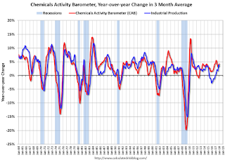
This graph shows the year-over-year change in the 3-month moving average for the Chemical Activity Barometer compared to Industrial Production. It does appear that CAB (red) generally leads Industrial Production (blue).
The year-over-year increase in the CAB has been solid over the last year, suggesting further gains in industrial production in 2018.
Ten Years Ago: Housing Starts were down Sharply as the Great Recession Started
by Calculated Risk on 2/20/2018 09:41:00 AM
It is hard to believe this was 10 years ago ...
Ten years ago today, I discussed housing starts: Single Family Housing Starts Lowest Since Jan 1991
"Single-family housing starts in January were at a rate of 743,000; this is 5.2 percent below the December figure of 784,000."Single family starts had collapsed significantly, but still had much further to fall.
...
[S]ingle family starts [are] at the lowest level since the '91 recession.
Single family starts reached the lowest on record (since 1968) of 353 thousand SAAR in March 2009. It wasn't until April 2015 that single family starts were back up to the level of January 2008!
 Click on graph for larger image.
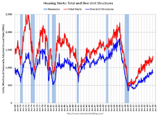
This graph shows total and single unit starts since 1968.
In the latest report, single starts were at 877 thousand SAAR. Well above the recession low, but still fairly low historically.
Monday, February 19, 2018
Las Vegas: Record Convention Attendance in 2017, Visitor Traffic off Slightly
by Calculated Risk on 2/19/2018 04:43:00 PM
During the recession, I wrote about the troubles in Las Vegas and included a chart of visitor and convention attendance: Lost Vegas.
Since then Las Vegas visitor traffic recovered to new record highs.
However, in 2017, visitor traffic declined 1.7% compared to 2016, but was still 8% above the pre-recession peak.
Convention attendance is now at record levels. Here is the data from the Las Vegas Convention and Visitors Authority.

The blue bars are annual visitor traffic (left scale), and the red line is convention attendance (right scale).
Convention attendance was up 5.3% in 2017 compared to 2016, and was at a new record high.
There were many housing related conventions during the housing bubble, so it took some time for convention attendance to recover. But attendance has really picked up over the last three years.
The Housing Bubble, Mortgage Debt as Percent of GDP
by Calculated Risk on 2/19/2018 12:09:00 PM
Last year on Presidents' Day, I excerpted from a post I wrote in February 2005 (yes, 13 years ago).
In that 2005 post, I included a graph of household mortgage debt as a percent of GDP. Several readers asked if I could update the graph.
First, from 2005:
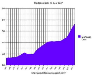
The following chart shows household mortgage debt as a % of GDP. Although mortgage debt has been increasing for years, the last four years have seen a tremendous increase in debt. Last year alone mortgage debt increased close to $800 Billion - almost 7% of GDP.
Source: Federal Reserve
 The second graph shows household mortgage debt as a percent of GDP through Q4 2017. Yes, the graphs have improved!
Mortgage debt has declined by $0.7 trillion from the peak. Studies suggest most of the decline in debt has been because of foreclosures (or short sales), but some of the decline is from homeowners paying down debt (sometimes so they can refinance at better rates).
The "bubble" is pretty obvious on this graph, and the sharp increase in mortgage debt was one of the warning signs.


