by Calculated Risk on 3/12/2018 06:10:00 PM
Monday, March 12, 2018
Tuesday: CPI, Small Business Confidence
From Matthew Graham at Mortgage News Daily: Mortgage Rates Just Barely Lower Ahead of Key Inflation Data
Mortgage rates spent the entirety of last week at the same levels based on end-of-day rates sheets from the average lender. ... Whereas today was fairly calm for markets and rates, tomorrow brings bigger risks. This is primarily due to the release of an important report on inflation in the morning. [30YR FIXED - 4.5-4.625%]Tuesday:
emphasis added
• At 6:00 AM ET, NFIB Small Business Optimism Index for February.
• At 8:30 AM, The Consumer Price Index for February from the BLS. The consensus is for a 0.2% increase in CPI, and a 0.2% increase in core CPI.
February Employment Report: Prime Participation and Diffusion Indexes
by Calculated Risk on 3/12/2018 01:12:00 PM
Two more graphs based on the February employment report ...
The BLS diffusion index for total private employment was at 68.6 in February, up from 58.9 in January.
For manufacturing, the diffusion index was at 69.1, up from 59.2 in January.

Think of this as a measure of how widespread job gains are across industries. The further from 50 (above or below), the more widespread the job losses or gains reported by the BLS. Above 60 is very good. From the BLS:
Figures are the percent of industries with employment increasing plus one-half of the industries with unchanged employment, where 50 percent indicates an equal balance between industries with increasing and decreasing employment.Overall both total private and manufacturing job growth was widespread in February.
The second graph shows the employment-population ratio and participation rate for those 25 to 54 years old.
 Since the overall participation rate has declined recently due to cyclical (recession) and demographic (aging population, younger people staying in school) reasons, here is the employment-population ratio for the key working age group: 25 to 54 years old.
In the earlier period the participation rate for this group was trending up as women joined the labor force. Since the early '90s, the participation rate moved more sideways, with a downward drift starting around '00 - and with ups and downs related to the business cycle.
The 25 to 54 participation rate increased in February at 82.2%, and the 25 to 54 employment population ratio increased to 79.3%.
The participation rate has been trending down for this group since the late '90s, however, with more younger workers (and fewer 50+ age workers), the prime participation rate might move up some more.
BLS: Unemployment Rates Lower in 6 states in January; Alabama, California, Maine and Mississippi at New Series Lows
by Calculated Risk on 3/12/2018 10:35:00 AM
From the BLS: Regional and State Employment and Unemployment Summary
Unemployment rates were lower in January in 6 states and the District of Columbia and stable in 44 states, the U.S. Bureau of Labor Statistics reported today. Sixteen states had jobless rate decreases from a year earlier and 34 states and the District had little or no change. The national unemployment rate was unchanged from December at 4.1 percent but was 0.7 percentage point lower than in January 2017.
...
Hawaii had the lowest unemployment rate in January, 2.1 percent. The rates in Alabama (3.7 percent), California (4.4 percent), Maine (3.0 percent), and Mississippi (4.6 percent) set new series lows. (All state series begin in 1976.) Alaska had the highest jobless rate, 7.3 percent.
emphasis added
 Click on graph for larger image.
This graph shows the current unemployment rate for each state (red), and the max during the recession (blue). All states are well below the maximum unemployment rate for the recession.
The size of the blue bar indicates the amount of improvement. The yellow squares are the lowest unemployment rate per state since 1976.
Twelve states have reached new all time lows since the end of the 2007 recession. These twelve states are: Alabama, Arkansas, California, Colorado, Hawaii, Maine, Mississippi, North Dakota, Oregon, Tennessee, Texas, and Wisconsin.
The states are ranked by the highest current unemployment rate. Alaska, at 7.3%, had the highest state unemployment rate.
 The second graph shows the number of states (and D.C.) with unemployment rates at or above certain levels since January 2006. At the worst of the employment recession, there were 11 states with an unemployment rate at or above 11% (red).
Currently one state, Alaska, has an unemployment rate at or above 7% (light blue); And only Alaska is above 6% (dark blue).
Oil Rigs "Big rig drop, another inflection point"
by Calculated Risk on 3/12/2018 08:43:00 AM
A few comments from Steven Kopits of Princeton Energy Advisors LLC on Mar 9, 2018:
• Total US oil rigs were down this week, -4 to 796
• Horizontal oil rigs fell, -5 to 694. This was the third biggest weekly drop since the trough of the cycle in May 2016
...
• None of the plays, except the Permian, is above their July 2017 peak
• We appear to be once again looking at an inflection point
• Both Harold Hamm (CLR) and Mark Papa (ex-EOG) have warned that shales will not live up to expectations. Rig counts ex-Permian support this thesis.
 Click on graph for larger image.
CR note: This graph shows the US horizontal rig count by basin.
Graph and comments Courtesy of Steven Kopits of Princeton Energy Advisors LLC.
Sunday, March 11, 2018
Sunday Night Futures
by Calculated Risk on 3/11/2018 09:18:00 PM
Weekend:
• Schedule for Week of Mar 11, 2018
Monday:
• 10:00 AM, State Employment and Unemployment (Monthly) for January 2018
From CNBC: Pre-Market Data and Bloomberg futures: S&P 500 are up 6, and DOW futures are up 100 (fair value).
Oil prices were up over the last week with WTI futures at $62.23 per barrel and Brent at $65.72 per barrel. A year ago, WTI was at $48, and Brent was at $50 - so oil prices are up solidly year-over-year.
Here is a graph from Gasbuddy.com for nationwide gasoline prices. Nationally prices are at $2.52 per gallon. A year ago prices were at $2.30 per gallon - so gasoline prices are up 22 cents per gallon year-over-year.
Hotels: Occupancy Rate Up Year-over-Year
by Calculated Risk on 3/11/2018 10:23:00 AM
From HotelNewsNow.com: STR: US hotel results for week ending 3 March
The U.S. hotel industry reported positive year-over-year results in the three key performance metrics during the week of 25 February through 3 March 2018, according to data from STR.The following graph shows the seasonal pattern for the hotel occupancy rate using the four week average.
In comparison with the week of 26 February through 4 March 2017, the industry recorded the following:
• Occupancy: +1.7% to 65.9%
• Average daily rate (ADR): +2.3% to US$126.06
• Revenue per available room (RevPAR): +4.1% to US$83.04
emphasis added
 Click on graph for larger image.
The red line is for 2018, dash light blue is 2017 (record year due to hurricanes), blue is the median, and black is for 2009 (the worst year since the Great Depression for hotels).
Currently the occupancy rate, to date, is fifth overall - and slightly ahead of the record year in 2017 (2017 finished strong due to the impact of the hurricanes).
Data Source: STR, Courtesy of HotelNewsNow.com
Saturday, March 10, 2018
Schedule for Week of Mar 11, 2018
by Calculated Risk on 3/10/2018 08:11:00 AM
The key economic reports this week are February Housing Starts, Retail Sales and the Consumer Price Index (CPI).
For manufacturing, February industrial production, and the March New York, and Philly Fed manufacturing surveys, will be released this week.
10:00 AM: State Employment and Unemployment (Monthly) for January 2018
6:00 AM ET: NFIB Small Business Optimism Index for February.
8:30 AM: The Consumer Price Index for February from the BLS. The consensus is for a 0.2% increase in CPI, and a 0.2% increase in core CPI.
7:00 AM ET: The Mortgage Bankers Association (MBA) will release the results for the mortgage purchase applications index.
 8:30 AM ET: Retail sales for February will be released. The consensus is for a 0.4% increase in retail sales.
This graph shows the year-over-year change in retail sales and food service (ex-gasoline) since 1993. Retail and Food service sales, ex-gasoline, increased by 3.5% on a YoY basis.
8:30 AM: The Producer Price Index for February from the BLS. The consensus is a 0.2% increase in PPI, and a 0.2% increase in core PPI.
10:00 AM: Manufacturing and Trade: Inventories and Sales (business inventories) report for January. The consensus is for a 0.5% increase in inventories.
8:30 AM ET: The initial weekly unemployment claims report will be released. The consensus is for 230 thousand initial claims, down from 231 thousand the previous week.
8:30 AM: the Philly Fed manufacturing survey for March. The consensus is for a reading of 23.3, down from 25.8.
8:30 AM ET: The New York Fed Empire State manufacturing survey for March. The consensus is for a reading of 14.6, up from 13.1.
10:00 AM: The March NAHB homebuilder survey. The consensus is for a reading of 72, unchanged from 72 in February. Any number above 50 indicates that more builders view sales conditions as good than poor.
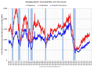 8:30 AM: Housing Starts for February.
 This graph shows single and total housing starts since 1968.
The consensus is for 1.284 million SAAR, down from 1.326 million SAAR.
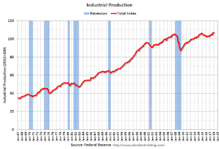 9:15 AM: The Fed will release Industrial Production and Capacity Utilization for February.
This graph shows industrial production since 1967.
The consensus is for a 0.3% increase in Industrial Production, and for Capacity Utilization to increase to 77.7%.
 10:00 AM ET: Job Openings and Labor Turnover Survey for January from the BLS.
 This graph shows job openings (yellow line), hires (purple), Layoff, Discharges and other (red column), and Quits (light blue column) from the JOLTS.
Jobs openings decreased in December to 5.811 million from 5.978 in November.
The number of job openings (yellow) were up 4.9% year-over-year, and Quits were up 5.6% year-over-year.
10:00 AM: University of Michigan's Consumer sentiment index (Preliminary for March). The consensus is for a reading of 98.5, down from 99.7.
Friday, March 09, 2018
AAR: Rail Carloads Declined YoY, Best February Ever for Intermodal
by Calculated Risk on 3/09/2018 06:38:00 PM
From the Association of American Railroads (AAR) Rail Time Indicators. Graphs and excerpts reprinted with permission.
Total U.S. rail carloads were down 0.3% (2,753 carloads) in February 2018 from February 2017. In what unfortunately seems to have become a pattern, the decline in overall carloads in February was due mainly to declines for coal (down 1.7%, or 5,801 carloads), grain (down 5.3%, or 4,712 carloads), and motor vehicles and parts (down 4.5%, or 3,283 carloads). ... February was another great month for intermodal: weekly average volume was 276,000 containers and trailers, the second highest weekly average for any month in history (behind only October 2017) and easily the highest ever for February.
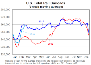 Click on graph for larger image.
This graph from the Rail Time Indicators report shows U.S. average weekly rail carloads (NSA). Light blue is 2018.
Rail carloads have been weak over the last decade due to the decline in coal shipments.
Total U.S. rail carloads were down 0.3%, or 2,753 carloads, in February 2018 from February 2017. It’s a decline, but it’s a big improvement from January’s 3.4% decline. Total carloads averaged 257,035 per week in February 2018; since 1988, when our U.S. data begin, only 2016 had a lower weekly average in February. For the first two months of 2018, total carloads were down 2.0%, or 45,184 carloads, to 2.245 million, the lowest January-February total since 1988 other than 2016.
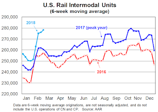 The second graph is for intermodal traffic (using intermodal or shipping containers):
In terms of average weekly volume, February 2018 was the second best month in history for U.S. railroads. Total originations in February 2018 were 1,104,001, up 6.9%, or 70,970 containers and trailers, over February 2017. Weekly average intermodal originations in February 2018 were 276,000. Only October 2017 (279,853 units) was higher. Since February is not typically one of the highest volume months of the year for intermodal, it’s reasonable to expect new intermodal records to be set in the months ahead, especially this coming fall.
Lawler: February Decline in Average Hourly Earnings Growth No Surprise
by Calculated Risk on 3/09/2018 04:11:00 PM
From housing economist Tom Lawler: February Decline in Average Hourly Earnings Growth No Surprise
To the surprise of no one who read either this report or the CalculatedRisk blog (which occasionally reproduces my report), the year-over-year growth in average hourly earnings of all employees on private nonfarm payrolls declined in February to 2.6%, down from the 2.9% shown in the January report (revised down to 2.8%.) Equally unsurprising was that the slowdown in AHE reflected a decline in the growth of AHE of “supervisory” workers (not shown in the BLS report, but derivable from data in the report) following two outsized gains in the previous two months (both of which were revised downward).
| Monthly % Change, Average Hourly Earnings of Private NonFarm Workers (SA) | ||||||
|---|---|---|---|---|---|---|
| February Report | January Report | |||||
| Total | Prod/Non | Super | Total | Prod/Non | Super | |
| November | 0.26% | 0.23% | 0.26% | 0.26% | 0.23% | 0.26% |
| December | 0.38% | 0.36% | 0.37% | 0.41% | 0.36% | 0.50% |
| January | 0.26% | 0.13% | 0.56% | 0.34% | 0.13% | 0.80% |
| February | 0.15% | 0.27% | -0.12% | |||
| "Prod/Non" is Production/Nonsupervisory, "Super" is Supervisory. | ||||||
Average Hourly Earnings for production/nonsupervisory employees actually showed a modest acceleration in growth last month, though the overall growth rate remained, at least to some, disappointing.
See Lawler's report from February 9, 2018 for further discussion.
Public and Private Sector Payroll Jobs During Presidential Terms
by Calculated Risk on 3/09/2018 02:35:00 PM
Here is another update of tracking employment during Presidential terms. We frequently use Presidential terms as time markers - we could use Speaker of the House, Fed Chair, or any other marker.
NOTE: Several readers have asked if I could add a lag to these graphs (obviously a new President has zero impact on employment for the month they are elected). But that would open a debate on the proper length of the lag, so I'll just stick to the beginning of each term.
Important: There are many differences between these periods. Overall employment was smaller in the '80s, however the participation rate was increasing in the '80s (younger population and women joining the labor force), and the participation rate is generally declining now. But these graphs give an overview of employment changes.
The first graph shows the change in private sector payroll jobs from when each president took office until the end of their term(s). Presidents Carter and George H.W. Bush only served one term.
Mr. G.W. Bush (red) took office following the bursting of the stock market bubble, and left during the bursting of the housing bubble. Mr. Obama (dark blue) took office during the financial crisis and great recession. There was also a significant recession in the early '80s right after Mr. Reagan (dark red) took office.
There was a recession towards the end of President G.H.W. Bush (light purple) term, and Mr Clinton (light blue) served for eight years without a recession.
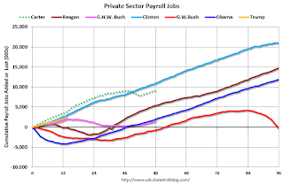
The first graph is for private employment only.
Mr. Trump is in Orange (just 13 months).
The employment recovery during Mr. G.W. Bush's (red) first term was sluggish, and private employment was down 804,000 jobs at the end of his first term. At the end of Mr. Bush's second term, private employment was collapsing, and there were net 391,000 private sector jobs lost during Mr. Bush's two terms.
Private sector employment increased by 20,964,000 under President Clinton (light blue), by 14,717,000 under President Reagan (dark red), 9,041,000 under President Carter (dashed green), 1,509,000 under President G.H.W. Bush (light purple), and 11,907,000 under President Obama (dark blue).
During the first 13 months of Mr. Trump's term, the economy has added 2,436,000 private sector jobs.

The public sector grew during Mr. Carter's term (up 1,304,000), during Mr. Reagan's terms (up 1,414,000), during Mr. G.H.W. Bush's term (up 1,127,000), during Mr. Clinton's terms (up 1,934,000), and during Mr. G.W. Bush's terms (up 1,744,000 jobs). However the public sector declined significantly while Mr. Obama was in office (down 266,000 jobs).
During the first 13 months of Mr. Trump's term, the economy has added 45,000 public sector jobs.
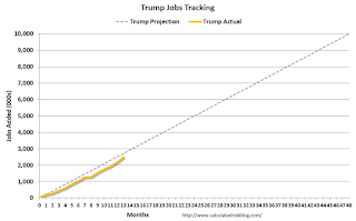
After 13 months of Mr. Trump's presidency, the economy has added 2,481,000 jobs, about 227,000 behind the projection.


