by Calculated Risk on 3/28/2018 12:25:00 PM
Wednesday, March 28, 2018
Reis: Apartment Vacancy Rate increased in Q1 to 4.7%
Reis reported that the apartment vacancy rate was at 4.7% in Q1 2018, up from 4.6% in Q4, and up from 4.3% in Q1 2017. This is the highest vacancy rate since Q3 2012. The vacancy rate peaked at 8.0% at the end of 2009, and bottomed at 4.1% in 2016.
From Reis:
Continuing on its upward path, the apartment vacancy rate increased to 4.7% from 4.6% at year-end 2017 and 4.3% in the first quarter of 2017. The vacancy rate has increased 60 basis points from a low of 4.1% in Q3 2016.
The national average asking rent increased 0.9% in the first quarter while effective rents, which net out landlord concessions, increased 0.8%. At $1,382 (market) and $1,318 (effective) per unit, the average rents have increased 4.4% and 3.9%, respectively, from the first quarter of 2017.
Net absorption was 27,875 units, well below the average quarterly absorption of 2017 of 44,707 units. Construction was also low at 39,917 units, trailing the 2017 quarterly average of 58,824 units. We caution that the first quarter tends to see the lowest activity, but this was particularly low given the construction pipeline.
...
Although many metros are expected to see considerably higher levels of completions in 2018 – including Dallas, New York, Los Angeles, Denver and Atlanta – the expected increase in vacancy is not expected to exceed 2.5% in any market as job growth is expected to remain healthy in most metros fueling the demand for apartments.
emphasis added
 Click on graph for larger image.
This graph shows the apartment vacancy rate starting in 1980. (Annual rate before 1999, quarterly starting in 1999). Note: Reis is just for large cities.
The vacancy rate had been mostly moving sideways for the last few years. However, the vacancy rate has bottomed and is starting to increase. With more supply coming on line - and less favorable demographics - the vacancy rate will probably continue to increase in 2018.
Apartment vacancy data courtesy of Reis.
NAR: Pending Home Sales Index Increased 3.1% in February, Down 4.1% Year-over-year
by Calculated Risk on 3/28/2018 10:04:00 AM
From the NAR: Pending Home Sales Reverse Course in February, Rise 3.1 Percent
Pending home sales snapped back in much of the country in February, but weakening affordability and not enough inventory on the market restricted overall activity compared to a year ago, according to the National Association of Realtors®.This was above expectations of a 2.7% increase for this index. Note: Contract signings usually lead sales by about 45 to 60 days, so this would usually be for closed sales in March and April.
The Pending Home Sales Index, a forward-looking indicator based on contract signings, grew 3.1 percent to 107.5 in February from a downwardly revised 104.3 in January. Even with last month’s increase in activity, the index is 4.1 percent below a year ago.
...
The PHSI in the Northeast surged 10.3 percent to 96.0 in February, but is still 5.1 percent below a year ago. In the Midwest the index inched forward 0.7 percent to 98.9 in February, but is 9.5 percent lower than February 2017.
Pending home sales in the South rose 3.0 percent to an index of 125.7 in February, but are 1.5 percent lower than last February. The index in the West climbed 0.4 percent in February to 96.9, but is 2.2 percent below a year ago.
emphasis added
Q4 GDP Revised up to 2.9% Annual Rate
by Calculated Risk on 3/28/2018 08:38:00 AM
From the BEA: Gross Domestic Product: Fourth Quarter and Annual 2017 (Third Estimate)
Real gross domestic product (GDP) increased at an annual rate of 2.9 percent in the fourth quarter of 2017, according to the "third" estimate released by the Bureau of Economic Analysis. In the third quarter, real GDP increased 3.2 percent.Here is a Comparison of Third and Second Estimates. PCE growth was up to 4.0% from 3.8%. Residential investment was revised down from 13.0% to 2.8%. This was above the consensus forecast.
The GDP estimate released today is based on more complete source data than were available for the "second" estimate issued last month. In the second estimate, the increase in real GDP was 2.5 percent. With this third estimate for the fourth quarter, the general picture of economic growth remains the same; personal consumption expenditures (PCE) and private inventory investment were revised up.
emphasis added
MBA: Purchase Mortgage Applications Increase in Latest Weekly Survey
by Calculated Risk on 3/28/2018 07:00:00 AM
From the MBA: Mortgage Applications Increase in Latest MBA Weekly Survey
Mortgage applications increased 4.8 percent from one week earlier, according to data from the Mortgage Bankers Association’s (MBA) Weekly Mortgage Applications Survey for the week ending March 23, 2018.
... The Refinance Index increased 7 percent from the previous week. The seasonally adjusted Purchase Index increased 3 percent from one week earlier. The unadjusted Purchase Index increased 4 percent compared with the previous week and was 8 percent higher than the same week one year ago. ...
The average contract interest rate for 30-year fixed-rate mortgages with conforming loan balances ($453,100 or less) increased to 4.69 percent from 4.68 percent, with points decreasing to 0.43 from 0.46 (including the origination fee) for 80 percent loan-to-value ratio (LTV) loans.
emphasis added
 Click on graph for larger image.
The first graph shows the refinance index since 1990.
Refinance activity will not pick up significantly unless mortgage rates fall 50 bps or more from the recent level.
 The second graph shows the MBA mortgage purchase index
 According to the MBA, purchase activity is up 8% year-over-year.
Tuesday, March 27, 2018
Wednesday: GDP, Pending Home Sales
by Calculated Risk on 3/27/2018 07:42:00 PM
Wednesday:
• At 7:00 AM ET, The Mortgage Bankers Association (MBA) will release the results for the mortgage purchase applications index.
• At 8:30 AM, Gross Domestic Product, 4th quarter 2017 (Third estimate). The consensus is that real GDP increased 2.3% annualized in Q4, unchanged from the second estimate of 2.3%.
• At 10:00 AM, Pending Home Sales Index for February. The consensus is for a 2.7% increase in the index.
• During the Day, Reis Q1 2018 Apartment Survey of rents and vacancy rates.
Freddie Mac: Mortgage Serious Delinquency Rate Decreased Slightly in February
by Calculated Risk on 3/27/2018 04:49:00 PM
Freddie Mac reported that the Single-Family serious delinquency rate in February was 1.06%, down from 1.07% in January. Freddie's rate is up from 0.98% in February 2017.
Freddie's serious delinquency rate peaked in February 2010 at 4.20%.
These are mortgage loans that are "three monthly payments or more past due or in foreclosure".

The recent increase in the delinquency rate was due to the hurricanes - no worries about the overall market (These are serious delinquencies, so it took three months late to be counted).
After the hurricane bump, maybe the rate will decline to a cycle bottom in the 0.5% to 0.8% range.
Note: Fannie Mae will report for February soon.
Update: A few comments on the Seasonal Pattern for House Prices
by Calculated Risk on 3/27/2018 04:41:00 PM
CR Note: This is a repeat of earlier posts with updated graphs.
A few key points:
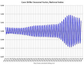
1) There is a clear seasonal pattern for house prices.
2) The surge in distressed sales during the housing bust distorted the seasonal pattern.
3) Even though distressed sales are down significantly, the seasonal factor is based on several years of data - and the factor is now overstating the seasonal change (second graph below).
4) Still the seasonal index is probably a better indicator of actual price movements than the Not Seasonally Adjusted (NSA) index.
For in depth description of these issues, see former Trulia chief economist Jed Kolko's article "Let’s Improve, Not Ignore, Seasonal Adjustment of Housing Data"
Note: I was one of several people to question the change in the seasonal factor (here is a post in 2009) - and this led to S&P Case-Shiller questioning the seasonal factor too (from April 2010). I still use the seasonal factor (I think it is better than using the NSA data).

This graph shows the month-to-month change in the NSA Case-Shiller National index since 1987 (through January 2018). The seasonal pattern was smaller back in the '90s and early '00s, and increased once the bubble burst.
The seasonal swings have declined since the bubble.

The swings in the seasonal factors has started to decrease, and I expect that over the next several years - as the percent of distressed sales declines further and recent history is included in the factors - the seasonal factors will move back towards more normal levels.
However, as Kolko noted, there will be a lag with the seasonal factor since it is based on several years of recent data.
Real House Prices and Price-to-Rent Ratio in January
by Calculated Risk on 3/27/2018 01:01:00 PM
Here is the earlier post on Case-Shiller: Case-Shiller: National House Price Index increased 6.2% year-over-year in January
It has been more than ten years since the bubble peak. In the Case-Shiller release this morning, the seasonally adjusted National Index (SA), was reported as being 7.6% above the previous bubble peak. However, in real terms, the National index (SA) is still about 11.1% below the bubble peak (and historically there has been an upward slope to real house prices).
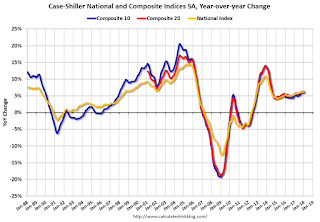
The year-over-year increase in prices is mostly moving sideways now around 6%. In January, the index was up 6.2% YoY.
Usually people graph nominal house prices, but it is also important to look at prices in real terms (inflation adjusted). Case-Shiller and others report nominal house prices. As an example, if a house price was $200,000 in January 2000, the price would be close to $284,000 today adjusted for inflation (42%). That is why the second graph below is important - this shows "real" prices (adjusted for inflation).
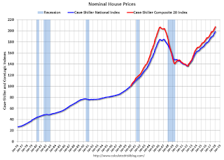
Nominal House Prices

In nominal terms, the Case-Shiller National index (SA)and the Case-Shiller Composite 20 Index (SA) are both at new all times highs (above the bubble peak).
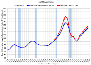
Real House Prices

In real terms, the National index is back to November 2004 levels, and the Composite 20 index is back to April 2004.
In real terms, house prices are back to 2004 levels.
Price-to-Rent
In October 2004, Fed economist John Krainer and researcher Chishen Wei wrote a Fed letter on price to rent ratios: House Prices and Fundamental Value. Kainer and Wei presented a price-to-rent ratio using the OFHEO house price index and the Owners' Equivalent Rent (OER) from the BLS.

This graph shows the price to rent ratio (January 2000 = 1.0).
On a price-to-rent basis, the Case-Shiller National index is back to January 2004 levels, and the Composite 20 index is back to October 2003 levels.
In real terms, prices are back to mid 2004 levels, and the price-to-rent ratio is back to late 2003, early 2004 - and the price-to-rent ratio has been increasing slowly.
Richmond Fed: "Fifth District Manufacturing Firms Reported Sluggish Growth in March"
by Calculated Risk on 3/27/2018 10:13:00 AM
From the Richmond Fed: Fifth District Manufacturing Firms Reported Sluggish Growth in March
Fifth District manufacturing expanded at a slower pace in March, according to the most recent survey results from the Federal Reserve Bank of Richmond. The composite index dropped from a particularly strong reading of 28 in February to 15 in March as each of the three components (shipments, new orders, and employment) fell. However, for each of these variables, a larger share of firms predicted growth in six months than had in February. Firms reported weaker growth in capital expenditures in March but saw an uptick in growth of business services expenditures.This was the last of the regional Fed surveys for March.
The survey's employment measures suggested slower growth in March. While the availability of skills index increased in March, it remained in negative territory indicating that skills shortages persisted. Firms anticipate stronger growth in all employment measures in the coming months.
District manufacturers saw higher growth in prices paid in March, but growth in prices received slowed slightly. However, firms expected to see accelerating price increases for both prices paid and received in the next six months.
emphasis added
Here is a graph comparing the regional Fed surveys and the ISM manufacturing index:
 Click on graph for larger image.
The New York and Philly Fed surveys are averaged together (yellow, through March), and five Fed surveys are averaged (blue, through March) including New York, Philly, Richmond, Dallas and Kansas City. The Institute for Supply Management (ISM) PMI (red) is through February (right axis).
Based on these regional surveys, it seems likely the ISM manufacturing index will be solid again in March, but probably lower than in February (to be released Monday, April 2nd).
Case-Shiller: National House Price Index increased 6.2% year-over-year in January
by Calculated Risk on 3/27/2018 09:12:00 AM
S&P/Case-Shiller released the monthly Home Price Indices for January ("January" is a 3 month average of November, December and January prices).
This release includes prices for 20 individual cities, two composite indices (for 10 cities and 20 cities) and the monthly National index.
Note: Case-Shiller reports Not Seasonally Adjusted (NSA), I use the SA data for the graphs.
From S&P: S&P CoreLogic Case-Shiller National Home Prices: All 20 Cities Up Year-over-year
The S&P CoreLogic Case-Shiller U.S. National Home Price NSA Index, covering all nine U.S. census divisions, reported a 6.2% annual gain in January, down from 6.3% in the previous month. The 10-City Composite annual increase came in at 6.0%, no change from the previous month. The 20-City Composite posted a 6.4% year-over-year gain, up from 6.3% in the previous month.
Seattle, Las Vegas, and San Francisco reported the highest year-over-year gains among the 20 cities. In January, Seattle led the way with a 12.9% year-over-year price increase, followed by Las Vegas with an 11.1% increase and San Francisco with a 10.2% increase. Twelve of the 20 cities reported greater price increases in the year ending January 2018 versus the year ending December 2017.
...
Before seasonal adjustment, the National Index posted a month-over-month gain of 0.05% in January. The 10-City and 20-City Composites both reported increases of 0.3%. After seasonal adjustment, the National Index recorded a 0.5% month-over-month increase in January. The 10-City and 20-City Composites posted 0.7% and 0.8% month-over-month increases, respectively. Sixteen of the 20 cities reported increases in January before seasonal adjustment, while all 20 cities reported increases after seasonal adjustment.
“The home price surge continues,” says David M. Blitzer, Managing Director and Chairman of the Index Committee at S&P Dow Jones Indices. “Since the market bottom in December 2012, the S&P Corelogic Case-Shiller National Home Price index has climbed at a 4.7% real – inflation adjusted – annual rate. That is twice the rate of economic growth as measured by the GDP. While price gains vary from city to city, there are few, if any, really weak spots. Seattle, up 12.9% in the last year, continues to see the largest gains, followed by Las Vegas up 11.1% over the same period. Even Chicago and Washington, the cities with the smallest price gains, saw a 2.4% annual increase in home prices.
“Two factors supporting price increases are the low inventory of homes for sale and the low vacancy rate among owner-occupied housing. The current months-supply -- how many months at the current sales rate would be needed to absorb homes currently for sale -- is 3.4; the average since 2000 is 6.0 months, and the high in July 2010 was 11.9. Currently, the homeowner vacancy rate is 1.6% compared to an average of 2.1% since 2000; it peaked in 2010 at 2.7%. Despite limited supplies, rising prices, and higher mortgage rates, affordability is not a concern. Affordability measures published by the National Association of Realtors show that a family with a median income could comfortably afford a mortgage for a median priced home.”
emphasis added
 Click on graph for larger image.
 The first graph shows the nominal seasonally adjusted Composite 10, Composite 20 and National indices (the Composite 20 was started in January 2000).
The Composite 10 index is off 2.4% from the peak, and up 0.7% in January (SA).
The Composite 20 index is up slightly from the bubble peak, and up 0.8% (SA) in January.
The National index is 7.6% above the bubble peak (SA), and up 0.5% (SA) in January. The National index is up 45.6% from the post-bubble low set in December 2011 (SA).
 The second graph shows the Year over year change in all three indices.
The Composite 10 SA is up 5.9% compared to January 2017. The Composite 20 SA is up 6.3% year-over-year.
The National index SA is up 6.1% year-over-year.
Note: According to the data, prices increased in all 20 of 20 cities month-over-month seasonally adjusted.
I'll have more later.


