by Calculated Risk on 6/26/2018 05:43:00 PM
Tuesday, June 26, 2018
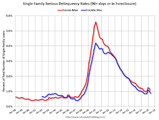
Freddie Mac: Mortgage Serious Delinquency Rate Decreased in May
Freddie Mac reported that the Single-Family serious delinquency rate in May was 0.87%, down from 0.94% in April. Freddie's rate is unchanged from 0.87% in May 2017.
Freddie's serious delinquency rate peaked in February 2010 at 4.20%.
These are mortgage loans that are "three monthly payments or more past due or in foreclosure".

The increase in the delinquency rate late last year was due to the hurricanes - no worries about the overall market (These are serious delinquencies, so it took three months late to be counted).
After the hurricane bump, maybe the rate will decline to a cycle bottom in the 0.5% to 0.8% range.
Note: Fannie Mae will report for May soon.
Real House Prices and Price-to-Rent Ratio in April
by Calculated Risk on 6/26/2018 02:31:00 PM
Here is the earlier post on Case-Shiller: Case-Shiller: National House Price Index increased 6.4% year-over-year in April
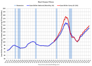
It has been over eleven years since the bubble peak. In the Case-Shiller release this morning, the seasonally adjusted National Index (SA), was reported as being 9.1% above the previous bubble peak. However, in real terms, the National index (SA) is still about 9.9% below the bubble peak (and historically there has been an upward slope to real house prices). The composite 20, in real terms, is still 15.8% below the bubble peak.
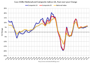
The year-over-year increase in prices is mostly moving sideways now around 6%. In April, the index was up 6.4% YoY.
Usually people graph nominal house prices, but it is also important to look at prices in real terms (inflation adjusted). Case-Shiller and others report nominal house prices. As an example, if a house price was $200,000 in January 2000, the price would be close to $284,000 today adjusted for inflation (42%). That is why the second graph below is important - this shows "real" prices (adjusted for inflation).
Nominal House Prices

In nominal terms, the Case-Shiller National index (SA)and the Case-Shiller Composite 20 Index (SA) are both at new all times highs (above the bubble peak).
Real House Prices

In real terms, the National index is back to December 2004 levels, and the Composite 20 index is back to June 2004.
In real terms, house prices are at 2004 levels.
Price-to-Rent
In October 2004, Fed economist John Krainer and researcher Chishen Wei wrote a Fed letter on price to rent ratios: House Prices and Fundamental Value. Kainer and Wei presented a price-to-rent ratio using the OFHEO house price index and the Owners' Equivalent Rent (OER) from the BLS.

This graph shows the price to rent ratio (January 2000 = 1.0).
On a price-to-rent basis, the Case-Shiller National index is back to February 2004 levels, and the Composite 20 index is back to December 2003 levels.
In real terms, prices are back to mid 2004 levels, and the price-to-rent ratio is back to late 2003, early 2004.
Update: A few comments on the Seasonal Pattern for House Prices
by Calculated Risk on 6/26/2018 12:09:00 PM
CR Note: This is a repeat of earlier posts with updated graphs.
A few key points:
1) There is a clear seasonal pattern for house prices.
2) The surge in distressed sales during the housing bust distorted the seasonal pattern.
3) Even though distressed sales are down significantly, the seasonal factor is based on several years of data - and the factor is now overstating the seasonal change (second graph below).
4) Still the seasonal index is probably a better indicator of actual price movements than the Not Seasonally Adjusted (NSA) index.
For in depth description of these issues, see former Trulia chief economist Jed Kolko's article "Let’s Improve, Not Ignore, Seasonal Adjustment of Housing Data"
Note: I was one of several people to question the change in the seasonal factor (here is a post in 2009) - and this led to S&P Case-Shiller questioning the seasonal factor too (from April 2010). I still use the seasonal factor (I think it is better than using the NSA data).

This graph shows the month-to-month change in the NSA Case-Shiller National index since 1987 (through April 2018). The seasonal pattern was smaller back in the '90s and early '00s, and increased once the bubble burst.
The seasonal swings have declined since the bubble.

The swings in the seasonal factors has started to decrease, and I expect that over the next several years - as the percent of distressed sales declines further and recent history is included in the factors - the seasonal factors will move back towards more normal levels.
However, as Kolko noted, there will be a lag with the seasonal factor since it is based on several years of recent data.
Case-Shiller: National House Price Index increased 6.4% year-over-year in April
by Calculated Risk on 6/26/2018 09:24:00 AM
S&P/Case-Shiller released the monthly Home Price Indices for April ("April" is a 3 month average of February, March and April prices).
This release includes prices for 20 individual cities, two composite indices (for 10 cities and 20 cities) and the monthly National index.
Note: Case-Shiller reports Not Seasonally Adjusted (NSA), I use the SA data for the graphs.
From S&P: Home Prices Continue Their Upward Trend According to S&P CoreLogic Case-Shiller Index
The S&P CoreLogic Case-Shiller U.S. National Home Price NSA Index, covering all nine U.S. census divisions, reported a 6.4% annual gain in April, down from 6.5% in the previous month. The 10-City Composite annual increase came in at 6.2%, down from 6.4% in the previous month. The 20-City Composite posted a 6.6% year-over-year gain, down from 6.7% in the previous month.
Seattle, Las Vegas, and San Francisco continue to report the highest year-over-year gains among the 20 cities. In April, Seattle led the way with a 13.1% year-over-year price increase, followed by Las Vegas with a 12.7% increase and San Francisco with a 10.9% increase. Nine of the 20 cities reported greater price increases in the year ending April 2018 versus the year ending March 2018
...
Before seasonal adjustment, the National Index posted a month-over-month gain of 1.0% in April. The 10-City and 20-City Composites reported increases of 0.6% and 0.8%, respectively. After seasonal adjustment, the National Index recorded a 0.3% month-over-month increase in April. The 10-City and 20-City Composites posted 0.1% and 0.2% month-over-month increases, respectively. Nineteen of 20 cities reported increases in April before seasonal adjustment, while 17 of 20 cities reported increases after seasonal adjustment.
“Home prices continued their climb with the S&P CoreLogic Case-Shiller National Index up 6.4% in the past 12 months,” says David M. Blitzer Managing Director and Chairman of the Index Committee at S&P Dow Jones Indices. “Cities west of the Rocky Mountains continue to lead price increases with Seattle, Las Vegas and San Francisco ranking 1-2-3 based on price movements in the trailing 12 months. The favorable economy and moderate mortgage rates both support recent gains in housing. One factor pushing prices up is the continued low supply of homes for sale. The months-supply is currently 4.3 months, up from levels below 4 months earlier in the year, but still low.
“Looking back to the peak of the boom in 2006, 10 of the 20 cities tracked by the indices are higher than their peaks; the other ten are below their high points. The National Index is also above its previous all-time high, the 20-city index slightly up versus its peak, and the 10-city is a bit below. However, if one adjusts the price movements for inflation since 2006, a very different picture emerges. Only three cities – Dallas, Denver and Seattle – are ahead in real, or inflation-adjusted, terms. The National Index is 14% below its boom-time peak and Las Vegas, the city with the longest road to a new high, is 47% below its peak when inflation is factored in.”
emphasis added
 Click on graph for larger image.
 The first graph shows the nominal seasonally adjusted Composite 10, Composite 20 and National indices (the Composite 20 was started in January 2000).
The Composite 10 index is off 1.1% from the peak, and up 0.1% in April (SA).
The Composite 20 index is 1.9% above the bubble peak, and up 0.2% (SA) in April.
The National index is 9.1% above the bubble peak (SA), and up 0.3% (SA) in April. The National index is up 47.5% from the post-bubble low set in December 2011 (SA).
 The second graph shows the Year over year change in all three indices.
The Composite 10 SA is up 6.2% compared to April 2017. The Composite 20 SA is up 6.5% year-over-year.
The National index SA is up 6.4% year-over-year.
Note: According to the data, prices increased in 17 of 20 cities month-over-month seasonally adjusted.
I'll have more later.
Monday, June 25, 2018
Tuesday: Case-Shiller House Prices
by Calculated Risk on 6/25/2018 07:01:00 PM
From Matthew Graham at Mortgage News Daily: Mortgage Rates Relatively Unchanged Despite Stock Losses
Conventional wisdom holds that interest rates tend to move in the same direction as stocks. This makes logical sense from a classical investment portfolio standpoint. If investors are selling stocks to buy bonds, the prices of stocks would fall and the price of bonds would rise. When bond prices rise, rates fall. But even with today's heavy losses in stocks, mortgage rates barely budged today. [30YR FIXED - 4.625% - 4.75%]Tuesday:
emphasis added
• At 9:00 AM ET, S&P/Case-Shiller House Price Index for April. The consensus is for a 6.8% year-over-year increase in the Comp 20 index for April.
• At 10:00 AM, Richmond Fed Survey of Manufacturing Activity for June.
Oil Rigs: Total US oil rigs fell 1 to 862 last week
by Calculated Risk on 6/25/2018 05:10:00 PM
A few comments from Steven Kopits of Princeton Energy Advisors LLC on June 22, 2018:
• Total US oil rigs fell 1 to 862 last week
• Horizontal oil rigs added 2 to 767
...
• The appetite to add rigs seems to be waning, as we noted last week, and a new interim peak may be forming.
• This in turn suggests the breakeven price to add oil rigs is rising to about $60 / barrel WTI, up from around $48 / barrel a year ago.
• Oil prices recovered on the OPEC deal – no surprise – but seem weak again today.
 Click on graph for larger image.
CR note: This graph shows the US horizontal rig count by basin.
Graph and comments Courtesy of Steven Kopits of Princeton Energy Advisors LLC.
Earlier from Dallas Fed: "Texas Manufacturing Continues to Expand, Outlook Improves"
by Calculated Risk on 6/25/2018 03:33:00 PM
From the Dallas Fed: Texas Manufacturing Continues to Expand, Outlook Improves
The expansion in Texas factory activity continued in June, albeit at a slower pace than in May, according to business executives responding to the Texas Manufacturing Outlook Survey. The production index, a key measure of state manufacturing conditions, declined 12 points to 23.3, signaling a deceleration in output growth.
Some other indexes of manufacturing activity also indicated slower growth in June. The capacity utilization and shipments indexes posted double-digit declines, falling to 21.7 and 25.5, respectively. However, demand improved further in June as the new orders index edged up to 29.6, its highest level this year.
Perceptions of broader business conditions were even more positive in June than in May. The general business activity index rose 10 points to 36.5, and the company outlook index rose five points to 33.2, its highest reading since 2006.
Labor market measures suggested robust growth in employment and longer work hours in June. The employment index stayed near last month’s six-year high at 23.9. Thirty-one percent of firms noted net hiring, compared with 7 percent noting net layoffs. The hours worked index remained highly positive but edged down to 20.2.
emphasis added
A few Comments on May New Home Sales
by Calculated Risk on 6/25/2018 12:34:00 PM
New home sales for May were reported at 689,000 on a seasonally adjusted annual rate basis (SAAR). This was above the consensus forecast, however the three previous months. combined, were revised down.
Sales in May were up 14.1% year-over-year compared to May 2017. This was strong YoY growth, however, this was also a fairly easy comparison since new home sales were soft in mid-year 2017.
Earlier: New Home Sales increase to 689,000 Annual Rate in May.

This graph shows new home sales for 2017 and 2018 by month (Seasonally Adjusted Annual Rate).
Sales are up 8.8% through May compared to the same period in 2017. Decent growth so far, and the next three months will also be an easy comparison to 2017.
This is on track to be close to my forecast for 2018 of 650 thousand new home sales for the year; an increase of about 6% over 2017. There are downside risks to that forecast, such as higher mortgage rates, higher costs (labor and material), and possible policy errors.
And here is another update to the "distressing gap" graph that I first started posting a number of years ago to show the emerging gap caused by distressed sales. Now I'm looking for the gap to close over the next several years.

Following the housing bubble and bust, the "distressing gap" appeared mostly because of distressed sales. The gap has persisted even though distressed sales are down significantly, since new home builders focused on more expensive homes.
I expect existing home sales to move more sideways, and I expect this gap to slowly close, mostly from an increase in new home sales.
However, this assumes that the builders will offer some smaller, less expensive homes. If not, then the gap will persist.

This ratio was fairly stable from 1994 through 2006, and then the flood of distressed sales kept the number of existing home sales elevated and depressed new home sales. (Note: This ratio was fairly stable back to the early '70s, but I only have annual data for the earlier years).
In general the ratio has been trending down since the housing bust, and this ratio will probably continue to trend down over the next several years.
Note: Existing home sales are counted when transactions are closed, and new home sales are counted when contracts are signed. So the timing of sales is different.
New Home Sales increase to 689,000 Annual Rate in May
by Calculated Risk on 6/25/2018 10:12:00 AM
The Census Bureau reports New Home Sales in May were at a seasonally adjusted annual rate (SAAR) of 689 thousand.
The previous three months were revised down, combined.
"Sales of new single-family houses in May 2018 were at a seasonally adjusted annual rate of 689,000, according to estimates released jointly today by the U.S. Census Bureau and the Department of Housing and Urban Development. This is 6.7 percent above the revised April rate of 646,000 and is 14.1 percent above the May 2017 estimate of 604,000. "
emphasis added
 Click on graph for larger image.
The first graph shows New Home Sales vs. recessions since 1963. The dashed line is the current sales rate.
Even with the increase in sales over the last several years, new home sales are still somewhat low historically.
The second graph shows New Home Months of Supply.
 The months of supply decreased in May to 5.2 months from 5.5 months in April.
 The all time record was 12.1 months of supply in January 2009.
This is in the normal range (less than 6 months supply is normal).
"The seasonally-adjusted estimate of new houses for sale at the end of May was 299,000. This represents a supply of 5.2 months at the current sales rate."
 On inventory, according to the Census Bureau:
 "A house is considered for sale when a permit to build has been issued in permit-issuing places or work has begun on the footings or foundation in nonpermit areas and a sales contract has not been signed nor a deposit accepted."Starting in 1973 the Census Bureau broke this down into three categories: Not Started, Under Construction, and Completed.
The third graph shows the three categories of inventory starting in 1973.
The inventory of completed homes for sale is still somewhat low, and the combined total of completed and under construction is also somewhat low.
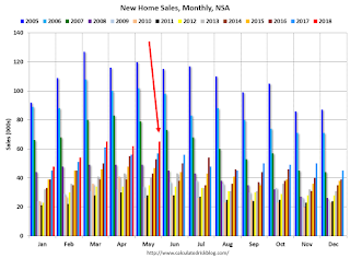
 The last graph shows sales NSA (monthly sales, not seasonally adjusted annual rate).
In May 2018 (red column), 64 thousand new homes were sold (NSA). Last year, 57 thousand homes were sold in May.
The all time high for May was 120 thousand in 2005, and the all time low for May was 26 thousand in 2010.
This was above expectations of 665,000 sales SAAR, however the previous months were revised down, combined. I'll have more later today.
Chicago Fed "Index Points to Slower Economic Growth in May "
by Calculated Risk on 6/25/2018 08:37:00 AM
From the Chicago Fed: Index Points to Slower Economic Growth in May
Led by declines in production-related indicators, the Chicago Fed National Activity Index (CFNAI) fell to –0.15 in May from +0.42 in April. Two of the four broad categories of indicators that make up the index decreased from April, and two of the four categories made negative contributions to the index in May. The index’s three-month moving average, CFNAI-MA3, decreased to +0.18 in May from +0.48 in April.This graph shows the Chicago Fed National Activity Index (three month moving average) since 1967.
emphasis added
 Click on graph for larger image.
This suggests economic activity was above the historical trend in May (using the three-month average).
According to the Chicago Fed:
The index is a weighted average of 85 indicators of growth in national economic activity drawn from four broad categories of data: 1) production and income; 2) employment, unemployment, and hours; 3) personal consumption and housing; and 4) sales, orders, and inventories.
...
A zero value for the monthly index has been associated with the national economy expanding at its historical trend (average) rate of growth; negative values with below-average growth (in standard deviation units); and positive values with above-average growth.


