by Calculated Risk on 7/09/2018 06:59:00 PM
Monday, July 09, 2018
Tuesday: Job Openings
From Matthew Graham at Mortgage News Daily: Mortgage Rates Edge Slightly Higher
Mortgage rates were modestly higher today amid exceptionally quiet market conditions. In general, the bond market (which underlies mortgage rates) has been sideways and fairly lifeless since the end of June. [30YR FIXED - 4.625% - 4.75%]Tuesday:
emphasis added
• At 6:00 AM ET, NFIB Small Business Optimism Index for June.
• At 10:00 AM, Job Openings and Labor Turnover Survey for May from the BLS. Job openings increased in April to 6.698 million from 6.633 million in March.
U.S. Heavy Truck Sales up Year-over-year in June
by Calculated Risk on 7/09/2018 02:09:00 PM
The following graph shows heavy truck sales since 1967 using data from the BEA. The dashed line is the June 2018 seasonally adjusted annual sales rate (SAAR).
Heavy truck sales really collapsed during the great recession, falling to a low of 181 thousand in April and May 2009, on a seasonally adjusted annual rate basis (SAAR). Then sales increased more than 2 1/2 times, and hit 480 thousand SAAR in June 2015.
Heavy truck sales declined again - probably mostly due to the weakness in the oil sector - and bottomed at 364 thousand SAAR in October 2016.
Click on graph for larger image.
With the increase in oil prices over the last year, heavy truck sales increased too.
Heavy truck sales were at 475 thousand SAAR in June, up from 452 thousand in May, and up from 416 thousand in June 2017.
Annual Vehicle Sales: On Pace to increase slightly in 2018
by Calculated Risk on 7/09/2018 01:28:00 PM
The BEA released their estimate of June vehicle sales. The BEA estimated sales of 17.38 million SAAR in June 2018 (Seasonally Adjusted Annual Rate), up 3.2% from the May sales rate, and up 4.7% from June 2017.
Through June, light vehicle sales are on pace to be up slightly in 2018 compared to 2017.
This would make 2018 the fourth best year on record after 2016, 2015, and 2000.
My guess is vehicle sales will finish the year with sales lower than in 2017. A small decline in sales this year isn't a concern - I think sales will move mostly sideways at near record levels.
As I noted last year, this means the economic boost from increasing auto sales is over (from the bottom in 2009, auto sales boosted growth every year through 2016).
Click on graph for larger image.
This graph shows annual light vehicle sales since 1976. Source: BEA.
Sales for 2018 are estimated based on the pace of sales during the first six months.
Black Knight Mortgage Monitor for May
by Calculated Risk on 7/09/2018 09:17:00 AM
Black Knight released their Mortgage Monitor report for May today. According to Black Knight, 3.64% of mortgages were delinquent in May, down from 3.79% in May 2017. Black Knight also reported that 0.59% of mortgages were in the foreclosure process, down from 0.83% a year ago.
This gives a total of 4.23% delinquent or in foreclosure.
Press Release: Black Knight’s May 2018 Mortgage Monitor
Today, the Data & Analytics division of Black Knight, Inc.released its latest Mortgage Monitor Report, based on data as of the end of May 2018. This month, the company looks again at tappable equity, or the share of equity available for homeowners with mortgages to borrow against before reaching a maximum total combined loan-to-value (LTV) ratio of 80 percent. Despite the record-setting growth in such equity seen in the first quarter of 2018, homeowners are withdrawing equity at a lower rate than in the past. As Ben Graboske, executive vice president of Black Knight’s Data & Analytics division explained, although total equity withdrawn by dollar amount has increased slightly since the same time last year, the rate of growth pales in comparison to that of tappable equity.
“In Q1 2018, homeowners with mortgages withdrew $63 billion in equity via cash-out refinances or HELOCs,” said Graboske. “That represents a slight one percent increase from the same time last year, despite the fact that the amount of equity available for homeowners to borrow against increased by 16 percent over the same time period. Collectively, American homeowners now have $5.8 trillion in tappable equity available, yet only 1.17 percent of that total was withdrawn in the first quarter of the year. That’s the lowest quarterly share in four years, and the second lowest since the housing recovery began six years ago. Somewhat surprisingly, even though rising first-lien interest rates normally produce an increase in HELOC lending, the volume of equity withdrawn via lines of credit dropped to a two-year low as well.
“One driving factor in the decline of HELOC equity utilization is likely the increasing spread between first-lien mortgage interest rates – which are tied most closely to 10-year Treasury yields – and those of HELOCs – which are more closely tied to the federal funds rate. As of late last year, the difference between a HELOC rate and a first-lien rate had widened to 1.5 percent, the widest spread we’ve seen since we began comparing the two rates 10 years ago. The distance between the two has closed somewhat in Q2 as 30-year mortgage rates have been on the rise, which does suggest the market remains ripe for relatively low-risk HELOC lending expansion. Still, increasing costs in the form of higher interest rates do appear to have impacted homeowners’ borrowing decisions in Q1 2018. We should also remember that the Federal Reserve raised its target interest rate again at its June meeting, which will likely further increase the standard interest rate on HELOCs in Q3 2018. Black Knight will continue to monitor the situation moving forward.”
The data also showed that tappable equity increased by more than $380 billion in Q1 2018, the largest single-quarter growth since Black Knight began tracking the metric in 2005. On an annual basis, total tappable equity increased $820 billion, a 16.5 percent increase over the prior 12 months. The $5.8 trillion in total available tappable equity is 16 percent higher than the peak seen during the pre-recession peak in 2006. Nearly 80 percent of the nation’s tappable equity is held by homeowners with first-lien interest rates at or below 4.5 percent, with 60 percent of the total being held by those with current rates below 4.0 percent. The average mortgage holder gained $14,700 in tappable equity over the past year and has $113,900 in total available equity to borrow against.
emphasis added
 Click on graph for larger image.
This graph from Black Knight shows the number of active foreclosure since 2000.
From Black Knight:
• The number of active foreclosures has declined from 2.3M at the peak in December 2010 to just 303k remaining today
• At the current rate of improvement (-29% Y/Y), the national foreclosure rate is on pace to ‘normalize’ (to the 2000-2005 average) within the next three months
• The number of outstanding foreclosures is on track to normalize in September 2018
• Given the various factors noted on the previous page, we may see foreclosure volumes dip even further
• Holding today's rate of improvement steady, both foreclosure rates and active foreclosure inventory would fall to the lowest level this century within the next 18 months

The second graph shows Black Knight's estimate of "Tappable Equity":
• Tappable equity increased by $820B (+16.5%) over the past 12 monthsThere is much more in the mortgage monitor.
• A total of $5.8T in tappable equity now held by U.S. homeowners with mortgages represents the highest volume ever recorded, and 16% above the mid-2006 peak
• Tappable equity grew by >$380B (+7%) in Q1 2018 alone, marking the largest single quarter growth volume of lendable equity since Black Knight began tracking it in 2005
...
• A large driver has been rising home prices, which rose + 2.5% in just the first 3 months of 2018, about +$6,900 for the median-priced home
• Additionally, declining current combined LTVs (CLTV) – now 52% on average, the lowest ever recorded by Black Knight – mean that the majority of home price gains are immediately eligible to be tapped
Oil Rigs: "A rebound after last week's fall"
by Calculated Risk on 7/09/2018 08:56:00 AM
A few comments from Steven Kopits of Princeton Energy Advisors LLC on July 6, 2018:
• Rig counts recovered after last week’s lousy numbers
• Total oil rigs are up, +5 to 863
• Horizontal oil rigs rebounded, +6 to 771
...
• The big movers this week were the Cana Woodford, -6; and Other US, +7. Expect some reversal of these numbers next week.
 Click on graph for larger image.
CR note: This graph shows the US horizontal rig count by basin.
Graph and comments Courtesy of Steven Kopits of Princeton Energy Advisors LLC.
Sunday, July 08, 2018
Sunday Night Futures
by Calculated Risk on 7/08/2018 06:39:00 PM
Weekend:
• Schedule for Week of July 8, 2018
Monday:
• At 3:00 PM ET, Consumer Credit from the Federal Reserve. The consensus is for consumer credit to increase $12.4 billion in May.
From CNBC: Pre-Market Data and Bloomberg futures: S&P 500 are up 4, and DOW futures are up 45 (fair value).
Oil prices were mixed over the last week with WTI futures at $73.96 per barrel and Brent at $77.29 per barrel. A year ago, WTI was at $44, and Brent was at $47 - so oil prices are up about 65% year-over-year.
Here is a graph from Gasbuddy.com for nationwide gasoline prices. Nationally prices are at $2.86 per gallon. A year ago prices were at $2.26 per gallon - so gasoline prices are up 60 cents per gallon year-over-year.
Public and Private Sector Payroll Jobs During Presidential Terms
by Calculated Risk on 7/08/2018 11:39:00 AM
By request, here is another update of tracking employment during Presidential terms. We frequently use Presidential terms as time markers - we could use Speaker of the House, Fed Chair, or any other marker.
NOTE: Several readers have asked if I could add a lag to these graphs (obviously a new President has zero impact on employment for the month they are elected). But that would open a debate on the proper length of the lag, so I'll just stick to the beginning of each term.
Important: There are many differences between these periods. Overall employment was smaller in the '80s, however the participation rate was increasing in the '80s (younger population and women joining the labor force), and the participation rate is generally declining now. But these graphs give an overview of employment changes.
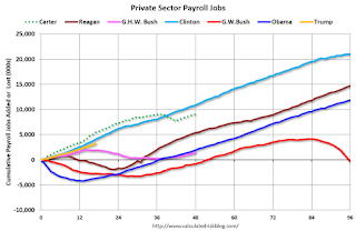
The first graph shows the change in private sector payroll jobs from when each president took office until the end of their term(s). Presidents Carter and George H.W. Bush only served one term.
Mr. G.W. Bush (red) took office following the bursting of the stock market bubble, and left during the bursting of the housing bubble. Mr. Obama (dark blue) took office during the financial crisis and great recession. There was also a significant recession in the early '80s right after Mr. Reagan (dark red) took office.
There was a recession towards the end of President G.H.W. Bush (light purple) term, and Mr Clinton (light blue) served for eight years without a recession.

The first graph is for private employment only.
Mr. Trump is in Orange (just 17 months).
The employment recovery during Mr. G.W. Bush's (red) first term was sluggish, and private employment was down 804,000 jobs at the end of his first term. At the end of Mr. Bush's second term, private employment was collapsing, and there were net 391,000 private sector jobs lost during Mr. Bush's two terms.
Private sector employment increased by 20,964,000 under President Clinton (light blue), by 14,717,000 under President Reagan (dark red), 9,041,000 under President Carter (dashed green), 1,509,000 under President G.H.W. Bush (light purple), and 11,907,000 under President Obama (dark blue).
During the first 17 months of Mr. Trump's term, the economy has added 3,188,000 private sector jobs.

The public sector grew during Mr. Carter's term (up 1,304,000), during Mr. Reagan's terms (up 1,414,000), during Mr. G.H.W. Bush's term (up 1,127,000), during Mr. Clinton's terms (up 1,934,000), and during Mr. G.W. Bush's terms (up 1,744,000 jobs). However the public sector declined significantly while Mr. Obama was in office (down 266,000 jobs).
During the first 17 months of Mr. Trump's term, the economy has added 28,000 public sector jobs.

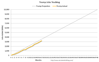
After 17 months of Mr. Trump's presidency, the economy has added 3,216,000 jobs, about 326,000 behind the projection.
Saturday, July 07, 2018
Schedule for Week of July 8, 2018
by Calculated Risk on 7/07/2018 08:11:00 AM
The key economic report this week is the June Consumer Price Index (CPI) on Thursday.
3:00 PM: Consumer Credit from the Federal Reserve. The consensus is for consumer credit to increase $12.4 billion in May.
6:00 AM: NFIB Small Business Optimism Index for June.
 10:00 AM ET: Job Openings and Labor Turnover Survey for May from the BLS.
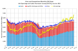
 This graph shows job openings (yellow line), hires (purple), Layoff, Discharges and other (red column), and Quits (light blue column) from the JOLTS.
Job openings increased in April to 6.698 million from 6.633 million in March.
The number of job openings (yellow) were up 9.7% year-over-year, and Quits were up 9.1% year-over-year.
7:00 AM ET: The Mortgage Bankers Association (MBA) will release the results for the mortgage purchase applications index.
8:30 AM: The Producer Price Index for June from the BLS. The consensus is a 0.2% increase in PPI, and a 0.2% increase in core PPI.
8:30 AM: The initial weekly unemployment claims report will be released. The consensus is for 225 thousand initial claims, down from 231 thousand the previous week.
8:30 AM: The Consumer Price Index for June from the BLS. The consensus is for a 0.2% increase in CPI, and a 0.2% increase in core CPI.
10:00 AM: University of Michigan's Consumer sentiment index (Preliminary for July).
11:00 AM: Federal Reserve Monetary Policy Report to Congress
Friday, July 06, 2018
Q2 GDP Forecasts
by Calculated Risk on 7/06/2018 08:51:00 PM
From Merrill Lynch:
The [trade] data bumped up 2Q GDP tracking by a tenth to 3.8% qoq saar. [July 6 estimate].And from the Altanta Fed: GDPNow
emphasis added
The GDPNow model estimate for real GDP growth (seasonally adjusted annual rate) in the second quarter of 2018 is 3.8 percent on July 6, down from 4.1 percent on July 2. [July 6 estimate]From the NY Fed Nowcasting Report
The New York Fed Staff Nowcast stands at 2.8% for 2018:Q2 and 2.7% for 2018:Q3. [July 6 estimate]CR Note: These estimates suggest real annualized GDP in the 2.8% to 3.8% range in Q2.
AAR: Rail Carloads Up 2.0% YoY, Intermodal Up 6.3% YoY
by Calculated Risk on 7/06/2018 05:27:00 PM
From the Association of American Railroads (AAR) Rail Time Indicators. Graphs and excerpts reprinted with permission.
All things considered, it could be a lot worse for rail traffic. U.S. railroads originated 1,159,973 containers and trailers in June 2018, up 6.3% over June 2017. Average weekly intermodal volume in June 2018 was 289,993 units, easily the most for any month in history. U.S. railroads also originated 1,080,769 carloads in June 2018, up 2.0%, or 21,098 carloads, over June 2017.
…
Not all is well, though. For example, weekly average U.S. grain carloads in June 2018 were the most for June since 1995, but near-term rail grain movements, especially soybeans, are at risk because of the ongoing trade fights. The more tit-for-tat escalation there is, the more railroads could suffer.
 Click on graph for larger image.
This graph from the Rail Time Indicators report shows U.S. average weekly rail carloads (NSA). Light blue is 2018.
Rail carloads have been weak over the last decade due to the decline in coal shipments.
Total originated U.S. rail carloads in June 2018 were 1,080,769, up 2.0%, or 21,098 carloads, over June 2017. That’s the fourth straight year-over-year monthly increase, something that hasn’t happened since last June. Total carloads averaged 270,192 in June 2018, the most for June since 2015 and the most for any month since October 2015.
 The second graph is for intermodal traffic (using intermodal or shipping containers):
U.S. railroads originated 1,159,973 intermodal containers and trailers in June 2018, up 6.3%, or 68,689 units, over June 2017. Average weekly intermodal volume in June 2018 was 289,993 units, easily the most ever. (The old record was 279,853 in February 2018.) In fact, the four weeks comprising June 2018 were first, third, fourth, and fifth on the all-time weekly U.S. intermodal list.


