by Calculated Risk on 3/27/2019 07:00:00 AM
Wednesday, March 27, 2019
MBA: Mortgage Applications Increased in Latest Weekly Survey
From the MBA: Mortgage Applications Increase in Latest MBA Weekly Survey
Mortgage applications increased 8.9 percent from one week earlier, according to data from the Mortgage Bankers Association’s (MBA) Weekly Mortgage Applications Survey for the week ending March 22, 2019.
... The Refinance Index increased 12 percent from the previous week. The seasonally adjusted Purchase Index increased 6 percent from one week earlier. The unadjusted Purchase Index increased 7 percent compared with the previous week and was 4 percent higher than the same week one year ago.
...
“The spring buying season is off to a strong start. Thanks to an unexpectedly large drop in mortgage rates following last week’s FOMC meeting, purchase applications jumped 6 percent and refinance applications surged over 12 percent,” said Joel Kan, MBA’s Associate Vice President of Economic and Industry Forecasting. “Rates dropped across all loan types, and the 30-year fixed-rate mortgage is now more than 70 basis points below last November’s peak. The average loan size increased once again to new highs for both purchase and refinance loans, as borrowers with – or seeking – larger loans tend to be more reactive to the drop in rates.”
...
The average contract interest rate for 30-year fixed-rate mortgages with conforming loan balances ($484,350 or less) decreased to 4.45 percent from 4.55 percent, with points decreasing to 0.39 from 0.42 (including the origination fee) for 80 percent loan-to-value ratio (LTV) loans.
emphasis added
 Click on graph for larger image.
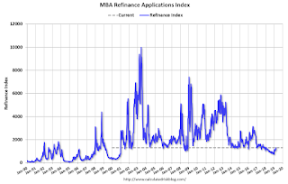
The first graph shows the refinance index since 1990.
Now that mortgage rates have fallen more than 50 bps from the highs last year, a number of recent buyers will be able to refinance.
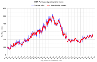
 The second graph shows the MBA mortgage purchase index
According to the MBA, purchase activity is up 4% year-over-year.
Tuesday, March 26, 2019
Wednesday: Trade Deficit
by Calculated Risk on 3/26/2019 07:33:00 PM
Wednesday:
• At 7:00 AM ET: The Mortgage Bankers Association (MBA) will release the results for the mortgage purchase applications index.
• At 8:30 AM: Trade Balance report for January from the Census Bureau. The consensus is the trade deficit to be $57.4 billion. The U.S. trade deficit was at $59.8 billion in December.
Real House Prices and Price-to-Rent Ratio in January
by Calculated Risk on 3/26/2019 03:42:00 PM
Here is the earlier post on Case-Shiller: Case-Shiller: National House Price Index increased 4.3% year-over-year in January
It has been over eleven years since the bubble peak. In the Case-Shiller release this morning, the seasonally adjusted National Index (SA), was reported as being 12.0% above the previous bubble peak. However, in real terms, the National index (SA) is still about 7.9% below the bubble peak (and historically there has been an upward slope to real house prices). The composite 20, in real terms, is still 14.6% below the bubble peak.
The year-over-year increase in prices has slowed to 4.3% nationally, and I expect price growth will slow some more.
Usually people graph nominal house prices, but it is also important to look at prices in real terms (inflation adjusted). Case-Shiller and others report nominal house prices. As an example, if a house price was $200,000 in January 2000, the price would be close to $286,000 today adjusted for inflation (43%). That is why the second graph below is important - this shows "real" prices (adjusted for inflation).
Nominal House Prices

In nominal terms, the Case-Shiller National index (SA)and the Case-Shiller Composite 20 Index (SA) are both at new all times highs (above the bubble peak).
Real House Prices

In real terms, the National index is back to February 2005 levels, and the Composite 20 index is back to June 2004.
In real terms, house prices are at 2004/2005 levels.
Price-to-Rent
In October 2004, Fed economist John Krainer and researcher Chishen Wei wrote a Fed letter on price to rent ratios: House Prices and Fundamental Value. Kainer and Wei presented a price-to-rent ratio using the OFHEO house price index and the Owners' Equivalent Rent (OER) from the BLS.

This graph shows the price to rent ratio (January 2000 = 1.0).
On a price-to-rent basis, the Case-Shiller National index is back to February 2004 levels, and the Composite 20 index is back to November 2003 levels.
In real terms, prices are back to late 2004 levels, and the price-to-rent ratio is back to late 2003, early 2004.
Update: A few comments on the Seasonal Pattern for House Prices
by Calculated Risk on 3/26/2019 01:31:00 PM
CR Note: This is a repeat of earlier posts with updated graphs.
A few key points:
1) There is a clear seasonal pattern for house prices.
2) The surge in distressed sales during the housing bust distorted the seasonal pattern.
3) Even though distressed sales are down significantly, the seasonal factor is based on several years of data - and the factor is now overstating the seasonal change (second graph below).
4) Still the seasonal index is probably a better indicator of actual price movements than the Not Seasonally Adjusted (NSA) index.
For in depth description of these issues, see former Trulia chief economist Jed Kolko's article "Let’s Improve, Not Ignore, Seasonal Adjustment of Housing Data"
Note: I was one of several people to question the change in the seasonal factor (here is a post in 2009) - and this led to S&P Case-Shiller questioning the seasonal factor too (from April 2010). I still use the seasonal factor (I think it is better than using the NSA data).

This graph shows the month-to-month change in the NSA Case-Shiller National index since 1987 (through January 2019). The seasonal pattern was smaller back in the '90s and early '00s, and increased once the bubble burst.
The seasonal swings have declined since the bubble.

The swings in the seasonal factors has started to decrease, and I expect that over the next several years - as recent history is included in the factors - the seasonal factors will move back towards more normal levels.
However, as Kolko noted, there will be a lag with the seasonal factor since it is based on several years of recent data.
Comments on February Housing Starts
by Calculated Risk on 3/26/2019 10:39:00 AM
Earlier: Housing Starts Decreased to 1.162 Million Annual Rate in February
Total housing starts in February were below expectations, however starts for December and January were revised up.
The housing starts report released this morning showed starts were down 8.7% in February compared to January, and starts were down 9.9% year-over-year compared to February 2018.
Single family starts were down 10.6% year-over-year, and multi-family starts were down 5.4%.
This first graph shows the month to month comparison for total starts between 2018 (blue) and 2019 (red).

Starts were down 9.9% in February compared to February 2018.
The weakness in February was primarily in the single family sector. February starts might have been impacted by the weather.
Last year, in 2018, starts were strong early in the year, and then fell off in the 2nd half - so the early comparisons are the most difficult.
Below is an update to the graph comparing multi-family starts and completions. Since it usually takes over a year on average to complete a multi-family project, there is a lag between multi-family starts and completions. Completions are important because that is new supply added to the market, and starts are important because that is future new supply (units under construction is also important for employment).
These graphs use a 12 month rolling total for NSA starts and completions.

The rolling 12 month total for starts (blue line) increased steadily for several years following the great recession - but turned down, and has moved sideways recently. Completions (red line) had lagged behind - however completions and starts are at about the same level now.
As I've been noting for a few years, the significant growth in multi-family starts is behind us - multi-family starts peaked in June 2015 (at 510 thousand SAAR).

Note the relatively low level of single family starts and completions. The "wide bottom" was what I was forecasting following the recession, and now I expect some further increases in single family starts and completions.
Case-Shiller: National House Price Index increased 4.3% year-over-year in January
by Calculated Risk on 3/26/2019 09:12:00 AM
S&P/Case-Shiller released the monthly Home Price Indices for January ("January" is a 3 month average of November, December and January prices).
This release includes prices for 20 individual cities, two composite indices (for 10 cities and 20 cities) and the monthly National index.
Note: Case-Shiller reports Not Seasonally Adjusted (NSA), I use the SA data for the graphs.
From S&P: S&P CoreLogic Case-Shiller Index Shows Annual Gains Lowest Since 2015
The S&P CoreLogic Case-Shiller U.S. National Home Price NSA Index, covering all nine U.S. census divisions, reported a 4.3% annual gain in January, down from 4.6% in the previous month. The 10-City Composite annual increase came in at 3.2%, down from 3.7% in the previous month. The 20-City Composite posted a 3.6% year-over-year gain, down from 4.1% in the previous month.
Las Vegas, Phoenix and Minneapolis reported the highest year-over-year gains among the 20 cities. In January, Las Vegas led the way with a 10.5% year-over-year price increase, followed by Phoenix with a 7.5% increase and Minneapolis with a 5.1% increase. Only one of the 20 cities reported greater price increases in the year ending January 2019 versus the year ending December 2018.
...
Before seasonal adjustment, the National Index posted a month-over-month decrease of 0.2% in January. The 10-City and 20-City Composites reported 0.3% and 0.2% decreases for the month, respectively. After seasonal adjustment, the National Index recorded a 0.2% month-over-month increase in January. The 10-City Composite did not post any gains, and the 20-City Composite posted 0.1% month-over-month increase. In January, five of 20 cities reported increases before seasonal adjustment, while 14 of 20 cities reported increases after seasonal adjustment.
“Home price gains continue to shrink,” says David M. Blitzer, Managing Director and Chairman of the Index Committee at S&P Dow Jones Indices. “In the year to January, the S&P CoreLogic Case-Shiller National Index rose 4.3%, two percentage points slower than its pace in January 2018. The last time it advanced this slowly was April 2015. In 16 of the 20 cities tracked, price gains were smaller in January 2019 than in January 2018. Only Phoenix saw any appreciable acceleration. Some cities where prices surged in 2017-2018 now face much smaller increases: in Seattle, annual price gains dropped from 12.8% to 4.1% from January 2018 to January 2019. San Francisco saw annual price increases shrink from 10.2% to 1.8% over the same time period.
Mortgage rates are as important as prices for many home buyers. Mortgage rates climbed from 3.95% in January 2018 to a peak of 4.95% in November 2018. Since then, rates have dropped to 4.28% as of mid-March. Sales of existing single-family homes slid gently downward from the 2017 fourth quarter until January of this year before jumping higher in February 2019. Home sales annual rate dropped from 5 million units in February 2018 to 4.36 million units in January 2019 before popping to 4.94 in February. It remains to be seen if recent low mortgage rates and smaller price gains can sustain improved home sales.”
emphasis added
 Click on graph for larger image.
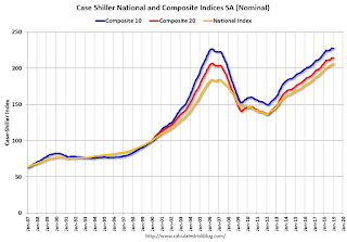
 The first graph shows the nominal seasonally adjusted Composite 10, Composite 20 and National indices (the Composite 20 was started in January 2000).
The Composite 10 index is up slightly from the bubble peak, and up slightly in January (SA).
The Composite 20 index is 3.8% above the bubble peak, and up 0.1% (SA) in January.
The National index is 12.0% above the bubble peak (SA), and up 0.2% (SA) in January. The National index is up 51.5% from the post-bubble low set in December 2011 (SA).
 The second graph shows the Year over year change in all three indices.
The Composite 10 SA is up 3.2% compared to January 2018. The Composite 20 SA is up 3.6% year-over-year.
The National index SA is up 4.3% year-over-year.
Note: According to the data, prices increased in 15 of 20 cities month-over-month seasonally adjusted.
I'll have more later.
Housing Starts Decreased to 1.162 Million Annual Rate in February
by Calculated Risk on 3/26/2019 08:40:00 AM
From the Census Bureau: Permits, Starts and Completions
Housing Starts:
Privately‐owned housing starts in February were at a seasonally adjusted annual rate of 1,162,000. This is 8.7 percent below the revised January estimate of 1,273,000 and is 9.9 percent below the February 2018 rate of 1,290,000. Single‐family housing starts in February were at a rate of 805,000; this is 17.0 percent below the revised January figure of 970,000. The February rate for units in buildings with five units or more was 352,000.
Building Permits:
Privately‐owned housing completions in February were at a seasonally adjusted annual rate of 1,303,000. This is 4.5 percent above the revised January estimate of 1,247,000 and is 1.1 percent above the February 2018 rate of 1,289,000. Single‐family housing completions in February were at a rate of 816,000; this is 10.0 percent below the revised January rate of 907,000. The February rate for units in buildings with five units or more was 473,000.
emphasis added
 Click on graph for larger image.
The first graph shows single and multi-family housing starts for the last several years.
Multi-family starts (red, 2+ units) increased in February compared to January. Multi-family starts were down 5% year-over-year in February.
Multi-family is volatile month-to-month, and has been mostly moving sideways the last few years.
Single-family starts (blue) decreased in February, and were down 11% year-over-year.
 The second graph shows total and single unit starts since 1968.
 The second graph shows the huge collapse following the housing bubble, and then eventual recovery (but still historically low).
Total housing starts in February were below expectations, however starts for December and January were revised up.
I'll have more later …
Monday, March 25, 2019
Tuesday: Housing Starts, Case-Shiller House Prices, and More
by Calculated Risk on 3/25/2019 06:27:00 PM
From Matthew Graham at Mortgage News Daily: Mortgage Rates Still Moving Lower After Last Week's Stellar Drop
Mortgage rates continued deeper into long-term lows today as the underlying bond market experiences its most impressive rally of the year. In a rally, bond prices are moving higher and rates are moving lower. [30YR FIXED - 4.00 - 4.125]Tuesday:
emphasis added
• At 8:30 AM ET: Housing Starts for February. The consensus is for 1.201 million SAAR, down from 1.230 million SAAR in January.
• At 9:00 AM: FHFA House Price Index for January 2019. This was originally a GSE only repeat sales, however there is also an expanded index.
• At 9:00 AM: S&P/Case-Shiller House Price Index for January. The consensus is for a 4.2% year-over-year increase in the Comp 20 index for December.
• At 10:00 AM: Richmond Fed Survey of Manufacturing Activity for March.
Freddie Mac: Mortgage Serious Delinquency Rate Decreased Slightly in February
by Calculated Risk on 3/25/2019 05:22:00 PM
Freddie Mac reported that the Single-Family serious delinquency rate in February was 0.69%, down slightly from 0.70% in January. Freddie's rate is down from 1.06% in February 2018.
Freddie's serious delinquency rate peaked in February 2010 at 4.20%.
This matches the lowest serious delinquency rate for Freddie Mac since December 2007.
These are mortgage loans that are "three monthly payments or more past due or in foreclosure".

The increase in the delinquency rate in late 2017 and early 2018 was due to the hurricanes (These are serious delinquencies, so it took three months late to be counted).
I expect the delinquency rate to decline to a cycle bottom in the 0.5% to 0.7% range - but this is close to a bottom.
Note: Fannie Mae will report for February soon.
Housing Inventory Tracking
by Calculated Risk on 3/25/2019 01:39:00 PM
Update: Watching existing home "for sale" inventory is very helpful. As an example, the increase in inventory in late 2005 helped me call the top for housing.
And the decrease in inventory eventually helped me correctly call the bottom for house prices in early 2012, see: The Housing Bottom is Here.
And in 2015, it appeared the inventory build in several markets was ending, and that boosted price increases.
I don't have a crystal ball, but watching inventory helps understand the housing market.
Inventory, on a national basis, was up 4.6% year-over-year (YoY) in January, this was the sixth consecutive month with a YoY increase, following over three years of YoY declines.
The graph below shows the YoY change for non-contingent inventory in Houston, Las Vegas, and Sacramento and Phoenix, and total existing home inventory as reported by the NAR (through February). (I'll be adding more areas).

The black line is the year-over-year change in inventory as reported by the NAR.
Note that inventory was up 105% YoY in Las Vegas in February (red), the eight consecutive month with a YoY increase.
Houston is a special case, and inventory was up for several years due to lower oil prices, but declined YoY recently as oil prices increased. Inventory was up 17% year-over-year in Houston in February.
Inventory is a key for the housing market. I expect a further increase in inventory in 2019, but overall I think inventory will still be fairly low.
Also note that inventory in Seattle was up 164% year-over-year in February (not graphed)!


