by Calculated Risk on 9/09/2019 10:28:00 AM
Monday, September 09, 2019
AAR: August Rail Carloads down 4.6% YoY, Intermodal Down 5.4% YoY
From the Association of American Railroads (AAR) Rail Time Indicators. Graphs and excerpts reprinted with permission.
It seems clear that U.S. railroads are facing a freight recession. Total originated U.S. rail carloads fell 4.6% in August 2019 from August 2018, their seventh straight year-over-year decline. The average decline over those seven months was 4.2%, a not-insignificant amount. Meanwhile, U.S. intermodal volume fell 5.4% in August, also the seventh straight monthly decline. … Why? The parts of the economy that generate much of the freight that railroads carry — manufacturing and goods trading — have weakened significantly over the past several months.
emphasis added
 Click on graph for larger image.
This graph from the Rail Time Indicators report shows the year-over-year changes in U.S. Carloads.
U.S. railroads originated 1.06 million total carloads in August 2019, down 4.6%, or 50,672 carloads, from August 2018. August was the seventh straight year-over-year decline. For the first eight months of 2019, total U.S. carloads were down 3.4%, or 310,246 carloads, compared with 2018. Our U.S. data begin in 1988. Since then, only 2016 had fewer year-to-date total carloads than this year.
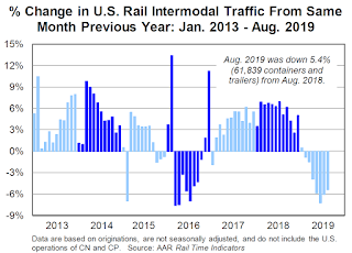 The second graph is the year-over-year change for intermodal traffic (using intermodal or shipping containers):
For intermodal, August was no prize either: originations were down 5.4% from August 2018. That too was the seventh straight decline. In 2019 through August, intermodal originations were down 3.9%, or 375,964 containers and trailers, from last year. It’s some consolation, though, that 2018 was a record year for intermodal, and this year’s January-August total is the second best ever (behind 2018).
So far, U.S. rail traffic appears to be mirroring what happened in late 2015 and 2016, when it fell for 13 out of 14 months. Back then, there was a freight recession, but not an economywide recession. We appear to be in another freight recession now. Whether the same thing happens this time around — the overall economy wobbles but doesn’t fall down1 — remains to be seen, but railroads are already suffering. One reason why is that the ongoing trade war and accompanying uncertainty has had the most direct impact on manufacturing and commodity-related industries that are heavily served by railroads but that comprise only a moderate share of the overall economy.
Black Knight Mortgage Monitor for July: National Delinquency Rate near Series Low
by Calculated Risk on 9/09/2019 08:11:00 AM
Black Knight released their Mortgage Monitor report for July today. According to Black Knight, 3.46% of mortgages were delinquent in July, down slightly from 3.61% in July 2018. Black Knight also reported that 0.49% of mortgages were in the foreclosure process, down from 0.57% a year ago.
This gives a total of 3.95% delinquent or in foreclosure.
Press Release: Black Knight Mortgage Monitor: Servicer Retention Rates Improve Significantly Among Rate-Driven Refinance Transactions; Cash-Out Refi Retention Still Lackluster
Today, the Data & Analytics division of Black Knight, Inc. released its latest Mortgage Monitor Report, based upon the company’s industry-leading mortgage performance, housing and public records datasets. This month’s report returned to the subject of servicer retention rates – the share of borrowers servicers retained through a refinance transaction. As Black Knight Data & Analytics President Ben Graboske explained, falling interest rates and a subsequent increase in rate/term refinances has worked in servicers’ favor.
...
This month’s analysis found that tappable equity – the amount of equity available to homeowners with mortgages before reaching a maximum combined loan-to-value ratio of 80% – rose for the second consecutive quarter. Gaining $335 billion in Q2 2019, tappable equity is now at an all-time high of $6.3 trillion. Approximately 45 million homeowners with mortgages have an average of $140,000 in tappable equity available to them. As mentioned above, falling 30-year rates have made cash-out refinances an affordable alternative to HELOCs as a way for these homeowners to tap equity. These falling rates have also opened up a relatively low-risk pool of potential borrowers with high credit scores. Nearly half of tappable equity holders have current first lien rates of 4.25%, while 76% have interest rates of 3.75% or higher, meaning they could potentially tap into home equity with little change to their existing 30-year rate, or perhaps even experience a slight improvement. More than half of this population has credit scores of 760 or above, making for a relatively low-risk market segment; another 16% have credit scores between 720-759.
emphasis added
 Click on graph for larger image.
Here is a graph from the Mortgage Monitor that shows the National delinquency rate over time.
From Black Knight:
• After June's calendar-driven spike, the national delinquency rate recovered strongly in JulyThe second graph shows the Year-over-year change in Black Knight's House Price Index:
• Delinquencies fell 7% from June, and are now down more than 4% from one year ago
• July 2019’s delinquency rate of 3.46% is the lowest for any July on record dating back to 2000
• The national delinquency rate is now more than 1% below the pre-recession average for the first time in 2019 after first crossing that threshold in late 2018

• The rate of a annual home price appreciation rose in July for the first time since February 2018There is much more in the mortgage monitor.
• Home prices were up by 0.34% for the month, increasing the annual home price growth rate to 3.9%
• Over those 16 months, annual home price growth had fallen from a peak of 6.75% in February 2018 to 3.7% as of June
• It’s important to note that the slowdown didn’t equate to falling home prices at the national level; in fact, July marked 87 consecutive months of annual home price growth
Sunday, September 08, 2019
Sunday Night Futures
by Calculated Risk on 9/08/2019 10:02:00 PM
Weekend:
• Schedule for Week of September 8, 2019
Tuesday:
• At 3:00 PM, Consumer Credit from the Federal Reserve.
From CNBC: Pre-Market Data and Bloomberg futures: S&P 500 are up 4 and DOW futures are up 25 (fair value).
Oil prices were up over the last week with WTI futures at $56.82 per barrel and Brent at $61.76 barrel. A year ago, WTI was at $68, and Brent was at $77 - so oil prices are down about 20% year-over-year.
Here is a graph from Gasbuddy.com for nationwide gasoline prices. Nationally prices are at $2.55 per gallon. A year ago prices were at $2.85 per gallon, so gasoline prices are down 30 cents year-over-year.
Hotels: Occupancy Rate Decreased Year-over-year
by Calculated Risk on 9/08/2019 08:19:00 AM
From HotelNewsNow.com: STR: US hotel results for week ending 31 August
The U.S. hotel industry reported mostly positive year-over-year results in the three key performance metrics during the week of 25-31 August 2019, according to data from STR.The following graph shows the seasonal pattern for the hotel occupancy rate using the four week average.
In comparison with the week of 26 August through 1 September 2018, the industry recorded the following:
• Occupancy: -0.4% to 66.7%
• Average daily rate (ADR): +1.4% to US$127.26
• Revenue per available room (RevPAR): +1.0% at US$84.87
Orlando, Florida, saw the steepest declines in occupancy (-21.6% to 52.4%) and RevPAR (-24.1% to US$52.84).
Miami/Hialeah, Florida, posted the largest drop in ADR (-6.6% to US$137.27) and the only other double-digit decreases in occupancy (-10.9% to 60.1%) and RevPAR (-16.8% to US$82.56).
Due to the anticipation of Hurricane Dorian, the three largest hotel markets in Florida each reported significant declines in occupancy on Friday and Saturday.
emphasis added
 Click on graph for larger image.
The red line is for 2019, dash light blue is 2018 (record year), blue is the median, and black is for 2009 (the worst year probably since the Great Depression for hotels).
Occupancy has been solid in 2019, and close to-date compared to the previous 4 years.
However occupancy will be lower this year than in 2018 (the record year), unless there is a strong boost due to hurricane impacted areas.
Seasonally, the occupancy rate will now decline until the Fall business travel season.
Data Source: STR, Courtesy of HotelNewsNow.com
Saturday, September 07, 2019
Schedule for Week of September 8, 2019
by Calculated Risk on 9/07/2019 08:11:00 AM
The key economic reports this week are August Retail sales, and the August Consumer Price Index (CPI).
3:00 PM: Consumer Credit from the Federal Reserve.
6:00 AM: NFIB Small Business Optimism Index for August.
 10:00 AM ET: Job Openings and Labor Turnover Survey for July from the BLS.
 This graph shows job openings (yellow line), hires (purple), Layoff, Discharges and other (red column), and Quits (light blue column) from the JOLTS.
Jobs openings decreased in June to 7.348 million from 7.384 million in May.
The number of job openings (yellow) were down 1% year-over-year, and Quits were up 2% year-over-year.
7:00 AM ET: The Mortgage Bankers Association (MBA) will release the results for the mortgage purchase applications index.
8:30 AM: The Producer Price Index for August from the BLS. The consensus is for a 0.1% increase in PPI, and a 0.2% increase in core PPI.
8:30 AM: The initial weekly unemployment claims report will be released. The consensus is for 215 thousand initial claims, down from 217 thousand the previous week.
8:30 AM: The Consumer Price Index for August from the BLS. The consensus is for a 0.1% increase in CPI, and a 0.2% increase in core CPI.
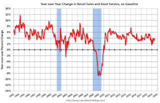 8:30 AM ET: Retail sales for August will be released. The consensus is for a 0.3% increase in retail sales.
This graph shows the year-over-year change in retail sales and food service (ex-gasoline) since 1993. Retail and Food service sales, ex-gasoline, increased by 3.7% on a YoY basis in July.
10:00 AM: University of Michigan's Consumer sentiment index (Preliminary for September).
Friday, September 06, 2019
Public and Private Sector Payroll Jobs During Presidential Terms
by Calculated Risk on 9/06/2019 04:00:00 PM
By request, here is another update of tracking employment during Presidential terms. We frequently use Presidential terms as time markers - we could use Speaker of the House, Fed Chair, or any other marker.
NOTE: Several readers have asked if I could add a lag to these graphs (obviously a new President has zero impact on employment for the month they are elected). But that would open a debate on the proper length of the lag, so I'll just stick to the beginning of each term.
Important: There are many differences between these periods. Overall employment was smaller in the '80s, however the participation rate was increasing in the '80s (younger population and women joining the labor force), and the participation rate is generally declining now. But these graphs give an overview of employment changes.
The first graph shows the change in private sector payroll jobs from when each president took office until the end of their term(s). Presidents Carter and George H.W. Bush only served one term.
Mr. G.W. Bush (red) took office following the bursting of the stock market bubble, and left during the bursting of the housing bubble. Mr. Obama (dark blue) took office during the financial crisis and great recession. There was also a significant recession in the early '80s right after Mr. Reagan (dark red) took office.
There was a recession towards the end of President G.H.W. Bush (light purple) term, and Mr Clinton (light blue) served for eight years without a recession.

The first graph is for private employment only.
Mr. Trump is in Orange (31 months).
The employment recovery during Mr. G.W. Bush's (red) first term was sluggish, and private employment was down 821,000 jobs at the end of his first term. At the end of Mr. Bush's second term, private employment was collapsing, and there were net 382,000 private sector jobs lost during Mr. Bush's two terms.
Private sector employment increased by 20,979,000 under President Clinton (light blue), by 14,714,000 under President Reagan (dark red), 9,039,000 under President Carter (dashed green), 1,511,000 under President G.H.W. Bush (light purple), and 11,890,000 under President Obama (dark blue).
During the first 31 months of Mr. Trump's term, the economy has added 5,561,000 private sector jobs.
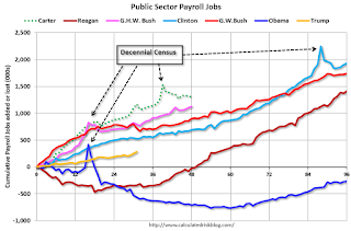
The public sector grew during Mr. Carter's term (up 1,304,000), during Mr. Reagan's terms (up 1,414,000), during Mr. G.H.W. Bush's term (up 1,127,000), during Mr. Clinton's terms (up 1,934,000), and during Mr. G.W. Bush's terms (up 1,744,000 jobs). However the public sector declined significantly while Mr. Obama was in office (down 269,000 jobs).
During the first 31 months of Mr. Trump's term, the economy has added 281,000 public sector jobs.

After 31 months of Mr. Trump's presidency, the economy has added 5,846,000 jobs, about 612,000 behind the projection.
Note: Based on the preliminary Benchmark revision, there will be 501,000 fewer jobs in March 2019 after the Benchmark revision is released in February - so job growth is probably over 1 million behind the projection.
Las Vegas Real Estate in August: Sales up 1.4% YoY, Inventory up 37% YoY
by Calculated Risk on 9/06/2019 01:00:00 PM
This is a key former distressed market to follow since Las Vegas saw the largest price decline, following the housing bubble, of any of the Case-Shiller composite 20 cities.
The Greater Las Vegas Association of Realtors reported More signs that Southern Nevada’s real estate roller-coaster ride has slowed down; GLVAR housing statistics for August 2019
The total number of existing local homes, condos and townhomes sold during August was 3,935. Compared to one year ago, August sales were up 3.1% for homes, but down 5.1% for condos and townhomes.1) Overall sales were up 1.4% year-over-year to 3,935 in August 2019 from 3,881 in August 2018.
By the end of August, GLVAR reported 7,766 single-family homes listed for sale without any sort of offer. That’s up 33.5% from one year ago. For condos and townhomes, the 1,860 properties listed without offers in August represented a 57.1% increase from one year ago.
While the local housing supply is up from one year ago, Carpenter said it’s still below what would normally be considered a balanced market. At the current sales pace, she said Southern Nevada has about a 2.5-month supply of homes available for sale.
...
[T]he number of so-called distressed sales remains near historically low levels. GLVAR reported that short sales and foreclosures combined accounted for just 2.1% of all existing local property sales in August. That compares to 2.5% of all sales one year ago and 6.1% two years ago.
emphasis added
2) Active inventory (single-family and condos) is up from a year ago, from a total of 7,002 in August 2018 to 9,626 in August 2019. Note: Total inventory was up 37% year-over-year. This is a significant increase in inventory, although the year-over-year increase is down substantially from earlier this year. And months of inventory is still low.
3) Low level of distressed sales.
Q3 GDP Forecasts: Mid-to-high 1%
by Calculated Risk on 9/06/2019 11:36:00 AM
From Merrill Lynch:
We left our Q3 GDP tracking estimate unchanged at +1.9% (qoq ar). [Sept 5 estimate]From Goldman Sachs:
emphasis added
[W]e lowered our Q3 GDP tracking estimate by one tenth to 1.9% (qoq ar).. [Sept 4 estimate] From the NY Fed Nowcasting Report
The New York Fed Staff Nowcast stands at 1.5% for 2019:Q3 and 1.1% for 2019:Q4. [Sept 6 estimate].And from the Altanta Fed: GDPNow
The GDPNow model estimate for real GDP growth (seasonally adjusted annual rate) in the third quarter of 2019 is 1.5 percent on September 4, down from 1.7 percent on September 3 [Sept 4 estimate]CR Note: These early estimates suggest real GDP growth will be around 1.5% to 2.0% annualized in Q3.
Comments on August Employment Report
by Calculated Risk on 9/06/2019 09:14:00 AM
The headline jobs number at 105 thousand for August ex-Census (130K total including temp Census hires) was well below consensus expectations of 158 thousand, and the previous two months were revised down 20 thousand, combined. The unemployment rate was unchanged at 3.7%. There was good news with the increase in the participation rate and employment-population ratio. But overall this was a disappointing employment report. Note: See: How to Report the Monthly Employment Number excluding Temporary Census Hiring
Earlier: August Employment Report: 105,000 Jobs Added Ex-Census, 3.7% Unemployment Rate
In August, the year-over-year employment change was 2.074 million jobs including Census hires (note: this will be revised down significantly in February with the benchmark revision).
Average Hourly Earnings
Wage growth was at expectations. From the BLS:
"In August, average hourly earnings for all employees on private nonfarm payrolls rose by 11 cents to $28.11, following 9-cent gains in both June and July. Over the past 12 months, average hourly earnings have increased by 3.2 percent."
 This graph is based on “Average Hourly Earnings” from the Current Employment Statistics (CES) (aka "Establishment") monthly employment report. Note: There are also two quarterly sources for earnings data: 1) “Hourly Compensation,” from the BLS’s Productivity and Costs; and 2) the Employment Cost Index which includes wage/salary and benefit compensation.
The graph shows the nominal year-over-year change in "Average Hourly Earnings" for all private employees. Nominal wage growth was at 3.2% YoY in August.
Wage growth had been generally trending up, but has weakened recently.
Prime (25 to 54 Years Old) Participation
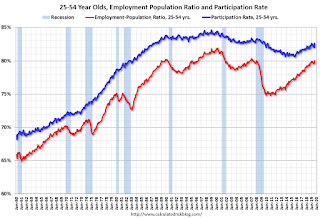 Since the overall participation rate has declined due to cyclical (recession) and demographic (aging population, younger people staying in school) reasons, here is the employment-population ratio for the key working age group: 25 to 54 years old.
In the earlier period the participation rate for this group was trending up as women joined the labor force. Since the early '90s, the participation rate moved more sideways, with a downward drift starting around '00 - and with ups and downs related to the business cycle.
The 25 to 54 participation rate increased in August to 82.6% from 82.0% in July, and the 25 to 54 employment population ratio was increased to 80.0% from 79.5%.
Part Time for Economic Reasons
 From the BLS report:
"The number of persons employed part time for economic reasons (sometimes referred to as involuntary part-time workers) increased by 397,000 to 4.4 million in August; this increase follows a decline of similar magnitude in July. These individuals, who would have preferred full-time employment, were working part time because their hours had been reduced or they were unable to find full-time jobs."The number of persons working part time for economic reasons increased in August to 4.381 million from 3.984 million in July. The number of persons working part time for economic reason has been generally trending down.
These workers are included in the alternate measure of labor underutilization (U-6) that increased to 7.2% in August.
Unemployed over 26 Weeks
 This graph shows the number of workers unemployed for 27 weeks or more.
 According to the BLS, there are 1.243 million workers who have been unemployed for more than 26 weeks and still want a job. This was up from 1.166 million in July.
Summary:
The headline jobs number was well below expectations, and the previous two months were revised down. The headline unemployment rate was unchanged at 3.7%. Wage growth was at expectations.
Some good news is the participation rate and employment-population rate increased.
Overall this was a disappointing jobs report. The economy added 1.239 million jobs through August 2019 ex-Census, down from 1.871 million jobs during the same period of 2018 (although 2018 will be revised down with benchmark revision to be released in February 2020). So job growth has slowed.
August Employment Report: 105,000 Jobs Added Ex-Census, 3.7% Unemployment Rate
by Calculated Risk on 9/06/2019 08:44:00 AM
From the BLS:
Total nonfarm payroll employment rose by 130,000 in August, and the unemployment rate was unchanged at 3.7 percent, the U.S. Bureau of Labor Statistics reported today. Employment in federal government rose, largely reflecting the hiring of temporary workers for the 2020 Census. Notable job gains also occurred in health care and financial activities, while mining lost jobs.
...
In August, employment in federal government increased by 28,000. The gain was mostly due to the hiring of 25,000 temporary workers to prepare for the 2020 Census.
The change in total nonfarm payroll employment for June was revised down by 15,000 from +193,000 to +178,000, and the change for July was revised down by 5,000 from +164,000 to +159,000. With these revisions, employment gains in June and July combined were 20,000 less than previously reported.
...
In August, average hourly earnings for all employees on private nonfarm payrolls rose by 11 cents to $28.11, following 9-cent gains in both June and July. Over the past 12 months, average hourly earnings have increased by 3.2 percent.
emphasis added
 Click on graph for larger image.
The first graph shows the monthly change in payroll jobs, ex-Census (meaning the impact of the decennial Census temporary hires and layoffs is removed - mostly in 2010 - to show the underlying payroll changes).
Total payrolls increased by 105 thousand in August ex-Census (private payrolls increased 96 thousand).
Payrolls for June and July were revised down 20 thousand combined.
 This graph shows the year-over-year change in total non-farm employment since 1968.
In August, the year-over-year change was 2.074 million jobs.
The third graph shows the employment population ratio and the participation rate.
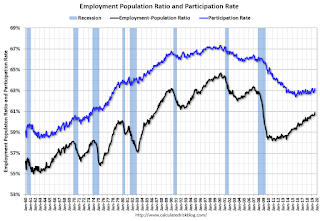 The Labor Force Participation Rate was increased in August to 62.9%. This is the percentage of the working age population in the labor force. A large portion of the recent decline in the participation rate is due to demographics and long term trends.
The Employment-Population ratio increased to 60.9% (black line).
I'll post the 25 to 54 age group employment-population ratio graph later.
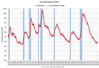 The fourth graph shows the unemployment rate.
 The unemployment rate was unchanged in August at 3.7%.
This was well below consensus expectations of 158,000 jobs added, and June and July were revised down by 41,000 combined.
I'll have much more later ...


