by Calculated Risk on 2/24/2021 07:00:00 AM
Wednesday, February 24, 2021
MBA: Mortgage Applications Decrease in Latest Weekly Survey
From the MBA: Mortgage Applications Decrease in Latest MBA Weekly Survey
Mortgage applications decreased 11.4 percent from one week earlier, according to data from the Mortgage Bankers Association’s (MBA) Weekly Mortgage Applications Survey for the week ending February 19, 2021.
... The Refinance Index decreased 11 percent from the previous week and was 50 percent higher than the same week one year ago. The seasonally adjusted Purchase Index decreased 12 percent from one week earlier. The unadjusted Purchase Index decreased 8 percent compared with the previous week and was 7 percent higher than the same week one year ago.
“Mortgage rates have increased in six of the last eight weeks, with the benchmark 30-year fixed rate last week climbing above 3 percent to its highest level since September 2020. As a result of these higher rates, overall refinance activity fell 11 percent to its lowest level since December 2020, but remained 50 percent higher than a year ago,” said Joel Kan, MBA’s Associate Vice President of Economic and Industry Forecasting. “Additionally, the severe winter weather in Texas affected many households and lenders, causing more than a 40 percent drop in both purchase and refinance applications in the state last week.”
Added Kan, “The housing market in most of the country remains strong, with activity last week 7 percent higher than a year ago. The average loan size of purchase applications increased to a record $418,000, in line with the accelerating home-price growth caused by very low inventory levels.”
...
The average contract interest rate for 30-year fixed-rate mortgages with conforming loan balances ($548,250 or less) increased to 3.08 percent from 2.98 percent, with points increasing to 0.46 from 0.43 (including the origination fee) for 80 percent loan-to-value ratio (LTV) loans. T
emphasis added
 Click on graph for larger image.
The first graph shows the refinance index since 1990.
The refinance index has been volatile recently depending on rates.
With near record low rates, the index remains up significantly from last year (but will be down year-over-year in early March - since rates fell sharply at the beginning of the pandemic).
 The second graph shows the MBA mortgage purchase index
According to the MBA, purchase activity is up 7% year-over-year unadjusted.
Note: Red is a four-week average (blue is weekly).
Tuesday, February 23, 2021
Wednesday: New Home Sales, Fed Chair Powell
by Calculated Risk on 2/23/2021 09:08:00 PM
Wednesday:
• At 7:00 AM ET, The Mortgage Bankers Association (MBA) will release the results for the mortgage purchase applications index.
• At 10:00 AM, New Home Sales for January from the Census Bureau. The consensus is for 855 thousand SAAR, up from 842 thousand in December.
• Also at 10:00 AM, Testimony, Fed Chair Jerome Powell, Semiannual Monetary Policy Report to the Congress, Before the Committee on Financial Services, U.S. House of Representatives
• During the day, The AIA's Architecture Billings Index for January (a leading indicator for commercial real estate).
February 23 COVID-19 Test Results and Vaccinations
by Calculated Risk on 2/23/2021 07:04:00 PM
SPECIAL NOTE: The Covid Tracking Project will end daily updates on March 7th.
From Bloomberg on vaccinations as of Feb 23rd.
"In the U.S., more Americans have now received at least one dose than have tested positive for the virus since the pandemic began. So far, 65 million doses have been given. In the last week, an average of 1.28 million doses per day were administered."Here is the CDC COVID Data Tracker. This site has data on vaccinations, cases and more.
The US is averaged 1.35 million tests per day over the last week. The percent positive over the last 7 days was 4.8%.
There were 1,202,838 test results reported over the last 24 hours.
There were 67,879 positive tests.
Over 60,000 US deaths have been reported in February. See the graph on US Daily Deaths here.
This data is from the COVID Tracking Project.
And check out COVID Act Now to see how each state is doing. (updated link to new site)
 Click on graph for larger image.
This graph shows the 7 day average of positive tests reported and daily hospitalizations.
Zillow Case-Shiller House Price Forecast: "More strong growth in the months ahead", 10.9% YoY in January
by Calculated Risk on 2/23/2021 04:56:00 PM
The Case-Shiller house price indexes for December were released today. Zillow forecasts Case-Shiller a month early, and I like to check the Zillow forecasts since they have been pretty close.
From Matthew Speakman at Zillow: December 2020 Case-Shiller Results & January Forecast: An Exclamation Point on 2020
Adding an exclamation point to a year unlike any other, home prices continued their powerful surge higher in December, setting the stage for more strong growth in the months ahead.
...
The factors that have, for months, stoked competition for homes remained firmly in place in December. A wave of eager buyers – many of whom are looking to enter the market for the first time – sought to capitalize on record-low mortgage rates and snap up the relatively few homes available for sale, leading homes to fly off the shelves and prices to continue to grow. In some major markets, homes are going under contract more than a month faster than they were this time last year. This forces would-be buyers to move very quickly to put an offer in on a home they desire, increases the likelihood that multiple offers will be fielded by the seller and ultimately places more upward pressure on prices. Looking ahead, with mortgage rates remaining relatively low and the wave of eager buyers continuing to swell, it’s unlikely that this competition for housing, and subsequent strong price appreciation, will meaningfully abate in the near future.
Monthly growth in January as reported by Case-Shiller is expected to slow slightly from December in all three main indices, while annual growth is expected to accelerate across the board. S&P Dow Jones Indices is expected to release data for the January S&P CoreLogic Case-Shiller Indices on Tuesday, March 30.
emphasis added
 The Zillow forecast is for the year-over-year change for the Case-Shiller National index to be at 10.9% in January, up from 10.4% in December.
 The Zillow forecast is for the 20-City index to be up 10.7% YoY in January from 10.1% in December, and for the 10-City index to increase to be up 10.4% YoY compared to 9.8% YoY in December.
FDIC: Problem Banks Unchanged, Residential REO Declined in Q4
by Calculated Risk on 2/23/2021 03:45:00 PM
The FDIC released the Quarterly Banking Profile for Q4 2020 today:
For the commercial banks and savings institutions insured by the Federal Deposit Insurance Corporation (FDIC), aggregate net income totaled $59.9 billion in fourth quarter 2020, an increase of $5 billion (9.1 percent) from a year ago. The improvement in quarterly net income was led by a reduction in provision expenses. Financial results for fourth quarter 2020 are included in the FDIC’s latest Quarterly Banking Profile released today.
...
The Deposit Insurance Fund’s Reserve Ratio Declined from the Previous Quarter to 1.29 Percent: The Deposit Insurance Fund totaled $117.9 billion in the fourth quarter, up $1.5 billion from the third quarter. The quarterly increase was led by assessment revenue and interest earned on investment securities held by the fund. The reserve ratio declined by 1 basis point from the previous quarter to 1.29 percent solely as a result of strong estimated insured deposit growth.
Mergers and New Bank Openings Continued in the Fourth Quarter: During the fourth quarter, three new banks opened, 31 institutions were absorbed through mergers, and two banks failed. 5,001 commercial banks and savings institutions filed fourth quarter Call Reports and are insured by the Federal Deposit Insurance Corporation (FDIC) as of December 31, 2020. ... The number of institutions on the FDIC’s “Problem Bank List” remained unchanged from the previous quarter at 56. Total assets of problem banks increased from $53.9 billion in third quarter 2020 to $55.8 billion in fourth quarter 2020.
emphasis added
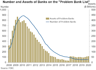
 Click on graph for larger image.
The FDIC reported the number of problem banks was unchanged.
This graph from the FDIC shows the number of problem banks was unchanged at 56 institutions.
Note: The number of assets for problem banks increased significantly back in 2018 when Deutsche Bank Trust Company Americas was added to the list (it must still be on the list given the assets of problem banks).
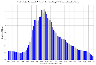
 The dollar value of 1-4 family residential Real Estate Owned (REOs, foreclosure houses) declined from $2.27 billion in Q4 2019 to $1.11 billion in Q4 2020. This is the lowest level of REOs in many years. (probably declined sharply due to foreclosure moratoriums and forbearance programs).
This graph shows the nominal dollar value of Residential REO for FDIC insured institutions. Note: The FDIC reports the dollar value and not the total number of REOs.
Real House Prices and Price-to-Rent Ratio in December
by Calculated Risk on 2/23/2021 12:48:00 PM
Here is the post earlier on Case-Shiller: Case-Shiller: National House Price Index increased 10.4% year-over-year in December
It has been almost fifteen years since the bubble peak. In the Case-Shiller release today, the seasonally adjusted National Index (SA), was reported as being 28% above the previous bubble peak. However, in real terms, the National index (SA) is about 2% above the bubble peak (and historically there has been an upward slope to real house prices). The composite 20, in real terms, is still 6% below the bubble peak.
The year-over-year growth in prices increased to 10.4% nationally.
Usually people graph nominal house prices, but it is also important to look at prices in real terms (inflation adjusted). Case-Shiller and others report nominal house prices. As an example, if a house price was $200,000 in January 2000, the price would be close to $294,000 today adjusted for inflation (47%). That is why the second graph below is important - this shows "real" prices (adjusted for inflation).
Nominal House Prices

In nominal terms, the Case-Shiller National index (SA) and the Case-Shiller Composite 20 Index (SA) are both at new all times highs (above the bubble peak).
Real House Prices

In real terms, the National index is back to the bubble peak, and the Composite 20 index is back to early 2005.
In real terms, house prices are at 2005 levels.
Note that inflation was negative for a few months earlier this year, and that also boosted real prices.
Price-to-Rent
In October 2004, Fed economist John Krainer and researcher Chishen Wei wrote a Fed letter on price to rent ratios: House Prices and Fundamental Value. Kainer and Wei presented a price-to-rent ratio using the OFHEO house price index and the Owners' Equivalent Rent (OER) from the BLS.

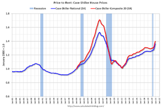
This graph shows the price to rent ratio (January 2000 = 1.0). The price-to-rent ratio had been moving mostly sideways, but picked up recently.
On a price-to-rent basis, the Case-Shiller National index is back to December 2004 levels, and the Composite 20 index is back to May 2004 levels.
In real terms, prices are back to 2005 levels, and the price-to-rent ratio is back to 2004.
Fed Chair Powell: Semiannual Monetary Policy Report to the Congress
by Calculated Risk on 2/23/2021 10:02:00 AM
From Fed Chair Jerome Powell: Monetary Policy Report – February 2021. A few excerpts:
The initial wave of COVID-19 infections led to a historic contraction in economic activity as a result of both mandatory restrictions and voluntary changes in behavior by households and businesses. The level of gross domestic product (GDP) fell a cumulative 10 percent over the first half of 2020, and the measured unemployment rate spiked to a post–World War II high of 14.8 percent in April. As mandatory restrictions were subsequently relaxed and households and firms adapted to pandemic conditions, many sectors of the economy recovered rapidly and unemployment fell back. Momentum slowed substantially in the late fall and early winter, however, as spending on many services contracted again amid a worsening of the pandemic. All told, GDP is currently estimated to have declined 2.5 percent over the four quarters of last year and payroll employment in January was almost 10 million jobs below pre-pandemic levels, while the unemployment rate remained elevated at 6.3 percent and the labor force participation rate was severely depressed. Job losses have been most severe and unemployment remains particularly elevated among Hispanics, African Americans, and other minority groups as well as those who hold lower-wage jobs.And on high frequency indicators:
Outside of the labor market, several new high-frequency indicators have been useful in monitoring the massive effects of the COVID-19 pandemic on consumer spending. Weekly data from NPD (a market analytics firm) on nonfood retail sales captured in real time the dramatic and sudden drop in consumption in mid-March; the monthly Census Bureau data recorded that decline only with a lag (figure B, left panel).3 The NPD data also reflected how the income support payments to families, provided by the Coronavirus Aid, Relief, and Economic Security Act, or CARES Act, rapidly affected consumer spending in mid-April. More recently, the NPD data showed some decline in consumption late last year, followed by a pickup in January after the passage of the most recent fiscal stimulus package. Several nontraditional data sources illustrate that services spending remains depressed as social distancing continues to restrain in-person activity
 Click on graph for larger image.
 This graph from the report shows a few high frequency indicators (I post several every Monday morning including Hotel Occupancy and TSA data).
Case-Shiller: National House Price Index increased 10.4% year-over-year in December
by Calculated Risk on 2/23/2021 09:13:00 AM
S&P/Case-Shiller released the monthly Home Price Indices for December ("December" is a 3 month average of October, November and December prices).
This release includes prices for 20 individual cities, two composite indices (for 10 cities and 20 cities) and the monthly National index.
From S&P: S&P Corelogic Case-Shiller Index Reports 10.4% Annual Home Price Gain to End 2020
The S&P CoreLogic Case-Shiller U.S. National Home Price NSA Index, covering all nine U.S. census divisions, reported a 10.4% annual gain in December, up from 9.5% in the previous month. The 10-City Composite annual increase came in at 9.8%, up from 8.9% in the previous month. The 20-City Composite posted a 10.1% year-over-year gain, up from 9.2% in the previous month.
Phoenix, Seattle, and San Diego continued to report the highest year-over-year gains among the 19 cities (excluding Detroit) in December. Phoenix led the way with a 14.4% year-over-year price increase, followed by Seattle with a 13.6% increase and San Diego with a 13.0% increase. Eighteen of the 19 cities reported higher price increases in the year ending December 2020 versus the year ending November 2020.
...
Before seasonal adjustment, the U.S. National Index posted a 0.9% month-over-month increase, while the 10-City and 20-City Composites both posted increases of 0.9% and 0.8% respectively in December. After seasonal adjustment, the U.S. National Index posted a month-over-month increase of 1.3%, while the 10-City and 20-City Composites both posted increases of 1.2% and 1.3% respectively. In December, 18 cities (excluding Detroit) reported increases before seasonal adjustment, while all 19 cities reported increases after seasonal adjustment.
“Home prices finished 2020 with double-digit gains, as the National Composite Index rose by 10.4% compared to year-ago levels,” says Craig J. Lazzara, Managing Director and Global Head of Index Investment Strategy at S&P DJI. “The trend of accelerating prices that began in June 2020 has now reached its seventh month and is also reflected in the 10- and 20-City Composites (up 9.8% and 10.1%, respectively). The market’s strength continues to be broadly-based: 18 of the 19 cities for which we have December data rose, and 18 cities gained more in the 12 months ended in December than they had gained in the 12 months ended in November.
emphasis added
 Click on graph for larger image.
 The first graph shows the nominal seasonally adjusted Composite 10, Composite 20 and National indices (the Composite 20 was started in January 2000).
The Composite 10 index is up 1.2% in December (SA) from November.
The Composite 20 index is up 1.3% (SA) in December.
The National index is 28% above the bubble peak (SA), and up 1.3% (SA) in December. The National index is up 73% from the post-bubble low set in December 2011 (SA).
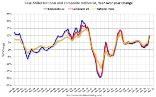
 The second graph shows the Year over year change in all three indices.
The Composite 10 SA is up 9.8% compared to December 2019. The Composite 20 SA is up 10.1% year-over-year.
The National index SA is up 10.4% year-over-year.
Note: According to the data, prices increased in 19 cities month-over-month seasonally adjusted.
Price increases were above expectations. I'll have more later.
Monday, February 22, 2021
Tuesday: Case-Shiller House Prices, Fed Chair Powell Testimony
by Calculated Risk on 2/22/2021 09:11:00 PM
From Matthew Graham at Mortgage News Daily: February Easily The Worst Month For Rates in Long Time
There are still 4 business days left in the month of February and thus still 4 days for the bond market to undergo an epic recovery that helps mortgage rates come back down. But traders and market-watchers alike have pined for--if not outright expected--such a recovery several times in the past few weeks only to be disappointed. Merely avoiding additional rate spikes would be a victory at this point.Tuesday:
Even if we can manage to avoid further rate spikes, February will still go down as the worst month for rates since January 2018 (March 2020 was worse at face value, but it's not really a fair comparison due to the unprecedented bond market reaction to the pandemic).
Some back-of-the-napkin math (OK, it's actually more official than that) shows the average lender charging at least a quarter of a percent more today than at the end of January. Depending on the initial rate quote, today's rates are .375% higher in many cases. [30 year fixed 3.10%]
emphasis added
• At 9:00 AM ET, FHFA House Price Index for December 2020. This was originally a GSE only repeat sales, however there is also an expanded index.
• Also at 9:00 AM, S&P/Case-Shiller House Price Index for December. The consensus is for a 9.1% year-over-year increase in the Comp 20 index for December.
• At 10:00 AM, Richmond Fed Survey of Manufacturing Activity for February.
• Also at 10:00 AM, Testimony, Fed Chair Jerome Powell, Semiannual Monetary Policy Report to the Congress, Before the Committee on Banking, Housing, and Urban Affairs, U.S. Senate
February 22 COVID-19 Test Results and Vaccinations
by Calculated Risk on 2/22/2021 06:52:00 PM
SPECIAL NOTE: The Covid Tracking Project will end daily updates on March 7th.
From Bloomberg on vaccinations as of Feb 22nd.
"In the U.S., more Americans have now received at least one dose than have tested positive for the virus since the pandemic began. So far, 64.2 million doses have been given. In the last week, an average of 1.37 million doses per day were administered.Here is the CDC COVID Data Tracker. This site has data on vaccinations, cases and more.
The US is averaged 1.3 million tests per day over the last week. The percent positive over the last 7 days was 4.8%.
There were 1,238,604 test results reported over the last 24 hours.
There were 52,530 positive tests.
Over 58,000 US deaths have been reported in February. See the graph on US Daily Deaths here.
This data is from the COVID Tracking Project.
And check out COVID Act Now to see how each state is doing. (updated link to new site)
 Click on graph for larger image.
This graph shows the 7 day average of positive tests reported and daily hospitalizations.


