by Calculated Risk on 3/08/2021 01:44:00 PM
Monday, March 08, 2021
Black Knight Mortgage Monitor for January
Black Knight released their Mortgage Monitor report for January today. According to Black Knight, 5.85% of mortgages were delinquent in January, down from 6.08% of mortgages in December, and up from 3.22% in January 2020. Black Knight also reported that 0.32% of mortgages were in the foreclosure process, down from 0.46% a year ago.
This gives a total of 6.17% delinquent or in foreclosure.
Press Release: Black Knight’s January 2021 Mortgage Monitor; Lock Activity Suggests Q1 2021 Refi Originations to Remain Near Record Highs as Rate Increases Cloud Q2 Outlook; Servicer Retention Hits New Low
Today, the Data & Analytics division of Black Knight, Inc. released its latest Mortgage Monitor Report, based upon the company’s industry-leading mortgage, real estate and public records datasets. This month’s report looks back on 2020 origination volumes as well as at rate lock data from Black Knight’s Secondary Marketing Technologies division to get a sense of how the market is faring as rates begin to rise. According to Black Knight Data & Analytics President Ben Graboske, despite interest rates recently spiking to more than 3.2% according to the daily tracking data of the company’s Optimal Blue Mortgage Market Index, Q1 2021 refinance lending volumes are poised to remain near Q4 2020’s record-breaking high.
“Roughly 2.8 million homeowners refinanced their mortgages in the last quarter of 2020, which saw a record-breaking $869 billion in refinance lending,” said Graboske. “Assuming a 45-day lock-to-close timeline, daily rate lock data from Black Knight through mid-February suggests refi activity could remain steady in Q1 2021. Of course, that’s before a recent spike in 30-year rates is expected to begin impacting closed loan volumes in late Q1 or early Q2. Still, by the end of March, another 2.8 million homeowners will have taken advantage of near-record-low rates to refinance their mortgages. It’s important to remember that this would be coupled with a 25% reduction from Q4 2020 in purchase loans as well, resulting in an overall 10% quarterly decline.
“With rates on the rise, refinance incentive has been significantly curtailed. Just under 13 million high-quality refinance candidates remain in the market – a nearly 30% drop in just the past three weeks. Added to that, retention of what is now a dwindling number of refinancing borrowers remains at record lows, with just 18% being retained by their servicers. Approximately 2.3 million borrowers were not retained in Q4 2020 alone. The current rate volatility serves to underscore the critical nature of both accurate and strategic pricing and advanced retention analytics to help identify borrowers who still have incentive and are out there transacting in the market.”
emphasis added
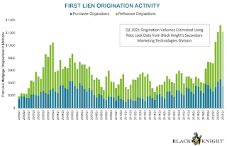 Click on graph for larger image.
Here is a graph from the Mortgage Monitor that shows First Lien Origination Activity by quarter.
From Black Knight:
• All in, a record-breaking $4.3T was originated in 2020, with $2.8T in refis – also an all-time high – and $1.5T in purchase loans, the largest annual volume since 2005
• Q4 2020 set an all-time high for a single quarter across the board, with $346B in purchase lending, $869B in refinance lending and $1,322B in total lending
• By the end of March, an expected 2.8M homeowners will have taken advantage of near-record-low rates to refinance their mortgages
• It’s important to note that the same data suggests a 25% reduction from Q4 2020 in purchase loans, resulting in an overall 10% quarterly decline.
• Despite quarter-over-quarter decline, that would still put Q1 2021 purchase originations some 31% above 2020 levels
 And on delinquencies from Black Knight:
 • Early-stage delinquencies continue to stay below pre-pandemic levels, with the number of borrowers with a single missed payment down 24% and 60-day delinquencies down 6%There is much more in the mortgage monitor.
• However, despite some slight improvement in January, serious delinquencies (90+ days) remain 5X their pre-pandemic levels
Las Vegas Real Estate in February: Sales up 13% YoY, Inventory down 57% YoY
by Calculated Risk on 3/08/2021 11:47:00 AM
This report is for closed sales in February; sales are counted at the close of escrow, so the contracts for these homes were mostly signed in December and January.
The Las Vegas Realtors reported Southern Nevada home prices set new record while supply shrinks; LVR housing statistics for February 2021
LVR reported a total of 3,489 existing local homes, condos and townhomes were sold during February. Compared to the same time last year, February sales were up 12.0% for homes and up 16.8% for condos and townhomes.1) Overall sales were up 12.9% year-over-year to 3,489 in February 2021 from 3,089 in February 2020.
…
By the end of February, LVR reported 1,677 single-family homes listed for sale without any sort of offer. That’s down 60.4% from one year ago. For condos and townhomes, the 675 properties listed without offers in February represent a 44.4% drop from one year ago.
...
Despite the coronavirus crisis and economic downturn, the number of so-called distressed sales remains near historically low levels. LVR reported that short sales and foreclosures combined accounted for just 0.6% of all existing local property sales in February. That compares to 2.5% of all sales one year ago, 2.6% two years ago, 3.8% three years ago and 10.6% four years ago.
emphasis added
2) Active inventory (single-family and condos) is down from a year ago, from a total of 5,454 in February 2020 to 2,352 in February 2021. Note: Total inventory was down 57% year-over-year. And months of inventory is extremely low.
3) Very low level of distressed sales.
Housing Inventory March 8th Update: At Record Lows
by Calculated Risk on 3/08/2021 10:07:00 AM
One of the key questions for 2021 is: Will inventory increase as the pandemic subsides, or will inventory decrease further in 2021?
Tracking inventory will be very important this year.

This inventory graph is courtesy of Altos Research.
Mike Simonsen discusses this data regularly on Youtube.
Seven High Frequency Indicators for the Economy
by Calculated Risk on 3/08/2021 08:33:00 AM
These indicators are mostly for travel and entertainment. It will interesting to watch these sectors recover as the vaccine is distributed.
The TSA is providing daily travel numbers.
 Click on graph for larger image.
This data shows the seven day average of daily total traveler throughput from the TSA for 2019 (Light Blue), 2020 (Blue) and 2021 (Red).
The dashed line is the percent of 2019 for the seven day average.
This data is as of March 7th.
The seven day average is down 55.9% from the same week in 2019 (45.1% of last year). (Dashed line)
There was a slow increase from the bottom, with ups and downs due to the holidays - but TSA data has mostly moved sideways or slightly up in 2021.
The second graph shows the 7 day average of the year-over-year change in diners as tabulated by OpenTable for the US and several selected cities.
 Thanks to OpenTable for providing this restaurant data:
This data is updated through March 6, 2021.
This data is "a sample of restaurants on the OpenTable network across all channels: online reservations, phone reservations, and walk-ins. For year-over-year comparisons by day, we compare to the same day of the week from the same week in the previous year."
Note that this data is for "only the restaurants that have chosen to reopen in a given market". Since some restaurants have not reopened, the actual year-over-year decline is worse than shown.
Dining picked up during the holidays, the slumped with the huge winter surge in cases. Dining is picking up again.
 This data shows domestic box office for each week and the median for the years 2016 through 2019 (dashed light blue).
 Note that the data is usually noisy week-to-week and depends on when blockbusters are released.
Movie ticket sales were at $5 million last week, down about 96% from the median for the week.
 This graph shows the seasonal pattern for the hotel occupancy rate using the four week average.
 The red line is for 2021, black is 2020, blue is the median, and dashed light blue is for 2009 (the worst year since the Great Depression for hotels - before 2020).
Even when occupancy increases to 2009 levels, hotels will still be hurting.
This data is through February 27th. Hotel occupancy is currently down 25.8% year-over-year. In a few weeks, the year-over-year comparisons will be easy - since occupancy declined sharply at the onset of the pandemic - but occupancy will still be down significantly from normal levels.
Notes: Y-axis doesn't start at zero to better show the seasonal change.
 This graph, based on weekly data from the U.S. Energy Information Administration (EIA), shows gasoline supplied compared to the same week of 2019.
Blue is for 2020. At one point, gasoline supplied was off almost 50% YoY. Red is for 2021.
As of February 26th, gasoline supplied was off about 10.0% (about 90.0% of the same week in 2019).
Note: Gasoline supplied was impacted by the snowstorm in Texas and other states the previous week.
This graph is from Apple mobility. From Apple: "This data is generated by counting the number of requests made to Apple Maps for directions in select countries/regions, sub-regions, and cities." This is just a general guide - people that regularly commute probably don't ask for directions.
There is also some great data on mobility from the Dallas Fed Mobility and Engagement Index. However the index is set "relative to its weekday-specific average over January–February", and is not seasonally adjusted, so we can't tell if an increase in mobility is due to recovery or just the normal increase in the Spring and Summer.
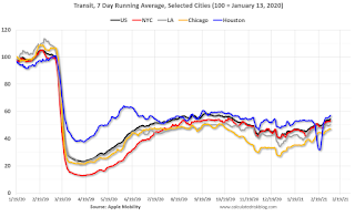 This data is through March 6th for the United States and several selected cities.
The graph is the running 7 day average to remove the impact of weekends.
IMPORTANT: All data is relative to January 13, 2020. This data is NOT Seasonally Adjusted. People walk and drive more when the weather is nice, so I'm just using the transit data.
According to the Apple data directions requests, public transit in the 7 day average for the US is at 54% of the January 2020 level. It is at 47% in Chicago, and 57% in Houston (the dip was a weather related decline) - and moving up recently.
Here is some interesting data on New York subway usage (HT BR).
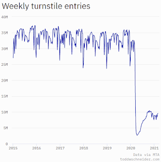 This graph is from Todd W Schneider. This is weekly data since 2015. Most weeks are between 30 and 35 million entries, and currently there are under 10 million subway turnstile entries per week.
This data is through Friday, March 5th.
Schneider has graphs for each borough, and links to all the data sources.
He notes: "Data updates weekly from the MTA’s public turnstile data, usually on Saturday mornings".
Sunday, March 07, 2021
Sunday Night Futures
by Calculated Risk on 3/07/2021 09:37:00 PM
Weekend:
• Schedule for Week of March 7, 2021
• The Employment Situation is Far Worse than the Unemployment Rate Indicates
Monday:
• No major economic releases scheduled.
From CNBC: Pre-Market Data and Bloomberg futures S&P 500 futures are up 22 and DOW futures are up 216 (fair value).
Oil prices were up over the last week with WTI futures at $67.31 per barrel and Brent at $70.53 per barrel. A year ago, WTI was at $31, and Brent was at $35 - so WTI oil prices are UP more than double year-over-year (oil prices collapsed at the beginning of the pandemic).
Here is a graph from Gasbuddy.com for nationwide gasoline prices. Nationally prices are at $2.77 per gallon. A year ago prices were at $2.36 per gallon, so gasoline prices are up $0.41 per gallon year-over-year.
March 7 COVID-19 Test Results and Vaccinations; Over 90 Million Doses Administered
by Calculated Risk on 3/07/2021 07:42:00 PM
SPECIAL NOTE: The Covid Tracking Project ends today (March 7th). Awesome job. Starting tomorrow, I will post from different sources.
From Bloomberg on vaccinations as of Mar 7th:
"In the U.S., more Americans have now received at least one dose than have tested positive for the virus since the pandemic began. So far, 90.4 million doses have been given. In the last week, an average of 2.16 million doses per day were administered."Here is the CDC COVID Data Tracker. This site has data on vaccinations, cases and more.
The US has averaged 1.4 million tests per day over the last week. The percent positive over the last 7 days was 4.1%.
There were 1,156,241 test results reported over the last 24 hours.
There were 41,265 positive tests.
Almost 12,000 US deaths have been reported in March. See the graph on US Daily Deaths here.
This data is from the COVID Tracking Project.
And check out COVID Act Now to see how each state is doing. (updated link to new site)
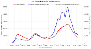 Click on graph for larger image.
This graph shows the 7 day average of positive tests reported and daily hospitalizations.
The Employment Situation is Far Worse than the Unemployment Rate Indicates
by Calculated Risk on 3/07/2021 09:13:00 AM
The headline unemployment rate of 6.2% significantly understates the current situation.
Then I calculated the unemployment rate by including the number of people that have left the labor force since early 2020, and the expected growth in the labor force.
| Unemployment Rate | Unemployed (000s) | Left Labor Force (000s) | Expected Labor Force Growth (000s) | Adjusted Unemployment Rate | |
|---|---|---|---|---|---|
| Jul-20 | 10.2% | 16,308 | 4,370 | 600 | 12.9% |
| Aug-20 | 8.4% | 13,542 | 3,637 | 700 | 10.8% |
| Sep-20 | 7.8% | 12,535 | 4,377 | 800 | 10.7% |
| Oct-20 | 6.9% | 11,049 | 3,737 | 900 | 9.5% |
| Nov-20 | 6.7% | 10,728 | 3,919 | 1,000 | 9.5% |
| Dec-20 | 6.7% | 10,736 | 3,888 | 1,100 | 9.5% |
| Jan-21 | 6.3% | 10,130 | 4,294 | 1,200 | 9.4% |
| Feb-21 | 6.2% | 9,972 | 4,244 | 1,300 | 9.4% |
As the economy recovers, many of the people that left the labor force will probably return, and there will likely be more entrants into the labor force (although recent demographic data has been dismal).
Employment in January of this year was nearly 10 million below its February 2020 level, a greater shortfall than the worst of the Great Recession's aftermath.
After rising to 14.8 percent in April of last year, the published unemployment rate has fallen relatively swiftly, reaching 6.3 percent in January. But published unemployment rates during COVID have dramatically understated the deterioration in the labor market. Most importantly, the pandemic has led to the largest 12-month decline in labor force participation since at least 1948. Fear of the virus and the disappearance of employment opportunities in the sectors most affected by it, such as restaurants, hotels, and entertainment venues, have led many to withdraw from the workforce. At the same time, virtual schooling has forced many parents to leave the work force to provide all-day care for their children. All told, nearly 5 million people say the pandemic prevented them from looking for work in January. In addition, the Bureau of Labor Statistics reports that many unemployed individuals have been misclassified as employed. Correcting this misclassification and counting those who have left the labor force since last February as unemployed would boost the unemployment rate to close to 10 percent in January.
emphasis added
 Click on graph for larger image.
 This graph from the Fed shows the actually unemployment rate and some alternative estimates (mostly due to people leaving the labor force).
It would be a mistake to just look at the headline unemployment rate to assess the current situation.
The following graph - that I post each month - show the percent decline in employment since the start of each recession since WWII.
 The second graph shows the job losses from the start of the employment recession, in percentage terms.
The current employment recession was by far the worst recession since WWII in percentage terms.
At the worst of the Great Recession, employment was down Down 6.29% from the previous peak.
Currently employment is down 6.21% - the current unemployment situation is about the same as the worst of the Great Recession (and there was no pandemic to contend with in 2009).
Saturday, March 06, 2021
March 6 COVID-19 Test Results and Vaccinations
by Calculated Risk on 3/06/2021 07:05:00 PM
SPECIAL NOTE: The Covid Tracking Project will end daily updates on March 7th.
From Bloomberg on vaccinations as of Mar 6th.
"In the U.S., more Americans have now received at least one dose than have tested positive for the virus since the pandemic began. So far, 87.9 million doses have been given. In the last week, an average of 2.16 million doses per day were administered."Here is the CDC COVID Data Tracker. This site has data on vaccinations, cases and more.
The US has averaged 1.4 million tests per day over the last week. The percent positive over the last 7 days was 4.2%.
There were 1,409,138 test results reported over the last 24 hours.
There were 59,620 positive tests.
Over 11,000 US deaths have been reported in March. See the graph on US Daily Deaths here.
This data is from the COVID Tracking Project.
And check out COVID Act Now to see how each state is doing. (updated link to new site)
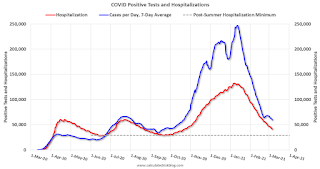 Click on graph for larger image.
This graph shows the 7 day average of positive tests reported and daily hospitalizations.
Schedule for Week of March 7, 2021
by Calculated Risk on 3/06/2021 08:11:00 AM
This will be a light week for economic data.
The key report scheduled for this week is February CPI.
No major economic releases scheduled.
6:00 AM ET: NFIB Small Business Optimism Index for February.
7:00 AM ET: The Mortgage Bankers Association (MBA) will release the results for the mortgage purchase applications index.
8:30 AM: The Consumer Price Index for February from the BLS. The consensus is for a 0.4% increase in CPI, and a 0.2% increase in core CPI.
8:30 AM: The initial weekly unemployment claims report will be released. The consensus is for a increase to 760 thousand from 745 thousand last week.
 10:00 AM ET: Job Openings and Labor Turnover Survey for January from the BLS.
 This graph shows job openings (yellow line), hires (purple), Layoff, Discharges and other (red column), and Quits (light blue column) from the JOLTS.
Jobs openings increased in December to 6.646 million from 6.572 million in November.
12:00 PM: Q4 Flow of Funds Accounts of the United States from the Federal Reserve.
8:30 AM: The Producer Price Index for February from the BLS. The consensus is for a 0.4% decrease in PPI, and a 0.2% increase in core PPI.
10:00 AM: University of Michigan's Consumer sentiment index (Preliminary for March).
Friday, March 05, 2021
March 5 COVID-19 Test Results and Vaccinations: 85 Million Doses Given So Far
by Calculated Risk on 3/05/2021 07:21:00 PM
SPECIAL NOTE: The Covid Tracking Project will end daily updates on March 7th.
From Bloomberg on vaccinations as of Mar 5th.
"In the U.S., more Americans have now received at least one dose than have tested positive for the virus since the pandemic began. So far, 85 million doses have been given. In the last week, an average of 2.08 million doses per day were administered."Here is the CDC COVID Data Tracker. This site has data on vaccinations, cases and more.
The US has averaged 1.5 million tests per day over the last week. The percent positive over the last 7 days was 4.2%.
There were 1,744,446 test results reported over the last 24 hours.
There were 68,787 positive tests.
Over 9,000 US deaths have been reported in March. See the graph on US Daily Deaths here.
This data is from the COVID Tracking Project.
And check out COVID Act Now to see how each state is doing. (updated link to new site)
 Click on graph for larger image.
This graph shows the 7 day average of positive tests reported and daily hospitalizations.


