by Calculated Risk on 3/29/2021 01:36:00 PM
Monday, March 29, 2021
Update: Framing Lumber Prices Up Sharply Year-over-year
Here is another monthly update on framing lumber prices.
This graph shows CME framing futures through Mar 29th.

There is a seasonal pattern for lumber prices, and usually prices will increase in the Spring, and peak around May, and then bottom around October or November - although there is quite a bit of seasonal variability.
Clearly there is another surge in demand for lumber.
Housing Inventory March 29th Update: At Record Lows
by Calculated Risk on 3/29/2021 10:49:00 AM
One of the key questions for 2021 is: Will inventory increase as the pandemic subsides, or will inventory decrease further in 2021?
Tracking inventory will be very important this year.

This inventory graph is courtesy of Altos Research.
Mike Simonsen discusses this data regularly on Youtube.
Dallas Fed: "Texas Manufacturing Activity Accelerates Sharply" in March
by Calculated Risk on 3/29/2021 10:43:00 AM
From the Dallas Fed: Texas Manufacturing Activity Accelerates Sharply
Texas factory activity expanded at a markedly faster pace in March, according to business executives responding to the Texas Manufacturing Outlook Survey. The production index, a key measure of state manufacturing conditions, surged 28 points to 48.0, its highest reading in the survey’s 17-year history.This was the last of the regional Fed surveys for March.
Other measures of manufacturing activity also pointed to sharply faster growth this month. The new orders index rose 18 points to 30.5, and the growth rate of orders index rose 11 points to 22.7. The capacity utilization index rocketed from 16.5 to 46.1, an all-time high. The shipments index rose 17 points to 33.1.
Perceptions of broader business conditions improved markedly in March. The general business activity index posted another double-digit increase, rising 12 points to 28.9. The company outlook index shot up 15 points to 25.8, its highest reading since mid-2018. The outlook uncertainty index edged down to 5.5.
Labor market measures indicated robust growth in employment and work hours. The employment index came in at 18.8, up from 12.7 and well above average.
emphasis added
Here is a graph comparing the regional Fed surveys and the ISM manufacturing index:
 Click on graph for larger image.
The New York and Philly Fed surveys are averaged together (yellow, through March), and five Fed surveys are averaged (blue, through March) including New York, Philly, Richmond, Dallas and Kansas City. The Institute for Supply Management (ISM) PMI (red) is through February (right axis).
The ISM manufacturing index for March will be released on Thursday, April 1st. Based on these regional surveys, the ISM manufacturing index will likely increase from the February level (the consensus is for an increase to 61.2 from 60.8 in February).
Seven High Frequency Indicators for the Economy
by Calculated Risk on 3/29/2021 08:26:00 AM
These indicators are mostly for travel and entertainment. It will interesting to watch these sectors recover as the vaccine is distributed.
The TSA is providing daily travel numbers.
 Click on graph for larger image.
This data shows the seven day average of daily total traveler throughput from the TSA for 2019 (Light Blue), 2020 (Blue) and 2021 (Red).
The dashed line is the percent of 2019 for the seven day average.
This data is as of March 28th.
The seven day average is down 42.6% from the same week in 2019 (57.4% of last year). (Dashed line)
There was a slow increase from the bottom, with ups and downs due to the holidays - and TSA data has moved up in 2021.
The second graph shows the 7 day average of the year-over-year change in diners as tabulated by OpenTable for the US and several selected cities.
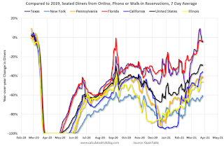 Thanks to OpenTable for providing this restaurant data:
This data is updated through March 27, 2021.
This data is "a sample of restaurants on the OpenTable network across all channels: online reservations, phone reservations, and walk-ins. For year-over-year comparisons by day, we compare to the same day of the week from the same week in the previous year."
Note that this data is for "only the restaurants that have chosen to reopen in a given market". Since some restaurants have not reopened, the actual year-over-year decline is worse than shown.
Dining picked up during the holidays, then slumped with the huge winter surge in cases. Dining is picking up again - and is close to 2019 in Texas and Florida.
 This data shows domestic box office for each week and the median for the years 2016 through 2019 (dashed light blue).
 Note that the data is usually noisy week-to-week and depends on when blockbusters are released.
Movie ticket sales were at $22 million last week, down about 88% from the median for the week.
 This graph shows the seasonal pattern for the hotel occupancy rate using the four week average.
 The red line is for 2021, black is 2020, blue is the median, and dashed light blue is for 2009 (the worst year since the Great Depression for hotels - before 2020).
Even when occupancy increases to 2009 levels, hotels will still be hurting.
This data is through March 20th. Hotel occupancy is currently down 15.4% compared to same week in 2019). Note: Occupancy was up year-over-year, since occupancy declined sharply at the onset of the pandemic. However, occupancy is still be down significantly from normal levels.
Notes: Y-axis doesn't start at zero to better show the seasonal change.
 This graph, based on weekly data from the U.S. Energy Information Administration (EIA), shows gasoline supplied compared to the same week of 2019.
Blue is for 2020. Red is for 2021.
As of March 19th, gasoline supplied was off about 5.6% (about 94.4% of the same week in 2019).
Gasoline supplied was up year-over-year, since at one point, gasoline supplied was off almost 50% YoY in 2020.
This graph is from Apple mobility. From Apple: "This data is generated by counting the number of requests made to Apple Maps for directions in select countries/regions, sub-regions, and cities." This is just a general guide - people that regularly commute probably don't ask for directions.
There is also some great data on mobility from the Dallas Fed Mobility and Engagement Index. However the index is set "relative to its weekday-specific average over January–February", and is not seasonally adjusted, so we can't tell if an increase in mobility is due to recovery or just the normal increase in the Spring and Summer.
 This data is through March 27th for the United States and several selected cities.
The graph is the running 7 day average to remove the impact of weekends.
IMPORTANT: All data is relative to January 13, 2020. This data is NOT Seasonally Adjusted. People walk and drive more when the weather is nice, so I'm just using the transit data.
According to the Apple data directions requests, public transit in the 7 day average for the US is at 62% of the January 2020 level. It is at 55% in Chicago, and 61% in Houston (the Houston dip was a weather related decline) - and moving up recently.
Here is some interesting data on New York subway usage (HT BR).
 This graph is from Todd W Schneider. This is weekly data since 2015.
 This data is through Friday, March 26th.
Schneider has graphs for each borough, and links to all the data sources.
He notes: "Data updates weekly from the MTA’s public turnstile data, usually on Saturday mornings".
Sunday, March 28, 2021
Sunday Night Futures
by Calculated Risk on 3/28/2021 07:50:00 PM
Weekend:
• Schedule for Week of March 28, 2021
Monday:
• At 10:30 AM ET, Dallas Fed Survey of Manufacturing Activity for March. This is the last of the regional surveys for March.
From CNBC: Pre-Market Data and Bloomberg futures S&P 500 futures are down 11 and DOW futures are down 57 (fair value).
Oil prices were mostly unchanged over the last week with WTI futures at $60.73 per barrel and Brent at $64.38 per barrel. A year ago, WTI was at $15, and Brent was at $22 - so WTI oil prices are UP sharply year-over-year (oil prices collapsed at the beginning of the pandemic).
Here is a graph from Gasbuddy.com for nationwide gasoline prices. Nationally prices are at $2.85 per gallon. A year ago prices were at $1.97 per gallon, so gasoline prices are up $0.88 per gallon year-over-year.
March 28 COVID-19 Vaccinations, New Cases, Hospitalizations
by Calculated Risk on 3/28/2021 05:36:00 PM
Note: I've been posting this data daily for over a year. I'll stop once 70% of the population over 18 has had at least one dose of vaccine, new cases are under 5,000 per day, and hospitalizations below 3,000.
According to the CDC, 143.5 million doses have been administered. 20.0% of the population over 18 is fully vaccinated, and 36.2% of the population over 18 has had at least one dose (93.3 million people have had at least one dose).
And check out COVID Act Now to see how each state is doing.
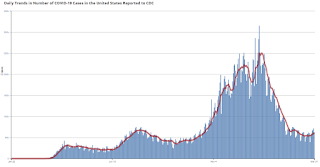 Click on graph for larger image.
This graph shows the daily (columns) 7 day average (line) of positive tests reported.
This data is from the CDC.
The second graph shows the number of people hospitalized.
 This data is also from the CDC.
The CDC cautions that due to reporting delays, the area in grey will probably increase.
Q1 2021 Update: Unofficial Problem Bank list Increased to 67 Institutions
by Calculated Risk on 3/28/2021 08:11:00 AM
The FDIC's official problem bank list is comprised of banks with a CAMELS rating of 4 or 5, and the list is not made public (just the number of banks and assets every quarter). Note: Bank CAMELS ratings are also not made public.
CAMELS is the FDIC rating system, and stands for Capital adequacy, Asset quality, Management, Earnings, Liquidity and Sensitivity to market risk. The scale is from 1 to 5, with 1 being the strongest.
As a substitute for the CAMELS ratings, surferdude808 is using publicly announced formal enforcement actions, and also media reports and company announcements that suggest to us an enforcement action is likely, to compile a list of possible problem banks in the public interest.
DISCLAIMER: This is an unofficial list, the information is from public sources only, and while deemed to be reliable is not guaranteed. No warranty or representation, expressed or implied, is made as to the accuracy of the information contained herein and same is subject to errors and omissions. This is not intended as investment advice. Please contact CR with any errors.
Here is the unofficial problem bank list for Q1 2021.
Here are the quarterly changes and a few comments from surferdude808:
Update on the Unofficial Problem Bank List through March 26, 2020. Since the last update at the end of December 2020, the list increased by two to 67 institutions after five additions and three removals. Assets increased by $800 million to $59 billion, with the change including a $1.1 billion decrease from updated asset figures through December 31, 2020. A year ago, the list held 65 institutions with assets of $48.6 billion.
Additions this month included Bank of the Orient, San Francisco, CA ($927 million); Southwestern National Bank, Houston, TX ($776 million); Lincoln 1st Bank, Lincoln Park, NJ ($314 million); Community First Bank, Maywood, NE ($127 million); and Spectra Bank, Fort Worth, TX ($92 million). Removals included Citizens Savings Bank and Trust Company, Nashville, TN ($112 million); The Morris County National Bank of Naples, Naples, TX ($94 million); and The First National Bank of Fleming, Fleming, CO ($25 million). Another change since year-end was the OCC issuing a Prompt Corrective Action order against The First National Bank and Trust Company of Vinita, Vinita, OK ($285 million).
On February 23, 2021, the FDIC released third quarter results and an update on the Official Problem Bank List. In that release, the FDIC said there were 56 institutions with assets of $56 billion on the official list, compared with 56 institutions with assets of $53.9 billion at the third quarter of 2020.
With the conclusion of the first quarter, we bring an updated transition matrix to detail how banks are transitioning off the Unofficial Problem Bank List. Since we first published the Unofficial Problem Bank List on August 7, 2009 with 389 institutions, 1,773 institutions have appeared on a weekly or monthly list since then. Only 3.8 percent of the banks that have appeared on a list remain today as 1,706 institutions have transitioned through the list. Departure methods include 1,005 action terminations, 411 failures, 271 mergers, and 19 voluntary liquidations. Of the 389 institutions on the first published list, only 3 or less than 1.0 percent, still have a troubled designation more than ten years later. The 411 failures represent 23.2 percent of the 1,773 institutions that have made an appearance on the list. This failure rate is well above the 10-12 percent rate frequently cited in media reports on the failure rate of banks on the FDIC's official list.
Saturday, March 27, 2021
March 27 COVID-19 Vaccinations, New Cases, Hospitalizations
by Calculated Risk on 3/27/2021 03:55:00 PM
Note1: There is growing concern about the UK, South African, and Brazilian variants. The UK and South African variants are causing a surge in cases in Michigan, New Jersey and New York.
Notes: I've been posting this data daily for over a year. I'll stop once 70% of the population over 18 has had at least one dose of vaccine, new cases are under 5,000 per day, and hospitalizations below 3,000.
According to the CDC, 140.2 million doses have been administered. 19.4% of the population over 18 is fully vaccinated, and 35.4% of the population over 18 has had at least one dose.
And check out COVID Act Now to see how each state is doing.
 Click on graph for larger image.
This graph shows the daily (columns) 7 day average (line) of positive tests reported.
This data is from the CDC.
The second graph shows the number of people hospitalized.
 This data is also from the CDC.
The CDC cautions that due to reporting delays, the area in grey will probably increase.
Schedule for Week of March 28, 2021
by Calculated Risk on 3/27/2021 08:11:00 AM
The key report scheduled for this week is the March employment report on Friday.
Other key reports include January Case-Shiller house prices and March Auto Sales.
For manufacturing, the March Dallas Fed survey and the ISM Manufacturing survey will be released.
10:30 AM: Dallas Fed Survey of Manufacturing Activity for March. This is the last of the regional surveys for March.
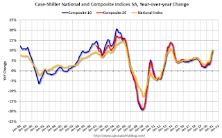 9:00 AM: S&P/Case-Shiller House Price Index for January.
This graph shows the year-over-year change for the Case-Shiller National, Composite 10 and Composite 20 indexes, through the most recent report (the Composite 20 was started in January 2000).
The consensus is for a 10.7% year-over-year increase in the Comp 20 index.
9:00 AM: FHFA House Price Index for January 2021. This was originally a GSE only repeat sales, however there is also an expanded index.
7:00 AM ET: The Mortgage Bankers Association (MBA) will release the results for the mortgage purchase applications index.
8:15 AM: The ADP Employment Report for March. This report is for private payrolls only (no government). The consensus is for 550,000 payroll jobs added in March, up from 117,000 added in February.
9:45 AM: Chicago Purchasing Managers Index for March. The consensus is for a reading of 60.3, up from 59.5 in February.
10:00 AM: Pending Home Sales Index for February. The consensus is for a 2.6% decrease in the index.
8:30 AM: The initial weekly unemployment claims report will be released. The consensus is for a decrease to 650 thousand from 684 thousand last week.
 All Day: Light vehicle sales for March. The consensus is for light vehicle sales to be 16.5 million SAAR in March, up from 15.7 million in February (Seasonally Adjusted Annual Rate).
This graph shows light vehicle sales since the BEA started keeping data in 1967. The dashed line is the February sales rate.
10:00 AM: ISM Manufacturing Index for March. The consensus is for the ISM to be at 61.2, up from 60.8 in February.
10:00 AM: Construction Spending for February. The consensus is for a 0.9% decrease in construction spending.
 8:30 AM: Employment Report for February. The consensus is for 565,000 jobs added, and for the unemployment rate to decrease to 6.0%.
There were 379,000 jobs added in February, and the unemployment rate was at 6.2%.
This graph shows the job losses from the start of the employment recession, in percentage terms.
The current employment recession was by far the worst recession since WWII in percentage terms, and is still at the worst of the "Great Recession".
Friday, March 26, 2021
Real Personal Income less Transfer Payments
by Calculated Risk on 3/26/2021 10:23:00 PM
Government transfer payments decreased sharply in February compared to January, but were still $1 trillion (on SAAR basis) above the February 2020 level. Most of the increase in transfer payments - compared to the level prior to the crisis - is from unemployment insurance and "other" (includes direct payments).
This table shows the amount of unemployment insurance and "Other" transfer payments since February 2020 (pre-crisis level). The increase in "Other" was mostly due to other parts of the relief acts (including direct payments).
| Selected Transfer Payments Billions of dollars, SAAR | ||
|---|---|---|
| Other | Unemployment Insurance | |
| Feb-20 | $506 | $28 |
| Mar-20 | $515 | $74 |
| Apr-20 | $3,379 | $493 |
| May-20 | $1,360 | $1,356 |
| Jun-20 | $758 | $1,405 |
| Jul-20 | $760 | $1,331 |
| Aug-20 | $692 | $636 |
| Sep-20 | $936 | $359 |
| Oct-20 | $732 | $304 |
| Nov-20 | $620 | $281 |
| Dec-20 | $654 | $304 |
| Jan-21 | $2,357 | $556 |
| Feb-21 | $781 | $537 |
A key measure of the health of the economy (Used by NBER in recession dating) is Real Personal Income less Transfer payments.
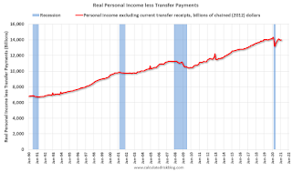 Click on graph for larger image.
This graph shows real personal income less transfer payments since 1990.
This measure of economic activity increased 0.2% in February, compared to January, and was down 2.5% compared to February 2020 (previous peak).
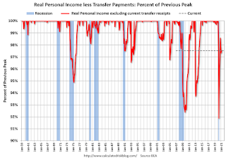 Another way to look at this data is as a percent of the previous peak.
Real personal income less transfer payments was off 8.1% in April. This was a larger decline than the worst of the great recession.
Currently personal income less transfer payments are still off 2.5% (dashed line).


