by Calculated Risk on 3/31/2021 03:48:00 PM
Wednesday, March 31, 2021
March 31 COVID-19 Vaccinations, New Cases, Hospitalizations
Note: I've been posting this data daily for over a year. I'll stop once 70% of the population over 18 has had at least one dose of vaccine, new cases are under 5,000 per day, and hospitalizations below 3,000.
According to the CDC, 150.3 million doses have been administered. 21.1% of the population over 18 is fully vaccinated, and 37.7% of the population over 18 has had at least one dose (97.2 million people have had at least one dose).
And check out COVID Act Now to see how each state is doing.
 Click on graph for larger image.
This graph shows the daily (columns) 7 day average (line) of positive tests reported.
This data is from the CDC.
The second graph shows the number of people hospitalized.
 This data is also from the CDC.
The CDC cautions that due to reporting delays, the area in grey will probably increase.
CDC: "Age-adjusted death rate increased by 15.9% in 2020"; COVID Third Leading Cause of Death
by Calculated Risk on 3/31/2021 12:33:00 PM
The CDC released the Provisional Mortality Data — United States, 2020 today:
During January–December 2020, the estimated 2020 age-adjusted death rate increased for the first time since 2017, with an increase of 15.9% compared with 2019, from 715.2 to 828.7 deaths per 100,000 population. COVID-19 was the underlying or a contributing cause of 377,883 deaths (91.5 deaths per 100,000). COVID-19 death rates were highest among males, older adults, and AI/AN and Hispanic persons. The highest numbers of overall deaths and COVID-19 deaths occurred during April and December. COVID-19 was the third leading underlying cause of death in 2020, replacing suicide as one of the top 10 leading causes of deathThis is very close to economist Tom Lawler's estimates, see: Lawler: Update on the Dismal Demographics of 2020; "Smallest Population increase since 1918"
emphasis added
NAR: Pending Home Sales Decrease 10.6% in February
by Calculated Risk on 3/31/2021 10:02:00 AM
From the NAR: Pending Home Sales Slip 10.6% in February
Pending home sales dipped for a second straight month in February, according to the National Association of Realtors®. Each of the four major U.S. regions witnessed month-over-month declines in February, while results were mixed in the four regions year-over-year.This was well below expectations for this index. Note: Contract signings usually lead sales by about 45 to 60 days, so this would usually be for closed sales in March and April.
The Pending Home Sales Index (PHSI), a forward-looking indicator of home sales based on contract signings, dropped 10.6% to 110.3 in February. Year-over-year, contract signings fell 0.5%. An index of 100 is equal to the level of contract activity in 2001.
...
The Northeast PHSI fell 9.2% to 92.3 in February, a 3.9% dip from a year ago. In the Midwest, the index dropped 9.5% to 102.4 last month, down 6.1% from February 2020.
Pending home sales transactions in the South declined 13.0% to an index of 133.2 in February, up 2.9% from February 2020. The index in the West fell 7.4% in February to 96.9, up 1.9% from a year prior.
emphasis added
ADP: Private Employment increased 517,000 in March
by Calculated Risk on 3/31/2021 08:19:00 AM
Private sector employment increased by 517,000 jobs from February to March according to the March ADP® National Employment ReportTM. Broadly distributed to the public each month, free of charge, the ADP National Employment Report is produced by the ADP Research Institute® in collaboration with Moody’s Analytics. The report, which is derived from ADP’s actual payroll data, measures the change in total nonfarm private employment each month on a seasonally-adjusted basisThis was below the consensus forecast of 550,000 for this report.
“We saw marked improvement in March’s labor market data, reporting the strongest gain since September 2020,” said Nela Richardson, chief economist, ADP. “Job growth in the service sector significantly outpaced its recent monthly average, led with notable increase by the leisure and hospitality industry. This sector has the most opportunity to improve as the economy continues to gradually reopen and the vaccine is made more widely available. We are continuing to keep a close watch on the hardest hit sectors but the groundwork is being laid for a further boost in the monthly pace of hiring in the months ahead.”
emphasis added
The BLS report will be released Friday, and the consensus is for 565 thousand non-farm payroll jobs added in March. The ADP report has not been very useful in predicting the BLS report.
MBA: Mortgage Applications Decrease in Latest Weekly Survey
by Calculated Risk on 3/31/2021 07:00:00 AM
From the MBA: Mortgage Applications Decrease in Latest MBA Weekly Survey
Mortgage applications decreased 2.2 percent from one week earlier, according to data from the Mortgage Bankers Association’s (MBA) Weekly Mortgage Applications Survey for the week ending March 26, 2021.
... The Refinance Index decreased 3 percent from the previous week and was 32 percent lower than the same week one year ago. The seasonally adjusted Purchase Index decreased 2 percent from one week earlier. The unadjusted Purchase Index decreased 1 percent compared with the previous week and was 39 percent higher than the same week one year ago.
“After seven consecutive weeks of increasing mortgage rates, the 30-year fixed rate declined 3 basis points to 3.33 percent, which is still almost half a percentage point higher than the start of this year. Mortgage applications for refinances and home purchases both declined, but purchase activity was still convincingly higher than the pandemic-induced drop seen a year ago, as well as up 6 percent from the same week in March 2019,” said Joel Kan, MBA’s Associate Vice President of Economic and Industry Forecasting. “Many prospective homebuyers this spring are feeling the effects of higher rates and rapidly accelerating home prices. Record-low inventory is pushing home-price growth at double the rate from a year ago, and even above the 10 percent growth rates seen in 2005. The housing market is in desperate need of more inventory to cool price growth and preserve affordability.”
Added Kan, “Higher mortgage rates continue to shut down refinance activity, as the pool of borrowers who can benefit from a refinance further shrinks.”
...
The average contract interest rate for 30-year fixed-rate mortgages with conforming loan balances ($548,250 or less) decreased to 3.33 percent from 3.36 percent, with points decreasing to 0.39 from 0.42 (including the origination fee) for 80 percent loan-to-value ratio (LTV) loans.
emphasis added
 Click on graph for larger image.
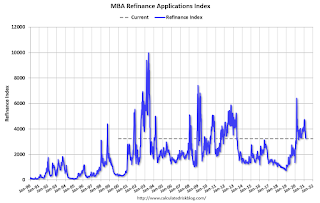
The first graph shows the refinance index since 1990.
With low rates, the index remains elevated, but falling as rates rise.
The second graph shows the MBA mortgage purchase index
 According to the MBA, purchase activity is up 38% year-over-year unadjusted.
Note: Until the 2nd half of May, the MBA index will be up sharply year-over-year since purchase activity collapsed in late March 2020 in the early weeks of the pandemic.
Note: Red is a four-week average (blue is weekly).
Tuesday, March 30, 2021
Wednesday: ADP Employment, Pending Home Sales
by Calculated Risk on 3/30/2021 09:15:00 PM
Wednesday:
• At 7:00 AM ET, The Mortgage Bankers Association (MBA) will release the results for the mortgage purchase applications index.
• At 8:15 AM, The ADP Employment Report for March. This report is for private payrolls only (no government). The consensus is for 550,000 payroll jobs added in March, up from 117,000 added in February.
• At 9:45 AM, Chicago Purchasing Managers Index for March. The consensus is for a reading of 60.3, up from 59.5 in February.
• At 10:00 AM, Pending Home Sales Index for February. The consensus is for a 2.6% decrease in the index.
Zillow Case-Shiller House Price Forecast: "No End in Sight", 12.0% YoY in February
by Calculated Risk on 3/30/2021 06:13:00 PM
The Case-Shiller house price indexes for January were released today. Zillow forecasts Case-Shiller a month early, and I like to check the Zillow forecasts since they have been pretty close.
From Matthew Speakman at Zillow: January 2021 Case-Shiller Results & Forecast: No End in Sight
Home prices continued their surge higher as the new year began, maintaining a torrid pace that appears likely to persist for many more months.
...
As more signs of an improving economy continue to arrive, demand for housing remains elevated leading homes to fly off the shelves and red-hot competition for the relatively few homes available for sale. Homes in many areas went under contract in January — generally one of the slower times of the year — merely days after hitting the market and about a month faster than the same period a year ago. Seeing this, and unfazed by rising mortgage rates, a wave of eager buyers is being forced to act swiftly and face heightened competition for the few homes available. The combined dynamic is pushing prices upward at their strongest pace in years, and it doesn’t appear that there is an end in sight.
Monthly growth in January as reported by Case-Shiller is expected to slow slightly from December in all three main indices, while annual growth is expected to accelerate across the board. S&P Dow Jones Indices is expected to release data for the January S&P CoreLogic Case-Shiller Indices on Tuesday, April 27.
emphasis added
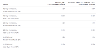
 The Zillow forecast is for the year-over-year change for the Case-Shiller National index to be at 12.0% in February, up from 11.2% in January.
 The Zillow forecast is for the 20-City index to be up 11.9% YoY in February from 11.1% in January, and for the 10-City index to increase to be up 11.6% YoY compared to 10.9% YoY in January.
March 30 COVID-19 Vaccinations, New Cases, Hospitalizations
by Calculated Risk on 3/30/2021 04:23:00 PM
Note: I've been posting this data daily for over a year. I'll stop once 70% of the population over 18 has had at least one dose of vaccine, new cases are under 5,000 per day, and hospitalizations below 3,000.
According to the CDC, 147.6 million doses have been administered. 20.7% of the population over 18 is fully vaccinated, and 37.1% of the population over 18 has had at least one dose (95.7 million people have had at least one dose).
And check out COVID Act Now to see how each state is doing.
 Click on graph for larger image.
This graph shows the daily (columns) 7 day average (line) of positive tests reported.
This data is from the CDC.
The second graph shows the number of people hospitalized.
 This data is also from the CDC.
The CDC cautions that due to reporting delays, the area in grey will probably increase.
Update: A few comments on the Seasonal Pattern for House Prices
by Calculated Risk on 3/30/2021 02:15:00 PM
CR Note: This is a repeat of earlier posts with updated graphs.
A few key points:
1) There is a clear seasonal pattern for house prices.
2) The surge in distressed sales during the housing bust distorted the seasonal pattern.
3) Even though distressed sales are down significantly, the seasonal factor is based on several years of data - and the factor is now overstating the seasonal change (second graph below).
4) Still the seasonal index is probably a better indicator of actual price movements than the Not Seasonally Adjusted (NSA) index.
For in depth description of these issues, see Jed Kolko's article from 2014 (currently Chief Economist at Indeed) "Let’s Improve, Not Ignore, Seasonal Adjustment of Housing Data"
Note: I was one of several people to question the change in the seasonal factor (here is a post in 2009) - and this led to S&P Case-Shiller questioning the seasonal factor too (from April 2010). I still use the seasonal factor (I think it is better than using the NSA data).

This graph shows the month-to-month change in the NSA Case-Shiller National index since 1987 (through January 2021). The seasonal pattern was smaller back in the '90s and early '00s, and increased once the bubble burst.
The seasonal swings have declined since the bubble, although the recent price surge changed the month-over-month pattern.

The swings in the seasonal factors have started to decrease, and it seemed - as recent history is included in the factors - the seasonal factors had been moving back towards more normal levels.
Real House Prices and Price-to-Rent Ratio in January
by Calculated Risk on 3/30/2021 11:26:00 AM
Here is the post earlier on Case-Shiller: Case-Shiller: National House Price Index increased 11.2% year-over-year in January
It has been fifteen years since the bubble peak. In the Case-Shiller release today, the seasonally adjusted National Index (SA), was reported as being 29% above the previous bubble peak. However, in real terms, the National index (SA) is about 3% above the bubble peak (and historically there has been an upward slope to real house prices). The composite 20, in real terms, is still 5% below the bubble peak.
The year-over-year growth in prices increased to 11.2% nationally.
Usually people graph nominal house prices, but it is also important to look at prices in real terms (inflation adjusted). Case-Shiller and others report nominal house prices. As an example, if a house price was $200,000 in January 2000, the price would be close to $294,000 today adjusted for inflation (47%). That is why the second graph below is important - this shows "real" prices (adjusted for inflation).
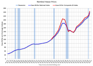
Nominal House Prices

In nominal terms, the Case-Shiller National index (SA) and the Case-Shiller Composite 20 Index (SA) are both at new all times highs (above the bubble peak).
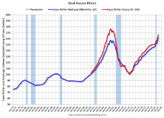
Real House Prices

In real terms, the National index is 3% above the bubble peak, and the Composite 20 index is back to early 2005.
In real terms, house prices are at 2005 levels.
Note that inflation was negative for a few months last year, and that also boosted real prices.
Price-to-Rent
In October 2004, Fed economist John Krainer and researcher Chishen Wei wrote a Fed letter on price to rent ratios: House Prices and Fundamental Value. Kainer and Wei presented a price-to-rent ratio using the OFHEO house price index and the Owners' Equivalent Rent (OER) from the BLS.

This graph shows the price to rent ratio (January 2000 = 1.0). The price-to-rent ratio had been moving mostly sideways, but picked up recently.
On a price-to-rent basis, the Case-Shiller National index is back to December 2004 levels, and the Composite 20 index is back to June 2004 levels.
In real terms, prices are back to 2005 levels, and the price-to-rent ratio is back to 2004.


