 RSS Feed
 by Calculated Risk on 8/02/2021 10:30:00 AM
Monday, August 02, 2021
Construction Spending increased 0.1% in June
From the Census Bureau reported that overall construction spending decreased:
Construction spending during June 2021 was estimated at a seasonally adjusted annual rate of $1,552.2 billion, 0.1 percent above the revised May estimate of $1,551.2 billion. The June figure is 8.2 percent above the June 2020 estimate of $1,435.0 billion.Private spending increased and public spending decreased:
emphasis added
Spending on private construction was at a seasonally adjusted annual rate of $1,215.2 billion, 0.4 percentabove the revised May estimate of $1,210.3 billion. ...
In June, the estimated seasonally adjusted annual rate of public construction spending was $337.0 billion, 1.2 percent below the revised May estimate of $340.9 billion.
 Click on graph for larger image.
This graph shows private residential and nonresidential construction spending, and public spending, since 1993. Note: nominal dollars, not inflation adjusted.
Residential spending is 13% above the bubble peak (in nominal terms - not adjusted for inflation).
Non-residential spending is 9% above the bubble era peak in January 2008 (nominal dollars), but has been weak recently.
Public construction spending is 4% above the previous peak in March 2009, and 29% above the austerity low in February 2014, but weak recently.
 The second graph shows the year-over-year change in construction spending.
On a year-over-year basis, private residential construction spending is up 29.3%. Non-residential spending is down 6.0% year-over-year. Public spending is down 7.5% year-over-year.
Construction was considered an essential service in most areas and did not decline sharply like many other sectors, but some sectors of non-residential have been under pressure. For example, lodging is down 26.5% YoY, multi-retail down 5.2% YoY, and office down 9.1% YoY.
This was below consensus expectations of a 0.4% increase in spending, however construction spending for the previous two months was revised up slightly.
ISM® Manufacturing index Decreased to 59.5% in July
by Calculated Risk on 8/02/2021 10:03:00 AM
(Posted with permission). The ISM manufacturing index indicated expansion in July. The PMI® was at 59.5% in July, down from 60.6% in June. The employment index was at 52.9%, up from 49.9% last month, and the new orders index was at 64.9%, down from 66.0%.
From ISM: July 2021 Manufacturing ISM® Report On Business®
conomic activity in the manufacturing sector grew in July, with the overall economy notching a 14th consecutive month of growth, say the nation's supply executives in the latest Manufacturing ISM® Report On Business®.This was below expectations.
The report was issued today by Timothy R. Fiore, CPSM, C.P.M., Chair of the Institute for Supply Management® (ISM®) Manufacturing Business Survey Committee:
“The July Manufacturing PMI® registered 59.5 percent, a decrease of 1.1 percentage points from the June reading of 60.6 percent. This figure indicates expansion in the overall economy for the 14th month in a row after contraction in April 2020. The New Orders Index registered 64.9 percent, decreasing 1.1 percentage points from the June reading of 66 percent. The Production Index registered 58.4 percent, a decrease of 2.4 percentage points compared to the June reading of 60.8 percent. The Prices Index registered 85.7 percent, down 6.4 percentage points compared to the June figure of 92.1 percent, which was the index’s highest reading since July 1979 (93.1 percent). The Backlog of Orders Index registered 65 percent, 0.5 percentage point higher than the June reading of 64.5 percent. The Employment Index registered 52.9 percent, 3 percentage points higher compared to the June reading of 49.9 percent. The Supplier Deliveries Index registered 72.5 percent, down 2.6 percentage points from the June figure of 75.1 percent. The Inventories Index registered 48.9 percent, 2.2 percentage points lower than the June reading of 51.1 percent. The New Export Orders Index registered 55.7 percent, a decrease of 0.5 percentage point compared to the June reading of 56.2 percent. The Imports Index registered 53.7 percent, a 7.3-percentage point decrease from the June reading of 61 percent.”
emphasis added
This suggests manufacturing expanded at a slower pace in July than in June.
Seven High Frequency Indicators for the Economy
by Calculated Risk on 8/02/2021 08:30:00 AM
These indicators are mostly for travel and entertainment. It will interesting to watch these sectors recover as the pandemic subsides.
The TSA is providing daily travel numbers.
This data is as of August 1st.
 Click on graph for larger image.
This data shows the 7-day average of daily total traveler throughput from the TSA for 2019 (Light Blue), 2020 (Blue) and 2021 (Red).
The dashed line is the percent of 2019 for the seven day average.
The 7-day average is down 20.1% from the same day in 2019 (79.9% of 2019). (Dashed line)
There was a slow increase from the bottom starting in May 2020 - and then TSA data picked up in 2021 - but has mostly sideways over the last few of weeks.
The second graph shows the 7-day average of the year-over-year change in diners as tabulated by OpenTable for the US and several selected cities.
IMPORTANT: OpenTable notes: "we’ve updated the data including downloadable dataset from January 1, 2021 onward to compare seated diners from 2021 to 2019, as opposed to year over year." Thanks!
 Thanks to OpenTable for providing this restaurant data:
This data is updated through July 31st, 2021.
This data is "a sample of restaurants on the OpenTable network across all channels: online reservations, phone reservations, and walk-ins. For year-over-year comparisons by day, we compare to the same day of the week from the same week in the previous year."
Note that this data is for "only the restaurants that have chosen to reopen in a given market". Since some restaurants have not reopened, the actual year-over-year decline is worse than shown.
Dining picked up during the holidays, then slumped with the huge winter surge in cases. Dining is generally picking up, but was down 6% in the US (7-day average compared to 2019). Florida and Texas are above 2019 levels.
----- Movie Tickets: Box Office Mojo -----
 This data shows domestic box office for each week and the median for the years 2016 through 2019 (dashed light blue).
 Thanks to OpenTable for providing this restaurant data:
This data is updated through July 31st, 2021.
This data is "a sample of restaurants on the OpenTable network across all channels: online reservations, phone reservations, and walk-ins. For year-over-year comparisons by day, we compare to the same day of the week from the same week in the previous year."
Note that this data is for "only the restaurants that have chosen to reopen in a given market". Since some restaurants have not reopened, the actual year-over-year decline is worse than shown.
Dining picked up during the holidays, then slumped with the huge winter surge in cases. Dining is generally picking up, but was down 6% in the US (7-day average compared to 2019). Florida and Texas are above 2019 levels.
 This data shows domestic box office for each week and the median for the years 2016 through 2019 (dashed light blue).
 Blue is 2020 and Red is 2021.
The data is from BoxOfficeMojo through July 29th.
Note that the data is usually noisy week-to-week and depends on when blockbusters are released.
Movie ticket sales were at $92 million last week, down about 63% from the median for the week.
Note that the data is usually noisy week-to-week and depends on when blockbusters are released.
Movie ticket sales were at $92 million last week, down about 63% from the median for the week.
 This graph shows the seasonal pattern for the hotel occupancy rate using the four week average.
 The red line is for 2021, black is 2020, blue is the median, dashed purple is 2019, and dashed light blue is for 2009 (the worst year on record for hotels prior to 2020).
Occupancy is well above the horrible 2009 levels and weekend occupancy (leisure) has been solid.
This data is through July 24th. The occupancy rate is down 7.8% compared to the same week in 2019. Note: Occupancy was up year-over-year, since occupancy declined sharply at the onset of the pandemic. However, the 4-week average occupancy is still down from normal levels.
Notes: Y-axis doesn't start at zero to better show the seasonal change.
 This graph, based on weekly data from the U.S. Energy Information Administration (EIA), shows gasoline supplied compared to the same week of 2019.
Blue is for 2020. Red is for 2021.
As of July 23rd, gasoline supplied was down 2.4% compared to the same week in 2019.
There have been 3 weeks so far this year when gasoline supplied was up compared to the same week in 2019.
This graph is from Apple mobility. From Apple: "This data is generated by counting the number of requests made to Apple Maps for directions in select countries/regions, sub-regions, and cities." This is just a general guide - people that regularly commute probably don't ask for directions.
There is also some great data on mobility from the Dallas Fed Mobility and Engagement Index. However the index is set "relative to its weekday-specific average over January–February", and is not seasonally adjusted, so we can't tell if an increase in mobility is due to recovery or just the normal increase in the Spring and Summer.
 This data is through July 31st for the United States and several selected cities.
The graph is the running 7-day average to remove the impact of weekends.
IMPORTANT: All data is relative to January 13, 2020. This data is NOT Seasonally Adjusted. People walk and drive more when the weather is nice, so I'm just using the transit data.
According to the Apple data directions requests, public transit in the 7 day average for the US is at 10% of the January 2020 level.
Strangely, New York City is doing well by this metric, but subway usage in NYC is down sharply (next graph). I'd put much more weight on subway usage!
----- New York City Subway Usage -----
Here is some interesting data on New York subway usage (HT BR).
 This graph is from Todd W Schneider. This is weekly data since 2015.
Here is some interesting data on New York subway usage (HT BR).
 This graph is from Todd W Schneider. This is weekly data since 2015.
 Most weeks are between 30 and 35 million entries, and currently there are over 12 million subway turnstile entries per week - and generally increasing.
This data is through Friday, July 30th.
Schneider has graphs for each borough, and links to all the data sources.
He notes: "Data updates weekly from the MTA’s public turnstile data, usually on Saturday mornings".
This data is through Friday, July 30th.
Schneider has graphs for each borough, and links to all the data sources.
He notes: "Data updates weekly from the MTA’s public turnstile data, usually on Saturday mornings".
Sunday, August 01, 2021
Monday: ISM Mfg, Construction Spending
by Calculated Risk on 8/01/2021 07:29:00 PM
Weekend:
• Schedule for Week of August 1, 2021
• A Few Comments on Inflation
Monday:
• At 10:00 AM ET, ISM Manufacturing Index for July. The consensus is for the ISM to be at 60.9, up from 60.6 in June. The employment index was at 49.9% in June, and the new orders index was at 66.0%.
• Also at 10:00 AM, Construction Spending for June. The consensus is for a 0.4% increase in construction spending.
• At 2:00 PM, Senior Loan Officer Opinion Survey on Bank Lending Practices for July.
From CNBC: Pre-Market Data and Bloomberg futures S&P 500 are up 19 and DOW futures are up 135 (fair value).
Oil prices were up over the last week with WTI futures at $73.85 per barrel and Brent at $75.26 per barrel. A year ago, WTI was at $40, and Brent was at $43 - so WTI oil prices are UP about 80% year-over-year (oil prices collapsed at the beginning of the pandemic).
Here is a graph from Gasbuddy.com for nationwide gasoline prices. Nationally prices are at $3.16 per gallon. A year ago prices were at $2.18 per gallon, so gasoline prices are up $0.98 per gallon year-over-year.
A Few Comments on Inflation
by Calculated Risk on 8/01/2021 04:22:00 PM
I haven't commented much on inflation because I do not consider inflation a serious economic problem.
However, I'm aware some people - like Larry Summers and Mohammed El-Erian are concerned. El-Erian was quoted in a recent Bloomberg article:
The first graph shows the PCE price index since January 2020 (before the pandemic), and the dashed blue line is the Fed's target of 2%.
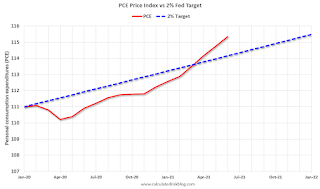 Click on graph for larger image.
As I've mentioned before, there was some deflation at the beginning of the pandemic, and this has increased the YoY change (base effect). There is some transitory inflation from supply chain issues, and surging rents will probably push up Owners Equivalent Rent (OER) over the next year.
“Inflation is not going to be transitory,” the chief economic adviser at Allianz SE said in an interview on Bloomberg TV’s The Open show ... “I have a whole list of companies that have announced price increases, that have told us they expect further price increases, and that they expect them to stick,” El-Erian said.First, transitory doesn't mean that price increases won't "stick". It means that year-over-year (YoY) inflation will decline back to the Fed's target of 2%.
The first graph shows the PCE price index since January 2020 (before the pandemic), and the dashed blue line is the Fed's target of 2%.
 Click on graph for larger image.
As I've mentioned before, there was some deflation at the beginning of the pandemic, and this has increased the YoY change (base effect). There is some transitory inflation from supply chain issues, and surging rents will probably push up Owners Equivalent Rent (OER) over the next year.
But overall the PCE price index isn't that far above what we would have expected 18 months ago!
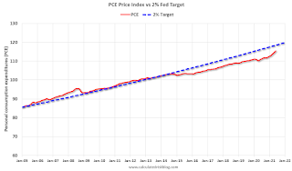 The second graph is from January 2005 (just an arbitrary date).
This shows that inflation has been below target for years. If we were doing price targeting (we aren't) we would be looking for more price increases.
The graphs for core PCE inflation show the same pattern.
The question is not will some prices "stick", but rather will YoY inflation ease back towards the Fed's target? Or will inflation stay at the current 4.0% (PCE YoY in June)?
My sense is inflation will ease back towards the Fed's target.
August 1st COVID-19, New Cases, Hospitalizations, Vaccinations
by Calculated Risk on 8/01/2021 04:16:00 PM
Note: Cases and Deaths not updated on Sundays.
The 7-day average cases is the highest since February 17th.
The 7-day average hospitalizations is the highest since May 1st.
This data is from the CDC.
According to the CDC, on Vaccinations.
Total doses administered: 346,456,669, as of a week ago 341,818,968. Average doses last week: 0.66 million per day.
| COVID Metrics | ||||
|---|---|---|---|---|
| Today | Yesterday | Week Ago | Goal | |
| Percent over 18, One Dose | 69.9% | 69.7% | 69.0% | ≥70.0%1,2 |
| Fully Vaccinated✅ (millions) | 164.8 | 164.4 | 163.0 | ≥1601 |
| New Cases per Day3🚩 | 72,493 | 67,556 | 50,333 | ≤5,0002 |
| Hospitalized3🚩 | 35,457 | 34,810 | 25,141 | ≤3,0002 |
| Deaths per Day3🚩 | 308 | 277 | 245 | ≤502 |
| 1 America's Short Term Goals, 2my goals to stop daily posts, 37 day average for Cases, Hospitalized, and Deaths 🚩 Increasing 7 day average week-over-week for Cases, Hospitalized, and Deaths ✅ Goal met (even if late). | ||||
KUDOS to the residents of the 20 states and D.C. that have achieved the 70% goal (percent over 18 with at least one dose): Vermont, Hawaii, Massachusetts and Connecticut are at 80%+, and Maine, New Mexico, New Jersey, Rhode Island, Pennsylvania, California, Maryland, Washington, New Hampshire, New York, Illinois, Virginia, Delaware, Minnesota, Oregon, Colorado and D.C. are all over 70%.
Next up are Florida at 69.0%, Utah at 68.0%, Nebraska at 67.5%, Wisconsin at 67.4%, Kansas at 66.5%, South Dakota at 66.4%, Iowa at 65.7%, and Nevada at 65.7%.
 Click on graph for larger image.
This graph shows the daily (columns) and 7 day average (line) of hospitalizations reported.
This data is from the CDC.
Saturday, July 31, 2021
July 31st COVID-19, New Cases, Hospitalizations, Vaccinations; Already 2nd Worst Wave for Cases
by Calculated Risk on 7/31/2021 05:42:00 PM
The 7-day average cases is the highest since February 17th.
The 7-day average hospitalizations is the highest since May 2nd.
This data is from the CDC.
According to the CDC, on Vaccinations.
Total doses administered: 345,640,466, as of a week ago 341,039,972. Average doses last week: 0.66 million per day.
| COVID Metrics | ||||
|---|---|---|---|---|
| Today | Yesterday | Week Ago | Goal | |
| Percent over 18, One Dose | 69.7% | 69.4% | 68.8% | ≥70.0%1,2 |
| Fully Vaccinated✅ (millions) | 164.4 | 163.9 | 162.7 | ≥1601 |
| New Cases per Day3🚩 | 72,493 | 67,556 | 50,333 | ≤5,0002 |
| Hospitalized3🚩 | 34,769 | 33,084 | 23,822 | ≤3,0002 |
| Deaths per Day3🚩 | 308 | 277 | 245 | ≤502 |
| 1 America's Short Term Goals, 2my goals to stop daily posts, 37 day average for Cases, Hospitalized, and Deaths 🚩 Increasing 7 day average week-over-week for Cases, Hospitalized, and Deaths ✅ Goal met (even if late). | ||||
KUDOS to the residents of the 20 states and D.C. that have achieved the 70% goal (percent over 18 with at least one dose): Vermont, Hawaii, Massachusetts and Connecticut are at 80%+, and Maine, New Mexico, New Jersey, Rhode Island, Pennsylvania, California, Maryland, Washington, New Hampshire, New York, Illinois, Virginia, Delaware, Minnesota, Oregon, Colorado and D.C. are all over 70%.
Next up are Florida at 68.7%, Utah at 68.0%, Wisconsin at 67.3%, Nebraska at 67.3%, South Dakota at 66.3%, Kansas at 66.3%, Iowa at 65.7%, and Nevada at 65.5%.
 Click on graph for larger image.
This graph shows the daily (columns) and 7 day average (line) of positive tests reported.
This data is from the CDC.
Schedule for Week of August 1, 2021
by Calculated Risk on 7/31/2021 08:11:00 AM
The key report this week is the July employment report.
Other key reports include ISM manufacturing and services indexes, July vehicle sales, and the Trade deficit for June.
10:00 AM: ISM Manufacturing Index for July. The consensus is for the ISM to be at 60.9, up from 60.6 in June. The employment index was at 49.9% in June, and the new orders index was at 66.0%.
10:00 AM: Construction Spending for June. The consensus is for a 0.4% increase in construction spending.
2:00 PM: Senior Loan Officer Opinion Survey on Bank Lending Practices for July.
8:00 AM ET: Corelogic House Price index for June
 All Day: Light vehicle sales for July from the BEA. The consensus is for light vehicle sales to be 15.7 million SAAR in July, up from 15.4 million in June (Seasonally Adjusted Annual Rate).
This graph shows light vehicle sales since the BEA started keeping data in 1967. The dashed line is the sales rate for last month.
11:00 AM: NY Fed: Q2 Quarterly Report on Household Debt and Credit
7:00 AM ET: The Mortgage Bankers Association (MBA) will release the results for the mortgage purchase applications index.
8:15 AM: The ADP Employment Report for July. This report is for private payrolls only (no government). The consensus is for 675 thousand payroll jobs added in July, down from 692 thousand added in June.
10:00 AM: the ISM Services Index for July. The consensus is for a reading of 60.4, up from 60.1.
 8:30 AM: Trade Balance report for June from the Census Bureau.
 This graph shows the U.S. trade deficit, with and without petroleum, through the most recent report. The blue line is the total deficit, and the black line is the petroleum deficit, and the red line is the trade deficit ex-petroleum products.
The consensus is the trade deficit to be $73.9 billion. The U.S. trade deficit was at $71.2 Billion the previous month.
8:30 AM: The initial weekly unemployment claims report will be released. The consensus is for a decrease to 390 thousand from 400 thousand last week.
 8:30 AM: Employment Report for July. The consensus is for 900,000 jobs added, and for the unemployment rate to decrease to 5.7%.
There were 850,000 jobs added in June, and the unemployment rate was at 5.9%.
This graph shows the job losses from the start of the employment recession, in percentage terms.
The current employment recession was by far the worst recession since WWII in percentage terms, but currently is not as severe as the worst of the "Great Recession".
Friday, July 30, 2021
Fannie Mae: Mortgage Serious Delinquency Rate Decreased in June
by Calculated Risk on 7/30/2021 04:10:00 PM
Fannie Mae reported that the Single-Family Serious Delinquency decreased to 2.08% in June, from 2.24% in May. The serious delinquency rate is down from 2.65% in June 2020.
These are mortgage loans that are "three monthly payments or more past due or in foreclosure".
The Fannie Mae serious delinquency rate peaked in February 2010 at 5.59% following the housing bubble, and peaked at 3.32% in August 2020 during the pandemic.
 Click on graph for larger image
By vintage, for loans made in 2004 or earlier (1% of portfolio), 5.04% are seriously delinquent (down from 5.27% in May). For loans made in 2005 through 2008 (2% of portfolio), 8.75% are seriously delinquent (down from 9.09%), For recent loans, originated in 2009 through 2021 (97% of portfolio), 1.69% are seriously delinquent (down from 1.82%). So Fannie is still working through a few poor performing loans from the bubble years.
Mortgages in forbearance are counted as delinquent in this monthly report, but they will not be reported to the credit bureaus.
This is very different from the increase in delinquencies following the housing bubble. Lending standards have been fairly solid over the last decade, and most of these homeowners have equity in their homes - and they will be able to restructure their loans once they are employed.
Note: Freddie Mac reported earlier.
July 30th COVID-19, New Cases, Hospitalizations, Vaccinations
by Calculated Risk on 7/30/2021 03:36:00 PM
The 7-day average cases is the highest since April 18th.
The 7-day average hospitalizations is the highest since May 6th.
This data is from the CDC.
According to the CDC, on Vaccinations.
Total doses administered: 344,928,514, as of a week ago 340,363,922. Average doses last week: 0.65 million per day.
| COVID Metrics | ||||
|---|---|---|---|---|
| Today | Yesterday | Week Ago | Goal | |
| Percent over 18, One Dose | 69.6% | 69.4% | 68.7% | ≥70.0%1,2 |
| Fully Vaccinated✅ (millions) | 164.2 | 163.9 | 162.4 | ≥1601 |
| New Cases per Day3🚩 | 67,080 | 65,476 | 46,828 | ≤5,0002 |
| Hospitalized3🚩 | 32,876 | 31,245 | 22,602 | ≤3,0002 |
| Deaths per Day3🚩 | 275 | 277 | 248 | ≤502 |
| 1 America's Short Term Goals, 2my goals to stop daily posts, 37 day average for Cases, Hospitalized, and Deaths 🚩 Increasing 7 day average week-over-week for Cases, Hospitalized, and Deaths ✅ Goal met (even if late). | ||||
KUDOS to the residents of the 20 states and D.C. that have achieved the 70% goal (percent over 18 with at least one dose): Vermont, Hawaii, Massachusetts and Connecticut are at 80%+, and Maine, New Mexico, New Jersey, Rhode Island, Pennsylvania, California, Maryland, Washington, New Hampshire, New York, Illinois, Virginia, Delaware, Minnesota, Oregon, Colorado and D.C. are all over 70%.
Next up are Florida at 68.5%, Utah at 67.7%, Wisconsin at 67.2%, Nebraska at 67.2%, South Dakota at 66.2%, Kansas at 66.2%, Iowa at 65.6%, and Nevada at 65.4%.
 Click on graph for larger image.
This graph shows the daily (columns) and 7 day average (line) of positive tests reported.
This data is from the CDC.


