 RSS Feed
 by Calculated Risk on 8/23/2021 04:00:00 PM
Monday, August 23, 2021
MBA Survey: "Share of Mortgage Loans in Forbearance Slightly Decreases to 3.25%"
Note: This is as of August 15th.
From the MBA: Share of Mortgage Loans in Forbearance Slightly Decreases to 3.25%
The Mortgage Bankers Association’s (MBA) latest Forbearance and Call Volume Survey revealed that the total number of loans now in forbearance decreased by 1 basis point from 3.26% of servicers’ portfolio volume in the prior week to 3.25% as of August 15, 2021. According to MBA’s estimate, 1.6 million homeowners are in forbearance plans.
The share of Fannie Mae and Freddie Mac loans in forbearance decreased 3 basis points to 1.66%. Ginnie Mae loans in forbearance decreased 3 basis points to 3.92%, while the forbearance share for portfolio loans and private-label securities (PLS) increased 10 basis points to 7.15%. The percentage of loans in forbearance for independent mortgage bank (IMB) servicers increased 2 basis points to 3.48%, and the percentage of loans in forbearance for depository servicers decreased 1 basis point to 3.35%.
“The share of loans in forbearance was little changed, as both new requests and exits were at a slower pace compared to the prior week. In fact, exits were at their slowest pace in over a year,” said Mike Fratantoni, MBA’s Senior Vice President and Chief Economist. “There were more new forbearance requests and re-entries for portfolio and PLS loans, leading to a 10-basis-point increase in their share. Portfolio and PLS loans now account for almost 50% of all depository servicer loans in forbearance and almost 40% of IMB servicer loans in forbearance, which highlights the importance of this investor category.”
emphasis added
 Click on graph for larger image.
This graph shows the percent of portfolio in forbearance by investor type over time. Most of the increase was in late March and early April 2020, and has trended down since then.
The MBA notes: "Total weekly forbearance requests as a percent of servicing portfolio volume (#) decreased relative to the prior week: from 0.06% to 0.05%.%"
Comments on July Existing Home Sales
by Calculated Risk on 8/23/2021 01:11:00 PM
Earlier: NAR: Existing-Home Sales Increased to 5.99 million in July
Two key points:
1) Existing home sales are somewhat above pre-pandemic levels rate of around 5.5 million SAAR (average six months prior to pandemic). Seasonally adjusted (SA) sales for July 2021 were also the highest since 2006 - about 2% above July 2020.
Some of the increase in sales over the previous year was probably related to record low mortgage rates, strong second home buying, a strong stock market and favorable demographics.
2) Inventory is very low, and was down 12.0% year-over-year (YoY) in July. Also, as housing economist Tom Lawler has noted, the local MLS data shows even a larger decline in active inventory (the NAR appears to include some pending sales in inventory). Lawler noted:
Months-of-supply at 2.6 months is still very low, but above the record low of 1.9 months set in December 2020 and January 2021. Inventory will be important to watch in 2021, see: Some thoughts on Housing Inventory
 Click on graph for larger image.
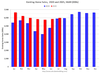
This graph shows existing home sales by month for 2020 and 2021.
The year-over-year comparison will be more difficult in the second half of the year.
The second graph shows existing home sales for each month, Not Seasonally Adjusted (NSA), since 2005.
 Sales NSA in July (584,000) were 2.2% below sales in July 2020 (597,000).
Also, the delay in the 2020 buying season pushed the seasonally adjusted number to very high levels over the winter. This means there are going to be some difficult comparisons in the second half of 2021!
2) Inventory is very low, and was down 12.0% year-over-year (YoY) in July. Also, as housing economist Tom Lawler has noted, the local MLS data shows even a larger decline in active inventory (the NAR appears to include some pending sales in inventory). Lawler noted:
"As I’ve noted before, the inventory measure in most publicly-released local realtor/MLS reports excludes listings with pending contracts, but that is not the case for many of the reports sent to the NAR (referred to as the “NAR Report!”), Since the middle of last Spring inventory measures excluding pending listings have fallen much more sharply than inventory measures including such listings, and this latter inventory measure understates the decline in the effective inventory of homes for sale over the last several months."
It seems likely that active inventory is down close to 30% year-over-year.
 Click on graph for larger image.
This graph shows existing home sales by month for 2020 and 2021.
The year-over-year comparison will be more difficult in the second half of the year.
The second graph shows existing home sales for each month, Not Seasonally Adjusted (NSA), since 2005.
 Sales NSA in July (584,000) were 2.2% below sales in July 2020 (597,000).
 There were fewer selling days in July 2021 than in July 2020, so the SA numbers were higher than last year, even though the NSA numbers were lower.
This was the second highest sales for July, NSA, since 2006.
This was the second highest sales for July, NSA, since 2006.
Housing Inventory August 23rd Update: Inventory Increased Week-over-week, Up 41% from Low in early April
by Calculated Risk on 8/23/2021 11:50:00 AM
Tracking existing home inventory will be very important this year.
 Click on graph for larger image in graph gallery.
This inventory graph is courtesy of Altos Research.
As of August 20th, inventory was at 432 thousand (7 day average), compared to 594 thousand for the same week a year ago. That is a decline of 27.3%.
Compared to the same week in 2019, inventory is down 55%.
A week ago, inventory was at 422 thousand, and was down 29.8% YoY.
Seasonally, inventory has bottomed. Inventory was about 40.8% above the record low in early April.
A couple of interesting points from 2019: In 2019, inventory bottomed at 814 thousand in February (so inventory is still very low compared to normal levels). And, in 2019, inventory peaked at 972 thousand in early August (an increase of about 19% from the low). So inventory is less than half of what we'd normally expect, however inventory has increased (as a percentage) more than normal.
Key question: Usually inventory peaks in the Summer, and then declines into the Fall. Will inventory follow the normal seasonal pattern, or will inventory continue to increase over the coming months? This will be important to watch for house prices and housing activity.
Mike Simonsen discusses this data regularly on Youtube.
Altos Research has also seen a significant pickup in price decreases - back to the level of a year ago - but still well below a normal rate for August.
NAR: Existing-Home Sales Increased to 5.99 million in July
by Calculated Risk on 8/23/2021 10:11:00 AM
From the NAR: Existing-Home Sales Climb 2.0% in July
Existing-home sales rose in July, marking two consecutive months of increases, according to the National Association of Realtors®. Three of the four major U.S. regions recorded modest month-over-month gains, and the fourth remained level. Figures varied from a year-over-year perspective as two regions saw gains, one witnessed a decline and one was unchanged.
Total existing-home sales, completed transactions that include single-family homes, townhomes, condominiums and co-ops, grew 2.0% from June to a seasonally adjusted annual rate of 5.99 million in July. Sales inched up year-over-year, increasing 1.5% from a year ago (5.90 million in July 2020).
...
Total housing inventory at the end of July totaled 1.32 million units, up 7.3% from June's supply and down 12.0% from one year ago (1.50 million). Unsold inventory sits at a 2.6-month supply at the present sales pace, up slightly from the 2.5-month figure recorded in June but down from 3.1 months in July 2020.
emphasis added
 Click on graph for larger image.
This graph shows existing home sales, on a Seasonally Adjusted Annual Rate (SAAR) basis since 1993.
Sales in July (5.99 million SAAR) were up 2.0% from last month, and were 1.5% above the July 2020 sales rate.
The second graph shows nationwide inventory for existing homes.
 According to the NAR, inventory increased to 1.32 million in July from 1.23 million in June.
Headline inventory is not seasonally adjusted, and inventory usually decreases to the seasonal lows in December and January, and peaks in mid-to-late summer.
The last graph shows the year-over-year (YoY) change in reported existing home inventory and months-of-supply. Since inventory is not seasonally adjusted, it really helps to look at the YoY change. Note: Months-of-supply is based on the seasonally adjusted sales and not seasonally adjusted inventory.
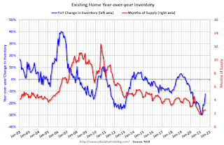 Inventory was down 12.0% year-over-year in July compared to July 2020.
Months of supply increased to 2.6 months in July from 2.5 months in June.
This was slightly above the consensus forecast. I'll have more later.
The last graph shows the year-over-year (YoY) change in reported existing home inventory and months-of-supply. Since inventory is not seasonally adjusted, it really helps to look at the YoY change. Note: Months-of-supply is based on the seasonally adjusted sales and not seasonally adjusted inventory.
 Inventory was down 12.0% year-over-year in July compared to July 2020.
 Months of supply increased to 2.6 months in July from 2.5 months in June.
This was slightly above the consensus forecast. I'll have more later.
Seven High Frequency Indicators for the Economy
by Calculated Risk on 8/23/2021 08:27:00 AM
These indicators are mostly for travel and entertainment. It will interesting to watch these sectors recover as the pandemic subsides.
The TSA is providing daily travel numbers.
This data is as of August 22nd.
 Click on graph for larger image.
This data shows the 7-day average of daily total traveler throughput from the TSA for 2019 (Light Blue), 2020 (Blue) and 2021 (Red).
The dashed line is the percent of 2019 for the seven day average.
The 7-day average is down 23.3% from the same day in 2019 (76.7% of 2019). (Dashed line)
There was a slow increase from the bottom starting in May 2020 - and then TSA data picked up in 2021 - but the dashed line was moving sideways, and has moved down recently.
The second graph shows the 7-day average of the year-over-year change in diners as tabulated by OpenTable for the US and several selected cities.
IMPORTANT: OpenTable notes: "we’ve updated the data including downloadable dataset from January 1, 2021 onward to compare seated diners from 2021 to 2019, as opposed to year over year." Thanks!
 Thanks to OpenTable for providing this restaurant data:
This data is updated through August 21, 2021.
This data is "a sample of restaurants on the OpenTable network across all channels: online reservations, phone reservations, and walk-ins. For year-over-year comparisons by day, we compare to the same day of the week from the same week in the previous year."
Note that this data is for "only the restaurants that have chosen to reopen in a given market". Since some restaurants have not reopened, the actual year-over-year decline is worse than shown.
Dining picked up during the holidays, then slumped with the huge winter surge in cases. Dining was generally picking up, but has moved down recently - especially in Florida and Texas. The 7-day average for the US is down 10% compared to 2019.
----- Movie Tickets: Box Office Mojo -----
 This data shows domestic box office for each week and the median for the years 2016 through 2019 (dashed light blue).
 Thanks to OpenTable for providing this restaurant data:
This data is updated through August 21, 2021.
This data is "a sample of restaurants on the OpenTable network across all channels: online reservations, phone reservations, and walk-ins. For year-over-year comparisons by day, we compare to the same day of the week from the same week in the previous year."
Note that this data is for "only the restaurants that have chosen to reopen in a given market". Since some restaurants have not reopened, the actual year-over-year decline is worse than shown.
Dining picked up during the holidays, then slumped with the huge winter surge in cases. Dining was generally picking up, but has moved down recently - especially in Florida and Texas. The 7-day average for the US is down 10% compared to 2019.
 This data shows domestic box office for each week and the median for the years 2016 through 2019 (dashed light blue).
 Blue is 2020 and Red is 2021.
The data is from BoxOfficeMojo through August 19th.
Note that the data is usually noisy week-to-week and depends on when blockbusters are released.
Movie ticket sales were at $107 million last week, down about 43% from the median for the week.
Note that the data is usually noisy week-to-week and depends on when blockbusters are released.
Movie ticket sales were at $107 million last week, down about 43% from the median for the week.
 This graph shows the seasonal pattern for the hotel occupancy rate using the four week average.
 The red line is for 2021, black is 2020, blue is the median, dashed purple is 2019, and dashed light blue is for 2009 (the worst year on record for hotels prior to 2020).
Occupancy is above the horrible 2009 levels. With solid leisure travel, the Summer months had decent occupancy - but it is uncertain what will happen in the Fall with business travel - especially with the sharp increase in COVID pandemic cases and hospitalizations.
This data is through August 14th. The occupancy rate is down 8.4% compared to the same week in 2019. Note: Occupancy was up year-over-year, since occupancy declined sharply at the onset of the pandemic.
Notes: Y-axis doesn't start at zero to better show the seasonal change.
 This graph, based on weekly data from the U.S. Energy Information Administration (EIA), shows gasoline supplied compared to the same week of 2019.
Blue is for 2020. Red is for 2021.
As of August 13th, gasoline supplied was down 3.0% compared to the same week in 2019.
There have been four weeks so far this year when gasoline supplied was up compared to the same week in 2019.
This graph is from Apple mobility. From Apple: "This data is generated by counting the number of requests made to Apple Maps for directions in select countries/regions, sub-regions, and cities." This is just a general guide - people that regularly commute probably don't ask for directions.
There is also some great data on mobility from the Dallas Fed Mobility and Engagement Index. However the index is set "relative to its weekday-specific average over January–February", and is not seasonally adjusted, so we can't tell if an increase in mobility is due to recovery or just the normal increase in the Spring and Summer.
 This data is through August 14th for the United States and several selected cities.
The graph is the running 7-day average to remove the impact of weekends.
IMPORTANT: All data is relative to January 13, 2020. This data is NOT Seasonally Adjusted. People walk and drive more when the weather is nice, so I'm just using the transit data.
According to the Apple data directions requests, public transit in the 7 day average for the US is at 105% of the January 2020 level.
New York City is doing well by this metric, but subway usage in NYC is down sharply (next graph).
----- New York City Subway Usage -----
Here is some interesting data on New York subway usage (HT BR).
 This graph is from Todd W Schneider. This is weekly data since 2015.
Here is some interesting data on New York subway usage (HT BR).
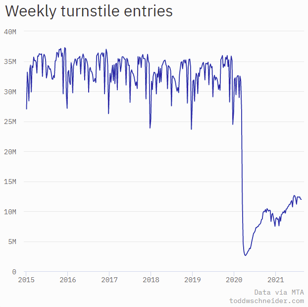 This graph is from Todd W Schneider. This is weekly data since 2015.
 Most weeks are between 30 and 35 million entries, and currently there are over 12 million subway turnstile entries per week - and generally increasing.
This data is through Friday, August 20th.
Schneider has graphs for each borough, and links to all the data sources.
He notes: "Data updates weekly from the MTA’s public turnstile data, usually on Saturday mornings".
This data is through Friday, August 20th.
Schneider has graphs for each borough, and links to all the data sources.
He notes: "Data updates weekly from the MTA’s public turnstile data, usually on Saturday mornings".
Sunday, August 22, 2021
Monday: Existing Home Sales
by Calculated Risk on 8/22/2021 07:29:00 PM
Weekend:
• Schedule for Week of August 22, 2021
Monday:
• At 8:30 AM ET, Chicago Fed National Activity Index for July. This is a composite index of other data.
• At 10:00 AM, Existing Home Sales for July from the National Association of Realtors (NAR). The consensus is for 5.81 million SAAR, down slightly from 5.86 million last month.
From CNBC: Pre-Market Data and Bloomberg futures S&P 500 are up 4 and DOW futures are up 30 (fair value).
Oil prices were down over the last week with WTI futures at $62.38 per barrel and Brent at $65.49 per barrel. A year ago, WTI was at $42, and Brent was at $44 - so WTI oil prices are UP about 50% year-over-year (oil prices collapsed at the beginning of the pandemic).
Here is a graph from Gasbuddy.com for nationwide gasoline prices. Nationally prices are at $3.14 per gallon. A year ago prices were at $2.18 per gallon, so gasoline prices are up $0.96 per gallon year-over-year.
August 22nd COVID-19: Averaging Over 1 Million Doses Administered Last 4 Days
by Calculated Risk on 8/22/2021 04:33:00 PM
Note: Cases and Deaths are not updated on Sundays.
The CDC is the source for all data.
According to the CDC, on Vaccinations.
Total doses administered: 362,657,771, as of a week ago 356,433,665. Average doses last week: 0.89 million per day.
| COVID Metrics | ||||
|---|---|---|---|---|
| Today | Yesterday | Week Ago | Goal | |
| Percent fully Vaccinated | 51.5% | 51.3% | 50.6% | ≥70.0%1 |
| Fully Vaccinated (millions) | 170.8 | 170.4 | 168.1 | ≥2321 |
| New Cases per Day3🚩 | 137,188 | 134,859 | 122,769 | ≤5,0002 |
| Hospitalized3🚩 | 79,310 | 80,298 | 69,269 | ≤3,0002 |
| Deaths per Day3🚩 | 738 | 688 | 600 | ≤502 |
| 1 Minimum to achieve "herd immunity" (estimated between 70% and 85%). 2my goals to stop daily posts, 37 day average for Cases, Currently Hospitalized, and Deaths 🚩 Increasing 7 day average week-over-week for Cases, Hospitalized, and Deaths ✅ Goal met. | ||||
IMPORTANT: For "herd immunity" most experts believe we need 70% to 85% of the total population fully vaccinated (or already had COVID).
KUDOS to the residents of the 7 states that have achieved 60% of total population fully vaccinated: Vermont at 67.4%, Massachusetts, Maine, Connecticut, Rhode Island, Maryland and New Jersey at 60.4%.
The following 17 states and D.C. have between 50% and 59.9% fully vaccinated: Washington at 59.4%, New Hampshire, New York State, New Mexico, Oregon, District of Columbia, Virginia, Colorado, Minnesota, California, Hawaii, Delaware, Pennsylvania, Wisconsin, Florida, Nebraska, Iowa, Illinois, and Michigan at 50.0%.
Next up (total population, fully vaccinated according to CDC) are South Dakota at 48.4%, Ohio at 47.8%, Kentucky at 47.6%, Kansas at 47.2%, Arizona at 47.0%, Utah at 46.7%, Alaska at 46.6%, and Nevada at 46.6%.
 Click on graph for larger image.
This graph shows the daily (columns) and 7 day average (line) of hospitalizations reported.
Note that the shaded area will be revised up.
Columbus Real Estate in July: Sales Up 3% YoY, Inventory UP 4% YoY
by Calculated Risk on 8/22/2021 03:23:00 PM
The is only the second local market that I track that saw a year-over-year increase in active inventory in July.
Note: I'm tracking data for many local markets around the U.S. I think it is especially important to watch inventory this year.
Here is a summary post for many markets: Existing Home Inventory in July: Local Markets
For for the Columbus, Ohio area:
Closed sales in July 2021 were 3,630, up 2.7% from 3,536 in July 2020.
Active Listings in July 2021 were 3,079, up 4.2% from 2,955 in July 2020.
Months of Supply was 1.0 Months in July 2021, compared to 1.1 Months in July 2020.
Inventory in July was up 27.0% from last month, and up 87.9% from the all time low in March 2021.
30 Year Mortgage Rates "Stuck in the Middle" at 2.93%
by Calculated Risk on 8/22/2021 08:58:00 AM
From Matthew Graham at Mortgage News Daily: Rates Stuck in The Middle
Rates are on hold until the next chapter is written in the complex saga of covid versus the market. This isn't to say rates perfectly flat--simply that the prevailing momentum has been sideways for the past few weeks.
Since mortgage rates only change once or twice a day, we can use 10yr Treasury yields to see finer detail. This entire week took place in the fairly narrow range of 1.29 to 1.21, and it ended with yields precisely in the middle at 1.25%.
...
What does all this mean in plain English? Rates are low--much lower than most anyone expected at this point in the year. The key reason is "delta" and Fed's patient approach to changing rate-friendly policies. The lingering concerns about the nature of the post-covid economy also make the list. [30 year fixed 2.93%]
emphasis added
 Click on graph for larger image.
This is a graph from Mortgage News Daily (MND) showing 30 year fixed rates from three sources (MND, MBA, Freddie Mac).
Go to MND and you can adjust the graph for different time periods.
30 year mortgage rates are just above the record lows in 2020.
Saturday, August 21, 2021
Indiana Real Estate in July: Sales Down 7% YoY, Inventory Down 25% YoY
by Calculated Risk on 8/21/2021 04:50:00 PM
Note: I'm tracking data for many local markets around the U.S. I think it is especially important to watch inventory this year.
Here is a summary post for many markets: Existing Home Inventory in July: Local Markets
For for the entire state Indiana:
Closed sales in July 2021 were 9,585, down 6.5% from 10,256 in July 2020.
Active Listings in July 2021 were 8,874, down 24.6% from 11,762 in July 2020.
Months of Supply was 1.1 Months in July 2021, compared to 1.6 Months in July 2020.
Inventory in July was up 14.6% from last month, and up 50.5% from the all time low in March 2021.


