by Calculated Risk on 10/25/2021 05:23:00 PM
Monday, October 25, 2021
October 25th COVID-19: Data Released On Monday is Always Low and Revised Up
| COVID Metrics | ||||
|---|---|---|---|---|
| Today | Week Ago | Goal | ||
| Percent fully Vaccinated | 57.4% | 57.0% | ≥70.0%1 | |
| Fully Vaccinated (millions) | 190.6 | 189.1 | ≥2321 | |
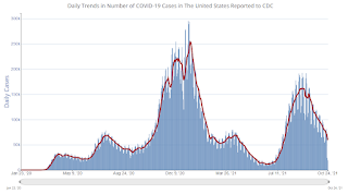
| New Cases per Day3 | 59,129 | 79,213 | ≤5,0002 | |
| Hospitalized3 | 45,801 | 53,648 | ≤3,0002 | |
| Deaths per Day3 | 1,122 | 1,214 | ≤502 | |
| 1 Minimum to achieve "herd immunity" (estimated between 70% and 85%). 2my goals to stop daily posts, 37 day average for Cases, Currently Hospitalized, and Deaths 🚩 Increasing 7 day average week-over-week for Cases, Hospitalized, and Deaths ✅ Goal met. | ||||
IMPORTANT: For "herd immunity" most experts believe we need 70% to 85% of the total population fully vaccinated (or already had COVID). Note: COVID will probably stay endemic (at least for some time).
The following 20 states have between 50% and 59.9% fully vaccinated: Minnesota at 59.5%, Hawaii, Delaware, Florida, Wisconsin, Nebraska, Iowa, Illinois, Michigan, Kentucky, South Dakota, Texas, Arizona, Kansas, Nevada, Alaska, Utah, North Carolina, Ohio and Montana at 50.0%.
Next up (total population, fully vaccinated according to CDC) are Indiana at 49.6%, Oklahoma at 49.6%, South Carolina at 49.5%, Missouri at 49.4%, Arkansas at 47.6%, and Georgia at 47.6%.
 Click on graph for larger image.
This graph shows the daily (columns) and 7 day average (line) of positive tests reported.
MBA Survey: "Share of Mortgage Loans in Forbearance Decreases to 2.21%"
by Calculated Risk on 10/25/2021 04:00:00 PM
Note: This is as of October 17th.
From the MBA: Share of Mortgage Loans in Forbearance Decreases to 2.21%
The Mortgage Bankers Association’s (MBA) latest Forbearance and Call Volume Survey revealed that the total number of loans now in forbearance decreased by 7 basis points from 2.28% of servicers’ portfolio volume in the prior week to 2.21% as of October 17, 2021. According to MBA’s estimate, 1.1 million homeowners are in forbearance plans.
The share of Fannie Mae and Freddie Mac loans in forbearance decreased 5 basis points to 1.00%. Ginnie Mae loans in forbearance decreased 5 basis points to 2.72%, and the forbearance share for portfolio loans and private-label securities (PLS) declined 13 basis points to 5.21%. The percentage of loans in forbearance for independent mortgage bank (IMB) servicers decreased 8 basis points relative to the prior week to 2.49%, and the percentage of loans in forbearance for depository servicers decreased 5 basis points to 2.11%.
“Following two weeks of rapid declines, the share of loans in forbearance dropped again, but at a reduced rate. As reported in the past, many servicers process forbearance exits at the beginning of the month, therefore it is not surprising to see the pace of exits slow again mid-month,” said Mike Fratantoni, MBA’s Senior Vice President and Chief Economist. “The composition of loans in forbearance is evolving. More than 25% of loans in forbearance are now made up of new forbearance requests and re-entries, while many other homeowners who have reached the end of 18-month terms are successfully exiting into deferrals or modifications.”
emphasis added
 Click on graph for larger image.
This graph shows the percent of portfolio in forbearance by investor type over time. The number of forbearance plans is decreasing rapidly recently since many homeowners have reached the end of the 18-month term.
The MBA notes: "By stage, 15.3% of total loans in forbearance are in the initial forbearance plan stage, while 74.8% are in a forbearance extension. The remaining 9.9% are forbearance re-entries."
Housing and Recessions
by Calculated Risk on 10/25/2021 01:34:00 PM
 Click on graph for larger image.
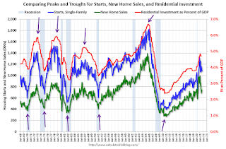
The arrows point to some of the earlier peaks and troughs for these three measures.
The purpose of this graph is to show that these three indicators generally reach peaks and troughs together. Note that Residential Investment is quarterly and single-family starts and new home sales are monthly.
New home sales and single family starts have turned down recently, but this is because of the huge surge in sales and starts in the 2nd half of 2020.
 The second graph shows the YoY change in New Home Sales from the Census Bureau.
Note: the New Home Sales data is smoothed using a three month centered average before calculating the YoY change. The Census Bureau data starts in 1963.
Some observations:
1) When the YoY change in New Home Sales falls about 20%, usually a recession will follow. An exception for this data series was the mid '60s when the Vietnam buildup kept the economy out of recession. Another exception is the current situation - due to the pandemic and the pickup in new home sales in the second half of 2020.
2) It is also interesting to look at the '86/'87 and the mid '90s periods. New Home sales fell in both of these periods, although not quite 20%. As I noted in earlier posts, the mid '80s saw a surge in defense spending and MEW that more than offset the decline in New Home sales. In the mid '90s, nonresidential investment remained strong.
Although new home sales are currently down over 20% year-over-year, this is just due to the delayed sales in 2020, and is not an indicator of an impending recession. No worries.
Housing Inventory Oct 25th Update: Inventory Down Slightly Week-over-week
by Calculated Risk on 10/25/2021 10:50:00 AM
Tracking existing home inventory will be very important this year.

This inventory graph is courtesy of Altos Research.
Seven High Frequency Indicators for the Economy
by Calculated Risk on 10/25/2021 08:26:00 AM
These indicators are mostly for travel and entertainment. It will interesting to watch these sectors recover as the pandemic subsides.
The TSA is providing daily travel numbers.
This data is as of October 24th.
 Click on graph for larger image.
This data shows the 7-day average of daily total traveler throughput from the TSA for 2019 (Light Blue), 2020 (Blue) and 2021 (Red).
The dashed line is the percent of 2019 for the seven day average.
The 7-day average is down 21.0% from the same day in 2019 (79.0% of 2019). (Dashed line)
The second graph shows the 7-day average of the year-over-year change in diners as tabulated by OpenTable for the US and several selected cities.
 Thanks to OpenTable for providing this restaurant data:
This data is updated through October 23, 2021.
This data is "a sample of restaurants on the OpenTable network across all channels: online reservations, phone reservations, and walk-ins. For year-over-year comparisons by day, we compare to the same day of the week from the same week in the previous year."
Note that this data is for "only the restaurants that have chosen to reopen in a given market". Since some restaurants have not reopened, the actual year-over-year decline is worse than shown.
Dining picked up for the Labor Day weekend, but declined after the holiday - but might be picking up a little again. The 7-day average for the US is down 7% compared to 2019.
 This data shows domestic box office for each week and the median for the years 2016 through 2019 (dashed light blue).
 Note that the data is usually noisy week-to-week and depends on when blockbusters are released.
Movie ticket sales were at $136 million last week, down about 14% from the median for the week.
 This graph shows the seasonal pattern for the hotel occupancy rate using the four week average.
 The red line is for 2021, black is 2020, blue is the median, dashed purple is 2019, and dashed light blue is for 2009 (the worst year on record for hotels prior to 2020).
This data is through October 16th. The occupancy rate was down 10.0% compared to the same week in 2019.
Notes: Y-axis doesn't start at zero to better show the seasonal change.
 This graph, based on weekly data from the U.S. Energy Information Administration (EIA), shows gasoline supplied compared to the same week of 2019.
Blue is for 2020. Red is for 2021.
As of October 15th, gasoline supplied was up slightly compared to the same week in 2019.
This was the 7th week so far this year when gasoline supplied was up compared to the same week in 2019 - and consumption is running close to 2019 levels now.
This graph is from Apple mobility. From Apple: "This data is generated by counting the number of requests made to Apple Maps for directions in select countries/regions, sub-regions, and cities." This is just a general guide - people that regularly commute probably don't ask for directions.
There is also some great data on mobility from the Dallas Fed Mobility and Engagement Index. However the index is set "relative to its weekday-specific average over January–February", and is not seasonally adjusted, so we can't tell if an increase in mobility is due to recovery or just the normal increase in the Spring and Summer.
 This data is through October 23rd for the United States and several selected cities.
The graph is the running 7-day average to remove the impact of weekends.
IMPORTANT: All data is relative to January 13, 2020. This data is NOT Seasonally Adjusted. People walk and drive more when the weather is nice, so I'm just using the transit data.
According to the Apple data directions requests, public transit in the 7 day average for the US is at 115% of the January 2020 level.
Here is some interesting data on New York subway usage (HT BR).
 This graph is from Todd W Schneider. This is weekly data since 2015.
 This data is through Friday, October 15th.
He notes: "Data updates weekly from the MTA’s public turnstile data, usually on Saturday mornings".
Sunday, October 24, 2021
Sunday Night Futures
by Calculated Risk on 10/24/2021 07:08:00 PM
Weekend:
• Schedule for Week of October 24, 2021
• Final Look: Local Housing Markets in September
Monday:
• At 8:30 AM ET, Chicago Fed National Activity Index for September. This is a composite index of other data.
• At 10:30 AM, Dallas Fed Survey of Manufacturing Activity for October.
From CNBC: Pre-Market Data and Bloomberg futures S&P 500 are down 8 and DOW futures are down 66 (fair value).
Oil prices were up over the last week with WTI futures at $83.98 per barrel and Brent at $85.62 per barrel. A year ago, WTI was at $40, and Brent was at $41 - so WTI oil prices are up more than double year-over-year.
Here is a graph from Gasbuddy.com for nationwide gasoline prices. Nationally prices are at $3.36 per gallon. A year ago prices were at $2.15 per gallon, so gasoline prices are up $1.21 per gallon year-over-year.
Final Look: Local Housing Markets in September
by Calculated Risk on 10/24/2021 09:12:00 AM
Today, in the Real Estate Newsletter: Final Look: Local Housing Markets in September
Adding Alabama, Charlotte, Columbus, Miami, New York, Phoenix and the Twin Cities
Excerpt:
Key Points:
1. Inventory is still very low, and inventory in most areas is at a record low for the month of September.
2.There is significant divergence between markets.
3. It is possible inventory will be up year-over-year during the Winter, but still at very low levels.
Saturday, October 23, 2021
Real Estate Newsletter Articles this Week
by Calculated Risk on 10/23/2021 02:11:00 PM
At the Calculated Risk Real Estate Newsletter this week:
• Will 4% Mortgage Rates "Halt the Housing Market"? Some comments on an interview with Ivy Zelman
• 4th Look at Local Housing Markets in September Adding Austin, California, Des Moines, Houston and Maryland
• Most Housing Units Under Construction Since 1974 Housing Starts Decreased to 1.555 Million Annual Rate in September
• 'Some prospective buyers took a break' Existing Home Sales forecast, and adding Boston, Indiana, Rhode Island, and Washington D.C. September Data
• Existing-Home Sales Increased to 6.29 million in September
• The Coming Deceleration in House Price Growth Still, the August Case-Shiller National Index will be up about 20% YoY
This will usually be published several times a week, and will provide more in-depth analysis of the housing market.
You can subscribe at https://calculatedrisk.substack.com/ Currently all content is available for free - and some will always be free - but please subscribe!.
Schedule for Week of October 24, 2021
by Calculated Risk on 10/23/2021 08:11:00 AM
The key reports this week are the advance estimate of Q3 GDP and September New Home sales.
Other key indicators include Personal Income and Outlays for September and Case-Shiller house prices for August.
For manufacturing, the Dallas, Richmond and Kansas City Fed manufacturing surveys will be released this week.
8:30 AM ET: Chicago Fed National Activity Index for September. This is a composite index of other data.
10:30 AM: Dallas Fed Survey of Manufacturing Activity for October.
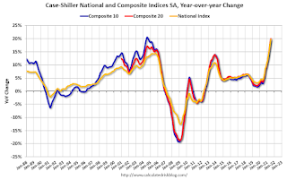
 9:00 AM ET: S&P/Case-Shiller House Price Index for August. The consensus is for the Composite 20 index to be up 20.1% year-over-year.
This graph shows the year-over-year change in the nominal seasonally adjusted National Index, Composite 10 and Composite 20 indexes through the most recent report (the Composite 20 was started in January 2000).
9:00 AM: FHFA House Price Index for August. This was originally a GSE only repeat sales, however there is also an expanded index.
 10:00 AM: New Home Sales for September from the Census Bureau.
 This graph shows New Home Sales since 1963. The dashed line is the sales rate for last month.
The consensus is for 760 thousand SAAR, up from 740 thousand in August.
10:00 AM: Richmond Fed Survey of Manufacturing Activity for October.
7:00 AM ET: The Mortgage Bankers Association (MBA) will release the results for the mortgage purchase applications index.
8:30 AM ET: Durable Goods Orders for September from the Census Bureau. The consensus is for a 1.0% decrease in durable goods orders.
8:30 AM: The initial weekly unemployment claims report will be released. The consensus is for 295 thousand initial claims, up from 290 thousand last week.
8:30 AM: Gross Domestic Product, 3rd quarter 2021 (advance estimate). The consensus is that real GDP increased 2.8% annualized in Q3, down from 6.7% in Q2.
10:00 AM: Pending Home Sales Index for September. The consensus is 0.5% increase in the index.
11:00 AM: Kansas City Fed Survey of Manufacturing Activity for October. This is the last of the regional surveys for October.
8:30 AM ET: Personal Income and Outlays for September. The consensus is for a 0.1% decrease in personal income, and for a 0.5% increase in personal spending. And for the Core PCE price index to increase 0.2%.
9:45 AM: Chicago Purchasing Managers Index for October. The consensus is for a reading of 64.0, down from 64.7 in September.
10:00 AM: University of Michigan's Consumer sentiment index (Final for October). The consensus is for a reading of 71.6.
Friday, October 22, 2021
30 Year Mortgage Rates "Highest Since April" at 3.27%
by Calculated Risk on 10/22/2021 05:21:00 PM
From Matthew Graham at Mortgage News Daily: Highest Rates Since April, But There's a Catch
Over the past 30 days, interest rates have risen sharply. This is true for both mortgage rates and bond market benchmarks like 10yr Treasury yields. ...
Translation: at the beginning of the month, traders only saw a small chance of the first rate hike happening in September and no chance for June. Fast forward 3 weeks and September is seen as 100% likely and June is up to about a 60% chance. [30 year fixed 3.27%]
emphasis added
 Click on graph for larger image.
This is a graph from Mortgage News Daily (MND) showing 30 year fixed rates from three sources (MND, MBA, Freddie Mac) since 2010.
Last 10 Posts
In Memoriam: Doris "Tanta" Dungey
Archive
Econbrowser
Pettis: China Financial Markets
NY Times Upshot
The Big Picture
| Privacy Policy |
| Copyright © 2007 - 2025 CR4RE LLC |
| Excerpts NOT allowed on x.com |


