by Calculated Risk on 12/06/2021 08:17:00 AM
Monday, December 06, 2021
Seven High Frequency Indicators for the Economy
These indicators are mostly for travel and entertainment. It is interesting to watch these sectors recover as the pandemic subsides.
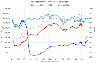
The TSA is providing daily travel numbers.
This data is as of December 5th.
 Click on graph for larger image.
This data shows the 7-day average of daily total traveler throughput from the TSA for 2019 (Light Blue), 2020 (Blue) and 2021 (Red).
The dashed line is the percent of 2019 for the seven-day average.
The 7-day average is down 15.2% from the same day in 2019 (84.8% of 2019). (Dashed line)
The second graph shows the 7-day average of the year-over-year change in diners as tabulated by OpenTable for the US and several selected cities.
 Thanks to OpenTable for providing this restaurant data:
This data is updated through December 4, 2021.
This data is "a sample of restaurants on the OpenTable network across all channels: online reservations, phone reservations, and walk-ins. For year-over-year comparisons by day, we compare to the same day of the week from the same week in the previous year."
Note that this data is for "only the restaurants that have chosen to reopen in a given market". Since some restaurants have not reopened, the actual year-over-year decline is worse than shown.
Dining picked up for the Labor Day weekend but declined after the holiday - and is mostly moving sideways. The 7-day average for the US is unchanged compared to 2019.
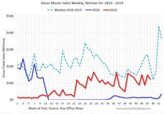 This data shows domestic box office for each week and the median for the years 2016 through 2019 (dashed light blue).
 Note that the data is usually noisy week-to-week and depends on when blockbusters are released.
Movie ticket sales were at $123 million last week, down about 36% from the median for the week.
 This graph shows the seasonal pattern for the hotel occupancy rate using the four week average.
 The red line is for 2021, black is 2020, blue is the median, dashed purple is 2019, and dashed light blue is for 2009 (the worst year on record for hotels prior to 2020).
This data is through November 27th. The occupancy rate was up 5.0% compared to the same week in 2019. This was the first week this year that was up compared to the same week in 2019.
Notes: Y-axis doesn't start at zero to better show the seasonal change.
 This graph, based on weekly data from the U.S. Energy Information Administration (EIA), shows gasoline supplied compared to the same week of 2019.
Blue is for 2020. Red is for 2021.
As of November 26th, gasoline supplied was down 2.6% compared to the same week in 2019.
There have been ten weeks this year that gasoline supplied was up compared to the same week in 2019 - so consumption is running close to 2019 levels now.
This graph is from Apple mobility. From Apple: "This data is generated by counting the number of requests made to Apple Maps for directions in select countries/regions, sub-regions, and cities." This is just a general guide - people that regularly commute probably don't ask for directions.
There is also some great data on mobility from the Dallas Fed Mobility and Engagement Index. However the index is set "relative to its weekday-specific average over January–February", and is not seasonally adjusted, so we can't tell if an increase in mobility is due to recovery or just the normal increase in the Spring and Summer.
 This data is through December 4th
 The graph is the running 7-day average to remove the impact of weekends.
IMPORTANT: All data is relative to January 13, 2020. This data is NOT Seasonally Adjusted. People walk and drive more when the weather is nice, so I'm just using the transit data.
According to the Apple data directions requests, public transit in the 7-day average for the US is at 108% of the January 2020 level.
Here is some interesting data on New York subway usage (HT BR).
 This graph is from Todd W Schneider.
 This data is through Friday, December 3rd.
He notes: "Data updates weekly from the MTA’s public turnstile data, usually on Saturday mornings".
Sunday, December 05, 2021
Sunday Night Futures
by Calculated Risk on 12/05/2021 09:01:00 PM
Weekend:
• Schedule for Week of December 5, 2021
Monday:
• No major economic releases scheduled.
From CNBC: Pre-Market Data and Bloomberg futures S&P 500 futures are up 24 and DOW futures are up 260 (fair value).
Oil prices were down over the last week with WTI futures at $66.26 per barrel and Brent at $69.88 per barrel. A year ago, WTI was at $46, and Brent was at $49 - so WTI oil prices are up 50% year-over-year.
Here is a graph from Gasbuddy.com for nationwide gasoline prices. Nationally prices are at $3.35 per gallon. A year ago prices were at $2.14 per gallon, so gasoline prices are up $1.11 per gallon year-over-year.
A few comments on the Seasonal Pattern for House Prices
by Calculated Risk on 12/05/2021 08:47:00 AM
A few key points:
1) There is a clear seasonal pattern for house prices.
2) The surge in distressed sales during the housing bust distorted the seasonal pattern.
3) Even though distressed sales are down significantly, the seasonal factor is based on several years of data - and the factor is now closer to normal (second graph below).
4) Still the seasonal index is probably a better indicator of actual price movements than the Not Seasonally Adjusted (NSA) index.
For in depth description of these issues, see Jed Kolko's article from 2014 (currently Chief Economist at Indeed) "Let’s Improve, Not Ignore, Seasonal Adjustment of Housing Data"
Note: I was one of several people to question the change in the seasonal factor (here is a post in 2009) - and this led to S&P Case-Shiller questioning the seasonal factor too (from April 2010). I still use the seasonal factor (I think it is better than using the NSA data).

This graph shows the month-to-month change in the NSA Case-Shiller National index since 1987 (through September 2021). The seasonal pattern was smaller back in the '90s and early '00s and increased once the bubble burst.
The seasonal swings declined following the bubble, however the recent price surge changed the month-over-month pattern.

The swings in the seasonal factors have decreased, and the seasonal factors has been moving back towards more normal levels.
Saturday, December 04, 2021
Real Estate Newsletter Articles this Week
by Calculated Risk on 12/04/2021 02:11:00 PM
At the Calculated Risk Real Estate Newsletter this week:
• Rents Still Increasing Sharply Rent increases slowing seasonally
• Real House Prices, Price-to-Rent Ratio and Price-to-Median Income in September And a look at "Affordability"
• Conforming Loan Limit Increases to $647,200 High-Cost Areas increase to $970,800
• Case-Shiller National Index up 19.5% Year-over-year in September Index for Conforming Loan Limit Increases 18.04% YoY
• 2022 Housing Forecasts: Second Look Optimism on New Home Sales in 2022
This is usually published several times a week, and provides more in-depth analysis of the housing market.
You can subscribe at https://calculatedrisk.substack.com/ Currently all content is available for free - and some will always be free - but please subscribe!.
Schedule for Week of December 5, 2021
by Calculated Risk on 12/04/2021 08:11:00 AM
The key economic reports this week are November CPI and the October trade deficit.
No major economic releases scheduled.
 8:30 AM: Trade Balance report for October from the Census Bureau.
 This graph shows the U.S. trade deficit, with and without petroleum, through the most recent report. The blue line is the total deficit, and the black line is the petroleum deficit, and the red line is the trade deficit ex-petroleum products.
The consensus is the trade deficit to be $67.0 billion. The U.S. trade deficit was at $80.9 billion in September.
8:00 AM: Corelogic House Price index for October.
7:00 AM ET: The Mortgage Bankers Association (MBA) will release the results for the mortgage purchase applications index.
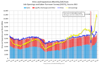 10:00 AM ET: Job Openings and Labor Turnover Survey for October from the BLS.
 This graph shows job openings (yellow line), hires (purple), Layoff, Discharges and other (red column), and Quits (light blue column) from the JOLTS.
Jobs openings decreased in September to 10.438 million from 10.629 million in August.
8:30 AM: The initial weekly unemployment claims report will be released. The consensus is for 228 thousand initial claims, up from 222 thousand last week.
12:00 PM: Q3 Flow of Funds Accounts of the United States from the Federal Reserve.
8:30 AM: The Consumer Price Index for November from the BLS. The consensus is for a 0.7% increase in CPI, and a 0.5% increase in core CPI.
10:00 AM: University of Michigan's Consumer sentiment index (Preliminary for December).
Friday, December 03, 2021
December 3rd COVID-19: Cases, Hospitalizations and Deaths Increasing
by Calculated Risk on 12/03/2021 04:00:00 PM
| COVID Metrics | ||||
|---|---|---|---|---|
| Today | Week Ago | Goal | ||
| Percent fully Vaccinated | 59.7% | --- | ≥70.0%1 | |
| Fully Vaccinated (millions) | 198.2 | --- | ≥2321 | |
| New Cases per Day3🚩 | 96,425 | 87,986 | ≤5,0002 | |
| Hospitalized3🚩 | 48,610 | 44,689 | ≤3,0002 | |
| Deaths per Day3🚩 | 975 | 893 | ≤502 | |
| 1 Minimum to achieve "herd immunity" (estimated between 70% and 85%). 2my goals to stop daily posts, 37-day average for Cases, Currently Hospitalized, and Deaths 🚩 Increasing 7-day average week-over-week for Cases, Hospitalized, and Deaths ✅ Goal met. | ||||
IMPORTANT: For "herd immunity" most experts believe we need 70% to 85% of the total population fully vaccinated (or already had COVID). Note: COVID will probably stay endemic (at least for some time).
The following 19 states have between 50% and 59.9% fully vaccinated: Wisconsin at 59.8%, Nebraska, Iowa, Utah, Michigan, Texas, Kansas, Arizona, Nevada, South Dakota, North Carolina, Alaska, Ohio, Kentucky, Montana, Oklahoma, South Carolina, Missouri and Indiana at 50.8%.
Next up (total population, fully vaccinated according to CDC) are Georgia at 49.8%, Tennessee at 49.7%, Arkansas at 49.6%, Louisiana at 49.0% and North Dakota at 49.0%.
 Click on graph for larger image.
This graph shows the daily (columns) and 7-day average (line) of positive tests reported.
Black Knight: Number of Mortgages in Forbearance "Drops Below the Million Mark"
by Calculated Risk on 12/03/2021 01:20:00 PM
This data is as of November 30th.
From Andy Walden at Black Knight: Forbearance Plan Total Drops Below the Million Mark
Daily tracking data through December 1 shows the number of active forbearance plan totals dropping below 1 million for the first time since the start of the pandemic.
According to our McDash Flash daily forbearance tracking dataset, the number of active forbearance plans fell by 23,000 (-2.3%) this week, led by a 14,000 (-3.9%) drop in FHA/VA loans. Both GSE (-7K/-2%) and PLS/portfolio (-2K/-.6%) plan volumes also improved.
As of November 30, 994,000 mortgage holders (1.9%) remain in COVID-19 related forbearance plans, including 1.1% of GSE, 2.9% of FHA/VA and 2.5% of portfolio held and privately securitized loans.
Click on graph for larger image.
Overall, the number of forbearance plans is down by 215,000 (-18%) from the same time last month, with the potential for additional improvements as we progress through December. After seeing starts jump before Thanksgiving, they fell to a pandemic low this week. This week’s low was likely due to the shorter holiday week.
emphasis added
AAR: November Rail Carloads Down Compared to 2019; Intermodal Up Slightly
by Calculated Risk on 12/03/2021 12:21:00 PM
From the Association of American Railroads (AAR) Rail Time Indicators. Graphs and excerpts reprinted with permission.
U.S. railroads originated 917,787 total carloads in November 2021, up 2.0% over November 2020 and down 3.9% from November 2019. The 2.0% gain in November was the ninth straight gain, but it was also the smallest percentage gain in those nine months.
...
U.S. railroads originated 1.03 million intermodal containers and trailers in November, down 9.6% from November 2020 and up 0.8% over November 2019. November 2021 was the fourth straight month in which intermodal volume fell, and the 9.6% decline was the biggest decline in those four months. In 2021, September, October, and November were all in the bottom half of months in terms of intermodal volume, something that has never happened before in our records that go back to 1989.
emphasis added
 Click on graph for larger image.
This graph from the Rail Time Indicators report shows the six week average of U.S. Carloads in 2019, 2020 and 2021:
U.S. railroads originated 917,787 total carloads in November 2021, up 2.0% over November 2020 and down 3.9% from November 2019. Total carloads averaged 229,447 per week in November 2021, the third lowest weekly average for total carloads so far this year. (In part because of Thanksgiving, November is usually in the bottom half of all months in terms of total carloads.)
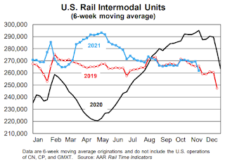 The second graph shows the six week average (not monthly) of U.S. intermodal in 2019, 2020 and 2021: (using intermodal or shipping containers):
Intermodal is not included in carload figures. In November 2021, U.S. railroads originated 1.03 million containers and trailers, down 9.6% from November 2020 and up 0.8% over November 2019. November 2021 was the fourth straight month in which year-over-year intermodal volume fell; November’s 9.6% decline is the biggest decline in those four months. Intermodal volume averaged 257,010 units per week in November; only February (253,999) was lower so this year.
Comments on November Employment Report
by Calculated Risk on 12/03/2021 09:19:00 AM
The headline jobs number in the November employment report was below expectations, however, employment for the previous two months was revised up by 82,000. The participation rate and employment-population ratio both increased, and the unemployment rate decreased to 4.2%.
Earlier: November Employment Report: 210 thousand Jobs, 4.2% Unemployment Rate
In November, the year-over-year employment change was 5.8 million jobs.
Permanent Job Losers
 Click on graph for larger image.
This graph shows permanent job losers as a percent of the pre-recession peak in employment through the report today. (ht Joe Weisenthal at Bloomberg).
In November, the number of permanent job losers decreased to 1.921 million from 2.126 million in October.
Prime (25 to 54 Years Old) Participation
 Since the overall participation rate has declined due to cyclical (recession) and demographic (aging population, younger people staying in school) reasons, here is the employment-population ratio for the key working age group: 25 to 54 years old.
The prime working age will be key as the economy recovers.
The 25 to 54 participation rate increased in November to 81.8% from 81.7% in October, and the 25 to 54 employment population ratio increased to 78.8% from 78.3% the previous month.
Seasonal Retail Hiring
Typically, retail companies start hiring for the holiday season in October, and really increase hiring in November. Here is a graph that shows the historical net retail jobs added for October, November and December by year.
 This graph really shows the collapse in retail hiring in 2008. Since then, seasonal hiring had increased back close to more normal levels. Note: I expect the long-term trend will be down with more and more internet holiday shopping.
Retailers hired 332 thousand workers Not Seasonally Adjusted (NSA) net in November.
Part Time for Economic Reasons
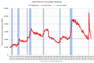 From the BLS report:
"The number of persons employed part time for economic reasons, at 4.3 million, changed little in November. These individuals, who would have preferred full-time employment, were working part time because their hours had been reduced or they were unable to find full-time jobs. This figure was about the same as in February 2020."The number of persons working part time for economic reasons decreased in November to 4.286 million from 4.423 million in November. This is back to pre-recession levels.
These workers are included in the alternate measure of labor underutilization (U-6) that decreased to 7.8% from 8.3% in the previous month. This is down from the record high in April 22.9% for this measure since 1994. This measure was at 7.0% in February 2020 (pre-pandemic).
Unemployed over 26 Weeks
 This graph shows the number of workers unemployed for 27 weeks or more.
 According to the BLS, there are 2.190 million workers who have been unemployed for more than 26 weeks and still want a job, down from 2.326 million the previous month.
This does not include all the people that left the labor force.
Summary:
The headline monthly jobs number was below expectations; however, the previous two months were revised up by 82,000 combined. And the headline unemployment rate decreased to 4.2%. The household survey indicated a large gain in employment of 1.136 million, and that led to a sharp decrease in the unemployment rate and an increase in the employment-population ratio.
November Employment Report: 210 thousand Jobs, 4.2% Unemployment Rate
by Calculated Risk on 12/03/2021 08:40:00 AM
From the BLS:
Total nonfarm payroll employment rose by 210,000 in November, and the unemployment rate fell by 0.4 percentage point to 4.2 percent, the U.S. Bureau of Labor Statistics reported today. Notable job gains occurred in professional and business services, transportation and warehousing, construction, and manufacturing. Employment in retail trade declined over the month.
...
The change in total nonfarm payroll employment for September was revised up by 67,000, from +312,000 to +379,000, and the change for October was revised up by 15,000, from +531,000 to +546,000. With these revisions, employment in September and October combined is 82,000 higher than previously reported.
emphasis added
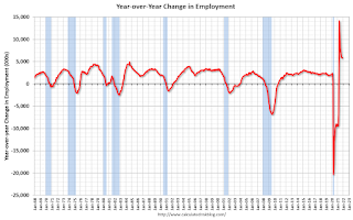 Click on graph for larger image.
The first graph shows the year-over-year change in total non-farm employment since 1968.
In November, the year-over-year change was 5.8 million jobs. This was up significantly year-over-year.
Total payrolls increased by 210 thousand in November. Private payrolls increased by 235 thousand, and public payrolls declined 25 thousand.
Payrolls for September and October were revised up 82 thousand, combined.
 The second graph shows the job losses from the start of the employment recession, in percentage terms.
The current employment recession was by far the worst recession since WWII in percentage terms. However, the current employment recession, 20 months after the onset, is now significantly better than the worst of the "Great Recession".
The third graph shows the employment population ratio and the participation rate.
 The Labor Force Participation Rate increased to 61.8% in November, from 61.6% in October. This is the percentage of the working age population in the labor force.
 The Employment-Population ratio increased to 59.2% from 58.8% (blue line).
I'll post the 25 to 54 age group employment-population ratio graph later.
 The fourth graph shows the unemployment rate.
 The unemployment rate decreased in November to 4.2% from 4.6% in October.
This was well below consensus expectations; however, August and September were revised up by 82,000 combined.


