 RSS Feed
 by Calculated Risk on 12/09/2021 08:47:00 PM
Thursday, December 09, 2021
Friday: CPI
Friday:
• At 8:30 AM ET, The Consumer Price Index for November from the BLS. The consensus is for a 0.7% increase in CPI, and a 0.5% increase in core CPI.
• At 10:00 AM: University of Michigan's Consumer sentiment index (Preliminary for December).
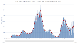
| COVID Metrics | ||||
|---|---|---|---|---|
| Today | Week Ago | Goal | ||
| Percent fully Vaccinated | 60.5% | --- | ≥70.0%1 | |
| Fully Vaccinated (millions) | 200.7 | --- | ≥2321 | |
| New Cases per Day3🚩 | 118,515 | 86,315 | ≤5,0002 | |
| Hospitalized3🚩 | 53,714 | 48,089 | ≤3,0002 | |
| Deaths per Day3🚩 | 1,092 | 854 | ≤502 | |
| 1 Minimum to achieve "herd immunity" (estimated between 70% and 85%). 2my goals to stop daily posts, 37-day average for Cases, Currently Hospitalized, and Deaths 🚩 Increasing 7-day average week-over-week for Cases, Hospitalized, and Deaths ✅ Goal met. | ||||
 Click on graph for larger image.
This graph shows the daily (columns) and 7-day average (line) of positive tests reported.
The Home ATM, aka Mortgage Equity Withdrawal (MEW)
by Calculated Risk on 12/09/2021 02:46:00 PM
Today, in the Real Estate Newsletter: The Home ATM in Q3 2021
Excerpt:
In Q3 2021, mortgage debt increased $230 billion, the largest quarterly increase since 2006.
...
For Q3 2021, the Net Equity Extraction was $147 billion, or 3.24% of Disposable Personal Income (DPI). The last two quarters have shown a sharp increase in equity extraction compared to recent years, but the level is nothing like the amount of equity extraction during the housing bubble as a percent of DPI. During the housing bubble we saw several quarters with MEW above 8% of DPI.
...
The bottom line is the recent increase in MEW is not concerning - it is far less as a percent of disposable personal income than during the bubble, and most homeowners have substantial equity.
Hotels: Occupancy Rate Down 9% Compared to Same Week in 2019
by Calculated Risk on 12/09/2021 01:13:00 PM
Note: Since occupancy declined sharply at the onset of the pandemic, CoStar is comparing to 2019.
From CoStar: STR: US Weekly Hotel Occupancy Hovers Around Mid-50%
U.S. hotel occupancy increased from the previous week, but performance comparisons with 2019 were lower, according to STR‘s latest data through December 4.The following graph shows the seasonal pattern for the hotel occupancy rate using the four week average.
November 28 through December 4, 2021 (percentage change from comparable week in 2019*):
• Occupancy: 54.8% (-8.8%)
• Average daily rate (ADR): $127.92 (-0.5%)
• Revenue per available room (RevPAR): $70.08 (-9.2%)
*Due to the steep, pandemic-driven performance declines of 2020, STR is measuring recovery against comparable time periods from 2019.
emphasis added
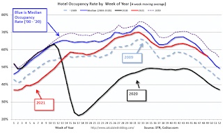 Click on graph for larger image.
The red line is for 2021, black is 2020, blue is the median, dashed purple is 2019, and dashed light blue is for 2009 (the worst year on record for hotels prior to 2020).
Although down compared to 2019, the 4-week average of the occupancy rate is close to the median rate for the previous 20 years (Blue).
Note: Y-axis doesn't start at zero to better show the seasonal change.
The occupancy rate will now decline seasonally into the new year.
Fed's Flow of Funds: Household Net Worth Increased $2.4 Trillion in Q3
by Calculated Risk on 12/09/2021 12:55:00 PM
The Federal Reserve released the Q3 2021 Flow of Funds report today: Financial Accounts of the United States.
The net worth of households and nonprofits rose to $144.7 trillion during the third quarter of 2021. The value of directly and indirectly held corporate equities decreased $0.3 trillion and the value of real estate increased $1.4 trillion.
...
Household debt increased 6.2 percent at an annual rate in the third quarter of 2021. Consumer credit grew at an annual rate of 5.3 percent, while mortgage debt (excluding charge-offs) grew at an annual rate of 7.8 percent.
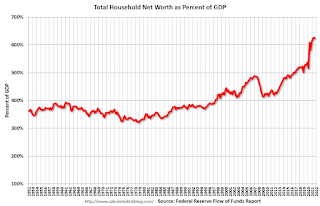 Click on graph for larger image.
The first graph shows Households and Nonprofit net worth as a percent of GDP.
With the sharp decline in GDP in Q2 2020, net worth as a percent of GDP increased sharply. This reversed somewhat in Q3 as GDP bounced back (even as net worth increased). But now net worth as a percent of GDP is just below the all-time high set in Q2.
This includes real estate and financial assets (stocks, bonds, pension reserves, deposits, etc) net of liabilities (mostly mortgages). Note that this does NOT include public debt obligations.
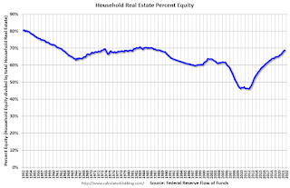 This graph shows homeowner percent equity since 1952.
Household percent equity (as measured by the Fed) collapsed when house prices fell sharply in 2007 and 2008.
In Q3 2021, household percent equity (of household real estate) was at 68.8% - up from 68.3% in Q2. This is the highest percent equity since the 1980s.
Note: about 30.3% of owner occupied households had no mortgage debt as of April 2010. So, the approximately 50+ million households with mortgages have less than 67.7% equity - and about 470 thousand homeowners still have negative equity.
 The third graph shows household real estate assets and mortgage debt as a percent of GDP. Note this graph was impacted by the sharp decline in Q2 2020 GDP.
Mortgage debt increased by $230 billion in Q3. This is the largest quarterly increase in mortgage debt since 2006.
Mortgage debt is up $800 billion from the peak during the housing bubble, but, as a percent of GDP is at 49.6% - up slightly from Q2 - and down from a peak of 73.3% of GDP during the housing bubble.
The value of real estate, as a percent of GDP, increased in Q3, and is well above the average of the last 30 years.
This graph shows homeowner percent equity since 1952. Household percent equity (as measured by the Fed) collapsed when house prices fell sharply in 2007 and 2008.
In Q3 2021, household percent equity (of household real estate) was at 68.8% - up from 68.3% in Q2. This is the highest percent equity since the 1980s.
Note: about 30.3% of owner occupied households had no mortgage debt as of April 2010. So, the approximately 50+ million households with mortgages have less than 67.7% equity - and about 470 thousand homeowners still have negative equity.
The third graph shows household real estate assets and mortgage debt as a percent of GDP. Note this graph was impacted by the sharp decline in Q2 2020 GDP.Mortgage debt increased by $230 billion in Q3. This is the largest quarterly increase in mortgage debt since 2006.
Mortgage debt is up $800 billion from the peak during the housing bubble, but, as a percent of GDP is at 49.6% - up slightly from Q2 - and down from a peak of 73.3% of GDP during the housing bubble.
The value of real estate, as a percent of GDP, increased in Q3, and is well above the average of the last 30 years.
CoreLogic: 470 thousand Homes with Negative Equity in Q3 2021
by Calculated Risk on 12/09/2021 09:55:00 AM
From CoreLogic: Homeowners Gained Over $3.2 Trillion in Equity in Q3 2021, CoreLogic Reports
CoreLogic® ... today released the Homeowner Equity Report for the third quarter of 2021. The report shows U.S. homeowners with mortgages (which account for roughly 63% of all properties) have seen their equity increase by 31.1% year over year, representing a collective equity gain of over $3.2 trillion, and an average gain of $56,700 per borrower, since the third quarter of 2020.
This summer, home price growth reached the highest level in more than 45 years, pushing equity gains to another record high and allowing 70,000 properties to regain equity in the third quarter of 2021. These equity gains provided a crucial barrier against foreclosure for the 1.2 million borrowers who reached the end of forbearance in September.
...
“Home price growth is the principal driver of home equity creation,” said Dr. Frank Nothaft, chief economist for CoreLogic. “The CoreLogic Home Price Index reported home prices were up 17.7% for the past 12 months ending September, spurring the record gains in home equity wealth.” ...
Negative equity, also referred to as underwater or upside-down mortgages, applies to borrowers who owe more on their mortgages than their homes are currently worth. As of the third quarter of 2021, negative equity share, and the quarter-over-quarter and year-over-year changes, were as follows:
• Quarterly change: From the second quarter of 2021 to the third quarter of 2021, the total number of mortgaged homes in negative equity decreased by 5.7% to 1.2 million homes, or 2.1% of all mortgaged properties.
• Annual change: In the third quarter of 2020, 1.6 million homes, or 3% of all mortgaged properties, were in negative equity. This number decreased by 28.9%, or approximately 470,000 properties, in the third quarter of 2021.
• National aggregate value: The national aggregate value of negative equity was approximately $276.2 billion at the end of the third quarter of 2021. This is up quarter over quarter by approximately $8.2 billion, or 3%, from $268 billion in the second quarter of 2021, and down year over year by approximately $8.3 billion, or 2.9%, from $284.5 billion in the third quarter of 2020.
emphasis added
 Click on graph for larger image.
This graph from CoreLogic compares Q3 to Q2 2021 equity distribution by LTV. There are still a few properties with LTV over 125%. But most homeowners have a significant amount of equity. This is a very different picture than at the start of the housing bust when many homeowners had little equity.
On a year-over-year basis, the number of homeowners with negative equity has declined from 1.6 million to 470 thousand.
Weekly Initial Unemployment Claims Decrease to 184,000
by Calculated Risk on 12/09/2021 08:34:00 AM
The DOL reported:
In the week ending December 4, the advance figure for seasonally adjusted initial claims was 184,000, a decrease of 43,000 from the previous week's revised level. This is the lowest level for initial claims since September 6, 1969 when it was 182,000. The previous week's level was revised up by 5,000 from 222,000 to 227,000. The 4-week moving average was 218,750, a decrease of 21,250 from the previous week's revised average. This is the lowest level for this average since March 7, 2020 when it was 215,250. The previous week's average was revised up by 1,250 from 238,750 to 240,000.The following graph shows the 4-week moving average of weekly claims since 1971.
emphasis added
 Click on graph for larger image.
The dashed line on the graph is the current 4-week average. The four-week average of weekly unemployment claims decreased to 218,750.
The previous week was revised up.
Regular state continued claims increased to 1,992,000 (SA) from 1,954,000 (SA) the previous week.
Weekly claims were well below the consensus forecast.
Wednesday, December 08, 2021
Thursday: Unemployment Claims, Q3 Flow of Funds
by Calculated Risk on 12/08/2021 08:58:00 PM
Thursday:
• At 8:30 AM ET,: The initial weekly unemployment claims report will be released. The consensus is for 228 thousand initial claims, up from 222 thousand last week.
• At 12:00 PM, Q3 Flow of Funds Accounts of the United States from the Federal Reserve.
| COVID Metrics | ||||
|---|---|---|---|---|
| Today | Week Ago | Goal | ||
| Percent fully Vaccinated | 60.4% | --- | ≥70.0%1 | |
| Fully Vaccinated (millions) | 200.4 | --- | ≥2321 | |
| New Cases per Day3🚩 | 117,488 | 82,848 | ≤5,0002 | |
| Hospitalized3🚩 | 52,605 | 47,372 | ≤3,0002 | |
| Deaths per Day3🚩 | 1,097 | 798 | ≤502 | |
| 1 Minimum to achieve "herd immunity" (estimated between 70% and 85%). 2my goals to stop daily posts, 37-day average for Cases, Currently Hospitalized, and Deaths 🚩 Increasing 7-day average week-over-week for Cases, Hospitalized, and Deaths ✅ Goal met. | ||||
 Click on graph for larger image.
This graph shows the daily (columns) and 7-day average (line) of positive tests reported.
Lawler: Updates on Key Drivers of US Population Growth
by Calculated Risk on 12/08/2021 03:02:00 PM
Today, in the Real Estate Newsletter: Lawler: Updates on Key Drivers of US Population Growth
Excerpt:
This is an article from housing economist Tom Lawler (this is important for understanding demographics):
Based on provisional CDC data on US births and deaths, and using a reasonable “guesstimate” on Net International Migration based on available immigration data, it appears as if the US resident population from 7/1/2020 to 7/1/2021 grew by just 486,290, or 0.15%. That growth would be the lowest in over a century.
emphasis added
NMHC: Rent Payment Tracker Shows Households Paying Rent Increased YoY in Early December
by Calculated Risk on 12/08/2021 12:31:00 PM
From the NMHC: NMHC Rent Payment Tracker Finds 77.1 Percent of Apartment Households Paid Rent as of December 6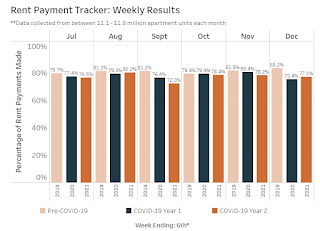 Click on graph for larger image.
This graph from the NMHC Rent Payment Tracker shows the percent of household making full or partial rent payments by the 6th of the month compared to 2019 and to the first COVID year.
The National Multifamily Housing Council (NMHC)’s Rent Payment Tracker found 77.1 percent of apartment households made a full or partial rent payment by December 6 in its survey of 11.8 million units of professionally managed apartment units across the country.
This is a 1.7 percentage point increase from the share who paid rent through December 6, 2020 and compares to 83.2 percent that had been paid by December 6, 2019. This data encompasses a wide variety of market-rate rental properties across the United States, which can vary by size, type and average rental price.
The NMHC Rent Payment Tracker metric provides insight into changes in resident rent payment behavior over the course of each month, and, as the dataset ages, between months. While the tracker is intended to serve as an indicator of resident financial challenges, it is also intended to track the recovery as well, including the effectiveness of government stimulus and subsidies.
emphasis added
Click on graph for larger image.This graph from the NMHC Rent Payment Tracker shows the percent of household making full or partial rent payments by the 6th of the month compared to 2019 and to the first COVID year.
Although payments are down from 2019, rent payments are up from last year.
This is mostly for large, professionally managed properties.
The second graph shows full month payments through November compared to the same month the prior year.
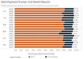
This is mostly for large, professionally managed properties.
The second graph shows full month payments through November compared to the same month the prior year.
For November, rent payments were down compared to November 2019 and 2020.
CR Note: There are some timing issues month-to-month.
BLS: Job Openings Increased to 11.0 million in October
by Calculated Risk on 12/08/2021 10:05:00 AM
From the BLS: Job Openings and Labor Turnover Summary
The number of job openings increased to 11.0 million on the last business day of October, the U.S. Bureau of Labor Statistics reported today. Hires were little changed at 6.5 million and total separations edged down to 5.9 million. Within separations, the quits rate decreased to 2.8 percent following a series high in September. The layoffs and discharges rate was unchanged at 0.9 percent.The following graph shows job openings (yellow line), hires (dark blue), Layoff, Discharges and other (red column), and Quits (light blue column) from the JOLTS.
emphasis added
This series started in December 2000.
Note: The difference between JOLTS hires and separations is similar to the CES (payroll survey) net jobs headline numbers. This report is for October, the most recent employment report was for November.
 Click on graph for larger image.
Note that hires (dark blue) and total separations (red and light blue columns stacked) are usually pretty close each month. This is a measure of labor market turnover. When the blue line is above the two stacked columns, the economy is adding net jobs - when it is below the columns, the economy is losing jobs.
The huge spike in layoffs and discharges in March 2020 are labeled, but off the chart to better show the usual data.
Jobs openings increased in October to 11.033 million from 10.602 million in September.
The number of job openings (yellow) were up 61% year-over-year.
Quits were up 24% year-over-year. These are voluntary separations. (See light blue columns at bottom of graph for trend for "quits").


