 RSS Feed
 by Calculated Risk on 12/15/2021 08:36:00 AM
Wednesday, December 15, 2021
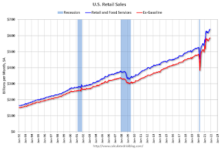
Retail Sales Increased 0.3% in November
On a monthly basis, retail sales were increased 0.3% from October to November (seasonally adjusted), and sales were up 18.2 percent from November 2020.
From the Census Bureau report:
Advance estimates of U.S. retail and food services sales for November 2021, adjusted for seasonal variation and holiday and trading-day differences, but not for price changes, were $639.8 billion, an increase of 0.3 percent from the previous month, and 18.2 percent above November 2020.
emphasis added
 Click on graph for larger image.
This graph shows retail sales since 1992. This is monthly retail sales and food service, seasonally adjusted (total and ex-gasoline).
Retail sales ex-gasoline were up 0.1% in November.
The second graph shows the year-over-year change in retail sales and food service (ex-gasoline) since 1993.
 Retail and Food service sales, ex-gasoline, increased by 15.6% on a YoY basis.
Sales in November were well below expectations, and sales in September and October were revised down, combined.
MBA: Mortgage Applications Decrease in Latest Weekly Survey
by Calculated Risk on 12/15/2021 07:00:00 AM
From the MBA: Mortgage Applications Decrease in Latest MBA Weekly Survey
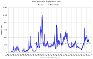
Mortgage applications decreased 4.0 percent from one week earlier, according to data from the Mortgage Bankers Association’s (MBA) Weekly Mortgage Applications Survey for the week ending December 10, 2021.
... The Refinance Index decreased 6 percent from the previous week and was 41 percent lower than the same week one year ago. The seasonally adjusted Purchase Index increased 1 percent from one week earlier. The unadjusted Purchase Index decreased 4 percent compared with the previous week and was 9 percent lower than the same week one year ago.
“Applications to refinance fell over the week, despite the 30-year fixed rate remaining at 3.30 percent. With rates more than 40 basis points higher than last year, applications were down 41 percent on an annual basis. Fewer homeowners have a strong incentive to refinance at current rates,” said Joel Kan, MBA’s Associate Vice President of Economic and Industry Forecasting. “Purchase activity increased slightly, as a 1.7 percent rise in conventional applications offset a 1.6 percent decline in applications for government loans. The strength in conventional purchase activity continues to support higher loan balances, which moved back over $400,000. Housing demand remains strong as the year comes to an end amidst tight inventory and steep home-price growth.”
...
The average contract interest rate for 30-year fixed-rate mortgages with conforming loan balances ($548,250 or less) remained unchanged at 3.30 percent, with points remaining unchanged at 0.39 (including the origination fee) for 80 percent loan-to-value ratio (LTV) loans.
emphasis added
 Click on graph for larger image.
The first graph shows the refinance index since 1990.
With relatively low rates, the index remains slightly elevated, but down sharply from last year.
The second graph shows the MBA mortgage purchase index
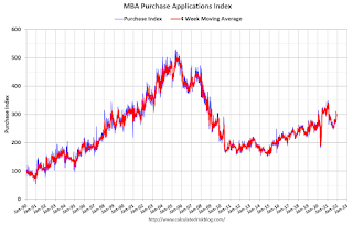 According to the MBA, purchase activity is down 9% year-over-year unadjusted.
Note: Red is a four-week average (blue is weekly).
Tuesday, December 14, 2021
Wednesday: Retail Sales, FOMC Announcement, Homebuilder Survey, NY Fed Mfg
by Calculated Risk on 12/14/2021 06:38:00 PM
Wednesday:
• At 7:00 AM ET, The Mortgage Bankers Association (MBA) will release the results for the mortgage purchase applications index.
• At 8:30 AM, Retail sales for November will be released. The consensus is for a 1.4% increase in retail sales.
• Also at 8:30 AM, The New York Fed Empire State manufacturing survey for December. The consensus is for a reading of 25.0, down from 30.9.
• At 10:00 AM, The December NAHB homebuilder survey. The consensus is for a reading of 84, up from 83. Any number above 50 indicates that more builders view sales conditions as good than poor.
• At 2:00 PM, FOMC Meeting Announcement. The FOMC is expected to announce a faster taper pace for asset purchases.
• Also at 2:00 PM, FOMC Forecasts This will include the Federal Open Market Committee (FOMC) participants' projections of the appropriate target federal funds rate along with the quarterly economic projections.
• At 2:30 PM, Fed Chair Jerome Powell holds a press briefing following the FOMC announcement.
And on COVID:
| COVID Metrics | ||||
|---|---|---|---|---|
| Today | Week Ago | Goal | ||
| Percent fully Vaccinated | 61.0% | --- | ≥70.0%1 | |
| Fully Vaccinated (millions) | 202.5 | --- | ≥2321 | |
| New Cases per Day3🚩 | 117,890 | 106,923 | ≤5,0002 | |
| Hospitalized3🚩 | 57,191 | 52,394 | ≤3,0002 | |
| Deaths per Day3🚩 | 1,147 | 1,095 | ≤502 | |
| 1 Minimum to achieve "herd immunity" (estimated between 70% and 85%). 2my goals to stop daily posts, 37-day average for Cases, Currently Hospitalized, and Deaths 🚩 Increasing 7-day average week-over-week for Cases, Hospitalized, and Deaths ✅ Goal met. | ||||
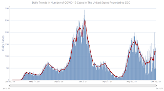
 Click on graph for larger image.
This graph shows the daily (columns) and 7-day average (line) of positive tests reported.
Employment: November Diffusion Indexes
by Calculated Risk on 12/14/2021 01:16:00 PM
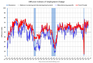
I haven't posted this in some time. The employment diffusion indexes are useful in gauging how widespread job gains are in a given month.
For manufacturing, the diffusion index was at 67.3, up from 66.7 the previous month.
Think of this as a measure of how widespread job gains or losses are across industries. The further from 50 (above or below), the more widespread the job losses or gains reported by the BLS. From the BLS:
Figures are the percent of industries with employment increasing plus one-half of the industries with unchanged employment, where 50 percent indicates an equal balance between industries with increasing and decreasing employment.
 Click on graph for larger image.
Both indexes declined sharply in March 2020, and collapsed to new record lows in April 2020 due to the impact from COVID-19. Then the indexes increased as the economy bounced back.
Both indexes were solid in November, indicating job growth was widespread across industries.
Missing Workers by Age Group
by Calculated Risk on 12/14/2021 09:12:00 AM
In November, Goldman Sachs economists put out a research note on the labor force participation rate: Why Isn’t Labor Force Participation Recovering?
Here are few excerpts from the note:
 Click on graph for larger image.
This data is comparing November 2021 to November 2019, using Not Seasonally Adjusted (NSA) data (I compared to November 2019 to minimize the seasonal impact when using NSA data).
While the unemployment rate continues to fall quickly, labor force participation has made no progress since August 2020. ... Most of the 5.0mn persons who have exited the labor force since the start of the pandemic are over age 55 (3.4mn), largely reflecting early (1.5mn) and natural (1mn) retirements that likely won’t reverse. The outlook for prime-age persons who have exited the labor force (1.7mn) is more positive, since very few are discouraged and most still view their exits as temporary.
First, there are two important monthly surveys from the BLS. The participation rate (and unemployment rate) comes from the Current Population Survey (CPS: commonly called the household survey), a monthly survey of about 60,000 households.
The jobs number comes from Current Employment Statistics (CES: payroll survey), a sample of approximately 634,000 business establishments nationwide.
These are very different surveys: the CPS gives the total number of employed (and unemployed including the alternative measures), and the CES gives the total number of positions (excluding some categories like the self-employed, and a person working two jobs counts as two positions).
Currently the payroll survey shows there are 3.9 million fewer jobs than in February 2020 (pre-pandemic).
The household survey shows there are 3.6 million fewer people employed than in February 2020.
Note: The 5 million number for the labor force, probably assumes some normal labor force growth; however, overall population growth has been dismal over the last 2 years (little immigration and large number of deaths). I'm not confident in Goldman's 5-million-person estimate.
Here is a graph of the number of missing people by age group (from the CPS household survey).
Click on graph for larger image.This data is comparing November 2021 to November 2019, using Not Seasonally Adjusted (NSA) data (I compared to November 2019 to minimize the seasonal impact when using NSA data).
Positive numbers are missing workers.
Almost all of the missing employed workers - by this method - are in the 25 to 29 and in the 45 to 59 age groups.
Note: this is over a 2-year period, and there have been some demographic shifts between cohorts.
This data would suggest most of the missing workers are prime age or took early retirement (the missing workers in their '50s).
Monday, December 13, 2021
Tuesday: PPI
by Calculated Risk on 12/13/2021 08:01:00 PM
From Matthew Graham at Mortgage News Daily: Mortgage Rates Start Lower, But Could See Some Volatility This Week
... today's effective rates were a bit lower versus Friday afternoon. Improvement mostly followed a bond rally which, in turn, followed weakness in the stock market. Low volume contributed to the size of the move, which is to say it would have been even smaller during a busier time of the year for financial markets.Tuesday:
Nonetheless, things will probably get fairly busy in the middle of the week after the Federal Reserve releases its new policy statement. The Fed is expected to announce that it will curtail its rate-friendly bond purchases at a faster pace. [30 year fixed 3.17%]
emphasis added
• At 6:00 AM ET, NFIB Small Business Optimism Index for November.
• At 8:30 AM, The Producer Price Index for November from the BLS. The consensus is for a 0.6% increase in PPI, and a 0.5% increase in core PPI.
And on COVID:
| COVID Metrics | ||||
|---|---|---|---|---|
| Today | Week Ago | Goal | ||
| Percent fully Vaccinated | 60.9% | --- | ≥70.0%1 | |
| Fully Vaccinated (millions) | 202.2 | --- | ≥2321 | |
| New Cases per Day3🚩 | 116,742 | 106,952 | ≤5,0002 | |
| Hospitalized3🚩 | 54,311 | 51,633 | ≤3,0002 | |
| Deaths per Day3 | 1,131 | 1,144 | ≤502 | |
| 1 Minimum to achieve "herd immunity" (estimated between 70% and 85%). 2my goals to stop daily posts, 37-day average for Cases, Currently Hospitalized, and Deaths 🚩 Increasing 7-day average week-over-week for Cases, Hospitalized, and Deaths ✅ Goal met. | ||||
 Click on graph for larger image.
This graph shows the daily (columns) and 7-day average (line) of positive tests reported.
3rd Look at Local Housing Markets in November
by Calculated Risk on 12/13/2021 04:28:00 PM
Today, in the Real Estate Newsletter: 3rd Look at Local Housing Markets in November
Excerpt:
Looks like we will see new record low inventories this winter
...
Here is a summary of active listings for these housing markets in November. Inventory was down 14.7% in November month-over-month (MoM) from October, and down 28.7% year-over-year (YoY).
Inventory almost always declines seasonally in November, so the MoM decline is not a surprise. Last month, these markets were down 25.4% YoY, so the YoY decline in November is larger than in October. This isn’t indicating a slowing market..
Notes for all tables:
1. New additions to table in BOLD.
2. Northwest (Seattle), North Texas (Dallas), and Santa Clara (San Jose), Jacksonville, Source: Northeast Florida Association of REALTORS®
3. Totals do not include Denver (included in state totals).
A Few Comments on Inflation
by Calculated Risk on 12/13/2021 12:19:00 PM
This is an update to a post I wrote in August.
The first graph shows the PCE price index since January 2020 (before the pandemic), and the dashed blue line is the Fed's target of 2%.
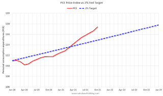 Click on graph for larger image.
The recent increase in inflation has led to some analysts to call for the Fed to raise rates. For example, from CNBC this morning: El-Erian says ‘transitory’ was the ‘worst inflation call in the history’ of the Fed
 The second graph is from January 2005 (just an arbitrary date).
This shows that inflation has been below target for years. If we were doing price targeting (we aren't), then prices would just be getting back to the target.
The graphs for core PCE inflation show the same pattern, but core PCE is even further below the trend line.
The question is not will some prices "stick", but rather will YoY inflation ease back towards the Fed's target? Or will inflation stay elevated?
My sense is inflation will ease back towards the Fed's target over the next year.
Click on graph for larger image.The recent increase in inflation has led to some analysts to call for the Fed to raise rates. For example, from CNBC this morning: El-Erian says ‘transitory’ was the ‘worst inflation call in the history’ of the Fed
“If I were them, I would do three things, which they will not do,” [El-Erian] said during a “Squawk Box” interview. “I would 1) be very open and honest as to why I got the inflation call wrong and try to regain the inflation narrative. 2) I would go even further than doubling the rate of taper, and 3) I would open it up to the possibility that rate hikes may come faster than what the market has. They’re not gonna do that."The FOMC will likely announce a faster pace of tapering assets purchases at the meeting this week, and asset purchases will probably end in March (if not sooner).
The second graph is from January 2005 (just an arbitrary date).This shows that inflation has been below target for years. If we were doing price targeting (we aren't), then prices would just be getting back to the target.
The graphs for core PCE inflation show the same pattern, but core PCE is even further below the trend line.
The question is not will some prices "stick", but rather will YoY inflation ease back towards the Fed's target? Or will inflation stay elevated?
My sense is inflation will ease back towards the Fed's target over the next year.
Housing Inventory December 13th Update: Inventory Down 3.3% Week-over-week
by Calculated Risk on 12/13/2021 10:14:00 AM
Tracking existing home inventory is very important this year and in 2022.
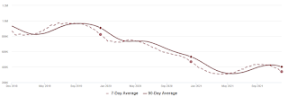
This inventory graph is courtesy of Altos Research.
As of December 10th, inventory was at 339 thousand (7-day average), compared to 469 thousand for the same week a year ago. That is a decline of 27.7%. Inventory is down 3.3% from last week.
Compared to the same week in 2019, inventory is down 58.8% from 822 thousand. A week ago, inventory was at 350 thousand, and was down 27.1% YoY.
Seasonally, inventory bottomed in April (usually inventory bottoms in January or February). Inventory last week was about 10.6% above the record low set-in early April.
Inventory peaked for the year in early September, when inventory was at 437 thousand (the peak for the year), so inventory is currently off about 22.5% from the peak for the year.
Mike Simonsen discusses this data regularly on Youtube.
Seven High Frequency Indicators for the Economy
by Calculated Risk on 12/13/2021 08:20:00 AM
These indicators are mostly for travel and entertainment. It is interesting to watch these sectors recover as the pandemic subsides.
The TSA is providing daily travel numbers.
This data is as of December 12th.
 Click on graph for larger image.
This data shows the 7-day average of daily total traveler throughput from the TSA for 2019 (Light Blue), 2020 (Blue) and 2021 (Red).
The dashed line is the percent of 2019 for the seven-day average.
The 7-day average is down 16.2% from the same day in 2019 (83.8% of 2019). (Dashed line)
Air travel had been off about 20% relative to 2019 for the last four months (with some ups and downs) - but picked up recently, especially over the Thanksgiving holiday week.
The second graph shows the 7-day average of the year-over-year change in diners as tabulated by OpenTable for the US and several selected cities.
IMPORTANT: OpenTable notes: "we’ve updated the data including downloadable dataset from January 1, 2021 onward to compare seated diners from 2021 to 2019, as opposed to year over year." Thanks!
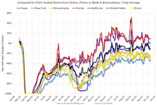 Thanks to OpenTable for providing this restaurant data:
This data is updated through December 9, 2021.
This data is "a sample of restaurants on the OpenTable network across all channels: online reservations, phone reservations, and walk-ins. For year-over-year comparisons by day, we compare to the same day of the week from the same week in the previous year."
Note that this data is for "only the restaurants that have chosen to reopen in a given market". Since some restaurants have not reopened, the actual year-over-year decline is worse than shown.
Dining picked up for the Labor Day weekend but declined after the holiday - and is mostly moving sideways. The 7-day average for the US is down 12% compared to 2019.
Thanks to OpenTable for providing this restaurant data:This data is updated through December 9, 2021.
This data is "a sample of restaurants on the OpenTable network across all channels: online reservations, phone reservations, and walk-ins. For year-over-year comparisons by day, we compare to the same day of the week from the same week in the previous year."
Note that this data is for "only the restaurants that have chosen to reopen in a given market". Since some restaurants have not reopened, the actual year-over-year decline is worse than shown.
Dining picked up for the Labor Day weekend but declined after the holiday - and is mostly moving sideways. The 7-day average for the US is down 12% compared to 2019.
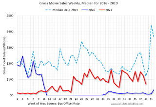 This data shows domestic box office for each week and the median for the years 2016 through 2019 (dashed light blue).
 Blue is 2020 and Red is 2021.
The data is from BoxOfficeMojo through December 2nd.
Note that the data is usually noisy week-to-week and depends on when blockbusters are released.
Movie ticket sales were at $70 million last week, down about 42% from the median for the week.
Note that the data is usually noisy week-to-week and depends on when blockbusters are released.
Movie ticket sales were at $70 million last week, down about 42% from the median for the week.
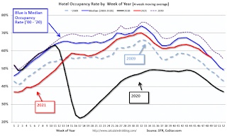 This graph shows the seasonal pattern for the hotel occupancy rate using the four week average.
 The red line is for 2021, black is 2020, blue is the median, dashed purple is 2019, and dashed light blue is for 2009 (the worst year on record for hotels prior to 2020).
This data is through December 4th. The occupancy rate was down 8.8% compared to the same week in 2019. Although down compared to 2019, the 4-week average of the occupancy rate is close to the median rate for the previous 20 years (Blue).
Notes: Y-axis doesn't start at zero to better show the seasonal change.
The occupancy rate will now decline seasonally into the new year.
 This graph, based on weekly data from the U.S. Energy Information Administration (EIA), shows gasoline supplied compared to the same week of 2019.
Blue is for 2020. Red is for 2021.
As of December 3rd, gasoline supplied was up 0.9% compared to the same week in 2019.
This was the 11th week this year that gasoline supplied was up compared to the same week in 2019 - so consumption is running close to 2019 levels now.
This graph is from Apple mobility. From Apple: "This data is generated by counting the number of requests made to Apple Maps for directions in select countries/regions, sub-regions, and cities." This is just a general guide - people that regularly commute probably don't ask for directions.
There is also some great data on mobility from the Dallas Fed Mobility and Engagement Index. However the index is set "relative to its weekday-specific average over January–February", and is not seasonally adjusted, so we can't tell if an increase in mobility is due to recovery or just the normal increase in the Spring and Summer.
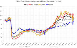 This data is through December 10th
 for the United States and several selected cities.
The graph is the running 7-day average to remove the impact of weekends.
IMPORTANT: All data is relative to January 13, 2020. This data is NOT Seasonally Adjusted. People walk and drive more when the weather is nice, so I'm just using the transit data.
According to the Apple data directions requests, public transit in the 7-day average for the US is at 111% of the January 2020 level.
New York City is doing well by this metric, but subway usage in NYC is down significantly (next graph).
----- New York City Subway Usage -----
Here is some interesting data on New York subway usage (HT BR).
 This graph is from Todd W Schneider.
Here is some interesting data on New York subway usage (HT BR).
This graph is from Todd W Schneider. This graph shows how much MTA traffic has recovered in each borough (Graph starts at first week in January 2020 and 100 = 2019 average).
Manhattan is at about 44% of normal.
This data is through Friday, December 10th.
He notes: "Data updates weekly from the MTA’s public turnstile data, usually on Saturday mornings".


