 RSS Feed
 by Calculated Risk on 12/29/2021 11:36:00 AM
Wednesday, December 29, 2021
Real House Prices, Price-to-Rent Ratio and Price-to-Median Income in October
Today, in the CalculatedRisk Real Estate Newsletter: Real House Prices, Price-to-Rent Ratio and Price-to-Median Income in October
Excerpt:
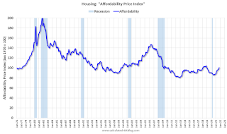
I’ve put together my own affordability index - since 1976 - that is similar to the FirstAm approach (more of a house price index adjusted by mortgage rates and the median household income).
I used median income from the Census Bureau (estimated 2021), assumed a 15% down payment, and used a 2% estimate for property taxes, insurance and maintenance. This is probably low for high property tax states like New Jersey and Texas, and too high for lower property tax states. If we were including condos, we’d also include HOA fees too (this is excluded).
For house prices, I used the Case-Shiller National Index, Seasonally Adjusted (SA). Also, for the down payment - there wasn’t a significant difference between 15% and 20%. For mortgage rates, I used the Freddie Mac PMMS (30-year fixed rates).
So here is what the index looks like (lower is more affordable like the FirstAm index)
...
In general, this would suggest houses are somewhat affordable right now (due to low mortgage rates). But this says nothing about if “now is a good time to buy” (see the bottom of my post Housing: A Look at "Affordability" Indexes).
Also, in October, the average 30-year mortgage rates were around 3.1%, and currently mortgage rates are close to 3.27% - so we already know the “Affordability Price Index” will increase over the next couple of months (meaning houses are less affordable).
emphasis added
NAR: Pending Home Sales Decreased 2.2% in November
by Calculated Risk on 12/29/2021 10:03:00 AM
From the NAR: Pending Home Sales Subside 2.2% in November
Pending home sales slipped in November, receding slightly after a previous month of gains, according to the National Association of Realtors®. Each of the four major U.S. regions witnessed contract transactions decline month-over-month. Year-over-year activity mostly retreated too, as three regions reported drops and only the Midwest saw an increase.This was well below expectations of a 0.6% increase for this index. Note: Contract signings usually lead sales by about 45 to 60 days, so this would usually be for closed sales in December and January.
The Pending Home Sales Index (PHSI), a forward-looking indicator of home sales based on contract signings, fell 2.2.% to 122.4 in November. Year-over-year, signings slid 2.7%. An index of 100 is equal to the level of contract activity in 2001.
...
Month-over-month, the Northeast PHSI declined 0.1% to 99.4 in November, an 8.5% drop from a year ago. In the Midwest, the index fell 6.3% to 116.8 last month, up 0.2% from November 2020.
Pending home sales transactions in the South ticked down 0.7% to an index of 148.2 in November, down 1.3% from November 2020. The index in the West slipped 2.2% in November to 105.5, down 4.6% from a year prior.
emphasis added
Tuesday, December 28, 2021
Wednesday: Pending Home Sales
by Calculated Risk on 12/28/2021 08:20:00 PM
Wednesday:
• At 7:00 AM ET, The Mortgage Bankers Association (MBA) will release the results for the mortgage purchase applications index.
• At 10:00 AM, Pending Home Sales Index for November. The consensus is for a 0.6% increase in the index.
And on COVID (focus on hospitalizations and deaths):
| COVID Metrics | ||||
|---|---|---|---|---|
| Today | Week Ago | Goal | ||
| Percent fully Vaccinated | 61.8% | --- | ≥70.0%1 | |
| Fully Vaccinated (millions) | 205.2 | --- | ≥2321 | |
| New Cases per Day3🚩 | 240,408 | 150,575 | ≤5,0002 | |
| Hospitalized3🚩 | 63,106 | 61,471 | ≤3,0002 | |
| Deaths per Day3 | 1,096 | 1,181 | ≤502 | |
| 1 Minimum to achieve "herd immunity" (estimated between 70% and 85%). 2my goals to stop daily posts, 37-day average for Cases, Currently Hospitalized, and Deaths 🚩 Increasing 7-day average week-over-week for Cases, Hospitalized, and Deaths ✅ Goal met. | ||||
 Click on graph for larger image.
This graph shows the daily (columns) and 7-day average (line) of positive tests reported.
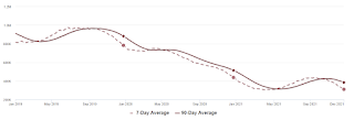
A few comments on the Seasonal Pattern for House Prices
by Calculated Risk on 12/28/2021 03:19:00 PM
A few key points:
1) There is a clear seasonal pattern for house prices.
2) The surge in distressed sales during the housing bust distorted the seasonal pattern.
3) Even though distressed sales are down significantly, the seasonal factor is based on several years of data - and the factor is now closer to normal (second graph below).
4) Still the seasonal index is probably a better indicator of actual price movements than the Not Seasonally Adjusted (NSA) index.
For in depth description of these issues, see Jed Kolko's article from 2014 (currently Chief Economist at Indeed) "Let’s Improve, Not Ignore, Seasonal Adjustment of Housing Data"
Note: I was one of several people to question the change in the seasonal factor (here is a post in 2009) - and this led to S&P Case-Shiller questioning the seasonal factor too (from April 2010). I still use the seasonal factor (I think it is better than using the NSA data).

This graph shows the month-to-month change in the NSA Case-Shiller National index since 1987 (through October 2021). The seasonal pattern was smaller back in the '90s and early '00s and increased once the bubble burst.
The seasonal swings declined following the bubble, however the recent price surge changed the month-over-month pattern.
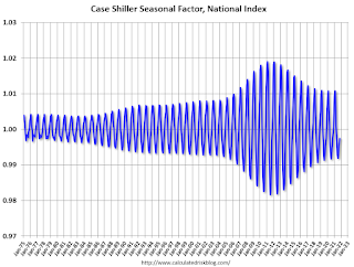
The swings in the seasonal factors have decreased, and the seasonal factors has been moving back towards more normal levels.
Note that the recent price surge hasn't distorted the seasonal factors.
Comments on Case-Shiller and FHFA House Price Increases
by Calculated Risk on 12/28/2021 10:39:00 AM
Today, in the CalculatedRisk Real Estate Newsletter: Case-Shiller National Index up 19.1% Year-over-year in October
Excerpt:
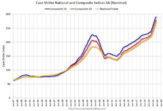
Both the Case-Shiller House Price Index (HPI) and the Federal Housing Finance Agency (FHFA) HPI for October were released today. Here is a graph of the month-over-month (MoM) change in the Case-Shiller National Index Seasonally Adjusted (SA).
The MoM increase in Case-Shiller was at 1.03%; still historically high, but lower than the previous 14 months. House prices started increasing sharply in the Case-Shiller index in August 2020, so the last 15 months have all been historically very strong, but the peak MoM growth is behind us - and the year-over-price growth is starting to decelerate.
...
We are seeing the expected deceleration in house price growth, and this trend will probably continue for at least a few more months (more on this tomorrow). My sense is the Case-Shiller National annual growth rate of 19.99% in August was probably the peak YoY growth rate, however, since the normal level of inventory is probably in the 4 to 6 months range - we’d have to see a significant increase in inventory to sharply slow price increases, and that is why I’m focused on inventory!
emphasis added

Case-Shiller: National House Price Index increased 19.1% year-over-year in October
by Calculated Risk on 12/28/2021 09:11:00 AM
S&P/Case-Shiller released the monthly Home Price Indices for October ("October" is a 3-month average of August, September and October prices).
This release includes prices for 20 individual cities, two composite indices (for 10 cities and 20 cities) and the monthly National index.
From S&P: S&P Corelogic Case-Shiller Index Reports 19.1% Annual Home Price Gain in October
The S&P CoreLogic Case-Shiller U.S. National Home Price NSA Index, covering all nine U.S. census divisions, reported a 19.1% annual gain in October, down from 19.7% in the previous month. The 10- City Composite annual increase came in at 17.1%, down from 17.9% in the previous month. The 20- City Composite posted an 18.4% year-over-year gain, down from 19.1% in the previous month.
Phoenix, Tampa, and Miami reported the highest year-over-year gains among the 20 cities in October. Phoenix led the way with a 32.3% year-over-year price increase, followed by Tampa with a 28.1% increase and Miami with a 25.7% increase. Six of the 20 cities reported higher price increases in the year ending October 2021 versus the year ending September 2021.
...
Before seasonal adjustment, the U.S. National Index posted a 0.8% month-over-month increase in October, while the 10-City and 20-City Composites both posted increases of 0.8%.
After seasonal adjustment, the U.S. National Index posted a month-over-month increase of 1.0%, and the 10-City and 20-City Composites posted increases of 0.8% and 0.9%, respectively.
In October, 18 of the 20 cities reported increases before seasonal adjustments while all 20 cities reported increases after seasonal adjustments
““In October 2021, U.S. home prices moved substantially higher, but at a decelerating rate,” says Craig J. Lazzara, Managing Director at S&P DJI. “The National Composite Index rose 19.1% from year-ago levels, and the 10- and 20-City Composites gained 17.1% and 18.4%, respectively. In all three cases, October’s gains were below September’s, and September’s gains were below August’s. That said, October’s 19.1% gain in the National Composite is the fourth-highest reading in the 34 years covered by our data. (The top three were the three months immediately preceding October.)”
emphasis added
 Click on graph for larger image.
 The first graph shows the nominal seasonally adjusted Composite 10, Composite 20 and National indices (the Composite 20 was started in January 2000).
The Composite 10 index is up 0.8% in October (SA).
The Composite 20 index is up 0.9% (SA) in October.
The National index is 48% above the bubble peak (SA), and up 1.0% (SA) in October. The National index is up 100% from the post-bubble low set in February 2012 (SA).
 The second graph shows the year-over-year change in all three indices.
The Composite 10 SA is up 17.1% year-over-year. The Composite 20 SA is up 18.4% year-over-year.
The National index SA is up 19.1% year-over-year.
Price increases were close to expectations. I'll have more later.
Monday, December 27, 2021
Tuesday: Case-Shiller and FHFA House Prices, Richmond Fed Mfg
by Calculated Risk on 12/27/2021 07:25:00 PM
From Matthew Graham at Mortgage News Daily: MBS RECAP: Bonds Sticking to Uneventful Script
Domestic traders were slightly better buyers despite another run to record highs in stocks. 10yr yields hit the 3pm close down just over 1bp (1.482). MBS were sideways at modestly stronger levels as well. [30 year fixed 3.27%]Tuesday:
emphasis added
• At 9:00 AM ET, FHFA House Price Index for October. This was originally a GSE only repeat sales, however there is also an expanded index.
• At 9:00 AM, S&P/Case-Shiller House Price Index for October. The consensus is for a 18.5% year-over-year increase in the Composite 20 index for October.
• At 10:00 AM, Richmond Fed Survey of Manufacturing Activity for December. This is the last of regional manufacturing surveys for December.
And on COVID:
| COVID Metrics | ||||
|---|---|---|---|---|
| Today | Week Ago | Goal | ||
| Percent fully Vaccinated | 60.9% | --- | ≥70.0%1 | |
| Fully Vaccinated (millions) | 202.2 | --- | ≥2321 | |
| New Cases per Day3🚩 | 206,577 | 136,450 | ≤5,0002 | |
| Hospitalized3 | 56,466 | 61,362 | ≤3,0002 | |
| Deaths per Day3 | 1,041 | 1,164 | ≤502 | |
| 1 Minimum to achieve "herd immunity" (estimated between 70% and 85%). 2my goals to stop daily posts, 37-day average for Cases, Currently Hospitalized, and Deaths 🚩 Increasing 7-day average week-over-week for Cases, Hospitalized, and Deaths ✅ Goal met. | ||||
 Click on graph for larger image.
This graph shows the daily (columns) and 7-day average (line) of positive tests reported.
Final Look at Local Housing Markets in November
by Calculated Risk on 12/27/2021 12:00:00 PM
Today, in the CalculatedRisk Real Estate Newsletter: Final Look at Local Housing Markets in November
Excerpt:
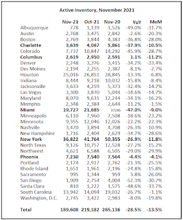
This update adds Charlotte, Columbus, Miami, New York, and Phoenix.You can subscribe at https://calculatedrisk.substack.com/ (Currently all content is available for free, but please subscribe).
...
Here is a summary of active listings for these housing markets in November. Inventory was down 13.5% in November month-over-month (MoM) from October, and down 28.5% year-over-year (YoY).
Inventory almost always declines seasonally in November, so the MoM decline is not a surprise. Last month, these markets were down 25.5% YoY, so the YoY decline in November is larger than in October. This isn’t indicating a slowing market and suggests we will see new record low inventory levels this Winter.
Housing Inventory December 27th Update: Inventory Down 4.8% Week-over-week; Near Record Low
by Calculated Risk on 12/27/2021 09:49:00 AM
Tracking existing home inventory is very important in 2022.
Inventory usually declines sharply over the holidays - so we will likely see new record lows next week.
This inventory graph is courtesy of Altos Research.
As of December 24th, inventory was at 310 thousand (7-day average), compared to 437 thousand for the same week a year ago. That is a decline of 29.0%. Inventory is down 4.8% from last week.
Compared to the same week in 2019, inventory is down 60.3% from 783 thousand. A week ago, inventory was at 326 thousand, and was down 28.2% YoY.
Seasonally, inventory bottomed in April (usually inventory bottoms in January or February). Inventory last week was about 1.3% above the record low set-in early April.
Inventory peaked for the year in early September, when inventory was at 437 thousand (the peak for the year), so inventory is currently off about 29.0% from the peak for the year.
Mike Simonsen discusses this data regularly on Youtube.
Seven High Frequency Indicators for the Economy
by Calculated Risk on 12/27/2021 08:23:00 AM
These indicators are mostly for travel and entertainment. It is interesting to watch these sectors recover as the pandemic subsides.
The TSA is providing daily travel numbers.
This data is as of December 25th.
 Click on graph for larger image.
This data shows the 7-day average of daily total traveler throughput from the TSA for 2019 (Light Blue), 2020 (Blue) and 2021 (Red).
The dashed line is the percent of 2019 for the seven-day average.
The 7-day average is down 17.1% from the same day in 2019 (82.9% of 2019). (Dashed line)
Air travel had been off about 20% relative to 2019 for the last four months (with some ups and downs) - but picked up over the Thanksgiving and Christmas holidays.
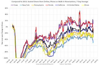
The second graph shows the 7-day average of the year-over-year change in diners as tabulated by OpenTable for the US and several selected cities.
IMPORTANT: OpenTable notes: "we’ve updated the data including downloadable dataset from January 1, 2021 onward to compare seated diners from 2021 to 2019, as opposed to year over year." Thanks!
 Thanks to OpenTable for providing this restaurant data:
This data is updated through December 25, 2021.
This data is "a sample of restaurants on the OpenTable network across all channels: online reservations, phone reservations, and walk-ins. For year-over-year comparisons by day, we compare to the same day of the week from the same week in the previous year."
Note that this data is for "only the restaurants that have chosen to reopen in a given market". Since some restaurants have not reopened, the actual year-over-year decline is worse than shown.
Dining was mostly moving sideways, but there has been a significant decline recently, probably due to the winter wave of COVID. The 7-day average for the US is down 19% compared to 2019.
Thanks to OpenTable for providing this restaurant data:This data is updated through December 25, 2021.
This data is "a sample of restaurants on the OpenTable network across all channels: online reservations, phone reservations, and walk-ins. For year-over-year comparisons by day, we compare to the same day of the week from the same week in the previous year."
Note that this data is for "only the restaurants that have chosen to reopen in a given market". Since some restaurants have not reopened, the actual year-over-year decline is worse than shown.
Dining was mostly moving sideways, but there has been a significant decline recently, probably due to the winter wave of COVID. The 7-day average for the US is down 19% compared to 2019.
 This data shows domestic box office for each week and the median for the years 2016 through 2019 (dashed light blue).
 Blue is 2020 and Red is 2021.
The data is from BoxOfficeMojo through December 23rd.
Note that the data is usually noisy week-to-week and depends on when blockbusters are released.
Movie ticket sales were at $418 million last week, down about 5% from the median for the week.
Note that the data is usually noisy week-to-week and depends on when blockbusters are released.
Movie ticket sales were at $418 million last week, down about 5% from the median for the week.
The numbers this week included the newest Spider Man.
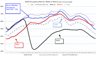 This graph shows the seasonal pattern for the hotel occupancy rate using the four-week average.
 The red line is for 2021, black is 2020, blue is the median, dashed purple is 2019, and dashed light blue is for 2009 (the worst year on record for hotels prior to 2020).
This data is through December 18th. The occupancy rate was up 8.0% compared to the same week in 2019. Although down compared to 2019, the 4-week average of the occupancy rate is now above the median rate for the previous 20 years (Blue).
Notes: Y-axis doesn't start at zero to better show the seasonal change.
The 4-week average of the occupancy rate will bottom seasonally over the next few weeks.
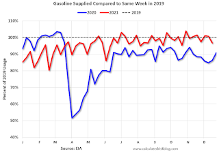 This graph, based on weekly data from the U.S. Energy Information Administration (EIA), shows gasoline supplied compared to the same week of 2019.
Blue is for 2020. Red is for 2021.
As of December 17th, gasoline supplied was down 3.4% compared to the same week in 2019.
There have been 12 weeks this year that gasoline supplied was up compared to the same week in 2019 - so consumption is running close to 2019 levels now.
This graph is from Apple mobility. From Apple: "This data is generated by counting the number of requests made to Apple Maps for directions in select countries/regions, sub-regions, and cities." This is just a general guide - people that regularly commute probably don't ask for directions.
There is also some great data on mobility from the Dallas Fed Mobility and Engagement Index. However the index is set "relative to its weekday-specific average over January–February", and is not seasonally adjusted, so we can't tell if an increase in mobility is due to recovery or just the normal increase in the Spring and Summer.
 This data is through December 25th
 for the United States and several selected cities.
The graph is the running 7-day average to remove the impact of weekends.
IMPORTANT: All data is relative to January 13, 2020. This data is NOT Seasonally Adjusted. People walk and drive more when the weather is nice, so I'm just using the transit data.
According to the Apple data directions requests, public transit in the 7-day average for the US is at 83% of the January 2020 level.
New York City is doing OK by this metric, but subway usage in NYC is down significantly (next graph).
----- New York City Subway Usage -----
Here is some interesting data on New York subway usage (HT BR).
 This graph is from Todd W Schneider.
Here is some interesting data on New York subway usage (HT BR).
This graph is from Todd W Schneider. This graph shows how much MTA traffic has recovered in each borough (Graph starts at first week in January 2020 and 100 = 2019 average).
Manhattan is at about 33% of normal (impacted by holidays too).
This data is through Friday, December 24th.
He notes: "Data updates weekly from the MTA’s public turnstile data, usually on Saturday mornings".


