 RSS Feed
 by Calculated Risk on 2/22/2022 06:33:00 PM
Tuesday, February 22, 2022
February Vehicle Sales Forecast: Decrease to 14.2 million SAAR
From WardsAuto: Volume Up But February’s U.S. Light-Vehicle SAAR Set to Decline from January (pay content)
Supply issues continue to impact vehicle sales, but it appears the supply chain disruption bottom is in.
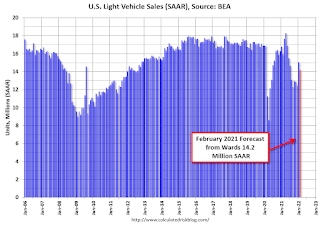
This graph shows actual sales from the BEA (Blue), and Wards forecast for January (Red).
The Wards forecast of 14.2 million SAAR, would be down about 6% from last month, and down 11% from a year ago (sales were solid in February 2021, as sales recovered from the depths of the pandemic, and weren't yet impacted by supply chain issues).
MBA Survey: "Share of Mortgage Loans in Forbearance Decreases to 1.30% in January"
by Calculated Risk on 2/22/2022 04:00:00 PM
Note: This is as of January 31st.
From the MBA: Share of Mortgage Loans in Forbearance Decreases to 1.30% in January
The Mortgage Bankers Association’s (MBA) monthly Loan Monitoring Survey revealed that the total number of loans now in forbearance decreased by 11 basis points from 1.41% of servicers’ portfolio volume in the prior month to 1.30% as of January 31, 2022. According to MBA’s estimate, 650,000 homeowners are in forbearance plans.
The share of Fannie Mae and Freddie Mac loans in forbearance decreased 4 basis points to 0.68%. Ginnie Mae loans in forbearance decreased 3 basis points to 1.60%, and the forbearance share for portfolio loans and private-label securities (PLS) declined 41 basis points to 3.02%.
“For the second straight month, the pace of forbearance exits reached another low since MBA began tracking exits in June 2020,” said Marina Walsh, CMB, MBA’s Vice President of Industry Analysis. “There was also a pick-up in new forbearance requests and re-entries for all loans, and particularly for Ginnie Mae loans. Even though the forbearance rate continued its downward trajectory, it was the smallest monthly decline since January 2021.”
Added Walsh, “The positive news is that the percentage of borrowers who were current on their mortgage payments increased from December 2021. However, there was some deterioration in the performance of borrowers with existing loan workouts. Borrowers in loan workouts may have experienced new life events unrelated to the pandemic, or alternatively, the omicron variant may have triggered or re-triggered employment, health, or other stresses.”
emphasis added
 Click on graph for larger image.
This graph shows the percent of portfolio in forbearance by investor type over time. The number of forbearance plans is decreasing.
A few comments on the Seasonal Pattern for House Prices
by Calculated Risk on 2/22/2022 01:09:00 PM
A few key points:
1) There is a clear seasonal pattern for house prices.
2) The surge in distressed sales during the housing bust distorted the seasonal pattern.
3) Even though distressed sales are down significantly, the seasonal factor is based on several years of data - and the factor is now closer to normal (second graph below).
4) Still the seasonal index is probably a better indicator of actual price movements than the Not Seasonally Adjusted (NSA) index.
For in depth description of these issues, see Jed Kolko's article from 2014 "Let’s Improve, Not Ignore, Seasonal Adjustment of Housing Data"
Note: I was one of several people to question the change in the seasonal factor (here is a post in 2009) - and this led to S&P Case-Shiller questioning the seasonal factor too (from April 2010). I still use the seasonal factor (I think it is better than using the NSA data).

This graph shows the month-to-month change in the NSA Case-Shiller National index since 1987 (through December 2021). The seasonal pattern was smaller back in the '90s and early '00s and increased once the bubble burst.
The seasonal swings declined following the bubble, however the recent price surge changed the month-over-month pattern.
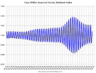
The swings in the seasonal factors have decreased, and the seasonal factors has been moving back towards more normal levels.
Note that the recent price surge hasn't distorted the seasonal factors.
Comments on Case-Shiller and FHFA House Price Increases
by Calculated Risk on 2/22/2022 10:37:00 AM
Today, in the Calculated Risk Real Estate Newsletter: Case-Shiller National Index up 18.8% Year-over-year in December
Excerpt:
This graph below shows existing home months-of-supply (inverted, from the NAR) vs. the seasonally adjusted month-to-month price change in the Case-Shiller National Index (both since January 1999 through December 2021).
Note that the months-of-supply is not seasonally adjusted.
There is a clear relationship, and this is no surprise (but interesting to graph). If months-of-supply is high, prices decline. If months-of-supply is very low (like now), prices rise quickly.
In December, the months-of-supply was at 1.7 months, and the Case-Shiller National Index (SA) increased 1.31% month-over-month. The black arrow points to the December 2021 dot. In the January existing home sales report, the NAR reported months-of-supply decreased to a record low 1.6 months in January.
My sense is the Case-Shiller National annual growth rate of 19.98% in August was probably the peak YoY growth rate, however, since the normal level of inventory is probably in the 4 to 6 months range - we’d have to see a significant increase in inventory to sharply slow price increases, and that is why I’m focused on inventory!
Note: I’ll have more on real prices, price-to-rent and affordability tomorrow.emphasis added

There is much more in the article. You can subscribe at https://calculatedrisk.substack.com/
Case-Shiller: National House Price Index increased 18.8% year-over-year in December
by Calculated Risk on 2/22/2022 09:12:00 AM
S&P/Case-Shiller released the monthly Home Price Indices for December ("December" is a 3-month average of October, November and December prices).
This release includes prices for 20 individual cities, two composite indices (for 10 cities and 20 cities) and the monthly National index.
From S&P: S&P Corelogic Case-Shiller Index Reports 18.8% Annual Home Price Gain for Calendar 2021
The S&P CoreLogic Case-Shiller U.S. National Home Price NSA Index, covering all nine U.S. census divisions, reported an 18.8% annual gain in December, remaining the same from the previous month. The 10-City Composite annual increase came in at 17.0%, up from 16.9% in the previous month. The 20-City Composite posted an 18.6% year-over-year gain, up from 18.3% in the previous month.
Phoenix, Tampa, and Miami reported the highest year-over-year gains among the 20 cities in December. Phoenix led the way with a 32.5% year-over-year price increase, followed by Tampa with a 29.4% increase and Miami with a 27.3% increase. Fifteen of the 20 cities reported higher price increases in the year ending December 2021 versus the year ending November 2021.
...
Before seasonal adjustment, the U.S. National Index posted a 0.9% month-over-month increase in December, while the 10-City and 20-City Composites posted increases of 1.0% and 1.1%, respectively.
After seasonal adjustment, the U.S. National Index posted a month-over-month increase of 1.3%, and the 10-City and 20-City Composites posted increases of 1.4% and 1.5%, respectively.
In December, all 20 cities reported increases before and after seasonal adjustments.
“We have noted that for the past several months, home prices have been rising at a very high, but decelerating rate. The deceleration paused in December, as year-over-year changes in all three composite indices were slightly ahead of their November levels. December’s 18.8% gain for the National Composite is the fifth-highest reading in history. [says Craig J. Lazzara, Managing Director at S&P DJI]. ...
“We have previously suggested that the strength in the U.S. housing market is being driven in part by a change in locational preferences as households react to the COVID pandemic. More data will be required to understand whether this demand surge simply represents an acceleration of purchases that would have occurred over the next several years rather than a more permanent secular change. In the short term, meanwhile, we should soon begin to see the impact of increasing mortgage rates on home prices.”
emphasis added
 Click on graph for larger image.
 The first graph shows the nominal seasonally adjusted Composite 10, Composite 20 and National indices (the Composite 20 was started in January 2000).
The Composite 10 index is up 1.4% in December (SA).
The Composite 20 index is up 1.5% (SA) in December.
The National index is 50% above the bubble peak (SA), and up 1.3% (SA) in December. The National index is up 105% from the post-bubble low set in February 2012 (SA).
 The second graph shows the year-over-year change in all three indices.
The Composite 10 SA is up 17.0% year-over-year. The Composite 20 SA is up 18.6% year-over-year.
The National index SA is up 18.8% year-over-year.
Price increases were above expectations. I'll have more later.
Monday, February 21, 2022
Tuesday: Case-Shiller House Prices, Richmond Fed Mfg
by Calculated Risk on 2/21/2022 08:55:00 PM
Tuesday:
• At 9:00 AM ET, FHFA House Price Index for December 2021. This was originally a GSE only repeat sales, however there is also an expanded index.
• Also at 9:00 AM, S&P/Case-Shiller House Price Index for December. The consensus is for a 18.2% year-over-year increase in the Comp 20 index for December.
• At 10:00 AM, Richmond Fed Survey of Manufacturing Activity for February.
Final Look at Local Housing Markets in January
by Calculated Risk on 2/21/2022 12:53:00 PM
Today, in the Calculated Risk Real Estate Newsletter: Final Look at Local Housing Markets in January
A brief excerpt:
This update adds Columbus, Illinois, Indiana, Miami, New York and Phoenix.There is much more in the article. You can subscribe at https://calculatedrisk.substack.com/
...
Here is a summary of active listings for these housing markets in January. Inventory was down 10.2% in January month-over-month (MoM) from December, and down 31.8% year-over-year (YoY).
Inventory almost always declines seasonally in January, so the MoM decline is not a surprise. Last month, these markets were down 29.4% YoY, so the YoY decline in January was larger than in December. This isn’t indicating a slowing market.
Notes for all tables:
1. New additions to table in BOLD.
2. Northwest (Seattle), North Texas (Dallas), and Santa Clara (San Jose), Jacksonville, Source: Northeast Florida Association of REALTORS®
3. Totals do not include Atlanta, Denver, Minneapolis (included in state totals).
Housing Inventory February 21st Update: Inventory Down Slightly Week-over-week; New Record Low
by Calculated Risk on 2/21/2022 10:07:00 AM
Tracking existing home inventory is very important in 2022.
Inventory usually declines in the winter, and this is a new record low for this series.
This inventory graph is courtesy of Altos Research.
As of February 18th, inventory was at 248 thousand (7-day average), compared to 334 thousand for the same week a year ago. That is a decline of 25.8%.
A week ago, inventory was at 250 thousand, and was down 27.5% YoY.
Inventory was down 0.7% from the previous week.
Compared to the same week in 2020, inventory is down 65.7% from 723 thousand.
Last year inventory bottomed seasonally in April 2021 - very late in the year - usually inventory bottoms by February. An early key in 2022 will be to watch if inventory bottoms earlier this year.
| Week Ending | YoY Change |
|---|---|
| 12/31/2021 | -30.0% |
| 1/7/2022 | -26.0% |
| 1/14/2022 | -28.6% |
| 1/21/2022 | -27.1% |
| 1/28/2022 | -25.9% |
| 2/4/2022 | -27.9% |
| 2/11/2022 | -27.5% |
| 2/18/2022 | -25.8% |
Mike Simonsen discusses this data regularly on Youtube.
Six High Frequency Indicators for the Economy
by Calculated Risk on 2/21/2022 08:50:00 AM
These indicators are mostly for travel and entertainment. It is interesting to watch these sectors recover as the pandemic subsides.
There was a clear negative impact from the omicron variant of COVID that is starting to ease.
----- Airlines: Transportation Security Administration -----
The TSA is providing daily travel numbers.
This data is as of February 19th.
 Click on graph for larger image.
This data shows the 7-day average of daily total traveler throughput from the TSA for 2019 (Light Blue), 2020 (Black), 2021 (Blue) and 2022 (Red).
The dashed line is the percent of 2019 for the seven-day average.
The 7-day average is down 17.0% from the same day in 2019 (83.0% of 2019). (Dashed line)
----- Restaurants: OpenTable -----
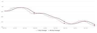
The second graph shows the 7-day average of the year-over-year change in diners as tabulated by OpenTable for the US and several selected cities.
----- Movie Tickets: Box Office Mojo -----
 This data shows domestic box office for each week and the median for the years 2016 through 2019 (dashed light blue).
----- Hotel Occupancy: STR -----
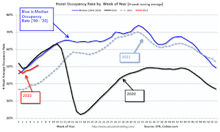 This graph shows the seasonal pattern for the hotel occupancy rate using the four-week average.
The red line is for 2022, black is 2020, blue is the median, and dashed light blue is for 2021.
This data is through February 12th. The occupancy rate was down 14.0% compared to the same week in 2019.
----- Transit: Apple Mobility -----
This graph is from Apple mobility. From Apple: "This data is generated by counting the number of requests made to Apple Maps for directions in select countries/regions, sub-regions, and cities." This is just a general guide - people that regularly commute probably don't ask for directions.
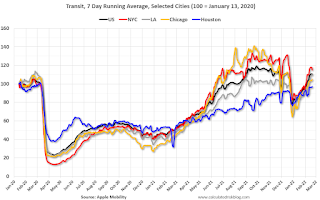 This data is through February 19th
----- New York City Subway Usage -----
Here is some interesting data on New York subway usage (HT BR).
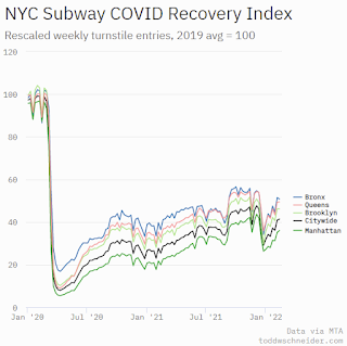 This graph is from Todd W Schneider.
This data is through Friday, February 18th.
He notes: "Data updates weekly from the MTA’s public turnstile data, usually on Saturday mornings".
The TSA is providing daily travel numbers.
This data is as of February 19th.
Click on graph for larger image.This data shows the 7-day average of daily total traveler throughput from the TSA for 2019 (Light Blue), 2020 (Black), 2021 (Blue) and 2022 (Red).
The dashed line is the percent of 2019 for the seven-day average.
The 7-day average is down 17.0% from the same day in 2019 (83.0% of 2019). (Dashed line)
Air travel declined in early 2022 (omicron / weak business travel) but appears to be picking up (both seasonally and less COVID).
The second graph shows the 7-day average of the year-over-year change in diners as tabulated by OpenTable for the US and several selected cities.
IMPORTANT: OpenTable notes that all data is compared to 2019. Thanks!
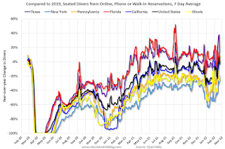 Thanks to OpenTable for providing this restaurant data:
This data is updated through February 19, 2022.
This data is "a sample of restaurants on the OpenTable network across all channels: online reservations, phone reservations, and walk-ins. For year-over-year comparisons by day, we compare to the same day of the week from the same week in the previous year."
Dining was mostly moving sideways but declined during the winter wave of COVID and is now increasing. The 7-day average for the US is down 3% compared to 2019.
Thanks to OpenTable for providing this restaurant data:This data is updated through February 19, 2022.
This data is "a sample of restaurants on the OpenTable network across all channels: online reservations, phone reservations, and walk-ins. For year-over-year comparisons by day, we compare to the same day of the week from the same week in the previous year."
Dining was mostly moving sideways but declined during the winter wave of COVID and is now increasing. The 7-day average for the US is down 3% compared to 2019.
This data shows domestic box office for each week and the median for the years 2016 through 2019 (dashed light blue). Black is 2020, Blue is 2021 and Red is 2022.
The data is from BoxOfficeMojo through February 17th.
Note that the data is usually noisy week-to-week and depends on when blockbusters are released.
Movie ticket sales were at $81 million last week, down about 57% from the median for the week.
Note that the data is usually noisy week-to-week and depends on when blockbusters are released.
Movie ticket sales were at $81 million last week, down about 57% from the median for the week.
This graph shows the seasonal pattern for the hotel occupancy rate using the four-week average. The red line is for 2022, black is 2020, blue is the median, and dashed light blue is for 2021.
This data is through February 12th. The occupancy rate was down 14.0% compared to the same week in 2019.
The 4-week average of the occupancy rate is below the median rate for the previous 20 years (Blue).
Notes: Y-axis doesn't start at zero to better show the seasonal change.
Notes: Y-axis doesn't start at zero to better show the seasonal change.
The 4-week average of the occupancy rate will increase seasonally over the next few months. The key question is: How much business travel will return?
This graph is from Apple mobility. From Apple: "This data is generated by counting the number of requests made to Apple Maps for directions in select countries/regions, sub-regions, and cities." This is just a general guide - people that regularly commute probably don't ask for directions.
This data is through February 19th for the United States and several selected cities.
The graph is the running 7-day average to remove the impact of weekends.
IMPORTANT: All data is relative to January 13, 2020. This data is NOT Seasonally Adjusted. People walk and drive more when the weather is nice, so I'm just using the transit data.
According to the Apple data directions requests, public transit in the 7-day average for the US is at 110% of the January 2020 level.
Here is some interesting data on New York subway usage (HT BR).
This graph is from Todd W Schneider. This graph shows how much MTA traffic has recovered in each borough (Graph starts at first week in January 2020 and 100 = 2019 average).
Manhattan is at about 36% of normal.
This data is through Friday, February 18th.
He notes: "Data updates weekly from the MTA’s public turnstile data, usually on Saturday mornings".
Sunday, February 20, 2022
Quarterly Starts by Purpose and Design: "Built for rent" Increasing
by Calculated Risk on 2/20/2022 10:05:00 AM
Along with the monthly housing starts for January last week, the Census Bureau released Housing Units Started by Purpose and Design through Q4 2021.
This graph shows the NSA quarterly intent for four start categories since 1975: single family built for sale, owner built (includes contractor built for owner), starts built for rent, and condos built for sale.

Single family starts built for sale (red) were down 9% in Q4 2021 compared to Q4 2020.
Owner built starts (orange) were up 11% year-over-year.
Condos built for sale increased and are still low.
The 'units built for rent' (blue) and were up 35% in Q4 2021 compared to Q4 2020.
The recent housing boom had been mostly in single family homes 'built for sale', but 'built for rent' has been picking up.


