by Calculated Risk on 4/06/2022 10:39:00 AM
Wednesday, April 06, 2022
Rents Still Increasing Sharply Year-over-year
Today, in the Calculated Risk Real Estate Newsletter: Rents Still Increasing Sharply Year-over-year
A brief excerpt:
Here is a graph of the year-over-year (YoY) change for these measures since January 2015. All of these measures are through February 2022 (Apartment List through March 2022).There is much more in the article. You can subscribe at https://calculatedrisk.substack.com/
Note that new lease measures (Zillow, Apartment List) dipped early in the pandemic, whereas the BLS measures were steady. Then new leases took off, and the BLS measures are picking up.
...
The Zillow measure is up 17.0% YoY in February, up from 16.2% YoY in January. And the ApartmentList measure is up 17.1% as of March, down from 17.7% in February. Both the Zillow measure (a repeat rent index), and ApartmentList are showing a sharp increase in rents.
Clearly rents are still increasing, and we should expect this to continue to spill over into measures of inflation in 2022. The Owners’ Equivalent Rent (OER) was up 4.3% YoY in February, from 4.1% YoY in January - and will likely increase further in the coming months.
MBA: Mortgage Applications Decrease in Latest Weekly Survey
by Calculated Risk on 4/06/2022 07:00:00 AM
From the MBA: Mortgage Applications Decrease in Latest MBA Weekly Survey
Mortgage applications decreased 6.3 percent from one week earlier, according to data from the Mortgage Bankers Association’s (MBA) Weekly Mortgage Applications Survey for the week ending April 1, 2022.
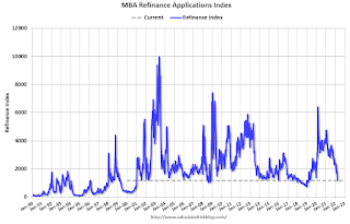
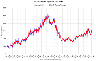
... The Refinance Index decreased 10 percent from the previous week and was 62 percent lower than the same week one year ago. The seasonally adjusted Purchase Index decreased 3 percent from one week earlier. The unadjusted Purchase Index decreased 3 percent compared with the previous week and was 9 percent lower than the same week one year ago.
“Mortgage application volume continues to decline due to rapidly rising mortgage rates, as financial markets expect significantly tighter monetary policy in the coming months. The 30-year fixed mortgage rate increased for the fourth consecutive week to 4.90 percent and is now more than 1.5 percentage points higher than a year ago. As higher rates reduce the incentive to refinance, application volume dropped to its lowest level since the spring of 2019. The refinance share of all applications dipped to 38.8 percent, down from 51 percent a year ago,” said Joel Kan, MBA’s Associate Vice President of Economic and Industry Forecasting. “The hot job market and rapid wage growth continue to support housing demand, despite the surge in rates and swift home-price appreciation. However, insufficient for-sale inventory is restraining purchase activity. Additionally, the elevated average purchase loan size, and steeper 8 percent drop in FHA purchase applications, are both indicative of first-time buyers being disproportionately impacted by supply and affordability challenges.”
...
The average contract interest rate for 30-year fixed-rate mortgages with conforming loan balances ($647,200 or less) increased to 4.90 percent from 4.80 percent, with points decreasing to 0.53 from 0.56 (including the origination fee) for 80 percent loan-to-value ratio (LTV) loans.
emphasis added
 Click on graph for larger image.
The first graph shows the refinance index since 1990.
 According to the MBA, purchase activity is down 9% year-over-year unadjusted.
Note: Red is a four-week average (blue is weekly).
Tuesday, April 05, 2022
Wednesday: Mortgage Applications, FOMC Minutes
by Calculated Risk on 4/05/2022 09:15:00 PM
From Matthew Graham at Mortgage News Daily: Mortgage Rates Jump Over 5%
The most recent bump was from Fed Chair Powell two weeks ago. It resulted in rates spiking to nearly 5%. Last week offered a bit of a lull and markets hoped that rates might finally be leveling off.Wednesday:
Now today, we have another bump from Fed Vice Chair Brainard. She's typically more rate-friendly than other Fed members, but today she offered a blunt reminder that Fed bond buying would be winding down significantly more and significantly faster than last time.
With tomorrow bringing the release of the Minutes from the most recent Fed meeting (a more detailed account of all of the voices within the Fed as opposed to the carefully worded policy statement), markets are on edge about just how troublesome that conversation may have been for the rate outlook. Is the Fed planning more "bumps" and simply pacing themselves? That's the concern pushed mortgage rates up and over 5.0% today. [30 year fixed 5.02%]
emphasis added
• At 7:00 AM ET, The Mortgage Bankers Association (MBA) will release the results for the mortgage purchase applications index.
• At 2:00 PM, FOMC Minutes, Minutes Meeting of March 15-16, 2022
On COVID (focus on hospitalizations and deaths):
| COVID Metrics | ||||
|---|---|---|---|---|
| Now | Week Ago | Goal | ||
| Percent fully Vaccinated | 65.6% | --- | ≥70.0%1 | |
| Fully Vaccinated (millions) | 217.9 | --- | ≥2321 | |
| New Cases per Day3 | 25,537 | 25,664 | ≤5,0002 | |
| Hospitalized3 | 10,645 | 13,134 | ≤3,0002 | |
| Deaths per Day3 | 537 | 681 | ≤502 | |
| 1 Minimum to achieve "herd immunity" (estimated between 70% and 85%). 2my goals to stop daily posts, 37-day average for Cases, Currently Hospitalized, and Deaths 🚩 Increasing 7-day average week-over-week for Cases, Hospitalized, and Deaths ✅ Goal met. | ||||
 Click on graph for larger image.
This graph shows the daily (columns) and 7-day average (line) of deaths reported.
Average daily deaths are the lowest since early August 2021.
Q1 2022 Update: Unofficial Problem Bank list Decreased to 54 Institutions
by Calculated Risk on 4/05/2022 03:39:00 PM
The FDIC's official problem bank list is comprised of banks with a CAMELS rating of 4 or 5, and the list is not made public (just the number of banks and assets every quarter). Note: Bank CAMELS ratings are also not made public.
CAMELS is the FDIC rating system, and stands for Capital adequacy, Asset quality, Management, Earnings, Liquidity and Sensitivity to market risk. The scale is from 1 to 5, with 1 being the strongest.
As a substitute for the CAMELS ratings, surferdude808 is using publicly announced formal enforcement actions, and also media reports and company announcements that suggest to us an enforcement action is likely, to compile a list of possible problem banks in the public interest.
DISCLAIMER: This is an unofficial list, the information is from public sources only, and while deemed to be reliable is not guaranteed. No warranty or representation, expressed or implied, is made as to the accuracy of the information contained herein and same is subject to errors and omissions. This is not intended as investment advice. Please contact CR with any errors.
Here are the quarterly changes and a few comments from surferdude808:
Update on the Unofficial Problem Bank List through March 31, 2022. Since the last update at the end of December 2021, the list decreased by three to 54 institutions after two additions and five removals. Assets increased by $4.3 billion to $60.9 billion, with the change primarily resulting from a $4.1 billion increase from updated asset figures through December 31, 2021. A year ago, the list held 65 institutions with assets of $48.6 billion. Additions during the fourth quarter Nano Banc, Irvine, CA ($1.2 billion) and Citizens State Bank, Ganado, TX ($64.5 million). Removals during the quarter because of action termination included Florida Capital Bank, National Association, Jacksonville, FL ($442 million); Southwest Capital Bank, Albuquerque, NM ($413 million); Commonwealth National Bank, Mobile, AL ($57 million); Ford County State Bank, Spearville, KS ($53 million); and State Bank, Green River, WY ($42 million).
With the conclusion of the fourth quarter, we bring an updated transition matrix to detail how banks are transitioning off the Unofficial Problem Bank List. Since we first published the Unofficial Problem Bank List on August 7, 2009 with 389 institutions, 1,783 institutions have appeared on a weekly or monthly list since then. Only 3.0 percent of the banks that have appeared on a list remain today as 1,729 institutions have transitioned through the list. Departure methods include 1,022 action terminations, 411 failures, 278 mergers, and 19 voluntary liquidations. Of the 389 institutions on the first published list, only 3 or less than 1.0 percent, still have a troubled designation more than ten years later. The 411 failures represent 23.1 percent of the 1,783 institutions that have made an appearance on the list. This failure rate is well above the 10-12 percent rate frequently cited in media reports on the failure rate of banks on the FDIC's official list.
On March 1, 2021, the FDIC released fourth quarter results and provided an update on the Official Problem Bank List. While FDIC did not make a comment within its press release on the Official Problem Bank List, they provided details in an attachment that listed 44 institutions with assets of $170 billion, which was a material increase in assets from the $51 billion of assets listed in the preceding disclosure. The last time the Official Problem Bank List had assets this high was $174 billion as of September 30, 2013. Given the decline in the number of institutions from last quarter, there is speculation as to what institution with assets of about $125 billion was added to the list during the quarter. At year-end 2021, there are six insured institutions with assets ranging from $115 billion to $130 billion. While one these could have caused the large asset jump, there could have been a large removal to mask the identity of the addition. There are stories, perhaps urban myths, of the list being manipulated during the early 1990s to obfuscate the addition of a money center bank to the list. On March 10, 2022, the American Banker published an article on the mystery of the large jump in assets.
Denver Real Estate: Active Inventory up Sharply in March
by Calculated Risk on 4/05/2022 12:46:00 PM
Today, in the Calculated Risk Real Estate Newsletter: Denver Real Estate: Active Inventory up Sharply in March
A brief excerpt:
Today, the Denver Metro Association of Realtors® (DMAR) has released their data for March, and it appears to show a sea change in active inventory.There is much more in the article. You can subscribe at https://calculatedrisk.substack.com/
From the DMAR: DMAR Real Estate Market Trends Report... Month-end active inventory went up 81.16 percent from February to March.DMAR reports total residential active inventory (detached and attached) was 2,221 at the end of March, up 81.2% from 1,226 at the end of February, and up 9.7% year-over-year from 1,921 in March 2021.
...
“Earlier in the year, buyers offered six figures above the asking price while competing with dozens of offers,” commented Andrew Abrams, Chair of the DMAR Market Trends Committee and Metro Denver Realtor®. “With the recently increased inventory, it is more common to compete with just a few offers."
...
I’ll have data on many more markets soon.
ISM® Services Index Increased to 58.3% in March
by Calculated Risk on 4/05/2022 10:03:00 AM
(Posted with permission). The ISM® Services index was at 58.3%, up from 56.5% last month. The employment index increased to 54.0%, from 48.5%. Note: Above 50 indicates expansion, below 50 in contraction.
From the Institute for Supply Management: Services PMI® at 56.5% February 2022 Services ISM® Report On Business®
Economic activity in the services sector grew in March for the 22nd month in a row — with the Services PMI® registering 58.3 percent — say the nation's purchasing and supply executives in the latest Services ISM® Report On Business®.The employment index increased to 54.0%, from 48.5% the previous month.
The report was issued today by Anthony Nieves, CPSM, C.P.M., A.P.P., CFPM, Chair of the Institute for Supply Management® (ISM®) Services Business Survey Committee: “In March, the Services PMI® registered 58.3 percent, 1.8 percentage points higher than February’s reading of 56.5 percent. The Business Activity Index registered 55.5 percent, an increase of 0.4 percentage point compared to the reading of 55.1 percent in February, and the New Orders Index figure of 60.1 percent is 4 percentage points higher than the February reading of 56.1 percent.
emphasis added
Trade Deficit Mostly Unchanged at $89.2 Billion in February
by Calculated Risk on 4/05/2022 08:40:00 AM
From the Department of Commerce reported:
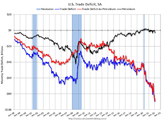
The U.S. Census Bureau and the U.S. Bureau of Economic Analysis announced today that the goods and services deficit was $89.2 billion in February, down less than $0.1 billion from $89.2 billion in January, revised.
February exports were $228.6 billion, $4.1 billion more than January exports. February imports were $317.8 billion, $4.1 billion more than January imports.
emphasis added
 Click on graph for larger image.
Exports decreased and imports increased in January.
Exports are up 20% compared to January 2021; imports are up 23% year-over-year.
Both imports and exports decreased sharply due to COVID-19, and have now bounced back (imports more than exports),
The second graph shows the U.S. trade deficit, with and without petroleum.
 The blue line is the total deficit, and the black line is the petroleum deficit, and the red line is the trade deficit ex-petroleum products.
Note that net, imports and exports of petroleum products are close to zero.
The trade deficit with China increased to $30.7 billion in February, from $24.6 billion in February 2021.
CoreLogic: House Prices up 20% YoY in February
by Calculated Risk on 4/05/2022 08:00:00 AM
Notes: This CoreLogic House Price Index report is for February. The recent Case-Shiller index release was for January. The CoreLogic HPI is a three-month weighted average and is not seasonally adjusted (NSA).
From CoreLogic: Annual Home Price Growth Again Hits New High in February, CoreLogic Reports
CoreLogic® ... today released the CoreLogic Home Price Index (HPI™) and HPI Forecast™ for February 2022.
U.S. home price growth registered a year-over-year increase of 20% in February, another series high and marking 12 months of consecutive double-digit gains. Annual price growth has been recorded every month for the past decade. While prospective buyers outnumber sellers, a record-low number of homes for sale remains the primary culprit for the rapid price gains. The CoreLogic HPI Forecast shows national year-over-year appreciation slowing to 5% by February 2023, as rising interest rates are expected to sideline even more buyers.
"New listings have not kept up with the large number of families looking to buy, leading to homes selling quickly and often above list price,” said Dr. Frank Nothaft, chief economist at CoreLogic. “This imbalance between an insufficient number of owners looking to sell relative to buyers searching for a home has led to the record appreciation of the past 12 months. Higher prices and mortgage rates erode buyer affordability and should dampen demand in coming months, leading to the moderation in price growth in our forecast.”
...
Nationally, home prices increased 20% in February 2022, compared to February 2021. On a month-over-month basis, home prices increased by 2.2% compared to January 2022.
...
Home price gains are projected to slow to 5% by February 2023.
At the state level, warmer regions of the U.S. continued to show the largest increases, with Florida showing the country’s strongest price growth at 29.1%. Arizona ranked a close second with 28.6% growth, while Nevada was third, at 25.8% annual appreciation.
emphasis added
Monday, April 04, 2022
Tuesday: Trade Deficit, CoreLogic House Prices, ISM Services
by Calculated Risk on 4/04/2022 09:11:00 PM
From Matthew Graham at Mortgage News Daily: Mortgage Rates Slightly Lower to Begin New Week
Mortgage rates are fresh off their best week since early March in terms of outright improvement. The catch is that they were at the highest levels since late 2018 immediately before that. ... As for today, we can enjoy a very modest improvement in rates and continue to wait for bigger news to cast a bigger vote on whether the next move is higher or lower. [30 year fixed 4.84%]Tuesday:
emphasis added
• At 8:00 AM ET, Corelogic House Price index for February.
• At 8:30 AM, Trade Balance report for February from the Census Bureau. The consensus is the trade deficit to be $88.7 billion. The U.S. trade deficit was at $89.7 billion in January.
• At 10:00 AM, the ISM Services Index for March.
On COVID (focus on hospitalizations and deaths):
| COVID Metrics | ||||
|---|---|---|---|---|
| Now | Week Ago | Goal | ||
| Percent fully Vaccinated | 65.6% | --- | ≥70.0%1 | |
| Fully Vaccinated (millions) | 217.9 | --- | ≥2321 | |
| New Cases per Day3 | 25,074 | 26,185 | ≤5,0002 | |
| Hospitalized3 | 10,348 | 13,574 | ≤3,0002 | |
| Deaths per Day3 | 572 | 680 | ≤502 | |
| 1 Minimum to achieve "herd immunity" (estimated between 70% and 85%). 2my goals to stop daily posts, 37-day average for Cases, Currently Hospitalized, and Deaths 🚩 Increasing 7-day average week-over-week for Cases, Hospitalized, and Deaths ✅ Goal met. | ||||
 Click on graph for larger image.
This graph shows the daily (columns) and 7-day average (line) of deaths reported.
Average daily deaths are the lowest since early August 2021.
Lawler: What is the Yield Curve Signaling?
by Calculated Risk on 4/04/2022 06:04:00 PM
From housing economist Tom Lawler: What is the Yield Curve Signaling?
Before addressing the above question, here is a little quiz:
The current Treasury yield is by historical standards:
(a) Unusually steep
(b) A bit flatter than normal
(c) Very unusually inverted
(d) All of the above
The current answer is, of course, (d), as the current Treasury yield curve is historically very steep from 3-months to 2-years, a bit flatter than normal from 2- to 3-years, and inverted from 3- to 10-years. (And spreads between the 3-year Treasury and the Fed funds rate is at its widest level since 1994).
Below is a chart comparing average yields curves during the previous three decades compared to today’s (mid-afternoon) yield curve.
 Such “humped” yield curves as the current curve are unusual, and the degree of “humpiest” in the current curve is virtually unprecedented.
Many analysts, economists, and financial news reporters have expressed significant “angst” recently because the spread between the 10-year Treasury yield and the 2-year Treasury yields has turned slightly negative, and such “inversions” have been leading indicators of recessions (though lag times vary considerably.)
However, there is nothing “magical” about the “10/2” spread: other yield curve measures have been comparable or some have argued even better indicators of recessions/growth slowdowns. For example, in a March “reprise” of their 2018 paper, Fed economists Engstrom and Sharpe (https://www.federalreserve.gov/econres/notes/feds-notes/dont-fear-the-yield-curve-reprise-20220325.htm) argue that a much shorter term yield curve measure (the implied forward 3-month Treasury rate 6 months out compared to the current 3-month Treasury rate) is a better forward indicator than the 10/2 spread.
While I’m not a fan of their particular “curve” indicator because (1) it requires quotes on 21 month and 18 month Treasuries, which are not readily available on screens or historically, and (2) the short part of the Treasury curve has at times been much steeper than private money market yield curves for reasons other than “expectations” (see Rowe, Lawler, and Cook https://citeseerx.ist.psu.edu/viewdoc/download?doi=10.1.1.1009.2682&rep=rep1&type=pdf , 1986), there are other yield curve measures that have had the same or better “indicator” value as the 10/2 spread but which today are sending much different signals than the 10/2 spread.
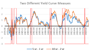
 E.g., [here] is a chart comparing the historical behavior of the spread between the 10-year and the 2-year Treasury with the spread between the 5-year and the 1-year Treasury. (Recessions are shown poorly in the chart.)
 As the chart shows, both of these yield curves meaasures have normally moved together, and both have typically inverted at about the same time – until recently. While the 10/2 spread went from an average of 79 bp in December of last year to negative 4 bp today, the 5/1 spread today is about 85 bp, down only slightly from the 93 bp average last December. And the spread between the 5-year Treasury and the Fed funds rate (not show here) has WIDENED to about 223 bp today from an 87 bp average last December.
 [Here] is another yield curve chart comparing spreads between 3-year Treasuries and Fed Funds as well as 3-year Treasuries and 6-month Treasuries from 1990 through today. This chart highlights have these yield curve measures have widened substantially this year. (The chart only goes back to 1990).
While the current “inversion” of the Treasury yield curve from 3-year to 10 years may reflect “the market’s” view that there may be a slowdown in the economy 3+year out in part because of substanial increases in the Fed’s target Fed funds rate over the next several years (though so far the Fed has only increased the funds rate by 25 bp current steepness of the the curve from the very short end to 3 years suggest that the yield curve is not giving any signals of a slowdown in economic growth over the next several years.


