 RSS Feed
 by Calculated Risk on 2/13/2024 02:33:00 PM
Tuesday, February 13, 2024
Cleveland Fed: Median CPI increased 0.5% and Trimmed-mean CPI increased 0.5% in January
The Cleveland Fed released the median CPI and the trimmed-mean CPI.
According to the Federal Reserve Bank of Cleveland, the median Consumer Price Index rose 0.5% in January. The 16% trimmed-mean Consumer Price Index increased 0.5%. "The median CPI and 16% trimmed-mean CPI are measures of core inflation calculated by the Federal Reserve Bank of Cleveland based on data released in the Bureau of Labor Statistics’ (BLS) monthly CPI report".
 Click on graph for larger image.
This graph shows the year-over-year change for these four key measures of inflation.
Note: The Cleveland Fed released the median CPI details. "Used cars and trucks" and "motor fuel" decreased at a 33% annual rate in January.
According to the Federal Reserve Bank of Cleveland, the median Consumer Price Index rose 0.5% in January. The 16% trimmed-mean Consumer Price Index increased 0.5%. "The median CPI and 16% trimmed-mean CPI are measures of core inflation calculated by the Federal Reserve Bank of Cleveland based on data released in the Bureau of Labor Statistics’ (BLS) monthly CPI report".
 Click on graph for larger image.
This graph shows the year-over-year change for these four key measures of inflation.
On a year-over-year basis, the median CPI rose 4.9% (unchanged from 4.9% in December), the trimmed-mean CPI rose 3.7% (down from 3.8%), and the CPI less food and energy rose 3.9% (unchanged from 3.9%).
Core PCE is for December was up 2.9% YoY, down from 3.2% in November.
Note: The Cleveland Fed released the median CPI details. "Used cars and trucks" and "motor fuel" decreased at a 33% annual rate in January.
Rent and Owner's equivalent rent are still very high, and if we exclude rent, median CPI would be much lower,
2nd Look at Local Housing Markets in January
by Calculated Risk on 2/13/2024 11:22:00 AM
Today, in the Calculated Risk Real Estate Newsletter: 2nd Look at Local Housing Markets in January
A brief excerpt:
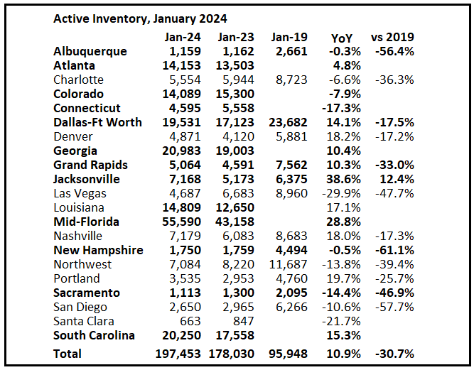
NOTE: The tables for active listings, new listings and closed sales all include a comparison to January 2019 for each local market (some 2019 data is not available).There is much more in the article.
This is the second look at several local markets in January. I’m tracking about 40 local housing markets in the US. Some of the 40 markets are states, and some are metropolitan areas. I’ll update these tables throughout the month as additional data is released.
Closed sales in January were mostly for contracts signed in November and December when 30-year mortgage rates averaged 7.44% and 6.82%, respectively.
...
Here is a summary of active listings for these housing markets in January.
Inventory for these markets were up 5.5% year-over-year in December and are now up 10.9% year-over-year. A key will be if inventory builds over the next few months.
Special Note: Florida is overweighted in this early sample, and that has distorted the overall picture (since inventory is surging in Florida).
Inventory is down sharply in all of these areas compared to 2019.
...
Many more local markets to come!
YoY Measures of Inflation: Services, Goods and Shelter
by Calculated Risk on 2/13/2024 09:00:00 AM
Here are a few measures of inflation:
The first graph is the one Fed Chair Powell had mentioned when services less rent of shelter was up around 8% year-over-year. This declined and is now up 3.6% YoY.
 Click on graph for larger image.
This graph shows the YoY price change for Services and Services less rent of shelter through January 2024.
Services were up 5.0% YoY as of January 2024, unchanged from 5.0% YoY in December.
Services less rent of shelter was up 3.6% YoY in January, up from 3.4% YoY in December.
Services less rent of shelter was up 3.6% YoY in January, up from 3.4% YoY in December.
 The second graph shows that goods prices started to increase year-over-year (YoY) in 2020 and accelerated in 2021 due to both strong demand and supply chain disruptions.
Durables were at -1.6% YoY as of January 2024, down from -1.2% YoY in December.
Commodities less food and energy commodities were down 0.3% YoY in January, down from up 0.1% YoY in December.
Commodities less food and energy commodities were down 0.3% YoY in January, down from up 0.1% YoY in December.
 Here is a graph of the year-over-year change in shelter from the CPI report (through January) and housing from the PCE report (through December 2023)
Shelter was up 6.1% year-over-year in January, down from 6.2% in December. Housing (PCE) was up 6.4% YoY in December, down from 6.7% in November.
This is still catching up with private data. The BLS noted this morning: "The index for shelter continued to rise in January, increasing 0.6 percent and contributing over two thirds of the monthly all items increase."
Core CPI ex-shelter was up 2.2% YoY in January, unchanged from 2.2% in December.
BLS: CPI Increased 0.3% in January; Core CPI increased 0.4%
by Calculated Risk on 2/13/2024 08:30:00 AM
The Consumer Price Index for All Urban Consumers (CPI-U) increased 0.3 percent in January on a seasonally adjusted basis, after rising 0.2 percent in December, the U.S. Bureau of Labor Statistics reported today. Over the last 12 months, the all items index increased 3.1 percent before seasonal adjustment.The change in both CPI and core CPI were above expectations. I'll post a graph later today after the Cleveland Fed releases the median and trimmed-mean CPI.
The index for shelter continued to rise in January, increasing 0.6 percent and contributing over two thirds of the monthly all items increase. The food index increased 0.4 percent in January, as the food at home index increased 0.4 percent and the food away from home index rose 0.5 percent over the month. In contrast, the energy index fell 0.9 percent over the month due in large part to the decline in the gasoline index.
The index for all items less food and energy rose 0.4 percent in January. Indexes which increased in January include shelter, motor vehicle insurance, and medical care. The index for used cars and trucks and the index for apparel were among those that decreased over the month.
The all items index rose 3.1 percent for the 12 months ending January, a smaller increase than the 3.4-percent increase for the 12 months ending December. The all items less food and energy index rose 3.9 percent over the last 12 months, the same increase as for the 12 months ending December. The energy index decreased 4.6 percent for the 12 months ending January, while the food index increased 2.6 percent over the last year.
emphasis added
Monday, February 12, 2024
Tuesday: CPI
by Calculated Risk on 2/12/2024 07:39:00 PM
 From Matthew Graham at Mortgage News Daily: Mortgage Rates Steady to Slightly Lower Ahead of Big Inflation Report
After spiking to the highest levels in over a month last Monday, rates have held eerily steady. To be fair, the steadiness started the following day after a moderate recovery that took the average conventional 30yr fixed rate from just over 7% to just below.Tuesday:
...
If any event on the calendar has the power to change this calm, sideways slide, it's Tuesday morning's Consumer Price Index (CPI). [30 year fixed 6.96%]
emphasis added
• At 6:00 AM ET, NFIB Small Business Optimism Index for January.
• At 8:30 AM, The Consumer Price Index for January from the BLS. The consensus is for 0.2% increase in CPI, and a 0.3% increase in core CPI. The consensus is for CPI to be up 3.0% year-over-year and core CPI to be up 3.8% YoY.
Trends in Educational Attainment in the U.S. Labor Force
by Calculated Risk on 2/12/2024 02:19:00 PM
The first graph shows the unemployment rate by four levels of education (all groups are 25 years and older) through January 2024. Note: This is an update to a post from a few years ago.
Unfortunately, this data only goes back to 1992 and includes only three recessions (the stock / tech bust in 2001, and the housing bust/financial crisis, and the 2020 pandemic). Clearly education matters with regards to the unemployment rate, with the lowest rate for college graduates at 2.1% in January, and highest for those without a high school degree at 6.0% in January.
All four groups were generally trending down prior to the pandemic. And all are close to pre-pandemic levels now (less than high school is a little higher than pre-pandemic).
 Click on graph for larger image.
Note: This says nothing about the quality of jobs - as an example, a college graduate working at minimum wage would be considered "employed".
This brings up an interesting question: What is the composition of the labor force by educational attainment, and how has that been changing over time?
Here is some data on the U.S. labor force by educational attainment since 1992.
 Currently, over 64 million people in the U.S. labor force have a bachelor's degree or higher. This is over 44% of the labor force, up from 26.2% in 1992.
This is the only category trending up. "Some college", "high school" and "less than high school" have been trending down.
Based on current trends, probably half the labor force will have at least a bachelor's degree sometime next decade (2030s).
Some thoughts: Since workers with bachelor's degrees typically have a lower unemployment rate, rising educational attainment is probably a factor in pushing down the overall unemployment rate over time.
Also, I'd guess more education would mean less labor turnover, and that education is a factor in lower weekly claims.
A more educated labor force is a positive for the future.
Part 1: Current State of the Housing Market; Overview for mid-February 2024
by Calculated Risk on 2/12/2024 11:10:00 AM
Today, in the Calculated Risk Real Estate Newsletter: Part 1: Current State of the Housing Market; Overview for mid-February 2024
A brief excerpt:
This 2-part overview for mid-February provides a snapshot of the current housing market.There is much more in the article.
Let’s talk house prices, sales, inventory, mortgage rates, rents and more!
I always like to start with inventory, since inventory usually tells the tale!
...
Here is a graph of new listing from Realtor.com’s January 2024 Monthly Housing Market Trends Report showing new listings were up 2.8% year-over-year in January. This is just a slight increase from the record low for January set in 2023. From Realtor.com:
Providing a boost to overall inventory, sellers turned out in higher numbers this January as newly listed homes were 2.8% above last year’s levels. This marked the third month of increasing listing activity after a 17-month streak of decline, however this month’s improvement is lower than last month’s 9.1% growth rate.Note the seasonality for new listings. December and January are seasonally the weakest months of the year for new listings. It seems very likely that new listings will be up year-over-year in 2024, but we will have to wait for the March data to see how close new listings are to normal levels.

Housing February 12th Weekly Update: Inventory Down 0.5% Week-over-week, Up 11.4% Year-over-year
by Calculated Risk on 2/12/2024 08:12:00 AM
Altos reports that active single-family inventory was down 0.5% week-over-week. I expect inventory to bottom in February this year, as opposed to mid-April in 2023.
 Click on graph for larger image.
This inventory graph is courtesy of Altos Research.
As of February 9th, inventory was at 495 thousand (7-day average), compared to 497 thousand the prior week.
Inventory is still far below pre-pandemic levels.

The red line is for 2024. The black line is for 2019. Note that inventory is up 99% from the record low for the same week in 2022, but still well below normal levels.
Inventory was up 11.4% compared to the same week in 2023 (last week it was up 8.7%), and down 39.1% compared to the same week in 2019 (last week also down 39.1%).
Back in June 2023, inventory was down almost 54% compared to 2019, so the gap to more normal inventory levels has closed a little.
Mike Simonsen discusses this data regularly on Youtube.
Sunday, February 11, 2024
Sunday Night Futures
by Calculated Risk on 2/11/2024 11:23:00 PM
Weekend:
• Schedule for Week of February 11, 2024
Monday:
• No major economic releases scheduled.
From CNBC: Pre-Market Data and Bloomberg futures S&P 500 and DOW futures are mostly unchanged (fair value).
Oil prices were up over the last week with WTI futures at $76.84 per barrel and Brent at $82.19 per barrel. A year ago, WTI was at $80, and Brent was at $85 - so WTI oil prices were down slightly year-over-year.
Here is a graph from Gasbuddy.com for nationwide gasoline prices. Nationally prices are at $3.18 per gallon. A year ago, prices were at $3.39 per gallon, so gasoline prices are down $0.21 year-over-year.
By Request: Public and Private Sector Payroll Jobs During Presidential Terms
by Calculated Risk on 2/11/2024 10:13:00 AM
Note: I used to post this monthly, but I stopped during the COVID-19 pandemic. I've received a number of requests lately to post this again, so here is another update of tracking employment during Presidential terms. We frequently use Presidential terms as time markers - we could use Speaker of the House, Fed Chair, or any other marker.
Important: There are many differences between these periods. Overall employment was smaller in the '80s, however the participation rate was increasing in the '80s (younger population and women joining the labor force), and the participation rate is generally declining now. But these graphs give an overview of employment changes.
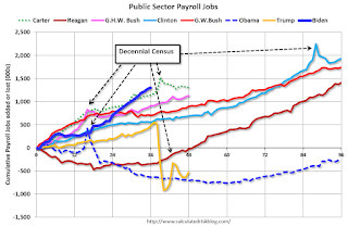
The first graph shows the change in private sector payroll jobs from when each president took office until the end of their term(s). Presidents Carter, George H.W. Bush and Trump only served one term.
Mr. G.W. Bush (red) took office following the bursting of the stock market bubble and left during the bursting of the housing bubble. Mr. Obama (dark blue) took office during the financial crisis and great recession. There was also a significant recession in the early '80s right after Mr. Reagan (dark red) took office.
There was a recession towards the end of President G.H.W. Bush (light purple) term, and Mr. Clinton (light blue) served for eight years without a recession. And there was a pandemic related recession in 2020.
First, here is a table for private sector jobs. The top two previous private sector terms were both under President Clinton.
| Term | Private Sector Jobs Added (000s) |
|---|---|
| Biden | 13,4811 |
| Clinton 1 | 10,876 |
| Clinton 2 | 10,094 |
| Obama 2 | 9,926 |
| Reagan 2 | 9,351 |
| Carter | 9,039 |
| Reagan 1 | 5,363 |
| Obama 1 | 1,907 |
| GHW Bush | 1,507 |
| GW Bush 2 | 443 |
| GW Bush 1 | -820 |
| Trump | -2,192 |
| 1After 36 months. | |
 Click on graph for larger image.
The first graph is for private employment only.
Private sector employment increased by 9,039,000 under President Carter (dashed green), by 14,714,000 under President Reagan (dark red), 1,507,000 under President G.H.W. Bush (light purple), 20,970,000 under President Clinton (light blue), lost 377,000 under President G.W. Bush, and gained 11,833,000 under President Obama (dark dashed blue). During Trump's term (Orange), the economy lost 2,135,000 private sector jobs.
In the first 36 months of President Biden's term (Blue), the economy has added 13,481,000 private sector jobs, as the economy recovered from the pandemic.
 A big difference between the presidencies has been public sector employment. Note: the bumps in public sector employment due to the decennial Census in 1980, 1990, 2000, 2010 and 2020.
The public sector grew during Mr. Carter's term (up 1,304,000), during Mr. Reagan's terms (up 1,414,000), during Mr. G.H.W. Bush's term (up 1,127,000), during Mr. Clinton's terms (up 1,934,000), and during Mr. G.W. Bush's terms (up 1,744,000 jobs). However, the public sector declined significantly while Mr. Obama was in office (down 263,000 jobs). During Trump's term, the economy lost 528,000 public sector jobs.
 A big difference between the presidencies has been public sector employment. Note: the bumps in public sector employment due to the decennial Census in 1980, 1990, 2000, 2010 and 2020.
 The public sector grew during Mr. Carter's term (up 1,304,000), during Mr. Reagan's terms (up 1,414,000), during Mr. G.H.W. Bush's term (up 1,127,000), during Mr. Clinton's terms (up 1,934,000), and during Mr. G.W. Bush's terms (up 1,744,000 jobs). However, the public sector declined significantly while Mr. Obama was in office (down 263,000 jobs). During Trump's term, the economy lost 528,000 public sector jobs.
In the first 36 months of President Biden's term, the economy has added 1,303,000 public sector jobs (about 93% of public job growth has been for state and local governments, and about 58% for education).
| Term | Public Sector Jobs Added (000s) |
|---|---|
| Reagan 2 | 1,438 |
| Carter | 1,304 |
| Biden | 1,3031 |
| Clinton 2 | 1,242 |
| GHW Bush | 1,127 |
| GW Bush 1 | 900 |
| GW Bush 2 | 844 |
| Clinton 1 | 692 |
| Obama 2 | 447 |
| Reagan 1 | -24 |
| Trump | -528 |
| Obama 1 | -710 |
| 1After 36 months. | |


