by Calculated Risk on 8/26/2009 07:56:00 PM
Wednesday, August 26, 2009
New Hampshire: The Clunker State
From the DOT: Cash for Clunkers Stats
Number Submitted: 690,114This should push light vehicle sales to about 16 million (SAAR) in August. Of course the real question is what happens in September.
Dollar Value: $2,877.9M
Darn - Floyd Norris beat me to it, but my table is sortable.
Using the Census Bureau population estimates, here is a table of dollars per person.
New Hampshire is the "Clunker State" by 'Dollars per person'. What happened in D.C.? No one wanted a new car? (UPDATE: several people told me almost everyone in D.C. buys cars in Virginia or Maryland)
NOTE: Columns are sortable - click on column headers: State (includes territories), Clunker dollars, Population, Dollars per person.
FDIC Lowers Qualifications for Failed Bank Acquisitions
by Calculated Risk on 8/26/2009 05:48:00 PM
From Bloomberg: FDIC Sets Standards for Private-Equity Firms to Buy Shut Banks (ht Anthony)
The Federal Deposit Insurance Corp. approved guidelines for private-equity firms to buy failed banks ... agreeing to lower to 10 percent from the proposed 15 percent the Tier 1 capital ratio private-equity investors must maintain after buying a bank.From the FDIC: Attachment: Final Statement of Policy of Qualifications for Failed Bank Acquisitions
As a reminder, the deadline for Corus Bank bids is reported to be next week. So this is just in time.
Also, the Q2 FDIC Quarterly Banking Profile will probably be released tomorrow AM (including stats on the Deposit Insurance Fund and the number of problem banks at the end of Q2).
Misc: ARMs, Mortgage Fraud, End of Tax Credits, and more
by Calculated Risk on 8/26/2009 03:59:00 PM
From the NY Times: Adjustable Mortgages Loom as Threat to Housing Recovery
(ht Shnaps, Ann)
When Harvey Clavon took out an exotic mortgage to refinance his home in Santa Clarita, Calif., three years ago, he thought he knew what he was doing.What a surprise!
Mr. Clavon, 63, was planning to sell the home in a few years and retire to Palm Springs. So he got a loan called an option adjustable rate mortgage, or option ARM, which allowed him the option of paying less than the interest for the first five years.
On his annual salary of $100,000 as a television camera operator, he could afford the $2,200 initial mortgage payments. And he would sell the home before the mortgage reset.
...
Mr. Clavon made only minimum payments on his mortgage, his balance has risen to $680,000 from $618,000, on a house worth closer to $400,000.
And the article also has a quote from the Shnapster's friend Ted Jadlos on Option ARMs!
“Everyone’s been focused on subprime, but we’re more concerned about this,” said Todd Jadlos, managing director of LPS Applied Analytics ... “By the time subprime defaults had increased 200 percent, in June and July of 2007, option ARMs had gone up 400 percent. People just didn’t notice because the overall numbers weren’t as high.”And some more mortgage fraud news: Task Force Cracks Mortgage Fraud Case Involving 453 Homes
Ohio Attorney General Richard Cordray and Cuyahoga County Prosecutor Bill Mason today announced details of an 18-month investigation that led to indictments against 41 people and four companies. The defendants are alleged to have engaged in real estate transactions to purchase 453 homes with fraudulent loans totaling $44 million. ...Hey, almost 100 homes in this scheme are not in foreclosure!
The scheme involved using straw buyers to purchase homes, falsely claiming home improvements were performed on houses in order to refinance them, and then selling houses to unqualified buyers with the assistance of real estate agents, mortgage brokers and title companies.
Lenders were tricked into believing that the buyers were making at least a 10% down payment when they were not, that the buyers had assets when they did not, and that the properties were worth more than they actually were. [Defendants] defrauded lenders through loan application fraud, down payment fraud and loan distribution fraud. The defendants siphoned off more than $31 million in profits from their criminal enterprise. Eventually, 358 of the homes fell into foreclosure.
As tax breaks expire, home sales decline ... from Reuters: California tax credit expires, home permits sink
Homebuilding permits filed in California in July fell significantly from June as a state tax credit for buyers of new homes expired ...Just imagine what will happen when the $8K first-time home buyer tax credit expires.
The tax credit offered earlier this year pulled homebuyers from the sidelines back into the state's beleaguered market for new homes but they have retreated since the incentive lapsed last month.
"Our homebuilders reported a significant drop in traffic last month, largely due to the state closing the window on the homebuyer tax credit," said Robert Rivinius, president and chief executive of the California Building Industry Association.
He noted the state government stopped taking applications for the $10,000 new-home credit at the beginning of July.
"Activity stopped as quickly as it started, which is bad news for housing and the broader economy," Rivinius said.
emphasis added
And a preview for BFF: Sioux City Bank at Risk of Failing
Vantus Bank, based in Sioux City, is at risk of failing because of the recession and rising bad loans.
Federal regulators have told the bank, which has 13 locations in Iowa, that its plan to increase its capital was unacceptable. According to a filing with the U.S. Securities and Exchange Commission, it must be sold or liquidated by Sept. 30.
Truck Tonnage Index Increased 2.1 Percent in July
by Calculated Risk on 8/26/2009 02:15:00 PM
From the American Trucking Association: ATA Truck Tonnage Index Rose 2.1 Percent in July Click on graph for slightly larger image in new window.
The American Trucking Associations’ advance seasonally adjusted (SA) For-Hire Truck Tonnage Index increased 2.1 percent in July. In June, SA tonnage fell 2.4 percent. July’s gain, which raised the SA index to 101.9 (2000=100), wasn’t large enough to completely offset the reduction in the previous month. The not seasonally adjusted (NSA) index, which represents the change in tonnage actually hauled by the fleets before any seasonal adjustment, equaled 106.3 in July, down 0.9 percent from June.Once again it appears the cliff diving is over, and the index is now moving sideways and "choppy".
Compared with July 2008, SA tonnage fell 10.4 percent, which was the best year-over-year showing since February 2009. June’s 13.6 percent contraction was the largest year-over-year decrease of the current cycle.
ATA Chief Economist Bob Costello said that truck tonnage will continue to be choppy in the months ahead, but that is not necessarily a bad thing. “It is not unusual for an economic indicator to become volatile before changing direction,” Costello noted. He is hopeful that truck tonnage has finally hit bottom as it has been bouncing around a seven-year low for the last few months. “While I am optimistic that the worst is behind us, I just don’t see anything on the economic horizon that suggests freight tonnage is about to rise significantly or consistently,” Costello said. “Still, even small gains are better than the February 2008 through April 2009 cumulative tonnage reduction of 15.5 percent.”
Fed's Lockhart: "slow recovery" and "protracted period of high unemployment"
by Calculated Risk on 8/26/2009 12:35:00 PM
From Atlanta Fed President Dennis Lockhart: The U.S. Economy and the Employment Challenge
On the economic outlook:
With respect to growth, my forecast envisions a return to positive but subdued gross domestic product (GDP) growth over the medium term weighed down by significant adjustments to our economy. Some of these adjustments are transitional in the sense that they impede the usual forces of recovery. Among these are the rewiring of the financial sector and the need for households to save more to repair their balance sheets.And on Commercial real estate:
Some of these adjustments, however, are more "structural" in nature. By this, I mean that the economy that emerges from this recession may not fully resemble the prerecession economy. In my view, it is unlikely that we will see a return of jobs lost in certain sectors, such as manufacturing. In a similar vein, the recession has been so deep in construction that a reallocation of workers is likely to happen—even if not permanent. ...
My forecast for a slow recovery implies a protracted period of high unemployment. And labor market weakness is a concern I hear about often as I travel around the Southeast.
I'm concerned that commercial real estate weakness poses a serious potential risk to the economic recovery and to the banking system. Commercial real estate loan exposure is heavily concentrated in banks and commercial mortgage-backed securities. Commercial real estate values—that is, collateral values for loans—are being revised down materially by the potent combination of increased vacancy, rent reductions, and appropriately higher capitalization rates. Further, there is a clear link between employment trends (positive and negative) and commercial real estate trends.On that note, here is a graph from a post in July:
 Click on graph for larger image in new window.
This graph shows the office vacancy rate vs. the quarterly unemployment rate and recessions.
As Lockhart noted: "[T]here is a clear link between employment trends (positive and negative) and commercial real estate trends."
As the unemployment rate continues to rise over the next year, the office vacancy rate will probably rise too. Reis' forecast is for the office vacancy rate to peak at 18.2 percent in 2010, and for rents to continue to decline through 2011.
Distressing Gap: Ratio of Existing to New Home Sales
by Calculated Risk on 8/26/2009 11:18:00 AM
For graphs based on the new home sales report this morning, please see: New Home Sales Increase in July
According to the Q2 Campbell national survey of real estate agents, over 63% of sales in Q2 were distressed. The number of distressed sales has probably declined in Q3, but it is still very high. The July NAR survey shows "distressed homes accounted for 31 percent of transactions", but their survey is very limited. And even using the NAR numbers, distressed sales are running around 1.5 million this year.
All this distressed sales activity has created a gap between new and existing sales as shown in the following graph that I've jokingly labeled the "Distressing" gap.
This is an update including July new and existing home sales data.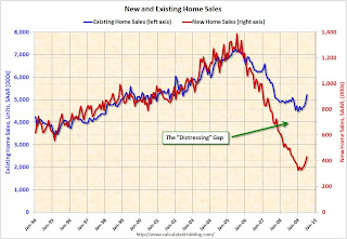 Click on graph for larger image in new window.
This graph shows existing home sales (left axis) and new home sales (right axis) through July.
As I've noted before, I believe this gap was caused by distressed sales. Even with the recent rebound in new and existing home sales, the gap is still very wide. The second graph shows the same information, but as a ratio for existing home sales divided by new home sales.
Although distressed sales will stay elevated for some time, eventually I expect this ratio to decline back to the previous ratio.
The ratio could decline because of a further increase in new home sales, or a decrease in existing home sales - or a combination of both. I expect the ratio will decline mostly from a decline in existing home sales as the first-time home buyer frenzy subsides, and as the foreclosure crisis moves into mid-to-high priced areas (with fewer cash flow investors).
From a longer term graph of the ratio, see my post last month.
New Home Sales Increase in July
by Calculated Risk on 8/26/2009 10:00:00 AM
The Census Bureau reports New Home Sales in July were at a seasonally adjusted annual rate (SAAR) of 433 thousand. This is an increase from the revised rate of 395 thousand in June. Click on graph for larger image in new window.
The first graph shows monthly new home sales (NSA - Not Seasonally Adjusted).
Note the Red columns for 2009. This is the 3rd lowest sales for July since the Census Bureau started tracking sales in 1963.
In July 2009, 39 thousand new homes were sold (NSA); the record low was 31 thousand in July 1982; the record high for July was 117 thousand in 2005.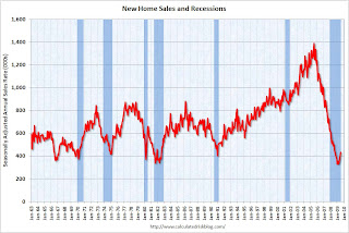 The second graph shows New Home Sales vs. recessions for the last 45 years. New Home sales fell off a cliff, but are now 32% above the low in January.
Sales of new one-family houses in July 2009 were at a seasonally adjusted annual rate of 433,000 ...And another long term graph - this one for New Home Months of Supply.
This is 9.6 percent (±13.4%) above the revised June rate of 395,000, but is 13.4 percent (±12.9%) below the July 2008 estimate of 500,000.
 There were 7.5 months of supply in July - significantly below the all time record of 12.4 months of supply set in January.
The seasonally adjusted estimate of new houses for sale at the end of July was 271,000. This represents a supply of 7.5months at the current sales rate..
 The final graph shows new home inventory.
 Note that new home inventory does not include many condos (especially high rise condos), and areas with significant condo construction will have much higher inventory levels.
Months-of-supply and inventory have both peaked for this cycle, and there is a good chance that sales of new homes has also bottomed for this cycle. However any further recovery in sales will likely be modest because of the huge overhang of existing homes for sale.
I'll have more later ...
MBA: Purchase Index Increases Slightly
by Calculated Risk on 8/26/2009 08:55:00 AM
The MBA reports:
The Market Composite Index, a measure of mortgage loan application volume, increased 7.5 percent on a seasonally adjusted basis from one week earlier.
...
The Refinance Index increased 12.7 percent from the previous week, the third increase in the last four weeks. The seasonally adjusted Purchase Index increased 1.0 percent from one week earlier ... This marks the fourth consecutive weekly gain – the first time this has happened since March, when fixed mortgage rates first dropped and stayed below 5 percent.
...
The average contract interest rate for 30-year fixed-rate mortgages increased to 5.24 percent from 5.15 percent ...
 Click on graph for larger image in new window.
This graph shows the MBA Purchase Index and four week moving average since 2002.
Note: The increase in 2007 was due to the method used to construct the index: a combination of lender failures, and borrowers filing multiple applications pushed up the index in 2007, even though activity was actually declining.
Even though sales of existing homes are up recently, the purchase index has only increased slightly. First-time home buyers using FHA loans would be included in the composite purchase index (the government index is up strongly over the last year), however this disconnect between sales and the MBA purchase index might be because of all the cash buyers at the low end - an example, from DataQuick on Las Vegas:
Of all buyers, those using cash to purchase their homes accounted for nearly 43 percent of all sales in July, based on an analysis of public property records. Specifically, these were transactions where there was no indication of a purchase mortgage recorded at the time of sale. ... All-cash deals have become popular in many Western markets where prices have dropped sharply and sellers favor the relative speed and certainty of all-cash buyers.
Tuesday, August 25, 2009
A comment on House Prices
by Calculated Risk on 8/25/2009 09:39:00 PM
I've seen story after story today suggesting the bottom is in for house prices.
This isn't like 2005 when it was almost certain that prices would fall, and fall sharply. Now we are much closer to the bottom than to the top in prices (for some metrics, see House Prices: Real Prices, Price-to-Rent, and Price-to-Income)
In some areas prices have probably already hit bottom - like some non-bubble areas, and some bubble areas with significant foreclosure activity.
But I think many areas, especially the mid-to-high priced bubble areas, there will be further price declines. I'm not as certain as I was in 2005, but I think these price declines will drag down the Case-Shiller indexes - and I don't think the price bottom is in.
I do not have a crystal ball, but ...
It seems there are many more foreclosures coming. Some of this depends on the success of the modification programs, but the Q2 MBA delinquency report shows a growing number of homeowners in the problem pipeline.
And the Fitch report yesterday suggests few of these delinquent homeowners will cure.
That seems to mean rising foreclosures, and more distressed inventory. The MBA Chief Economist Jay Brinkmann thinks foreclosures will peak at the end of 2010.
Historically prices bottom about the same time as foreclosure activity peaks. Maybe it will be different this time - maybe the modification programs will significantly reduce foreclosures - maybe prices will bottom before foreclosures peak ... but I'll go with the normal pattern.
And on the demand side, there has been a surge in first-time homebuyer activity. There was significant pent up demand from potential first-time buyers who were priced out of the market in 2004-2006, and then were afraid to buy as prices fell. But demand from these buyers will probably wane later this year, even if another tax credit is enacted.
Just like the "cash-for-clunkers" demand declined after the initial burst.
For mid-to-high priced homes, there are few move-up buyers (or so it would seem since so many low end homes were distress sales). Right now the months-of-supply in many of these areas is well into double figures, suggesting further price declines.
And on unemployment: most forecasts are for unemployment to rise into next year some time. Historically house prices do not bottom until after unemployment peaks. That seems especially likely now since so many homeowners are underwater. Once again I'll go with the normal pattern.
Also looking back at previous housing busts (like I did earlier today looking at the early '90s) there are usually some months during the bust with increasing prices. So no one should expect every month to be negative during the bust ... especially are prices get closer to the bottom.
I could be wrong - this isn't as certain as in 2005 - but I don't think house prices have bottomed. If I'm proven wrong, I'll be the first to admit it.
Best to all.
Will Mortgage Insurers Limit the Housing Market?
by Calculated Risk on 8/25/2009 06:46:00 PM
From Matt Padilla at the O.C. Register: Housing demand could snag on mortgage insurance
Matt quotes an article from the National Mortgage News:
The GSEs can purchase single-family mortgages with loan-to-value ratios higher than 80% only if the homebuyer gets mortgage insurance. The FHFA Mortgage Market Note issued a few days after Mr. Lockhart’s departure projects that the demand for such high LTV loans could hit $230 billion in 2009. The ability of the MIs to meet that level of demand is “remote,” FHFA report says. “The industry’s ability to build and maintain sufficient capital to meet the needs of the enterprises over the short term without some federal assistance or an infusion of private capital is unclear,” the report concludes.Another goverment program?
emphasis added
Misc: A possible 1991 House Price Headline, and Falling Rents in NYC
by Calculated Risk on 8/25/2009 04:05:00 PM
Imagine a headline in June 1991 (if Case-Shiller was around):
"House Prices increase at 11.6% annualized rate in June!"
The horrible price declines were over ... right? Nope. Real house prices declined for almost another 5 years. Just something to remember.
From Bloomberg: NYC Apartment Rents Fall as Tenants Gain Leverage
In buildings attended by doormen, rents on one-bedroom apartments dropped 10 percent from a year earlier to an average of $3,274 a month, according to a report by the Real Estate Group of New York. Studio prices fell 7 percent at those properties to $2,329 and two-bedrooms declined almost 6.9 percent to $5,161.Falling rents means a further decline in house prices to lower the price-to-rent ratio.
And a market graph from Doug Short. This matches up the market bottoms for four crashes (with an interim bottom for the Great Depression).
Note that the Great Depression crash is based on the DOW; the three others are for the S&P 500.
Case-Shiller House Prices and Stress Test Scenarios
by Calculated Risk on 8/25/2009 02:25:00 PM
This following graph compares the Case-Shiller Composite 10 SA index with the Stress Test scenarios from the Treasury (stress test data is estimated from quarterly forecasts).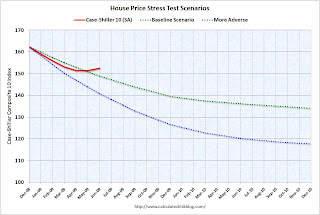 The Stress Test scenarios use the Composite 10 index and start in December. Here are the numbers:
Case-Shiller Composite 10 Index, June: 152.55
Stress Test Baseline Scenario, June: 148.82
Stress Test More Adverse Scenario, June: 140.71
Unlike with the unemployment rate (worse than both scenarios), house prices are performing better (from the perspective of the banks) than the the stress test scenarios. I believe there will be further price declines later this year, because I think the Case-Shiller seasonal adjustment is insufficient, and because I expect the first-time home buyer frenzy to slow just as more distressed supply comes on the market - even if an extension to the tax credit is passed.
Philly Fed State Coincident Indicators: Still a Widespread Recession in July
by Calculated Risk on 8/25/2009 11:30:00 AM
Click on map for larger image.
Here is a map of the three month change in the Philly Fed state coincident indicators. Forty six states are showing declining three month activity.
This is what a widespread recession looks like based on the Philly Fed states indexes.
On a one month basis, activity decreased in 35 states in June, and was unchanged in 8 states. Here is the Philadelphia Fed state coincident index release for July.
The Federal Reserve Bank of Philadelphia has released the coincident indexes for the 50 states for July 2009. In the past month, the indexes increased in seven states (Louisiana, Mississippi, North Dakota, South Carolina, South Dakota, Vermont, and Wisconsin), decreased in 35, and remained unchanged in eight (Hawaii, Indiana, Nebraska, New Jersey, Oklahoma, Rhode Island, Tennessee, and Virginia) for a one-month diffusion index of -56. Over the past three months, the indexes increased in three states (Mississippi, North Dakota, and Vermont), decreased in 46, and remained unchanged in one (South Carolina) for a three-month diffusion index of -86.
 The second graph is of the monthly Philly Fed data of the number of states with one month increasing activity. Most of the U.S. was has been in recession since December 2007 based on this indicator.
Note: this graph includes states with minor increases (the Philly Fed lists as unchanged).
A large percentage of states showed declining activity in July. Still a widespread recession in July by this indicator ...
House Prices: Real Prices, Price-to-Rent, and Price-to-Income
by Calculated Risk on 8/25/2009 10:01:00 AM
Here are three key measures of house prices: Price-to-Rent, Price-to-Income and real prices based on the Case-Shiller quarterly national home price index.
Price-to-Rent
In October 2004, Fed economist John Krainer and researcher Chishen Wei wrote a Fed letter on price to rent ratios: House Prices and Fundamental Value. Kainer and Wei presented a price-to-rent ratio using the OFHEO house price index and the Owners' Equivalent Rent (OER) from the BLS.
Here is a similar graph through Q2 2009 using the Case-Shiller National Home Price Index (SA): Click on image for larger graph in new window.
This graph shows the price to rent ratio (Q1 1997 = 1.0) for the Case-Shiller national Home Price Index. For rents, the national Owners' Equivalent Rent from the BLS is used.
Looking at the price-to-rent ratio based on the Case-Shiller index, the adjustment in the price-to-rent ratio is mostly behind us as of Q2 2009 on a national basis. However this ratio could easily decline another 10% or so.
It is important to note that rents are now falling and this has not shown up in the OER measure yet. The OER lags REIT rents, and I expect OER to declines later this year. And declining rents will impact the price-to-rent ratio.
Price-to-Income:
The second graph shows the price-to-income ratio: This graph is based off the Case-Shiller national index, and the Census Bureau's median income Historical Income Tables - Households (and an estimate of 2% increase in household median income for 2008 and flat for 2009).
Using national median income and house prices provides a gross overview of price-to-income (it would be better to do this analysis on a local area). However this does shows that the price-to-income is still too high, and that this ratio needs to fall another 10% or so. A further decline in this ratio could be a combination of falling house prices and/or rising nominal incomes.
Real Prices This graph shows the real and nominal house prices based on the Case-Shiller national index. (Q1 2000 = 100 for nominal index)
Nominal prices are adjusted using CPI less Shelter.
The Case-Shiller real prices are still significantly above prices in the '90s and perhaps real prices will decline another 10% to 20%.
Summary
These measures are useful, but somewhat flawed. These measures give a general idea about house prices, but there are other important factors like inventory levels and credit issues. All of this data is on a national basis and it would be better to use local area price-to-rent, price-to-income and real prices.
It appears that house prices - in general - are still too high. However prices depend on the local supply and demand factors. In many lower priced bubble areas supply has declined sharply (as banks are currently slow to foreclose), and demand is very strong (first-time home buyer frenzy, and cash flow investors). This is pushing up low end prices.
However in the mid-to-high end of the bubble areas - with significant supply and little demand - prices are probably still too high.
Case-Shiller House Price Index Increases in June
by Calculated Risk on 8/25/2009 09:00:00 AM
S&P/Case-Shiller released their monthly Home Price Indices for June this morning.
This monthly data includes prices for 20 individual cities, and two composite indices (10 cities and 20 cities). This is the Seasonally Adjusted data - others report the NSA data. Note: I have more on the quarterly national index soon.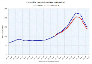 Click on graph for larger image in new window.
The first graph shows the nominal seasonally adjusted Composite 10 and Composite 20 indices (the Composite 20 was started in January 2000).
The Composite 10 index is off 32.6% from the peak, and up about 9% (annualized) in June.
The Composite 20 index is off 31.4% from the peak, and up in June.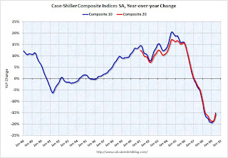 The second graph shows the Year over year change in both indices.
The Composite 10 is off 15.1% over the last year.
The Composite 20 is off 15.4% over the last year.
This is still a very strong YoY decline.
The third graph shows the price declines from the peak for each city included in S&P/Case-Shiller indices.
NOTE: updated 3rd graph. Two cities have price increases for 2009, and hopefully this graph shows the change better.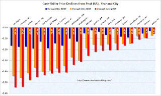 Prices increased (SA
 NSA) in 15 of the 20 Case-Shiller cities in June. In Las Vegas, house prices have declined 54.6% from the peak. At the other end of the spectrum, prices in Dallas are only off about 5.6% from the peak - and up in 2009. Prices have declined by double digits almost everywhere.
Let the debate begin - seasonal issues of mix (distressed sales vs. non-distressed sales), the impact of the first-time home buyer frenzy on prices, etc. - but this does show a price increase in June.
I'll compare house prices to the stress test scenarios soon.
FOIA: Court Orders Fed to Disclose Loan Program Details
by Calculated Risk on 8/25/2009 08:33:00 AM
From Bloomberg: Court Orders Federal Reserve to Disclose Emergency Loan Details
The Federal Reserve must for the first time identify the companies in its emergency lending programs after losing a Freedom of Information Act lawsuit.There is going to be some interesting information available soon.
...
The Fed has refused to name the financial firms it lent to or disclose the amounts or the assets put up as collateral under 11 programs, most put in place during the deepest financial crisis since the Great Depression, saying that doing so might set off a run by depositors and unsettle shareholders.
...
The judge said the central bank “improperly withheld agency records” ... She gave the Fed five days to turn over documents it told the reporters it located ...
The case is Bloomberg LP v. Board of Governors of the Federal Reserve System, 08-CV-9595, U.S. District Court, Southern District of New York (Manhattan).
Banks to Raise more Tier 1 Capital
by Calculated Risk on 8/25/2009 12:43:00 AM
Some people knew this was coming ...
From Reuters: Deutsche Bank plans Tier 1 issue, reopens market
Deutsche Bank AG plans to raise new Tier 1 debt ... as banks seek to rebuild balance sheets in the wake of the financial crisis.And SunTrust hints at raising new capital, from Bloomberg: U.S. Banks Face More Loan Losses, SunTrust Chief Says
The German bank confirmed it planned to issue euro fixed-rate perpetual notes, with annual call dates beginning from March 2015, and said it was managing the issue. ... the first of an expected series of new Tier 1 notes to hit the market in coming months from banks ... The deal would be smaller than 1 billion euros as the bank was seeking to test the market's appetite ...
“The industry is a long way from declaring any sort of victory, especially regarding credit issues,” Chief Executive Officer James Wells III said today in a speech to the Rotary Club of Atlanta. “This credit cycle has yet to play itself out. We do not expect things to improve for the banking industry in the very near future.”Ahhh ... just prudent balance sheet management!
...
“The industry has moved from a potentially cataclysmic scenario to one that is merely very difficult,” Wells said. “The industry is back from the brink of a potential global financial-system meltdown.” ... “Even if the economy begins to improve modestly, commercial real estate conditions will probably deteriorate until 2010.”
...
Wells said SunTrust may repurchase $4.9 billion in preferred shares sold through the U.S. Troubled Asset Relief Program “as soon as possible,” without being more specific.
Monday, August 24, 2009
Obama to Reappoint Bernanke
by Calculated Risk on 8/24/2009 10:13:00 PM
From CNBC: Obama to Reappoint Bernanke as Fed Chief
U.S. President Barack Obama will reappoint Ben Bernanke for a second term as chairman of the Federal Reserve on Tuesday, a senior administration official said on Monday.As Fed Governor Bernanke supported the flawed policies of Alan Greenspan - he never recognized the housing bubble or the lack of oversight - and there is no question, as Fed Chairman, Bernanke was slow to understand the credit and housing problems. And I'd prefer someone with better forecasting skills.
...
"The man next to me, Ben Bernanke, has led the Fed through one of the worst financial crises that this nation and this world have ever faced," Obama will say in a statement to the media at 9 am New York time.
However once Bernanke started to understand the problem, he was very effective at providing liquidity for the markets. The financial system faced both a liquidity and a solvency crisis, and it is the Fed's role to provide appropriate liquidity. Bernanke met that challenge, and I think he is a solid choice for a 2nd term (not my first choice, but solid).
Hotels: A "Perfect Storm" in San Francisco
by Calculated Risk on 8/24/2009 08:06:00 PM
From the SF Gate: Hotel losses mount, hurting city's coffers (ht Michael)
In June, the average room rate in San Francisco was $134, the lowest it has been since 2005 and well below the $162 peak in June 2008 ... For a while, managers filled rooms by offering lower rates, but the number of visitors also has begun to slide, and in June, occupancy tumbled to 73 percent, down from 85 percent the same time last year.A 17% decline in room rates, and a 14% decline in occupancy rates, suggests about a 30% decline in RevPAR (Revenue Per Available Room).
Add to the troubled mix the fact that many hotel owners, in San Francisco and across the state, financed purchases or refinanced loans between 2005 and 2007 - when the hotel values were at their peak. Since then, hotels statewide have lost 50 to 80 percent of their value, meaning that many owners owe far more than their asset is worth.Actually this is a perfect storm everywhere for hotels. Too much supply - and more coming online every day. Too much debt. And too few guests.
Hospitality industry analyst Alan Reay calls the situation a "perfect storm" that won't improve any time soon ...
NY Fed: US Credit Conditions Map
by Calculated Risk on 8/24/2009 05:49:00 PM
Check out the updates to the NY Fed Credit Conditions map.
A very cool tool from the NY Fed: New York Fed Launches Expanded U.S. Credit Conditions Section of Website (ht Bob, Justin)
The Federal Reserve Bank of New York today launched an expanded section of its website, adding new regional information on consumer credit conditions intended to assist policymakers address mortgage delinquency and foreclosure issues.
The U.S. Credit Conditions section offers new interactive maps and data on auto and student loan delinquencies, and mortgage “roll” rates. These features complement existing maps and spreadsheets on mortgage foreclosures and delinquencies, measures of subprime and alt-A mortgages and bank credit card delinquencies. The data are available at the state and county level.


