by Calculated Risk on 9/12/2012 09:47:00 PM
Wednesday, September 12, 2012
Thursday: FOMC Meeting, Unemployment Claims
From Tim Duy at EconomistsView: The Wait Should be Finally Over
With respect to the meeting tomorrow, I agree with Robin Harding at the FT on this point:From Jon Hilsenrath at the WSJ: Four Things to Watch at Fed Meeting. Some excerpts:
For me, the question of what the Fed will do is far less interesting – and far less in doubt – than how the Fed will do it. This will not be a pro forma repeat of previous actions. As Mr Bernanke’s speech shows, the Fed is trying to address grave concerns about the labour market. The crucial issue is whether and how they tie any action to the state of the economy.I don't anticipate a lump sum QE announcement. I anticipate an open-ended commitment to regular purchases of securities, Treasuries and/or MBS, that can be scaled up or down in response to the economy. Wall Street may be initially disappointed by the lack of a big number, but over time I think markets will come to appreciate the greater impact offered by a regular commitment based upon economic outcomes rather than the arbitrary amounts and time lines of previous QE efforts.
As Harding says, how they tie the policy to the economy is key.
–QE STRATEGY: Many investors expect the Federal Reserve to launch a new round of bond purchases, often called quantitative easing or QE. One big question is how the Fed would structure such a program.On Thursday:
...
–WHAT TO DO WITH TWIST: Officials must decide what to do about the “Operation Twist” program if they launch a new bond-buying program. The Fed is funding the Twist purchases with money it gets by selling short-term Treasury securities.
...
–COMMUNICATION: How the Fed describes its impetus for action, and its criteria for even more in the future, could matter a lot. Is it responding to a darkening outlook? Or has it decided to take more aggressive action because its patience with slow growth and high unemployment is running out and it has a new commitment to changing that?
...
–WHETHER TO LOWER ANOTHER RATE: The Fed now pays banks 0.25% interest on reserves they keep with the central bank. The Fed could reduce the rate it pays on reserves that aren’t required of banks (known as excess reserves) a little bit to try to give banks more impetus to lend.
• At 8:30 AM ET, The initial weekly unemployment claims report will be released. The consensus is for claims to increase to 370 thousand from 365 thousand.
• Also at 8:30 AM, the Producer Price Index for August will be released. The consensus is for a 1.4% increase in producer prices (0.2% increase in core).
• At 12:30 PM, the FOMC Meeting Announcement will be released. Additional policy accommodation is very likely. The FOMC might lengthen their forward guidance for the first rate hike to mid-2015 or later, and / or also launch an open ended Large Scale Asset Purchases(LSAP) program (commonly called QE3).
• At 2:00 PM, The FOMC Forecasts will be released. These include the Federal Open Market Committee (FOMC) participants' projections of the appropriate target federal funds rate along with the quarterly economic projections. Earlier I posted a preview with the June projections for reference.
• At 2:15 PM: Fed Chairman Ben Bernanke will hold a press briefing and discuss the FOMC policy decisions.
.
FOMC Projections Preview
by Calculated Risk on 9/12/2012 07:01:00 PM
There is plenty of discussion about QE3 (will they or won't they), but another key piece of information released tomorrow is the projections of the FOMC participants. In advance of the meeting I thought I'd take a look back at the previous projections from the June meeting.
The first chart is when participants project the initial increase in the target federal funds rate should occur, and the participants view of the appropriate path of the federal funds rate.
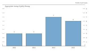
The key is to see if this shifts further to the right with more participants thinking the first rate increase will happen in 2015 or beyond. Many analysts expect that the FOMC will push out their forward guidance to 2015 (from 2014), and that suggests many more participants will view 2015 or beyond as appropriate.

This graph will probably be extended to 2015, and once again many participants will probably think the Fed Funds rate will be in the current range into 2015.
On the projections, GDP will probably be revised down again for 2012.
| GDP projections of Federal Reserve Governors and Reserve Bank presidents | |||
|---|---|---|---|
| Change in Real GDP1 | 2012 | 2013 | 2014 |
| June 2012 Projections | 1.9 to 2.4 | 2.2 to 2.8 | 3.0 to 3.5 |
GDP grew at a 1.8% annualized rate in the first half of 2012, and would have to increase at a 2.0% to 3.0% rate in the 2nd half to reach the previous range of projections.
The unemployment rate was at 8.1% in August. This is still in the June projection range, and the key will be to watch the projections for 2013 and 2014. Fed Chairman Ben Bernanke called unemployment a "grave concern" in his recent Jackson Hole speech.
| Unemployment projections of Federal Reserve Governors and Reserve Bank presidents | |||
|---|---|---|---|
| Unemployment Rate2 | 2012 | 2013 | 2014 |
| June 2012 Projections | 8.0 to 8.2 | 7.5 to 8.0 | 7.0 to 7.7 |
Overall PCE inflation has been on a 1.3% annualized pace this year through July (although this will probably increase with the increase in oil prices), and core PCE has been increasing at a 1.8% annualized pace. The core PCE rate has slowed further over the last few months. Right now inflation is tracking near the bottom of the previous FOMC projections.
| Inflation projections of Federal Reserve Governors and Reserve Bank presidents | |||
|---|---|---|---|
| PCE Inflation1 | 2012 | 2013 | 2014 |
| June 2012 Projections | 1.2 to 1.7 | 1.5 to 2.0 | 1.5 to 2.0 |
Here is core inflation:
| Core Inflation projections of Federal Reserve Governors and Reserve Bank presidents | |||
|---|---|---|---|
| Core Inflation1 | 2012 | 2013 | 2014 |
| June 2012 Projections | 1.7 to 2.0 | 1.6 to 2.0 | 1.6 to 2.0 |
Here was the key sentence from the most recent FOMC minutes: "Many members judged that additional monetary accommodation would likely be warranted fairly soon unless incoming information pointed to a substantial and sustainable strengthening in the pace of the economic recovery."
There is nothing in the recent data pointing to a "substantial and sustainable strengthening in the pace of the economic recovery". So I expect QE3 to be announced tomorrow.
Lawler: Preliminary Table of Short Sales and Foreclosures for Selected Cities in August
by Calculated Risk on 9/12/2012 02:59:00 PM
CR Note: Yesterday I posted some distressed sales data for Sacramento. I'm following the Sacramento market to see the change in mix over time (short sales, foreclosure, conventional). There has been a clear shift to fewer distressed sales in Sacramento.
Economist Tom Lawler has been digging up similar data, and he sent me the following table today for several more distressed areas. For all of these areas the share of distressed sales is down from August 2011 - and for the areas that break out short sales, the share of short sales has increased (except Minneapolis) and the share of foreclosure sales are down - and down significantly in some areas.
Previous comments from Lawler:
Note that the distressed sales shares in the below table are based on MLS data, and often based on certain “fields” or comments in the MLS files, and some have questioned the accuracy of the data. Some MLS/associations only report on overall “distressed” sales.
| Short Sales Share | Foreclosure Sales Share | Total "Distressed" Share | ||||
|---|---|---|---|---|---|---|
| 12-Aug | 11-Aug | 12-Aug | 11-Aug | 12-Aug | 11-Aug | |
| Las Vegas | 43.7% | 21.7% | 16.9% | 50.2% | 60.6% | 71.9% |
| Reno | 38.0% | 30.0% | 13.0% | 31.0% | 51.0% | 61.0% |
| Phoenix | 29.4% | 25.2% | 14.0% | 41.5% | 43.4% | 66.7% |
| Sacramento | 35.4% | 23.6% | 16.6% | 38.4% | 52.0% | 62.0% |
| Minneapolis | 10.8% | 11.6% | 26.0% | 33.4% | 36.8% | 45.0% |
| Mid-Atlantic (MRIS) | 11.8% | 11.2% | 8.7% | 14.7% | 20.6% | 25.9% |
| Hampton Roads VA | 24.4% | 29.3% | ||||
| Charlotte | 13.6% | 19.0% | ||||
| Memphis | 28.7% | 31.5% | ||||
| Birmingham AL | 27.8% | 30.3% | ||||
Shiller on House Prices
by Calculated Risk on 9/12/2012 12:39:00 PM
An interview with Professor Robert Shiller on NPR: The Housing Market: Have We Finally Hit Bottom? A brief excerpt:
Neil Conan, Host, NPR: And in the spring you were on the fence as those first reports came in giving three months of generally positive data. Do you think we're coming off the bottom?Robert Shiller makes a few key points:
Robert Shiller, economist, Yale University: Well, we definitely have positive data. The question is how strong is it, and will this fizzle - this rally fizzle or not? And I don't know the answer to that. But I point out that this is the fourth time we've had a rally since the crisis ended. It's coming in the summertime, right? Well, that's the normal time of strength in the market.
So if you look at the data, it doesn't jump out at you that we've reached the turning point. Now, we may have, but I think that seasonality seems to be getting stronger, and that's another contender.
CONAN: So how long do you think you would want to wait before you saw enough numbers to make a decision?
SHILLER: Well, I used to forecast home prices, and I thought a year - once you have a year - this is what I used to think, and whether it's still true, but ... But once you have a year of solid price increases, you are probably off to the races for some years. So yeah, but we're not into it that long yet.
CONAN: And there's other factors, because of all those foreclosures, because of all those mortgages underwater, a lot of people fear that there's a big backlog of housing stock that you're going to have to work through before you can start going again.
SHILLER: Right, there's a lot of people who are thinking, you know, if the prices would just come up a little bit, I'd sell.
• There is a seasonal pattern for house prices, and the seasonality has been much stronger in recent years. The reason is foreclosures and short sales happen all year, but there is a seasonal pattern for conventional sales. So distressed sales push down prices more than normal in the winter. Some of the recent increase in house prices was due to seasonal factors, and - as I noted last month - we should expect the NSA indexes to show month-over-month declines later this year. But the key will be to watch the year-over-year change.
• I've argued before that we will not really know if house prices have bottomed until at least a year after it happens (I think prices bottomed early this year). Robert Shiller makes the same argument: "once you have a year of solid price increases, you are probably off to the races for some years". I don't think prices will be "off to the races" because ...
• As Shiller notes, there are probably quite a few people waiting for a better market and somewhat higher prices: "there's a lot of people who are thinking, you know, if the prices would just come up a little bit, I'd sell". That is one reason why prices will probably not be "off to the races". Also there are still quite a few distressed sales in the pipeline - and that will keep prices from rising quickly.
Here is the radio interview:
CoreLogic: Negative Equity Decreases in Q2 2012
by Calculated Risk on 9/12/2012 09:31:00 AM
From CoreLogic: CORELOGIC® Reports Number of Residential Properties in Negative Equity Decreases Again in Second Quarter of 2012
CoreLogic ... today released new analysis showing that 10.8 million, or 22.3 percent, of all residential properties with a mortgage were in negative equity at the end of the second quarter of 2012. This is down from 11.4 million properties, or 23.7 percent, at the end of the first quarter of 2012. An additional 2.3 million borrowers possessed less than 5 percent equity in their home, referred to as near-negative equity, at the end of the second quarter. Approximately 600,000 borrowers reached a state of positive equity at the end of the second quarter of 2012, adding to the more than 700,000 borrowers that moved into positive equity in the first quarter of this year.
Together, negative equity and near-negative equity mortgages accounted for 27.0 percent of all residential properties with a mortgage nationwide in the second quarter, down from 28.5 percent at the end of the first quarter in 2012. Nationally, negative equity decreased from $691 billion at the end of the first quarter in 2012 to $689 billion at the end of the second quarter, a decrease of $2 billion driven in large part by an improvement in house price levels.
“The level of negative equity continues to improve with more than 1.3 million housholds regaining a positive equity position since the beginning of the year,” said Mark Fleming, chief economist for CoreLogic. “Surging home prices this spring and summer, lower levels of inventory, and declining REO sale shares are all contributing to the nascent housing recovery and declining negative equity.”
 Click on graph for larger image.
This graph shows the break down of negative equity by state. Note: Data not available for some states. From CoreLogic:
"Nevada had the highest percentage of mortgaged properties in negative equity at 59 percent, followed by Florida (43 percent), Arizona (40 percent), Georgia (36 percent) and Michigan (33 percent). These top five states combined account for 34.1 percent of the total amount of negative equity in the U.S."
 The second graph shows the distribution of home equity. Close to 10% of residential properties have 25% or more negative equity - it will be long time before those borrowers have positive equity. But some borrowers are close.
More from CoreLogic: "As of Q2 2012, there were 1.8 million borrowers who were only 5 percent underwater. If home prices continue increasing over the next year, these borrowers could move out of a negative equity position."
This is some improvement, but there are still 10.8 million residential properties with negative equity.
MBA: Mortgage Applications increase, might be distorted by Holiday adjustment
by Calculated Risk on 9/12/2012 07:01:00 AM
From the MBA: Mortgage Applications Increase in Latest MBA Weekly Survey
The adjusted Refinance Index increased 12 percent from the previous week. The seasonally adjusted Purchase Index increased 8 percent from one week earlier.
The holiday adjusted numbers may overstate the level of refinance applications because some lenders who rely primarily on the internet/consumer direct channel for originations saw little if any decline in applications for Labor Day as compared with the drops for lenders relying on retail offices, perhaps because borrowers had additional time over the Labor Day weekend to complete online refinance applications.
The average contract interest rate for 30-year fixed-rate mortgages with conforming loan balances ($417,500 or less) decreased to 3.75 percent from 3.78 percent, with points increasing to 0.44 from 0.37 (including the origination fee) for 80 percent loan-to-value ratio (LTV) loans. The effective rate decreased from last week.
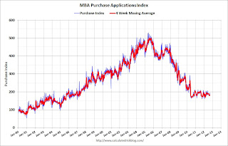 Click on graph for larger image.
This graph shows the MBA mortgage purchase index.
The purchase index has been mostly moving sideways over the last two years.
Wednesday: iPhone 5
by Calculated Risk on 9/12/2012 12:01:00 AM
On QE3 from Binyman Appelbaum at the NY Times: Economic Stimulus as the Election Nears? It’s Been Done Before
In September 1992, the Federal Reserve culminated a long-running effort to stimulate the sluggish economy by cutting its benchmark interest rate to 3 percent, the lowest level it had reached in almost three decades.Monetary policy impacts the economy with a lag, and it is too late to have an impact before the election - so politics shouldn't be a consideration.
The cut was avidly sought by the administration of President George H. W. Bush, but it was not enough to change the course of the presidential election. Years later, Mr. Bush told an interviewer that the Fed’s chairman, Alan Greenspan, had cost him a second term by failing to act more quickly and more forcefully.
...
Experts say Fed officials are sensitive to the danger of a political reaction. But Randall S. Kroszner, a Fed governor from 2006 to 2009, said the Fed’s current chairman, Ben S. Bernanke, has concluded that the best defense of the Fed’s independence is to demonstrate its value by reaching decisions on the economic merits, then offering clear explanations to politicians and the public. “Any decision the Fed will make will make someone unhappy, but what you want out of an independent agency is a careful deliberative process,” said Mr. Kroszner, a professor of economics at the University of Chicago Booth School of Business.
“Providing as much substantive economic explanation as possible for the actions that the Fed is taking, that’s the best way to maintain the Fed’s independence,” he added.
The iPhone 5 is almost an economic event, from the WSJ: Expectancy Builds Up For Apple's New iPhone
The next iPhone, which has been referred to internally by the code name N41, has been in the works for more than a year, a person familiar with the matter said. Apple is expected to tweak the smartphone's shape with a slightly larger screen and a different shell, and it will work with wireless carriers' fastest LTE networks and run new mobile software. That software, iOS 6, includes improvements to voice-activated assistant Siri, a new digital-coupon-and-passes service called Passbook, and new call-blocking features, among several others.On Wednesday:
• At 7:00 AM ET, The Mortgage Bankers Association (MBA) will release the mortgage purchase applications index.
• At 8:30 AM, Import and Export Prices for August will be released. The consensus is a for a 1.5% increase in import prices.
• At 10:00 AM, Monthly Wholesale Trade: Sales and Inventories for July. The consensus is for a 0.4% increase in inventories.
Tuesday, September 11, 2012
Sacramento August House Sales: Percentage of distressed sales lowest in years
by Calculated Risk on 9/11/2012 06:21:00 PM
I've been following the Sacramento market to look for changes in the mix of house sales in a distressed area over time (conventional, REOs, and short sales). The Sacramento Association of REALTORS® started breaking out REOs in May 2008, and short sales in June 2009.
Recently there has been a dramatic shift from REO to short sales, and the percentage of distressed sales has been declining. This data would suggest some improvement although the percent of distressed sales is still very high.
In August 2012, 52.0% of all resales (single family homes and condos) were distressed sales. This was down from 54.4% last month, and down from 62.0% in August 2011. The percentage of REOs fell to 16.6%, the lowest since the Sacramento Realtors started tracking the data and the percentage of short sales increased to 35.4%, the highest percentage recorded.
Here are the statistics.
 Click on graph for larger image.
This graph shows the percent of REO sales, short sales and conventional sales. Usually there is a seasonal pattern for conventional sales (stronger in the spring and summer), and distressed sales happen all year - so the percentage of distressed sales decreases every summer and the increases in the fall and winter.
There has been an increase in conventional sales this year, and there were twice as many short sales as REO sales in August. The gap between short sales and REO sales is increasing.
Total sales were unchanged from August 2011 (same pace as last year even with fewer foreclosures).
Active Listing Inventory for single family homes declined 62.0% from last August, although listings were up 10.6% in August (from July).
Cash buyers accounted for 33.1% of all sales (frequently investors), and median prices were up 12.0% from last August.
This seems to be moving in the right direction, although the market is still in distress.
We are seeing a similar pattern in other distressed areas to more conventional sales, and a shift from REO to short sales,.
Lawler: Where has the increase in the number of renters of Single Family homes come from?
by Calculated Risk on 9/11/2012 04:04:00 PM
From housing economist Tom Lawler:
One of the big changes in the structure of the US Single Family (SF) housing market has been the sharp increase in the share of SF housing units that are occupied by renters. Obviously, one reason is the substantial increase in the share of SF home purchases by investor attracted by the steep drop in home prices relative to rents, and who plan to rent the purchased properties for “several” years. But ... where has the increase in the number of renters of SF homes come from?
Well, a decent % of the increased number of renters of SF homes has probably come from … yup, folks who “lost” their previously-owned SF home either to foreclosure or through a short sale.
In a Federal Reserve Staff Working Paper published last May entitled “The Post-Foreclosure Experience of U.S. Households,” Fed economists Raven Molloy and Hui Shan used data from the FRB of New York/Equifax “Consumer Credit Panel” dataset to try to identify where households experiencing foreclosure end up moving to, including the type of housing. While there are challenges with using the CCP dataset for this purpose (e.g., the dataset only identifies a foreclosure start, and not a completed foreclosure, and does not explicitly identify a mortgage as backing the borrower’s primary residence), the authors make certain assumptions (ya gotta read the paper) to attempt to identify where “owners” who experienced a foreclosure start and who moved two years later ended up living. They also compare the experience of these householders to a group of “similar” householders who did not experience a foreclosure but who also moved two years later.
While the dataset limitations make it difficult to make crystal-clear conclusions, the data seem to suggest that a fairly large (perhaps as high as 60%) percentage of householders experiencing a foreclosure from 2006 to 2008 subsequently ended up renting a SF home, though a non-trivial (perhaps as high as 23%) ending up renting a unit in a multifamily structure. Not surprisingly, very few of the householders in the dataset who experienced a foreclosure and subsequently moved had a mortgage on the property they had moved into.
When it comes to analyzing the portion of the so-called “shadow inventory” that is currently occupied by owners behind on their mortgages, where these householders may ultimately live is important in assessing the implications for the overall housing market. Some folks who write about the “shadow” inventory where they include properties backing mortgages likely to be foreclosed upon seem to assume that all of the folks living in these properties will either “disappear,” or move in with someone else. That just ain’t so!
Unfortunately, of course, there are to the best of my knowledge no good (or possibly no) data on the percentage of properties backing seriously-delinquent/in foreclosure mortgages that are vacant, occupied by renters, or occupied by owners. There also doesn't appear to be any data on the condition of these properties. I don’t rightly know why government officials haven’t asked the large servicers for such data, though it’s quite possible they don’t have a clue.
There are, of course, reasons to believe that the share of the “shadow” inventory that is either vacant or non-owner-occupied has fallen over the past few years. After all, the share of completed foreclosure sales that were non-owner-occupied has been significantly higher than the non-owner-occupied share of outstanding first-lien mortgages.
QE Timeline Update
by Calculated Risk on 9/11/2012 02:12:00 PM
By request, here is an updated timeline of QE (and Twist operations):
• November 25, 2008: Press Release: $100 Billion GSE direct obligations, $500 billion in MBS
• December 16, 2008 FOMC Statement: Evaluating benefits of purchasing longer-term Treasury Securities
• January 28, 2009: FOMC Statement: FOMC Stands Ready to expand program.
• March 18, 2009: FOMC Statement: Expand MBS program to $1.25 trillion, buy up to $300 billion of longer-term Treasury securities
• March 31, 2010: QE1 purchases were completed at the end of Q1 2010.
• August 27, 2010: Fed Chairman Ben Bernanke hints at QE2: Analysis: Bernanke paves the way for QE2
• November 3, 2010: FOMC Statement: $600 Billion QE2 announced.
• June 30, 2011: QE2 purchases were completed at the end of Q2 2011.
• September 21, 2011: "Operation Twist" announced. "The Committee intends to purchase, by the end of June 2012, $400 billion of Treasury securities with remaining maturities of 6 years to 30 years and to sell an equal amount of Treasury securities with remaining maturities of 3 years or less."

• June 20, 2012: "Operation Twist" extended. "The Committee also decided to continue through the end of the year its program to extend the average maturity of its holdings of securities."
• August 31, 2012: Fed Chairman Ben Bernanke hints at QE3: Analysis: Bernanke Clears the way for QE3 in September
This graph show the S&P 500 and the Fed actions. Click on graph for larger image.
Las Vegas August Real Estate: Sales decline, Inventory down sharply year-over-year
by Calculated Risk on 9/11/2012 12:34:00 PM
This is a key distressed market to follow since Las Vegas has seen the largest price decline of any of the Case-Shiller composite 20 cities.
From the GLVAR: GLVAR August 2012 Housing Statistics
According to GLVAR, the total number of local homes, condominiums and townhomes sold in August was 3,688. That’s up from 3,572 in July but down from the near-record 4,693 total sales in August 2011.A few key points:
...
For the second straight month, the total number of homes listed for sale on GLVAR’s Multiple Listing Service bounced back a bit, with a total of 17,047 single-family homes listed for sale at the end of the month. That’s up 0.6 percent from 16,944 single-family homes listed for sale at the end of July, but still down 23.9 percent from one year ago.
[T]he number of available homes listed for sale without any sort of pending or contingent offer fell from the previous month and year. By the end of August, GLVAR reported 3,981 single-family homes listed without any sort of offer. That’s down 7.3 percent from 4,293 such homes listed in July and down 64.4 percent from one year ago.
...
Meanwhile, 43.7 percent of all existing local homes sold during August were short sales. That’s up from 40 percent in July and the highest short sale percentage GLVAR has ever recorded.
Continuing a trend of declining foreclosure sales in recent months, bank-owned homes accounted for 16.9 percent of all existing home sales in August, down from 20.7 percent in July.
• Even with the slight increase in inventory in August, inventory is still down sharply from a year ago (down 64.4 percent year-over-year for single family homes without contingent offers).
• The decline in sales from the record levels in 2011 (even more sales than during the bubble!) is because of the decline in foreclosures. Some of the recent decline in foreclosures is due to new foreclosure rules in Nevada, but there is also a shift to short sales.
• Short sales are more than double foreclosures now. The GLVAR reported 43.7 percent of sales were short sales, and only 16.9% foreclosures. We've seen a shift from foreclosures to short sales in most areas (not just in areas with new foreclosure laws).
• The percent distressed sales was extremely high at 60.6% in August (short sales and foreclosures), down slightly from 60.7% in July.
• There is a push to complete short sales, from the article:
[H]omeowners are pushing to short-sell their homes by the end of the year, when the Mortgage Forgiveness Debt Relief Act is set to expire unless Congress acts to extend it. If Congress does not extend this law by Dec. 31, she said any amount of money a bank writes off in agreeing to sell a home as part of a short sale will become taxable income when sellers pay their income taxes.
BLS: Job Openings "little changed" in July
by Calculated Risk on 9/11/2012 10:00:00 AM
From the BLS: Job Openings and Labor Turnover Summary
There were 3.7 million job openings on the last business day of July, little changed from June, the U.S. Bureau of Labor Statistics reported today.The following graph shows job openings (yellow line), hires (dark blue), Layoff, Discharges and other (red column), and Quits (light blue column) from the JOLTS.
...
The level of total nonfarm job openings in July was up from 2.4 million at the end of the recession in June 2009.
...
In July, the quits rate was unchanged for total nonfarm, total private, and government. The number of quits was 2.2 million in July, up from 1.8 million at the end of the recession in June 2009. ... Quits are generally voluntary separations initiated by the employee. Therefore, the quits rate can serve as a measure of workers’ willingness or ability to leave jobs.
This series started in December 2000.
Note: The difference between JOLTS hires and separations is similar to the CES (payroll survey) net jobs headline numbers. This report is for July, the most recent employment report was for August.
 Click on graph for larger image.
Notice that hires (dark blue) and total separations (red and light blue columns stacked) are pretty close each month. When the blue line is above the two stacked columns, the economy is adding net jobs - when it is below the columns, the economy is losing jobs.
Jobs openings decreased in July to 3.664 million, down from 3.722 million in June. The number of job openings (yellow) has generally been trending up, and openings are up about 9% year-over-year compared to July 2011.
Quits increased slightly in July, and quits are up about 8% year-over-year. These are voluntary separations and more quits might indicate some improvement in the labor market. (see light blue columns at bottom of graph for trend for "quits").
Trade Deficit at $42.0 Billion in July
by Calculated Risk on 9/11/2012 08:30:00 AM
The Department of Commerce reported:
[T]otal July exports of $183.3 billion and imports of $225.3 billion resulted in a goods and services deficit of $42.0 billion, up from $41.9 billion in June, revised. July exports were $1.9 billion less than June exports of $185.2 billion. July imports were $1.8 billion less than June imports of $227.1 billion.June was revised down from $42.9 billion. The trade deficit was below the consensus forecast of $44.3 billion.
The first graph shows the monthly U.S. exports and imports in dollars through July 2012.
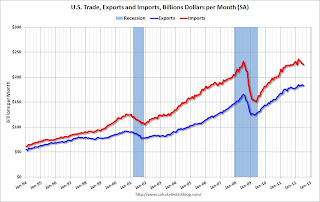 Click on graph for larger image.
Both exports and imports decreased in July. Exports are 10% above the pre-recession peak and up 3% compared to July 2011; imports are just below the pre-recession peak, and up about 1% compared to July 2011.
The second graph shows the U.S. trade deficit, with and without petroleum, through July.
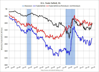 The blue line is the total deficit, and the black line is the petroleum deficit, and the red line is the trade deficit ex-petroleum products.
Oil averaged $93.83 in July, down from $100.13 per barrel in June, and the lowest level since early 2011. Import oil prices will probably start increasing again in August. The trade deficit with China increased to $29.4 billion in July, up from $27.0 billion in July 2011. Once again most of the trade deficit is due to oil and China.
The trade deficit with the euro area was $10.2 billion in July, up from $7.7 billion in July 2011.
Monday, September 10, 2012
Tuesday: Trade Deficit, Job Openings
by Calculated Risk on 9/10/2012 09:11:00 PM
A couple of interesting stories ...
From the NY Times: Chinese Leader’s Absence Stokes Rumor Mills
Over the past week, the new leader, Xi Jinping, has missed at least three scheduled meetings with foreign dignitaries, including Secretary of State Hillary Rodham Clinton last Wednesday and the prime minister of Denmark on Monday. So far officials have declined to provide an explanation for his absences.I heard he was spotted standing in line waiting for the iPhone 5!
That set off furious speculation on the Internet that the 59-year-old Mr. Xi’s health, either physical or political, has taken a turn for the worse. Some diplomats say they have heard that Mr. Xi suffered a pulled muscle while swimming or playing soccer. One media report, since retracted, had it that Mr. Xi was hurt in an auto accident when a military official tried to injure or kill him in a revenge plot. A well-connected political analyst in Beijing said in an interview that Mr. Xi might have had a mild heart attack.
Whatever the actual reason, Mr. Xi’s unexplained absences are conspicuous on the eve of what is supposed to be China’s once-in-a-decade transfer of power.
And on Apple, from Catherine Rampell at the NY Times Economix: How the iPhone 5 Could Bolster the G.D.P.
Michael Feroli, the chief United States economist at JPMorgan Chase, did a back-of-the-envelope calculation and estimated that the upcoming release of what is expected to be the iPhone 5 could add one-quarter to one-half of a percentage point to the annualized growth rate of America’s gross domestic product next quarter.• At 8:30 AM, the Trade Balance report for July will be released. The consensus is for the U.S. trade deficit to increase to $44.3 billion in July, up from from $42.9 billion in June. Export activity to Europe will be closely watched due to economic weakness.
• At 10:00 AM, the BLS will released the Job Openings and Labor Turnover Survey for July from the BLS. This survey has been showing an increase in job openings; in June openings were up about 16% year-over-year compared to June 2011.
Another question for the September economic contest:
Employment Graphs: Construction Employment, Unemployment by Education
by Calculated Risk on 9/10/2012 06:04:00 PM
A couple more graphs based on the August employment report. The first graph below shows the number of total construction payroll jobs in the U.S. including both residential and non-residential since 1969.
Construction employment increased by only 1 thousand jobs in August, and so far is down for the year.
Unfortunately this graph is a combination of both residential and non-residential construction employment. The BLS only started breaking out residential construction employment fairly recently (residential specialty trade contractors in 2001).
 Click on graph for larger image.
Construction employment appears to be moving sideways, although I expect this will change soon (and I'd expect some upward revisions to construction employment). The preliminary annual Benchmark Revision will be released on September 27, 2012.
Note: When housing was collapsing, one of the mysteries was why construction employment wasn't declining - and then finally employment started falling sharply. I think we are seeing a similar "mystery" now, and I expect BLS reported construction employment will start increasing soon.
 This graph shows the unemployment rate by four levels of education (all groups are 25 years and older).
Unfortunately this data only goes back to 1992 and only includes one previous recession (the stock / tech bust in 2001). Clearly education matters with regards to the unemployment rate - and it appears all four groups are generally trending down - although the unemployment rate for 'high school grads, no college' has increased recently.
Note: This says nothing about the quality of jobs - as an example, a college graduate working at minimum wage would be considered "employed".
WSJ: UBS expects the Fed to announce QE3 this week
by Calculated Risk on 9/10/2012 02:17:00 PM
On Saturday, I wrote: I expect QE3 on Sept 13th
From the WSJ: UBS: Bernanke Will Unleash QE3 This Week
More and more market prognosticators are calling for the Fed to unveil a third round of quantitative easing this week UBS is the latest to join the fray ...The QE3 view isn't unanimous, from the WSJ:
“We now anticipate an announcement of another round of quantitative easing at the FOMC meeting on Sept. 13,” UBS economists wrote in a note to clients.
The QE3 parameters will likely entail a six-month program of at least $500 billion, primarily focused on buying Treasurys, UBS predicts, while also anticipating the Fed will extend its ultra-low rate guidance into 2015.
One of the outliers not calling for more Fed stimulus is Nomura Securities. ... The disappointing jobs report “is not weak enough to compel the Fed to deliver anouther round of quantitative easing at next week’s meeting,” Nomura said on Friday.I think a combination of lengthening the low rate guidance and some sort of Large Scale Asset Purchases (LSAP, aka QE3) is very likely.
Alphaville: 'German domino theory and book-cooking'
by Calculated Risk on 9/10/2012 10:43:00 AM
This is an interesting piece from David Keohane at FT Alphaville: German domino theory and book-cooking
There are two fairly important bits to this story in Der Spiegel.Keohane goes on to discuss domino theory and the key word: "undoubtedly". The story makes it sound like the outcome of the troika's audit is preordained.
One, that Merkel wants to avoid a Grexit for the time being and two, that the upcoming Troika report might be massaged to make that a reality.
From Der Spiegel (with our emphasis):
In reality, Merkel has already made up her mind. After long hesitation, she has sided with French President François Hollande and the European Commission. The report from the troika — which consists of the European Commission, the International Monetary Fund (IMF) and the European Central Bank (ECB) and which departed on its fact-finding tour last week — will undoubtedly conclude that Greece can remain in the euro zone.The change in mind-set is down to domino theory.
Where once the chancellor saw Greece as the weakest link in a chain which would be stronger without it, now she sees it as a domino which, if toppled, would put the rest of the set in danger ...
LPS: Mortgage Delinquencies decreased slightly in July
by Calculated Risk on 9/10/2012 08:45:00 AM
LPS released their Mortgage Monitor report for July today. According to LPS, 7.03% of mortgages were delinquent in July, down from 7.14% in June, and down from 7.80% in July 2011.
LPS reports that 4.08% of mortgages were in the foreclosure process, down slightly from 4.09% in June, and down slightly from 4.11% in July 2011.
This gives a total of 11.12% delinquent or in foreclosure. It breaks down as:
• 1,960,000 loans less than 90 days delinquent.
• 1,560,000 loans 90+ days delinquent.
• 2,042,000 loans in foreclosure process.
For a total of 5,562,000 loans delinquent or in foreclosure in July. This is down from 5,663,000 last month.
This following graph shows the total delinquent and in-foreclosure rates since 1995.
 Click on graph for larger image.
The total delinquency rate has fallen to 7.03% from the peak in July 2010 of 10.57%. A normal rate is probably in the 4% to 5% range, so there is a long ways to go.
The in-foreclosure rate was at 4.08%. There are still a large number of loans in this category (about 1.96 million).
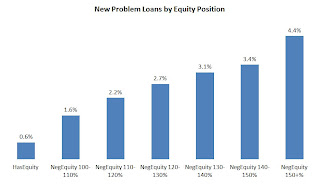 The second graph shows new problem loans by equity position.
From LPS:
“The July mortgage performance data shows a continuing correlation between negative equity and new problem loans,” explained Herb Blecher, senior vice president, LPS Applied Analytics.The third graph shows percent negative equity by state.
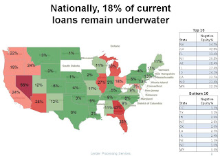 From Herb Blecher:
 “Nationally, 18 percent of borrowers who are current on their loan payments are ‘underwater’ (owing more on the mortgage than the home’s current market value), ranging from a low of 0.4 percent in Wyoming to nearly 55 percent in Nevada. As negative equity increases, we see corresponding increases in the number of new problem loans. In Nevada and Florida, two of the states with the highest percentage of underwater borrowers, more than three percent of borrowers who were up to date on their payments are 60 or more days delinquent six months later. This suggests that further home price declines – should they occur – could jeopardize recent improvements.”
Sunday, September 09, 2012
Sunday Night Futures
by Calculated Risk on 9/09/2012 09:24:00 PM
It is time for the next act of the Greek tragedy, from the WSJ: Inspectors Reject Some Cuts Greece Plans
The [European Commission, International Monetary Fund and the European Central Bank — the so-called troika] rejected some €2 billion ($2.6 billion) of proposed spending and revenue measures the government had hoped would help meet budget targets for the next two years ... The troika is demanding €13.5 billion in budget cuts in exchange for its latest €173 billion bailout.The Asian markets are mostly green tonight, although the Nikkei is down 0.2%.
The troika report, to be delivered before a European finance ministers' meeting Oct. 8, will also play a role in determining whether Greece is able to win a sought after two-year extension in meeting tough budget-deficit targets.
From CNBC: Pre-Market Data and Bloomberg futures: the S&P future are down 2, and the DOW futures down 26 points.
Oil prices are moving mostly unchanged with WTI futures are at $96.27 and Brent is at $114.12 per barrel. Using the calculator at Econbrowser suggests national gasoline prices at about $3.69 per gallon.
Yesterday:
• Summary for Week Ending Sept 7th
• Schedule for Week of Sept 9th
• Analysis: I expect QE3 on Sept 13th
Five more questions for the September economic prediction contest (Note: You can now use Facebook, Twitter, or OpenID to log in).
Employment Report Graphs: Participation Rate, Duration of Unemployment and Diffusion Indexes
by Calculated Risk on 9/09/2012 01:41:00 PM
Below are three more graphs based on the August employment report.
For more employment graphs and analysis, see:
• August Employment Report: 96,000 Jobs, 8.1% Unemployment Rate
• Employment: Another Weak Report (more graphs)
• All Employment Graphs
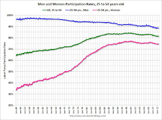
The following graph shows the changes in the participation rates for men and women since 1960 (in the 25 to 54 age group - the prime working years).
 Click on graph for larger image in graph gallery.
The participation rate for women increased significantly from the mid 30s to the mid 70s. This rate was at 75.5% prior to the recession, and declined to a post-recession low of 74.3%. There has been almost no recovery in the participation rate for prime working age women. This rate has mostly flattened out this year, and was still near the low in August at 74.5%.
The participation rate for men has decreased from the high 90s a few decades ago, to a low of 88.3% after the recession. This rate hasn't increased very much, and was at 88.5% in August.
There might be some "bounce back" for both men and women (some of the recent decline is probably cyclical), but the long term trend for men is down.
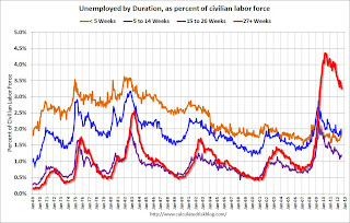 This graph shows the duration of unemployment as a percent of the civilian labor force. The graph shows the number of unemployed in four categories: less than 5 weeks, 6 to 14 weeks, 15 to 26 weeks, and 27 weeks or more.
All categories are generally moving down, but there was an increase in the 'less than 5 weeks' and '15 to 26 weeks' categories in August.
Unfortunately the long term unemployed remains very high at 3.3% of the labor force in August, but this is the lowest percentage since 2009.
 Diffusion indexes are a measure of how widespread job gains are across industries. The further from 50 (above or below), the more widespread the job losses or gains reported by the BLS. If there are employment gains, the more widespread, the better - even if job growth is slow. From the BLS:
 Figures are the percent of industries with employment increasing plus one-half of the industries with unchanged employment, where 50 percent indicates an equal balance between industries with increasing and decreasing employment.The BLS diffusion index for total private employment was at 50.2 in August, down from 54.3 in July. For manufacturing, the diffusion index declined to 36.4 from 50.6 in July. This is the lowest level for manufacturing since 2009.
Not only was job growth was weak in August, but job gains were not widespread across industries (another negative).
Yesterday:
• Summary for Week Ending Sept 7th
• Schedule for Week of Sept 9th
• Analysis: I expect QE3 on Sept 13th


