by Calculated Risk on 9/16/2021 08:36:00 AM
Thursday, September 16, 2021
Weekly Initial Unemployment Claims increase to 332,000
The DOL reported:
In the week ending September 11, the advance figure for seasonally adjusted initial claims was 332,000, an increase of 20,000 from the previous week's revised level. The previous week's level was revised up by 2,000 from 310,000 to 312,000. The 4-week moving average was 335,750, a decrease of 4,250 from the previous week's revised average. This is the lowest level for this average since March 14, 2020 when it was 225,500. The previous week's average was revised up by 500 from 339,500 to 340,000.This does not include the 28,456 initial claims for Pandemic Unemployment Assistance (PUA) that was down from 94,638 the previous week.
emphasis added
The following graph shows the 4-week moving average of weekly claims since 1971.
 Click on graph for larger image.
The dashed line on the graph is the current 4-week average. The four-week average of weekly unemployment claims decreased to 335,750.
The previous week was revised up.
Regular state continued claims decreased to 2,656,747 (SA) from 2,662,844 (SA) the previous week.
Note (released with a 2 week delay): There were an additional 5,487,233 receiving Pandemic Unemployment Assistance (PUA) that increased from 5,090,524 the previous week (there are questions about these numbers). This is a special program for business owners, self-employed, independent contractors or gig workers not receiving other unemployment insurance. And were an additional 3,805,795 receiving Pandemic Emergency Unemployment Compensation (PEUC) up from 3,805,008.
Weekly claims were higher than the consensus forecast.
Wednesday, September 15, 2021
Thursday: Retail Sales, Unemployment Claims, Philly Fed Mfg
by Calculated Risk on 9/15/2021 09:00:00 PM
Thursday:
• At 8:30 AM ET, The initial weekly unemployment claims report will be released. There were 310 thousand initial claims last week.
• Also at 8:30 AM, Retail sales for August will be released. The consensus is for a 0.7% decrease in retail sales.
• Also at 8:30 AM, the Philly Fed manufacturing survey for September. The consensus is for a reading of 20.0, up from 19.4.
September 15th COVID-19: 2,000 Deaths Reported Today, Most since February
by Calculated Risk on 9/15/2021 05:22:00 PM
| COVID Metrics | ||||
|---|---|---|---|---|
| Today | Week Ago | Goal | ||
| Percent fully Vaccinated | 54.1% | 53.3% | ≥70.0%1 | |
| Fully Vaccinated (millions) | 179.7 | 177.1 | ≥2321 | |
| New Cases per Day3🚩 | 145,675 | 141,275 | ≤5,0002 | |
| Hospitalized3 | 90,593 | 93,243 | ≤3,0002 | |
| Deaths per Day3🚩 | 1,358 | 1,125 | ≤502 | |
| 1 Minimum to achieve "herd immunity" (estimated between 70% and 85%). 2my goals to stop daily posts, 37 day average for Cases, Currently Hospitalized, and Deaths 🚩 Increasing 7 day average week-over-week for Cases, Hospitalized, and Deaths ✅ Goal met. | ||||
IMPORTANT: For "herd immunity" most experts believe we need 70% to 85% of the total population fully vaccinated (or already had COVID).
The following 15 states and D.C. have between 50% and 59.9% fully vaccinated: Oregon at 59.4%, District of Columbia, Virginia, Colorado, Minnesota, California, Hawaii, Delaware, Pennsylvania, Wisconsin, Florida, Nebraska, Iowa, Illinois, Michigan, South Dakota, and Kentucky at 50.3%.
Next up (total population, fully vaccinated according to CDC) are Arizona at 49.9%, Kansas at 49.8%, Ohio at 49.4%, Nevada at 49.4%, Texas at 49.4%, Utah at 49.0% and Alaska at 48.5%.
 Click on graph for larger image.
This graph shows the daily (columns) and 7 day average (line) of positive tests reported.
LA Area Port Traffic: Solid Imports, Weak Exports in August
by Calculated Risk on 9/15/2021 02:36:00 PM
Notes: The expansion to the Panama Canal was completed in 2016 (As I noted a few years ago), and some of the traffic that used the ports of Los Angeles and Long Beach is probably going through the canal. This might be impacting TEUs on the West Coast.
Also, incoming port traffic is backed up significantly in the LA area with around 50 ships at anchor waiting to unload.
Container traffic gives us an idea about the volume of goods being exported and imported - and usually some hints about the trade report since LA area ports handle about 40% of the nation's container port traffic.
The following graphs are for inbound and outbound traffic at the ports of Los Angeles and Long Beach in TEUs (TEUs: 20-foot equivalent units or 20-foot-long cargo container).
To remove the strong seasonal component for inbound traffic, the first graph shows the rolling 12 month average.

On a rolling 12 month basis, inbound traffic was up 0.1% in August compared to the rolling 12 months ending in July. Outbound traffic was down 1.3% compared to the rolling 12 months ending the previous month.
The 2nd graph is the monthly data (with a strong seasonal pattern for imports).

Imports were up 1% YoY in August (recovered last year following the early months of the pandemic), and exports were down 14.0% YoY.
Another 5 Local Housing Markets in August
by Calculated Risk on 9/15/2021 10:55:00 AM
In the Newsletter: Another 5 Local Housing Markets in August
Active inventory, new listings and sales added for Boston, Des Moines, Jacksonville, Minnesota, South Carolina
So far sales are up 0.2% YoY, Not Seasonally Adjusted (NSA).
Industrial Production Increased 0.4 Percent in August
by Calculated Risk on 9/15/2021 09:21:00 AM
From the Fed: Industrial Production and Capacity Utilization
Industrial production increased 0.4 percent in August after moving up 0.8 percent in July. Late-month shutdowns related to Hurricane Ida held down the gain in industrial production by an estimated 0.3 percentage point. Although the hurricane forced plant closures for petrochemicals, plastic resins, and petroleum refining, overall manufacturing output rose 0.2 percent. Mining production fell 0.6 percent, reflecting hurricane-induced disruptions to oil and gas extraction in the Gulf of Mexico. The output of utilities increased 3.3 percent, as unseasonably warm temperatures boosted demand for air conditioning.
At 101.6 percent of its 2017 average, total industrial production in August was 5.9 percent above its year-earlier level and 0.3 percent above its pre-pandemic (February 2020) level. Capacity utilization for the industrial sector rose 0.2 percentage point in August to 76.4 percent, a rate that is 3.2 percentage points below its long-run (1972–2020) average.
emphasis added
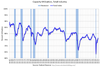 Click on graph for larger image.
This graph shows Capacity Utilization. This series is up from the record low set in April 2020, and slightly above the level in February 2020.
Capacity utilization at 76.4% is 3.2% below the average from 1972 to 2020.
Note: y-axis doesn't start at zero to better show the change.
 The second graph shows industrial production since 1967.
Industrial production increased in August to 101.6. This is 0.3% above the February 2020 level.
The change in industrial production was slightly below consensus expectations.
MBA: Mortgage Applications Increase in Latest Weekly Survey
by Calculated Risk on 9/15/2021 07:00:00 AM
From the MBA: Mortgage Applications Increase in Latest MBA Weekly Survey
Mortgage applications increased 0.3 percent from one week earlier, according to data from the Mortgage Bankers Association’s (MBA) Weekly Mortgage Applications Survey for the week ending September 10, 2021. This week’s results include an adjustment for the Labor Day holiday.
... The Refinance Index decreased 3 percent from the previous week and was 3 percent lower than the same week one year ago. The seasonally adjusted Purchase Index increased 8 percent from one week earlier. The unadjusted Purchase Index decreased 5 percent compared with the previous week and was 12 percent lower than the same week one year ago.
“Purchase applications – after adjusting for the impact of Labor Day – increased over 7 percent last week to their highest level since April 2021. Compared to the same week last September, which was right in the middle of a significant upswing in home purchases, applications were down 11 percent – the smallest year-over-year decline in 14 weeks,” said Joel Kan, MBA’s Associate Vice President of Economic and Industry Forecasting. “Both conventional and government purchase applications increased, and the average loan size for a purchase application rose to $396,800. The very competitive purchase market continues to put upward pressure on sales prices.”
Added Kan, “While the 30-year fixed rate was unchanged at just over 3 percent, it was not enough to drive more refinance activity. Refinance applications slipped to their slowest pace since early July, and the refinance share of applications fell to 65 percent, which was also the lowest since July.”
...
The average contract interest rate for 30-year fixed-rate mortgages with conforming loan balances ($548,250 or less) remained unchanged at 3.03 percent, with points decreasing to 0.32 from 0.33 (including the origination fee) for 80 percent loan-to-value ratio (LTV) loans.
emphasis added
 Click on graph for larger image.
The first graph shows the refinance index since 1990.
With low rates, the index remains elevated.
The second graph shows the MBA mortgage purchase index
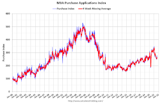 According to the MBA, purchase activity is down 12% year-over-year unadjusted.
Note: The year ago comparisons for the unadjusted purchase index are now difficult since purchase activity picked up in late May 2020.
Note: Red is a four-week average (blue is weekly).
Tuesday, September 14, 2021
Wednesday: NY Fed Mfg, Industrial Production
by Calculated Risk on 9/14/2021 09:00:00 PM
Wednesday:
• At 7:00 AM ET, The Mortgage Bankers Association (MBA) will release the results for the mortgage purchase applications index.
• At 8:30 AM ET: The New York Fed Empire State manufacturing survey for September. The consensus is for a reading of 18.6, up from 18.3.
• At 9:15 AM: The Fed will release Industrial Production and Capacity Utilization for August. The consensus is for a 0.5% increase in Industrial Production, and for Capacity Utilization to increase to 76.4%.
September 14th COVID-19: Almost 1 Million Doses per Day
by Calculated Risk on 9/14/2021 07:51:00 PM
| COVID Metrics | ||||
|---|---|---|---|---|
| Today | Week Ago | Goal | ||
| Percent fully Vaccinated | 54.0% | 53.0% | ≥70.0%1 | |
| Fully Vaccinated (millions) | 179.3 | 176.0 | ≥2321 | |
| New Cases per Day3 | 139,897 | 149,796 | ≤5,0002 | |
| Hospitalized3 | 90,651 | 93,201 | ≤3,0002 | |
| Deaths per Day3🚩 | 1,262 | 1,147 | ≤502 | |
| 1 Minimum to achieve "herd immunity" (estimated between 70% and 85%). 2my goals to stop daily posts, 37 day average for Cases, Currently Hospitalized, and Deaths 🚩 Increasing 7 day average week-over-week for Cases, Hospitalized, and Deaths ✅ Goal met. | ||||
IMPORTANT: For "herd immunity" most experts believe we need 70% to 85% of the total population fully vaccinated (or already had COVID).
The following 15 states and D.C. have between 50% and 59.9% fully vaccinated: Oregon at 59.3%, District of Columbia, Virginia, Colorado, Minnesota, California, Hawaii, Delaware, Pennsylvania, Wisconsin, Florida, Nebraska, Iowa, Illinois, Michigan, South Dakota, and Kentucky at 50.2%.
Next up (total population, fully vaccinated according to CDC) are Arizona at 49.8%, Kansas at 49.7%, Ohio at 49.3%, Nevada at 49.3%, Texas at 49.2%, Utah at 48.9% and Alaska at 48.5%.
 Click on graph for larger image.
This graph shows the daily (columns) and 7 day average (line) of positive tests reported.
House Price to Median Income
by Calculated Risk on 9/14/2021 12:30:00 PM
House Price to Median Income
NOTE: This is the new Newsletter that focuses solely on Real Estate. It is completely Free at this time. Please subscribe!
The Census Bureau released median income data for 2020 today.
Cleveland Fed: Key Measures of Inflation in August
by Calculated Risk on 9/14/2021 11:46:00 AM
The Cleveland Fed released the median CPI and the trimmed-mean CPI this morning:
According to the Federal Reserve Bank of Cleveland, the median Consumer Price Index rose 0.3% in August. The 16% trimmed-mean Consumer Price Index rose 0.4% in August. "The median CPI and 16% trimmed-mean CPI are measures of core inflation calculated by the Federal Reserve Bank of Cleveland based on data released in the Bureau of Labor Statistics’ (BLS) monthly CPI report".
Note: The Cleveland Fed released the median CPI details for July here. "Car and truck rental" were down 65% annualized (reversing some of the previous increase).

This graph shows the year-over-year change for these four key measures of inflation.
Early Look at 2022 Cost-Of-Living Adjustments and Maximum Contribution Base
by Calculated Risk on 9/14/2021 10:18:00 AM
The BLS reported this morning:
The Consumer Price Index for Urban Wage Earners and Clerical Workers (CPI-W) increased 5.8 percent over the last 12 months to an index level of 268.387 (1982-84=100). For the month, the index rose 0.2 percent prior to seasonal adjustment.CPI-W is the index that is used to calculate the Cost-Of-Living Adjustments (COLA). The calculation dates have changed over time (see Cost-of-Living Adjustments), but the current calculation uses the average CPI-W for the three months in Q3 (July, August, September) and compares to the average for the highest previous average of Q3 months. Note: this is not the headline CPI-U, and is not seasonally adjusted (NSA).
• In 2020, the Q3 average of CPI-W was 253.412.
The 2020 Q3 average was the highest Q3 average, so we only have to compare Q3 this year to last year.
 Click on graph for larger image.
This graph shows CPI-W since January 2000. The red lines are the Q3 average of CPI-W for each year.
Note: The year labeled for the calculation, and the adjustment is effective for December of that year (received by beneficiaries in January of the following year).
CPI-W was up 5.8% year-over-year in August, and although this is early - we need the data for September - my current guess is COLA will probably be around 5.8% this year, the largest increase since 5.8% in 2008 - and it is possible this will be the largest increase since 1982 (7.4%).
Contribution and Benefit Base
The contribution base will be adjusted using the National Average Wage Index. This is based on a one year lag. The National Average Wage Index is not available for 2020 yet, but wages probably increased again in 2020. If wages increased the same as in 2019, then the contribution base next year will increase to around $148,200 in 2022, from the current $142,800.
Remember - this is an early look. What matters is average CPI-W, NSA, for all three months in Q3 (July, August and September).
BLS: CPI increased 0.3% in August, Core CPI increased 0.1%
by Calculated Risk on 9/14/2021 08:32:00 AM
The Consumer Price Index for All Urban Consumers (CPI-U) increased 0.3 percent in August on a seasonally adjusted basis after rising 0.5 percent in July, the U.S. Bureau of Labor Statistics reported today. Over the last 12 months, the all items index increased 5.3 percent before seasonal adjustment.CPI and core CPI were both below expectations. I'll post a graph later today after the Cleveland Fed releases the median and trimmed-mean CPI.
The indexes for gasoline, household furnishings and operations, food, and shelter all rose in August and contributed to the monthly all items seasonally adjusted increase. The energy index increased 2.0 percent, mainly due to a 2.8-percent increase in the gasoline index. The index for food rose 0.4 percent, with the indexes for food at home and food away from home both increasing 0.4 percent.
The index for all items less food and energy rose 0.1 percent in August, its smallest increase since February 2021. Along with the indexes for household operations and shelter, the indexes for new vehicles, recreation, and medical care also rose in August. The indexes for airline fares, used cars and trucks, and motor vehicle insurance all declined over the month.
The all items index rose 5.3 percent for the 12 months ending August, a smaller increase than the 5.4-percent rise for the period ending July. The index for all items less food and energy rose 4.0 percent over the last 12 months, also a smaller increase than the period ending July.
emphasis added
Monday, September 13, 2021
September 13th COVID-19: Data reported on Monday is always low, and will be revised up as data is received
by Calculated Risk on 9/13/2021 09:47:00 PM
| COVID Metrics | ||||
|---|---|---|---|---|
| Today | Week Ago | Goal | ||
| Percent fully Vaccinated | 53.8% | 53.0% | ≥70.0%1 | |
| Fully Vaccinated (millions) | 178.7 | 176.0 | ≥2321 | |
| New Cases per Day3 | 117,622 | 152,402 | ≤5,0002 | |
| Hospitalized3 | 87,848 | 93,421 | ≤3,0002 | |
| Deaths per Day3 | 1,077 | 1,213 | ≤502 | |
| 1 Minimum to achieve "herd immunity" (estimated between 70% and 85%). 2my goals to stop daily posts, 37 day average for Cases, Currently Hospitalized, and Deaths 🚩 Increasing 7 day average week-over-week for Cases, Hospitalized, and Deaths ✅ Goal met. | ||||
IMPORTANT: For "herd immunity" most experts believe we need 70% to 85% of the total population fully vaccinated (or already had COVID).
The following 15 states and D.C. have between 50% and 59.9% fully vaccinated: Oregon at 59.2%, District of Columbia, Virginia, Colorado, Minnesota, California, Hawaii, Delaware, Pennsylvania, Wisconsin, Florida, Nebraska, Iowa, Illinois, Michigan, South Dakota, and Kentucky at 50.0%.
Next up (total population, fully vaccinated according to CDC) are Arizona at 49.7%, Kansas at 49.5%, Ohio at 49.2%, Nevada at 49.1%, Texas at 49.0%, Utah at 48.8% and Alaska at 48.3%.
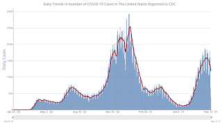 Click on graph for larger image.
This graph shows the daily (columns) and 7 day average (line) of positive tests reported.
Tuesday: CPI
by Calculated Risk on 9/13/2021 09:00:00 PM
From Matthew Graham at Mortgage News Daily: Mortgage Rates Flat to Start The Week
Mortgage rates were fairly flat to start the new week. This leaves the average lender in the high 2% range for top tier conventional 30yr fixed scenarios (i.e. 20%+ equity, 740+ FICO, owner-occupied, single-family, detached homes). This is just a bit higher than the all-time lows seen at the beginning of the year when rates were in the mid-2% range. [30 year fixed 2.94%]Tuesday:
emphasis added
• At 6:00 AM ET, NFIB Small Business Optimism Index for August.
• At 8:30 AM, The Consumer Price Index for August from the BLS. The consensus is for a 0.4% increase in CPI, and a 0.3% increase in core CPI.
MBA Survey: "Share of Mortgage Loans in Forbearance Decreases to 3.08%"
by Calculated Risk on 9/13/2021 04:00:00 PM
Note: This is as of September 5th.
From the MBA: Share of Mortgage Loans in Forbearance Decreases to 3.08%
The Mortgage Bankers Association’s (MBA) latest Forbearance and Call Volume Survey revealed that the total number of loans now in forbearance decreased by 15 basis points from 3.23% of servicers’ portfolio volume in the prior week to 3.08% as of September 5, 2021. According to MBA’s estimate, 1.5 million homeowners are in forbearance plans.
The share of Fannie Mae and Freddie Mac loans in forbearance decreased 11 basis points to 1.52%. Ginnie Mae loans in forbearance decreased 24 basis points to 3.39%, while the forbearance share for portfolio loans and private-label securities (PLS) decreased 25 basis points to 7.27%. The percentage of loans in forbearance for independent mortgage bank (IMB) servicers decreased 16 basis points to 3.33%, and the percentage of loans in forbearance for depository servicers decreased 18 basis points to 3.15%.
“The share of loans in forbearance decreased by 15 basis points last week, as forbearance exits jumped to their fastest pace since March. The fast pace of exits outweighed the slight increase in new forbearance requests and re-entries,” said Mike Fratantoni, MBA’s Senior Vice President and Chief Economist. “Servicer call volume jumped last week as summer came to an end and many borrowers reached the end of their forbearance terms. We anticipate a similarly fast pace of exits in the weeks ahead, which should lead to increased call volume and a further decline in the forbearance share.”
emphasis added
 Click on graph for larger image.
This graph shows the percent of portfolio in forbearance by investor type over time. Most of the increase was in late March and early April 2020, and has trended down since then.
The MBA notes: "Total weekly forbearance requests as a percent of servicing portfolio volume (#) increased relative to the prior week: from 0.04% to 0.05%."
Second Home Market: South Lake Tahoe in August
by Calculated Risk on 9/13/2021 01:57:00 PM
Early this year, from Jann Swanson at MortgageNewsDaily: Fannie Warns Lenders on Investment Properties and 2nd Homes.
I'm looking at data for some second home markets - and will track those markets to see if there is an impact from the lending changes.
This graph is for South Lake Tahoe since 2004 through August 2021, and shows inventory (blue), and the year-over-year (YoY) change in the median price (12 month average).
Note: The median price is distorted by the mix, but this is the available data.

Following the housing bubble, prices declined for several years in South Lake Tahoe, with the median price falling about 50% from the bubble peak.
Currently inventory is still very low, but solidly above the record low set five months ago, and prices are up sharply YoY. This will be interesting to watch.
5 Additional Local Housing Markets in August: Albuquerque, Colorado, Houston, Memphis and Nashville
by Calculated Risk on 9/13/2021 11:09:00 AM
Starting this month, I'm going to post local market data (Sales, Active Inventory, New listings) several times during the month on the CalculatedRisk Newsletter.
Here are 5 more of about 30 local markets that I track: 5 More Local Housing Markets in August
This includes Albuquerque, Colorado, Houston, Memphis and Nashville.
Housing Inventory Sept 13th Update: Inventory Down 1.4% Week-over-week, Up 41% from Low in early April
by Calculated Risk on 9/13/2021 10:29:00 AM
Tracking existing home inventory will be very important this year.
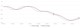
This inventory graph is courtesy of Altos Research.
Mike Simonsen discusses this data regularly on Youtube.
Seven High Frequency Indicators for the Economy
by Calculated Risk on 9/13/2021 08:10:00 AM
These indicators are mostly for travel and entertainment. It will interesting to watch these sectors recover as the pandemic subsides.
The TSA is providing daily travel numbers.
This data is as of September 12th.
 Click on graph for larger image.
This data shows the 7-day average of daily total traveler throughput from the TSA for 2019 (Light Blue), 2020 (Blue) and 2021 (Red).
The dashed line is the percent of 2019 for the seven day average.
The 7-day average is down 23.2% from the same day in 2019 (76.8% of 2019). (Dashed line)
The second graph shows the 7-day average of the year-over-year change in diners as tabulated by OpenTable for the US and several selected cities.
 Thanks to OpenTable for providing this restaurant data:
This data is updated through September 11, 2021.
This data is "a sample of restaurants on the OpenTable network across all channels: online reservations, phone reservations, and walk-ins. For year-over-year comparisons by day, we compare to the same day of the week from the same week in the previous year."
Note that this data is for "only the restaurants that have chosen to reopen in a given market". Since some restaurants have not reopened, the actual year-over-year decline is worse than shown.
Dining picked up for the Labor Day weekend, but declined after the holiday. The 7-day average for the US is down 6% compared to 2019.
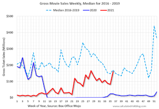 This data shows domestic box office for each week and the median for the years 2016 through 2019 (dashed light blue).
 Note that the data is usually noisy week-to-week and depends on when blockbusters are released.
Movie ticket sales were at $162 million last week, down only about 5% from the median for the week due to the blockbuster "Shang-Chi and the Legend of the Ten Rings".
 This graph shows the seasonal pattern for the hotel occupancy rate using the four week average.
 The red line is for 2021, black is 2020, blue is the median, dashed purple is 2019, and dashed light blue is for 2009 (the worst year on record for hotels prior to 2020).
Occupancy is above the horrible 2009 levels. With solid leisure travel, the Summer months and Labor Day had decent occupancy - but it is uncertain what will happen in the Fall with business travel.
This data is through September 4th. The occupancy rate was unchanged compared to the same week in 2019, boosted by Labor Day demand and Hurricane Ida. Note: Occupancy was up year-over-year, since occupancy declined sharply at the onset of the pandemic.
Notes: Y-axis doesn't start at zero to better show the seasonal change.
 This graph, based on weekly data from the U.S. Energy Information Administration (EIA), shows gasoline supplied compared to the same week of 2019.
Blue is for 2020. Red is for 2021.
As of September 3rd, gasoline supplied was down 2.0% compared to the same week in 2019.
There have been five weeks so far this year when gasoline supplied was up compared to the same week in 2019.
This graph is from Apple mobility. From Apple: "This data is generated by counting the number of requests made to Apple Maps for directions in select countries/regions, sub-regions, and cities." This is just a general guide - people that regularly commute probably don't ask for directions.
There is also some great data on mobility from the Dallas Fed Mobility and Engagement Index. However the index is set "relative to its weekday-specific average over January–February", and is not seasonally adjusted, so we can't tell if an increase in mobility is due to recovery or just the normal increase in the Spring and Summer.
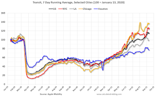 This data is through September 11th for the United States and several selected cities.
The graph is the running 7-day average to remove the impact of weekends.
IMPORTANT: All data is relative to January 13, 2020. This data is NOT Seasonally Adjusted. People walk and drive more when the weather is nice, so I'm just using the transit data.
According to the Apple data directions requests, public transit in the 7 day average for the US is at 115% of the January 2020 level.
Here is some interesting data on New York subway usage (HT BR).
 This graph is from Todd W Schneider. This is weekly data since 2015.
 This data is through Friday, September 10th.
Schneider has graphs for each borough, and links to all the data sources.
He notes: "Data updates weekly from the MTA’s public turnstile data, usually on Saturday mornings".


