by Calculated Risk on 4/07/2012 01:28:00 PM
Saturday, April 07, 2012
Schedule for Week of April 8th
Earlier:
• Summary for Week Ending April 6th
The key reports for this week are the February Trade Balance report, to be released on Thursday, and the March Consumer Price Index (CPI), to be released on Friday.
FHFA acting director Edward DeMarco is speaking on Tuesday: "Addressing the Weak Housing Market: Is Principal Reduction the Answer?"
There will be several speeches by Fed officials, including both Fed Chairman Ben Berananke, and Fed Vice Chairman Janet Yellen.
Morning: LPS House Price Index for January.
7:15 PM ET: Speech by Fed Chairman Ben Bernanke, "Fostering Financial Stability", At the 2012 Federal Reserve Bank of Atlanta Financial Markets Conference, Stone Mountain, Georgia
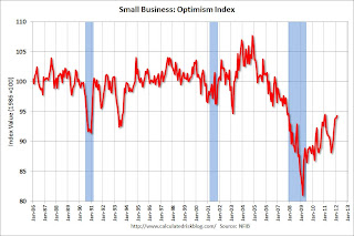 7:30 AM: NFIB Small Business Optimism Index for March.
 Click on graph for larger image in graph gallery.
This graph shows the small business optimism index since 1986. The index increased to 94.3 in February from 93.9 in January. This is the sixth increase in a row after for the index, and the index is now at second highest level since December 2007. The consensus is for an increase to 94.8.
9:30 AM ET: Speech by FHFA acting director Edward DeMarco: "Addressing the Weak Housing Market: Is Principal Reduction the Answer?" at the The Brookings Institution, 1775 Massachusetts Ave., NW Washington, DC.
 10:00 AM ET: Job Openings and Labor Turnover Survey for February from the BLS.
 This graph shows job openings (yellow line), hires (purple), Layoff, Discharges and other (red column), and Quits (light blue column) from the JOLTS.
Jobs openings were unchanged in January, and the number of job openings (yellow) has generally been trending up, and are up about 21% year-over-year compared to January 2011.
10:00 AM: Monthly Wholesale Trade: Sales and Inventories for February. The consensus is for a 0.6% increase in inventories.
7:00 AM: The Mortgage Bankers Association (MBA) will release the mortgage purchase applications index. This index has been weak this year, although this does not include all the cash buyers.
8:30 AM: Import and Export Prices for February. The consensus is a for a 0.9% increase in import prices.
2:00 PM: Federal Reserve Beige Book, an informal review by the Federal Reserve Banks of current economic conditions in their Districts.
6:15 PM: Speech by Fed Vice Chair Janet Yellen, "The Economic Outlook and Monetary Policy", At the Money Marketeers of New York University Dinner Meeting, New York, New York
8:30 AM: The initial weekly unemployment claims report will be released. The consensus is for claims to increase slightly to 359,000.
 8:30 AM: Trade Balance report for February from the Census Bureau.
 Both exports and imports increased in January. Imports stalled in the middle of 2011, but increased towards the end of the year (seasonally adjusted). Exports are well above the pre-recession peak and up 8% compared to January 2011; imports just passed the pre-recession high and imports are up about 8% compared to January 2011.
The consensus is for the U.S. trade deficit to decrease to $51.7 billion in February, up from from $52.6 billion in January. Export activity to Europe will be closely watched due to economic weakness.
8:30 AM: Producer Price Index for March. The consensus is for a 0.3% increase in producer prices (0.2% increase in core).
8:30 AM: Consumer Price Index for March. The consensus is a 0.3% increase in prices. The consensus for core CPI to increase 0.2%.
9:55 AM: Reuter's/University of Michigan's Consumer sentiment index (perliminary for April). The consensus is for sentiment to be unchanged at 76.2.
1:00 PM: Speech by Fed Chairman Ben Bernanke, "Reflections on the Crisis and the Policy Response", At the Russell Sage Foundation and The Century Foundation Conference on "Rethinking Finance," New York, New York
Summary for Week ending April 6th
by Calculated Risk on 4/07/2012 07:43:00 AM
The March employment report was below expectations with only 120,000 payroll jobs added. The unemployment rate declined slightly to 8.2%. U-6, an alternate measure of labor underutilization that includes part time workers and marginally attached workers, declined to 14.5% from 14.9% in February.
Is this the beginning of even slower employment growth, or was this just noise? That is a key question and will put additional pressure on the April report.
In 2011, the economy added 1.84 million payroll jobs (2.1 million private sector), and, even after the weak March report, the economy is on pace to add over 2.5 million payroll jobs this year. That is still sluggish growth given the slack in the system, but better than 2011.
Other reports below expectations included March auto sales, February construction spending, and the March ISM service survey. The ISM manufacturing survey was slightly above expectations.
A couple of other positives: initial weekly unemployment claims continued to decline, and, for commercial real estate, the office and mall vacancy rates are now declining.
Overall it was a disappointing week and suggests sluggish growth.
Here is a summary in graphs:
• March Employment Report: 120,000 Jobs, 8.2% Unemployment Rate
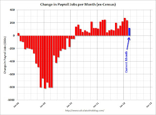 Click on graph for larger image.
This graph shows the jobs added or lost per month (excluding temporary Census jobs) since the beginning of 2008.
From the BLS: "Nonfarm payroll employment rose by 120,000 in March, and the unemployment rate was little changed at 8.2 percent, the U.S. Bureau of Labor Statistics reported today."
The second graph shows the employment population ratio, the participation rate, and the unemployment rate. The unemployment rate was declined to 8.2% (red line).
 The Labor Force Participation Rate decreased to 63.8% in March (blue line). This is the percentage of the working age population in the labor force. The participation rate is well below the 66% to 67% rate that was normal over the last 20 years, although most of the decline is due to demographics.
The Employment-Population ratio decreased slightly to 58.5% in March (black line).
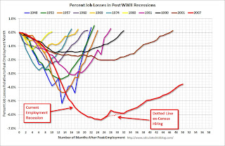 The third graph shows the job losses from the start of the employment recession, in percentage terms. The dotted line is ex-Census hiring.
This shows the depth of the recent employment recession - much worst than any other post-war recession - and the relatively slow recovery due to the lingering effects of the housing bust and financial crisis.
This was weaker payroll growth than expected (expected was 201,000).
• ISM Manufacturing index indicates slightly faster expansion in March
 PMI was at 53.4% in March, up from 52.4% in February. The employment index was at 56.1%, up from 53.2%, and new orders index was at 54.5%, down from 54.9%.
 Here is a long term graph of the ISM manufacturing index.
This was slightly above expectations of 53.0%. This suggests manufacturing expanded at a faster rate in March than in February. It appears manufacturing employment expanded in March with the employment index at 56.1%.
• ISM Non-Manufacturing Index indicates slower expansion in March
 The March ISM Non-manufacturing index was at 56.0%, down from 57.3% in February. The employment index increased in March to 56.7%, up from 55.7% in February. Note: Above 50 indicates expansion, below 50 contraction.
 This graph shows the ISM non-manufacturing index (started in January 2008) and the ISM non-manufacturing employment diffusion index.
This was below the consensus forecast of 56.7% and indicates slightly slower expansion in March than in February.
• U.S. Light Vehicle Sales at 14.4 million annual rate in March
 Based on an estimate from Autodata Corp, light vehicle sales were at a 14.37 million SAAR in March. That is up 10.4% from March 2011, but down 4.4% from the sales rate last month (15.03 million SAAR in Feb 2012).
This graph shows light vehicle sales since the BEA started keeping data in 1967.
March was above the August 2009 rate with the spike in sales from "cash-for-clunkers". Only February had a higher sales rates since early 2008. This was below the consensus forecast of 14.7 million SAAR.
Even though this was below expectations, growth in auto sales will make another strong positive contribution to GDP in Q1 2012.
• Construction Spending declined in February
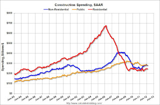 This graph shows private residential and nonresidential construction spending, and public spending, since 1993. Note: nominal dollars, not inflation adjusted.
Private residential spending is 63.5% below the peak in early 2006, and up 10% from the recent low. Non-residential spending is 32% below the peak in January 2008, and up about 15% from the recent low.
Public construction spending is now 13% below the peak in March 2009.
The year-over-year improvement in private residential investment is an important change (the positive in 2010 was related to the tax credit), and this suggest the bottom is in for residential investment.
• Reis: Office, Mall and Apartment Vacancy Rates
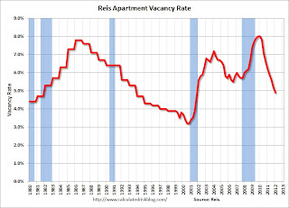 Reis reported the apartment vacancy rate (82 markets) fell to 4.9% in Q1 from 5.2% in Q4 2011. The vacancy rate was at 6.1% in Q1 2010 and peaked at 8.0% at the end of 2009.
This graph shows the apartment vacancy rate starting in 1980 (prior to 1999 the data is annual). Back in the early '80s, there was overbuilding in the apartment sector (just like for offices) with the very loose lending that led to the S&L crisis. Once the lending stopped, starts of built-for-rent units slowed, and the vacancy rate started to decline.
Following the financial crisis, starts and completions of multi-family units fell to record lows (there were a record low number of completions last year). Builders have increased construction, but it usually takes over a year to complete a multi-family building, so this new supply hasn't reached the market yet. As Reis noted, the number of completions will increase this year, but the vacancy rate will probably decline further.
This will also impact on house prices. The upward pressure on rents will make the price-to-rent ratio a little more favorable for buying.
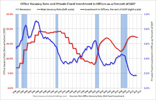 Reis reported the office vacancy rate declined slightly to 17.2% in Q1 from 17.3% in Q4 2011. The vacancy rate was at 17.6% in Q1 2011.
This graph shows the office vacancy rate starting in 1980 (prior to 1999 the data is annual). Back in the early '80s, there was overbuilding in the office sector even as the vacancy rate was rising. This was due to the very loose lending that led to the S&L crisis.
In the '90s, office investment picked up as the vacancy rate fell. Following the bursting of the stock bubble, the vacancy rate increased sharply and office investment declined.
During the housing bubble, office investment started to increase even before the vacancy rate had fallen below 14%. This was due to loose lending - again. Investment essentially stopped following the financial crisis.
The good news is there is very little new office construction right now and the vacancy rate will probably continue to decline.
 Ries reported the regional mall vacancy rate declined to 9.0% in Q1, and the strip mall vacancy rate declined to 10.9% from 11.0%.
This graph shows the vacancy rate for regional and strip malls since Q1 2000.
It appears the vacancy rate is starting to decline, but very slowly. Just like for office space, there is almost no new supply of malls being built.
• Weekly Initial Unemployment Claims decline to 357,000
 The DOL reports:
In the week ending March 31, the advance figure for seasonally adjusted initial claims was 357,000, a decrease of 6,000 from the previous week's revised figure of 363,000. The 4-week moving average was 361,750, a decrease of 4,250 from the previous week's revised average of 366,000.The previous week was revised up to 363,000 from 359,000.
The dashed line on the graph is the current 4-week average. The four-week average of weekly unemployment claims declined to 361,750.
The 4-week moving average is at the lowest level since early 2008.
• Other Economic Stories ...
• FOMC Minutes: No Push for QE3
• Federal Reserve Issues Statement on Rental of REOs
• Trulia announces new "mix adjusted" House Asking Price Monitor, Prices up 1.4% from Q4
• Ceridian-UCLA: Diesel Fuel index increased 0.3% in March
• ADP: Private Employment increased 209,000 in March
• LPS: February Foreclosure Starts and Sales Reversed Prior Month’s Increases
Friday, April 06, 2012
Stand-up economist Yoram Bauman: S*** happens: the economics version
by Calculated Risk on 4/06/2012 10:32:00 PM
Language warning on video below ...
Earlier Employment posts:
• March Employment Report: 120,000 Jobs, 8.2% Unemployment Rate
• Employment Summary and Discussion
• Construction Employment, Duration of Unemployment, Unemployment by Education and Diffusion Indexes
• All Employment Graphs
AAR: Rail Traffic "mixed" in March
by Calculated Risk on 4/06/2012 04:01:00 PM
From the Association of American Railroads (AAR): AAR Reports Mixed Rail Traffic for March
The Association of American Railroads (AAR) today reported reported U.S. rail carloads originated in March 2012 totaled 1,123,298, down 69,190 carloads or 5.8 percent, compared with March 2011. Intermodal volume in March 2012 was 928,350 containers and trailers, up 31,348 units or 3.5 percent compared with March 2011.
...
Commodities with carload declines in March were led by coal, down 84,854 carloads or 15.8 percent from March 2011. Other commodities with declines included grain, down 9,088 carloads or 9.7 percent; chemicals, down 4,278 carloads or 3.4 percent; nonmetallic minerals, down 1,863 carloads or 9.7 percent; and farm products excluding grain, down 479 carloads or 13.3 percent. Carloads excluding coal and grain were up 4.4 percent or 24,752 carloads in March 2012 over March 2011.
...
“There is no denying that coal is a crucial commodity for railroads, and there’s also no denying that recent declines in coal traffic are presenting significant challenges to railroads right now,” said AAR Senior Vice President John T. Gray. “That said, it’s encouraging that many commodities that are better indicators of the state of the economy than coal is — things like motor vehicles, lumber and wood products, and crushed stone — saw higher rail carloadings in March.”
 Click on graph for larger image.
This graph shows U.S. average weekly rail carloads (NSA).
U.S. railroads originated 1,123,298 total carloads in March 2012, down 5.8% (69,190 carloads) from the same period in 2011. Total carloads averaged 280,825 per week in March 2012, down from 298,122 in March 2011. Coal and, to a lesser extent, grain were the main reasons for the decline. Excluding coal and grain, U.S. rail carloads were up 4.4% (24,752 carloads) in March 2012 over March 2011, though the 4.4% gain is the smallest gain for this category of rail traffic in six monthsAccording to the AAR, the decline in coal is because coal is being used less for electricity generation.
The second graph is for intermodal traffic (using intermodal or shipping containers):
 Graphs reprinted with permission.
Intermodal traffic is now above the peak year in 2006.
Intermodal continued to impress in March. U.S. railroads originated 928,350 containers and trailers in March 2012, up 3.5% (31,348 units) over March 2011 and the 28th straight year-over-year monthly increase. Average weekly U.S. intermodal loadings in March 2012 were the highest of any March in history.
Earlier Employment posts:
• March Employment Report: 120,000 Jobs, 8.2% Unemployment Rate
• Employment Summary and Discussion
• Construction Employment, Duration of Unemployment, Unemployment by Education and Diffusion Indexes
• All Employment Graphs
Construction Employment, Duration of Unemployment, Unemployment by Education and Diffusion Indexes
by Calculated Risk on 4/06/2012 01:09:00 PM
The first graph below shows the number of total construction payroll jobs in the U.S. including both residential and non-residential since 1969.
Construction employment decreased by 7 thousand jobs in March, giving back some of the gains from January. Last year was the first year with an increase in construction employment since 2006, and the first with an increase in residential construction employment since 2005.
Unfortunately this graph is a combination of both residential and non-residential construction employment. The BLS only started breaking out residential construction employment fairly recently (residential specialty trade contractors in 2001).
Usually residential investment (and residential construction) leads the economy out of recession, and non-residential construction usually lags the economy. Because this graph is a blend, it masks the usual pickup in residential construction following previous recessions. Of course there was no pickup for residential construction this time because of the large excess supply of vacant homes - although that appears to be changing and residential construction employment will probably increase this year.
 Click on graph for larger image.
Construction employment is now generally increasing, and construction will add to both GDP and employment growth in 2012.
As I've noted for years, there are usually two bottoms for housing following a bubble: 1) when housing starts, new home sales, and residential construction bottoms, and 2) when house prices bottom. The bottom is in for construction and construction employment.
 This graph shows the duration of unemployment as a percent of the civilian labor force. The graph shows the number of unemployed in four categories: less than 5 week, 6 to 14 weeks, 15 to 26 weeks, and 27 weeks or more.
All categories are generally moving down (the less than 5 week category is back to normal levels). The other categories are still high.
The the long term unemployed declined to 3.4% of the labor force - this is still very high, but the lowest since September 2009.
 This graph shows the unemployment rate by four levels of education (all groups are 25 years and older).
Unfortunately this data only goes back to 1992 and only includes one previous recession (the stock / tech bust in 2001). Clearly education matters with regards to the unemployment rate - and it appears all four groups are generally trending down.
Note: This says nothing about the quality of jobs - as an example, a college graduate working at minimum wage would be considered "employed".
 This is a little more technical. The BLS diffusion index for total private employment was at 59.6 in March, down slightly from 60.7 in January. For manufacturing, the diffusion index increased to 67.9, up from 59.9 in February.
 Think of this as a measure of how widespread job gains are across industries. The further from 50 (above or below), the more widespread the job losses or gains reported by the BLS. From the BLS:
Figures are the percent of industries with employment increasing plus one-half of the industries with unchanged employment, where 50 percent indicates an equal balance between industries with increasing and decreasing employment.It appears job growth was still fairly widespread in March.
We'd like to see the diffusion indexes consistently above 60 - and even in the 70s like in the '1990s.
Earlier Employment posts:
• March Employment Report: 120,000 Jobs, 8.2% Unemployment Rate
• Employment Summary and Discussion
• All Employment Graphs


