by Calculated Risk on 4/24/2012 02:49:00 PM
Tuesday, April 24, 2012
Comments on Housing and "Distressing Gap" Graph
The solid new home sales report this morning is further confirmation that the recovery for the housing industry has started. New home sales are up about 17% from the weakest three month period during the housing bust. That is a significant improvement, even if the absolute levels are still very low.
The debate is now about the strength of the recovery, not whether there is a recovery. My view is housing will remain sluggish for some time, and I expect 2012 to be another historically weak year, but better than 2011.
For house prices, the Case-Shiller index has a serious lag, and the key right now is to see if the year-over-year change is declining (it is). Note: The current Case-Shiller report was an average of December, January and February closing prices, and some of those sales were probably negotiated last October, about six months ago!
More current, but less reliable, pricing data (such as asking prices, new home prices and some anecdotal comments) suggest that house prices have stopped falling in most areas, and I expect the year-over-year change in the Case-Shiller index to turn slightly positive in the not too distant future (it is difficult to predict when, although I'll try in a couple of months). Of course the number of REO sales (lender Real Estate Owned) are down, and some of the improvement is related to fewer foreclosures and other distressed sales.
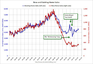
Here is an update to the "distressing gap" graph that shows existing home sales (left axis) and new home sales (right axis) through March. This graph starts in 1994, but the relationship has been fairly steady back to the '60s.
 Click on graph for larger image.
Following the housing bubble and bust, the "distressing gap" appeared mostly because of distressed sales. The flood of distressed sales has kept existing home sales elevated, and depressed new home sales since builders haven't been able to compete with the low prices of all the foreclosed properties.
I expect this gap to eventually close, but it will probably take a number of years.
Note: Existing home sales are counted when transactions are closed, and new home sales are counted when contracts are signed. So the timing of sales is different.
On March New Home Sales:
• New Home Sales in March at 328,000 Annual Rate
• New Home Sales graphs
On House Prices:
• Case Shiller: House Prices fall to new post-bubble lows in February NSA
• Real House Prices and Price-to-Rent Ratio at late '90s Levels
• House Price graphs
Real House Prices and Price-to-Rent Ratio at late '90s Levels
by Calculated Risk on 4/24/2012 11:51:00 AM
Another Update: Case-Shiller, CoreLogic and others report nominal house prices. It is also useful to look at house prices in real terms (adjusted for inflation) and as a price-to-rent ratio.
Below are three graphs showing nominal prices (as reported), real prices and a price-to-rent ratio. Real prices, and the price-to-rent ratio, are back to late 1998 and early 2000 levels depending on the index.
Nominal House Prices
 Click on graph for larger image.
The first graph shows the quarterly Case-Shiller National Index SA (through Q4 2011), and the monthly Case-Shiller Composite 20 SA and CoreLogic House Price Indexes (through February) in nominal terms as reported.
In nominal terms, the Case-Shiller National index (SA) is back to Q3 2002 levels, the Case-Shiller Composite 20 Index (SA) is back to January 2003 levels, and the CoreLogic index (NSA) is back to January 2003.
Real House Prices
 The second graph shows the same three indexes in real terms (adjusted for inflation using CPI less Shelter). Note: some people use other inflation measures to adjust for real prices.
In real terms, the National index is back to Q4 1998 levels, the Composite 20 index is back to January 2000, and the CoreLogic index back to May 1999.
In real terms, all appreciation in the '00s is gone.
Price-to-Rent
In October 2004, Fed economist John Krainer and researcher Chishen Wei wrote a Fed letter on price to rent ratios: House Prices and Fundamental Value. Kainer and Wei presented a price-to-rent ratio using the OFHEO house price index and the Owners' Equivalent Rent (OER) from the BLS.
 Here is a similar graph using the Case-Shiller National, Composite 20 and CoreLogic House Price Indexes.
This graph shows the price to rent ratio (January 1998 = 1.0).
On a price-to-rent basis, the Case-Shiller National index is back to October 1998 levels, the Composite 20 index is back to February 2000 levels, and the CoreLogic index is back to June 1999.
In real terms - and as a price-to-rent ratio - prices are mostly back to late 1990s or early 2000 levels.
Earlier:
• Case Shiller: House Prices fall to new post-bubble lows in February NSA
• New Home Sales in March at 328,000 Annual Rate
New Home Sales in March at 328,000 Annual Rate
by Calculated Risk on 4/24/2012 10:00:00 AM
The Census Bureau reports New Home Sales in March were at a seasonally adjusted annual rate (SAAR) of 328 thousand. This was down from a revised 353 thousand SAAR in February (revised up sharply from 313 thousand). December and January were revised up too.
The first graph shows New Home Sales vs. recessions since 1963. The dashed line is the current sales rate.
Sales of new single-family houses in March 2012 were at a seasonally adjusted annual rate of 328,000 ... This is 7.1 percent (±20.7%) below the revised February rate of 353,000, but is 7.5 percent (±19.6%) above the March 2011 estimate of 305,000..
 Click on graph for larger image in graph gallery.
The second graph shows New Home Months of Supply.
Months of supply increased to 5.3 in March from 5.0 in February.
The all time record was 12.1 months of supply in January 2009.
 This is now in the normal range (less than 6 months supply is normal).
The seasonally adjusted estimate of new houses for sale at the end of March was 144,000. This represents a supply of 5.3 months at the current sales rate.On inventory, according to the Census Bureau:
"A house is considered for sale when a permit to build has been issued in permit-issuing places or work has begun on the footings or foundation in nonpermit areas and a sales contract has not been signed nor a deposit accepted."Starting in 1973 the Census Bureau broke this down into three categories: Not Started, Under Construction, and Completed.
 This graph shows the three categories of inventory starting in 1973.
The inventory of completed homes for sale was at a record low 48,000 units in March. The combined total of completed and under construction is at the lowest level since this series started.
The last graph shows sales NSA (monthly sales, not seasonally adjusted annual rate).
In March 2012 (red column), 32 thousand new homes were sold (NSA). Last year only 28 thousand homes were sold in March. This was the third weakest March since this data has been tracked. The high for March was 127 thousand in 2005.
 Even though sales are still very low, new home sales have clearly bottomed. New home sales have averaged 335 thousand SAAR over the last 5 months, after averaging under 300 thousand for the previous 18 months. All of the recent revisions have been up too.
This was a solid report and above the consensus forecast.
Case Shiller: House Prices fall to new post-bubble lows in February NSA
by Calculated Risk on 4/24/2012 09:00:00 AM
S&P/Case-Shiller released the monthly Home Price Indices for February (a 3 month average of December, January and February).
This release includes prices for 20 individual cities, and two composite indices (for 10 cities and 20 cities).
Note: Case-Shiller reports NSA, I use the SA data.
From S&P: Nine Cities and Both Composites Hit New Lows in February 2012 According to the S&P/Case-Shiller Home Price Indices
Data through February 2012, released today by S&P Indices for its S&P/Case-Shiller Home Price Indices ... showed annual declines of 3.6% and 3.5% for the 10- and 20-City Composites, respectively. This is an improvement over the annual rates posted for the month of January, -4.1% and -3.9%, respectively. ... Nine MSAs and both Composites posted new cycle lows as of February 2012.
...
“While there might be pieces of good news in this report, such as some improvement in many annual rates of return, February 2012 data confirm that, broadly-speaking, home prices continued to decline in the early months of the year,” says David M. Blitzer, Chairman of the Index Committee at S&P Indices. “Nine MSAs -- Atlanta, Charlotte, Chicago, Cleveland, Las Vegas, New York, Portland, Seattle and Tampa -- and both Composites hit new post-crisis lows. Atlanta continued its downward spiral, posting its lowest annual rate of decline in the 20-year history of the index at -17.3%. The 10-City Composite declined 3.6% and the 20-City was down 3.5% compared to February 2011.
 Click on graph for larger image.
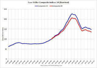
 The first graph shows the nominal seasonally adjusted Composite 10 and Composite 20 indices (the Composite 20 was started in January 2000).
The Composite 10 index is off 34.2% from the peak, and up 0.2% in February (SA). The Composite 10 is at a new post bubble low Not Seasonally Adjusted.
The Composite 20 index is off 33.9% from the peak, and up 0.1% (SA) from January. The Composite 20 is also at a new post-bubble low NSA.
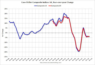
 The second graph shows the Year over year change in both indices.
The Composite 10 SA is down 3.6% compared to February 2011.
The Composite 20 SA is down 3.4% compared to February 2011. This was a smaller year-over-year decline for both indexes than in January.
The third graph shows the price declines from the peak for each city included in S&P/Case-Shiller indices.
 Prices increased (SA) in 12 of the 20 Case-Shiller cities in February seasonally adjusted (only 3 cities increased NSA). Prices in Las Vegas are off 61.7% from the peak, and prices in Dallas only off 8.2% from the peak.
The NSA indexes are at new post-bubble lows - and the NSA indexes will continue to decline in March (this report was for the three months ending in February). I'll have more on prices later
Monday, April 23, 2012
Two Convicted of Mortgage Fraud in San Diego
by Calculated Risk on 4/23/2012 07:53:00 PM
These people didn't think they'd get caught? And how did they earn $350,000 in fees on $8 million in loans? That sure seems excessive.
From Eric Wolff at the North County Times: Carlsbad mother and Orange County son convicted in $8 million mortgage fraud
A jury convicted a Carlsbad mother and her Orange County son of an $8 million mortgage fraud scheme, the U.S. Attorney for Southern California said Wednesday.Now they will get free rent at the Big House.
Stephen Chrysler, an Orange County attorney and loan broker, and his mother, Aida Agusti Castro, a Carlsbad real estate agent living in Cardiff, inflated clients incomes on loan mortgages to buy 16 properties in Escondido, Oceanside, San Marcos, Lakeside and Menifee over 25 months from 2005 to 2007 to create false loans, which in turn netted the pair $350,000 in fees.
...
Castro and Chrysler located their clients through advertising in Spanish-language publications. They then inflated their clients' incomes so the clients could purchase more expensive houses, which in turn inflated Castro and Chrysler's fees. In order to persuade lenders, the pair had to fake businesses, management companies, tenants and rental histories.
...
The pair then told clients to sign the loan documents without reading them, and they often refused to translate the documents from English to Spanish.


