by Calculated Risk on 12/27/2012 03:28:00 PM
Thursday, December 27, 2012
Philly Fed: State Coincident Indexes increased in 45 States in November
From the Philly Fed:
The Federal Reserve Bank of Philadelphia has released the coincident indexes for the 50 states for November 2012. In the past month, the indexes increased in 45 states and decreased in five states, for a one-month diffusion index of 80. Over the past three months, the indexes increased in 45 states, decreased in three, and remained stable in two, for a three-month diffusion index of 84. For comparison purposes, the Philadelphia Fed has also developed a similar coincident index for the entire United States. The Philadelphia Fed’s U.S. index rose 0.2 percent in November and 0.6 percent over the past three months.Note: These are coincident indexes constructed from state employment data. From the Philly Fed:
The coincident indexes combine four state-level indicators to summarize current economic conditions in a single statistic. The four state-level variables in each coincident index are nonfarm payroll employment, average hours worked in manufacturing, the unemployment rate, and wage and salary disbursements deflated by the consumer price index (U.S. city average). The trend for each state’s index is set to the trend of its gross domestic product (GDP), so long-term growth in the state’s index matches long-term growth in its GDP.
 Click on graph for larger image.
This is a graph is of the number of states with one month increasing activity according to the Philly Fed. This graph includes states with minor increases (the Philly Fed lists as unchanged).
In November, 45 states had increasing activity, down slightly from 46 in October (including minor increases). This is the second consecutive year with a weak spot during the summer, and improvement towards the end of the year.
 Here is a map of the three month change in the Philly Fed state coincident indicators. This map was all red during the worst of the recession.
 The map was all green earlier this year, than started to turn red, and is mostly green again.
"Fiscal Cliff": There is no Drop Dead Date and more thoughts
by Calculated Risk on 12/27/2012 01:50:00 PM
Two months ago I pointed out that there was no drop dead date for the "fiscal cliff" (more a slope than a cliff).
A few things to remember:
• There is no drop dead date. Online sites and TV channels with "fiscal cliff" countdown timers are an embarrassment and are just trying to scare viewers.
• The "fiscal cliff" is about too much austerity too quickly (cutting the deficit too quickly). The "cliff" is a combination of expiring tax cuts (income taxes, payroll taxes, and more will increase), and forced spending cuts (mostly for defense). This has NOTHING to do with other long term fiscal issues, primarily related to medicare.
• All along I've assumed an agreement would be reached in January. That timing is based on a two assumptions: 1) the tax cuts for high income earners would be allowed to expire, and 2) some politicians will not vote for any package that included a tax rate increase. After January 1st the politicians can vote for a tax cut for most Americans. That is obviously dumb, and makes extra work for many involved with payrolls and taxes, but that is politics. It is possible an agreement could be reached in the next few days - but I still think January is more likely. If it slips to February, I'll be concerned.
• We need the details of the fiscal agreement before we can estimate the drag on the US economy from all the austerity.
New Home Sales and Distressing Gap
by Calculated Risk on 12/27/2012 11:49:00 AM
New home sales have averaged 363,000 on an annual rate basis through November. That means sales are on pace to increase 18%+ from last year. Most sectors would be pretty happy with an 18% increase in sales.
But even with the significant increase this year, 2012 will be the 3rd lowest year for New Home sales since the Census Bureau started tracking new home sales in 1963. This year will be above 2010 and 2011, but below the 375,000 sales in 2009. I expect new home sales to double from here within the next several years as distressed sales continue to decline.
I started posting the following graph four years ago when the "distressing gap" first appeared.
The "distressing gap" graph shows existing home sales (left axis) and new home sales (right axis) through October. This graph starts in 1994, but the relationship has been fairly steady back to the '60s.
 Click on graph for larger image.
Following the housing bubble and bust, the "distressing gap" appeared mostly because of distressed sales. The flood of distressed sales kept existing home sales elevated, and depressed new home sales since builders weren't able to compete with the low prices of all the foreclosed properties.
I don't expect much of an increase in existing home sales (distressed sales will slowly decline and be offset by more conventional sales). But I do expect this gap to close - mostly from an increase in new home sales.
Note: Existing home sales are counted when transactions are closed, and new home sales are counted when contracts are signed. So the timing of sales is different.
Earlier:
• New Home Sales at 377,000 SAAR in November
• New Home Sales graphs
New Home Sales at 377,000 SAAR in November
by Calculated Risk on 12/27/2012 10:00:00 AM
The Census Bureau reports New Home Sales in November were at a seasonally adjusted annual rate (SAAR) of 377 thousand. This was up from a revised 361 thousand SAAR in October (revised down from 368 thousand). Sales for August and September were revised up slightly.
The first graph shows New Home Sales vs. recessions since 1963. The dashed line is the current sales rate.
Sales of new single-family houses in November 2012 were at a seasonally adjusted annual rate of 377,000 ... This is 4.4 percent above the revised October rate of 361,000 and is 15.3 percent above the November 2011 estimate of 327,000.
 Click on graph for larger image in graph gallery.
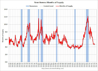
The second graph shows New Home Months of Supply.
The months of supply decreased in November to 4.7 months. October was revised up to 4.9 months (from 4.8 months).
The all time record was 12.1 months of supply in January 2009.
 This is now in the normal range (less than 6 months supply is normal).
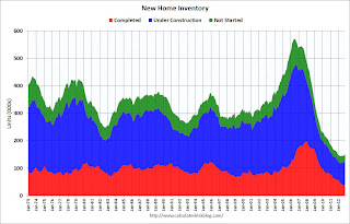
The seasonally adjusted estimate of new houses for sale at the end of November was 149,000. This represents a supply of 4.7 months at the current sales rate.On inventory, according to the Census Bureau:
"A house is considered for sale when a permit to build has been issued in permit-issuing places or work has begun on the footings or foundation in nonpermit areas and a sales contract has not been signed nor a deposit accepted."Starting in 1973 the Census Bureau broke this down into three categories: Not Started, Under Construction, and Completed.
 This graph shows the three categories of inventory starting in 1973.
The inventory of completed homes for sale was just above the record low in November. The combined total of completed and under construction is also just above the record low since "under construction" is starting to increase.
The last graph shows sales NSA (monthly sales, not seasonally adjusted annual rate).
In November 2012 (red column), 27 thousand new homes were sold (NSA). Last year only 23 thousand homes were sold in November. This was the fourth weakest November since this data has been tracked (above 2011, 2009 and 1966). The high for November was 86 thousand in 2005.
 New home sales have averaged 363 thousand SAAR through November 2012, up sharply from the 307 thousand sales in 2011. Also sales are finally at the lows for previous recessions too.
This was slightly above expectations of 375,000. I'll have more soon ...
Weekly Initial Unemployment Claims decline to 350,000, 4-Week average at low for 2012
by Calculated Risk on 12/27/2012 08:30:00 AM
The DOL reports:
In the week ending December 22, the advance figure for seasonally adjusted initial claims was 350,000, a decrease of 12,000 from the previous week's revised figure of 362,000. The 4-week moving average was 356,750, a decrease of 11,250 from the previous week's revised average of 368,000.The previous week was revised up slightly from 361,000.
The following graph shows the 4-week moving average of weekly claims since January 2000.

Click on graph for larger image.
The dashed line on the graph is the current 4-week average. The four-week average of weekly unemployment claims declined to 356,750.
The 4-week average is now at the low for the year. The previous low for the 4-week average was 363,000.
The recent spike in the 4-week average was due to Hurricane Sandy.
Weekly claims were lower than the 365,000 consensus forecast.

And here is a long term graph of weekly claims:
Note: There are large seasonal factors in December and January, and that can make for large swings for weekly claims. Still - it is nice finishing year at the lowest level for the 4-week average.


