by Calculated Risk on 12/09/2013 04:32:00 PM
Monday, December 09, 2013
Weekly Update: Housing Tracker Existing Home Inventory up 1.8% year-over-year on Dec 9th
Here is another weekly update on housing inventory ... for the eight consecutive week, housing inventory is up year-over-year. This suggests inventory bottomed early in 2013.
There is a clear seasonal pattern for inventory, with the low point for inventory in late December or early January, and then peaking in mid-to-late summer.
The Realtor (NAR) data is monthly and released with a lag (the most recent data was for October). However Ben at Housing Tracker (Department of Numbers) has provided me some weekly inventory data for the last several years.
 Click on graph for larger image.
This graph shows the Housing Tracker reported weekly inventory for the 54 metro areas for 2010, 2011, 2012 and 2013.
In 2011 and 2012, inventory only increased slightly early in the year and then declined significantly through the end of each year.
Inventory in 2013 is now 1.8% above the same week in 2012 (red is 2013, blue is 2012).
We can be pretty confident that inventory bottomed early this year. Inventory is still very low, but this increase in inventory should slow house price increases.
Note: One of the key questions for 2014 will be: How much will inventory increase? I'll post some thoughts on inventory at the end of the year.
Fed's Q3 Flow of Funds: Household Mortgage Debt increased slightly, First Mortgage Debt increase since Q1 2008
by Calculated Risk on 12/09/2013 12:00:00 PM
The Federal Reserve released the Q3 2013 Flow of Funds report today: Flow of Funds.
According to the Fed, household net worth increased in Q3 compared to Q2, and is at a new record. Net worth peaked at $69.1 trillion in Q3 2007, and then net worth fell to $55.7 trillion in Q1 2009 (a loss of $13.4 trillion). Household net worth was at $77.3 trillion in Q3 2013 (up $21.6 trillion from the trough in Q1 2009).
The Fed estimated that the value of household real estate increased to $19.0 trillion in Q3 2013. The value of household real estate is still $3.6 trillion below the peak in early 2006.
 Click on graph for larger image.
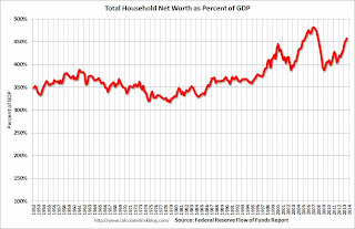
This is the Households and Nonprofit net worth as a percent of GDP. Although household net worth is at a record high, as a percent of GDP it is still below the peaks in 2000 (stock bubble) and 2006 (housing bubble).
This includes real estate and financial assets (stocks, bonds, pension reserves, deposits, etc) net of liabilities (mostly mortgages). Note that this does NOT include public debt obligations.
This ratio was increasing gradually since the mid-70s, and then we saw the stock market and housing bubbles. The ratio has been trending up and increased again in Q3 with both stock and real estate prices increasing.
 This graph shows homeowner percent equity since 1952.
Household percent equity (as measured by the Fed) collapsed when house prices fell sharply in 2007 and 2008.
In Q3 2013, household percent equity (of household real estate) was at 50.7% - up from Q2, and the highest since Q2 2007. This was because of both an increase in house prices in Q3 (the Fed uses CoreLogic) and a reduction in mortgage debt.
Note: about 30.3% of owner occupied households had no mortgage debt as of April 2010. So the approximately 52+ million households with mortgages have far less than 50.7% equity - and millions have negative equity.
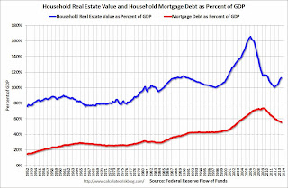
 The third graph shows household real estate assets and mortgage debt as a percent of GDP.
Mortgage debt increased by $10.0 billion in Q3. (Still declined as percent of GDP). This is the first increase in mortgage debt since Q1 2008.
Mortgage debt has now declined by $1.32 trillion from the peak. Studies suggest most of the decline in debt has been because of foreclosures (or short sales), but some of the decline is from homeowners paying down debt (sometimes so they can refinance at better rates).
The value of real estate, as a percent of GDP, was up in Q3 (as house prices increased), but still close to the average of the last 30 years (excluding bubble). However household mortgage debt, as a percent of GDP, is still historically high, suggesting a little more deleveraging ahead for certain households.
Update on "Small Ball" Budget Agreement
by Calculated Risk on 12/09/2013 09:27:00 AM
An agreement should be reached this week ...
From Ezra Klein and Evan Soltas at the WaPo: Wonkbook: The ‘Grand Bargain’ is over
The budget deal Patty Murray and Paul Ryan are crafting isn't a "grand bargain." ... But the deal does lift about a third of sequestration's cuts while giving agencies more flexibility to deal with the rest. It does mean the 2014 budget is the work of human hands rather than automatic cuts. It might be a vehicle for Capitol Hill to extend expiring unemployment benefits. And it would be a small but real boost to the economy.Reducing the sequester budget cuts is good policy. And it would be good economics (and good overall policy) to extend the emergency unemployment benefits too - but it isn't clear if that will happen.
Joel Prakken of Macroeconomic Advisors says the deal "would be a modest boost to GDP growth (relative to sequester). Maybe 1/4 percentage point." Moody's Mark Zandi adds in the possibility of extending unemployment insurance and estimates that "the lift to GDP next year compared to current law is .4. Small, but it matters."
Sunday, December 08, 2013
Sunday Night Futures: Taper Talk and "Small Ball" Budget Agreement
by Calculated Risk on 12/08/2013 08:44:00 PM
This will be a light week for economic data, but there will be plenty of discussion about when the Fed will start to taper QE3 asset purchases. From Binyamin Appelbaum at the NY Times: Fed’s Plan to Taper Stimulus Effort Not Expected Until Next Year
Federal Reserve officials are in no hurry to retreat from their bond-buying campaign to stimulate the economy and are likely to postpone any cuts to the program until next year, according to public statements by Fed officials and interviews with some of them.I still think there is a chance that the taper will start in December, but the consensus seems to be early in 2014 (either at the January or March meeting).
...
[I]nfluential Fed officials see little harm in postponing the decision, particularly compared with the risks of pulling back too soon. Significant details of the eventual retreat also remain the subjects of unresolved debates, according to the public statements and interviews. And some officials argue that the slow pace of inflation is itself a reason for the Fed to maintain its stimulus campaign.
Another key event this week will be the expected "small ball" budget agreement on Friday. From Lori Montgomery at the WaPo: Budget deal expected this week amounts to a cease-fire as sides move to avert a standoff
House and Senate negotiators were putting the finishing touches Sunday on what would be the first successful budget accord since 2011 ...Cutting back the sequester is good economic policy, and we don't need more austerity right now ... so this agreement will be a positive for the economy.
Senior aides familiar with the talks say the emerging agreement aims to partially repeal the sequester and raise agency spending to roughly $1.015 trillion in fiscal 2014 and 2015. That would bring agency budgets up to the target already in place for fiscal 2016. To cover the cost, Ryan and Murray are haggling over roughly $65 billion in alternative policies, including cuts to federal worker pensions and higher security fees for the nation’s airline passengers.
Weekend:
• Schedule for Week of December 8th
• Update: Four Charts to Track Timing for QE3 Tapering
The Nikkei is up about 1.8%.
From CNBC: Pre-Market Data and Bloomberg futures: the S&P futures are up 2 and DOW futures are up 20 (fair value).
Oil prices are up with WTI futures at $97.76 per barrel and Brent at $111.58 per barrel.
Below is a graph from Gasbuddy.com for nationwide gasoline prices. Nationally prices are around $3.24 per gallon. If you click on "show crude oil prices", the graph displays oil prices for WTI, not Brent; gasoline prices in most of the U.S. are impacted more by Brent prices.
| Orange County Historical Gas Price Charts Provided by GasBuddy.com |
Graphs: Duration of Unemployment, Unemployment by Education, Construction Employment and Diffusion Indexes
by Calculated Risk on 12/08/2013 03:31:00 PM
Friday on the employment report:
• November Employment Report: 203,000 Jobs, 7.0% Unemployment Rate
• Employment Report: Decent Report, Solid Seasonal Retail Hiring
A few more employment graphs by request ...
 This graph shows the duration of unemployment as a percent of the civilian labor force. The graph shows the number of unemployed in four categories: less than 5 week, 6 to 14 weeks, 15 to 26 weeks, and 27 weeks or more.
The general trend is down for all categories, and both the "less than 5 weeks" and 6 to 14 weeks" are close to normal levels.
The long term unemployed is at 2.6% of the labor force - the lowest since May 2009 - however the number (and percent) of long term unemployed remains a serious problem.
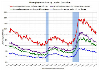
 This graph shows the unemployment rate by four levels of education (all groups are 25 years and older).
Unfortunately this data only goes back to 1992 and only includes one previous recession (the stock / tech bust in 2001). Clearly education matters with regards to the unemployment rate - and it appears all four groups are generally trending down.
Although education matters for the unemployment rate, it doesn't appear to matter as far as finding new employment!
Note: This says nothing about the quality of jobs - as an example, a college graduate working at minimum wage would be considered "employed".
 This graph shows total construction employment as reported by the BLS (not just residential).
Since construction employment bottomed in January 2011, construction payrolls have increased by 416 thousand. According to the BLS, essentially no construction jobs have been over the last five months. Historically there is a lag between an increase in activity and more hiring - and it appears hiring should pickup significant in 2014.
 The BLS diffusion index for total private employment was at 63.5 in November, up from 61.1 in October.
For manufacturing, the diffusion index increased to 63.0, up from 56.8 in October.
Think of this as a measure of how widespread job gains are across industries. The further from 50 (above or below), the more widespread the job losses or gains reported by the BLS. From the BLS:
Figures are the percent of industries with employment increasing plus one-half of the industries with unchanged employment, where 50 percent indicates an equal balance between industries with increasing and decreasing employment.Job growth was widespread in November (a good sign).


