by Calculated Risk on 3/07/2014 04:53:00 PM
Friday, March 07, 2014
Fannie, Freddie and FHA REO Inventory
Note: The FHA has stopped releasing REO inventory on a monthly basis. I was able to obtain data for February as show on the graph below.
I'm still trying to get Quarter ending data from the FHA.
In their Q4 SEC filing, Fannie reported their Real Estate Owned (REO) increased to 103,229 single family properties, up from 100,941 at the end of Q3.
Freddie reported their REO increased to 47,308 in Q4, up from 44,623 at the end of Q3.
The FHA reported their REO decreased to 25,306 in February 2014, down from 32,226 in October 2013.
The combined Real Estate Owned (REO) for Fannie, Freddie and the FHA decreased to 175,843, down from 180,286 at the end of Q3 2013 (note: FHA data is not for Quarter end). The peak for the combined REO of the F's was 295,307 in Q4 2010.
This following graph shows the REO inventory for Fannie, Freddie and the FHA.
 Click on graph for larger image.
This is only a portion of the total REO. There is also REO for private-label MBS, FDIC-insured institutions (declined in Q4), VA and more. REO has been declining for those categories.
REO for Fannie and Freddie has increased a little over the last two quarters and is still elevated, but REO for the FHA is apparently back to normal levels.
When will payroll employment exceed the pre-recession peak?
by Calculated Risk on 3/07/2014 01:19:00 PM
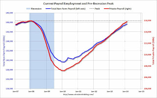
Payroll employment is getting very close to the pre-recession peak.
Of course this doesn't include population growth and new entrants into the workforce (the workforce has continued to grow), but reaching new highs in employment will be a significant milestone in the recovery.
The graph below shows both total non-farm payroll (blue, left axis) and private payroll (red, right axis) since January 2007. Both total non-farm and private payroll employment peaked in January 2008.
The dashed line is the pre-recession peak.
 Click on graph for larger image.
The pre-recession peak for total non-farm payroll employment was 138.365 million. Currently there are 137.699 million total non-farm payroll jobs, or 666 thousand fewer than the pre-recession peak.
At the recent annual pace (about 2.2 million jobs added per year), total non-farm payroll will be at a new high in June 2014.
The pre-recession peak for private payroll employment was 115.977 million. Currently there are 115.848 million total non-farm payroll jobs, or 129 thousand fewer than the pre-recession peak. It seems likely private sector employment that will be at a new high in March.
Trade Deficit increased in January to $39.1 Billion
by Calculated Risk on 3/07/2014 12:20:00 PM
The Department of Commerce reported this morning:
[T]otal January exports of $192.5 billion and imports of $231.6 billion resulted in a goods and services deficit of $39.1 billion, up from $39.0 billion in December, revised. January exports were $1.2 billion more than December exports of $191.3 billion. January imports were $1.3 billion more than December imports of $230.3 billion.The trade deficit was close to the consensus forecast of $39.0 billion.
The first graph shows the monthly U.S. exports and imports in dollars through January 2014.
 Click on graph for larger image.
Imports and exports increased in January.
Exports are 15% above the pre-recession peak and up 3% compared to January 2013; imports are at the pre-recession peak, and up about 1% compared to January 2013.
The second graph shows the U.S. trade deficit, with and without petroleum, through January.
 The blue line is the total deficit, and the black line is the petroleum deficit, and the red line is the trade deficit ex-petroleum products.
Oil averaged $90.21 in January, down from $91.34 in December, and down from $94.08 in January 2013. The petroleum deficit has generally been declining and is the major reason the overall deficit has declined since early 2012.
The trade deficit with China was mostly unchanged at $27.84 billion in January, from $27.79 billion in January 2013. A majority of the trade deficit is related to China.
Overall it appears trade is picking up a little.
Comments on Employment Report
by Calculated Risk on 3/07/2014 09:50:00 AM
First, a milestone for next month: Private payroll employment increased 162 thousand in February and private employment is now just 129 thousand below the previous peak (total employment is still 666 thousand below the peak in January 2008). It seems very likely that private employment will be at a new high in March.
Total non-farm employment will probably be at a new high this summer (all the government layoff have held back total employment).
This was a better employment report than the previous two months with 175,000 jobs added in February (and 25,000 in upward revisions to prior months). Hopefully job growth will be averaging over 200,000 jobs per month again soon (I expect stronger employment growth in 2014 than in 2013 even with the poor start to this year).
Employment-Population Ratio, 25 to 54 years old
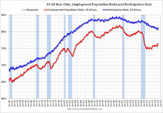
 Since the participation rate declined recently due to cyclical (recession) and demographic (aging population) reasons, an important graph is the employment-population ratio for the key working age group: 25 to 54 years old.
In the earlier period the employment-population ratio for this group was trending up as women joined the labor force. The ratio has been mostly moving sideways since the early '90s, with ups and downs related to the business cycle.
The 25 to 54 participation rate increased in February to 81.2% from 81.1%, and the 25 to 54 employment population ratio was unchanged at 76.5%. As the recovery continues, I expect the participation rate for this group to increase.
Percent Job Losses During Recessions

This graph shows the job losses from the start of the employment recession, in percentage terms - this time aligned at maximum job losses. At the recent pace of improvement, it appears employment will be back to pre-recession levels mid-year (Of course this doesn't include population growth).
In the earlier post, the graph showed the job losses aligned at the start of the employment recession.
Part Time for Economic Reasons
 From the BLS report:
The number of persons employed part time for economic reasons (sometimes referred to as involuntary part-time workers) was little changed at 7.2 million in February. These individuals were working part time because their hours had been cut back or because they were unable to find full-time work.This is the lowest level for part time workers since October 2008.
These workers are included in the alternate measure of labor underutilization (U-6) that declined to 12.6% in February. This is the lowest level for U-6 since November 2008.
Unemployed over 26 Weeks
 This graph shows the number of workers unemployed for 27 weeks or more.
 According to the BLS, there are 3.849 million workers who have been unemployed for more than 26 weeks and still want a job. This was up from 3.646 in January. This is trending down, but is still very high. Long term unemployment remains one of the key labor problems in the US.
State and Local Government
 This graph shows total state and government payroll employment since January 2007. State and local governments lost jobs for four straight years. (Note: Scale doesn't start at zero to better show the change.)
 In February 2014, state and local governments added 19,000 jobs.
It appears state and local employment employment has bottomed. Of course Federal government layoffs are ongoing.
All things considered, this was a decent report. Hopefully the severe weather is behind us, and the pace of employment growth will pick up.
February Employment Report: 175,000 Jobs, 6.7% Unemployment Rate
by Calculated Risk on 3/07/2014 08:30:00 AM
From the BLS:
Total nonfarm payroll employment increased by 175,000 in February, and the unemployment rate was little changed at 6.7 percent, the U.S. Bureau of Labor Statistics reported today. ...
The change in total nonfarm payroll employment for December was revised from +75,000 to +84,000, and the change for January was revised from +113,000 to +129,000. With these revisions, employment gains in December and January were 25,000 higher than previously reported.
...
 Click on graph for larger image.
The headline number was above expectations of 150,000 payroll jobs added.
The first graph shows the job losses from the start of the employment recession, in percentage terms, compared to previous post WWII recessions. The dotted line is ex-Census hiring.
This shows the depth of the recent employment recession - worse than any other post-war recession - and the relatively slow recovery due to the lingering effects of the housing bust and financial crisis.

Employment is 0.5% below the pre-recession peak (666 thousand fewer total jobs).
NOTE: The second graph is the change in payroll jobs ex-Census - meaning the impact of the decennial Census temporary hires and layoffs is removed to show the underlying payroll changes.
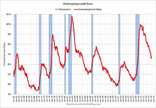
The third graph shows the unemployment rate.
The unemployment rate increased in February to 6.7% from 6.6% in January.

The fourth graph shows the employment population ratio and the participation rate.
The Labor Force Participation Rate was unchanged in February at 63.0%. This is the percentage of the working age population in the labor force.
 The participation rate is well below the 66% to 67% rate that was normal over the last 20 years, although a significant portion of the recent decline is due to demographics.
The Employment-Population ratio was unchanged in February at 58.8% (black line).
I'll post the 25 to 54 age group employment-population ratio graph later.
This was a decent employment report considering the recent harsh weather. I'll have much more later ...


