by Calculated Risk on 11/22/2010 11:52:00 AM
Monday, November 22, 2010
Moody's: Commercial Real Estate Prices increase in September
Moody's reported today that the Moody’s/REAL All Property Type Aggregate Index increased 4.3% in September. This reverses the sharp decline in August. Note: Moody's CRE price index is a repeat sales index like Case-Shiller - but there are far fewer commercial sales - and that can impact prices and make the index very volatile.
Below is a comparison of the Moodys/REAL Commercial Property Price Index (CPPI) and the Case-Shiller composite 20 index. Beware of the "Real" in the title - this index is not inflation adjusted.
 Click on graph for larger image in new window.
CRE prices only go back to December 2000.
The Case-Shiller Composite 20 residential index is in blue (with Dec 2000 set to 1.0 to line up the indexes).
It is important to remember that the number of transactions is very low and there are a large percentage of distressed sales.
From Bloomberg: Commercial Property Prices in U.S. Increase the Most on Record, Moody Says
U.S. commercial property prices rose 4.3 percent in September from the previous month ... “Each of the summer months this year recorded declines in the 3 percent to 4 percent range, followed by this month’s sizeable uptick,” Nick Levidy, a Moody’s managing director in New York, said in the statement. “The relatively large swings seen in the index recently are due in part to the uncertain macroeconomic environment and the effects of a thin market with low transaction volumes.”The headline for the Bloomberg article is a little misleading - there was a large reported increase in September, but that was pretty minor compared to the price declines over the summer.
CoreLogic: Shadow Housing Inventory pushes total unsold inventory to 6.3 million units
by Calculated Risk on 11/22/2010 09:21:00 AM
From CoreLogic: Shadow Inventory Jumps More Than 10 Percent in One Year, Pushing Total Unsold Inventory to 6.3 Million Units

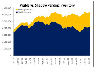
This graph from CoreLogic shows the breakdown of "shadow inventory" by category. For this report, CoreLogic estimates the number of 90+ day delinquencies, foreclosures and REOs not currently listed for sale. Obviously if a house is listed for sale, it is already included in the "visible supply" and cannot be counted as shadow inventory.
CoreLogic estimates the "shadown inventory" (by this method) at about 2.1 million units.
CoreLogic estimates shadow inventory, sometimes called pending supply, by calculating the number of properties that are seriously delinquent (90 days or more), in foreclosure and real estate owned (REO) by lenders and that are not currently listed on multiple listing services (MLSs). Shadow inventory is typically not included in the official metrics of unsold inventory.
According to CoreLogic, the visible supply of unsold inventory was 4.2 million units in August 2010, the same as the previous year. The visible inventory measures the unsold inventory of new and existing homes that were on the market. The visible months’ supply increased to 15 months in August, up from 11 months a year earlier due to the decline in sales during the last few months.
The total visible and shadow inventory was 6.3 million units in August, up from 6.1 million a year ago. The total months’ supply of unsold homes was 23 months in August, up from 17 months a year ago. Although it can vary and it depends on the market and real estate cycle, typically a reading of six to seven months is considered normal so the current total months’ supply is roughly three times the normal rate.
...
Mark Fleming, chief economist for CoreLogic commented, “The weak demand for housing is significantly increasing the risk of further price declines in the housing market. This is being exacerbated by a significant and growing shadow inventory that is likely to persist for some time due to the highly extended time-to-liquidation that servicers are currently experiencing.”
 The second graph from CoreLogic shows the total visible and pending inventory. Even though the visible inventory has declined slightly from the peak in 2007, the total inventory is at close to an all time high of 6.3 million units.
Note: The term "shadow inventory" is used in many different ways. My definition is: housing units that are not currently listed on the market, but will probably be listed soon. This includes:
Although the CoreLogic report is useful in estimating future supply, I think it is the visible supply that impacts prices.
Chicago Fed: Economic Activity picked up slightly in October
by Calculated Risk on 11/22/2010 08:30:00 AM
Note: This is a composite index based on a number of economic releases.
From the Chicago Fed: Index shows economic activity picked up in October
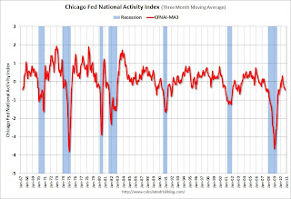
Led by improvements in production- and employment-related indicators, the Chicago Fed National Activity Index increased to –0.28 in October from –0.52 in September.
...
The index’s three-month moving average, CFNAI-MA3, decreased to –0.46 in October from –0.33 in September, reaching its lowest level since November 2009. October’s CFNAI-MA3 suggests that growth in national economic activity was below its historical trend for the fifth consecutive month. With regard to inflation, the amount of economic slack reflected in the CFNAI-MA3 suggests subdued inflationary pressure from economic activity over the coming year.
 Click on graph for larger image in new window.
This graph shows the Chicago Fed National Activity Index (three month moving average) since 1967. According to the Chicago Fed:
A zero value for the index indicates that the national economy is expanding at its historical trend rate of growth; negative values indicate below-average growth; and positive values indicate above-average growth.This index suggests the economy was sluggish in October.
Sunday, November 21, 2010
Shadow Inventory
by Calculated Risk on 11/21/2010 10:10:00 PM
Tomorrow morning CoreLogic will release their Shadow Inventory report as of August 2010. For this report, CoreLogic estimates the number of 90+ day delinquencies, foreclosures and REOs not currently listed for sale. Obviously if a house is listed for sale, it is already included in the "visible supply" and cannot be counted as shadow inventory.
CoreLogic then adds this shadow or "pending inventory" to the "visible supply" for August as reported by the NAR: 4.1 million units and 12.0 months-of-supply.
The term "shadow inventory" is used in many different ways. My definition is: housing units that are not currently listed on the market, but will probably be listed soon. This includes:
I expect CoreLogic to report 1.5 to 2.0 million units of pending supply, and that will put their combined months-of-supply metric in the stratosphere. Although the CoreLogic report is useful in estimating future supply, I think it is the visible supply that impacts prices.
Earlier: Here is the economic schedule for the coming holiday week. There will be plenty of data released early in the week, including existing home sales on Tuesday, new home sales on Wednesday, the 2nd estimate of Q3 GDP on Tuesday, and Personal income and spending for October on Wednesday - and much more.
And a summary of last week.
Irish Bailout approved by EU and IMF
by Calculated Risk on 11/21/2010 04:09:00 PM
From the Irish Times: Irish application for IMF/EU rescue package approved
Taoiseach Brian Cowen tonight confirmed the European Union has agreed to Government request for financial aid package from the European Union and the International Monetary Fund.The amount of the aid still hasn't been determined. Apparently the loans will be from the IMF, the European Financial Stability Facility (EFSF), and possibly from the UK and Sweden directly.
European finance ministers held an emergency conference call tonight to consider a Cabinet request for aid, during which the application was approved.
More from the Financial Times: Eurozone agrees €80bn-€90bn Irish aid
Earlier: Here is the economic schedule for the coming holiday week. There will be plenty of data released early in the week, including existing home sales on Tuesday, new home sales on Wednesday, the 2nd estimate of Q3 GDP on Tuesday, and Personal income and spending for October on Wednesday - and much more.
And a summary of last week.
A Summary for the Week ending November 20th
by Calculated Risk on 11/21/2010 11:30:00 AM
Below is a summary of last week mostly in graphs. Note: A key story again last week was the imminent bailout of Ireland. There will probably be more on the bailout details later today.
 Click on graph for larger image in new window.
Total housing starts were at 519 thousand (SAAR) in October, down 11.7% from the revised September rate of 588 thousand, and just up 9% from the all time record low in April 2009 of 477 thousand (the lowest level since the Census Bureau began tracking housing starts in 1959).
This was below expectations of 590 thousand starts, mostly because of the volatile multi-family starts. Single-family starts decreased 1.1% to 436 thousand in October. This is 21% above the record low in January 2009 (360 thousand).
The graph shows the huge collapse following the housing bubble, and that housing starts have mostly been moving sideways for almost two years - with a slight up and down over the last six months due to the home buyer tax credit. Starts will stay low until the excess inventory of existing homes is absorbed.
The MBA reported that 13.52 percent of mortgage loans were either one payment delinquent or in the foreclosure process in Q3 2010 (seasonally adjusted). This is down from 14.42 percent in Q2 2010.
Note: the MBA's National Delinquency Survey (NDS) covered "about 44 million first-lien mortgages on one- to four-unit residential properties" and the "NDS is estimated to cover approximately 88 percent of the outstanding first lien mortgages in the market." This gives about 50 million total first lien mortgages or about 6.75 million delinquent or in foreclosure.
 This graph shows the percent of loans delinquent by days past due.
Most of the decline in the overall delinquency rate was in the seriously delinquent categories (90+ days or in foreclosure process). Part of the reason is lenders were being more aggressive in foreclosing in Q3 (before the foreclosure pause), and there was a surge in REO inventory (real estate owned). Some of the decline was probably related to modifications too.
Loans 30 days delinquent decreased to 3.36%. This is slightly below the average levels of the last 2 years, but still high.
Delinquent loans in the 60 day bucket decreased to 1.44% - the lowest since Q2 2008.
With the foreclosure pause, the 90+ day and in foreclosure rates will probably increase in Q4.
The CoreLogic HPI is a three month weighted average of July, August, and September and is not seasonally adjusted (NSA).
 This graph shows the national CoreLogic HPI data since 1976. January 2000 = 100.
The index is down 2.8% over the last year, and off 29.2% from the peak.
The index is 3.9% above the low set in March 2009, and I expect to see a new post-bubble low for this index later this year or early in 2011.
“We’re continuing to see price declines across the board with all but seven states seeing a decrease in home prices,” said Mark Fleming, chief economist for CoreLogic. “This continued and widespread decline will put further pressure on negative equity and stall the housing recovery.”
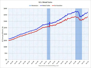
 On a monthly basis, retail sales increased 1.2% from September to October (seasonally adjusted, after revisions), and sales were up 7.3% from October 2009.
 Retail sales increased 0.4% ex-autos - about at expectations.
This graph shows retail sales since 1992. This is monthly retail sales, seasonally adjusted (total and ex-gasoline).
Retail sales are up 11.2% from the bottom, and only off 1.8% from the pre-recession peak.
From the Fed: Industrial production and Capacity Utilization
Industrial production was unchanged in October after having fallen 0.2 percent in September. ... The capacity utilization rate for total industry was flat at 74.8 percent, a rate 6.6 percentage points above the low in June 2009 and 5.8 percentage points below its average from 1972 to 2009.
 This graph shows Capacity Utilization. This series is up 9.7% from the record low set in June 2009 (the series starts in 1967).
Capacity utilization at 74.8% is still far below normal - and well below the pre-recession levels of 81.2% in November 2007.
Note: y-axis doesn't start at zero to better show the change.
 The next graph shows industrial production since 1967.
Industrial production was unchanged in October, and production is still 7.3% below the pre-recession levels at the end of 2007.
This was below consensus expectations of a 0.3% increase in Industrial Production, and an increase to 74.9% for Capacity Utilization.
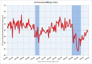
Note: This index is a leading indicator for new Commercial Real Estate (CRE) investment.
 Reuters reported that the American Institute of Architects’ Architecture Billings Index decreased to 48.7 in October from 50.4 in September. Any reading below 50 indicates contraction.
 This graph shows the Architecture Billings Index since 1996. The index showed expansion in September (above 50) for the first time since Jan 2008, however the index is indicating contraction again in October.
According to the AIA, there is an "approximate nine to twelve month lag time between architecture billings and construction spending" on non-residential construction. So there will probably be further declines in CRE investment for the next 9 to 12 months.
 The National Association of Home Builders (NAHB) reported the housing market index (HMI) was at 16 in November. This is a 1 point increase from the revised 15 in October (revised down from 16). This is the highest level since June, but slightly below expectations of an increase to 17. The record low was 8 set in January 2009, and 16 is still very low ...
Note: any number under 50 indicates that more builders view sales conditions as poor than good.
This graph compares the NAHB HMI (left scale) with single family housing starts (right scale). This includes the November release for the HMI and the September data for starts.
This shows that the HMI and single family starts mostly move in the same direction - although there is plenty of noise month-to-month.
Over the last 12 months, the median CPI rose 0.5%, the trimmed-mean CPI rose 0.8%, and the CPI less food and energy rose 0.6%. The indexes for rent and owners' equivalent rent both increased in October (some analysts blamed the disinflation trend on these measures of rent, but that wasn't true in October).
 This graph shows these three measure of inflation on a year-over-year basis.
 They all show that inflation has been falling, and that measured inflation is up less than 1% year-over-year.
As far as disinflation, the U.S. is still tracking Japan in the '90s ...
Best wishes and Happy Thanksgiving to all!


